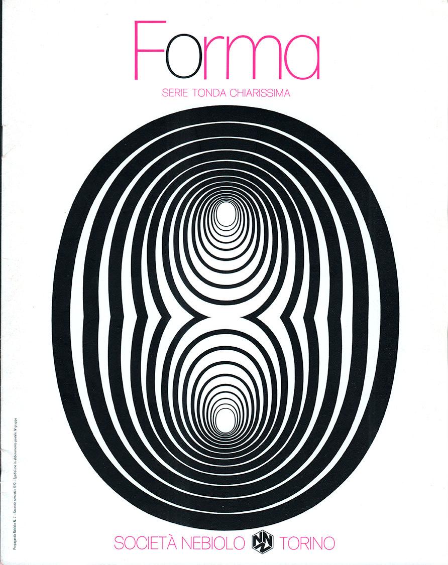
Forma is back

A revival of Aldo Novarese’s Forma comes at a time when mid-century design has never been more stylish.
Neue Haas-Grotesk, the precursor to Helvetica, that flagship of corporate design, has enjoyed a spirited revival. Now we reach back to explore Forma—a 1960s Italian neo-grotesque. Somehow this warm, rich sans serif did not make it to the digital era—until now. Forma DJR was crafted to capture the flair and precision of the original Nebiolo design, while adding interesting details observed in the printing process.
The type: Forma DJR, a revival in 5 weights & 5 sizes

The designer: Aldo Novarese
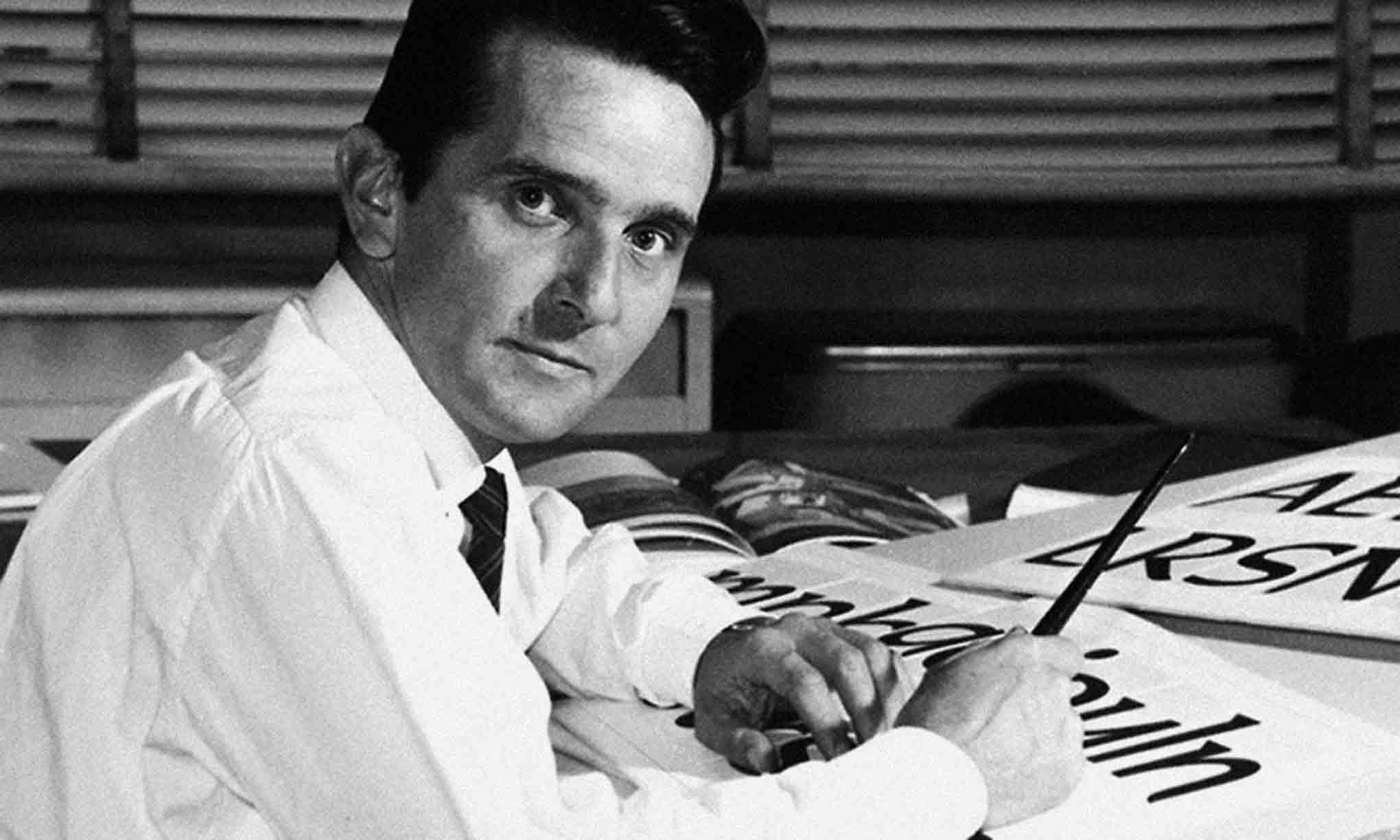
Novarese at his design studio in the 1960s. Nebiolo, 1969

A biographical sketch by Indra Kupferschmid
As Ferrari is to cars, Novarese is to type
Turin-based Aldo Novarese was one of the most inspired type designers of the 20th century.
As art director at the Italian type foundry Società Nebiolo from 1952 to 1975, and in later years as a freelance designer until his death in 1995, Aldo Novarese created more than 200 typefaces for metal and photographic setting.
His Eurostile (1962)—a reworking of Microgramma (1951), the earlier typeface that he designed with Alessandro Butti—added a new lowercase and new weights to the all-caps original. Eurostile is still seen as emblematic of mid-century modernism and futuristic style.
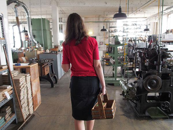
The type: The original metal
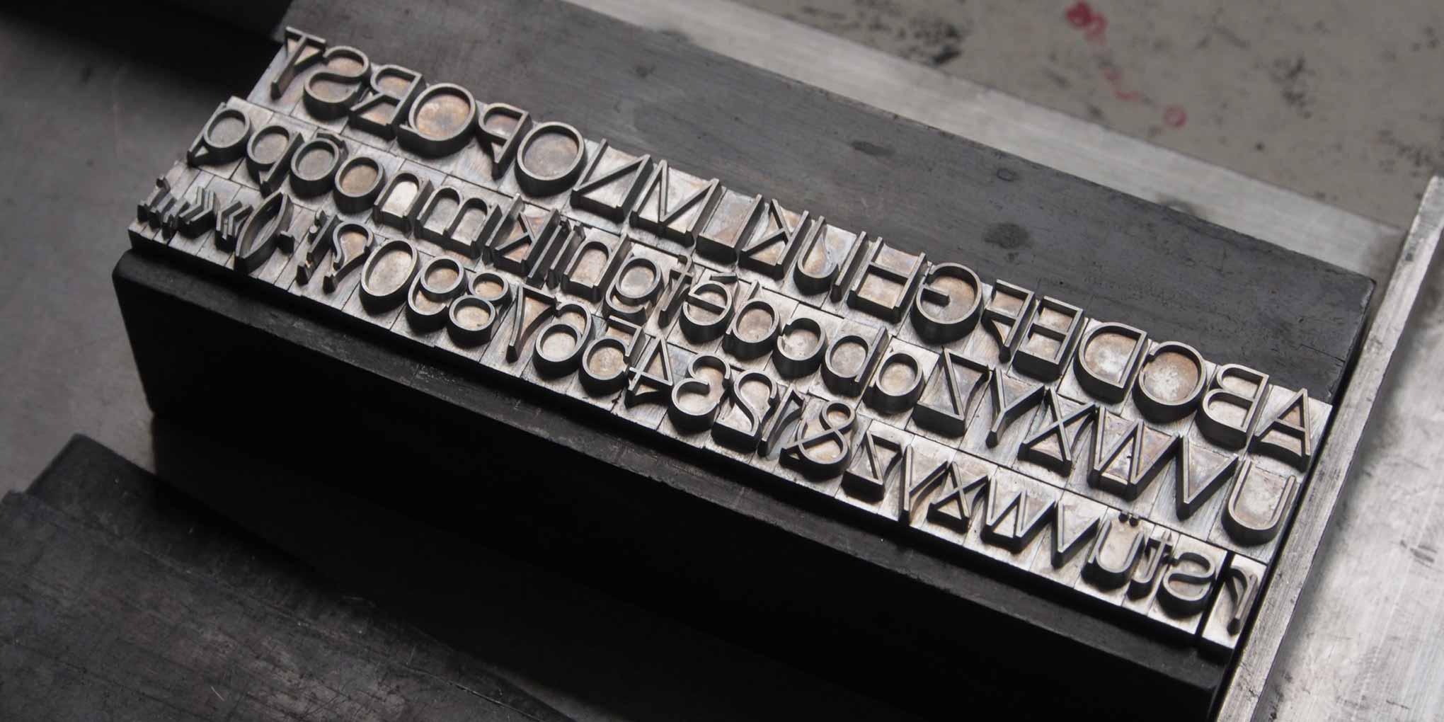
An actual metal font! Forma set by Indra Kupferschmid for test printing.
Getting the lead out
Working directly from metal type was a first for us, but it revealed how Forma had been adapted for different sizes and different weights, helping us to understand some of the key design features of this historic face.
Alternate glyphs

If you feel like Forma is just not enough like Helvetica, DJR‘s revival features a few key alternate glyphs: with a chin for the G, a rounded stem for the R, and a two-story a. (Forma DJR also has an alternate tailed j not shown here.) These small changes give a surprisingly different feel to a body of text.
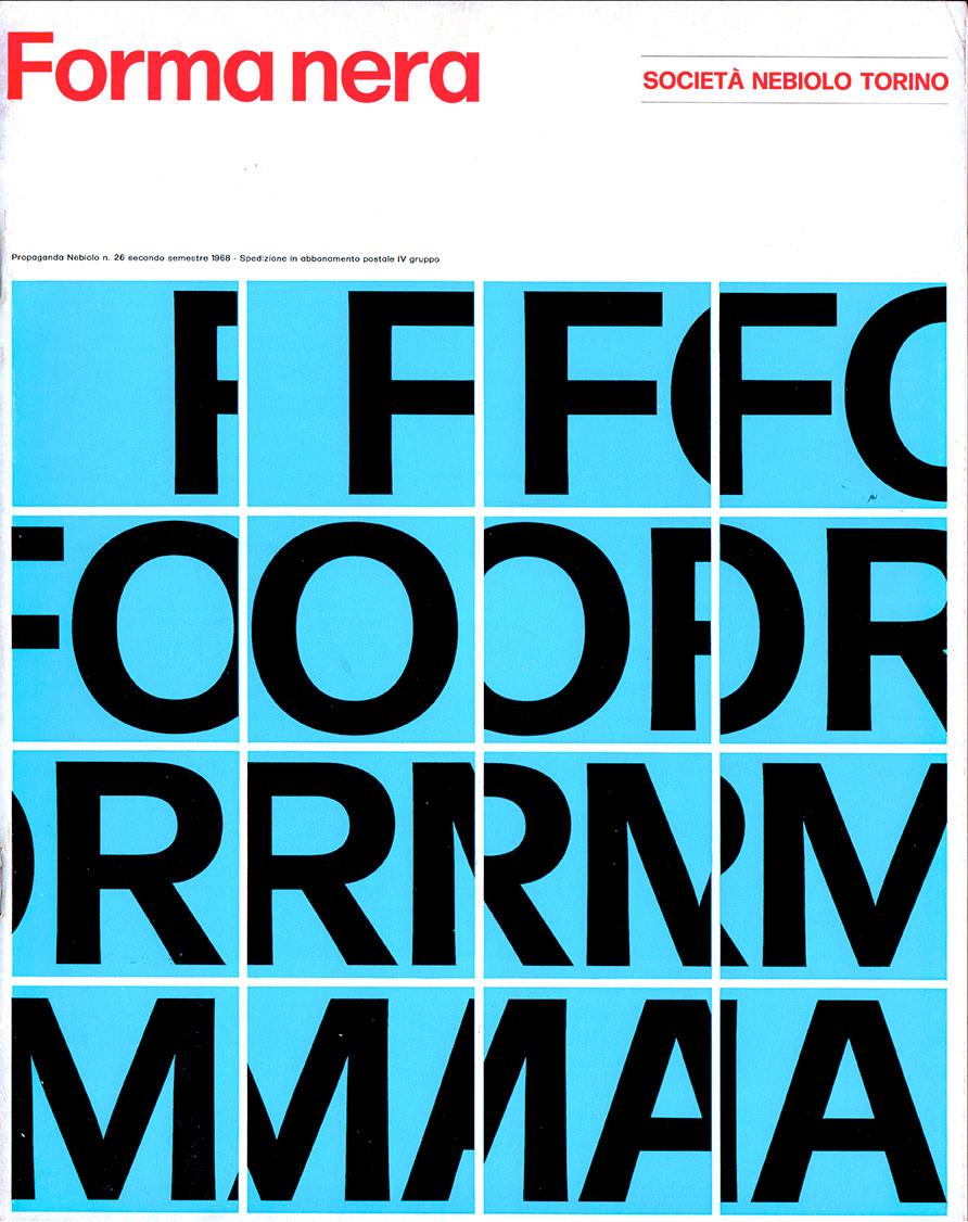
The foundry
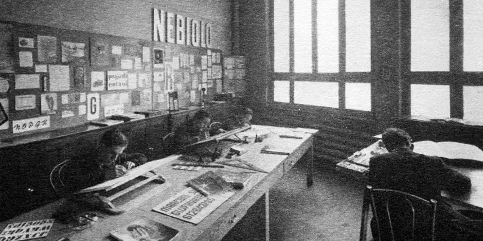
The production area at Nebiolo in Turin. Image from TipoItalia
The story of Nebiolo
The Nebiolo foundry of Turin was formerly the biggest type and printing equipment manufacturer in Italy. Founded in 1852, Nebiolo thrived in the first half of the 20th century, but never made the transition to phototype. The foundry closed in 1978.
My whole sense of type is shaped by that foundry.—Roger Black
The Milan connection
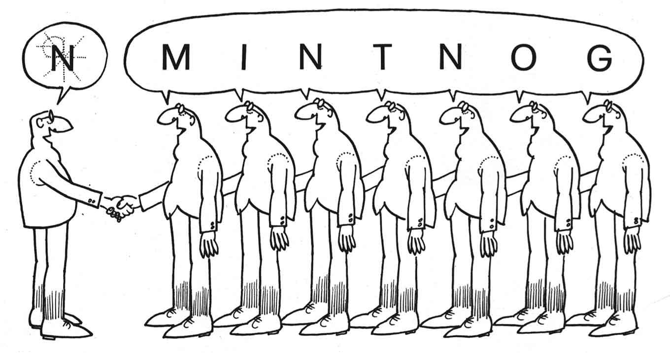
The quest for a typeface ‘without salt’
The original development of Forma is an extraordinary story, and the question of who designed it is not as easy to answer as it is with other typefaces.
Aldo Novarese is not always given sole credit for the design. Sometimes seven additional people are credited: Franco Grignani, Giancarlo Iliprandi, Bruno Munari, Ilio Negri, Till Neuburg, Luigi Oriani, and Pino Tovaglia—all graphic designers in Milan. How did this come about?
Ephemera
The design team that advised Nebiolo toward the end of the foundry’s existence produced some wonderful promotional brochures for Forma, the first product of the collaboration. Whatever their influence on the final design, these are amazing pieces of type promotion.
Between the poles
Size
Type design is approached as a series of axes. Forma DJR started with size and weight axes—five of each. At the smaller optical sizes, design features like the taper are emphasized, especially in the bolder weights.

Weight
There are five weights for each size, from Extra Light to Bold. The technology employed in developing Forma DJR worked with the extremes (poles) of each axis to automate the design process.

The reviver: David Jonathan Ross
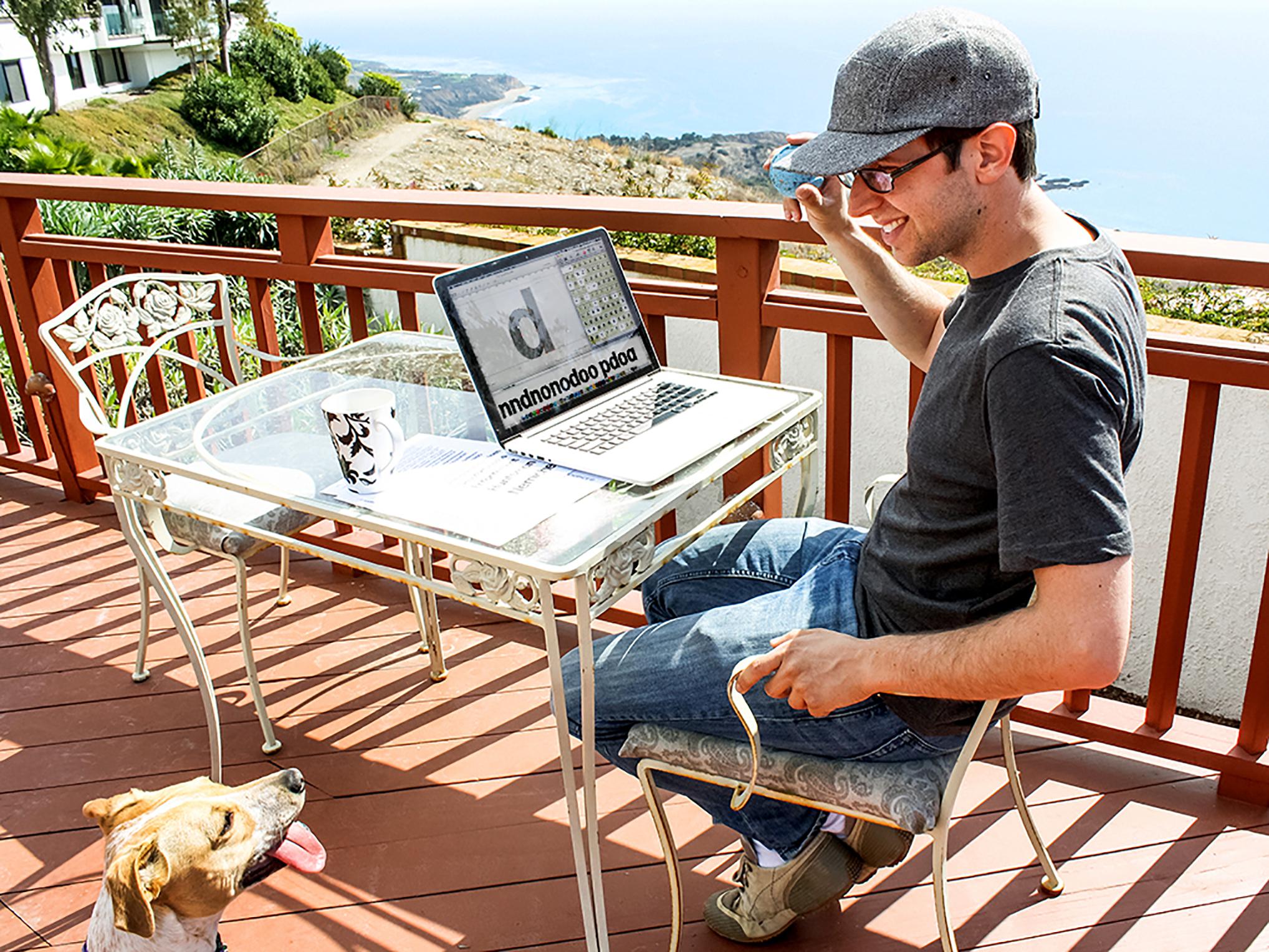
Photograph by Emily Richardson
Type design is the purest form of drawing
Because it’s not representing people, places or things: it’s a graphic code. By combining computer code with drawing, DJR made Input, the hit type family designed for coders. Now he brings us Forma, the latest release from his recently-launched digital foundry.
David Jonathan Ross draws letters of all shapes and sizes for custom and retail typeface designs. A designer at the Font Bureau since 2007, he strives to build useful tools that challenge designers to confront the unique visual and technical demands of their text.
From slab serifs of the 19th century to computer terminals of the 20th, DJR ransacks forgotten and pigeonholed lettering styles and searches for new approaches to the same old alphabet. His mini-site detailing the revival of Forma offers a glimpse into the research and thinking that determined its direction.
More about Forma
FINDING FORMA This revival began as a custom font at Font Bureau. Roger Black was the art director, and Indra Kupferschmid did amazing research.
IN USE The Tatler magazines in Asia commissioned Forma for a redesign in 2014. Another well-received redesign brought them to the West: WWD.
WALLPAPER? Not the magazine, but screen wallpaper. In an idle moment, DJR produced some screensaver images in Drawbot. Download them here (3.1MB ZIP file).