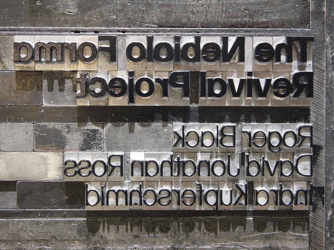
Getting the lead out
Most digital revivals of old metal fonts start with printed specimens. But Indra Kupferschmid, who led the research effort, suspected we might be able to get to the source.
The Forma project was started by Roger Black, who had first seen the type in a Nebiolo catalog in the early 1970s. He always wanted to use it someplace, and when commissioned to redesign the Tatler magazines in Asia he figured, after 40 years, that now was the time.
Font Bureau’s David Berlow suggested that David Jonathan Ross was the right designer to work on it, while Roger tapped me to do some research on Forma’s history and find good specimens.
My investigation kicked off with a surprising find: I happened to visit a print shop in Dresden and discovered a metal font of Forma Light, still in its original package. Up until then, the rumor was that everything at the Nebiolo foundry had been lost or scrapped, including punches and matrices, after it ceased production in the mid-1970s. But maybe there was, after all, still some type around that we could use as the basis for the project.
After some inquiries, I was able to track down new Forma fonts at the type foundry of Rainer Gerstenberg in Darmstadt, Germany (a successor to the Stempel foundry). Gerstenberg had several sizes and styles, and even matrices for some fonts of Forma, so he could still cast new type. These came from the remains of the Haas type foundry in Münchenstein, Switzerland, who, in turn, had taken over the remains of Nebiolo after they closed.
I drove to Darmstadt and made a “heavy” purchase of small, medium, and larger sizes in Light, Regular, and Bold, and brought them to my art school’s print shop in Saarbrücken to proof. There I made sample settings of the full character set, with test words and spacing strings in all fonts, printing on different paper (cream and bright white, matte and glossy coated, and rough and smooth uncoated stock) on an FAG proof press. I then scanned these proofs without any color or tonal adjustments and sent them to David Jonathan Ross in Los Angeles. He would frequently meet online with Roger to discuss the process and design decisions.
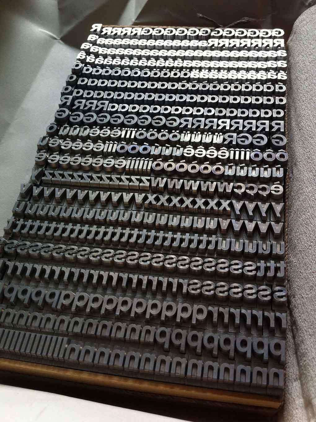
Photo by Indra Kupferschmid.
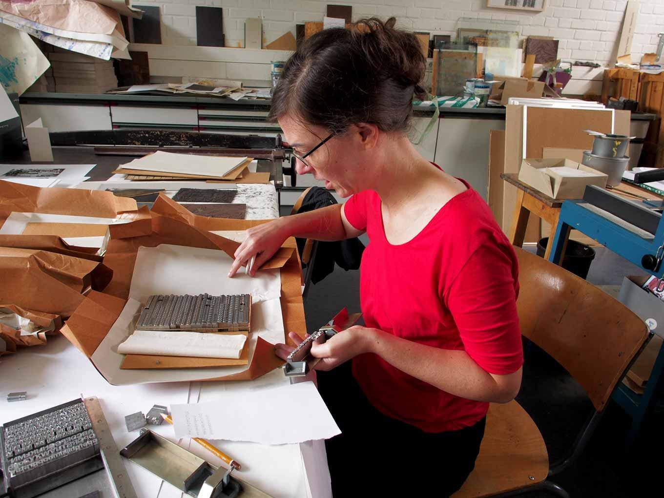
Indra Kupferschmid at the print shop at HBKsaar, Saarbrücken.
Good scans from good type specimens can be sufficient inspiration and material to digitize a typeface, but specimens usually don’t show the full character set in all sizes. Sample texts are also almost always justified, so that it can be hard to determine how the out-of-the-box spacing of the fonts really looks. This was done partly so that it was not that easy to replicate a typeface from just a specimen book.
Proofing under “normal,” non-clinical conditions (read: sub-optimally printed by an amateur who had never used that proof press before, which she did not tell the others of course), on various kinds of paper brought out the key features that would become the main characteristics of the new digital Forma.
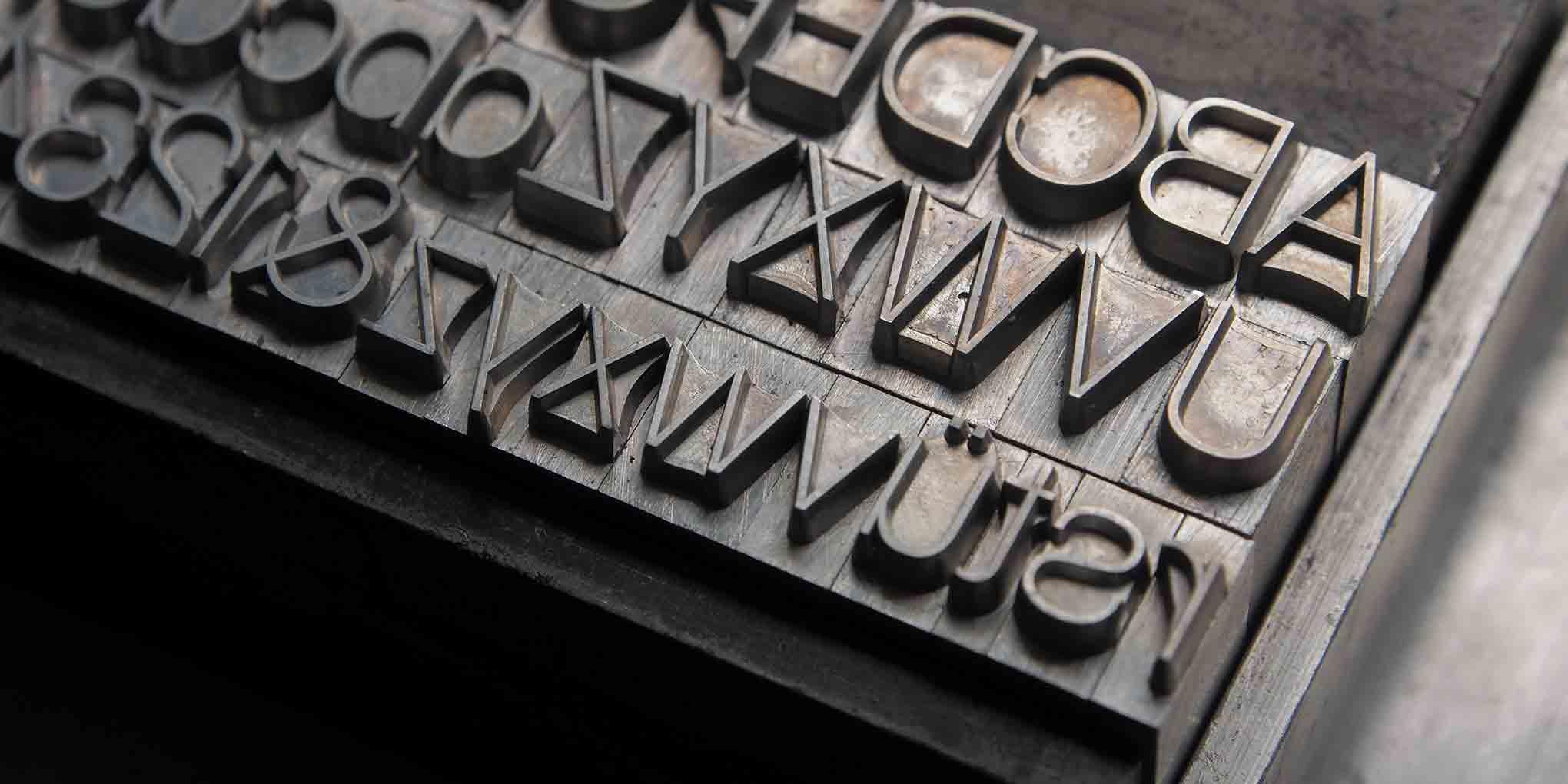
The first surprise upon unpacking the fonts was how incredibly tight the metal Forma really was, basically with no dispensable space left and right of the letterforms. This became much more obvious as I held some large-sized glyphs of the Light in hand weight compared to just looking at it in a specimen book. The smaller sizes, e.g. the 8-point fonts, were more loosely spaced; they are quite comfortable to read in text, especially if you use the alternate two-story form for a‚ which is less easily confused with an o. From the range of point sizes on offer, we guessed that Nebiolo worked with three different sets of patterns for pantographic matrix engraving. (Ultimately David Jonathan Ross decided to design five sizes for the digital fonts.)
Looking at a photograph of one of these patterns [link], you can see a feature that Roger saw on the proofs I made, but which I hadn’t noticed so explicitly before: the slightly concave tapering of the stems. This is more pronounced in the regular and bold weights, only barely visible in the Light, and more defining in the smaller sizes–all contingent on the amount of pressure, the ink, and the kind of paper.
Another artifact of the letterpress printing process was the slight rounding of corners, which gave the type a pleasant warmth and approachability compared to the often sterile and rigid appearance of other neo-grotesks in digital typesetting. Roger felt that this was exactly what set Forma apart and decided to accentuate it.
In the end, these three traits—the tight spacing, the tapered stems, and the rounded corners—became the key characteristics in the new Forma series. They were even emphasized beyond what you see in metal fonts, because, Roger reasoned, we could make a range of size masters that included both smaller and larger sizes than the original:
- Micro has greater tapering
- Corners become more rounded as the sizes get smaller'
- Banner is even more tightly spaced than the large foundry type
Taking this “longer” route (via Dresden, Darmstadt, Saarbrücken, Boston, Los Angeles, and Hong Kong) helped Forma DJR become a revitalization—more than just a digitization. As a result, after being off the stage for 40 years, Forma appears in a fresh, contemporary role.

October 11, 2023 · Brochure
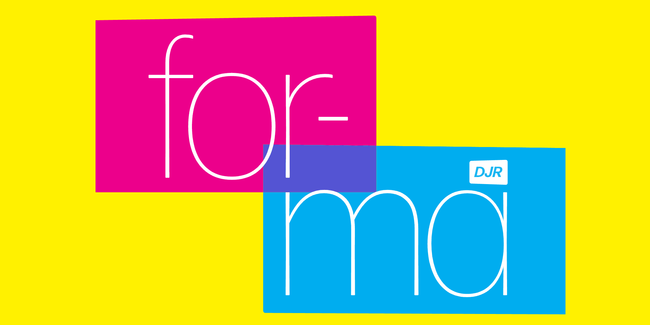
A revival of Aldo Novarese’s Forma comes at a time when mid-century design has never been more stylish.
82 styles
Every weight, width, style, and script of Forma DJR, available exclusively on Type Network.