Aldo: as Ferrari is to cars, Novarese is to type
Turin-based Aldo Novarese was one of the most inspired type designers of the 20th century.
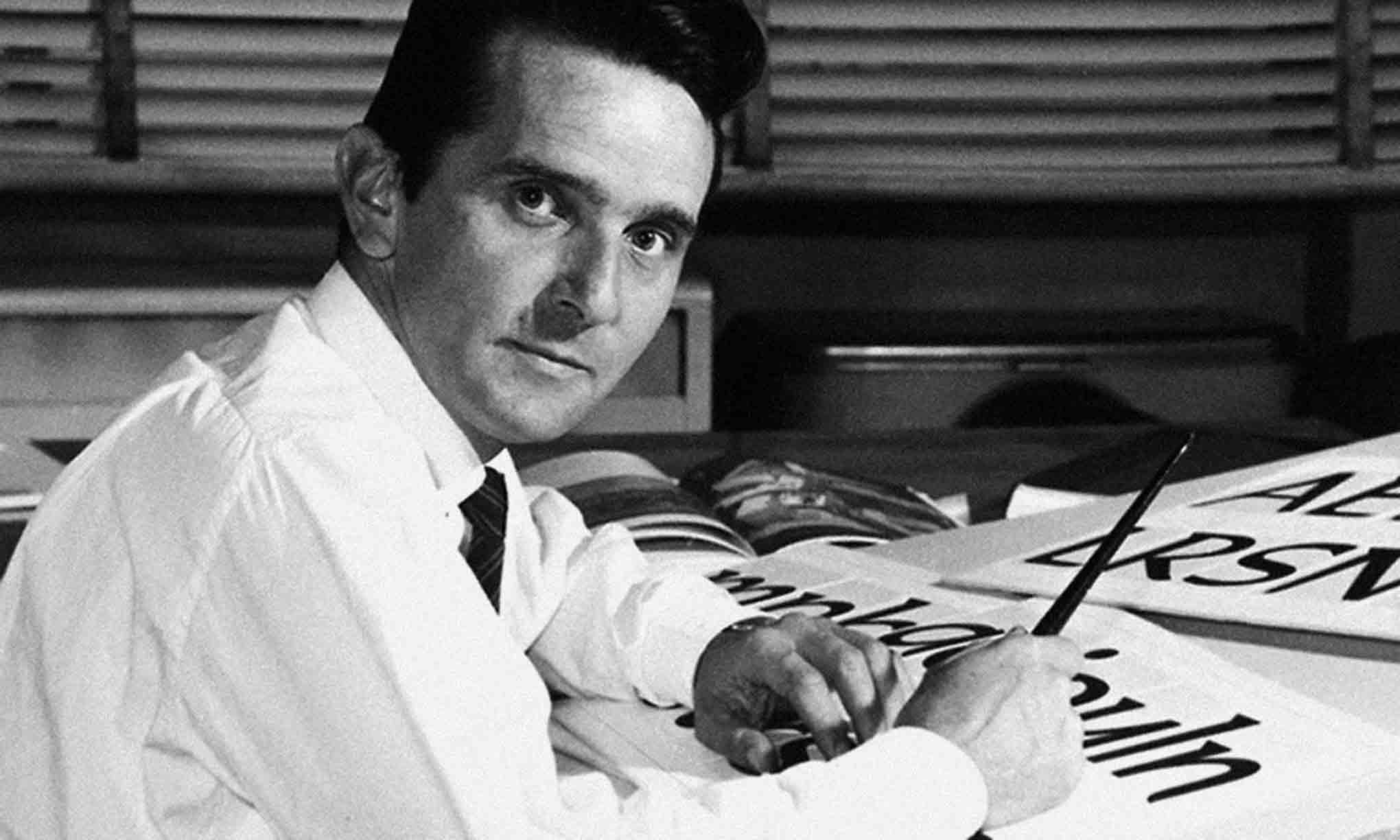
Aldo Novarese is one of the most prolific type designers of the 20th century, having designed over 100 type families—some 30 of these at Nebiolo—and influenced the design landscape of mid-century Italy and beyond. His professional career, first as a draftsman at Nebiolo, then as their artistic director from 1952–1975, and later continuing as a freelance designer, can be followed by reference to his exceptionally diverse oeuvre of typefaces. Yet not much is known about his personal life. Reserved and shy, he wanted his work to speak for him as a whole; he was designing type until well into his seventies.
Novarese was born on June 29, 1920, in the small town of Pontestura in the Piedmont region of Northern Italy. His father worked as a customs officer in Turin, where the family later moved. Novarese was introduced to printing and typography at early in his youth. In 1931, at only 11 years of age, he attended the vocational middle school for printing, Scuola Artieri Stampatori, and learned about graphic and printing techniques such as lithography and engraving. From 1933 to 1936, Novarese continued at the Scuola Tipografica Giuseppe Vigliardi-Paravia, where Alessandro Butti had been teaching, focusing on typography and typeface design. This led him to join the Nebiolo foundry in 1936, at the age of 16, as an apprentice draftsman in their Studio Artistico (of which Butti had just become the director).
The two men worked together for almost two decades, closely collaborating on typefaces such as Landi, Normandia, Fluidum, and Microgramma, an all-caps family originally designed for small sizes. It was later expanded into the Eurostile family. However, Novarese’s career was interrupted in 1939, when he was imprisoned for participating in protests against the Second World War.
When he was called up for military service at the outbreak of the war, the young Novarese protested—a dangerous thing to do in Fascist Italy—but because the year before he had won a gold medal in the Ludi Juveniles, a celebration of Fascist culture, sport, and art, he was spared being condemned to hard labor.
After the 1943 armistice, with Italy divided between the German occupation and the American-led liberation, Novarese joined the partisan resistance—an experience that marked him for life. By his own account, he was captured by the Germans and shot, along with other partisans; but he survived, hiding out for two days under the dead bodies of his comrades.
After the War, Novarese returned to work at Nebiolo. The company was not in great economic shape, but thanks to demand for Nebiolo fonts outside Italy, production and creative output at the type studio picked up again. Novarese succeeded Butti as Nebiolo’s artistic director in 1952, and held the position for twenty-three years. The 1950s were one of the most productive phases in his career. His Cigno, Ritmo, and Slogan are lively jobbing typefaces from this period, in line with the elated post-war spirit. Garaldus is a classic text face in the style of Garamond, while Egizio was a new interpretation of the 19th-century Clarendons, in several weights, two widths, plus italics — suitable not only for display but also for body copy. (The italics were criticized for their odd curves and overall wideness, a result of “duplexing” of Regular and Italic for line-casting systems, forcing both onto the same glyph widths. Late in its history, Nebiolo had licensed designs to Adler Traldi and Simoncini to produce matrices for Linotype machines.)
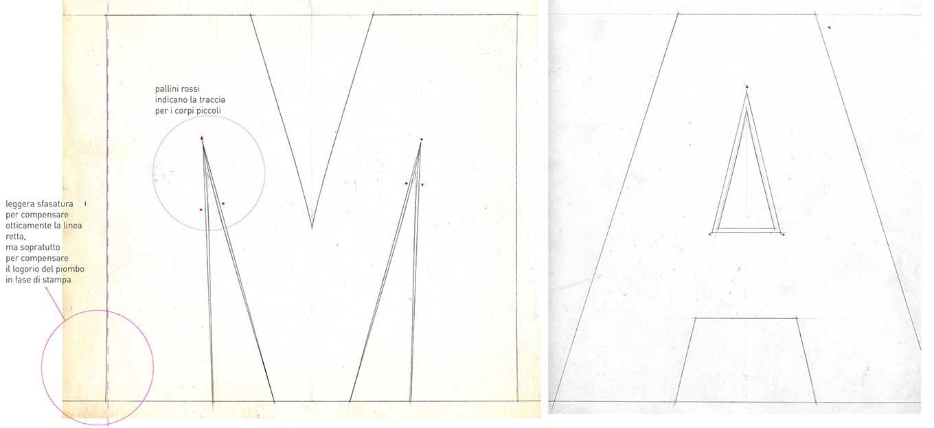
Forma: optical adjustments.
In 1952, Novarese was awarded a gold medal at the Milan trade fair for his then already remarkable portfolio of typefaces. As well as working at Nebiolo, he taught at his former school, the Scuola Tipografica, for five years, and he was active in the local and international type community. While the Italian design scene was dominated by the Milanese designers, Novarese tried to represent the “Turin position” and to promote typeface design and typography in Italy through lectures and articles in magazines. He regularly attended the annual Rencontres de Lure in France, where he encountered his peers from the rest of Europe. Through this, he became friends with the influential French typographer Maximilien Vox, who created the Vox system of classifying typefaces. In 1957, Novarese proposed his own typeface classification system, but this was never as widely adopted as Vox’s.
His creative activities did not stop at type and typography. He practiced photography as well as painting, and was interested in early writing and illuminated manuscripts, which he researched at the Biblioteca Nazionale Marciana in Venice.
At the end of the 1950s, the studio began to make larger type families for the emerging corporate and advertising market, starting with Recta in 1958–59. Until then, Nebiolo did not have a contemporary, versatile sans serif family in their catalog. Cairoli/Narciso and Etrusco were two widespread turn-of-the-century series taken over from German foundries which had fallen out of fashion. Recta was Nebiolo’s (first) answer to the demand, drawing from geometric sans serifs on the one hand, and on the other, the rationalized neo-grotesques such as Univers and Neue Haas-Grotesk (Helvetica), with their horizontal terminals and more uniform proportions.
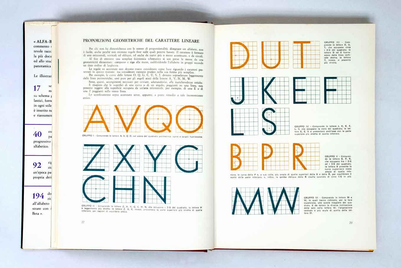
Alfa-Beta. Lo studio e il disegno del carattere, 1964.
Eurostile (1962–64), probably Novarese’s most widely used typeface, is an expansion of the Microgramma family complemented by a lowercase, additional condensed styles, and a larger character-set, which made it more versatile. The characteristic rounded square forms, reminiscent of TV screens, hit the futuristic taste of the 1960s and ’70s, and Eurostile is still popular for anything related to science fiction or technology today.
Forma started as Novarese’s attempt to make a more humane sans serif, less rigid than the flagship families of the international style like Akzidenz-Grotesk, but developed to something closer to the increasingly popular neo-grotesques. Metropol (1967) is his take on the ultra condensed grots popularized by Stephenson Blake and Haas. If Forma was Nebiolo’s answer to Helvetica, Magister was their answer to Times Roman. It was also available for line-casting systems and marketed as a companion to Forma, similar to how the pairing of Garaldus and Recta was suggested a decade earlier.
Despite his focus on versatile families in the 1960s, Novarese did not cease designing brisk fantasie faces, such as Estro, a cheerful reverse-contrast slab, or the casual scripts Oscar and Elite—all still released as foundry type. But Novarese was also becoming interested in the possibilities of the new phototypesetting technology, and his relationship with Nebiolo allowed him to spend part of his time on his own projects. He took part in the international type design competitions by the American Visual Graphics Corporation (VGC), and he won third prize in 1966 with his typeface Exempla, which would lead to a long-term collaboration and several more releases at VGC. In 1964, he published his first textbook aimed at graphic design students—Alfa-Beta. Lo studio e il disegno del carattere—followed by Il Segno Alfabetico in 1971.
Considering the huge investment required for the development of a new type family in the days of metal type, the typefaces had to meet the expectations of the market as well as the manufacturer. A foundry’s catalog typically consisted of representatives of all popular type genres. Aldo Novarese managed to anticipate demand and meet the current taste while still adding something unique to his designs. Some typefaces, like Egizio, Ritmo, Recta, Garaldus, or Metropol, may have started with the brief to produce “something like x,” but Nebiolo’s versions always had a certain special twist to them.
By the mid 1970s, the downswing of Nebiolo’s casting business had become more and more apparent. Foundry type sold less and less in a market that was shifting to phototypesetting systems. Novarese’s Stop (1971) was Nebiolo’s last successful new typeface; his Dattilo family from 1972–74—a slab serif companion to Forma—never saw full production and wide distribution. In 1975, Nebiolo closed its artistic studio and ceased the production of type. Novarese had to leave the company and continued as a freelance typeface designer, launching a second successful phase in his career. He developed several typefaces for VGC in the US and the German company Berthold, which manufactured phototypesetting machines. Among these new typefaces were Editorial, the innovative Modern face Fenice, and the family with his own name, Novarese, with its very small serifs and a unique narrow italic with upright uppercase. (The latter two type families were later taken over by ITC.)
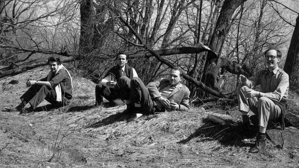
Matthew Carter, Aldo Novarese, André Gürtler, and Mike Parker during a 1960s Linotype type selection meeting in Colrain, Massachusetts.
Novarese continued to draw a huge variety of typefaces for 20 more years—for phototype, transfer type, and later digital systems, not only for Berthold and VGC, but also for Haas/Stempel, Agfa Compugraphic, Tygra, Reber, and ITC. His most widely known later designs include ITC Symbol, a condensed text face similar to ITC Novarese but with even smaller serifs, and ITC Mixage, a sans serif that matches both families harmoniously. Arbiter (1989) for Berthold is an unusual blend of squarish forms, small straight serifs, and long sharp terminals like Fenice’s, as well as whimsical ball terminals—in a way, a concocted culmination of his 50+ years of typeface design.
While many of the typefaces from Novarese’s Nebiolo years are available digitally, most of his phototype fonts were never digitized, and, apart from those done for ITC, sank into obscurity when the commissioning companies closed. Novarese’s oeuvre is one of incredible diversity. Many of his very different typefaces draw inspiration from the time, their surrounding, and trends in art and technology—so much so that some did not age well and became hard to use after a while without evoking a certain period or style. But others live on, or keep coming back.
Aldo Novarese died on September 12, 1995, in Turin, but his exceptionally wide-ranging work continues to be seen throughout Italy and all across the globe.