The story of Nebiolo
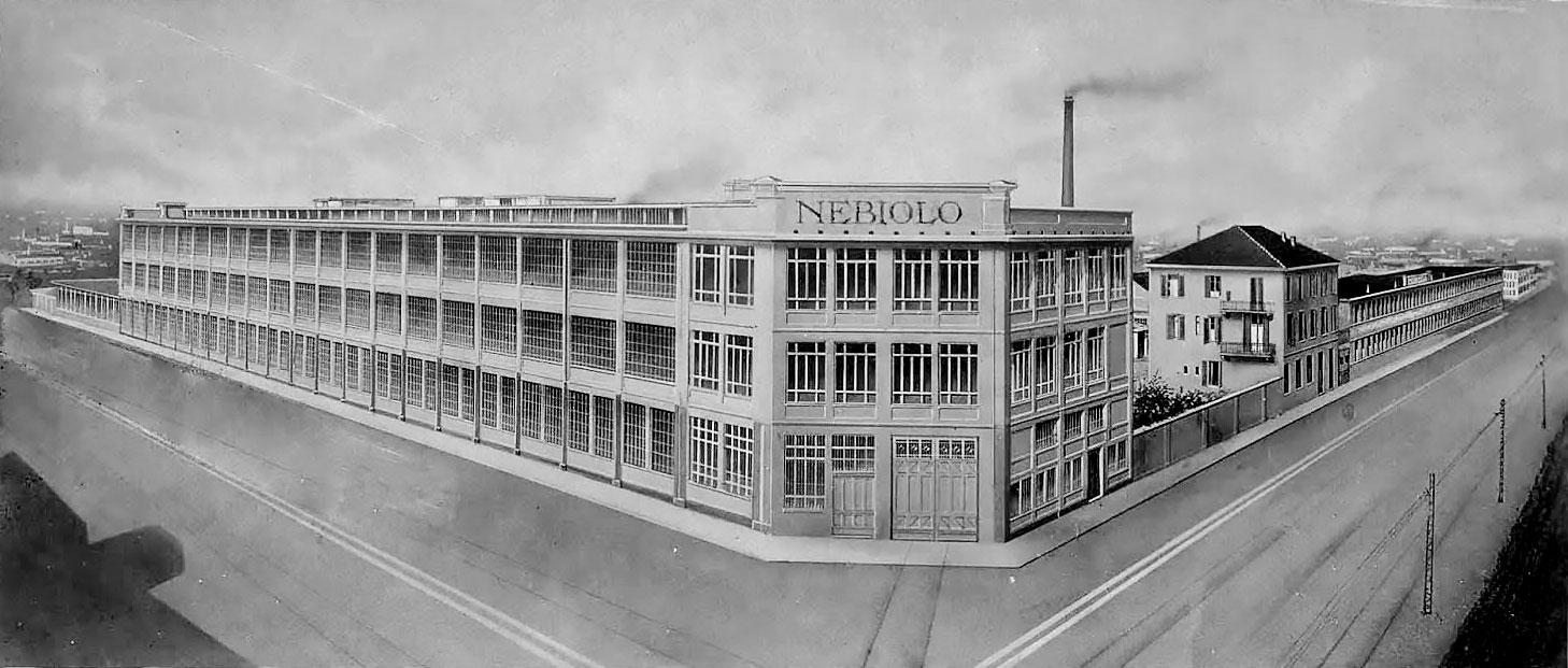
The Italian type foundry Nebiolo of Turin was the biggest type and printing equipment manufacturer in Italy. It started in 1852 and thrived in the first half of the 20th century, but never made the transition to phototype. The foundry closed in 1978.
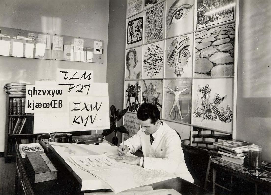
Aldo Novarese, the art director of Nebiolo, in his studio, in the 1960s. (Photo: gaetanodonato.blogspot.com)
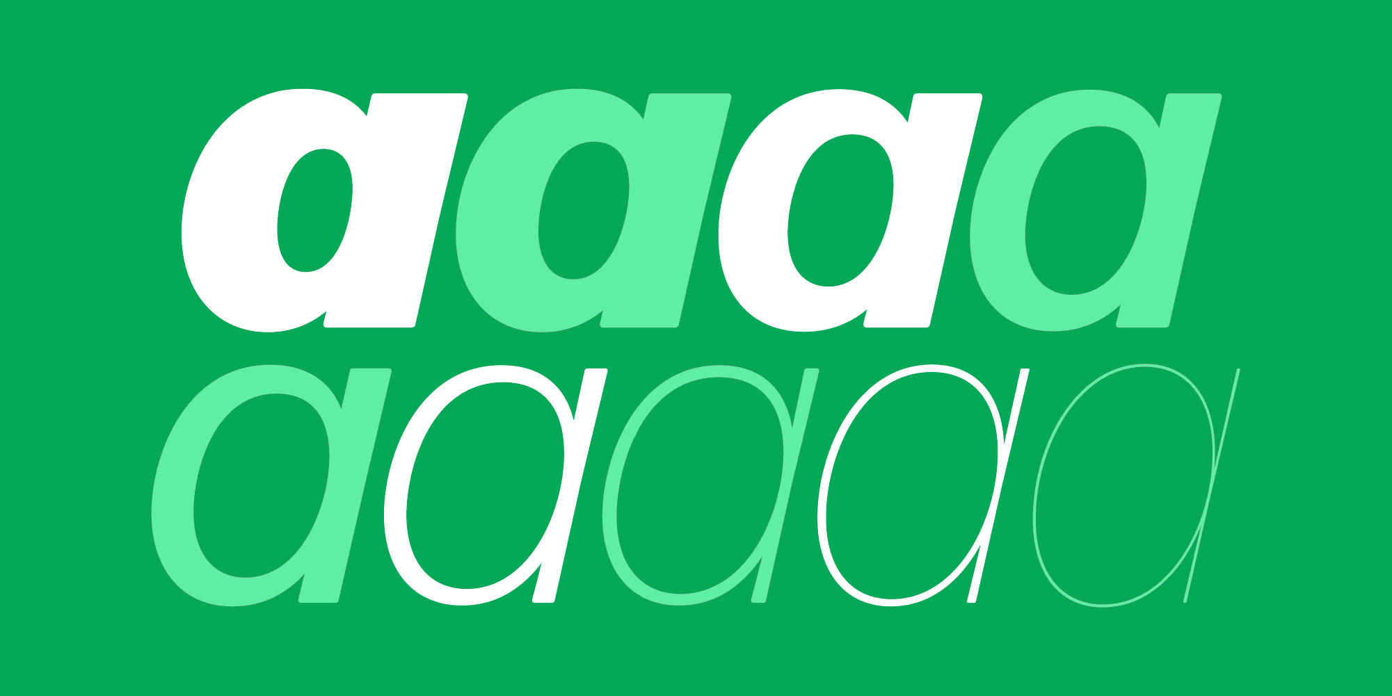
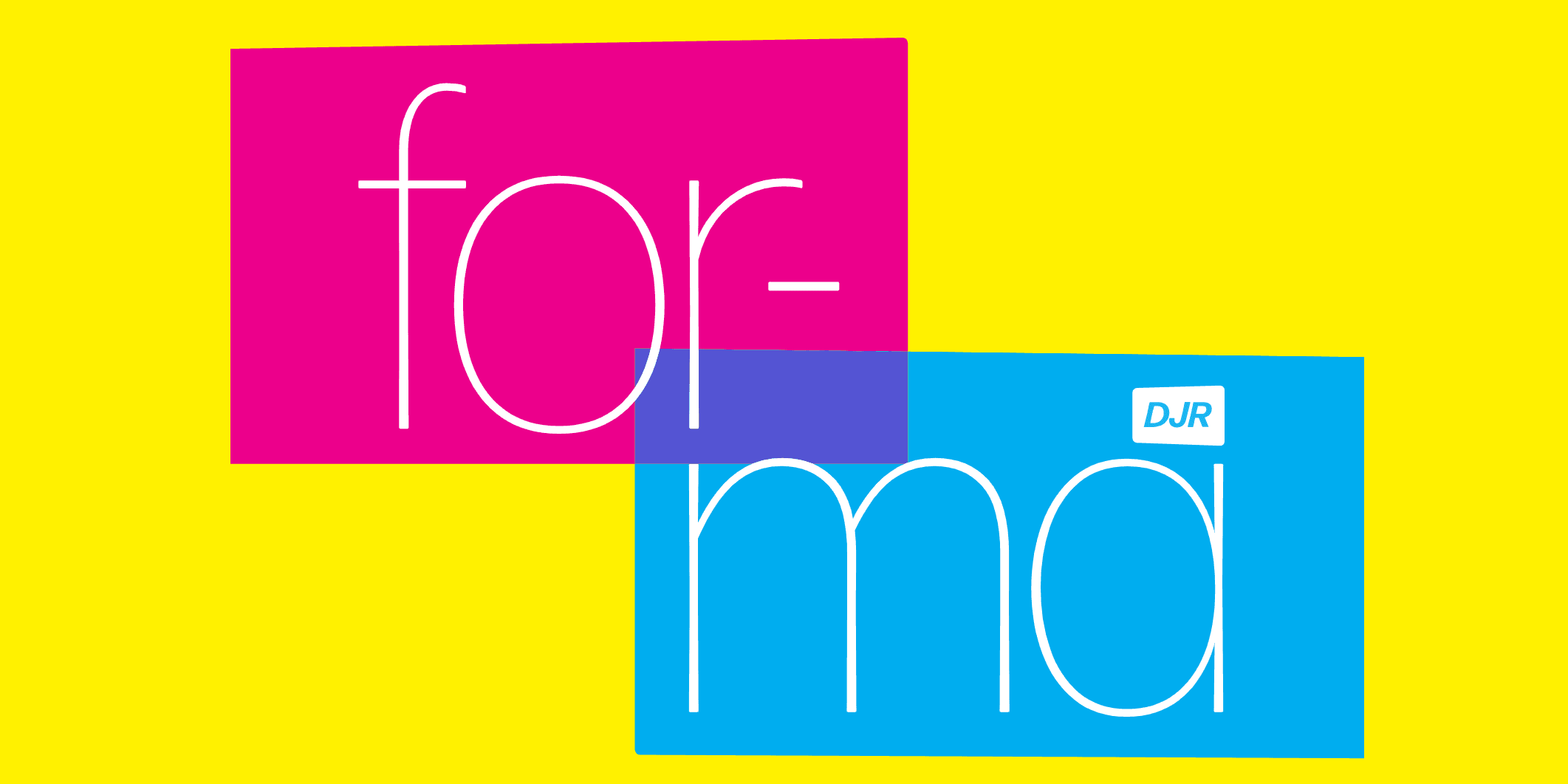
David Jonathan Ross got his start as a type designer at Font Bureau. And Nebiolo has always been a source of inspiration for that digital type foundry. Their first typeface, drawn in 1987 by David Berlow for a redesign of California magazine by Roger Black, was an interpretation of Egizio (Font Bureau’s Belizio). It was followed by Giza, based on Egiziano; Parkinson, the Rolling Stone typeface inspired by Nebiolo’s Jenson; an unpublished attempt at Recta; now Forma, and Roger’s wish list goes on.
My whole sense of type is shaped by that foundry.
—Roger Black
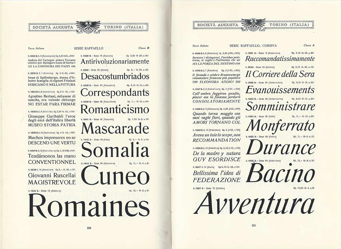
Raffaello, a hallmark typeface of Nebiolo in the 1920s, presumably designed by Raffaello Bertieri.
The creative output of Nebiolo can be divided into before and after the formation of their studio artistico in 1933. In earlier years, the foundry offered typefaces acquired or “borrowed” from other foundries abroad. From Germany came the grotesques Cairoli, Narciso, and Piacenza (compare Aurora); Etrusco, Bastone, Monza, and Gigante (a variant of Block); the scripts Calipso, Donatello, and other “Inglesi”; or several “Elzevirian” serifs like Raffaello and Romano.
For Moderns there was, among others, Torino, a condensed Bodoni; G.B. Bodoni, the Bodoni series taken over from ATF in 1913; and another high-contrast typeface rather confusingly named Aldino. (Nebiolo’s Bodonia is actually their version of Cheltenham.)
Since foundry type was a heavy product to transport, the metal-type market was a relatively local one. All type foundries more or less carried typefaces of the same popular styles. Making adaptations of existing typefaces or exchanging designs with other foundries was easier than developing a new family from scratch. But even in those imitative days of type history, Nebiolo managed to produce interesting series, many with a certain kick.
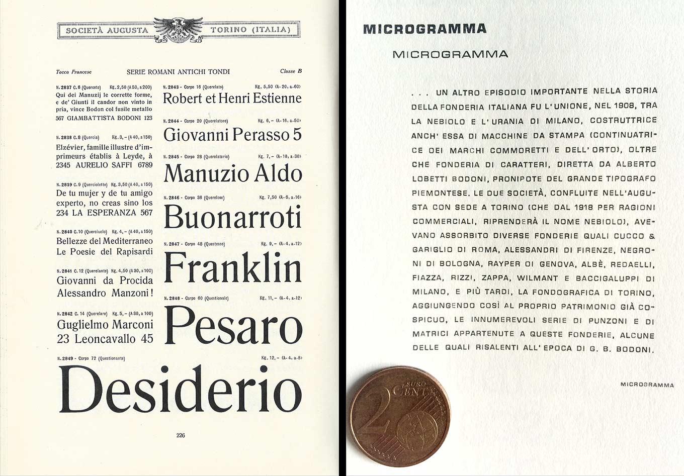
Nebiolo was known for the style which American designers called “French Old Style.” The Romana Anticha (left) became Romana, the condensed companion to Rafaello. (Photo Indra Kupferschmid)
Among new designs created for Nebiolo were a series of Renaissance revivals, including Ruano, an upright Cancellaresca (1925); the Venetian serif Incunabula (1928); a calligraphic roman called Siribaldi (1928); and the Manuale Umanistico–all by Raffaello Bertieri. He was one of the first type designers affiliated with the company, along with Dalmazzo Gianolio. Both taught at the Scuola Tipografica in Turin and wrote books about type and printing history. Yet also released in 1928 was Paganini, a lively high-contrast serif somewhere between a crisp Baskerville and the low-x-height Cochin, designed by Bertieri and the then newly hired Alessandro Butti. This hinted at the potential for more creative designs.
They did versions of typefaces from foreign foundries that were better than the originals. The Egiziani are an example. The Italians did not claim to have originated the style, but that’s the best slab ever made, in my book.—Roger Black
The new course was initiated by Giulio da Milano, Nebiolo’s first artistic director (1930–36), who, with Bertieri, set up the studio artistico to advance in-house education in the design of typefaces. Although the monolinear script Veltro (1934) was still rather a “me-too” typeface, similar to German casual scripts from that time, like Signal, da Milano’s elongating geometric sans Neon (1935) was a truly unique design: the base width of the characters stays the same across sizes but the height changes as type size increases, resulting in rather wide small sizes and very tall, compressed larger ones, all with a distinctive low “waist” and rounded forms. A related design is Razionale, a reversed-out sans on a black grid-background. Expanding on these two ideas, da Milano developed a modular set of glyphs for composing characters and ornaments—Fregio Mecano and Fregio Razionale (1935)—which were similar to Brüder Butter’s NePo (1931), or the later ATF Alpha-Blox (1944). Apart from one collaboration with an outside artist, for the stencil display face Resolut by H. Brünnel, Nebiolo relied on its in-house designers. In later years, the most prolific of those would be Alessandro Butti and Aldo Novarese.
This change of direction coincided with a change in management after a long period of economic struggle, as Mario Graziadì Levi, son of company partner Giuseppe Levi, took over in 1934.
The company had been founded in 1852 when Giacomo Narizzano set up a type foundry in Turin. Giovanni Nebiolo bought the company in 1878, and to strengthen the business, he brought in the brothers Lazzaro and Giuseppe Levi as partners and managers. They ran the company for many years; Giovanni Nebiolo himself retired in 1891.
It wasn’t easy. In 1899, Nebiolo went bankrupt for the first time. The company was reorganized as Nebiolo & Co, with a new division for the manufacturing and trading of printing machines. With fresh financing, Nebiolo bought up smaller Italian type foundries, such as Cucco & Gariglio in Rome, Alessandri in Florence, Negroni in Bologna, Rayper in Genoa, Albè, Redaelli, Fiazza, Rizzi, Zappa, Wilmant, and Baccigaluppi in Milan, and later Fondografica in Turin. The most significant cooperation was with their competitor Urania in Milan: the two formed a joint venture with the name Società Augusta in 1908.
The first World War hit Augusta hard. During the war, production came almost to a halt, followed by another financial crisis and bailout. In 1918, Augusta was dissolved, Urania and Nebiolo officially merged, and the company was renamed “Fonderia di caratteri e Fabbrica di macchine Ditta Nebiolo & Comp.” The postwar years 1919 and 1920 saw intense worker unrest, with strikes that significantly affected sales. Nebiolo had a good run during the 1920s, but the global economic crisis of 1929 led to large losses. The company retrenched again, closing branches and lowering wages. To survive, Nebiolo added the production of other machine tools in 1936, which helped the bottom line, and despite the Depression and the Fascist regime, the company was prolific in the production of new typefaces.
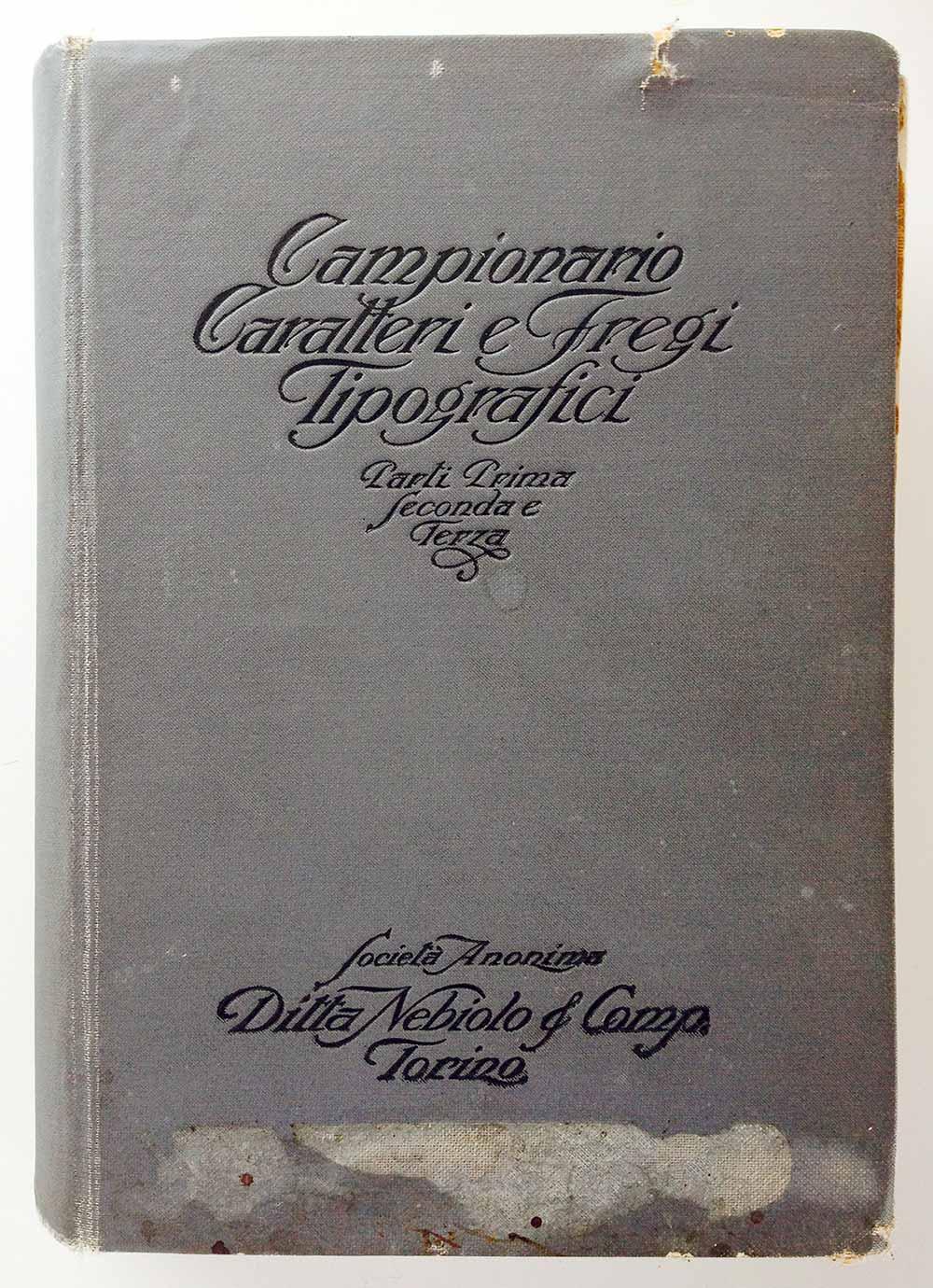
The cover of the 1920 Nebiolo book.
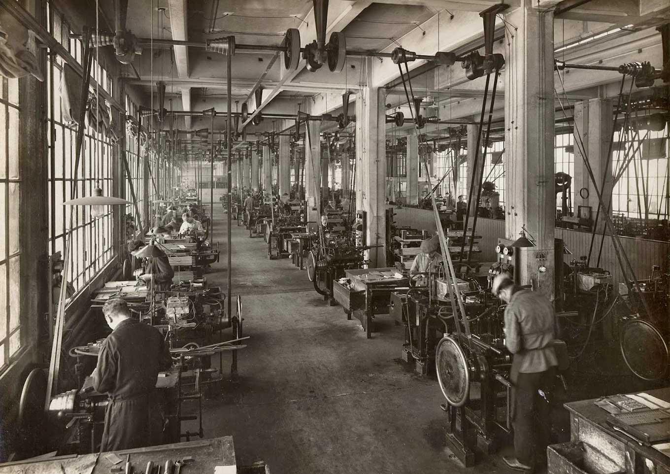
The foundry casting room, c. 1926 (Photo: gaetanodonato.blogspot.com)
Alessandro Butti had made a name for himself under Bertieri and da Milano, and followed the latter as artistic director in 1936. This marked the start of a very productive design phase at Nebiolo. His earlier contributions include Semplicità (1930), a spurless sans and Butti’s answer to geometrics like Futura (though since in Italy the style was associated with the Fascist regime, it is not much seen there today); Landi (1933), a geometric slab serif similar to Memphis but with an interesting breadth of styles—light weights with italics suitable for text, condensed styles, and decorated ones like the fantastic Landi Echo and Landi Linear (the latter by Novarese); and the beefy display face Titano from 1935, channeling Koch’s Neuland.
This phase of linear typefaces was followed in the late 1930s and ’40s by elegant high-contrast designs. The unique script Fluidum, in two weights (1938), shows an unusual treatment of initial and finial strokes—sort of a prelude to Butti’s squarish serif Quirinus (1939), which seems inspired by Imre Reiner’s Corvinus and other interpretations of the Modern face from the 1930s. Hastile (1941) may have started as a sans serif version of Quirinus, similarly extreme in stroke contrast but even more compressed and geared to display use. Normandia (1944) is a classic fat face made interesting by the addition of a compressed and an outline style. Athenaeum is an edgy old style with calligraphic ductus (1945), and Rondine (1948) and Cigogna (1950) are lively casual scripts.
While work at the artistic studio was extraordinarily productive, with a number of new designs that are still in use sixty years later, the Second World War was an inescapable diversion. Like most of the type industry, the factory was used to make war materials, including airplane parts and bombs. But type production continued until Turin was bombed by the allies in 1942 and 1943. (Roger recalls inquiring in the 1970s about the history of Egiziano. In a letter, the sales department replied that all records of the old typefaces were lost, “due to war events.”) After the war, normal activities resumed, but the Italian economy was in desperate shape. Workers went on strike, and the company had to lay off staff in the 1950s.
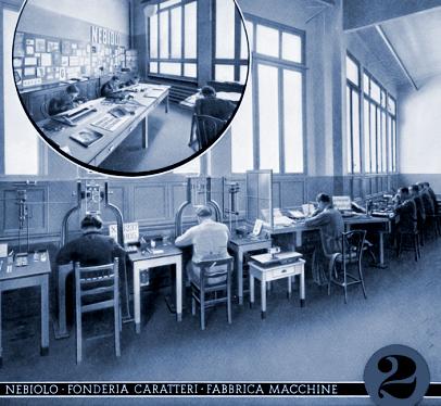
The design department in the early 1920s. (Photo: Cooper Union)
At the artistic studio, the 1950s saw more restrained designs by Butti, like Augustea in 1951, a classic roman Capitalis (a lowercase was added by Novarese in 1964 and released as Nova Augustea), or Microgramma (1952), a square all-caps sans inspired by modern day aesthetics and emerging technologies. With its wide letterforms and large counters, Microgramma is especially suited for text in very small sizes, down to 4 point, and was ubiquitously used for all kinds of labeling and captions. Yet, it also became a display-type hit when Novarese added a lowercase in 1962 and reworked Microgramma into the Eurostile family. Butti’s last project was the initial sketches for Recta, a geometric sans serif, finished by Aldo Novarese, who followed him as artistic director of Nebiolo in 1952.
Despite the economic stress, the development of new typefaces was encouraged, and Novarese produced a number of lasting designs. (For the full story, see his bio.) But the company, weakened by Depression, war, and slow economic recovery, was ill-equipped to face the big change in the business, the rise of phototype. An economic slump in 1964 led to more layoffs, and ownership was taken over by the Italian bank IMI. In the 1970s, the cast iron smeltery was closed, followed by the type studio and the foundry. In 1976, Fiat, the industrial giant of Turin, came in as the main shareholder and tried to reorganize the company. But Nebiolo went into bankruptcy in 1978. The only part that survived was the printing machinery business, today called Nebiolo Printech, which still manufactures printing presses.
Some of Nebiolo’s types and printed promotional materials are now at the Tipoteca Italiana in Cornuda, and the Nebiolo archives are still accessible in Turin. Parts of Nebiolo’s foundry equipment and some matrices were acquired by Walter Fruttiger in Münchenstein, Switzerland, in 1990 and are now at Rainer Gerstenberg’s foundry in Darmstadt, Germany, Europe’s last metal type foundry—where you can still buy many of Nebiolo’s wonderful typefaces in their original form.
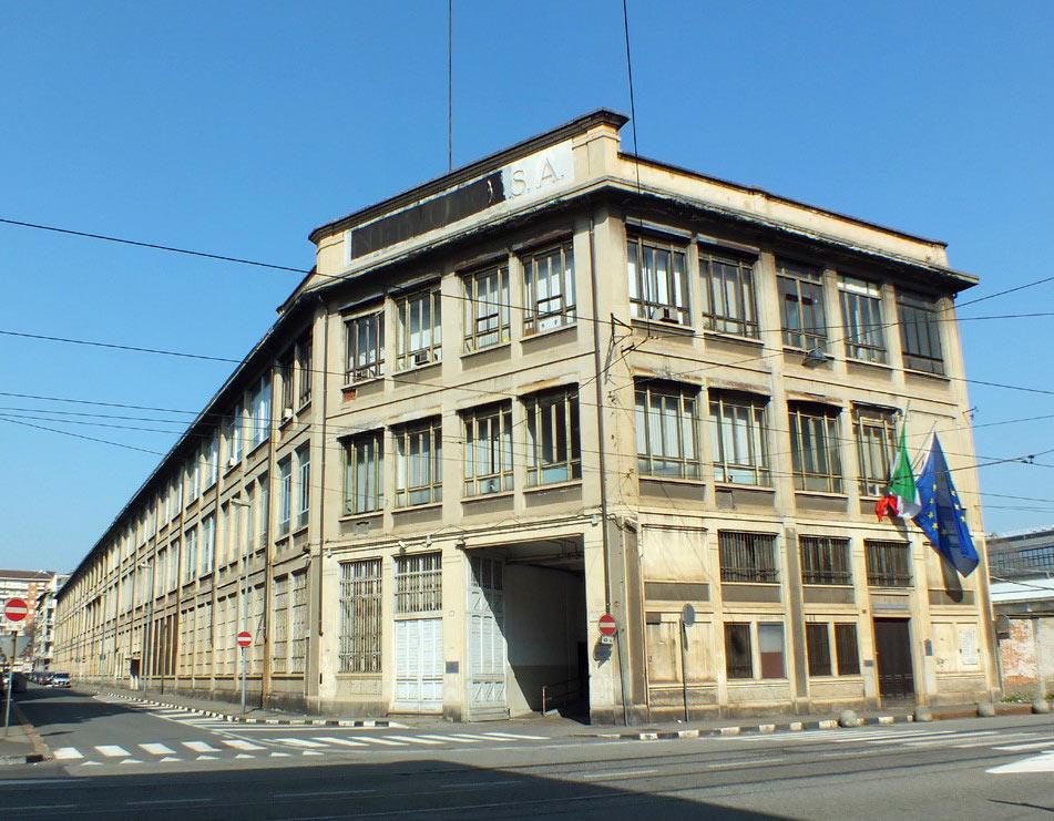
The Nebiolo foundry in Turin today, now used for a government office. (Google Maps image)

