The quest for a typeface ‘without salt’
The development of Forma is an extraordinary story, and the question of who designed it is not as easy to answer as it is with other typefaces.
Sometimes, Aldo Novarese is solely credited with the design of Forma; other times, seven additional people are mentioned: Franco Grignani, Giancarlo Iliprandi, Bruno Munari, Ilio Negri, Till Neuburg, Luigi Oriani, and Pino Tovaglia—all graphic designers in Milan. How did this come about?
In the mid-1960s, Nebiolo realized that they needed a new “lineare” in their catalog. The leading Italian graphic designers were looking elsewhere for their sans serifs, preferring neo-grotesques like Akzidenz-Grotesk, Helvetica, and Univers. What Nebiolo had to offer seemed dated, and too strongly flavored for advertising, branding, and corporate projects in the then-favored “international style.” Recta featured some modernist alternate characters and traits like horizontal terminals, but the airy geometric style was no longer the order of the day.
Microgramma/Eurostile—contemporary and fashionable, by comparison—weren’t “neutral” enough, while older idiosyncratic grotesques in the Nebiolo catalog such as Cairoli likely felt too loose and dusty.
Aldo Novarese began sketching a new design in 1965. Perhaps to counter the trend for the rigid, rational grotesques prevalent during the 1960s, or perhaps being influenced by traditional typography, Novarese took a rather calligraphic direction, with a strong ductus and pronounced tapering in the letterforms. The draft was not received well among the Milanese graphic designers and was quite vocally criticized by Franco Grignani and Pino Tovaglia, two renowned protagonists of the Italian modernist design movement. (Grignani is best known for the Woolmark logo, and for his work for the magazine Pubblicità, which he was involved in from 1956 on. Tovaglia designed iconic marks and posters for Rei, Pirelli, and Alfa Romeo.)
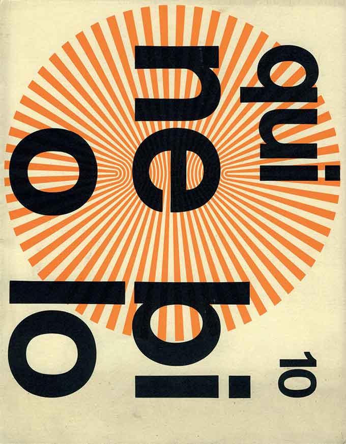
Issue 10 of Qui Nebiolo, Nebiolo’s in-house publication.
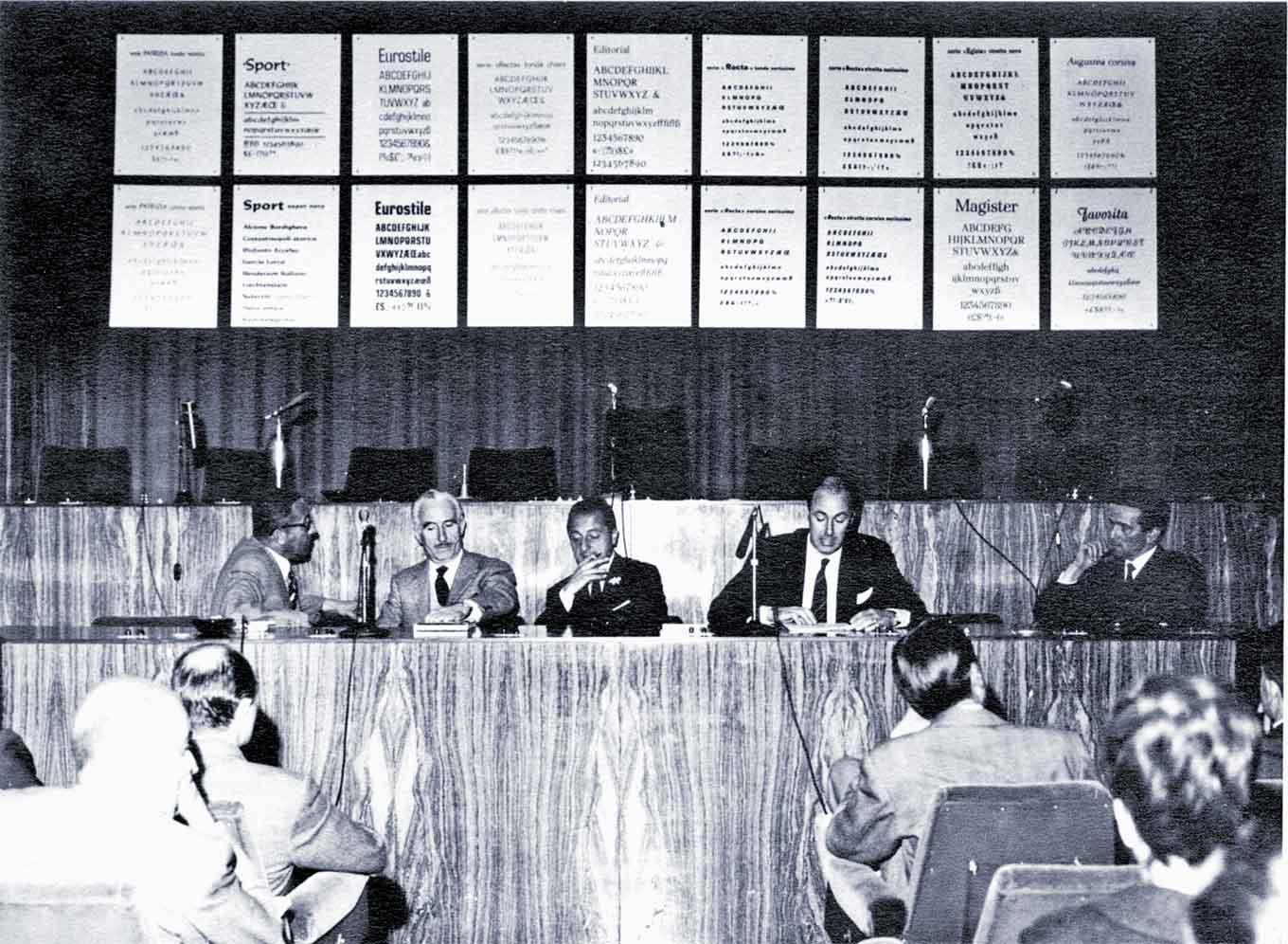
But Nebiolo wanted—indeed needed—to make sure that the new typeface would suit the tastes of influential designers, thus creating demand among other designers and printers who would then have to buy the typeface. This led Franco Etzi-Coller, commercial director of Nebiolo at that time, to make a bold move: extending an invitation to the group of critics and other designers and architects to express their opinions and requirements. A working group of first three, then eight designers was set up to collaborate with Novarese on the new typeface. This unique design process is documented in an issue of Nebiolo’s corporate magazine Qui Nebiolo (no. 10, 1969). They approached the AIAP (the Italian association of graphic and advertising artists), and scheduled a meeting with a large group of their members and a handful of Nebiolo representatives for May 22, 1965, in Turin. It was not an easy step for the foundry, and certainly not enjoyable for Novarese to stand in the pillory. Etzi-Coller expressed his “embarrassment when [he] first approached the designers to ask if they are willing to exchange ideas and help us with suggestions and criticism.” The discussions were heated and the critique sometimes sharp, with the designers letting off steam as if they had “finally received a call that had long been awaited.”
Alessandro Colizzi has observed that the problem was that Nebiolo’s traditional market consisted of Italian printers, who had very traditional expectations, while Italy’s active graphic designers were looking abroad and were “bound to the emerging discipline of visual communication.” There was an enormous amount of theoretizing, in the avant garde spirit of the 1960s, but there was also a very practical matter of producing typefaces that would be used by “the emerging professionals working in the advertising and corporate sectors.” As Grignani put it during that confrontational May 1965 meeting: “We are typographers who use few typefaces, only those which represent the spirit, the architecture of modern graphics.”
Nebiolo had always taken pride in combining the development of interesting typefaces with meeting the taste of the market. Before the 1930s, Nebiolo worked with various local and international artists and foundries on typeface development, bringing in a broad range of styles, until they decided to entrust an in-house artistic studio with new designs. As fortunate and successful as they were with first Alessandro Butti and then Aldo Novarese, Nebiolo’s output at any given time was nonetheless colored by the taste and creativity of mainly one person, who had to anticipate—and who also influenced—trends in Italian graphic design. This “method of how Nebiolo made typefaces” and the “excessive personalization” (Grignani), detached from the requirements of (some) designers, was harshly criticized at the meeting. But the main point was that the proposed design was too calligraphic, too traditional, and not suited for modern graphic design and architecture. The modernist designers wanted “a typeface that isn’t subjective and very personal, but sort of universal” (Tovaglia).
Franco Grignani: “To me there is a break between your work [Nebiolo/Novarese], which is close to traditional typography, and ours, which is close to the problems of aesthetics in graphic design … Someone who only ever draws typefaces can’t know the secrets of another part of the world that deals with other visual problems instead.”
This statement describes the heart of the conflict: the difference between typefaces suitable for traditional typographic work that follow established patterns and optical conventions, and typefaces for commercial graphic and advertising design, which Grignani imagines to be “less predetermined and more forward-looking.” But there were also concerns expressed about readability: that the new typeface should not solely serve modern graphic design with a “grey, monotonous, uniform” appearance, but that it should also be legible in texts, not just in headlines.
Following this meeting in May 1965, a first small research group was formed, consisting of Aldo Novarese, Franco Grignani, and Pino Tovaglia, who were later, on the suggestion of Tovaglia, joined by Giancarlo Iliprandi, Bruno Munari, Ilio Negri, Till Neuburg, and Luigi Oriani.
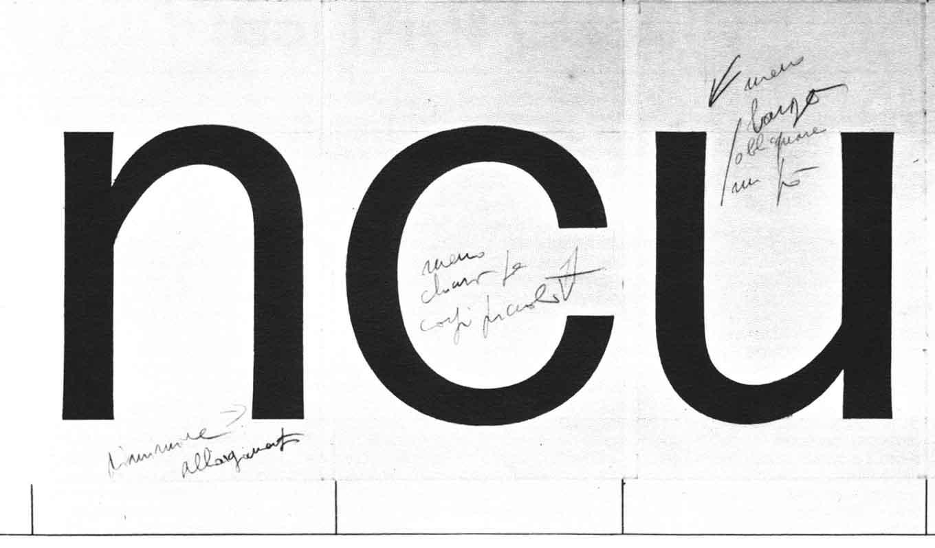
First proposal by Aldo Novarese, Franco Grignani, Albe Steiner, and Pino Tovaglia. April 1966. The design was still influenced by calligraphic proportions and forms, less round, with pronounced flaring of the stems and tiny serifs. Some forms seem influenced by Antique Olive; alternates for a and g show that the group did not agree on the direction for some characters.
Late sketches.
The group met for several months to discuss directions and drawings, beginning with the initial design by Novarese, which featured quite some stroke contrast, and pronounced flaring and tapering of the stems. The graphic designers didn’t deem it a promising course and posed the question to Nebiolo: do you “want to try out new character shapes, or do you want a sans serif that sells?” Evidently, Nebiolo wanted a typeface that sells, but which also had to set itself apart from other designs, one that conveyed a certain message and reached as many potential users as possible. To get a better idea about the distinctions to other faces, the new design was extensively compared to other typefaces already on the market throughout the process.
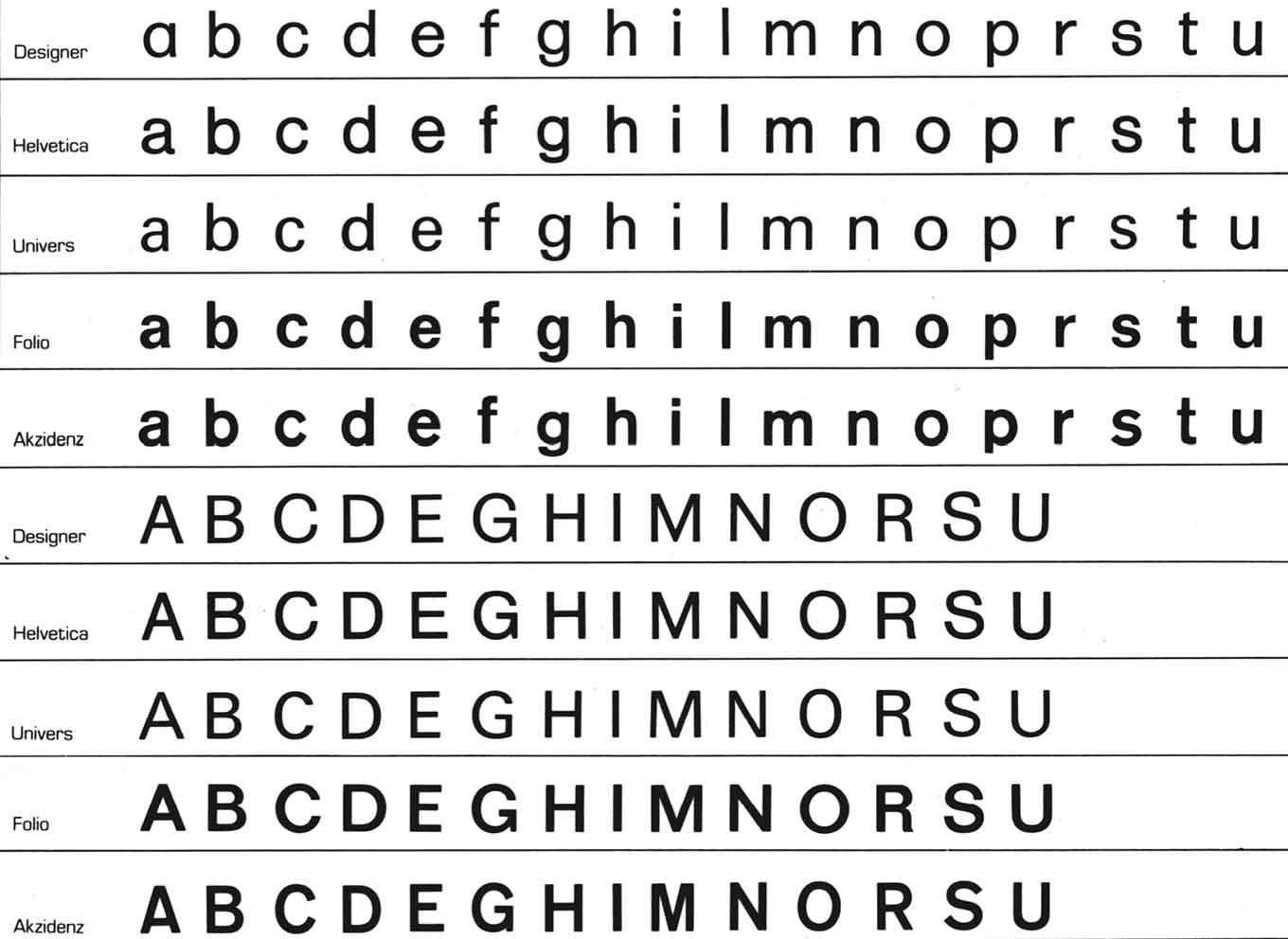
Comparison with other contemporary typefaces.
In search of a more uniform tone, the design gradually changed, first by reducing the stroke contrast and flaring at the terminals, then by widening the proportions and shortening the ascenders and descenders. Tovaglia was advocating a design as linear as possible, enabling a “uniform grey” column and avoiding the patchy appearance of texts set in typefaces with serifs or stroke contrast. Suggestions were made to consult additional experts on reading, e.g., writers, editors, and proofreaders. Till Neuburg especially was concerned that while the tight spacing and the short extenders would give the typefaces a very clean aesthetic, they might hinder readability. He claimed, “So far Akzidenz-Grotesk remains the most beautiful expression of linear rhythm.” For Tovaglia, the success of these kinds of neo-grotesks was mainly due to their anonymity, even if they partly sacrifice readability to achieve that: “it is risky to go against the tide” and “making a promiscuous typeface could mean heading into a failure.” But Novarese and Nebiolo were not yet convinced to abandon all of the traditional proportioning and adaptations. The tapering of stems, for instance, not only aided readability but also helped in certain reproduction processes, e.g., photographic ones.
Grignani: “At this point I wonder, how do we get rid of the traditional character?”
Second design.
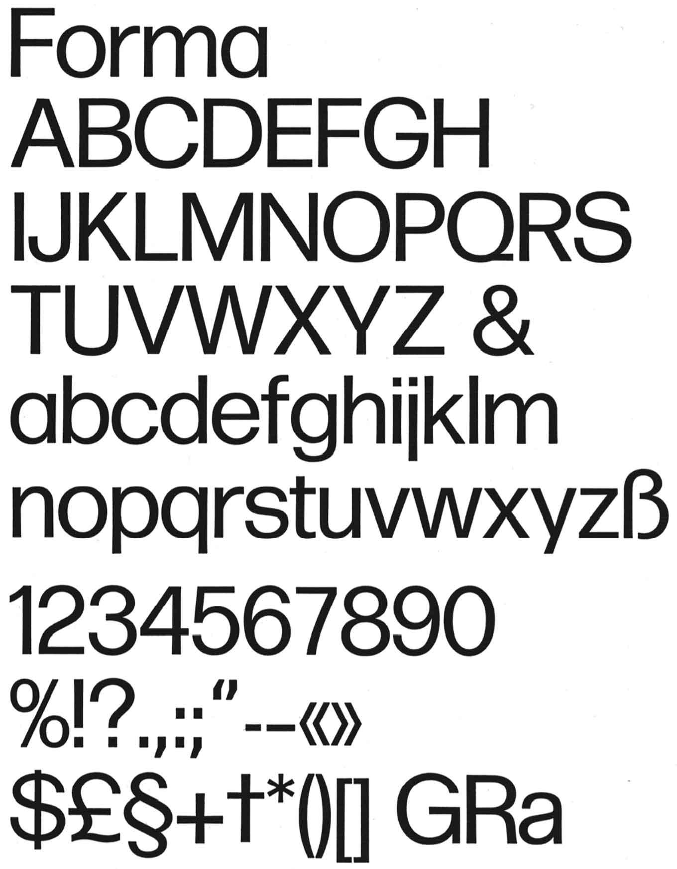
Final drawings.
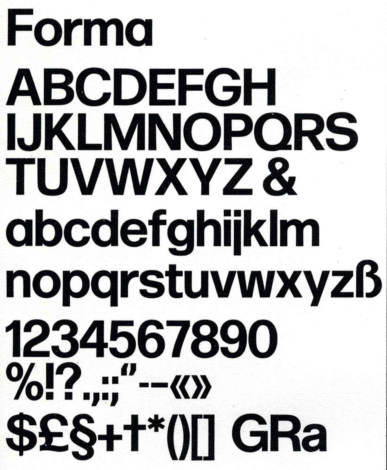
Final bold drawings.
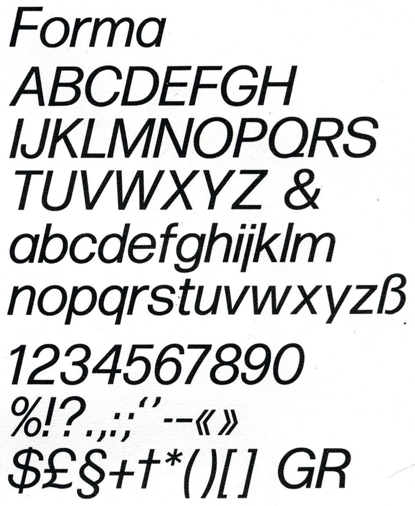
Final italic drawings.
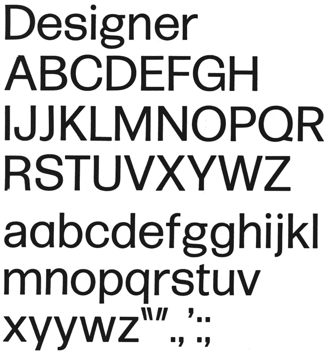
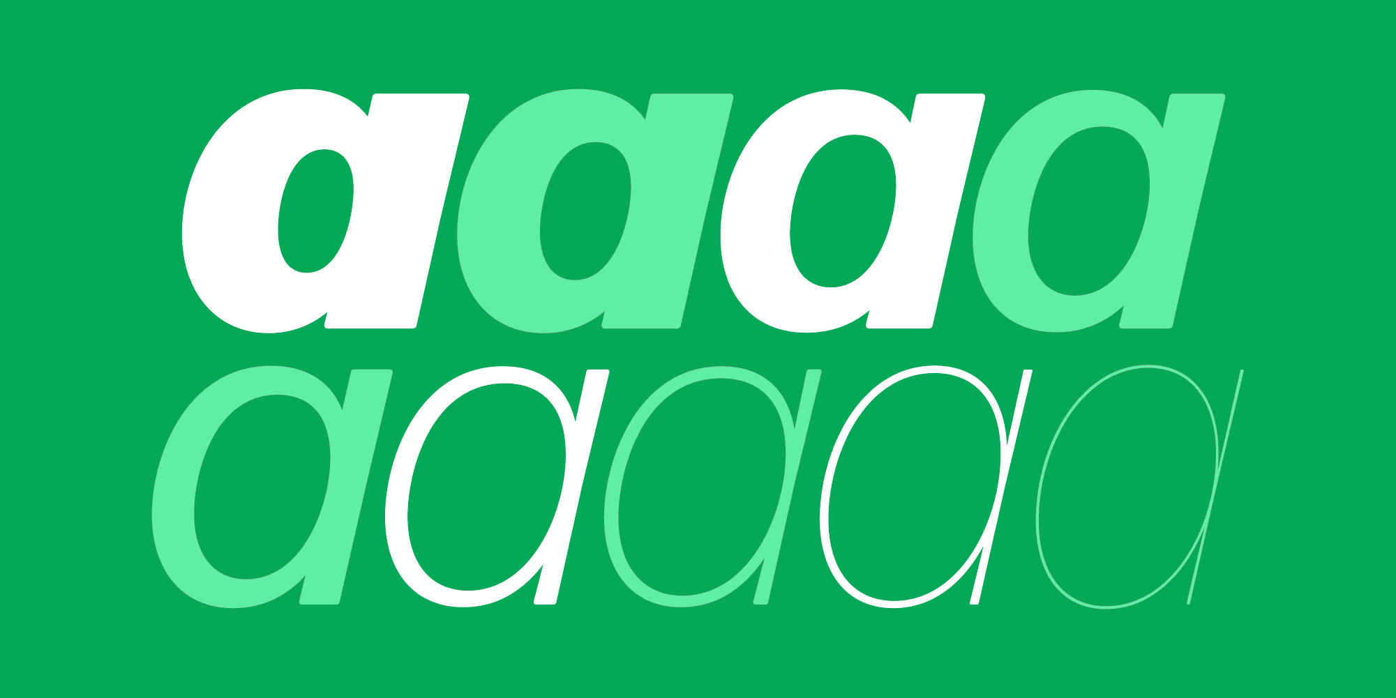
With all these different opinions in the room, pulling on different strings and demanding different features, the various stages of Forma show that many minds were involved in the design, but the modernist voices eventually prevailed. The “right” form for a and g, but also G, were the subject of lively discussion until the very end. In the final version, the simple, modernist forms were chosen as the default, and alternate characters were released for R, G, and a, allowing for different nuances of being “salt-less”—a descriptive that came up in the discussions again and again. (Luckily the clumsy double-storey g was dropped.)
Another topic of discussion was the style gamut that should be tackled. For the initial release, a regular, italic, and bold style were planned. Tovaglia found that “Forma should stop at the bold weight, impossible to go beyond that” as “further increase of the stem thickness would distort the character” (Oriani) but that they should try a Bold Italic. Iliprandi suggested a light weight—“especially in large sizes, this would be decorative”—and was also in favor of a black weight “that deviates from traditional norms,” with stroke thickness as uniform as possible and only small counters. Novarese had to dissuade the graphic designers from some of these radical ideas. “I think a typeface like this, as well as too significant mechanizations, would create difficulties in visual perception. We have to correct certain optical appearances and for that it is necessary to draw the letter with a non-uniform stroke thickness … In my personal opinion, the trial Black is not of sufficient strength.”
For the design of the Italic, two approaches were tried and compared: (1) photographical slanting of the regular, and (2) a manually drawn Italic by Novarese. To quickly judge the idea for the Bold Italic, the first method was chosen, but the idea was dropped in favor of only having a Regular Italic. For that style, the manually drawn version seemed superior; nevertheless criticism was voiced against the extent of Novarese’s adjustments, asking for “more harmony with the roman.” Munari: “Analyzing the two italic versions, one obtained with a modification camera and the other designed by Novarese, you immediately notice a rather substantial difference. We might ask, among other things, whether the use of the machine in graphic production can change our taste.”
After more redrawing and comparison, the group was finally happy with the three styles. Grignani: “We wanted an impersonal nature, this is it.” It was the typefaces they were looking for: grey, uniform, depersonalized, with characteristics of good readability and maximum versatility, receptive to the personality of the design it would be used for.
To open the dialog again after working in a small team for over two years, Nebiolo invited a larger group of people from the graphic industry, advertising, and publishing to a round-table discussion at the Hotel Principe & Savoia in Milan on December 11, 1968. The same points that had kept the working group busy for months came to life again in this larger round, and the team had to face substantial criticism. The main discontent concerned readability: that the typeface was too monotonous, “excessively uniform,” “a compact grey that does not invite reading, especially in smaller sizes,” “it almost seems like the result of a computer,” of “exasperated tranquility.” “Typography is not only about formal perfection, it is a communication tool.” Thankfully, this time, Nebiolo had the graphic team to help leap to their defense. Grignani: “The typeface is the block. I have to give it its movement.” Or from the audience, Coppola, a local architect and designer: “A typeface is like a piano, it is up to the graphic designer to know how to use it. In this case, we are given a keyboard, the cleanest and most anonymous possible, thus the designer has to use it wisely to draw all the desired effects.” Coppola also had praise for the slight tapering and thickening of stems towards the ends, while others found these adjustments “exaggerated” and “excessively expressive.” Likewise, the short extenders were points of criticism: they would contribute to crowding and a monotony that hinders readability, just like the tight spacing.
Before they could get lost in specifics, Iliprandi asked for a more general vote. “What interests us now is your general opinion on the typeface. When starting the study, we made detailed comparisons with other typefaces. Advertising is style, I don’t want to do the design but the styling. This requires a certain visual impact. Comparing Akzidenz-Grotesk with Neue Haas-Grotesk, we found that the former, though much older, invited reading more than the latter. We asked ourselves, do we want a characteristic typeface, or an aseptic typeface? … We tried to make a typeface that is understood as a product for a certain design.” Some voices remained skeptical about Forma having “too little personality” for an advertising campaign, but overall the feedback was positive, with many mentioning that they would just have to try it and see for themselves.
One designer encapsulated the typeface, the intention, and the process especially poetically: “That this sans serif is the result of teamwork is felt immediately: none of the designers who lent a hand would alone, making use of only his experience and sensitivity, have been able to produce such a well-balanced mix of softness and dryness. Let’s see it grow in intensity, from regular to black, from small sizes to large. In few other cases does one have such a clear impression of a typeface sensitive to different temperatures of language. Small sizes and regular: the warmth contained in a page of prose or poetry, the modest intelligence of a nonfiction page. Large sizes: the aggressive immediacy of an advertising message, the poster that wants and needs to be read in a flash.”
The experiment of team design remained a singular event in the history of Nebiolo, although the committee continued for several years, even after Novarese himself left the company. (One of the reasons was likely his frustration at being faced with design-by-committee.) More styles were added subsequently to the Forma family: as desired by Iliprandi, a light weight, a bold condensed style, and an outline variant to complete it in 1970. A slab serif companion, Dattilo, was developed and released in 1972–74. But both saw only moderate success in the market and the handwriting was on the wall: the era of metal type was over. Nebiolo’s management had failed to adapt to the demands of changing technology and a changing market. Novarese went on to design numerous typefaces for the newer technologies, while the Nebiolo type foundry stumbled to an end.

October 11, 2023 · Brochure
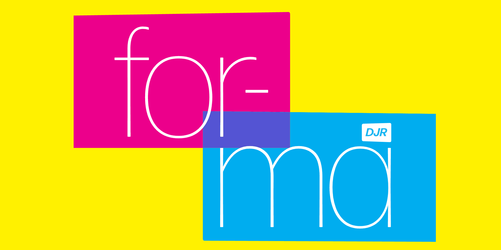
A revival of Aldo Novarese’s Forma comes at a time when mid-century design has never been more stylish.
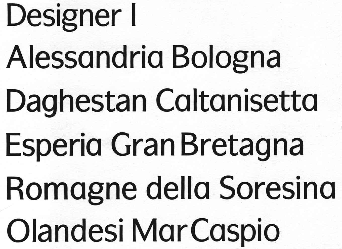
82 styles
Every weight, width, style, and script of Forma DJR, available exclusively on Type Network.