October 7, 2026 · Feature
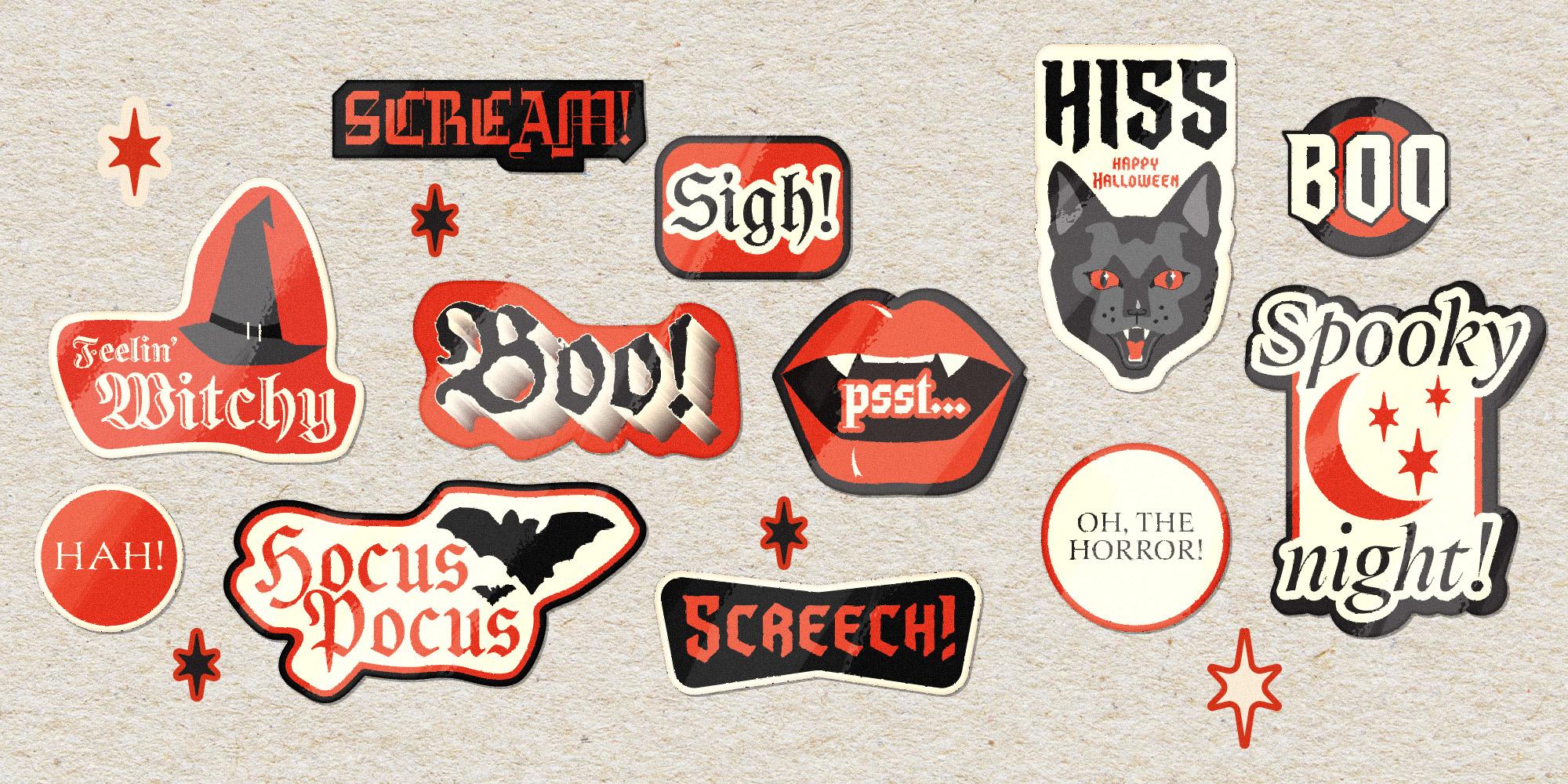
Some letterforms were built for daylight: reading rooms, annual reports, the produce aisle. Others were clearly raised somewhere darker. This collection leans that way : Serifs sharpened to a point, blackletter thick enough to block out the moon, and one custom face drawn expressly for the undead. Here are five fonts (and one blood relative) for anything that needs to look a little more haunted this October.