Fer Cozzi, Rodrigo Saini, and Alejandro Lo Celso
Voices from Latin America
Alejandro “Loche” Lo Celso of PampaType, Fernanda Cozzi of FerCozzi, and Rodrigo Saiani of Plau: Together, they present a cross section type design that is equal parts practical and exciting. Lucas Czarnecki talks to them about the combination of Latin culture and contemporary design they bring to Type Network.
Lucas Czarnecki: Tell me about the neighborhood in which you work.
Loche: My partner and our two children live in a mountain forest on the outskirts of a small town, 30 kilometers from Cordoba, which is the second largest city in Argentina. We moved here seven years ago; we had our house built so we could raise our children in what we believe is a healthier environment. There is a natural area with several streams and rivers; it’s full of many species of trees and animals so they can learn to appreciate nature and protect the species and all that. On the other hand, we are 20 minutes away from a big city, with its urban and cultural offerings. We both work from home, in a studio. This sometimes makes it difficult to clearly separate family and work, but it’s great to be able to follow your children from close by.
Fernanda Cozzi: I live and work in Buenos Aires, in a neighborhood of the capital called Nuñez. I love it. It is like a mix between a small suburb and big city; what me and my friends call an old lady neighborhood. Close to everything but not that close. It is quite quiet despite the usual big movement of a capital city.
And Buenos Aires is… just beautiful. It has everything: Nice views and a lot of things to do; a mix between cool contemporary lifestyle with some old architecture; good wine and cheese; fun people and nice weather (except now it is a super-hot summer). You always can have ice cream no matter the weather or the time of the day! You can buy a kilogram of artisanal ice cream to-go and be happy anywhere.
Buenos Aires is a mix of cultures: It has so many different flavors, traditions, identities… But all with an Argentinian twist.
—Fernanda Cozzi
Rodrigo Saiani: I work from home in Lagoa, a neighborhood in Rio that's right next to Jardim Botânico. Plau’s team is spread throughout the city and overseas in Germany. I can see the statue of Christ from both my daughter’s window and my office window. Rio has big social and economic issues, but it’s one of the most beautiful cities in the world. The fact that I make type while just outside there is the sun, the beach, sports, and everything else the city has to offer speaks as much about my love for type as the need to support my family!
PampaType’s Atahualpa in the album art for La Calandria’s self-titled release. Source: Fonts in Use.

PampaType
Alejandro (Loche) Le Celso is an info and type designer, author, and teacher born in Córdoba, Argentina (1970). In 2001 he founded PampaType, the first digital type foundry in Argentina, whose work has been widely recognized for its originality. Loche’s work has been prized by Morisawa, ATypI, TDC, Hii awards, Typographica, Tipos Latinos, Bienal Iberoamericana de Diseño, Communication Arts, Creative Review.
LC: In what ways does the area serve as a source of inspiration for you?
Loche: It’s quiet around here. It can be a great place to relax but also to concentrate and work. Inspiration for me is different. I usually get it from other artists’ work, writers or musicians, or other sorts of artists, from my (say) previous lives.
The fact that I make type while just outside there is the sun, the beach, sports, and everything else the city has to offer speaks as much about my love for type as the need to support my family!
—Rodrigo Saiani
FC: Buenos Aires is a mix of cultures: It has so many different flavors, traditions, identities… But all with an Argentinian twist. We live our version of our culture and of other cultures as well; although, the rest of the country probably would make the clarification that it is not something "Argentine" but rather a “porteño*” thing. (*Porteño/a: Apply to people who live in Capital Federal.)
There are many sources of inspiration: You can find yourself going from a movie to having dinner to having some drinks to playing video games on a bar… you never know. And for me and my friends, there’s always a place where music is playing, and if there’s music, it means we can dance.
Buenos Aires offers a real variety of inspiration, if you are really willing to live and see the city. You have graffiti, street art, fileteado, tango, cumbia, freestyle, art nouveau, football, contemporary art, asado smell, noise, parks, colorful corners, and very gray ones… and now a world cup championship and Messi atmosphere in everything and everywhere, and yes, I’ll once again mention the ice cream.
Did I already say that I love Buenos Aires? I can’t picture myself living elsewhere.
RS: Even though we consume references from our browser windows these days, going about town and just looking around, there is so much variety: From sign painting and vernacular type to local and global brands co-existing in a chaotic harmony, it’s all inspiring. Sometimes leaving our place and being placed somewhere new makes you open your eyes wider. It’s as though our graphic landscape has become just that: a landscape. Getting back home from travel usually resets our eyes, and we can look at our surroundings in a new light.
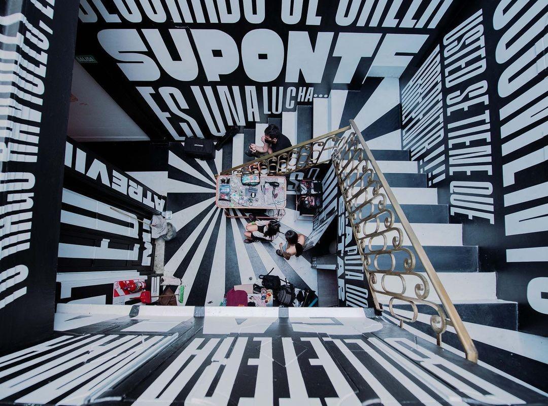
Fer Cozzi’s Gabriella and Inge adorn the walls of a stairwell in Buenos Aires’s La Uat Bar.

Fer Cozzi
Fer Cozzi is an independent type designer born in Buenos Aires, Argentina. She obtained her diploma at the University of Buenos Aires, where she teaches in the master’s in typeface design program.
LC: Describe the creative community where you work.
Loche: In our social lives, we interact with many friends who happen to be musicians. We often spontaneously start to make music—just improvisations, mostly initiated by our kids. We have some instruments like guitars, ukeleles, quenas (a sort of flute), bombos (sort of bass drums), keyboard, and percussion sets, and everyone plays together. It’s just playing around. These informal sessions can be very inspiring and valuable; hopefully, they’ll help our children grow in freedom.
FC: There’s a large creative community here: Pick something interesting in any field, and within six degrees of separation you know the people behind it. People making creative things—lettering, art, digital art, music, animation, graphic design—are always ready to support other people making things. For interest, for pleasure, and obviously for the gossip! So, it is easy to get new input on what’s happening in the creative world.
For example, my closest friends in Buenos Aires are not type designers, each one of us has a different interest. We drag each other to things that interest us personally. We share things that catch our attention, even if things go wrong. It’s nice being surrounded by people with similar tastes but different visions or interests.
RS: We used to work in a studio placed in the heart of the city, surrounded by other creative agencies, photographers, artists, and other designers that we admire. That was always refreshing. Not to mention some great coffee sipped and friends made along the way. Nowadays, after the pandemic, that interaction has been mostly happening online. In Brazil, the typographic community is tight knit, with sprouting WhatsApp groups where we discuss things. Other than that, one of our main pillars at Plau is to reach out to students and the design community. Online and in-person workshops, teaching, content creation, and other endeavors always put us face to face with creative people, which we absolutely love.
Typography too—being the music of language—can be a universal bridge, even if sometimes it is restricted to a specific script or scripts that you know, but everyone can understand typography.
—Loche
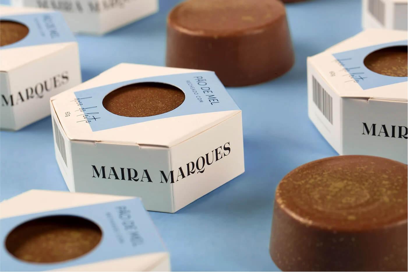
Plau’s Tenez in use on the packaging for Maira Marques Chocolatier. Source: Fonts in Use.

Plau
Rodrigo Saiani is trying to make type as popular in the world as music, starting with Brazil. He gets closer everyday by making typefaces for people and the brands they love; teaching about type at Miami Ad School; creating workshops and talking about type with pretty much anyone.
LC: What do you think creatives in your city or country could learn from those in other places?
Loche: Art is quite universal for me. I have lived in many other places before, and, after a while, you start to understand the universals of humanity, common to all people regardless of their cultural skin. Music, I think, is one of the most universal languages out there: Everybody empathizes with music; everybody is attracted to music; and everybody can connect through harmony. Typography too—being the music of language—can be a universal bridge, even if sometimes it is restricted to a specific script or scripts that you know, but everyone can understand typography. Even more so if you try to explain it in a clear and inspiring way. Type designers have that mandate for our work: To explain the transparent and usually invisible to the majority. It is one of our challenges in fact: To make a living out of something that is so invisible to almost everyone.
FC: I think that what I miss the most and what I feel is missing compared to other cities are the massive events around typography. In Buenos Aires, I feel that we are ready for the party, but not everything else involved in organizing events. I say this, having participated in the organization of Tipos Latinos in Buenos Aires for 12 years, the last being in 2018 (which was not that long ago but seems like a century ago). The energy of the younger people is missing. The power of organization seems to fail; although, the desire to get together is plenty.
In other typographic communities there are monthly or annual events. It seems more constant.
When I became interested in typography, there was the Tipos Latinos biennial, the memory and consumption of the Tipográfica magazine was fresh, and T-Convoca (a space for chat and debate for professionals and amateurs that was organized monthly). Maybe it’s just a pause before coming back with a lot more stuff, but the lack of those organizational pushes around typography is what I feel we could learn from others… how to keep that flame alive.
RS: I think each place has its own set of cultural references and visual mottos. Taking the subway in New York, you can feel how palpable that New York design aesthetic hits you. Traveling to Europe, it’s an immediate time travel. There are also questions of design ethics, with some places putting a lot more value into design than others.
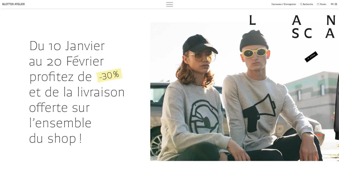
Blotter Atelier, a French clothing brand, uses Chercán for everything, leveraging the typeface’s readability and personality within each page’s composition. Source: www.blotteratelier.com
Argentinian studio PampaType develops high quality typefaces for the widest range of uses, for both retail and bespoke customers.
LC: Is there a distinct look to Latin American typefaces? Do you believe that your typefaces reflect your culture and heritage?
Loche: This is difficult to distinguish today, with the atomization of production combined with the instantaneousness of things going global in a matter of seconds. Personally, I lived in Mexico for eight years and had the chance to contribute to the training of several generations of type designers; I also travelled quite a lot in the region, so one could say I have a privileged view of the Latin American type scene.
It is possible to attribute to Latin American typography a sense of “friendliness”, i.e., warm, sometimes excessively curved designs, or vernacular shapes in a certain way. This has somehow become a sort of common expectation, both from outside and within our region. I believe it has to do with the natural courtesy one can find in the people in this part of the world. But this can be tricky: At PampaType, we like the idea of friendliness, but we take it very seriously to avoid any caricature that our typefaces may breathe. We work hard to achieve what we believe is the right balance between expression and versatility. We aspire to a design with as much universal value as possible in the eyes of a discerning user. But as I said, we believe in the idea of friendly type designs that read comfortably and which can express thoughts and ideas with certain courtesy. And that’s one of our beacons, let’s say.
There is a less purist, more irreverent way of mixing and matching things that is inherent to any cultural aspect of Latin America, and it is impossible for drawing letters not to include the same thing.
—Fernanda Cozzi
The idea of friendliness is not new. It is something that North American typography also manifested in its beginnings, a century ago, by the hand of William Addison Dwiggins and even Fred Goudy. They cultivated the idea of new letterforms that did not strictly follow the traditions inherited from Europe. They sought to propose forms with a certain degree of innovation and freshness. This idea evolved and reached its peak in America throughout the 1970s in photocomposition times, with what we might call the Pop moment of American type: The great Herb Lubalin, Tony Di Spigna, Ed Benguiat, and a whole group of enthusiastic designers behind ITC fonts, also congregated in the pages of Upper and lower case magazine. ITC fonts of the time—either new designs or interpretations of European classics—were made in a very relaxed tone, more in-keeping with the sex, drugs, and rock ’n’ roll spirit of the times: Seducing the reader with a sense of freshness, candor, and formal exploration was more important than fidelity to the original sources. I briefly discussed this idea in an article section of our blog.
Also, in our blog there is an article on “Tuscan letters” which samples vernacular styles as practiced coincidentally in various parts of Latin America, which may be of interest.
Back to Latin American type design: One can get a good appreciation of the diversity and quality of the production in the region at the successive Tipos Latinos Biennales which have been showcasing the output of the region since 2004.
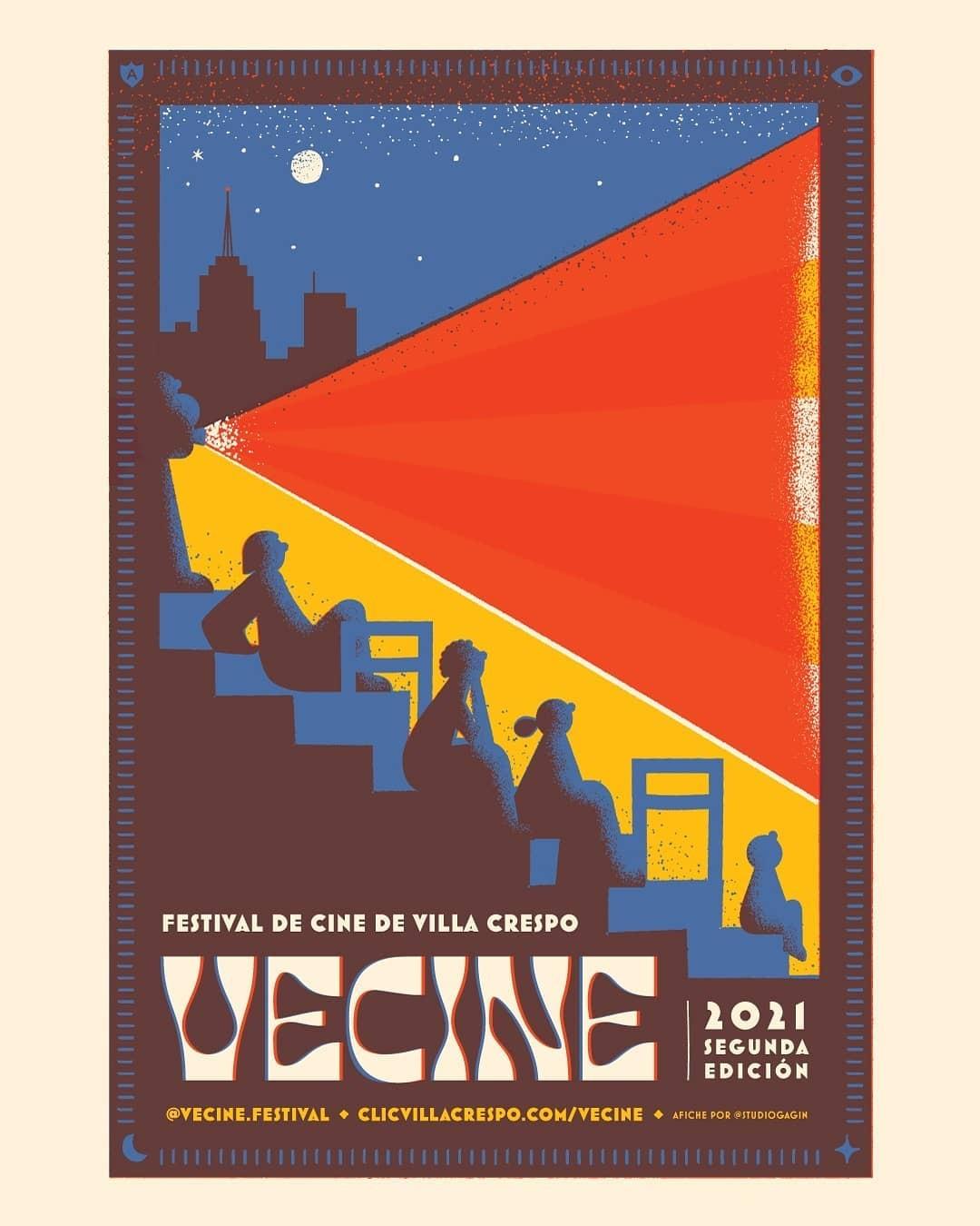
Fer Cozzi’s June Expt in use on a poster by Studio Gagin for the Vecine Festival.
Making letters, drinking wine, and eating cheese: Buenos Aires-based Fer Cozzi designs typefaces that live outside the box.
FC: I believe that there is no particular Latin American style, but there is a way of thinking that unites us: We can do what we want, and no one will tell us otherwise! Or we are going to do it and let history judge us.
I believe that since there is not such a large academic history on how to do type, and because we started more recently than Europe, it was always tied to reinterpreting things that are foreign to us. Doing our version of things is—in my opinion—the way in which we face any project. There is a less purist, more irreverent way of mixing and matching things that is inherent to any cultural aspect of Latin America, and it is impossible for drawing letters not to include the same thing. It’s like trying to do the same recipe but with another flavor: The seasonings are different!
We are descendants of the Spanish and the Italian, yet we don’t make pizza, pasta, or traditional tortilla and paella. Would we do it with typography? I don’t think so.
For me, creativity is about combining things that you wouldn’t normally combine and creating something new and consistent, that has its own spirit and that in turn can inspire other people.
—Loche
RS: I started my type design journey thinking no—most likely driven by the modernist discourse about function and form. My dream was to design the perfect Swiss sans. I’m happy to acknowledge that I grew out of that idea and not only think that each region has its own flavors, but also look out for our own flavor of type. Maybe the past ten years have opened everyone’s eyes to this, with so much action around diversity and inclusion. Being from Brazil, the only Portuguese-speaking country in the continent, it took me a while to realize how South American I was (or could be). Learning about the Spanish-speaking countries and our rich, shared cultural heritage (even though definitely driven by our colonial past) made me try new things and take that as an opportunity.
Of course, questions like these also tend to push forward the idea that yes, there is or there should be a certain flavor to Latin-American typefaces. But I also look forward to the moment when typefaces made in our continent will not be taken as “World Music” but simply good, outstanding music.
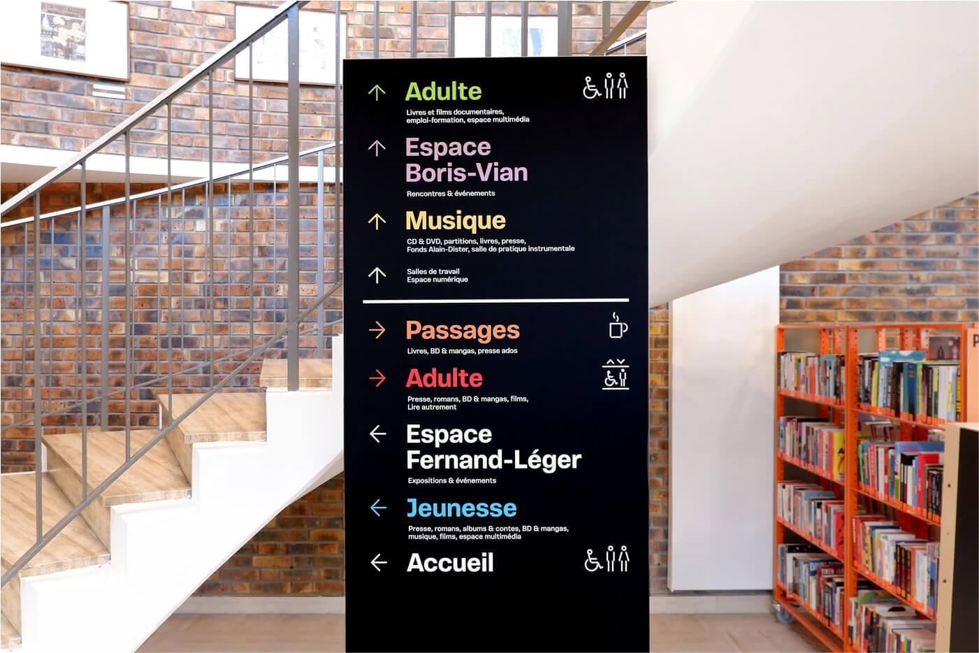
Vinila by Plau was used by Studio des formes in their signage design system for
Bibliothèque Robert Desnos Montreuil. Source: Fonts In Use.

Music sparks conversations, brings people together, and moves ideas forward. So does type.
Learning about the Spanish-speaking countries and our rich, shared cultural heritage (even though definitely driven by our colonial past) made me try new things and take that as an opportunity.
—Rodrigo Saiani
LC: How will Latin American type design and graphic design change over the next decade?
Loche: I have no clue. Digital technology brought in the 1990s the opportunity to design and produce fonts in various non-dominant cultures, on all continents, so we began to hear new voices emerging from around the world, including Latin America. In the last two decades, several Latin American type designers and foundries have emerged and made their own contribution to the international scene. Today, I feel that these new voices are all incorporated into (let’s say) the global orchestra, and although some forms may seem clearly local or vernacular, everything is quickly integrated into an international landscape. A feature of our internet community. The local feeds the global, and vice versa, in such a fast and close way that everything becomes the raw material with which anyone can work. Any new design is a combination of previous forms. For me, creativity is about combining things that you wouldn’t normally combine and creating something new and consistent, that has its own spirit and that in turn can inspire other people. My feeling is that this becomes more and more difficult, with more exposure and concurrency. But like I said, maybe the tougher the environment, the smarter and more creative the answer needs to be.
FC: I don’t have a clue! But I hope that it continues to grow, focused on making a difference and not trying to reproduce foreign models, seeking to explore what our mixed cultural vision has to give and thus conquer the world... while I watch it from retirement, in my house, thinking about how time goes by.
RS: The talent here is incredible, resilient, and disciplined. Trends in type point toward expression, stemming from knowing what you stand for and not being shy about it. That will make the work coming from Latin America an absolute must-see. I expect nothing short of incredible work coming as the next wave of designers show what they are capable of.

Hear more from our Latin American partners Fernanda Cozzi and Rodrigo Saiani at the Cha Che Chi conference, March 3 & 4, a two-day showcase of presentations and panels on what’s happening in Latin American typography today, presented by the Type Directors Club.