
Illustration by Yann Legendre
Pieter Van Rosmalen’s CakeType joins TN
Known for his work at Bold Monday—including Nitti, Dico, and Puffin—Pieter van Rosmalen is reviving and releasing his more personal (and experimental) typefaces under the name CakeType. Here, he shares his affinity for action figures, soccer, and monospaced typefaces.
Lucas Czarnecki: If you can remember a specific moment, when and why did you become interested in type design?
Pieter Van Rosmalen: It was back in 1989 when I was in my first year on Sint Lucas in Boxtel. One of the teachers was able to draw great letter shapes on the blackboard. I was impressed.
What is the story behind your first typefaces?
One of my favorite graphic designers is Neville Brody. In the middle of the eighties, he designed a few constructed typefaces for Face and Arena magazines, which I liked very much. My first typeface—named First—is a manually drawn typeface inspired by Neville’s.

CakeType was founded in 2004 as a boutique foundry, distributing Pieter van Rosmalen’s early—somewhat idiosyncratic—typefaces.
Why did you start your own foundry, and what is the story behind your foundry’s name?
I started CakeType in 2004 as a boutique foundry to distribute that first typeface. Some of my other early typefaces will become available again, once I’m done overhauling them.
I loved running my own foundry back then mainly because of the website, which was very funny. I spent hours designing GIF animations to use in the nameplate of the site. The current website is more basic, but of course it’s much better than the old one.
The story about the name: One of the typefaces I designed while visiting Type & Media was Capibara. For the type specimen, I designed an action figure, Capibara Kees—the Dutch first name Kees sounds like the english case. The name CakeType is short for CApibara KEes TYPEfoundry.
Is there anything unique about your type design process?
I don’t know if this is unique, but I almost never sketch on paper.


What are your major sources of design inspiration?
I love the work of Jurriaan Schrofer; his way of working inspires me a lot. I also love the work of Adrian Frutiger, Motter, Crouwel, and Excoffon. And I like the feeling and look of monospaced typefaces, like those designed for IBM Selectric typewriters.
Do you have a favorite example of seeing your type used in the wild?
I’m a fan of Dutch football club PSV and designed custom typefaces for their jerseys and communication. Each time I visit the stadium, I feel proud because they use the typefaces everywhere. And big, too! There’s more information about the typefaces for PSV on my instagram:
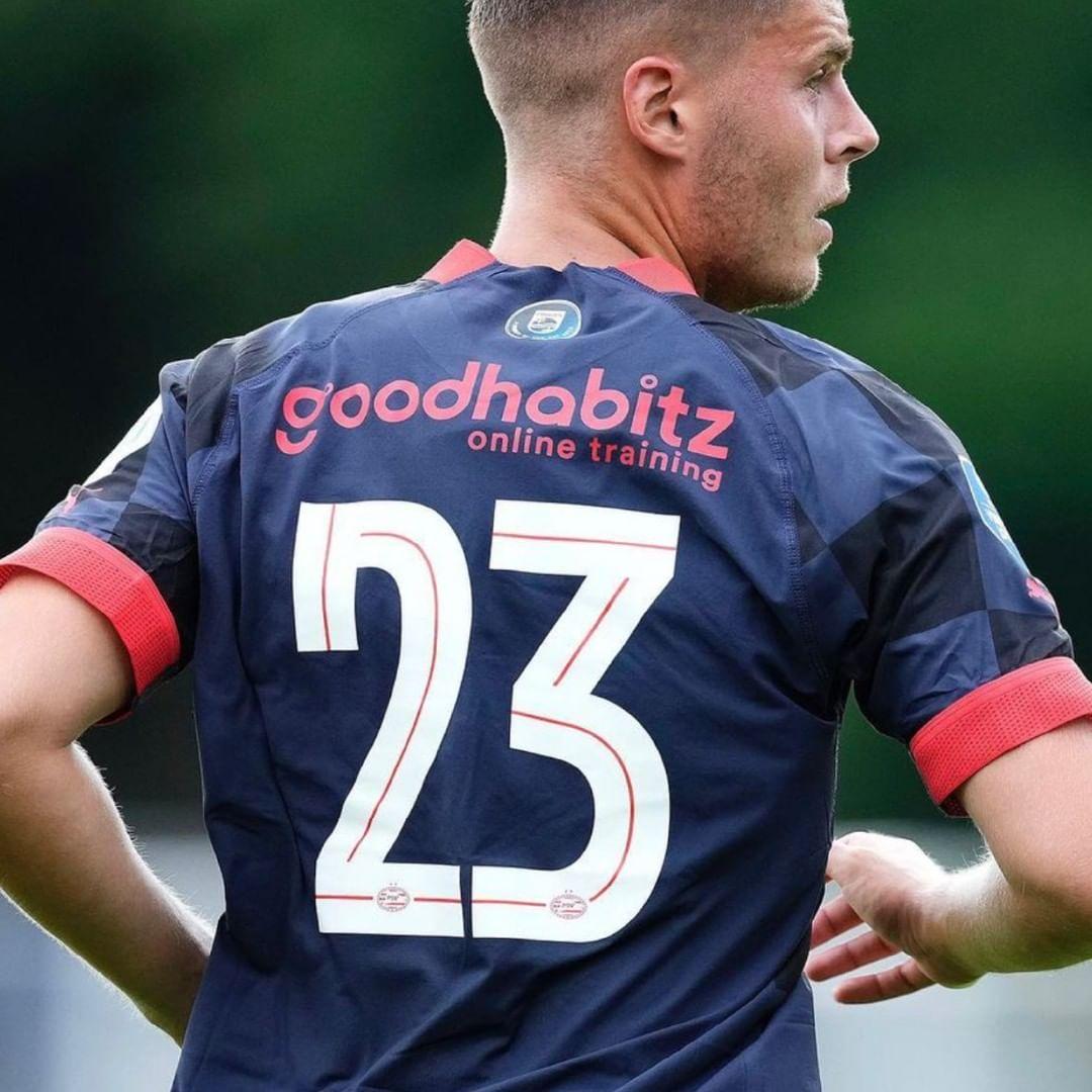
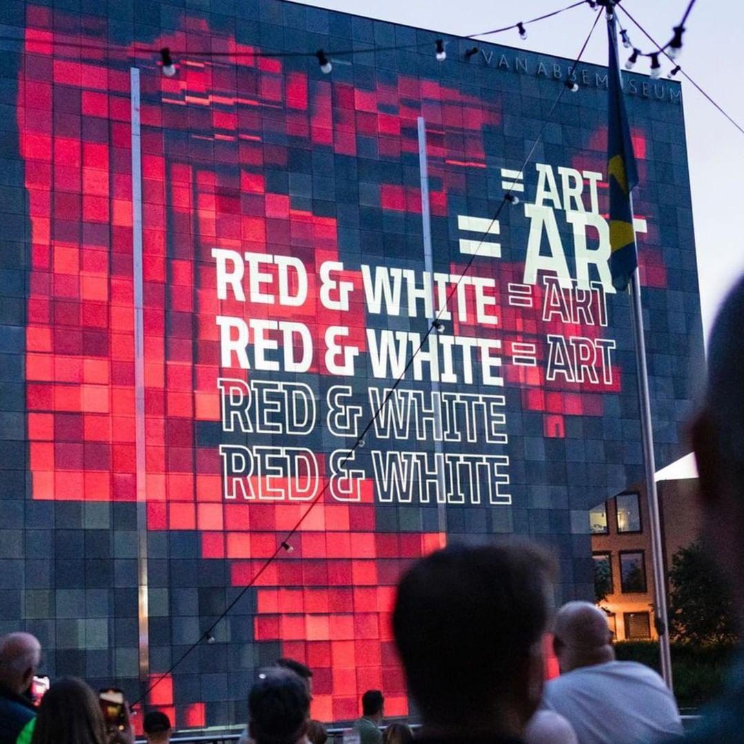
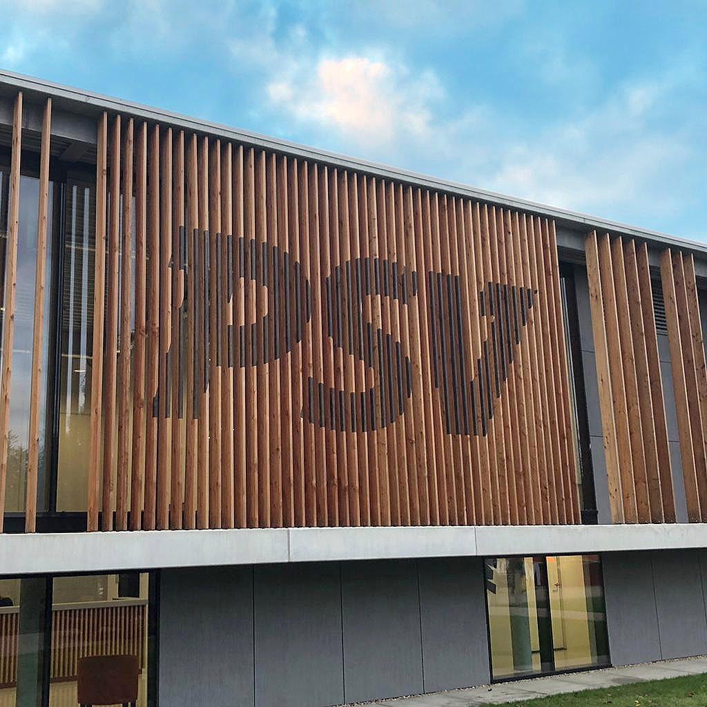
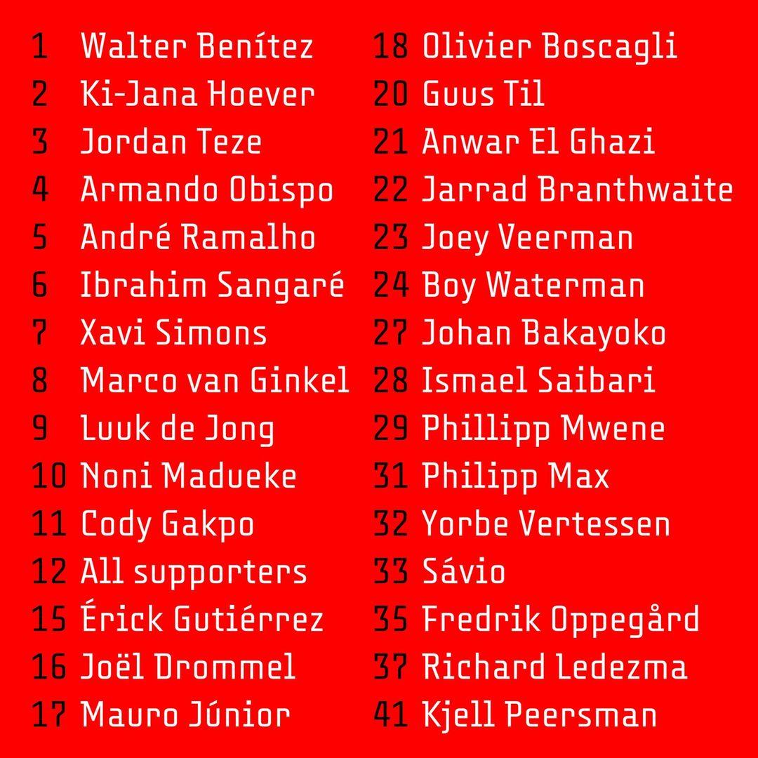
Pieter van Rosmalen’s custom typeface for PSV is put to use on everything from jerseys to buildings and from correspondence to merchandise.
Tell me about the typefaces with which you’re launching on Type Network.
I think these three typefaces—Vandertak, Cake Mono, and Whale—are typical for my work. Two are constructed and two are monospaced.
What does it mean for CakeType to be joining Type Network?
I’m excited that CakeType will be part of the great Type Network family. I like to work with Glenda (Bellarosa, TN’s library manager) because, thanks to her, my typefaces keep getting better technically—thanks Glenda!
Vandertak, Cake Mono, and Whale can be licensed for print, web, mobile apps, and ePubs. Webfonts may be tested for thirty days, and desktop trials are available upon request. Have a licensing question? Check out our support page or get in touch.