THE MATTHEW CARTER COLLECTION
The fonts
F
OR THE FIRST time, almost all of Matthew Carter’s typefaces that exist in digital form are brought together in one place. There are fonts from TN foundry partner Carter & Cone and others from Morisawa and Hamilton Wood Type. All available for license at Type Network.
Alisal
Alisal is a calligraphically inspired serif typeface with its roots in 15th- and 16th-century Italian lettering and type. It is both free-flowing and angular, giving a sprightly lilt to a block of text. It’s a design that Matthew refined over a long time; so long, he says, that it began to feel like a historical revival of his own typeface.
Auriga
A slab-serif text typeface designed to meet the technical limitations of early phototypesetting systems, Auriga was begun at Crosfield Electronics in 1963 and completed for Mergenthaler Linotype in 1970. One of its few uses was in Hachette’s Dictionnaire practique du français.
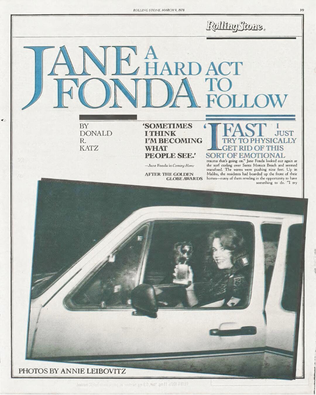
Bell Centennial
Source: Fonts in Use. License: All Rights Reserved.
There’s no arguing with the impact of a phonebook typeface, even if nobody consciously notices it. In the 1970s, when AT&T was still “Ma Bell” and telephone directories were thick printed books on cheap, thin paper, the phone company commissioned Mergenthaler Linotype to produce a new typeface, to celebrate AT&T’s 100th anniversary. The brief was to fit more characters on a line, and to be legible at very small size, in order to fit more entries on a page and thereby save on paper. The very features that make Bell Centennial extremely legible at its intended tiny sizes, such as the ink traps in sharp angles, have been used to good effect at very large sizes as well. They also make it a good choice for everyday needs such as readable name badges.
Bell Centennial Std
Address
Starting at $35
BuyIn the words of others
“When the world has stopped panting after new faces and the last of the font manufacturers is complaining that they can’t make a living it is the types that started life in digital form that will survive. Then abideth Charter, Swift and Galliard; these three; but the greatest of them is Galliard.”
John Miles
Gladdened by Galliard
Gladdened by Galliard
“He commands a wider audience for his work than most artists ever dream of. Open a book catalog from any major publisher and you will see ITC Galliard. Browse a newsstand and some version of Miller News will pop into view. Go online and you'll find Verdana everywhere on the Web. Use a reference book. Find a telephone number. Buy a ticket for an event. Read an announcement in a digital source. Carter's work pervades the media through which the messages you receive are being conveyed.”
Johanna Drucker
Typographic Intelligence
Typographic Intelligence
“Carter, the perennial student, is a master at considering and utilizing divergent elements in the construction of a typeface as he quietly ‘serves' letterforms used to lend structure to thought across time and space.”
Margaret Re
Matthew Carter’s Typefaces
Matthew Carter’s Typefaces
Big Caslon
At very large sizes, Big Caslon stands out and expresses the style and flair of William Caslon’s display typefaces, in dramatic contrast to the smooth readability of his text faces. Big Caslon has old-style letter forms, but with a very modern sensibility. It sets tightly but comfortably, with a big x-height and refined thin strokes. The roman includes small caps and ligatures; the italic has a variety of swash caps and distinctive ligatures.
Source: Fonts in Use. License: All Rights Reserved.

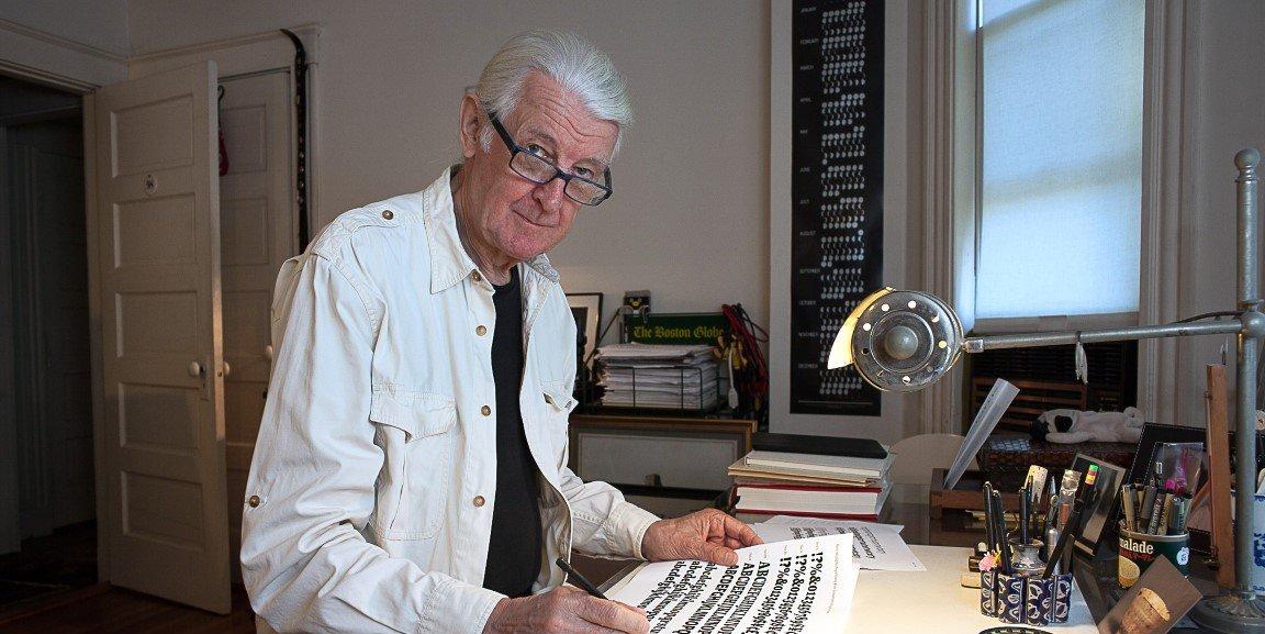
Matthew Carter is a type designer with fifty years’ experience of typographic technologies ranging from hand-cut punches to computer fonts.
Big Figgins
Source: Fonts in Use. License: All Rights Reserved.
Originally called Elephant, this dramatically high-contrast typeface is made for headlines. Vincent Figgins developed his “fat face” in the early 1800s in response to the demand for advertising. It features extremely high contrast, and some of the italic caps have aggressively prominent ball terminals. It works as dramatically in advertising today as Figgins’s original did on posters hastily slapped onto hoardings in 1820s London. In addition to roman and italic, there is a caps-only version, Big Figgins Open, with white inlines hugging the left edges of the letters.
Big Moore
A 1766 type specimen by Isaac Moore, former manager of Joseph Fry’s foundry in Bristol, England, shows many types inspired by John Baskerville’s. But a century later, standardization had foisted inept lining figures and shortened descenders upon these designs. Matthew remedied the tragedy with Big Moore, restoring oldstyle figures, full-length descenders, and historic swashes to this regal serif in two styles, roman and italic.
Carter Sans
Carter Sans is a “flared serif” typeface – a design with no serifs as such, but with a slightly flared expansion to the ends of many of the strokes, where one might expect to see serifs. Although Carter Sans can give a monumental effect at large display sizes, it may have its most effective use in text, especially in small text. The open shapes and the relatively large x-height give it presence at small sizes. The heavier weights, useful for display, maintain the faceted appearance of the Regular, and if anything make it more dramatic. Its chiseled look makes it a natural for inscriptions, or for certificates and other formal-looking documents.
Source: Fonts in Use. License: All Rights Reserved.
Cascade Script
Cascade Script is a jaunty, bold handwriting face with strong, angular shapes. It was originally designed in 1966 for Mergenthaler’s Linofilm phototypesetting system. Its lively forms work well in headlines or short texts, both in all-caps settings and in caps and lowercase.
Charter
Source: Fonts in Use. License: All Rights Reserved.
Charter is a typeface designed for the low-resolution laser printers of the early 1990s. Like many typefaces designed for a specific purpose, Charter proved to be useful far beyond its initial remit. It is an open, upright, low-contrast typeface for running text; its italic has generous, rounded shapes. In creating the letter forms, Matthew kept in mind the limitations of computer memory as well as laser printing, avoiding complex curves and keeping the strokes as straightforward as possible, while still giving the face a comfortable old-style feeling.
Cochin
Source: Rolling Stone. License: All Rights Reserved.
Although Cochin was originally published by the French type foundry Deberny et Peignot as a typeface for hand-setting in metal, Matthew revived it for Linotype in 1977, and expanded the number of available weights. Its distinctive style, with a low x-height and long, elegant extenders, is based on the 18th-century copperplate engravings of Charles-Nicolas Cochin.
DeFace
DeFace is a “self-vandalizing” typeface, published in 1998 in the experimental typographic collection “Fuse 18,” on the theme of “secrets.” The base letters are outline versions of the all-caps Mantinia typeface, surrounded by a cloud of lightly lettered names of famous type designers and typographers.
Fenway
Fenway was commissioned as a text typeface for Sports Illustrated: “an elegant serif, to modernize SI’s long literary tradition of great writing,” according to design director Steve Hoffman. Although the copy-fitting requirements were rigorous, Matthew had “a free hand in the appearance of the face.” It has been successfully used a book typeface as well as in publication design.
DTL Flamande
Source: Fonts in Use. License: All Rights Reserved.
DTL Flamande is a blackletter typeface in the textura style, the archetypal “broken script” where every curve in the narrow lowercase letters is broken into diagonals, as though written in a strictly angular fashion by a late-medieval scribe. The capitals are rounder but highly decorated. It is based on textura types by the 16th-century Flemish punchcutter Hendrik van den Keere. Matthew designed Flamande in 1992, though it was not released until 2017. Along with the standard font, he added Flamande Archaic, which includes many of the abbreviations and ligatures that would have been used in that historical period.
ITC Galliard
Galliard is Matthew Carter’s most distinctive text typeface. Based on the 16th-century roman and italic types of Robert Granjon, Galliard brings back some of the sparkle that’s lacking in many revivals of French Renaissance typefaces, while being extremely readable en masse. Galliard has been the text typeface used for the volumes in the Library of America series since its inception in 1982. It is a popular book face, as well as adding elegance to advertising and collateral for cultural institutions. It is sometimes paired as a text face with the all-caps Mantinia for large titles.
Source: Fonts in Use. License: All Rights Reserved.
Gando Ronde
As its name suggests (“ronde” is French for “round”), Gando Ronde is a script face with very round letter forms. Its heavy strokes, although clearly cursive, are almost upright. It is based on a 17th-century writing style that was revived in the 19th century for French official correspondence. Matthew created this version in 1970 as one of his first designs for phototypesetting.
Georgia and Georgia Pro
Source: Fonts in Use. License: All Rights Reserved.
Georgia is a highly readable serif typeface for the Web. Its roots are in a “transitional” Scotch Roman style, not unlike Miller but beefed up for onscreen legibility. Georgia became the default text face for web pages from its introduction in 1996. Georgia Pro added Light, Semibold, and Black weights and condensed widths, with their italics, as well as typographic features such as true small capitals, ligatures, fractions, old style figures, lining tabular figures, and lining proportional figures.
Helvetica Compressed
As a tightly compressed headline addition to the Helvetica type family, Helvetica Compressed, designed in 1966, used the limitations of the Linofilm phototypesetting system to create three progressively narrower variations: Compressed, Extra Compressed, and Ultra Compressed. It was used for dramatic titles and headlines in magazine design from the 1960s on. The Ultra Compressed width was designed by Hans-Jörg Hunziker.
Source: Fonts in Use. License: All Rights Reserved.
Mantinia
Source: Fonts in Use. License: All Rights Reserved.
Mantinia is an elegant, lively set of sharply serifed inscriptional capitals, based on the lettering seen on the classical buildings in the paintings and prints of Andrea Mantegna. It is designed to complement Galliard, and it features a variety of swash and alternate characters that mimic the art of stonecut lettering.
Miller
Source: Fonts in Use. License: All Rights Reserved.
Miller and its cousins (Miller Headline, Miller News, and Miller Daily) form one of Matthew Carter’s largest and most widely used type families. Although he designed it originally with book use in mind, it has become a go-to choice for both magazines and newspapers. Miller comes in a range of weights and size-specific forms, which can take it seamlessly from shouting headline to whispering footnote. Although Miller is an original design, not a historical revival, it is faithful to the spirit and many of the details of what came to be called Scotch Roman types. Its name is a nod to the Miller & Richard type foundry in 19th-century Edinburgh.
Monticello
Monticello is a book typeface used to typeset the complete papers of Thomas Jefferson, who had admired the face in its original form as Binny & Ronaldson’s “Pica Roman No. 1,” one of the first typefaces produced in the United States. Matthew took the much-compromised Linotype version and created this more robust digital version, including well-designed old-style figures and small caps.
Olympian
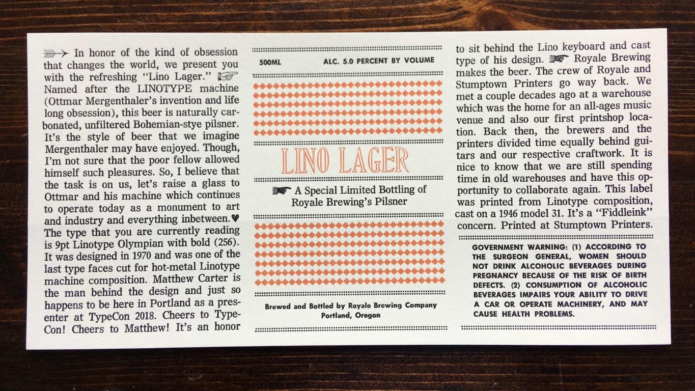
Source: Fonts in Use. License: All Rights Reserved.
Designed as a text typeface for newspapers, Olympian was released in 1970 by Mergenthaler Linotype as both a hot-metal face and a phototypesetting face. Its width is compact but appears wider, an effect that Matthew achieved by tilting the stress slightly and making the internal counters larger than those in competing typefaces.
Rocky
For years, Matthew wondered why no Latins with Bodoni proportions had been developed, or why no Bodonis had Latin serifs. He solved this problem by drawing Rocky Regular and Bold, with italics, to fill the gap, then expanded the family with the aid of Richard Lipton. In publications, they provide a sharp spot of typographic “color” as signature headline series for Roger Black’s redesign of the Rocky Mountain News.
Role
Source: Fontelier. License: All rights reserved.
Matthew was invited by Morisawa to design a super-family of typefaces in four different styles: serif, slab, sans, and “soft.” Working with Japanese type designers Sakura Taruno, Kunihiko Okano (Shotype Design), Yuya Kobari, Shotaro Nakano, and Ai Handa, Matthew shepherded the development of four complementary yet distinct type families, which can be used together for a unified, harmonious treatment of different typographic voices. All but the Soft variation have optically adjusted designs for text, display, and banner headlines.
Roster (Wrigley)

Source: Fonts in Use. License: All Rights Reserved.
Roster is a dramatic slab-serif display typeface, characterized by the tension of square corners in round shapes. It was adopted as a display face by Sports Illustrated under the name Wrigley. Roster’s outer shapes are large, curved rectangles, while its inner shapes have the chisel-cut clarity of counters carved out of the surrounding letter forms.
Shelley Script
Source: Fonts in Use. License: All Rights Reserved.
Based on English handwriting styles of the 18th and 19th centuries, Shelley Script has three increasingly elaborate styles, each named after a musical term. Matthew chose Andante, Allegro, and Volante to reflect the three different moods: Andante is the most reserved, Allegro has a few more flourishes, and Volante’s capital letters are surrounded by swirling strokes.
Snell Roundhand
Based on the roundhand script of Charles Snell, a formal writing style of the late 17th century, this script typeface is often used to evoke gender, era, exclusivity, and courtesy. Its letters have connecting strokes that make them appear to have been written in a continuous flow.
Sophia
Sophia harks back to the inscriptional lettering styles of the ancient world. It was suggested by hybrid alphabets of capitals, uncials, and Greek letterforms from 6th-century Constantinople. Sophia has joining characters that fuse with other characters to form ligatures.
Stilson
Since 1997, The Washington Post’s iconic headlines have been distinguished by their own sturdy, concise variation on Bodoni, designed by Matthew. For the 2009 redesign, Richard Lipton, Jill Pichotta, and Dyana Weissman expanded the family with more refined Display and Condensed styles for use in larger sizes. Originally called Postoni, the fonts were renamed in honor of The Post’s founder, Stilson Hutchins.
Tahoma, Nina, and Meiryo (Western scripts)
Source: Fonts in Use. License: All Rights Reserved.
Tahoma, Nina, and the Western scripts segment of Meiryo are all offshoots or variants of Verdana. Tahoma is a narrower version of Verdana, and Nina a very narrow version, useful for user interfaces. Meiryo is a Japanese typeface, designed for reading onscreen; the Latin, Greek, and Cyrillic elements are based on Verdana.
HWT Van Lanen
In 2002 Matthew was commissioned to create a new design to be cut in wood by the then nascent Hamilton Wood Type Museum. This was significant in that this was the one format for which Carter had not yet designed type. The new design emerged as a two-part chromatic type to be cut specifically in wood. Originally called Carter Latin, the font was renamed Van Lanen after one of the Museum’s founders. The first cutting and printing of the type took place in late 2009, and although it has been available through the Museum, contemporary wood-type production is expensive and few have acquired this font in wood. The digital version of the pair of Van Lanen fonts is now available. The design recalls Antique Latin wood type, but with a refined sensibility and intentional quirks (like the sideways ampersand). It is a wonderful addition to Carter’s oeuvre, and to the ongoing history of wood type.
Verdana and Verdana Pro
Source: Fonts in Use. License: All Rights Reserved.
Verdana is a very readable sans-serif typeface for the Web. It was designed “backwards”: from size-specific bitmaps first to digital outlines, rather than the other way around, so that it would appear crisp and clear at common text sizes on low-resolution screens. Verdana is wide and open, with generous spacing between letters – all to increase onscreen readability. Verdana Pro added Light, Semibold, and Black weights and condensed widths, with their italics, as well as typographic features such as true small capitals, ligatures, fractions, old style figures, lining tabular figures, and lining proportional figures.
Victoria & Albert Titling
Victoria & Albert is an all-capitals titling typeface that was commissioned by Derek Birdsall for a series of museum guides for the Victoria & Albert Museum in London. Although its classic forms appear chiseled and sculptural, Matthew originally drew the letters in pen and ink. It has been used for section titles of the Los Angeles Times since 2000.
Video
Originally created in 1969 for the Linotype 505, a hybrid photo/digital typesetting system, CRT Gothic was designed so that its sans serif letter forms could withstand being artificially slanted as oblique “italics.” It was rereleased in 1977, when Linotype was building its digital type library, in four weights as Video.
Vincent
Matthew was commissioned by Newsweek in 1999 to design Vincent as a new text face for the magazine. It is based on types cut in the early 19th century by Vincent Figgins for an edition of the Bible; Figgins’s types in turn were based on those of William Caslon. Vincent’s roman has the straightforwardness you’d expect in a news magazine, while its italic is quite lively and calligraphic.
Walker
Walker is an all-caps display face designed to express the identity of the Walker Art Center in Minneapolis. Its basic, “vanilla” state is sans serif, but it has five different sets of snap-on serifs that can be combined to link letters and create new, almost abstract shapes.
Colophon
The Matthew Carter Collection is set in ITC Galliard Pro, Verdana Pro, Roster, and Miller Text and Display.
Written by John D. Berry.
Designed by Roger Black.
Developed by Lucas Czarnecki.
Matthew Carter illustration by David Johnson.
August 7, 2023 · Brochure
Matthew has a thorough grounding in the 500-year history of movable type; at the same time, he has dived deep into each successive wave of technological development, mastering and sometimes demonstrating the ways of designing type for each new environment.
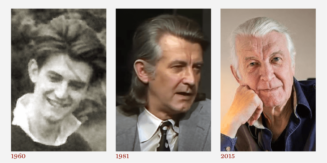
August 7, 2023 · Brochure
He got off to a fast start as a type designer by learning how to cut metal type punches at Enschedé foundry in Holland. Then, despite his dad’s example, he ducked going to college and, by the age of 27, was a staff designer at Mergenthaler Linotype headquarters in Brooklyn. The rest is history.