THE MATTHEW CARTER COLLECTION
For the first time in one place, Matthew Carter’s fonts from the span of a 60-year career.

The Carter Identity
M
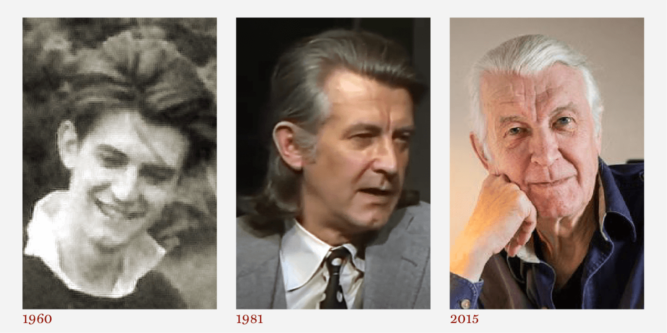
ATTHEW CARTER is the consummate designer of type. As the
great
San Francisco printer Jack Stauffacher once described it, Matthew’s work is “carrying on the great tradition in designing humanistic digitized letters.” Matthew has a thorough grounding in the 500-year history of movable type; at the same time, he has dived deep into each successive wave of technological development, mastering and sometimes demonstrating the ways of designing type for each new environment.
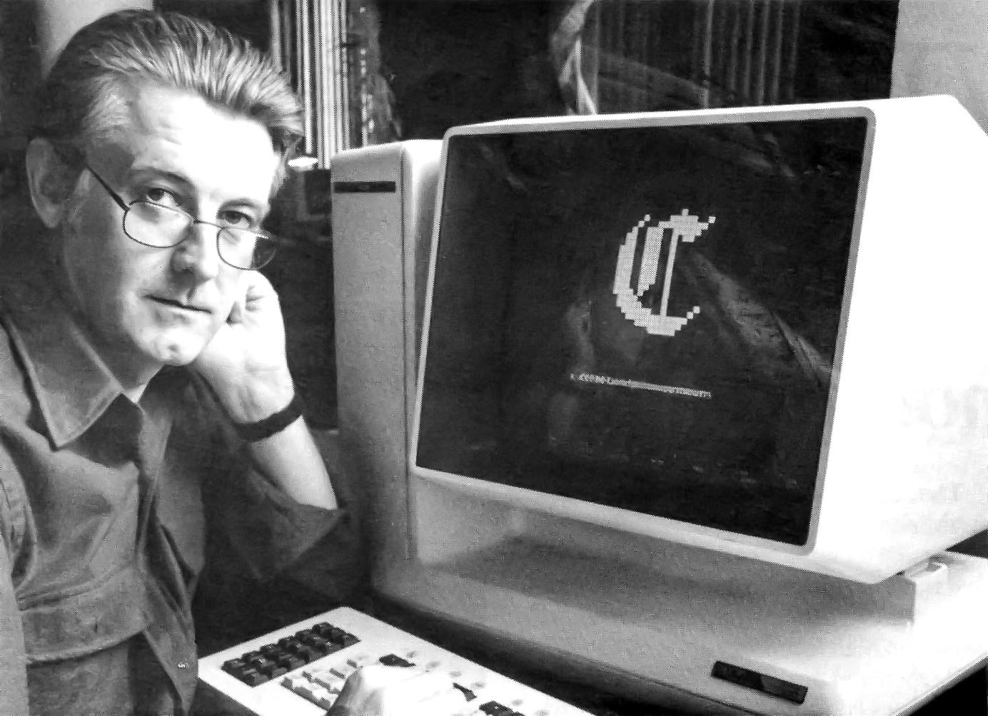
At a Bitstream workstation in about 1986, Carter improved the digital outlines for Flamande, at 16th century Gothic, by building the outline from bitmaps .
Adapting technology to design,
not the other way
As a young man, he learned to cut metal punches by hand, studying at the Plantin-Moretus Museum in Antwerp. At that time, in the mid-1950s, punchcutting was already an arcane and almost lost craft, but it had been the heart of type design since the days of Gutenberg.
His early work for Mergenthaler Linotype involved creating or adapting typefaces for phototypesetting – and, in the case of the newspaper text face Olympian, designing a typeface that could be issued simultaneously as metal Linotype matrices and as Linofilm phototype fonts.
“The technology has changed a number of times since I started work: photo, digital, desktop, screen, web.”
CRT Gothic was designed to survive distortion of width or slant on the Linotype 505, a typesetter that used a cathode ray tube for imaging. The result was that a single physical font was needed for multiple styles. Like many of his typefaces designed to solve specific technical problems, CRT Gothic was made obsolete by new typesetting technology, but its design survived to be released as a digital type family by Linotype.
Matthew’s first purely digital typeface was the two-year project of Bell Centennial, a new type family for AT&T, the company that produced almost all the American telephone books. It was made to replace the previous phonebook face, Bell Gothic, a metal Linotype family. The challenge was designing size-specific fonts that would save space and costs, and be readable after being printed on very cheap paper on high-speed presses.
By the early 1990s, Matthew was designing Georgia and Verdana, the first finely crafted typefaces for on-screen reading, which became the default fonts on the web.
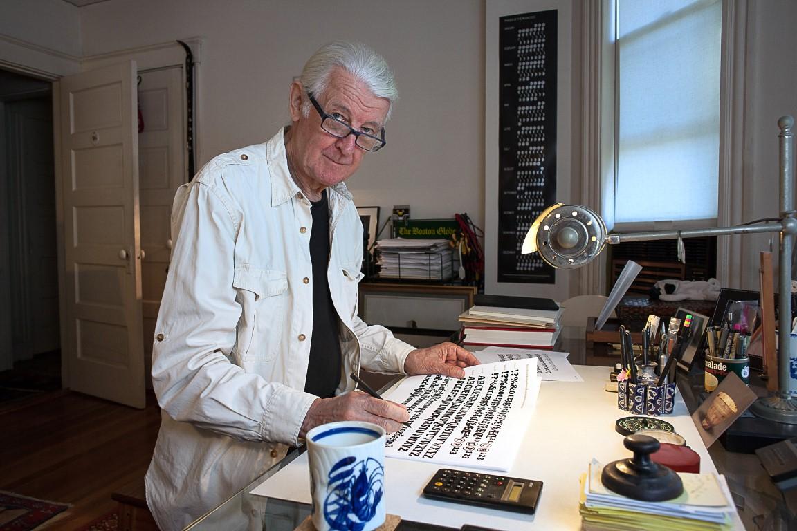
In his studio in Cambridge, MA. Matthew still draws type with the traditional graphic tools. But the screen is always there, ready to make a final font.
A great output of great typefaces
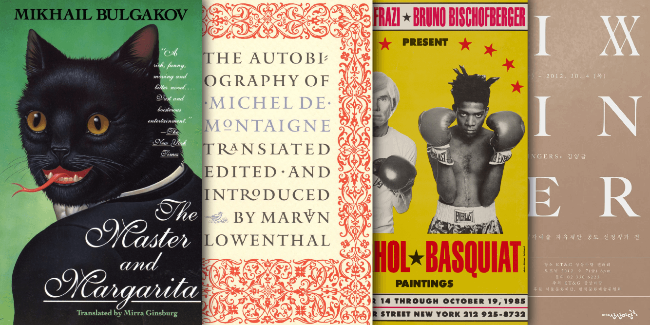
Matthew’s most widely seen typefaces must be Verdana and Georgia, since they became ubiquitous on the web almost 30 years ago. Also widely seen are his typefaces that are used in so many newspapers and magazines: Olympian, Miller, Times Cheltenham, Time Caledonia, Postoni, Newsbaum, Fenway, Roster, Vincent.
For eye-catching titles at large size, Big Caslon and Big Figgins (Elephant) are perennially popular choices. The elegant combination of Galliard for text and Mantinia for titles is used frequently. And one of his earliest typefaces, Snell Roundhand, has never lost its popularity.
“I think of myself as an industrial designer: the thing I design is manufactured, and it has a function: to be read, to convey.”
In 2018, Microsoft released his Sitka type family, a ground-breaking exercise in designing a typeface for reading, based on repeated readability tests and design iterations, with six optical sizes.
A year later, in 2019, Morisawa released his extensive type superfamily, Role, the first extensive Latin typeface from the prominent Japanese type foundry. While Matthew has assembled many teams to produce big type families, for Role he used his pedagogical experience to teach four designers from Japan how to deal with the challenges that surround a giant project in – for them – a foreign script. The result contains serif, sans, slab, and round subfamilies in nine weights and three optical sizes.
The fonts
With the collaboration of Carter & Cone and other partners, Type Network presents the Matthew Carter Collection.


August 7, 2023 · Brochure
For the first time, almost all of Matthew Carter’s typefaces that exist in digital form are brought together in one place. There are fonts from TN foundry partner Carter & Cone and others from Morisawa and Hamilton Wood Type.
August 7, 2023 · Brochure
He got off to a fast start as a type designer by learning how to cut metal type punches at Enschedé foundry in Holland. Then, despite his dad’s example, he ducked going to college and, by the age of 27, was a staff designer at Mergenthaler Linotype headquarters in Brooklyn. The rest is history.