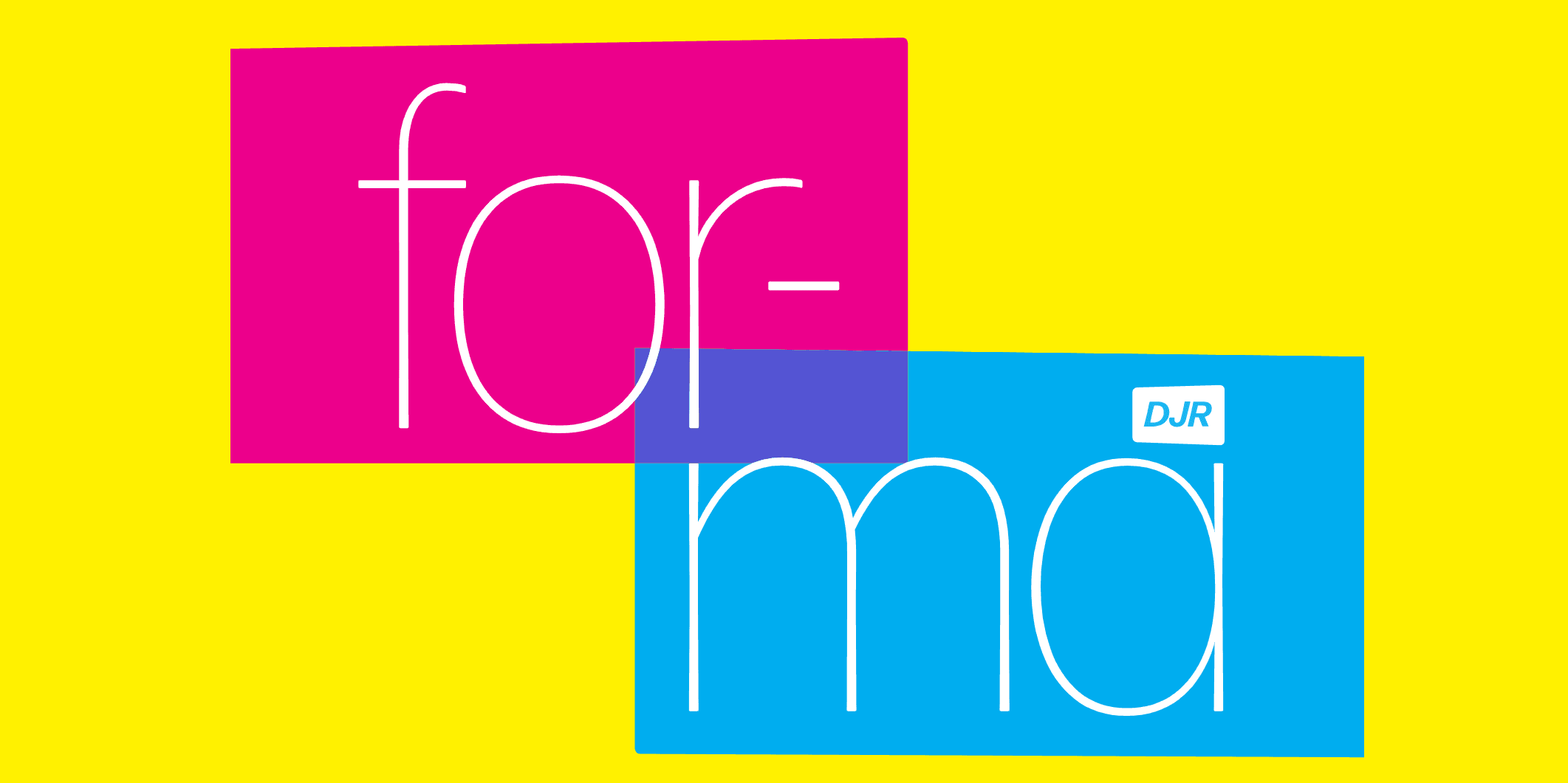
Finding Forma
Forma is a neo-grotesque typeface by the Italian type foundry Nebiolo. It was designed in 1965–68 by a team of eight designers, and spear-headed by Nebiolo’s art director, Aldo Novarese. This is the story of its revival.
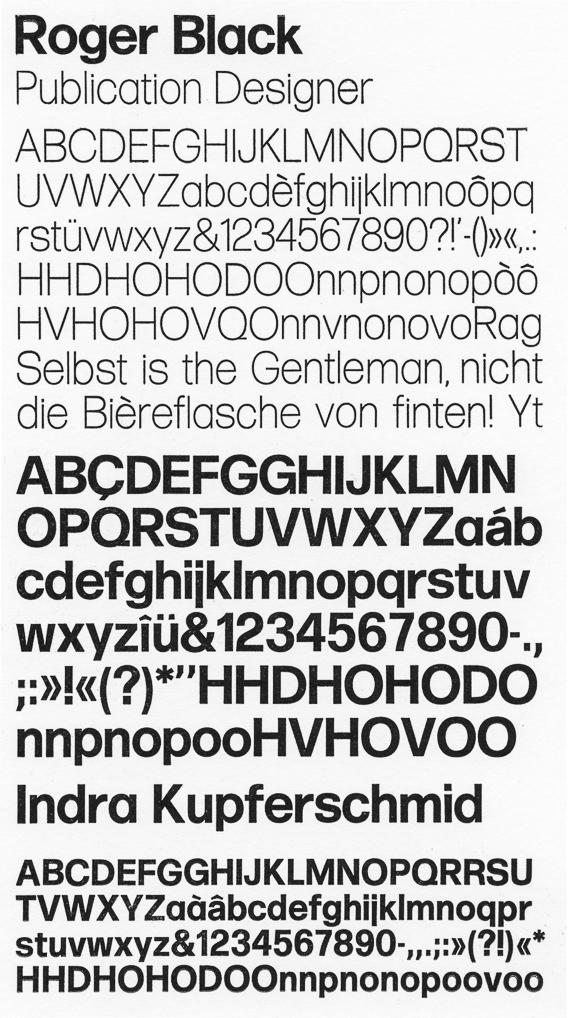
Roger Black first saw Forma at the Nebiolo stand during the Drupa exhibition in 1977. He’s loved it ever since. To him, it was the answer to monotonous Helvetica, which, by the mid-1970s, was already overly familiar and overused. Like Times Roman, it became “ground into the dirt by one-size-fits-all masters,” said Roger, when included on laser printers and PCs in the 1980s.
When Roger took a new position as group creative director of Edipresse Media in Hong Kong last summer, he thought of Forma for a redesign of their nine Asian Tatler magazines. He was after a neutral sans serif to work with Joshua Darden’s Corundum-“an excellent Fournier”-which had been in use at the magazine for five years. “With fashion layouts, you want the photographs to project the style, not the fonts.”
“Whenever I do a redesign, I think about out-of-use typefaces from Nebiolo, Miller & Richard, or Barnhardt Brothers & Spindler,” Roger explained. “Forma’s contemporary, super-tight letterspacing was remarkable for a metal font. I had been pulling away from the sixties’ tight-but-not-touching style for 40 years, but suddenly, it looked wonderful.”
Roger says there are four key features that make Forma better than Helvetica:
- More distinction between characters
- Even higher x-height
- Large counters
- One-story a and g
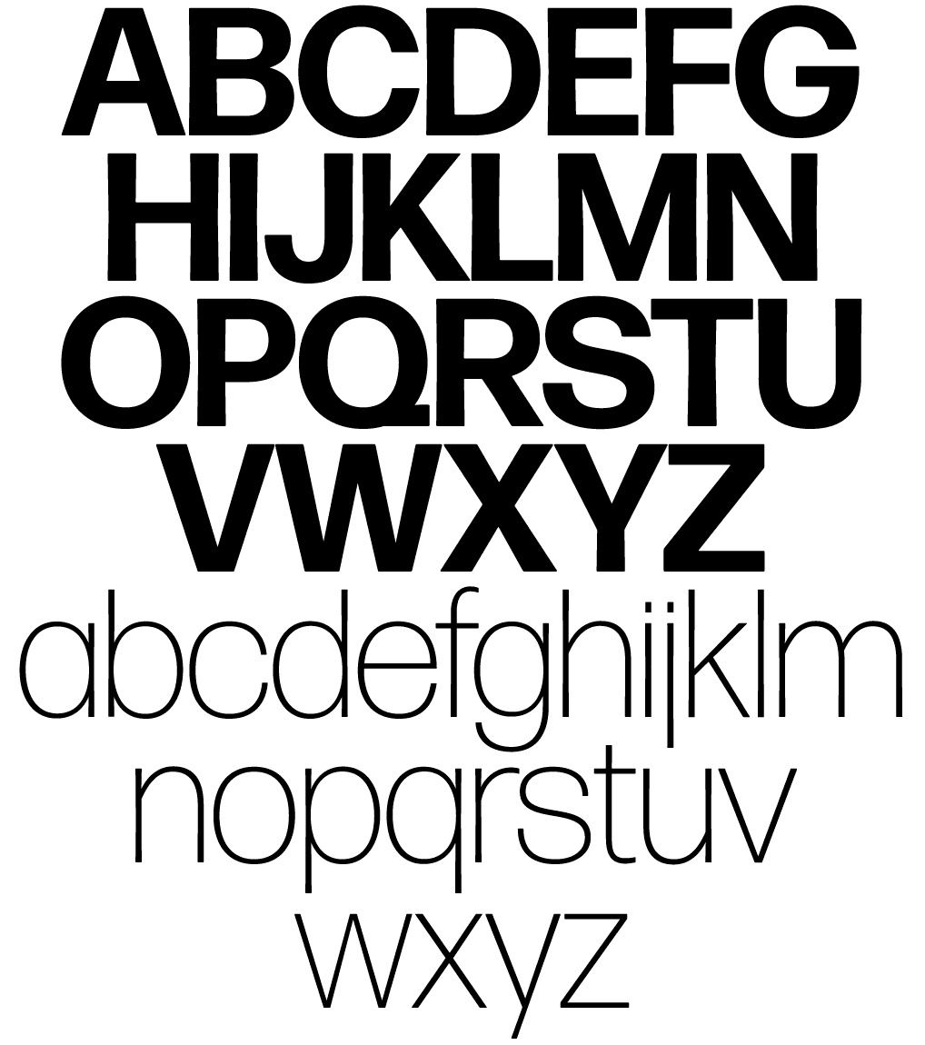
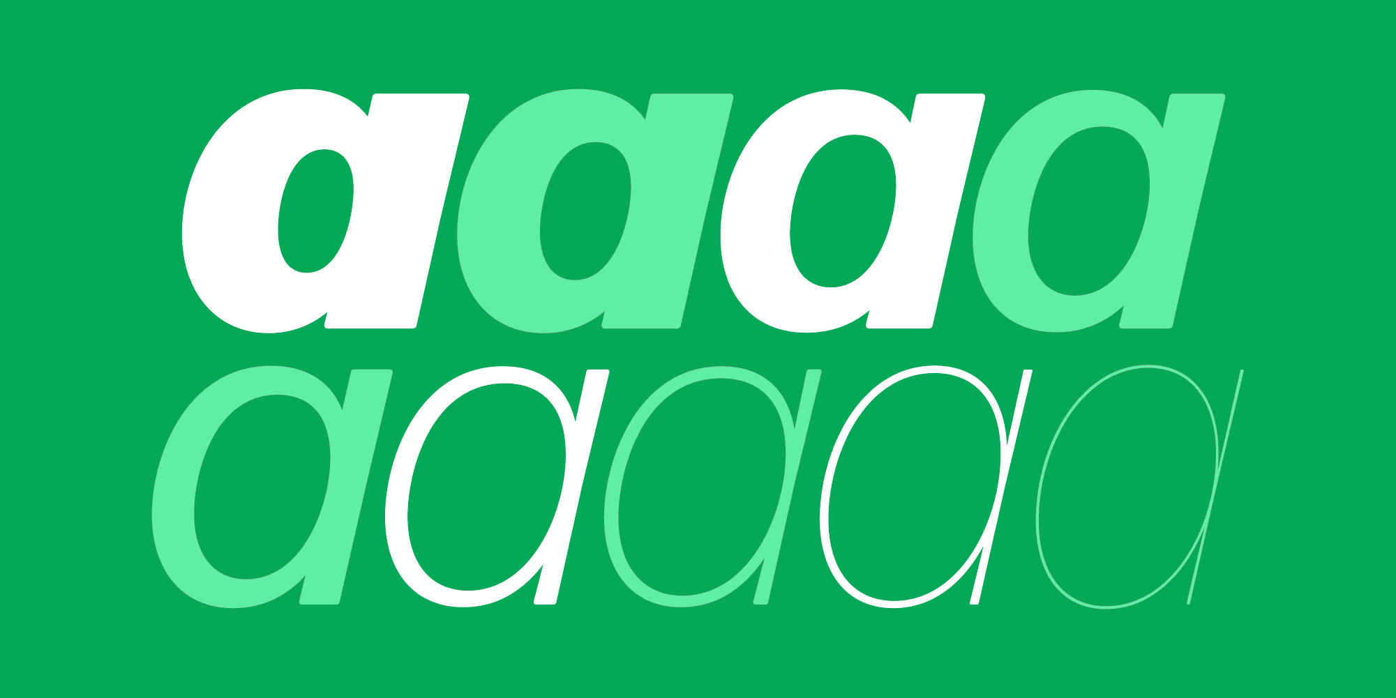
“That first point is what makes it a great typeface. The much-remarked dulling rhythm of Helvetica-fine for logotypes but hard to read as text or on signs — was replaced by more distinct glyphs. Take a look at the ‘e’: By reducing the top, it becomes less symmetrical and more distinct from the ‘o’ than in Helvetica. The ‘ball-and-stick characters’ b, d, g, p, and q feature enhanced counters; the inside curve scoops out the stem. The stems are just slightly flared at the ends while their corners are rounded. This is a stylistic idea which gives the typeface more warmth than most grotesques. More importantly, it helps separate the letterforms, making Forma easier to read than Helvetica.”
Loving little more than some good research on 20th-century European Grotesks, I was called in as German correspondent and asked if I had information and material on Forma. (Roger’s books were still in a container on their way to Hong Kong.) I did.
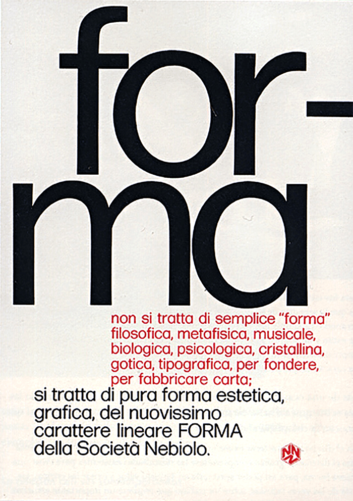
Forma cover
I was introduced to Forma by Alfred Hoffmann in connection with my research for the book Helvetica Forever. Hoffmann, former principal of the Haas typefoundry, called Forma “a blatant copy of Helvetica.” At first, I tended to agree, especially when looking at the bold weight set with the richiesta-the alternate characters for R, G, and a in the so-called “German form.” But upon a closer look and comparison, I now regard it as a soulful interpretation of the neo-grotesque style in its own right.
To be a mere rip-off of Helvetica, Forma would have been very late to the hype. Released more than ten years after Helvetica, Forma arrived as the metal type era was ending. Rather, Nebiolo tried to catch up and improve on the whole genre of restrained sans serifs, of which they had none in their catalog. In 1965, Nebiolo installed a “research group” of eight (!) designers—no doubt to Aldo Novarese’s mortification. Novarese lead a team of (mostly) Milanese designers: Bruno Munari, Franco Grignani, Giancarlo Iliprandi, Ilio Negri, Luigi Oriani, Pino Tovaglia, and Till Neuburg.
They were commissioned “to develop a more mature, humane interpretation of the Swiss sans serif trend,” as Alessandro Colizzi puts it. Colizzi gave a great talk on the committee-driven development of Forma (and Datillo and Modulo) at ATypI Amsterdam in 2013. He suggested that the panel was essentially inflicted on Novarese to try to come up with some products that the designers in Milan would use.
“Forma is still very much Novarase’s work,” says Roger, “perhaps his best.” Nebiolo tried to gain customers who preferred the more rigid Swiss style by offering alternate characters similar to Helvetica. But overall, the typeface was not a big international break in a market saturated by Helvetica and Univers. Nebiolo never made the transition to photo-type. The type foundry closed in 1978, and Forma became a memory.
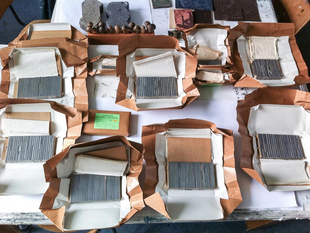
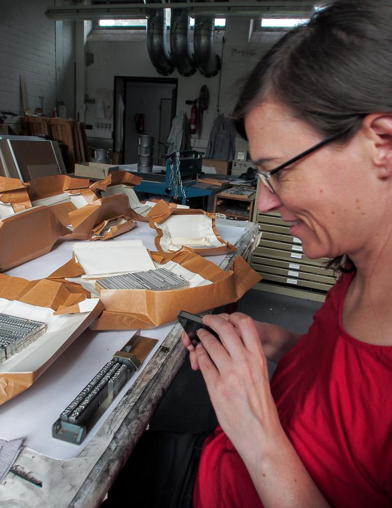
But not forgotten. For Tatler, it was finally time to attempt a worthy revival. To everyone involved, David Jonathan Ross was the right person to design it. Coincidentally, as that decision was being made, I was at the type shop of Eckehart SchumacherGebler in Dresden and found Forma Light foundry type in one of his drawers.
This find gave me the idea that there might still be metal Forma out there that could be used as a basis for the design, especially in the small sizes. According to SchumacherGebler, all matrices and type were lost, but just a few days later, I tracked down unused Forma at Rainer Gerstenberg’s foundry in Darmstadt-the last commercial type foundry in Europe. I contacted Gerstenberg, inquired about which sizes and styles he has in stock-probably cast by Nebiolo in the 1970s-and learned he even had matrices for a few fonts. Apparently, some Nebiolo matrices survived, having made their way to Germany after sales of material to the Haas foundry in Münchenstein, Switzerland, and the local collector Walter Fruttiger.
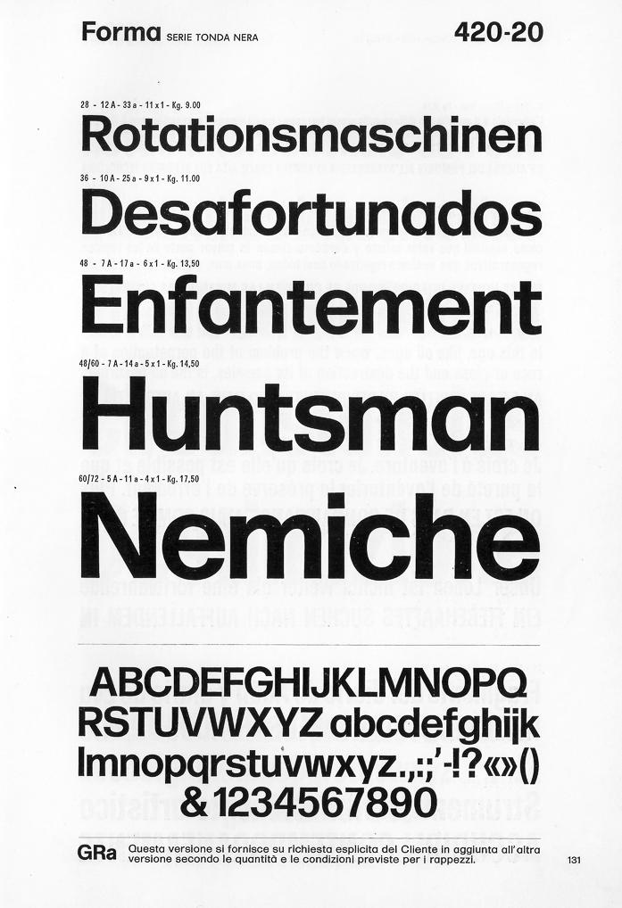
From the Nebiolo specimen
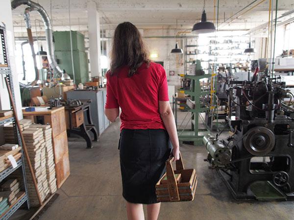
We decided to order Light, Regular, and Bold, in 8 pt and 10 pt, as well as the largest display sizes he had. Picking up the type from the foundry site was probably the most exciting font shopping experience imaginable. Fonts are heavy!
I took the fonts to my school’s print shop in Saarbrücken, to print proofs of the full character set, spacing strings, and sample text in all sizes and on different paper stock. (Unpacking freshly cast type was probably the second most exciting font shopping experience imaginable.)
“The fact that Herr Gerstenberg has held on to this type is a kind of cosmic compensation for all the Nebiolo type that has been lost,” Roger wrote in an email. “In 1977, I remember finding out that the New York type shop Metro had melted down the only known Egiziano fonts in New York. They had had them all. I chased the salesman through the office, screaming ‘Type Murderer!’ If I had not been held back by my secretary, I probably would have killed the guy.”
Font shopping at Schriftgießerei Gerstenberg. This is one of three wooden crates; my car lowered significantly upon loading the fonts.
Unpacking Forma.
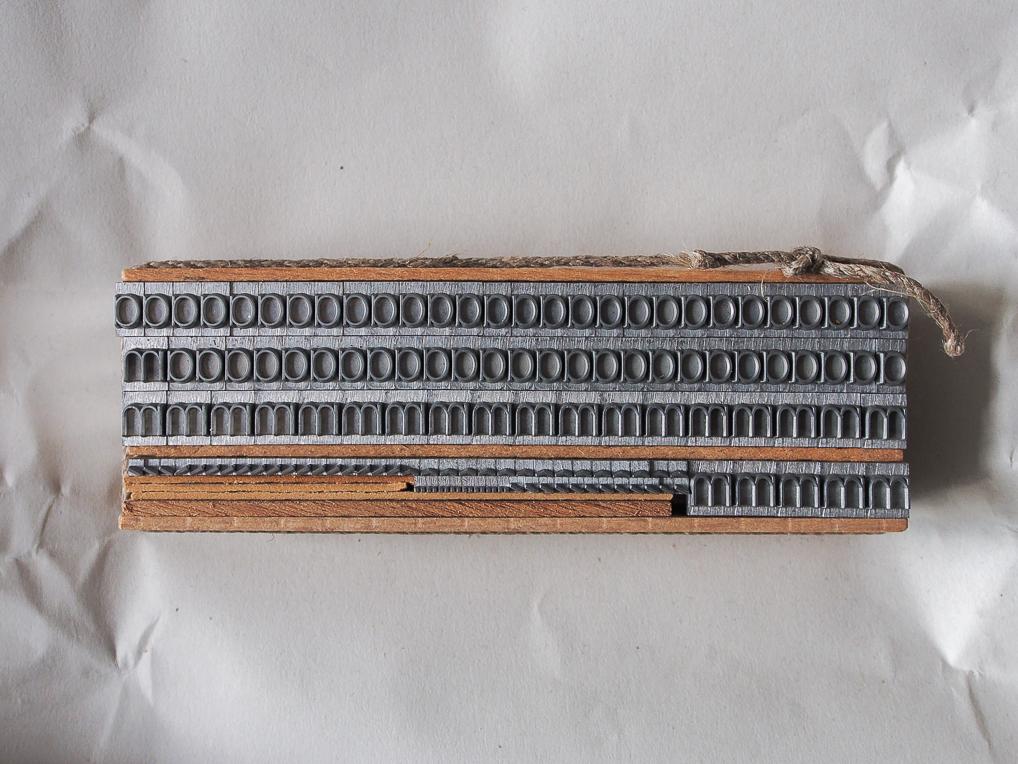
as and ms
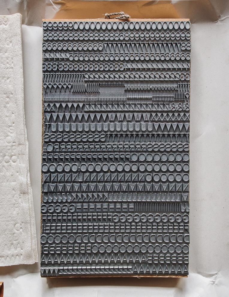
Forma Light.
Me in font heaven. From HBKsaar’s print shop, I reported to Hong Kong and the US by the minute.
Taking the laborious route of proofing metal type, in both text and display sizes, was a first for a Font Bureau revival project. But it had the advantage of informing design decisions for the size-specific variants. “There is something to be learned by proofing at three sizes, both on clay-coated repro-paper and on book stock,” says Roger. “Novarese knew what he was doing. Even certain weird characteristics of the design were there for a reason, I believe.” Furthermore, the foundry specimens don’t show the full character sets of the fonts.
Once proofs were made, I scanned the prints as well as the Nebiolo specimens and sent them to David Jonathan Ross. “At first I was hesitant to do a revival of what I thought was a Helvetica knockoff,” said DJR, “but what made it interesting was learning to see what Roger sees in it and trying to bring that out in a modern design. It’s a revival of what he loves about Forma. If you do a character-to-character comparison with Helvetica, the differences may seem small, but the overall appearance has a very different feel.
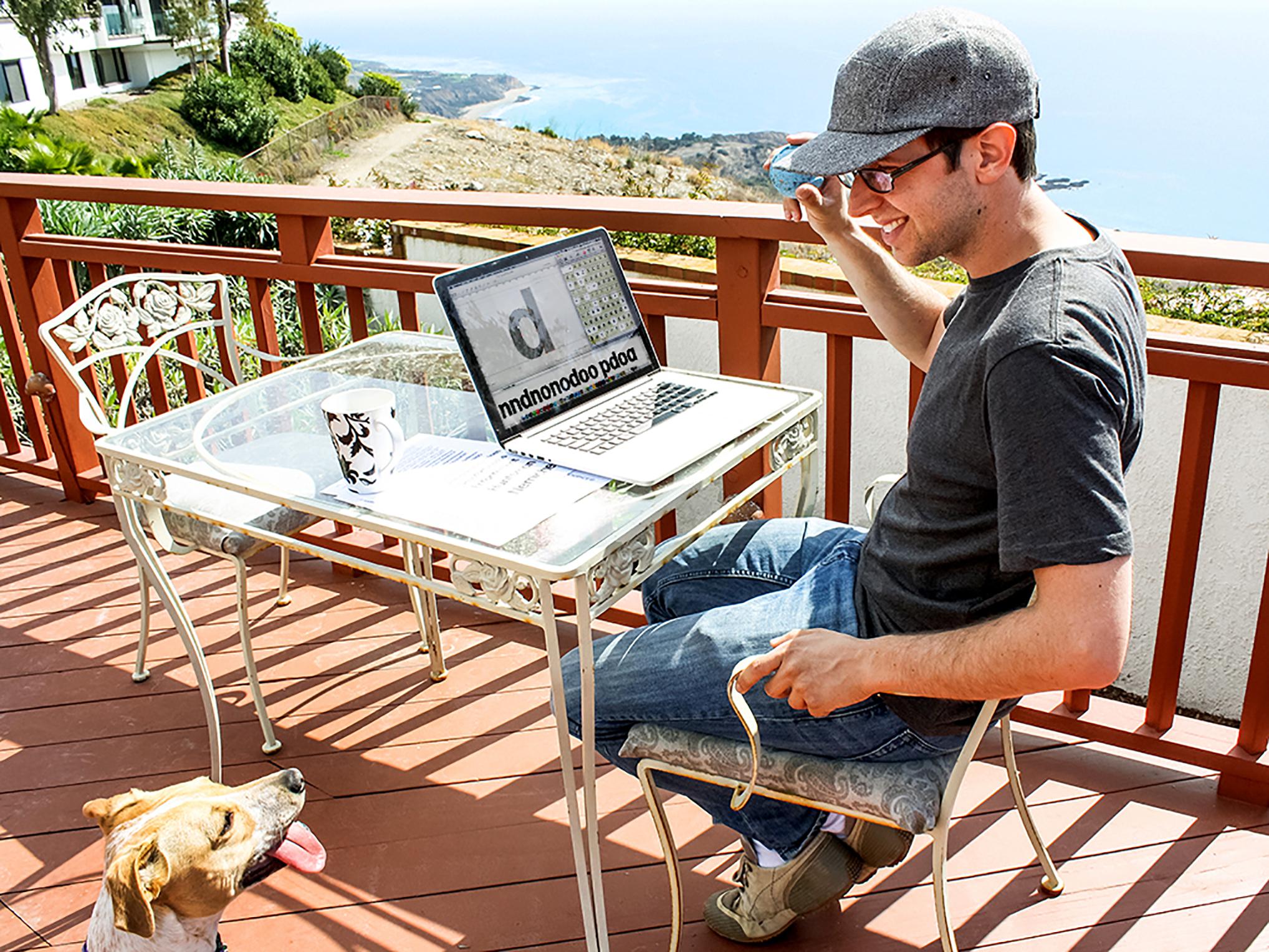
Type designer David Jonathan Ross.
“This was my first time working so directly from a source. I did do some tracing at first to help get general contrast and proportions, but when you get down to that level of detail, the scans from Indra’s proofs of the metal type were different than the scans of the specimen. By that point the digital Forma had a life of its own and the scans were more of a reference, giving me a general sense of how a certain character was drawn or how tightly text should be spaced at that size.”
Initially, I thought that the slight tapering of the stems was just a printing artifact, but it was intentional, as is clearly visible in this drawing of original Forma. The tapering is strongest in small sizes, mainly visible in bold weights, and almost undetectable in large sizes. If you compare Forma with Eurostile, Recta, and Semplicità in the same specimen book, the latter typefaces have much straighter stems and sharper edges. “It is exactly these characteristics-the tapered stems, the rounded corners, the ‘routed’ counters-that make Forma warmer than Helvetica or Univers,” Roger says. “This is what we wanted to bring out in the design.”
Roger: “God! It’s so seventies. Probably why I like it!”
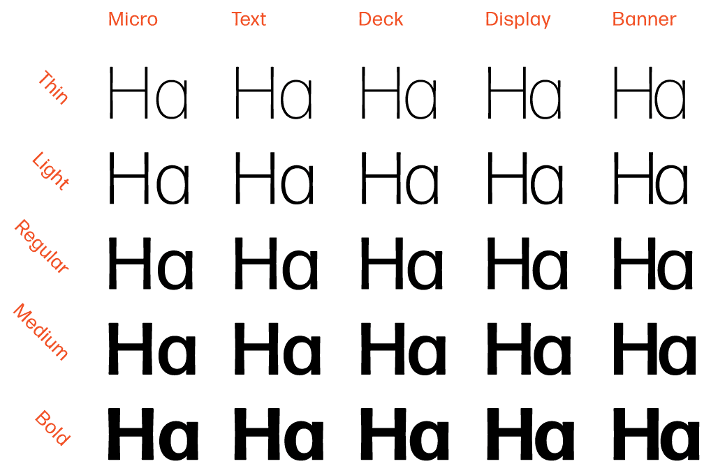
David extensively explored the tapered and rounded qualities, setting up interpolations in Robofont to determine what the style gamut should be for different sizes. “It was clear from the beginning,” he said, “that Novarese and the team knew what they were doing with the size range. In fact, I don’t think Forma would be as compelling without the increased emphasis on these features as sizes got smaller.” He identified five size ranges—probably two more than Nebiolo’s:
- Micro (agate)
- Text
- Deck (small display)
- Display
- Banner (large display)

David Jonathan Ross draws letters of all shapes and sizes for custom and retail typeface designs.
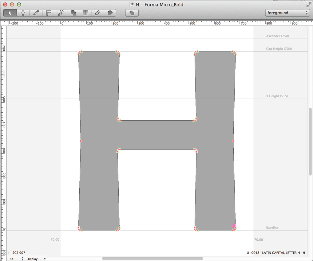
DJR: “In this screenshot, you can see how the tapering works in the Micro. No scan actually had edges like that. It was about finding a digital interpretation that would achieve the effect that Roger was looking for—one that is flexible enough to be used across weights and optical sizes, and that felt at home with the spirit of the typeface.”
Forma’s weights and optical sizes.

Distinct tapering of stems is especially visible in the original bold weights (shown above the digital version).
Forma Display Bold and Light.
“Whenever I looked at the project fresh,” said David, “I was struck with how tightly this metal type fits.” The tight-but-not-touching style, then and since rejected by the purists, was a chief characteristic of commercial typography in the 1960s. Roger kept pounding on the idea, said David, “like he was trying to summon the ghost of Herb Lubalin.” At first David tried to space the fonts by evening out inter-character spaces with inner-character counters, but Roger demanded tighter and tighter spacing. “In the end, we deviated from the metal, allowing some characters to collide in order to maximize the tight-but-not-touching aspect.”
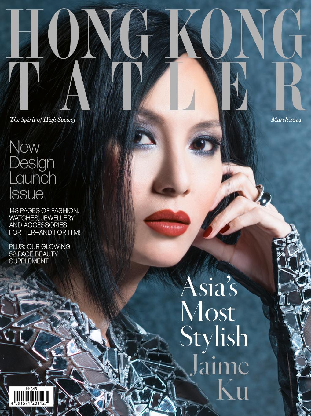
Hong Kong Tatler, March 2014 cover.
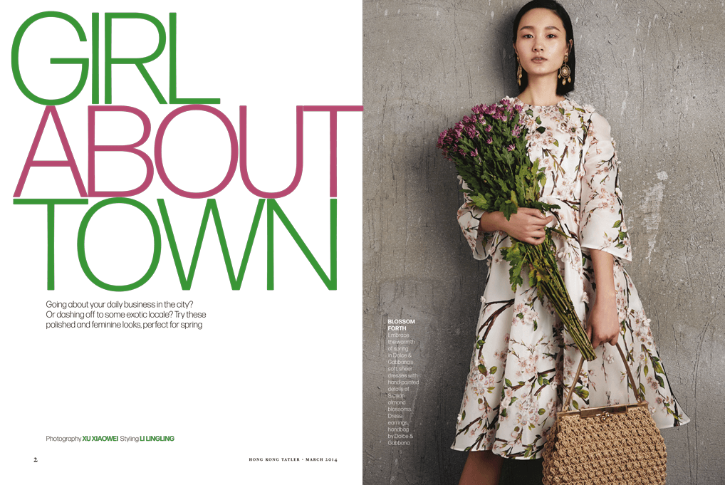
Hong Kong Tatler spread.
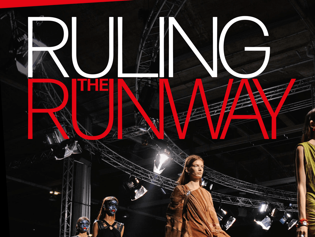
Hong Kong Tatler page detail.
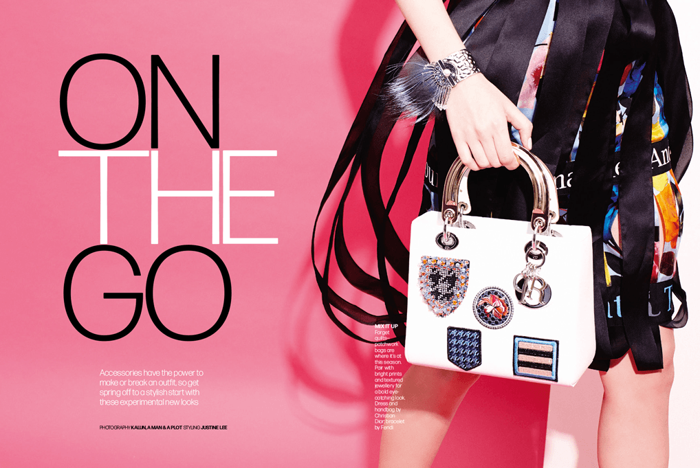
Hong Kong Tatler spread.
On November 16, 2013 Roger notes: “This is Forma!!!” And from there, the fonts were implemented and the magazine’s redesign began. Today the new Hong Kong Tatler appears, to be followed by launches in seven editions, from Macau to Taipei, all dressed up in new digital Forma.
In the coming months, the family will be complemented with italics. Forma will eventually be released, with web fonts, for general use, and there are even plans for other unsung Italian gems. Amore vecchio non fa ruggine. ●

October 11, 2023 · Brochure
A revival of Aldo Novarese’s Forma comes at a time when mid-century design has never been more stylish.
82 styles
Every weight, width, style, and script of Forma DJR, available exclusively on Type Network.