Bitcount Prop
This spacing variant contains glyphs as wide as they need to be (e.g. “m” and “M”), including their necessary spacing and kerning. The vertical metrics (accents, ascender, and descenders) is identical to the Mono variant.

The DrawBot script that generates this animation is explained here
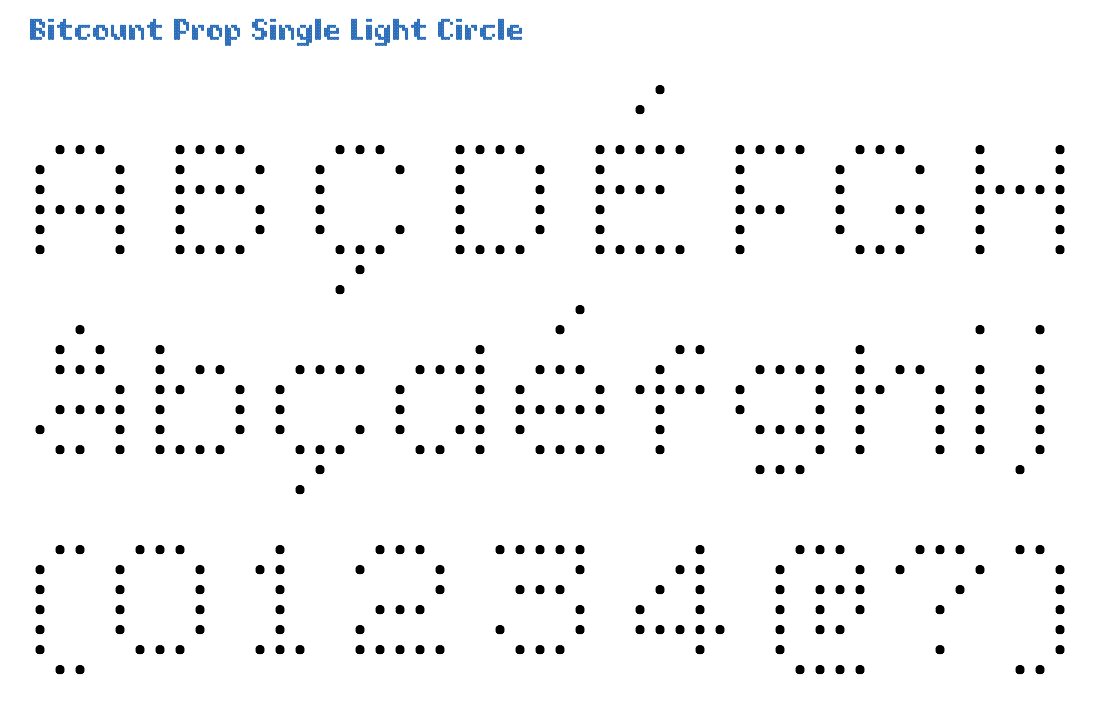
The Prop variant has full kerning for all glyph combinations where necessary. In Single glyphs, stems are defined by one pixel. This makes thinner letters, but also leaves too much space in diagonals. The Light is almost too light be used by itself. But it can well be used as highlight in combination with other shapes and weights. Circle pixels suggest better “rounds” and diagonals than Square. Circle pixels can be used to for letters with sushi rolls. Or flower pots.
Click on this image to open the TypeNetwork specimen page on this style in a separate window.
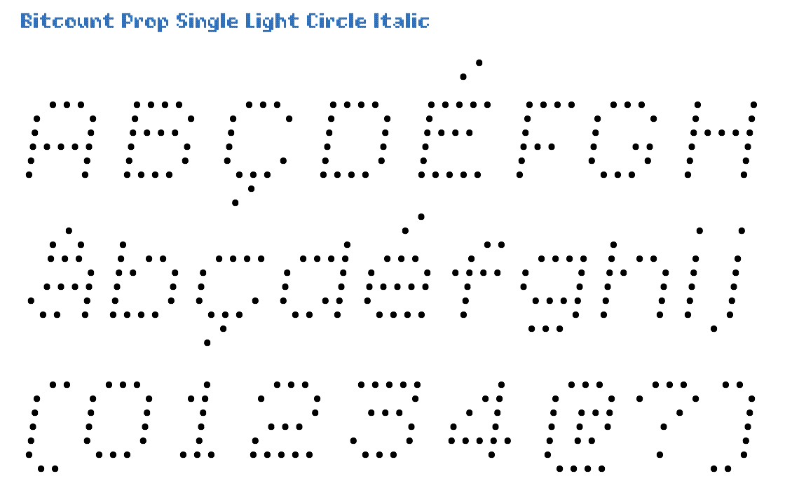
The Italic variant is identical to Roman, with a slant of 14/100 angle. Italic glyphs with Circle pixels just have them shifted over a 14/100 angle. There are no “slanted” circles.
Click on this image to open the TypeNetwork specimen page on this style in a separate window.

The Prop matrix measures 1/10 of the EM square for each pixel position. In the Double there is an addition “constrast-pixel” in some glyphs to fill diagonal holes. They can be removed by OpenType feature [ss05]. As the Light weight pixels register on the grid for alignment in layers with other shapes and weights, they are positioned above the base line. Circle pixels suggest better “rounds” and diagonals than Square. Circle pixels can be used to simulate Led displays.
Click on this image to open the TypeNetwork specimen page on this style in a separate window.
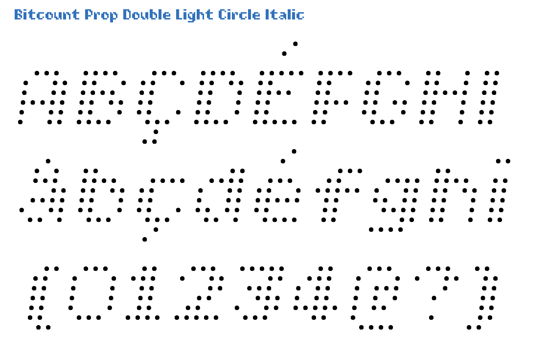
The Italic variant is identical to Roman, with a slant of 14/100 angle. Italic glyphs with Circle pixels just have them shifted over a 14/100 angle. There are no “slanted” circles.
Click on this image to open the TypeNetwork specimen page on this style in a separate window.

The Prop is the variant of Bitcount with proportional spacing. In Single glyphs, stems are defined by one pixel. This makes thinner letters, but also leaves too much space in diagonals. Book is the middle between weights Light and Regular. Circle pixels suggest better “rounds” and diagonals than Square. Circle pixels can be used to for letters with tennis balls. Or eggs.
Click on this image to open the TypeNetwork specimen page on this style in a separate window.
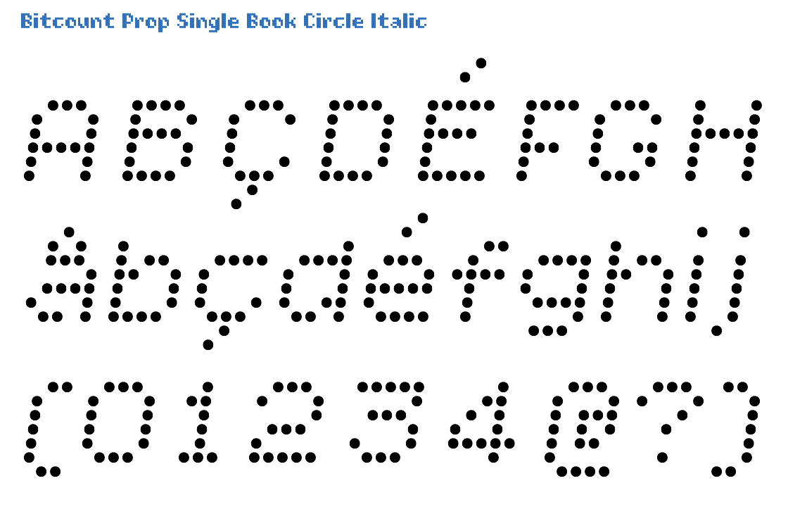
The Italic variant is identical to Roman, with a slant of 14/100 angle. Italic glyphs with Circle pixels just have them shifted over a 14/100 angle. There are no “slanted” circles.
Click on this image to open the TypeNetwork specimen page on this style in a separate window.
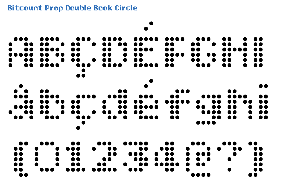
Prop variants have fractions avaialble as OpenType feature [frac], in superior/inferior figures of 2x4 pixels. In the Double there is an addition “constrast-pixel” in some glyphs to fill diagonal holes. They can be removed by OpenType feature [ss05]. In the Book weight the pixels are larger than Light and smaller than Regular, 72/1000 of the EM size. Circle pixels suggest better “rounds” and diagonals than Square. Circle pixels can be used to for letters with sushi rolls. Or flower pots.
Click on this image to open the TypeNetwork specimen page on this style in a separate window.

The Italic variant is identical to Roman, with a slant of 14/100 angle. Italic glyphs with Circle pixels just have them shifted over a 14/100 angle. There are no “slanted” circles.
Click on this image to open the TypeNetwork specimen page on this style in a separate window.
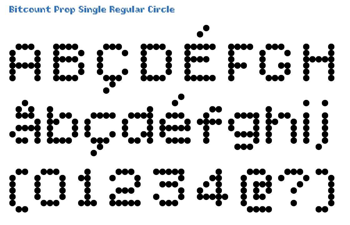
The Prop matrix measures 1/10 of the EM square for each pixel position. In Single glyphs, stems are defined by one pixel. This makes thinner letters, but also leaves too much space in diagonals. The Regular weight is between Book and Medium. Circle pixels suggest better “rounds” and diagonals than Square. Circle pixels can be used to for letters with tennis balls. Or eggs.
Click on this image to open the TypeNetwork specimen page on this style in a separate window.
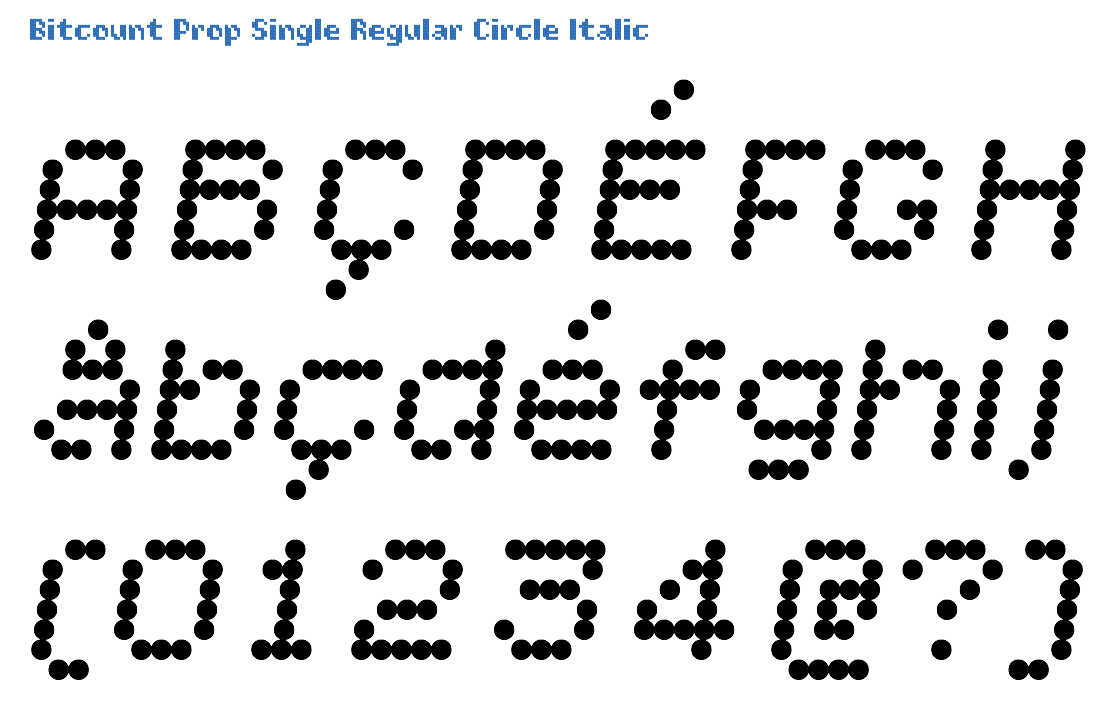
The Italic variant is identical to Roman, with a slant of 14/100 angle. Italic glyphs with Circle pixels just have them shifted over a 14/100 angle. There are no “slanted” circles.
Click on this image to open the TypeNetwork specimen page on this style in a separate window.
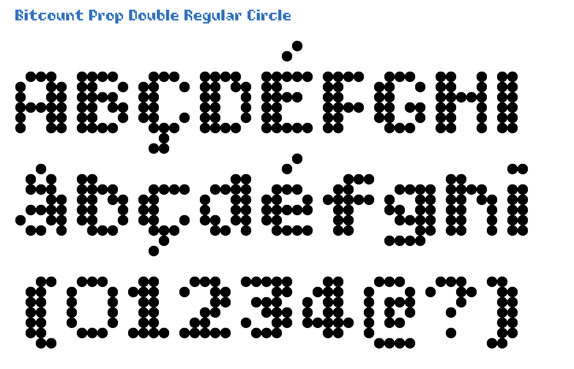
In the Prop variant all accents take the vertical space they need, different from Grid In some glyphs the “constrast-pixel” – filling diagonal holes – can be switched off by OpenType feature [ss05]. As all Regular weight pixels exactly match the grid, they are positioned on the base line. Circle pixels suggest better “rounds” and diagonals than Square. Circle pixels can be used to for letters with sushi rolls. Or flower pots.
Click on this image to open the TypeNetwork specimen page on this style in a separate window.
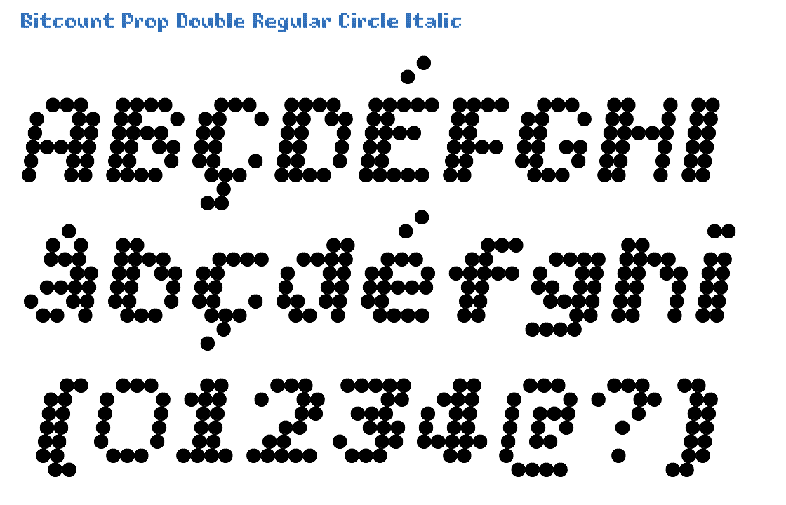
The Italic variant is identical to Roman, with a slant of 14/100 angle. Italic glyphs with Circle pixels just have them shifted over a 14/100 angle. There are no “slanted” circles.
Click on this image to open the TypeNetwork specimen page on this style in a separate window.
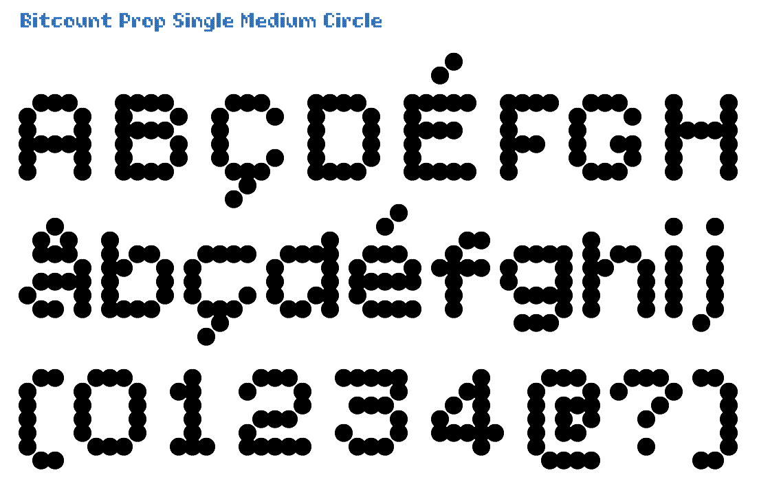
The Prop matrix measures 1/10 of the EM square for each pixel position. In Single variants there is an addition “constrast-pixel” in some glyphs to fill diagonal holes. It can be switches on as OpenType feature [ss04]. In the Medium weight the pixels are larger than Regular and smaller than Bold, 128/1000 of the EM size. Circle pixels suggest better “rounds” and diagonals than Square. The size of Medium Circle pixels, creates automatic natural ink-traps on diagonals.
Click on this image to open the TypeNetwork specimen page on this style in a separate window.
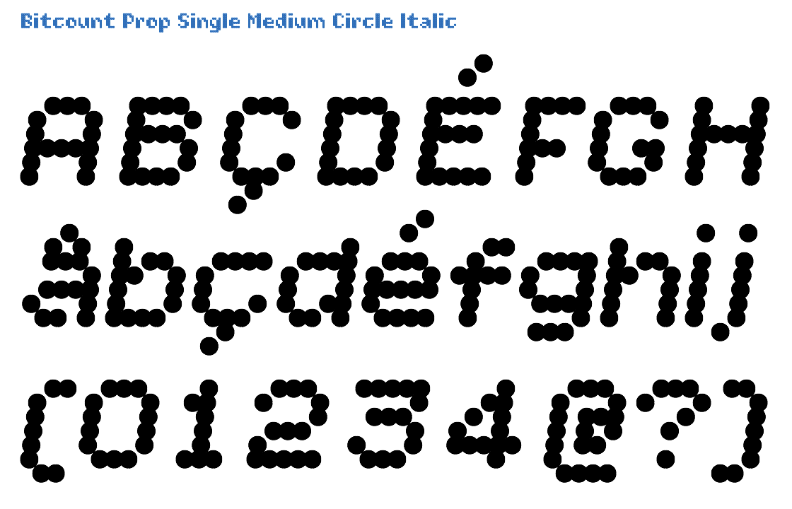
The Italic variant is identical to Roman, with a slant of 14/100 angle. Italic glyphs with Circle pixels just have them shifted over a 14/100 angle. There are no “slanted” circles.
Click on this image to open the TypeNetwork specimen page on this style in a separate window.

Prop variants have fractions avaialble as OpenType feature [frac], in superior/inferior figures of 2x4 pixels. The Double is how Bitcount started: adding contrast to even the smallest pixel matrix. The Medium pixels are thin enough to be used on their own, and yet leaving enough size in the counters. Circle pixels suggest better “rounds” and diagonals than Square. The size of Medium Circle pixels, creates automatic natural ink-traps on diagonals.
Click on this image to open the TypeNetwork specimen page on this style in a separate window.

The Italic variant is identical to Roman, with a slant of 14/100 angle. Italic glyphs with Circle pixels just have them shifted over a 14/100 angle. There are no “slanted” circles.
Click on this image to open the TypeNetwork specimen page on this style in a separate window.

All Prop glyphs can vertically use 10 pixels for accents and extended ascenders, identical to Mono. In Single glyphs, stems are defined by one pixel. This makes thinner letters, but also leaves too much space in diagonals. In the Bold weight the pixels are large, 156/1000 of the EM size. Circle pixels suggest better “rounds” and diagonals than Square.
Click on this image to open the TypeNetwork specimen page on this style in a separate window.
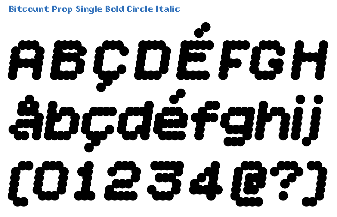
The Italic variant is identical to Roman, with a slant of 14/100 angle. Italic glyphs with Circle pixels just have them shifted over a 14/100 angle. There are no “slanted” circles.
Click on this image to open the TypeNetwork specimen page on this style in a separate window.
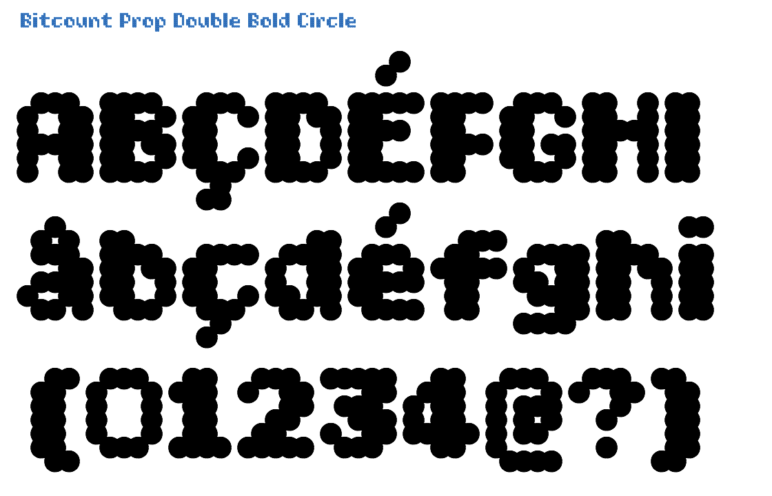
Prop has the same vertical spacing as Mono. In the Double variant, stems are made from 2 pixels where possible. This simulates the “contrast” of normal letters. As all Bold pixels register on the grid for better alignment in layers with other shapes and weights, they are positioned below the base line, with an overshoot of -28/1000 EM. Circle pixels suggest better “rounds” and diagonals than Square.
Click on this image to open the TypeNetwork specimen page on this style in a separate window.
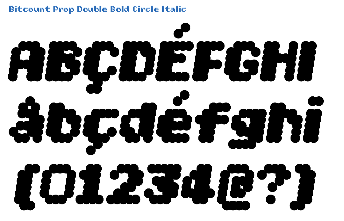
The Italic variant is identical to Roman, with a slant of 14/100 angle. Italic glyphs with Circle pixels just have them shifted over a 14/100 angle. There are no “slanted” circles.
Click on this image to open the TypeNetwork specimen page on this style in a separate window.

The DrawBot script that generates this animation is explained here

The glyphs of Prop variant have their own width, “i” is narrow, “m” and “W” are wide. In Single variants there is an addition “constrast-pixel” in some glyphs to fill diagonal holes. It can be switches on as OpenType feature [ss04]. The Light is almost too light be used by itself. But it can well be used as highlight in combination with other shapes and weights. Circle pixels suggest better “rounds” and diagonals than Square. All Line pixels have a thickness of 14/1000 EM. This is the exact difference between the weights pixels, causing the inside and outside of lines match up.
Click on this image to open the TypeNetwork specimen page on this style in a separate window.

The Italic variant is identical to Roman, with a slant of 14/100 angle. Italic glyphs with Circle pixels just have them shifted over a 14/100 angle. There are no “slanted” circles.
Click on this image to open the TypeNetwork specimen page on this style in a separate window.
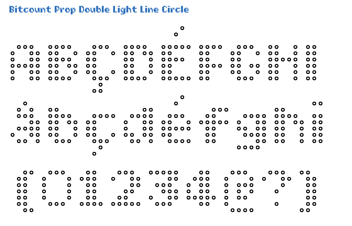
The glyphs of Prop variant have their own width, “i” is narrow, “m” and “W” are wide. Different from the Single, does Double not support the condensed OpenType feature, due to the lack of horizontal space. Light weight pixels are the lightest of all 5 weights. Circle pixels suggest better “rounds” and diagonals than Square. Circle pixels can be used to for letters with sushi rolls. Or flower pots. All Line pixels have a thickness of 14/1000 EM.
Click on this image to open the TypeNetwork specimen page on this style in a separate window.
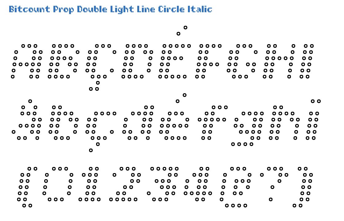
The Italic variant is identical to Roman, with a slant of 14/100 angle. Italic glyphs with Circle pixels just have them shifted over a 14/100 angle. There are no “slanted” circles.
Click on this image to open the TypeNetwork specimen page on this style in a separate window.

Prop variants have fractions avaialble as OpenType feature [frac], in superior/inferior figures of 2x4 pixels. In Single variants there is an addition “constrast-pixel” in some glyphs to fill diagonal holes. It can be switches on as OpenType feature [ss04]. In the Book weight the pixels are larger than Light and smaller than Regular, 72/1000 of the EM size. Circle pixels suggest better “rounds” and diagonals than Square. Circle pixels can be used to for letters with tennis balls. Or eggs. All Line pixels have a thickness of 14/1000 EM.
Click on this image to open the TypeNetwork specimen page on this style in a separate window.
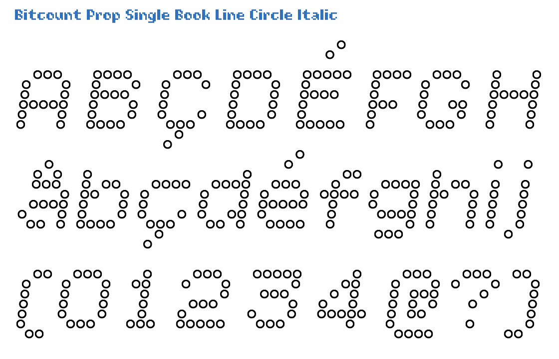
The Italic variant is identical to Roman, with a slant of 14/100 angle. Italic glyphs with Circle pixels just have them shifted over a 14/100 angle. There are no “slanted” circles.
Click on this image to open the TypeNetwork specimen page on this style in a separate window.
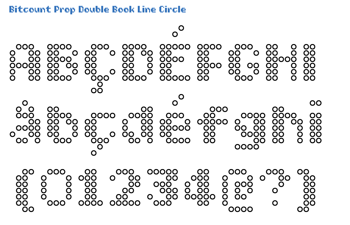
Prop variants have fractions avaialble as OpenType feature [frac], in superior/inferior figures of 2x4 pixels. The Double is how Bitcount started: adding contrast to even the smallest pixel matrix. Book is the middle between weights Light and Regular. Circle pixels suggest better “rounds” and diagonals than Square. Circle pixels can be used to for letters with sushi rolls. Or flower pots. All Line pixels have a thickness of 14/1000 EM.
Click on this image to open the TypeNetwork specimen page on this style in a separate window.
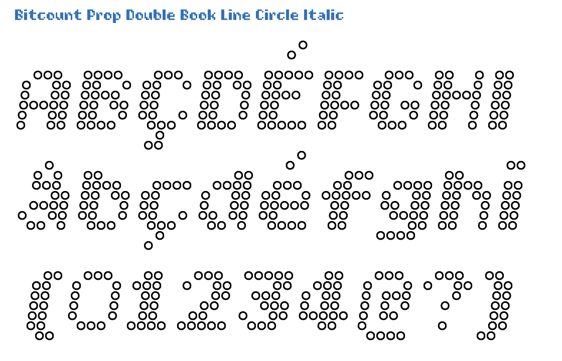
The Italic variant is identical to Roman, with a slant of 14/100 angle. Italic glyphs with Circle pixels just have them shifted over a 14/100 angle. There are no “slanted” circles.
Click on this image to open the TypeNetwork specimen page on this style in a separate window.

Prop variants have fractions avaialble as OpenType feature [frac], in superior/inferior figures of 2x4 pixels. To fill diagonal holes in some glyphs, the “constrast-pixel” can be switched on by OpenType feature [ss04]. The Regular weight pixels have a diameter of 1/10 of the EM size, excactly touching each other. Circle pixels suggest better “rounds” and diagonals than Square. All Line pixels have a thickness of 14/1000 EM.
Click on this image to open the TypeNetwork specimen page on this style in a separate window.
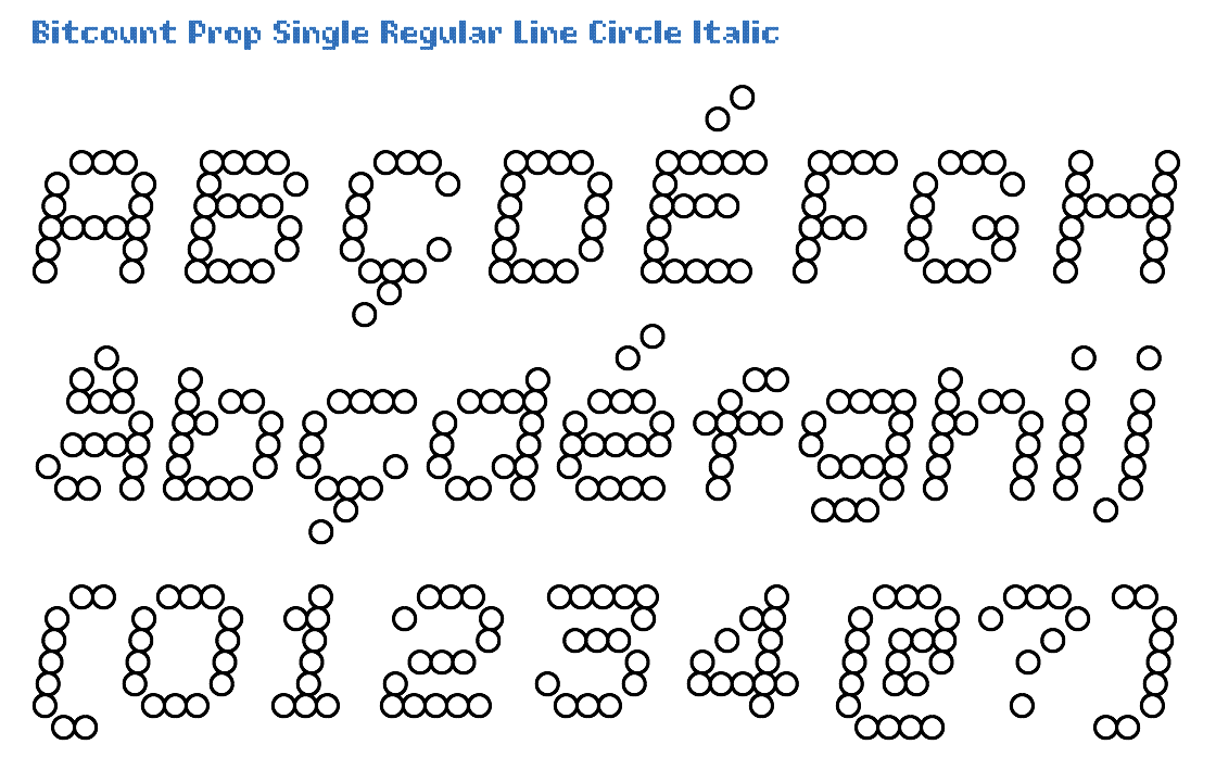
The Italic variant is identical to Roman, with a slant of 14/100 angle. Italic glyphs with Circle pixels just have them shifted over a 14/100 angle. There are no “slanted” circles.
Click on this image to open the TypeNetwork specimen page on this style in a separate window.
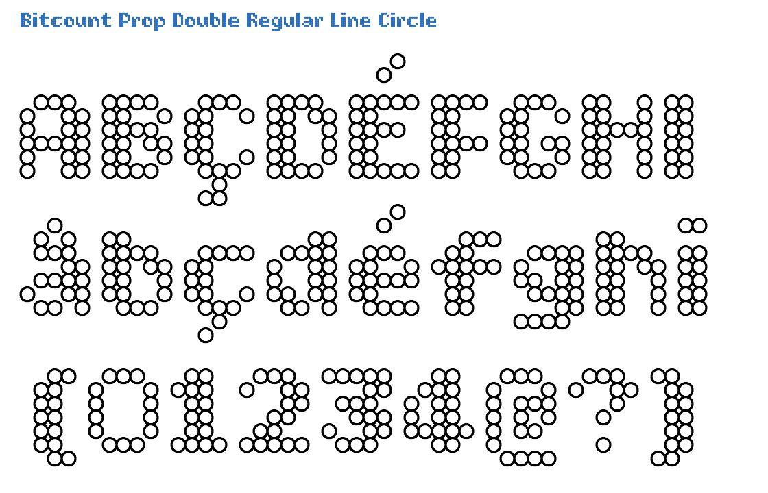
The Prop variant has full kerning for all glyph combinations where necessary. The Double is how Bitcount started: adding contrast to even the smallest pixel matrix. As all Regular weight pixels exactly match the grid, they are positioned on the base line. Circle pixels suggest better “rounds” and diagonals than Square. Circle pixels can be used to for letters with tennis balls. Or eggs. All Line pixels have a thickness of 14/1000 EM. This is the exact difference between the weights pixels, causing the inside and outside of lines match up.
Click on this image to open the TypeNetwork specimen page on this style in a separate window.
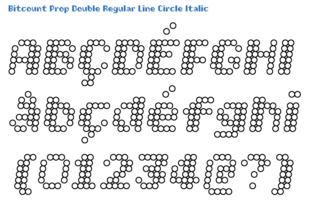
The Italic variant is identical to Roman, with a slant of 14/100 angle. Italic glyphs with Circle pixels just have them shifted over a 14/100 angle. There are no “slanted” circles.
Click on this image to open the TypeNetwork specimen page on this style in a separate window.
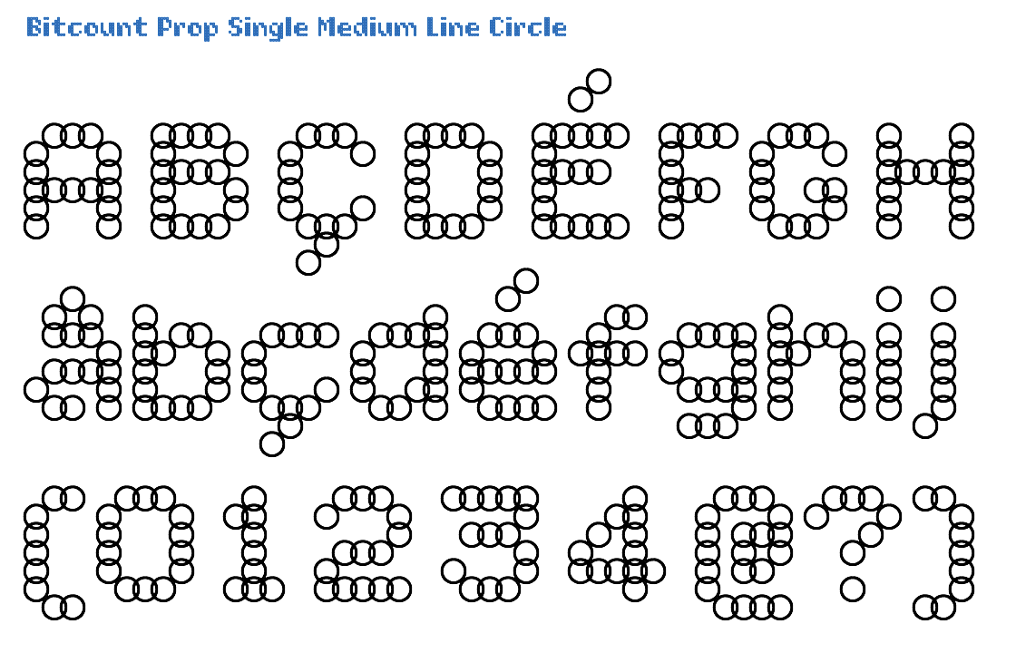
All capitals of the Prop variant have 2 white pixels on the side to allow for better spacing. In Single variants there is an addition “constrast-pixel” in some glyphs to fill diagonal holes. It can be switches on as OpenType feature [ss04]. The Medium pixels are thin enough to be used on their own, and yet leaving enough size in the counters. Circle pixels suggest better “rounds” and diagonals than Square. The size of Medium Circle pixels, creates automatic natural ink-traps on diagonals. All Line pixels have a thickness of 14/1000 EM. This is the exact difference between the weights pixels, causing the inside and outside of lines match up.
Click on this image to open the TypeNetwork specimen page on this style in a separate window.
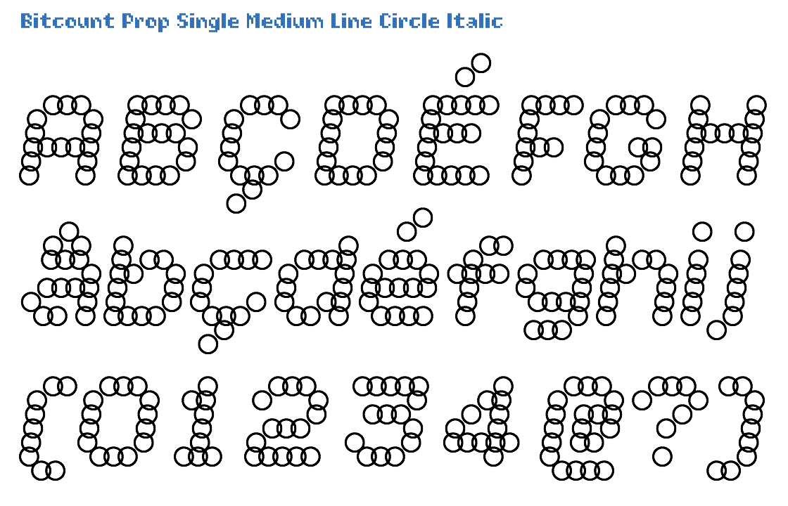
The Italic variant is identical to Roman, with a slant of 14/100 angle. Italic glyphs with Circle pixels just have them shifted over a 14/100 angle. There are no “slanted” circles.
Click on this image to open the TypeNetwork specimen page on this style in a separate window.

All glyphs of the Prop have their own pixel width, different from Grid and Mono. Different from the Single, does Double not support the condensed OpenType feature, due to the lack of horizontal space. As all Medium pixels register on the grid for better alignment in layers with other shapes and weights, they are positioned below base line, with an overshoot of -28/1000 EM. Circle pixels suggest better “rounds” and diagonals than Square. The size of Medium Circle pixels, creates automatic natural ink-traps on diagonals. All Line pixels have a thickness of 14/1000 EM, making the, making them match with the size and position of other shapes and weights.
Click on this image to open the TypeNetwork specimen page on this style in a separate window.

The Italic variant is identical to Roman, with a slant of 14/100 angle. Italic glyphs with Circle pixels just have them shifted over a 14/100 angle. There are no “slanted” circles.
Click on this image to open the TypeNetwork specimen page on this style in a separate window.

The Prop matrix measures 1/10 of the EM square for each pixel position. Single variants have a full condensed glyph set, accessable as OpenType feature [ss07]. The Bold is almost too dark be used by itself, laving small counters. But can well be used as background or shadow in combination with other shapes and weights. Circle pixels suggest better “rounds” and diagonals than Square. All Line pixels have a thickness of 14/1000 EM. This is the exact difference between the weights pixels, causing the inside and outside of lines match up.
Click on this image to open the TypeNetwork specimen page on this style in a separate window.

The Italic variant is identical to Roman, with a slant of 14/100 angle. Italic glyphs with Circle pixels just have them shifted over a 14/100 angle. There are no “slanted” circles.
Click on this image to open the TypeNetwork specimen page on this style in a separate window.

In the Prop variant all accents take the vertical space they need, different from Grid Different from the Single, does Double not support the condensed OpenType feature, due to the lack of horizontal space. In the Bold weight the pixels are large, 156/1000 of the EM size. Circle pixels suggest better “rounds” and diagonals than Square. All Line pixels have a thickness of 14/1000 EM.
Click on this image to open the TypeNetwork specimen page on this style in a separate window.
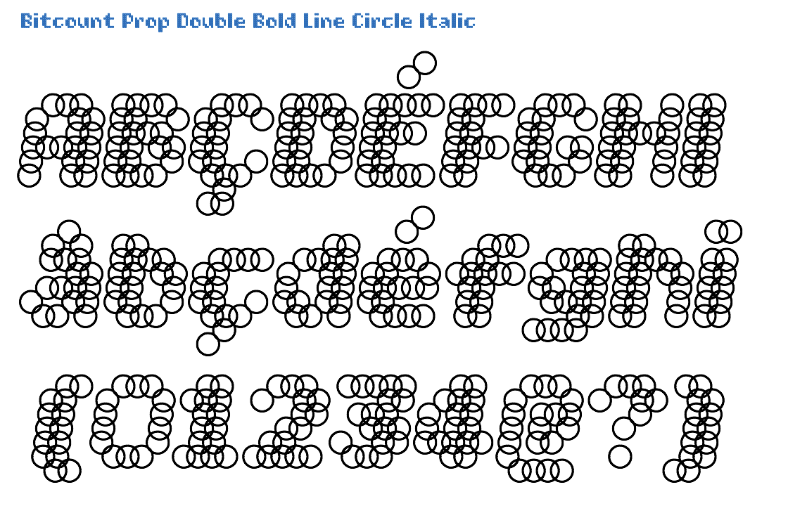
The Italic variant is identical to Roman, with a slant of 14/100 angle. Italic glyphs with Circle pixels just have them shifted over a 14/100 angle. There are no “slanted” circles.
Click on this image to open the TypeNetwork specimen page on this style in a separate window.

The DrawBot script that generates this animation is explained here
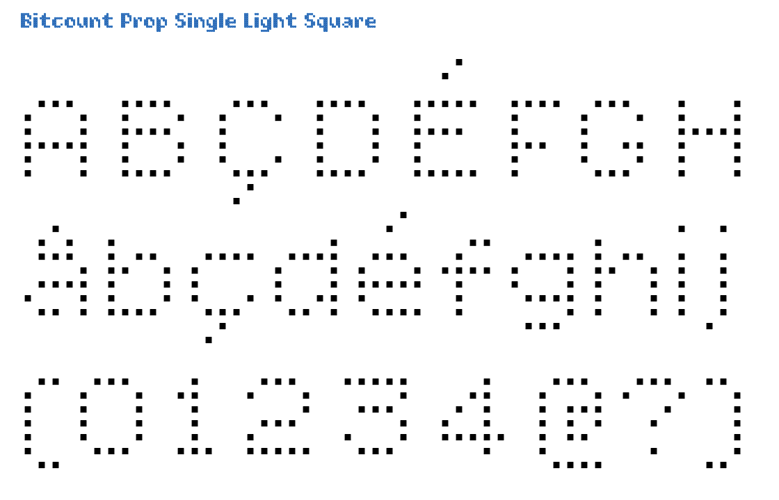
Prop variants have fractions avaialble as OpenType feature [frac], in superior/inferior figures of 2x4 pixels. To fill diagonal holes in some glyphs, the “constrast-pixel” can be switched on by OpenType feature [ss04]. As the Light weight pixels register on the grid for alignment in layers with other shapes and weights, they are positioned above the base line. Square pixels line up, making straight stems, but they also have jagged “rounds” and diagonals.
Click on this image to open the TypeNetwork specimen page on this style in a separate window.
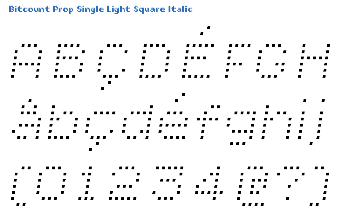
The Italic variant is identical to Roman, with a slant of 14/100 angle. Italic glyphs have slanted Square pixels with the same angle as the glyph, to make the pixels match up on the stems. This avoids “stair-case” lines.
Click on this image to open the TypeNetwork specimen page on this style in a separate window.
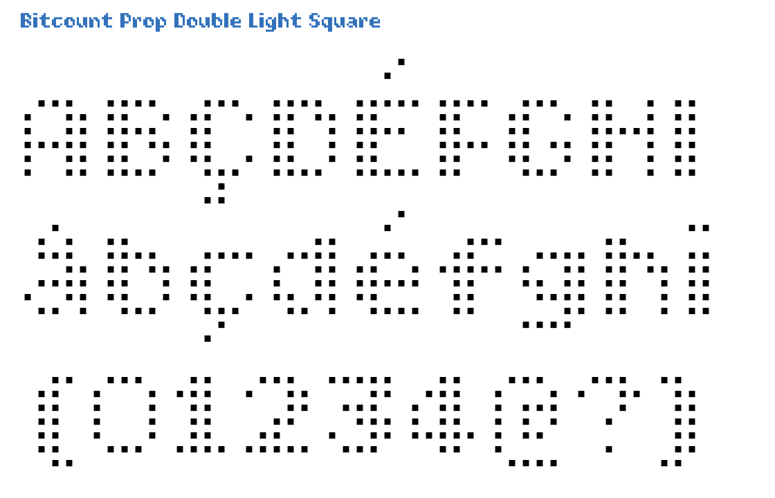
The Prop variant has full kerning for all glyph combinations where necessary. In some glyphs the “constrast-pixel” – filling diagonal holes – can be switched off by OpenType feature [ss05]. As the Light weight pixels register on the grid for alignment in layers with other shapes and weights, they are positioned above the base line. Square pixels line up, making straight stems, but they also have jagged “rounds” and diagonals.
Click on this image to open the TypeNetwork specimen page on this style in a separate window.

The Italic variant is identical to Roman, with a slant of 14/100 angle. Italic glyphs have slanted Square pixels with the same angle as the glyph, to make the pixels match up on the stems. This avoids “stair-case” lines.
Click on this image to open the TypeNetwork specimen page on this style in a separate window.

Prop has the same vertical spacing as Mono. To fill diagonal holes in some glyphs, the “constrast-pixel” can be switched on by OpenType feature [ss04]. The Book weight pixels are thick enough to use on their own, and yet not touching each other. Square pixels line up, making straight stems, but they also have jagged “rounds” and diagonals.
Click on this image to open the TypeNetwork specimen page on this style in a separate window.

The Italic variant is identical to Roman, with a slant of 14/100 angle. Italic glyphs have slanted Square pixels with the same angle as the glyph, to make the pixels match up on the stems. This avoids “stair-case” lines.
Click on this image to open the TypeNetwork specimen page on this style in a separate window.
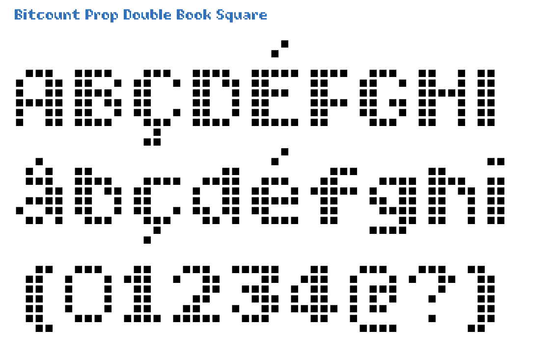
In the Prop variant all accents take the vertical space they need, different from Grid The Double is how Bitcount started: adding contrast to even the smallest pixel matrix. The Book weight pixels are thick enough to use on their own, and yet not touching each other. Square pixels line up, making straight stems, but they also have jagged “rounds” and diagonals.
Click on this image to open the TypeNetwork specimen page on this style in a separate window.

The Italic variant is identical to Roman, with a slant of 14/100 angle. Italic glyphs have slanted Square pixels with the same angle as the glyph, to make the pixels match up on the stems. This avoids “stair-case” lines.
Click on this image to open the TypeNetwork specimen page on this style in a separate window.
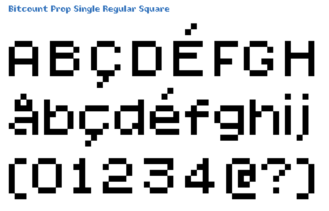
The Prop variant has full kerning for all glyph combinations where necessary. Single variants have a full condensed glyph set, accessable as OpenType feature [ss07]. In the Regular weight the pixels are larger than Book and smaller than Medium, 1/10 of the EM size. Square pixels line up, making straight stems, but they also have jagged “rounds” and diagonals. Square Regular pixels can be used for building with pieces of Lego.
Click on this image to open the TypeNetwork specimen page on this style in a separate window.
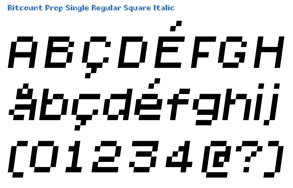
The Italic variant is identical to Roman, with a slant of 14/100 angle. Italic glyphs have slanted Square pixels with the same angle as the glyph, to make the pixels match up on the stems. This avoids “stair-case” lines.
Click on this image to open the TypeNetwork specimen page on this style in a separate window.

In the Prop variant all accents take the vertical space they need, different from Grid In the Double variant, stems are made from 2 pixels where possible. This simulates the “contrast” of normal letters. The Regular weight lies between Light and Bold. Square pixels line up, making straight stems, but they also have jagged “rounds” and diagonals.
Click on this image to open the TypeNetwork specimen page on this style in a separate window.

The Italic variant is identical to Roman, with a slant of 14/100 angle. Italic glyphs have slanted Square pixels with the same angle as the glyph, to make the pixels match up on the stems. This avoids “stair-case” lines.
Click on this image to open the TypeNetwork specimen page on this style in a separate window.
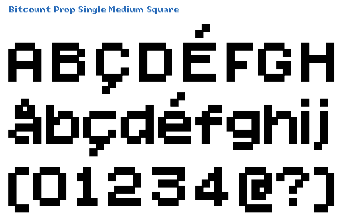
The Prop is the variant of Bitcount with proportional spacing. In Single variants there is an addition “constrast-pixel” in some glyphs to fill diagonal holes. It can be switches on as OpenType feature [ss04]. The Medium pixels have a diameter of 128/1000 of the EM size and an overlap of 28/1000. Square pixels line up, making straight stems, but they also have jagged “rounds” and diagonals.
Click on this image to open the TypeNetwork specimen page on this style in a separate window.
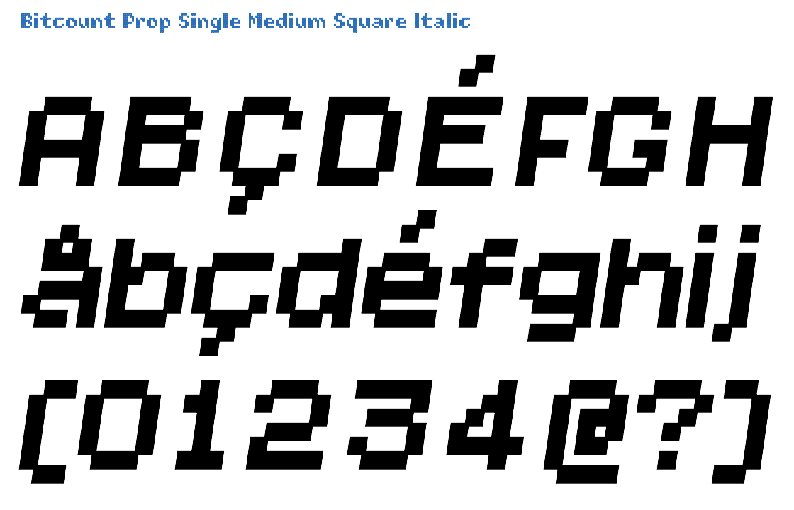
The Italic variant is identical to Roman, with a slant of 14/100 angle. Italic glyphs have slanted Square pixels with the same angle as the glyph, to make the pixels match up on the stems. This avoids “stair-case” lines.
Click on this image to open the TypeNetwork specimen page on this style in a separate window.

All capitals of the Prop variant have 2 white pixels on the side to allow for better spacing. In some glyphs the “constrast-pixel” – filling diagonal holes – can be switched off by OpenType feature [ss05]. Medium is the weight on the middle between Regular and Bold. Square pixels line up, making straight stems, but they also have jagged “rounds” and diagonals.
Click on this image to open the TypeNetwork specimen page on this style in a separate window.
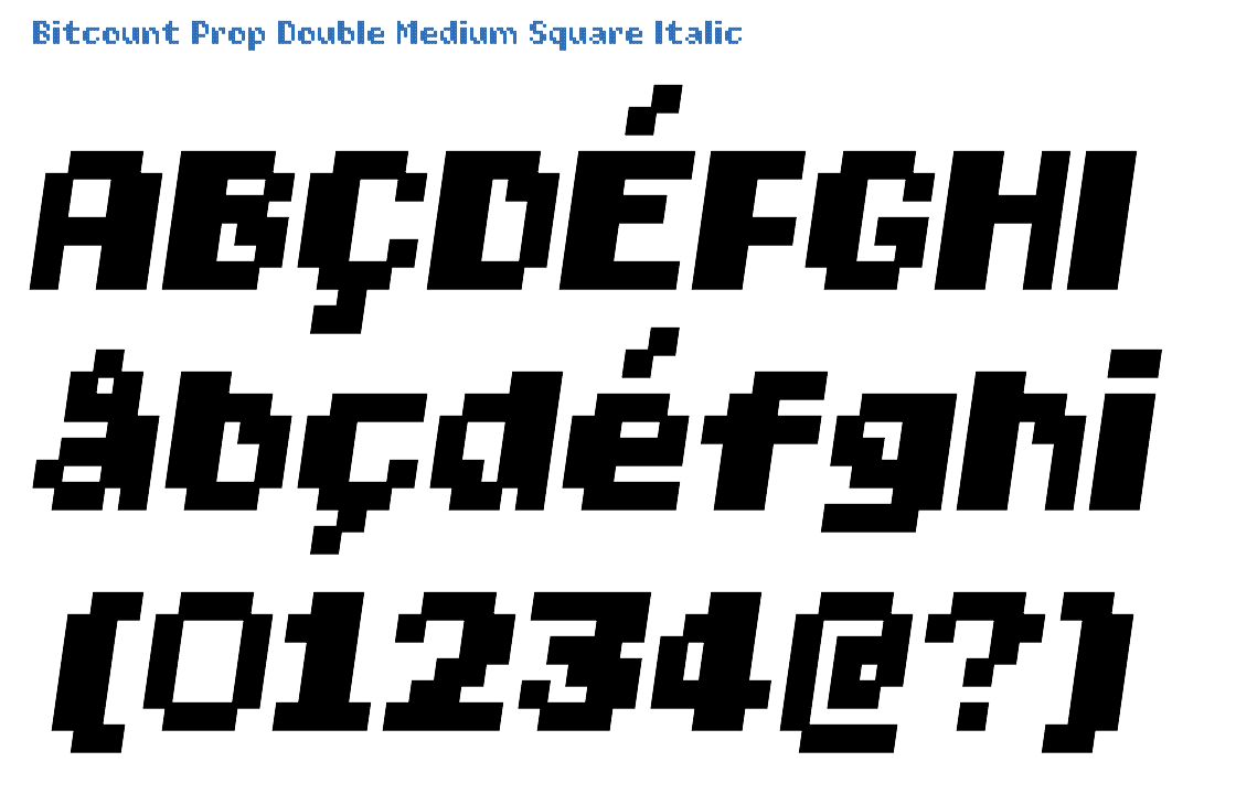
The Italic variant is identical to Roman, with a slant of 14/100 angle. Italic glyphs have slanted Square pixels with the same angle as the glyph, to make the pixels match up on the stems. This avoids “stair-case” lines.
Click on this image to open the TypeNetwork specimen page on this style in a separate window.
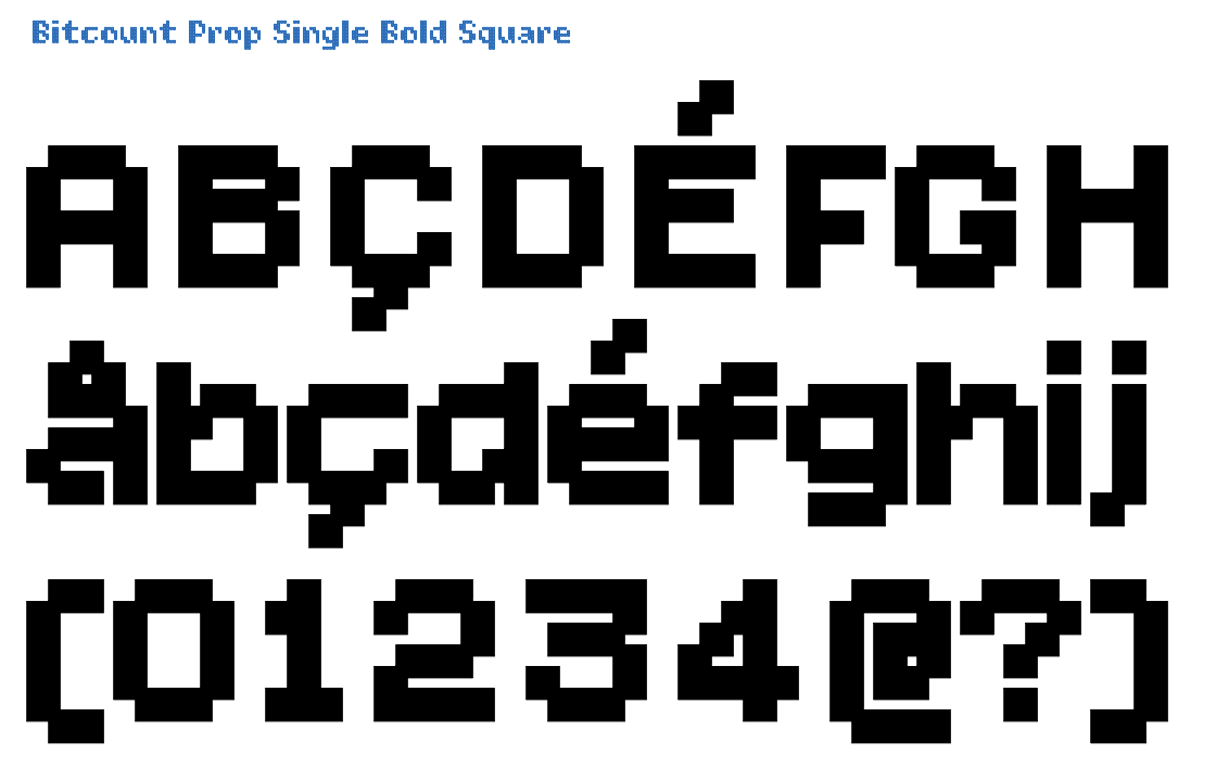
All Prop glyphs can vertically use 10 pixels for accents and extended ascenders, identical to Mono. To fill diagonal holes in some glyphs, the “constrast-pixel” can be switched on by OpenType feature [ss04]. The Bold is almost too dark be used by itself, laving small counters. But can well be used as background or shadow in combination with other shapes and weights. Square pixels line up, making straight stems, but they also have jagged “rounds” and diagonals.
Click on this image to open the TypeNetwork specimen page on this style in a separate window.
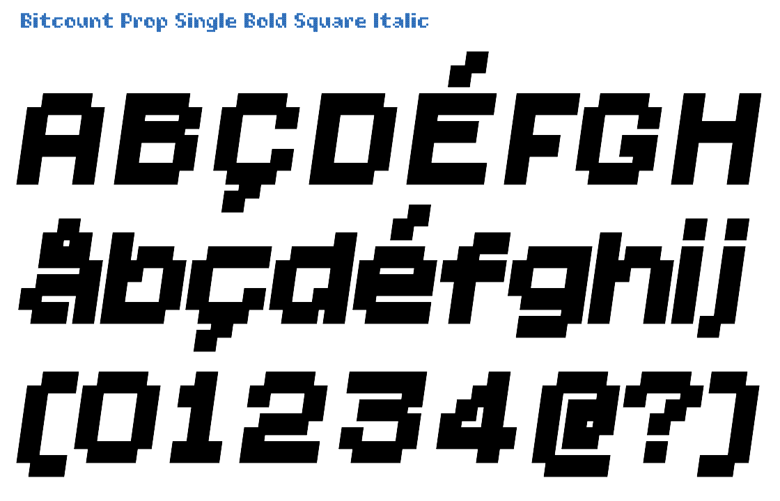
The Italic variant is identical to Roman, with a slant of 14/100 angle. Italic glyphs have slanted Square pixels with the same angle as the glyph, to make the pixels match up on the stems. This avoids “stair-case” lines.
Click on this image to open the TypeNetwork specimen page on this style in a separate window.
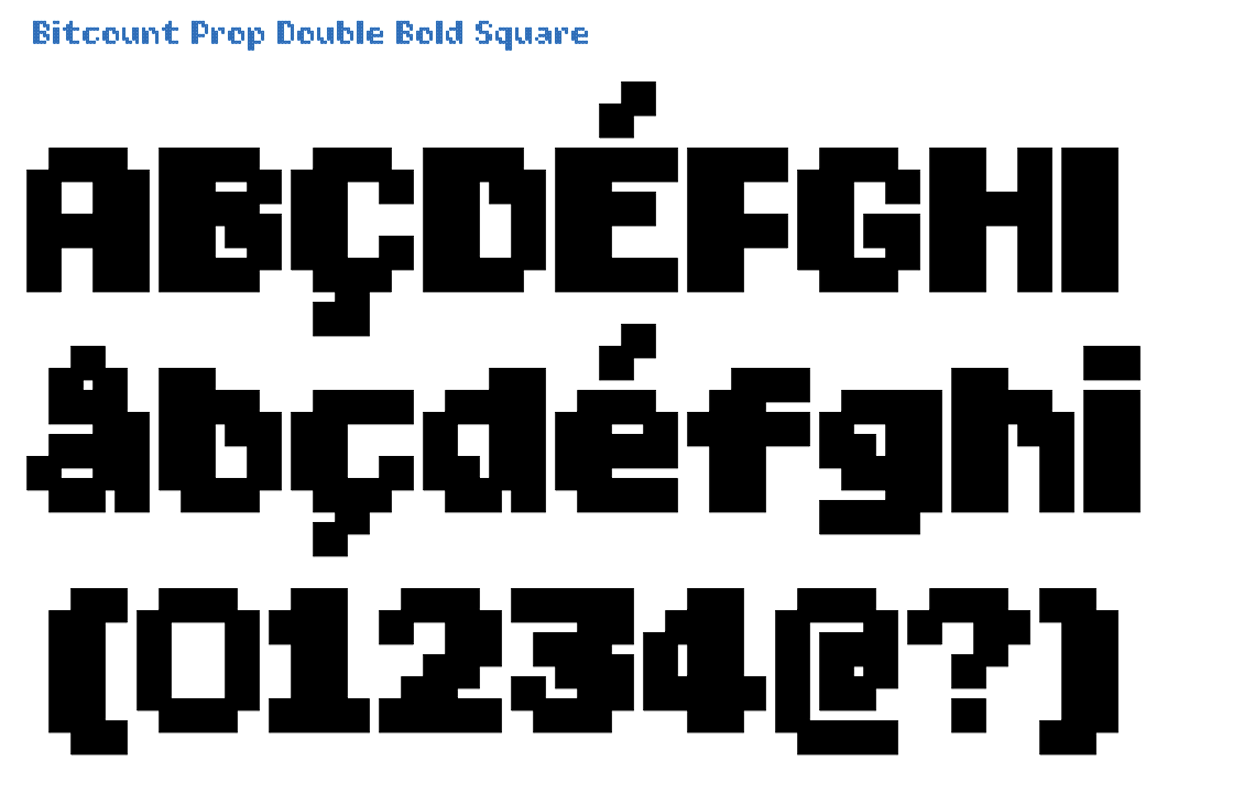
The glyphs of Prop variant have their own width, “i” is narrow, “m” and “W” are wide. Different from the Single, does Double not support the condensed OpenType feature, due to the lack of horizontal space