Who is Dan Rhatigan?
You might have seen him speak at TDC’s Type Drives Culture conference or SoTA’s TypeCon. You might have read one of his zines. Back in the day, you might have attended one of his lectures at the ArtEZ Institute of the Arts in the Netherlands. More recently, you might have read or used one of his typefaces. Dan Rhatigan, Type Network’s new Director of Type Products, is as inexplicable as a typographer can be, but that won’t stop us from trying.
Lucas Czarnecki: You had a whole career before discovering your love for type. Can you share your journey into the world of letters?
Dan Rhatigan: My whole career has been about letters, really. An early interest in comic books led to drawing strips for my high school newspaper, and then the discovery of Letraset and a Kroy lettering machine. These led me to the simple idea that by choosing a style of letters you could change the entire feel of the words that would get printed, which put me on the path towards graphic design.
Typography was the part of the process that always held my attention, leading to my occasional side-tracks into typesetting software. After so many years of loving typography and typesetting, the real change happened when I finally realized that designing typefaces themselves would be the next step.
LC: So, throughout your career, you’ve held positions as a graphic designer, a type designer, a manager, and more. How do you see yourself contributing to the typographic community going forward?
DR: I spent so much time as the type specialist in various fields that I’ve accumulated a lot of different perspectives on how type is used, and I’ve discovered a lot of smart, talented makers and users of type. I love to see superb type end up in the hands of folks who bring out its greatness! Really, one of the best things I can do after all I’ve learned over the years is to be a good matchmaker–helping bring the right ingredients together whenever possible.

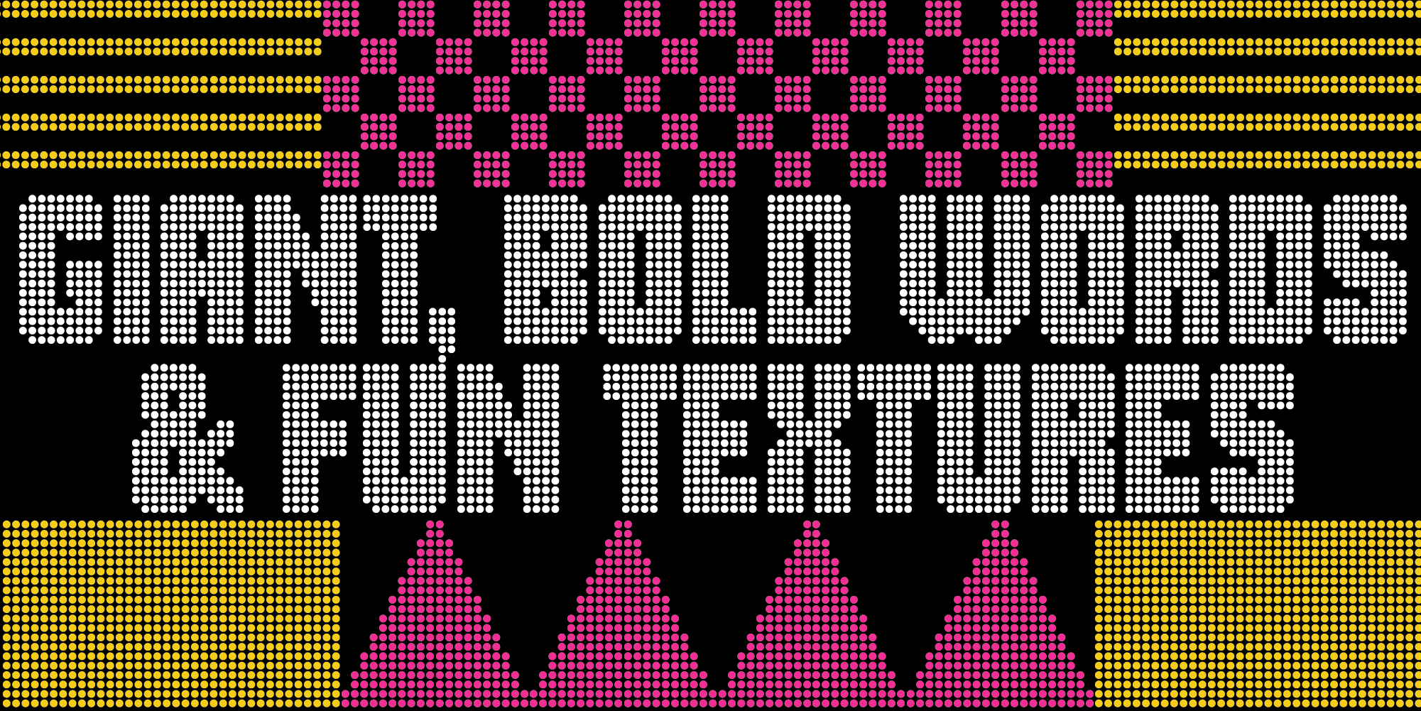
Bijou Type is home to typefaces developed by Dan Rhatigan, an experienced typographer whose skills and sensibilities have been honed by years in the type industry working with clients big and small.
LC: You could work with type foundries in various ways and for various organizations; what attracted you to this role specifically?
DR: For one thing, I am a legitimate fanboy of many of the foundries that are part of the network, and it was a compelling chance to get to work with them more closely—especially if I can help get their work into the hands of more people. The idea of the network itself is a big part of what drew me in, since Type Network exists not only to support the foundries but also to help customers tap into that deep well of knowledge held by the group overall.
Type Network also allows me freedom to keep working on my own typefaces, which is perhaps the best way for me to stay on top of how the world of type keeps evolving.
LC: You’ve worked as a type designer on custom type projects for major companies; how will that experience influence your approach to Type Network’s agency work?
DR: A lot of what I learned from working with agencies (or even different teams within places like Adobe) comes down to what Type Network tries to do: establish mutual trust that everyone involved has some specific expertise to contribute.
I’d often function as a bridge, digesting what others say about their needs and challenges in their own words, and helping them understand the role that type could play in their work. On the flip side, I was often the one trying to explain typographic minutiae in terms that made sense to folks outside our niche, helping make sense of a given project to everyone involved.
We’re a small group of specialists at Type Network, and we’re all trying to be that same kind of bridge, connecting our foundry partners and the customers who come to us for solutions about licensing, custom typeface design, or even just finding the right typefaces for what they’re doing.
LC: You won’t be directly designing type for Type Network, but you mentioned earlier that you plan to design type again in the future. When will we see a new Dan Rhatigan original?
DR: During the years I spent designing type for other people (or helping other designers bring their own typefaces to fruition), I spent a lot of time thinking about how I could distill my own interests into typographic form. Luckily, I’ve had a lot of time in the past year to finally start hashing out those ideas once and for all. If I can manage my time well, there should finally be some more of my own work making its way into the world.

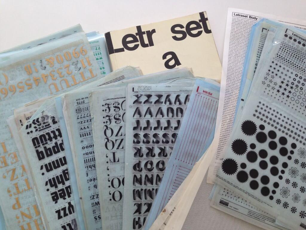
A small part of Dan’s personal collection of Letraset.
LC: Changing gears here: I’m not going to add any preface to this question because it’s best to let you run with it… Tell us about Letraset.
DR: We may as well get into it, because I certainly spend enough time talking about it! Letraset (or any of the other brands of dry transfer type that flourished over the years) absolutely dominated graphic design for decades, putting typefaces into anyone’s hands at fairly affordable prices. It led to this whole explosion of creative design work from high-end professional projects all the way to home-made “fanzines” with no hang-ups about the “right” way to do things.
I started studying graphic design right on the cusp of the desktop publishing, and in my eagerness to dive into the world of working on a Mac, I took for granted how much I’d already learned about setting type letter by letter–developing perceptual skills about spacing and alignment and making creative choices with the material available.
As much I feel giddy excitement about the many exuberant typefaces that Letraset produced, I now also have this deep appreciation for the role it played in making the means of production available to just about anyone, and how it inherently made people grapple with these subtle craft of setting type. Letraset was both less and more immediate than digital fonts, but the things you make with it ended up with an inherently different feel.
LC: I’ve resisted so far, but for those who don’t know you, you have quite a few typographic tattoos. Do you have a favorite? Do you have any more in mind?
DR: Just the way it’s hard for a designer to pick just one favorite typeface, I couldn’t pick just one favorite of my tattoos. My tattoos are my own shortlist of favorites, so I might give you a different answer depending on when you ask me.
LC: Finally, across TN’s various foundry partners and staff members, who are some people you are most excited to be working with?
DR: I’m lucky that Type Network reunites me with a number of people I’ve worked with over the years–wonderful people like Christopher Slye and Glenda Bellarosa–and finally gives us the chance to do more together. Like I said earlier, though, a lot of the thrill is getting to support the work of many of my own heroes—talents like Matthew Carter or the folks at Underware—or the incredible designers I’ve taught alongside over the years—friends like Tobias Frere-Jones and Cyrus Highsmith. Honestly, it’s unfair to ask me to pick favorites from such a good roster. I’m just glad I get to help out so many pals, and hopefully bring more people I admire into the fold.
To stay current on all things Type Network, subscribe to Type Network News, our email newsletter featuring font analysis, designer profiles, type and design events, and more.

March 15, 2023 · Interview
When Dan Rhatigan joined TN in 2021, he teased a potential return to type design: “If I can manage my time well, there should finally be some more of my own work making its way into the world.” That finally is here, in the form of Bijou Type. With the foundry’s launch, Rhatigan shares how Letraset helps him focus on end users, why Bijou’s fonts look so Dan, and the three meanings behind Bijou.