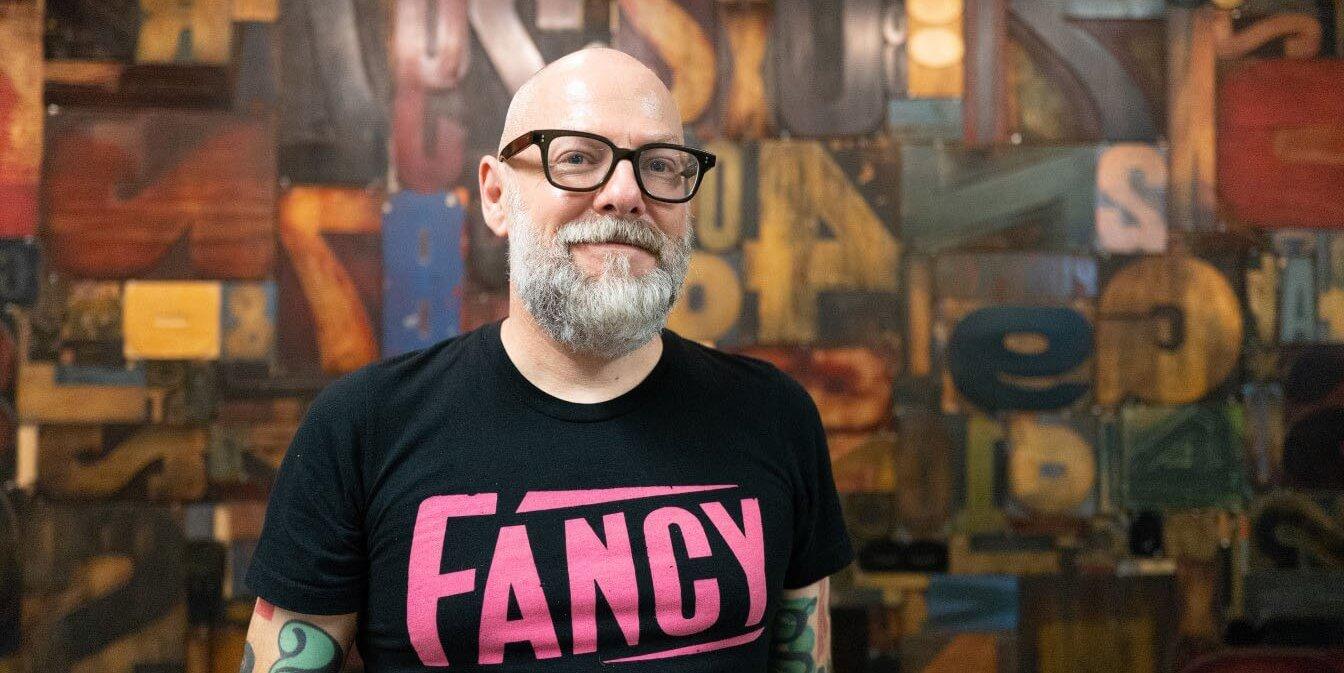
Dan Rhatigan launches his foundry, Bijou Type
When Dan Rhatigan joined TN in 2021, he teased a potential return to type design: “If I can manage my time well, there should finally be some more of my own work making its way into the world.” That
finally
is here, in the form of Bijou Type. With the foundry’s launch, Rhatigan shares how Letraset helps him focus on end users, why Bijou’s fonts look so
Dan
, and the three meanings behind
Bijou
.
Lucas Czarnecki: You took a break from type design for several years; what brought you back?
Dan Rhatigan: I’ve never stopped being heavily involved with type creation since I began studying type design at Reading in 2006, but some of my actual jobs over the years have been more managerial and less design-centric. In particular, my time at Adobe—where I was senior manager for the Adobe Type team—was more about organizing the development of others’ typefaces, rather than my own. I worked on one unrealized project at Adobe that reminded me how much I love creating type, though, and that’s what really inspired me to get back in the design game. I was a responsible enough manager for Adobe to admit that the things I wanted to design didn’t really make sense as Adobe projects.
LC: Where did the name Bijou Type come from?
DR: I enjoy the multiple meanings of “bijou”. It’s the French word for jewel, an English word for something tiny and exquisitely made, and in Polari—a coded slang used by the British gay community of a certain era—it’s the word for small. After working for large companies like Monotype and Adobe, I am acutely aware that mine is a small operation, a chance to develop ideas that are somewhat precious to me.
A public service announcement from Dan Rhatigan, set in Bijou Type’s Ringold.
LC: Where does Bijou Type fit into the wide world of foundries? What is unique about your contributions?
DR: Bijou is a space for me to develop ideas that are tailored to my own sensibilities, which have been formed by my unique background. I have the capabilities and experiences honed with some of the industry’s biggest players—doing lots of custom client work at Monotype, looking after technology development at Adobe—and all that dovetails with my personal work in zine publishing and research in type history. All my time pushing students to grapple with and refine their own idiosyncratic ideas plays a part, too. With all that mixed together, I’m bringing my own taste, and a pretty solid background in bringing ideas to life in a practical way.
LC: At Type Network, one of your various responsibilities is finding and vetting potential new foundry partners. How did that affect your thought process when considering launching Bijou Type with Type Network?
DR: Working with so many talented foundries encourages me to focus on ideas that are a little more personal to me. I don’t need to have one of everything in my own catalog, when I spend so much time drawing attention to the wonderful type that others have already created. That keeps my eye on what else I can bring to the mix.
Every day I see firsthand that Type Network is doing its best to help foundry partners in running their business by tailoring our level of support and guidance to each foundry’s needs. Since Bijou Type is an after-hours project for me, I also appreciate what my TN colleagues contribute to help keep things running smoothly for my own foundry.
Bijou Type is home to typefaces developed by Dan Rhatigan, an experienced typographer whose skills and sensibilities have been honed by years in the type industry working with clients big and small.
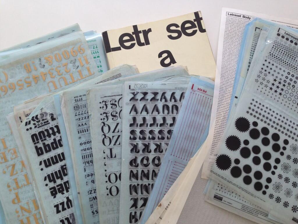
A small part of Rhatigan’s personal collection of Letraset.
LC: We all know your love of Letraset; has that influence made its way into your type designs?
DR: Letraset produced exceptionally well-crafted versions of the type they sold, no matter how mundane or whimsical the style, and they made that type accessible. It’s a constant reminder that I should stay focused on getting my typefaces ready for people who’ll find them appealing and reliable, because the real fun is what people do with the type.
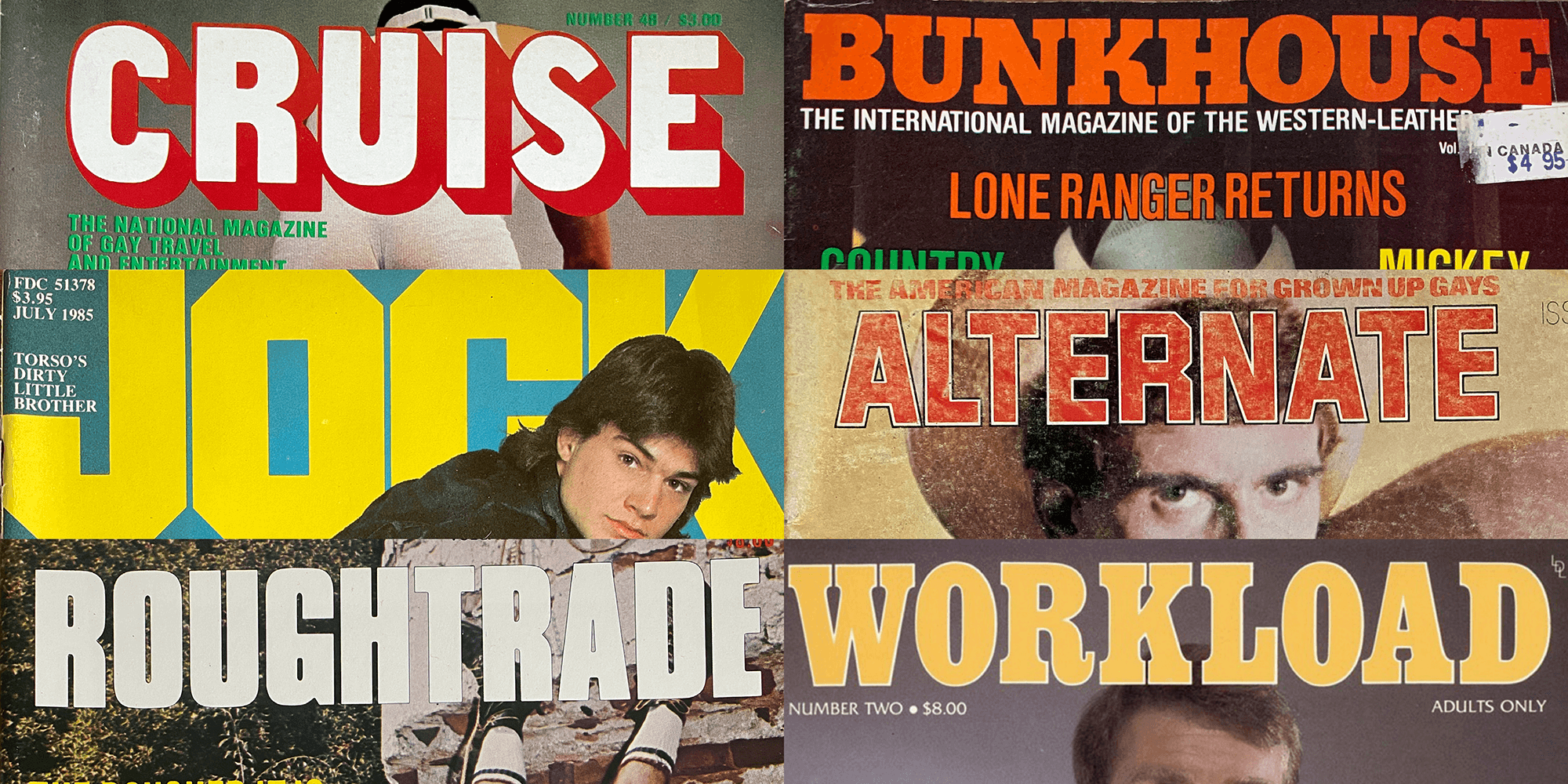
LC: What are your other sources of inspiration?
DR: Inspiration comes from all sides, and my challenge is usually one of digesting all the influences into a coherent expression. For a while now, most of the concepts I’m developing have grown out of zine culture, and the grass-roots evolution of gay magazines from the covert physique digests of the 1950s into a wide range of sub-cultural niches by the 1980s. (And so much of that was thanks to the availability of type like Letraset!) I’m drawn to idiosyncratic typography that pushes back against the prevailing culture of accepted good taste, but still strikes a chord.
December 13, 2021
You might have seen him speak at TDC’s Type Drives Culture conference or SoTA’s TypeCon. You might have read one of his zines. Back in the day, you might have attended one of his lectures at the ArtEZ Institute of the Arts in the Netherlands. More recently, you might have read or used one of his typefaces. Dan Rhatigan, Type Network’s new Director of Type Products, is as inexplicable as a typographer can be, but that won’t stop us from trying.
A selection of references Rhatigan used while designing Ringold.
LC: Tell me about the typefaces you’re launching with. What is the story behind each?
DR: These first two releases come right out of that magazine research I mentioned.
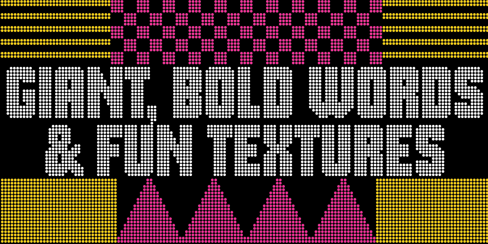
Gloridot started with a handful of letters on a 1970s magazine cover that I was trying to recreate for an issue of my zine, Pink Mince. No matter how much I scoured old type catalogs, I couldn’t identify the design, but it was easy enough to recreate. Once I worked out the grid system for laying out the dots, I began working out a full alphabet, and eventually that grew to include, Cyrillic, Greek, and all the other bits of typography marks and symbols a useful typeface needs—even a design like Gloridot that is more about fun than utility.
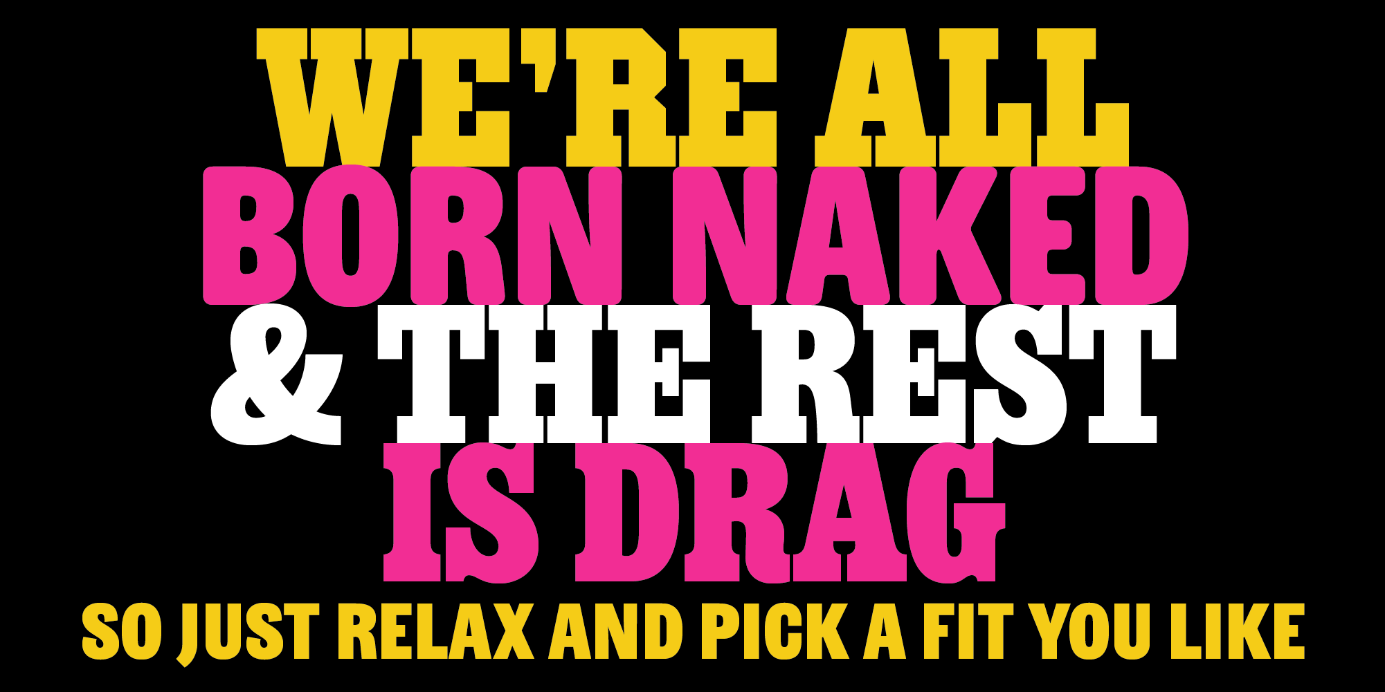
Ringold started with its Clarendon style, where I was trying to recreate the way that numerous old magazines and pulp novels would use styles like Letraset’s Egyptienne Bold Condensed in a really tight, dense way. I wanted to polish and refine that way of working with the type, reconceiving the letters and figures (and ignoring the lowercase) to emphasize the solidity and the sparkle of those old headlines. Once that approach came into focus, I began shifting the personality with the details of other styles, the way you might change an outfit to make a different impression, even though you’re dressing someone of the same size and build.
LC: Who among the TN foundry partners have been most supportive as you’ve worked to launch Bijou Type?
DR: Maria Doreuli of Contrast Foundry gave me invaluable feedback on the Cyrillic of both families. She really understood the eccentricity I was trying to preserve, but helped me shape it properly for readers of the script. Although, I never spoke to them about their project or my own, XYZ Type’s family of Egyptians for New York magazine help me hone the direction of Ringold Clarendon, since their spin on the genre really pushed me to clarify my own point of view, and that clarity sparked the development of the other Ringold styles.
On the production side, my Type Network colleagues Glenda and Guido were incredible—both Glenda’s thoroughness and Guido’s tools really helped me cross the finish line in ways I couldn’t have on my own.
LC: What are your plans for Bijou Type? What’s next?
DR: Because I wasn’t free to publish my own designs when I worked elsewhere, I have a backlog of long-simmering ideas to finally bring to life. These first headline faces were the easiest to complete, but there are a couple of text faces that will require some more time to come together. Especially if any interesting custom projects show up first!