The story behind Paramount’s Peak Sans
In 2020, the entertainment giant Paramount decided it was time to step into the next phase of the industry: Streaming. But they needed to look the part. Type Network collaborated with agency loyalkaspar to bring this classic entertainment provider into the future with fresh branding and custom type designed by foundry partners Lipton Letter Design and Plau.
By Abigayle White
Paramount is a media company that has been entertaining global audiences across various platforms since 1912. In the 100+ years since its founding, the world has evolved, and so has Paramount. 2020 was no exception.
At the start of the pandemic, digital entertainment rose to the forefront, with streaming services becoming the new standard for movies, tv-series, and more. With this change, Paramount wanted to take the next step in their entertainment medium.
In 2020, Paramount launched Paramount Plus, an independent streaming platform that showcases their robust library of shows, movies, and more. Distinct from Paramount as a whole, but strongly related, Paramount Plus needed its own branding.
Service: Custom licensing and consulting
Partners: Lipton Letter Design and Plau in collaboration with loyalkaspar
Date: 2020

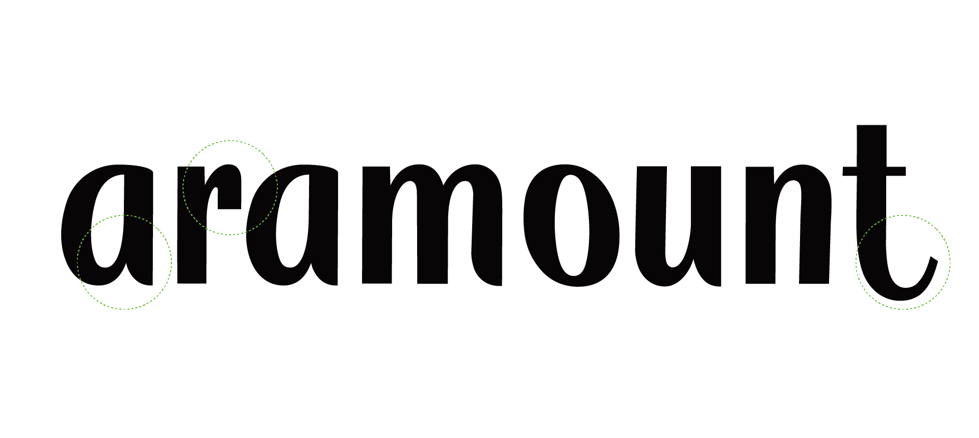
The process started by identifying which aspects of the Paramount script could be reused in a modern sans.
Creating a sub-brand to house all of Paramount’s digital streaming content required custom type foundries with an emphasis on logos and brand design. The overall challenge was to create a timeless identity–based on Paramount’s iconic branding–that lived firmly in the future.
Enter Type Network. We worked with loyalkaspar to determine Paramount Plus’s typographic needs and the parameters for a custom typeface. Type Network’s Victoria Rushton and Dyana Weissman then provided project management and our usual high standard of quality control for both the design and technical aspects of the typefaces.
For the initial styles, we tapped partner Richard Lipton, founder of Lipton Letter Design. Lipton has been creating exquisite letterforms for more than 40 years and has a constant thirst for creativity. With a long history in type and a strong familiarity with Paramount’s work, Lipton was perfect for the project.

Calligrapher Richard Lipton develops original typefaces as well as custom fonts for international clients.

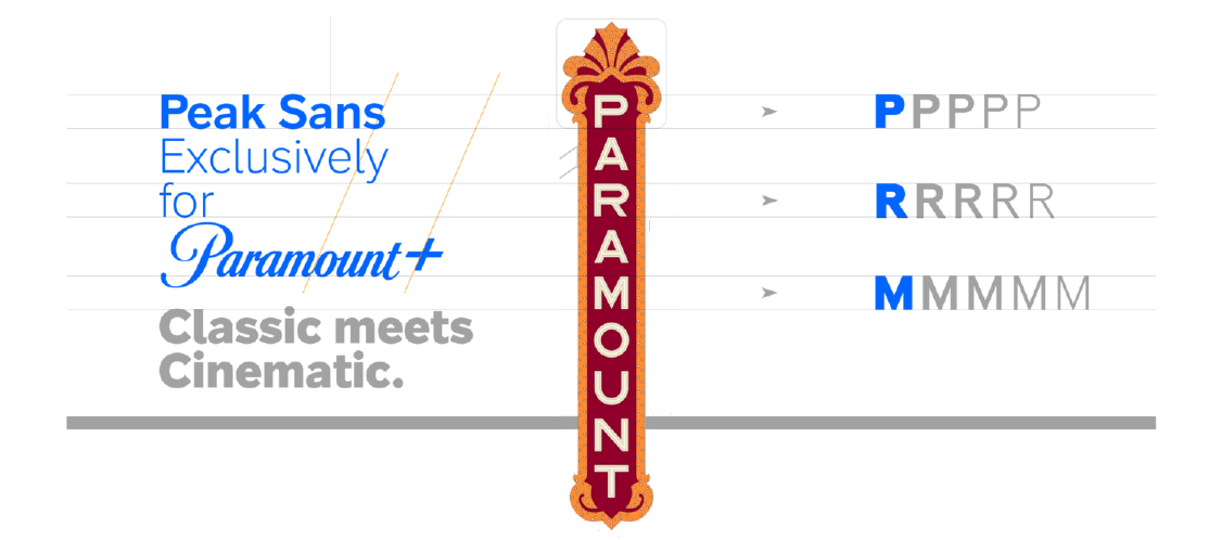
Further adjustments and versions were derived from the iconic Paramount blade sign.
The design process started with the question “Which parts of the Paramount Script could be adopted and adapted to a modern sans serif typeface?” Loyalkaspar started pulling curves and shapes from the original typeface to play with in the initial drawings. The script alone wasn't enough inspiration. More was necessary to push this typeface to its full potential.
Loyalkaspar looked to Paramount’s recognizable marquee for a strong historical essence. Their team made a number of slight adjustments to modernize these elements; however, its integrity stood as a focal point for the final type design.

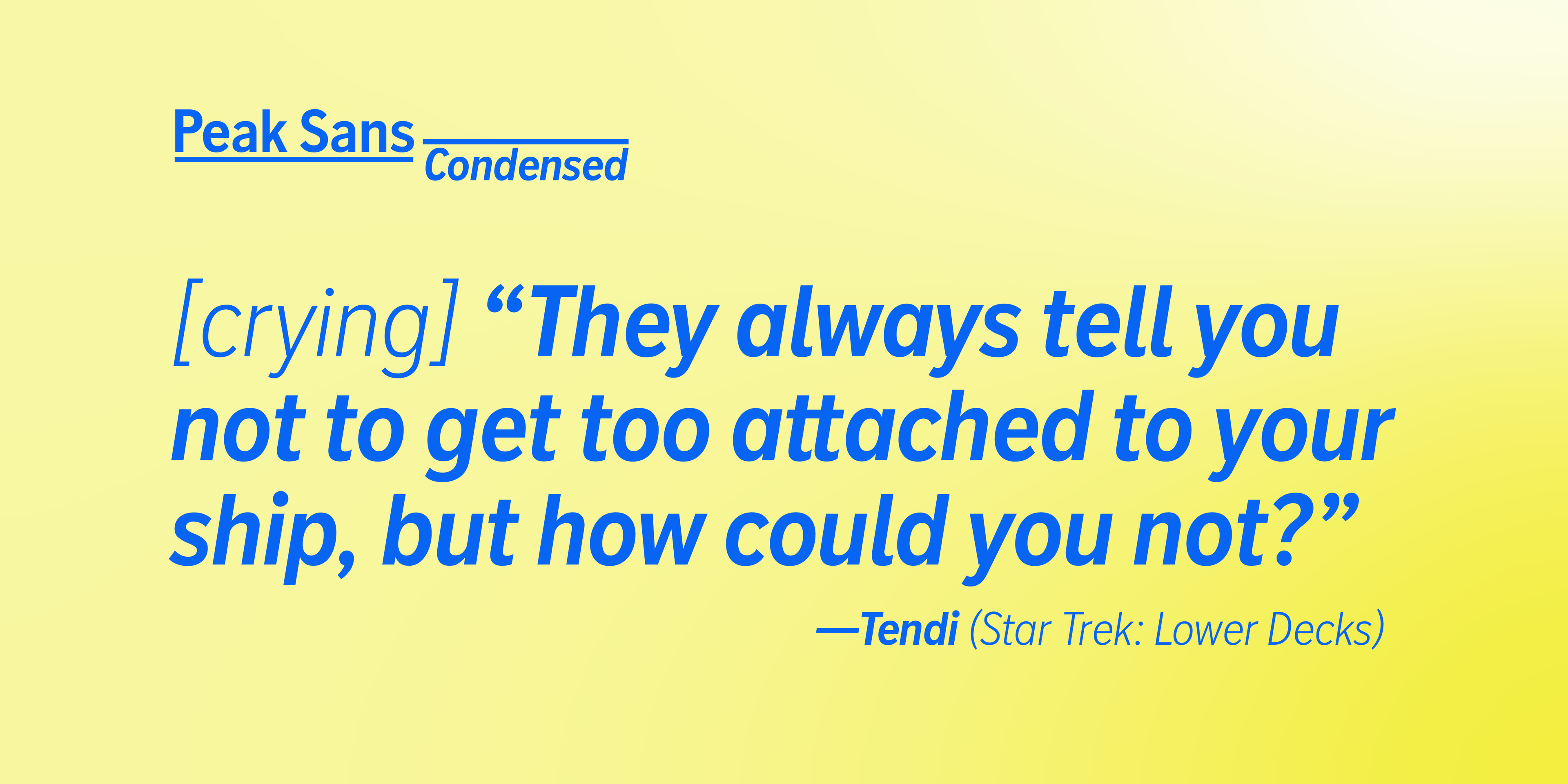
Once the initial styles were finalized and put to use, loyalkaspar and Paramount wanted to expand their options. Adding condensed styles to the typeface meant more flexibility both on screens and in advertising. To create these additional styles of Peak Sans, Rodrigo Saiani of foundry partner Plau was brought in. Saiani was selected not only for his robust experience designing type for media brands but also for his expertise in creating condensed typefaces. On this Saiani said:
It’s interesting to see how Peak fits into this genre of cinematic Sans-Serifs, being inspired by historical marquee signs that represent the entertainment industry so beautifully. On the other hand, a typeface has to perform (pun-intended) so many other roles in the communication of a brand. We have to be conscious so that the type does not take too much of a leading role sometimes. Peak, to me, is like this trustworthy actor whose name you don’t quite remember but keeps being cast in all our favorite shows.

Music sparks conversations, brings people together, and moves ideas forward. So does type.

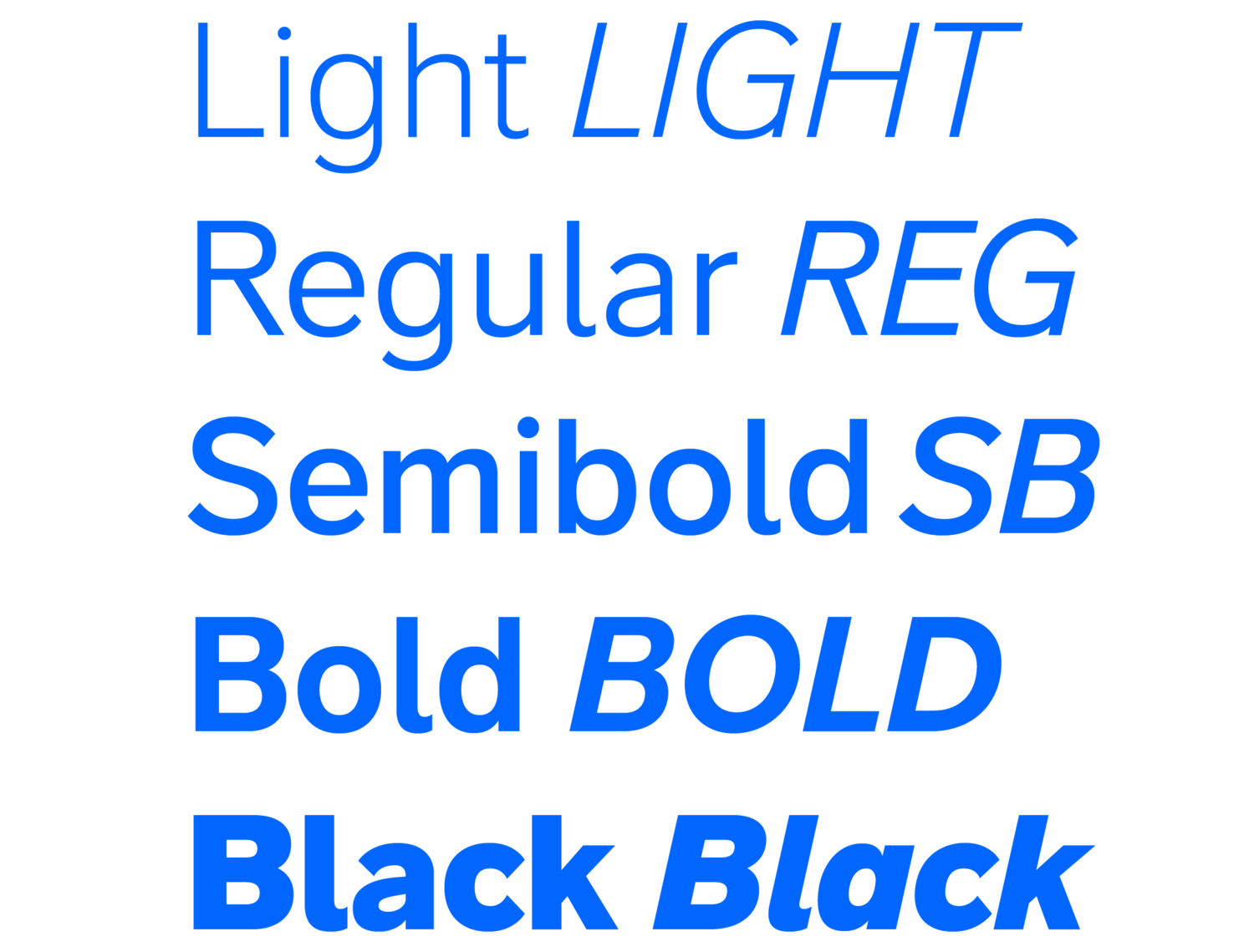
The result is the Peak Sans Family: A sturdy serif that stands the test of time and pays homage to the years of entertainment history Paramount has built as it looks toward its new digital streaming potential. According to Daniel Dörnemann, Executive Creative Director at loyalkaspar:
Typography is one of the few brand elements that has the ability to travel along with the brand to almost any place, which is why it is so important to have it bespoke and related to the brand. The custom font for Paramount+ had to be robust and neutral to not only communicate effortlessly across all touchpoints, but to make sense in the context of all content from Drama to News, to Sports, to Comedy.
We balanced this with grounding it in the rich heritage of the brand, taking inspiration from the iconic Script and from theater marquee signage. Richard Lipton and Rodrigo Saiani’s work on Peak Sans and Peak Sans Condensed captured that history beautifully, without sacrificing functionality in modern uses. We are proud of how the Paramount+ identity and Peak Sans work together to create the overall brand.
The overall identity went on to win several Promax awards, including the bronze prize for ‘Streaming Brand Image: Rebrand, Refresh or Launch,’ and the coveted gold prize for ‘Total Brand Image Package.’
If your company wants to revitalize its brand across every kind of screen, there’s no better solution than custom type. Contact us to start the conversation with one of our partner foundries.