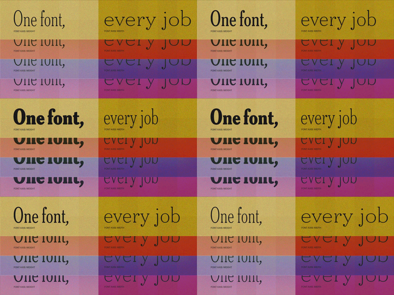
Featuring: Fit · DJR, Apotek · Kerns & Cairns, Uai · Naipe Foundry, Zeitung Pro · Underware, 29LT Azahar AL VF · 29LT, Antenna 2 VF · Occupant Fonts,
One font, every job: variable fonts that flex
For most of type history, a font family worked like a light switch: regular or bold, condensed or not, and nothing in between. Variable fonts traded the switch for a dimmer, letting designers tune weight, width, and size by the degree. Type Network has followed them from the start, and even built a guide to them with Google at variablefonts.typenetwork.com. Five more families flex just as gracefully. Consider these the dimmers worth installing.
Everyone loves them, almost no one licenses them
Variable fonts arrived on September 14, 2016, when Adobe, Apple, Google, and Microsoft jointly announced them at the ATypI conference in Warsaw. On the web, they have gone mainstream: the 2025 Web Almanac found at least one variable font on about 39 percent of desktop sites and 41 percent of mobile sites. Look closer, though, and four free families (Noto Sans JP, Roboto, Open Sans, and Montserrat) account for almost 60 percent of those requests. The weight axis does most of the work, while width shows up on only about 17 percent of the pages that use variable fonts.
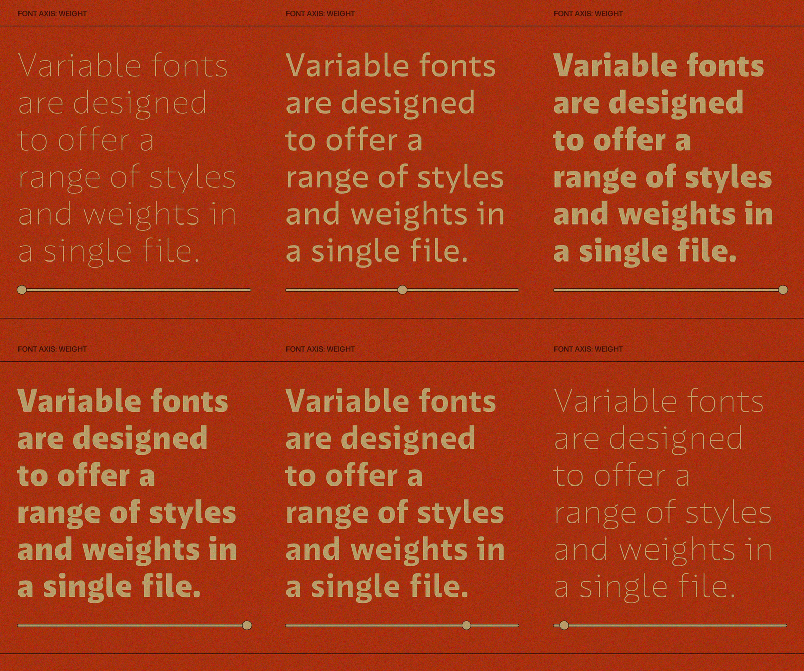
The appeal is easy to see. One variable file can stand in for a whole stack of static styles, and designers can land on exactly the weight or width a layout needs instead of the nearest preset. Responsive design gets the most out of it, since a headline can tighten on a phone and relax on a desktop screen without ever switching families.
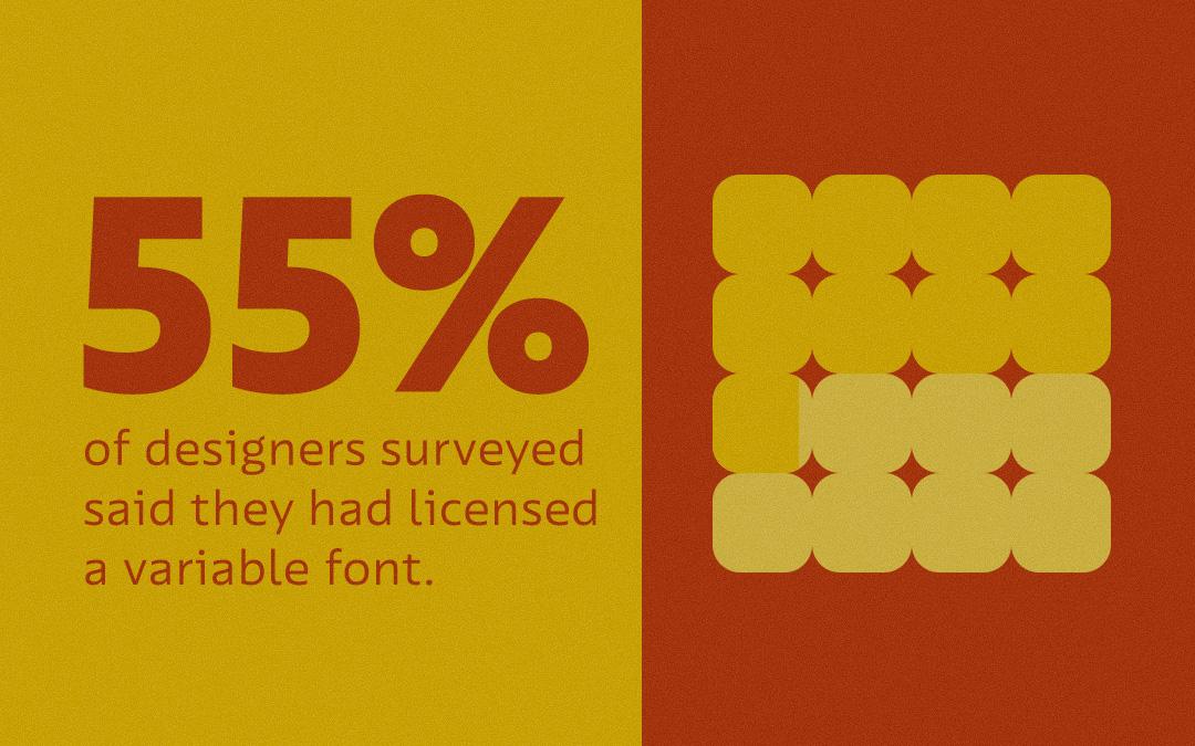
Licensing tells a different story. In Type Network’s 2025 Type Report, 55.5 percent of designers surveyed said they had licensed a variable font (a self-reported figure the authors suspect runs high), yet variable fonts made up just 0.8 percent of new licenses sold through TN. The report points to price as the main hurdle, since a variable font usually costs closer to a whole family than to a single style, while Adobe Fonts users get font syncing as part of their Creative Cloud plan. Tooling has lagged, too: Figma only added variable font support in 2022.
Here is the case for a second look. A variable license costs about what a family costs because it is the whole family, plus every weight and width in between.
Take him at his word, then set a headline nobody can ignore
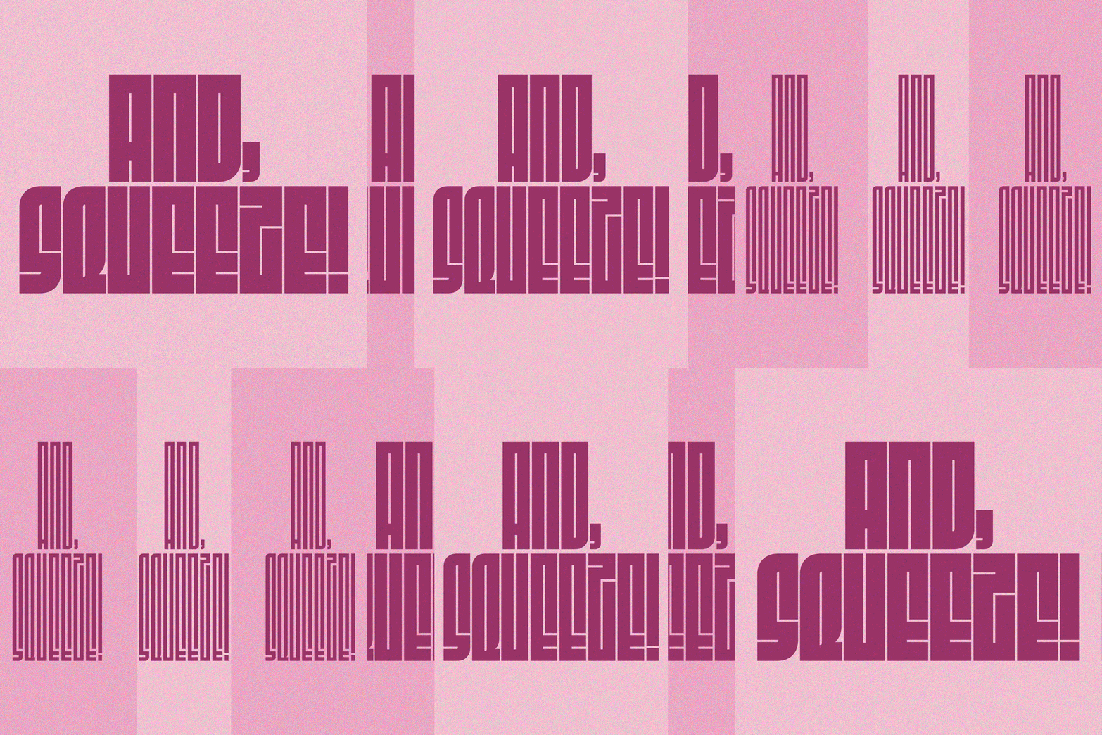
David Jonathan Ross released Fit in 2017 as one of the first typefaces available in the OpenType variable format, and built it around a single question: how completely can letters fill a space? Its width axis runs from the impossibly narrow Skyline to the gargantuan Ultra Extended, and a 2024 update has added a lowercase, small caps, and new alternates by Gor Jihanian. Ross himself warns that it is not for copy you actually want people to read. Take him at his word, then set a headline nobody can ignore.
Axis to try: width.

David Jonathon Ross
DJR is a type designer who won the 2018 Prix Charles Peignot award. He was an early creator of retail variable fonts and explores new font technology through his Font of the Month Club and work with Google.

A full pharmacy, one prescription
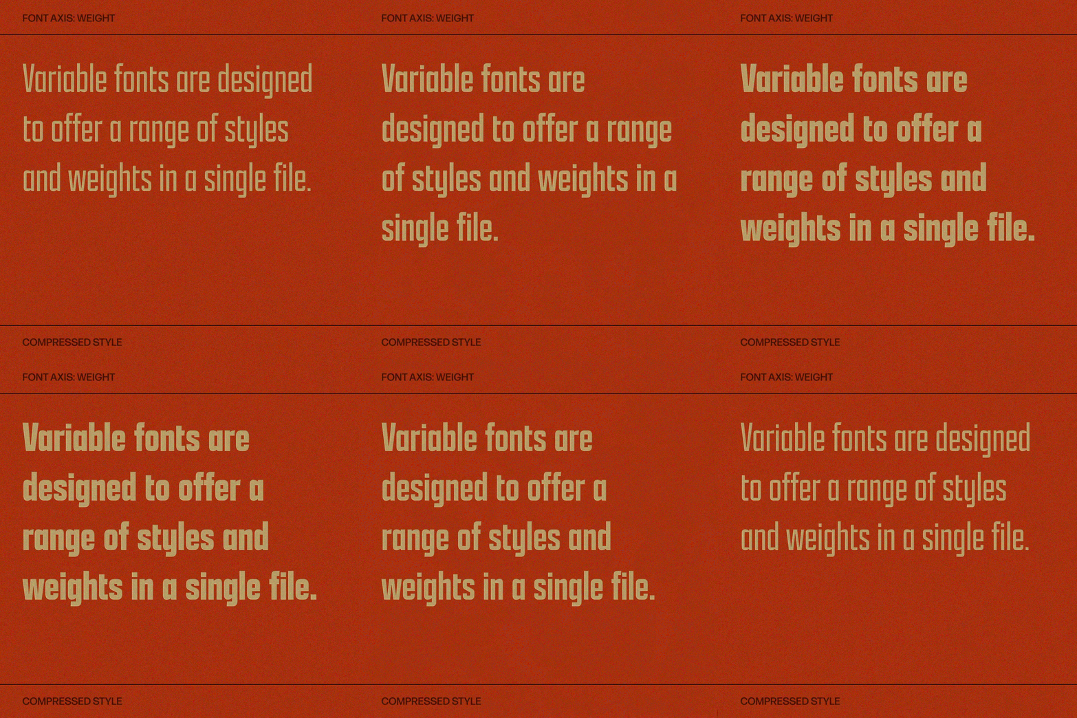
Dyana Weissman is not usually a fan of sans serifs, but the robust lettering on antique medicine bottle labels, displayed in a museum in Norway, changed her mind. Starting from mostly uppercase sources in a single style, she stretched Apotek across weights, widths, and eventually posture, for 98 styles in all. When Fotografiska revised its identity in 2021, it chose Apotek as its display face, in part because its clean, geometric letters support the photography instead of competing with it. A full pharmacy, one prescription.
Axes to try: weight and width, together.

Dyana Weissman
For 20 years, Dyana has designed custom typefaces for clients including AMC, Disney, Ford, MoMA, and The Washington Post, guided by a belief in genuine connections and the beauty of imperfection.
All the emphasis, none of the shuffle
Felipe Casaprima and Álvaro Franca led the Naipe Foundry team that named Uai after a common Portuguese interjection that happens to sound like “UI,” with the spirit of Minas Gerais in mind. Along the way, they ran 45 days of focus groups with more than 100 UI designers. The result is a fully variable family of 14 styles that is also multiplexed: change the weight, and the width of the text stays exactly the same. In an interface, that means bold hover states and active tabs that never nudge a button out of line. All the emphasis, none of the shuffle.
Axis to try: weight, without the reflow.
Felipe Casaprima and Álvaro Franca
Felipe Casaprima and Álvaro Franca are the founders of Naipe Foundry, combining type design, branding, and font engineering. Watch their recent "meet the foundry" video.

Proof that variable fonts were never only a web trick
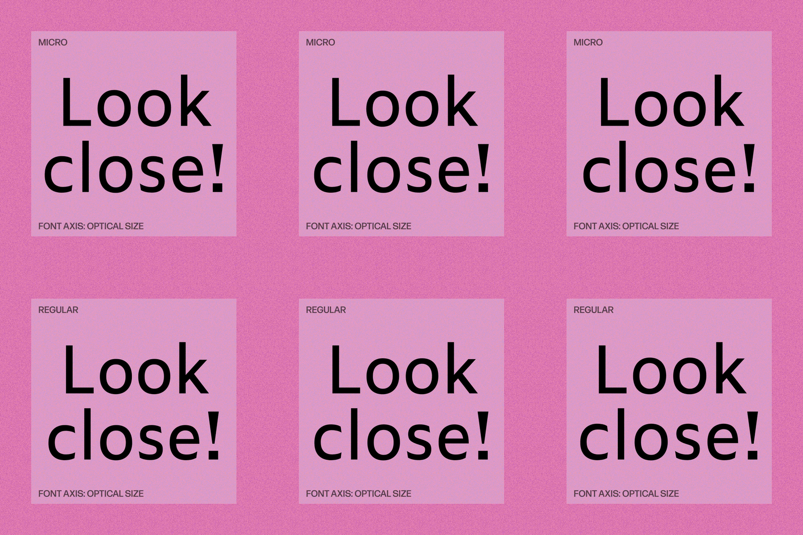
Akiem Helmling, Bas Jacobs, and Sami Kortemäki of Underware had Zeitung flexing as a variable font by November 2016, just weeks after the format was announced. The sans system comes in two optical sizes, Micro and Standard, and its variable fonts carry weight and optical size as axes. The Flex package goes further: an extension for InDesign and Illustrator picks the right optical size for whatever point size you set. It was made with print in mind, where the same weight can land differently depending on ink and paper. Proof that variable fonts were never only a web trick.
Axis to try: optical size.
Zeitung Pro
Variable Roman
Starting at $50
Buy
Zealotry wouldn’t be an inappropriate collective noun for Underware. They not only design typefaces, they live type—and they want others to do the same.
Three scripts, one bloom
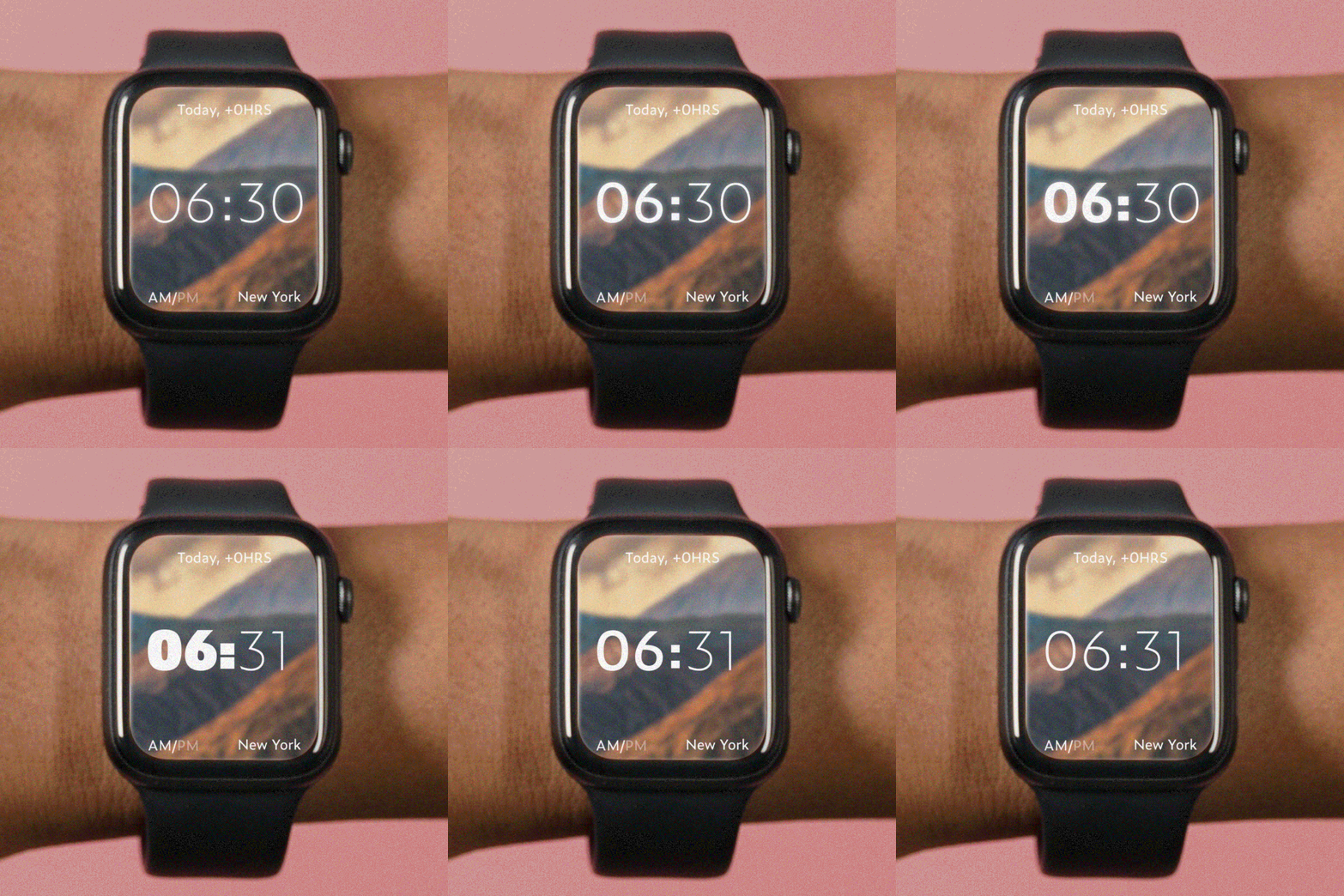
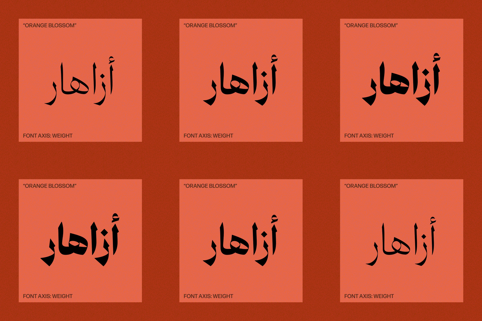
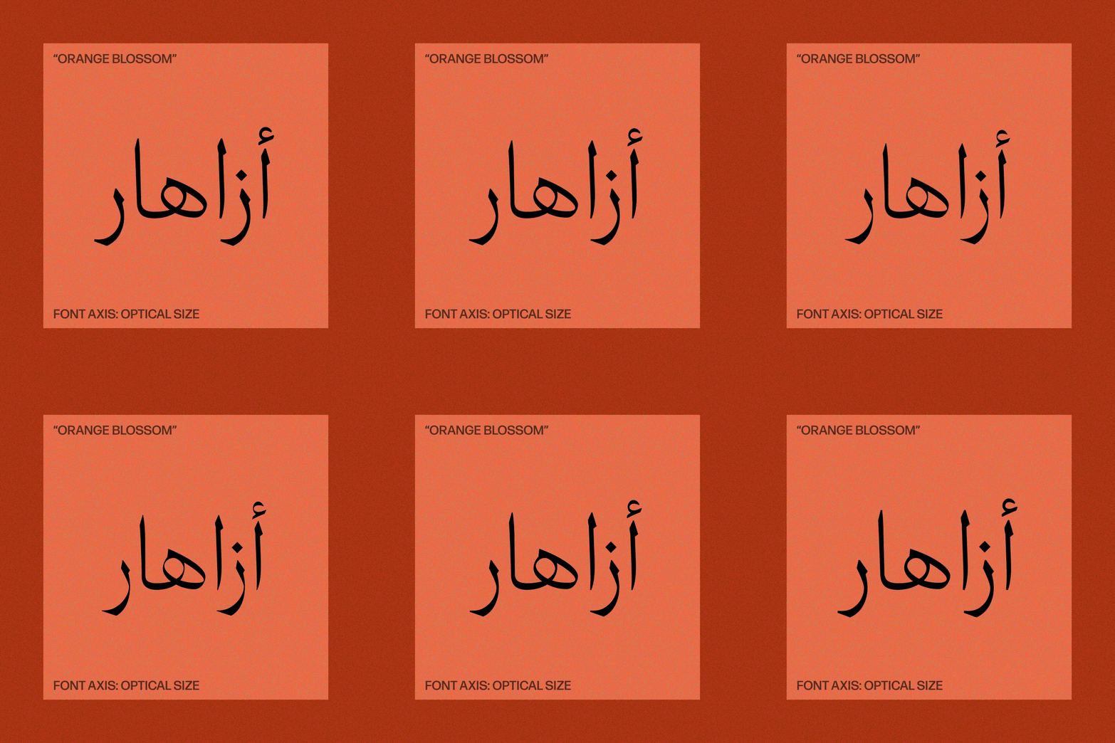
Naïma Ben Ayed drew the Arabic and Jose Carratalá the Latin for 29LT Azahar, with Krista Radoeva consulting on the Latin and creating the Cyrillic at Pascal Zoghbi's invitation. Zoghbi, who founded 29LT in 2013, oversaw the whole system. The foundry’s name counts the Arabic alphabet’s 28 letters plus the hamza, and its families grow outward from Arabic. Azahar is Spanish for orange blossom, borrowed from the Arabic az-zahra. Its variable version carries weight and optical size as axes, moving from a reader-friendly text style to a sharp, high-contrast display, and the family has earned a Type Directors Club award. Three scripts, one bloom.
Axes to try: weight and optical size, in Arabic and Latin at once.
29LT Azahar AL VF
Variable Display Light
Starting at $300
Buy
29Letters Type Foundry S.L. (aka 29LT) is dedicated to creating and publishing multi-script typefaces. Its Arabic and Latin typography leading edge arises from its collaborative team of professional Arab and European type designers crafting high-quality typefaces.
The workhorse finally learned to stretch
Cyrus Highsmith first released Antenna in 2006, an industrial sans that slows down his usual fast curves and puts the emphasis on the pattern of white shapes inside and between the letters. Victoria Rushton led its 2025 return as Antenna 2, which added more language support and variable fonts. Seven weights in four widths now live along two axes, so a layout can drift from compressed to regular and from light to black without ever changing fonts. The workhorse finally learned to stretch.
Axes to try: weight and width.
Antenna 2 VF
Variable Regular
Starting at $40
Buy
Cyrus Highsmith
Cyrus is a type designer, teacher, author, and graphic artist who teaches at RISD. He wrote Inside Paragraphs and won the 2015 Gerrit Noordzij Prize for his contributions to typography.

One file, every job, and no more settling for the bold you have instead of the weight you wanted. Slide the axes yourself, and meet the foundries behind these five, at
store.typenetwork.com.