
HP commissions global scripts from Type Network
In an international economy, companies need to communicate in many languages. Their brands depend on quality global scripts. When Wieden+Kennedy enlisted Type Network to expand the
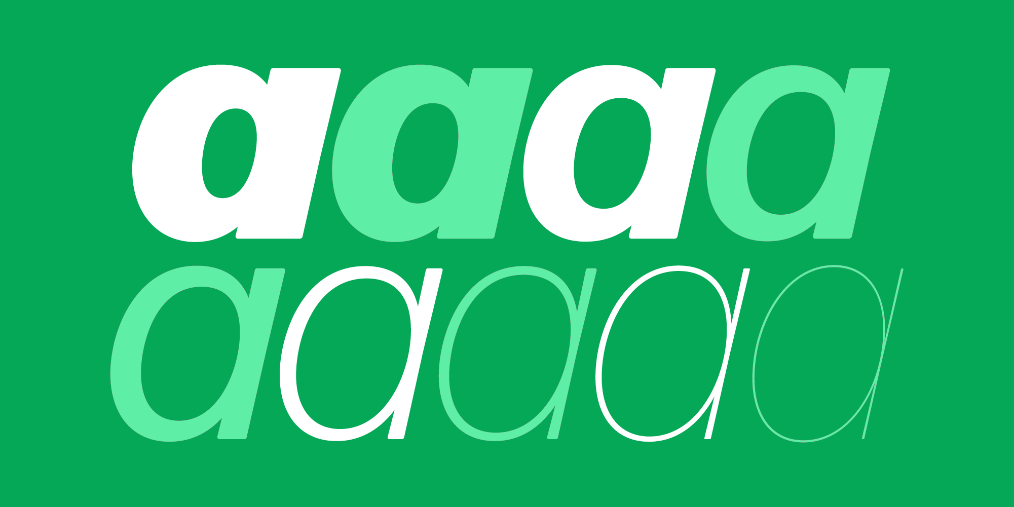
Forma DJR
family with five new scripts for HP Inc., we brought together a team of designers from around the world.
By Kate Beckwith • February 8, 2023
Tech giant HP Inc. switched their brand typeface from HP Simplified to Forma DJR as a part of a global upgrade in the voice of their brand. As a new design language spread to reach global markets, they asked TN partner foundry DJR for a license to the Latin styles of Forma DJR—and then asked to expand the family to include Arabic, Devanagari, Greek, Hebrew, and Thai scripts. David Jonathan Ross, a TN partner and shareholder, turned to TN, and our director of custom type Dyana Weissman got to work, finding the right designer to bring Forma to each language.
Type Network commissioned eight type designers from six countries to develop the scripts: Aleksandra Samuļenkova took on Forma DJR Greek; Tanya George worked on Devanagari; Wael Morcos and Khajag Apelian made Arabic; Liron Lavi Turkenich was enlisted for Hebrew; Knaz Uiyamathiti of Cadson Demak developed Thai; and Type Network partner Victoria Rushton was brought on for drawing additional Latin characters.


David Jonathan Ross draws letters of all shapes and sizes for custom and retail typeface designs.
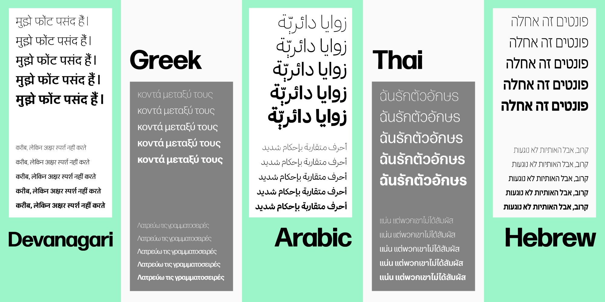
Using Forma DJR as a starting point, each design team worked independently to draw their assigned script. At a project midpoint, the designers shared proofs of their work with the whole team, creating an opportunity to incorporate new inspiration and techniques from the others. This produced an international, integrated typeface.

Forma DJR Banner
Regular
Starting at $50
BuyWith Weissman as project manager, the designers handled the job of imposing Forma DJR’s hyper-rationalist dogma of tight spacing, closed counters, and brutal minimalism onto the curvaceous and open counters of scripts like Greek, Arabic, and Thai. Despite these constraints, there were two entry points for the scripts. The subtle incurves of the stems give Novarese’s original design a warmer feeling than, say, Helvetica. DJR added the second: slightly rounded corners.


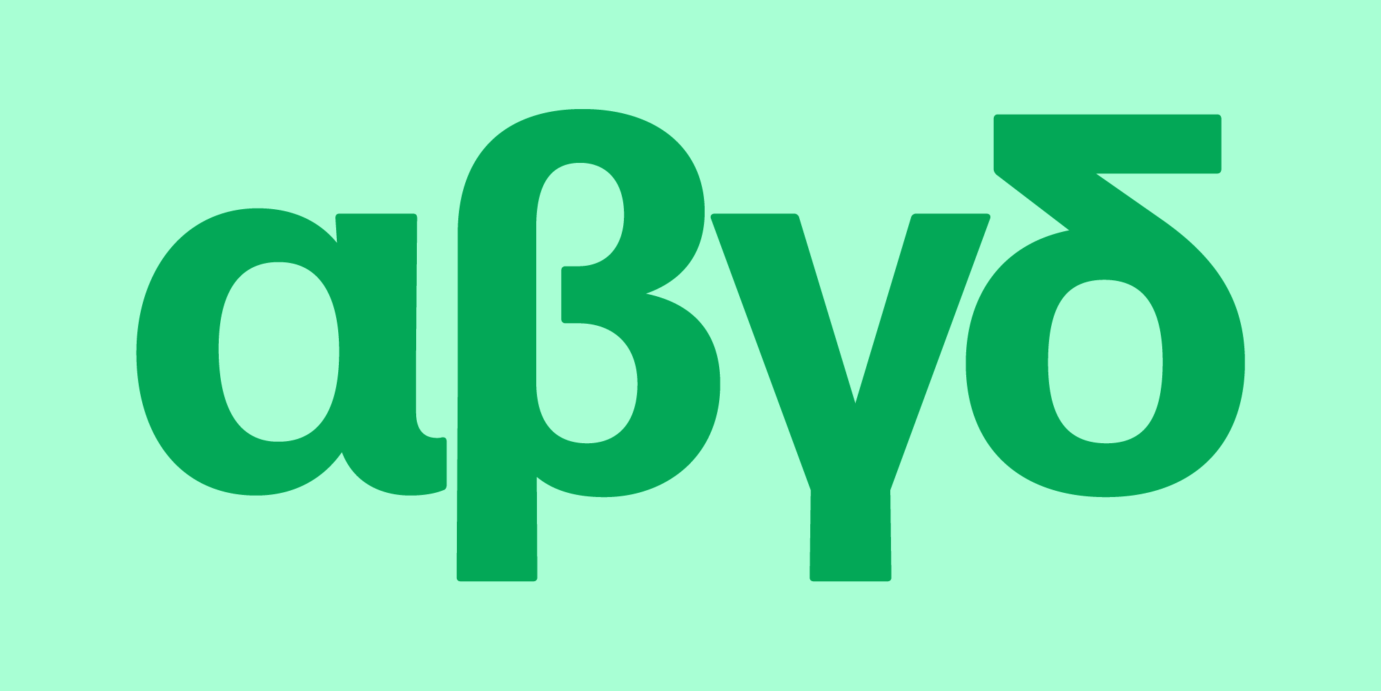
The designer of the Greek script, Aleksandra Samuļenkova, had to consider whether some letters should have in-strokes (η) and exit-strokes (α, μ). "Strokeless" letters are not uncommon in Greek typefaces. Sometimes they are made in the effort to be "modern." Sometimes they originate from extensions of Latin fonts made by designers who don't think the strokes increase readability. A number of professional native Greek type designers are embracing Latinized Greek letter shapes, as a natural evolution of the script.
To respect the integrity of the Greek script, Samuļenkova normally wouldn’t dream of leaving these strokes out. However she saw that the rhythm of the text was more Forma-like without the strokes. It was tempting to gratify the spirit of the typeface at the cost of tradition and legibility.
After reflecting on the options and consulting with Ross and Weissman, Forma DJR Greek was designed with a hybrid solution of the in- and exit-strokes in the η, α, and μ.
Forma DJR Arabic designers Wael Morcos and Khajag Apelian had their own approach to the needs of the Arabic writing system. They further rounded Forma’s corners, softening the design and lending a tactile quality that evokes the sense of ink on paper. Then they integrated tapered stems by modulating the vertical strokes, most visibly in the alefs and lams, accentuating this feature of the Latin. This slight flaring gives the typeface a quirky and friendly attitude.
The optical sizes of the Arabic script addressed the issue of spacing in specific ways: The Micro size has relaxed spacing. The Banner size is very tightly spaced, giving the typeface a compact look when used in its intended larger sizes. Apelian and Morcos achieved tight spacing for the ordinarily open and loose Arabic script.
First, the connection stroke entering and exiting the medial forms of the letters was shortened without changing the proportion of the letters themselves.
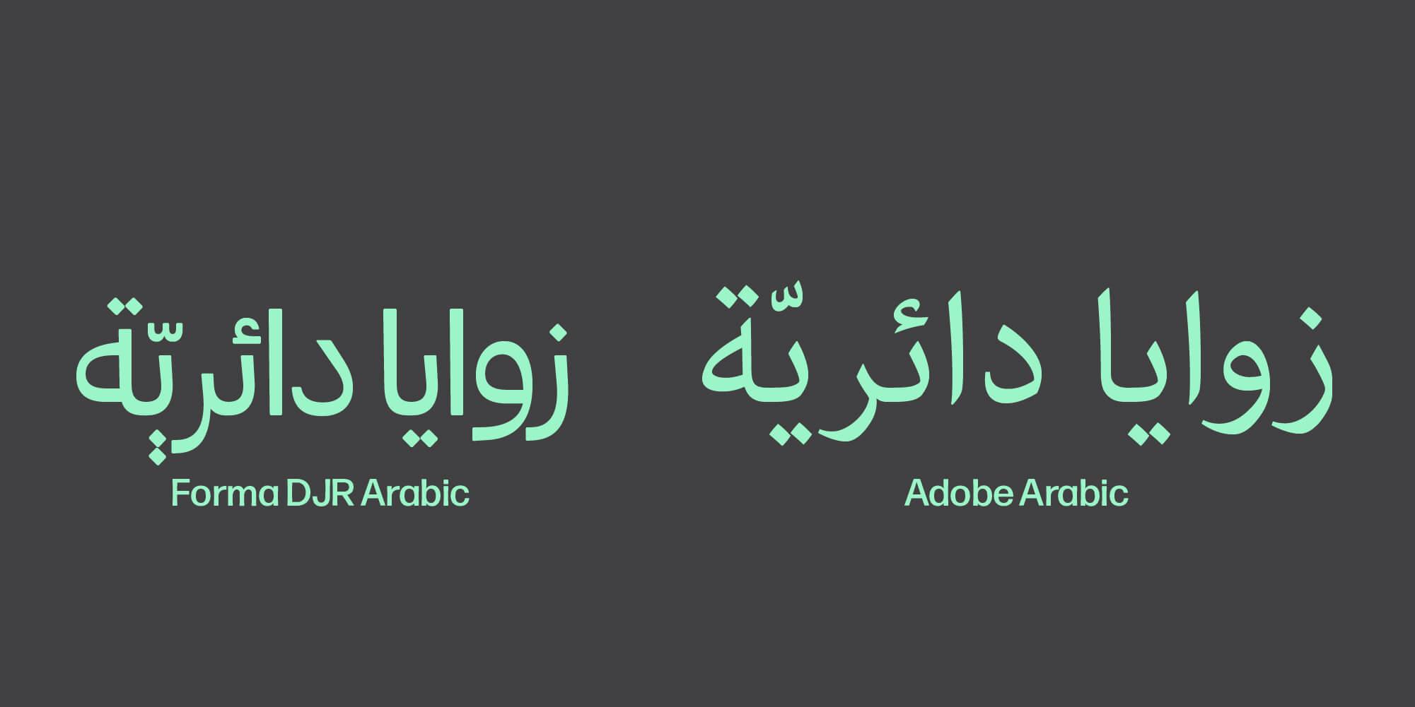
Second, they added kerning pairs to reduce the gap that occurs after some letters, like rah (ـر). In other letter combinations, the horizontal two dots above and below the nabirah were replaced by a contextual alternate consisting of vertically stacking dots. Finally, the vocalization marks were given a steep angle, allowing them to fit in a tighter horizontal space, avoiding undesired overlaps.
This project required a feat of coordination amidst a global pandemic. Drawing the custom scripts took four and a half months, including the addition of some new Latin characters to fill in HP’s specifications. The result is a suite of scripts that stand confidently on their own, while cohering as a series under the Forma DJR umbrella.
One of the cool parts is that Forma comes in a range of weights and optical sizes, so even though a lot of liberties were taken, they’re still matching the weight range. Some of these scripts don’t have a lot of typefaces with different optical sizes, so this is blazing a new trail.
—David Jonathan Ross
Once the script designs were finalized, Type Network put each of them through our rigorous technical review process, helmed by library manager Maria Glenda Bellarosa and font engineer Guido Ferreyra. Attention to all the small details guaranteed not only that the new scripts would integrate seamlessly with the existing ones, but also ensured that each font would function in every relevant use case required by the client, from tiny sizes on screens to large sizes in print, and everything in between and beyond. Bellarosa specifically brought along her years of experience with global scripts from her time working on Google’s Noto fonts. This added an extra layer of assurance that every script would be carefully reviewed by someone who understands its particular nuances.
We went into this knowing it would be complicated, and now we’re prepared for even more expansive global projects. We can confidently tell clients what it requires, and we can absolutely deliver it to them.
—Dyana Weissman
Type Network partners with the best type designers from around the world to deliver quality type in any script. When you come to us for a brand typeface, we first collaborate on the brief to agree on design direction, costs, schedule—and team. For most projects, we’ll introduce several designers for you to meet, and to choose from.
We handle project management to ensure we stay on time and on budget, but put clients are in direct contact with designers. Before delivery TN rigorously tests the digital files.
This is type consulting from Type Network. With our foundry partners, we’ve created many custom typefaces and adapted and expanded many families from our library. We can tailor any typeface in our library to your needs. We help clients create a typographical branding system for any medium. And by following our tested process, we can assure a predictably great type product. Contact us to start the conversation.