Forma and Function
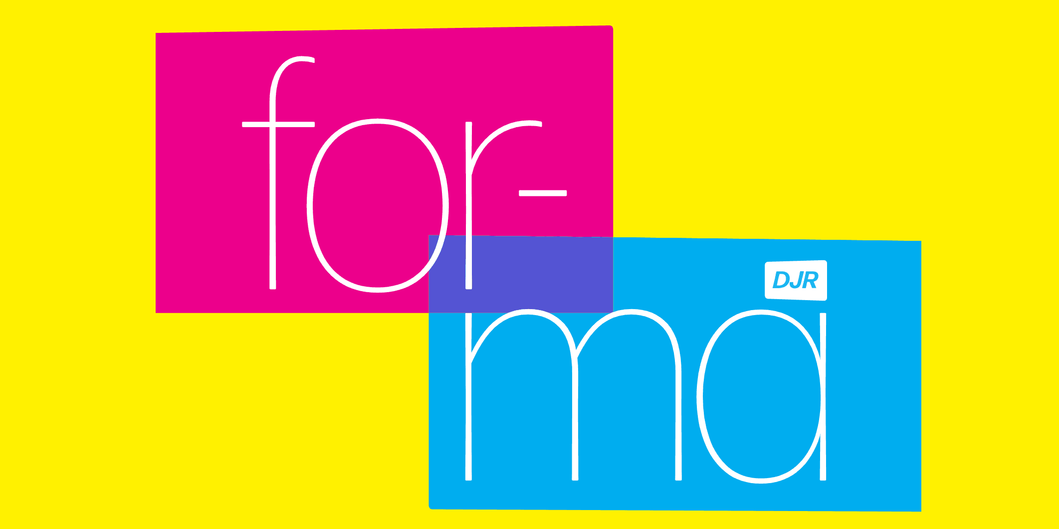
DJR's expansive revival of Novarese's mid-century classic reimagines a near-forgotten gem for the modern typographer.
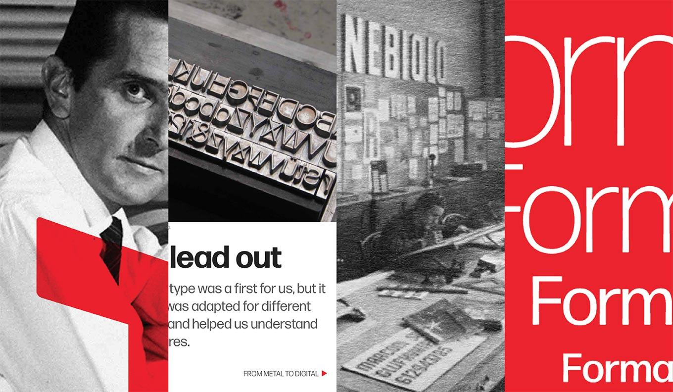
Some things old really are new again. Case in point, the thoroughly modern revival of Forma by David Jonathan Ross. The latest release from his growing type library, Forma DJR is a thoughtful reimagining of a classic sans from a mid-century master. Originally released in 1968 by the famed Nebiolo foundry of Turin, Italy, Forma got a late start in competing for the attention of a public smmitten with neo-grotesques. Helvetica was, at the time, considered fresh, vibrant, and exciting—and proved to be a serious money-maker. In striving to emulate the startling success of Max Meidinger's Swiss powerhouse, Novarese and his team added tiny details to their rendition, intended to soften the rigidity displayed by the frontrunner. This differences made Forma not quite as pure and precise, but more stylish and warm than the strict Helvetian neutrals.

Forma is back: Novarese, Nebiolo, DJR, and the quest for the perfect neo-grotesque.
We saw the culmination of an entire era of typography: an era when designers strove for formal purity, when headlines were spaced far too tightly, and when neutral sans serifs like Helvetica were actually something fresh and exciting to look at.
—David Jonathan Ross
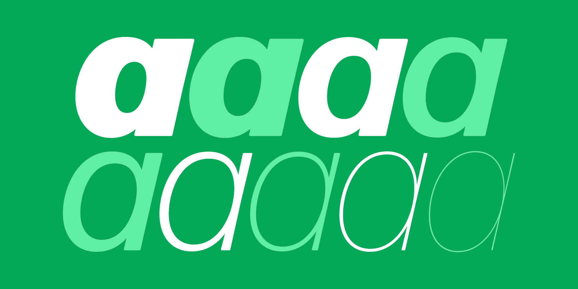
Ross worked with Roger Black—a longtime fan of Forma—and Indra Kupferschmid in reviving the family. They studied the Novarese’s drawings, the typeface cast in metal, and printed proofs in determining the direction of Forma DJR. The result is a 50-style collection of types in a range of optical sizes designed to maintain legibility while staying true to the “tight-not-touching” style of mid-century ad typography. In celebration of this milestone release, Black and Kupferschmid, along with other members of the Type Network team, have developed a brochure site chronicling the history of the original Forma, the stories of Novarese and Nebiolo, the odyssey of discovery surrounding the revival, and the backstories of the lead actors in this typographical drama. We hope you'll enjoy discovering Forma—both the old and the new—as much as we have.


