ScreenFonts_201706_2-1_lede.jpg

ScreenFonts: June 2017

Poster galleries galore: the June episode of ScreenFonts looks at posters for LA 92, Restless Creature: Wendy Whelan, Sleight, Burden, Violet, Hounds of Love, A Dark Song, The Void, Free Fire, and Berlin Syndrome.
The lone film poster used to be one of the most direct artistic expressions in the public sphere. Nowadays, campaigns consisting of multiple teasers, character posters, theatrical one-sheets, localized variants, festival posters, collectors’ editions, and digital-only posters have become integral to many movie-marketing efforts. This episode highlights several good examples of this evolution.

LA 92
Poster for LA 92
© 2017 National Geographic & Lightbox.
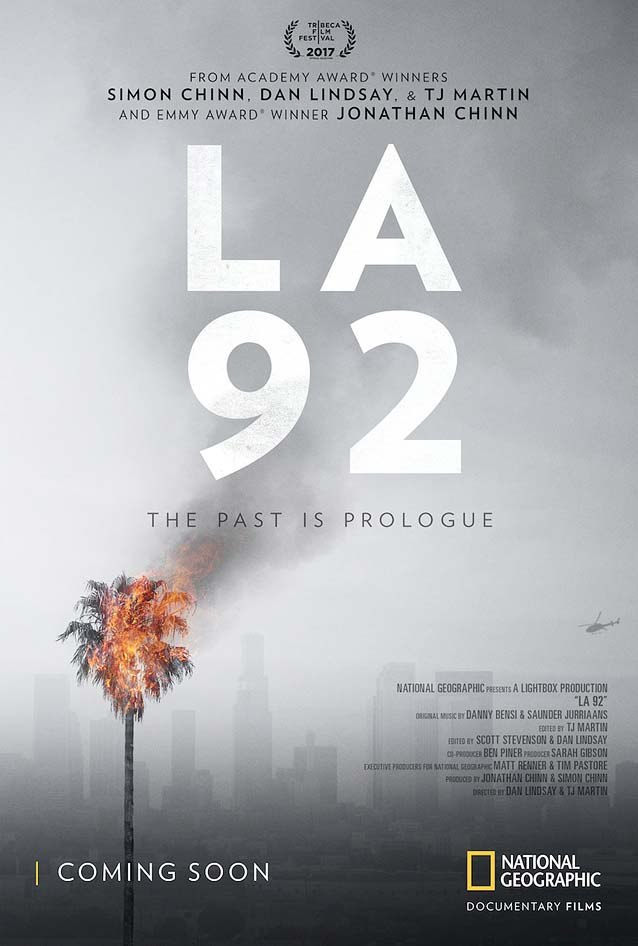
LA 92 proves that all you need is a strong, memorable image. The documentary shines a light on how the killing of Rodney King by Los Angeles police officers led to the LA Uprising twenty-five years ago. The designer(s) resisted the urge to bludgeon the viewer with images of protesting people or confrontations with the police. Instead, the poster shows the Los Angeles skyline shrouded in an acrid smoke that turns all color into shades of despair. In the bottom left corner stands a lone palm tree, its crest ablaze—an understated but powerful image that effectively gets the message across. While downplayed, the typography is sophisticated. The transparent big LA 92, set in Verlag, lets the smoke emanating from the palm tree shine through. There’s nothing special about the centered lockup at the top, but check out the position of the “Coming soon” at bottom left. The MIN sequence is evenly spaced around the tree trunk, with the I dead in the center. This kind of attention to detail makes me feel all warm and fuzzy inside. Agenda would be a great alternative typeface choice.

Restless Creature: Wendy Whelan

Poster for Restless Creature: Wendy Whelan
© 2016 Got The Shot Films. Photography by Paul Kolnik.
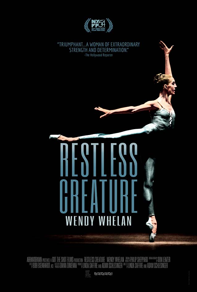
The poster for the documentary Restless Creature: Wendy Whelan is a no-brainer. Capturing an exceptional dancer mid-movement invariably produces images of singular impact and grace. Photographer Paul Kolnik immortalizes a classic gravity-defying ballet pose. The typography, however, elevates the design to a higher level. Set as a compact block, the extra-condensed letterforms huddle neatly under Whelan’s outstretched leg. Their elongated shapes mirror the vertical motion of her body, almost literally supporting her leg. These shapes, known as skyline faces, originated in wood type for situations where letters needed to be as tall as possible but had only a modest line length to work with. David Berlow’s Titling Gothic FB has Skyline styles, and the Extra Compressed widths of Bureau Grot serve the same purpose. Empire offers an alternative with contrast, while Agency Compressed is confidently squarish.

Sleight

Poster for Sleight
© 2016 Diablo Entertainment. Poster by Blood & Chocolate.
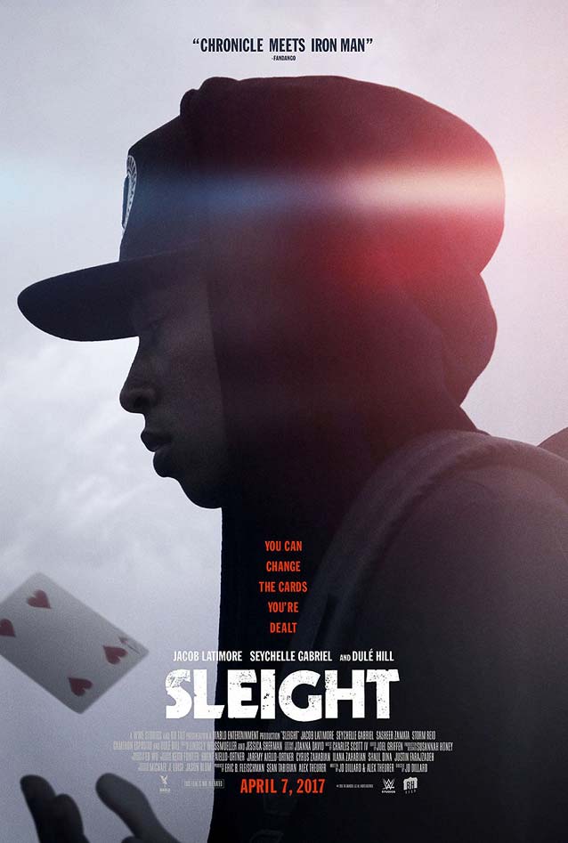
By contrast, Sleight demonstrates how excellent photography can be diminished when typography doesn’t utilize an image to its full potential. In this action sci-fi drama, a young street magician is forced to draw on his exceptional magical and mental abilities to save his kidnapped sister. The moody backlit portrait of the young man, haloed by a lovely lens flare, is just gorgeous. My reservations about the typographic lock-up in Blood & Chocolate’s theatrical one-sheet are admittedly very personal. Granted, the centered approach is a valid solution. But when you analyze the photograph, you notice a clear light/dark division in the bottom half that just begs to be used as an anchor for the text. Having the type aligned left along that division line would have been more in tune with the image. The typeface is Kabel Black. CJ Dunn drew inspiration from geometric sans faces from the same time period in crafting Dunbar, which comes in two display cuts and a text version designed for contemporary use.

Burden

Poster for Burden
© 2016 Magnolia Pictures.
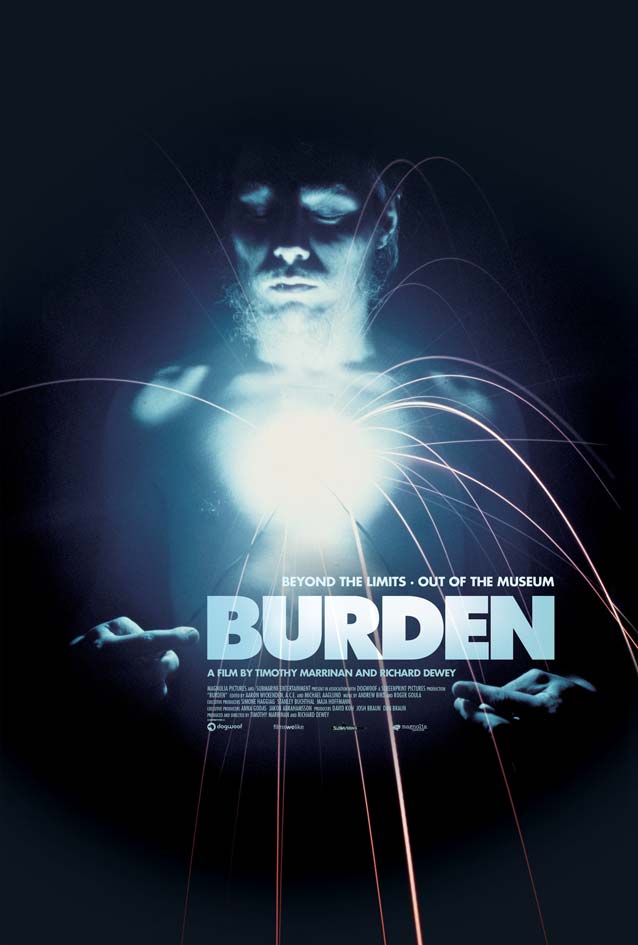
A wonderful interaction is at play between the photography and typography in the poster for Burden, a probing documentary on the maverick artist who took creative expression to an extreme and risked his life in the name of art. Chris Burden seems to make the block of type levitate between his fingers by sheer willpower, sparks flying in all directions. The tension in this mesmerizing photograph is almost unbearable; Burden’s calm, meditative expression offsets the lethal force of the crackling electricity. Futura Extra Bold, one of the most overused typefaces in poster design, has been used to set Burden’s name. Miles Newlyn offers a welcome alternative: New Hero adds a contemporary crispness to the geometric sans model, with an extended character set that includes the Greek and Cyrillic alphabets.

Violet

Film poster for Violet
© 2014 Minds Meet.
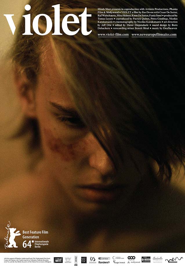
A minimal customization can go a long way toward turning a plain typographic treatment into something special. The theatrical one-sheet for the Dutch family drama Violet shows a close-up portrait of fifteen-year-old Jesse, who witnessed the stabbing of his friend and is now confronted by his family and cohorts from his BMX riders crew. The rawness of Jesse’s emotions is almost palpable in this unvarnished photograph. All of the type congregates at the top, making the poster resemble the cover of a hip magazine with the nameplate on the left and the table of contents on the right. The movie title is set all lowercase in a simple Times-like face (cf. Starling), but with the right stem of the v removed. Observing the word gives the viewer a sensation akin to phantom pain: even though that part of the letter is missing, one can still sense it very clearly.

Hounds of Love

Poster for Hounds of Love
© 2017 Factor 30 Films. Key art by Brandon Schaefer.
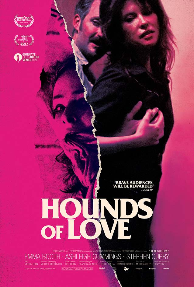
The theatrical one-sheet for Australian crime drama Hounds of Love masterfully visualizes its premise: a seventeen-year-old high school girl is sedated, abducted, and chained up in the guest room of a cold-blooded predatory couple. On the left side of the rip, the bound girl’s despair is amplified by the brutal contrast of the image on a scratchy magenta background, and further enhanced by flipping it on its side. On the right, the sickly pink colorization of the couple, caught in a lewd embrace, is a metaphor for their depraved minds and reprehensible behavior; their laviscious sideways glance is disturbing. The typography leaves me torn. On one hand, the film title is skillfully set—the OF is sized in such a way that the right side of the N perfectly lines up with the left side of the E; the inner shapes of the N and V match up nicely, and the OL and UO are perfectly stacked. Lastly, the “belly” of the S does a lovely touch-and-go at the black-and-pink border. On the other hand, for me, Friz Quadrata has become somewhat of a joke. Just like a number of other iconic ITC faces that have recently found their way back into the spotlight, Friz Quadrata is an easy out, evoking the heydays of thrillers and horror movies without adding anything new. The gratuitous use of such faces yanks poster design back into cheap nostalgia instead of furthering the medium.

A Dark Song

Poster for A Dark Song
© 2016 Samson Films & Tall Man Films.
Poster for A Dark Song
© 2016 Samson Films & Tall Man Films. Poster by Ómar Hauksson.
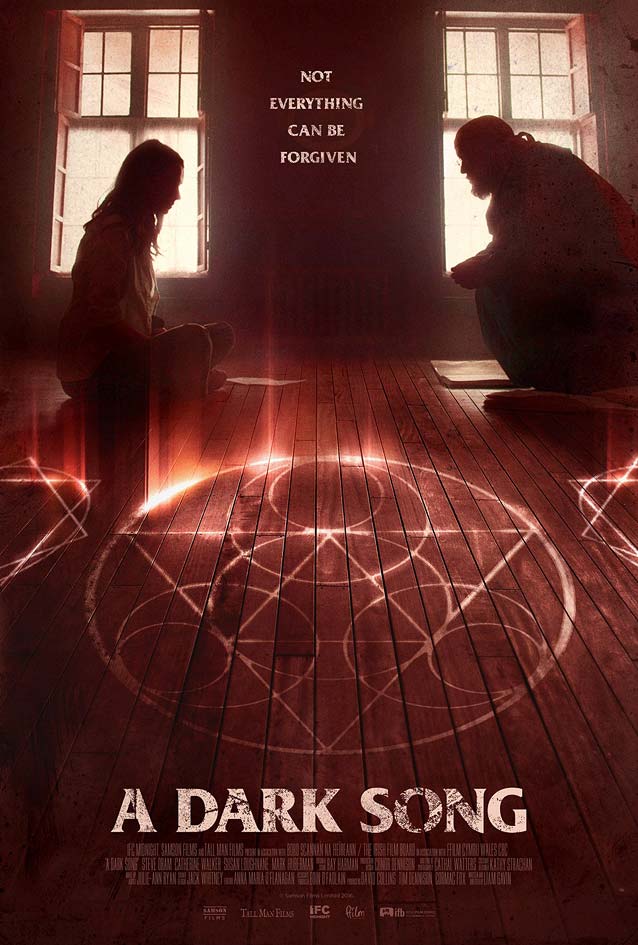
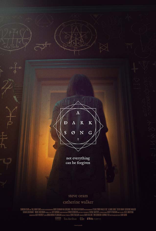
It doesn’t have to be like that. Irish occult horror drama A Dark Song allows us to compare two different approaches. Like the previous poster, the obligatory retro design sports Friz Quadrata. The poster looks good primarily because it shrouds the viewer in an inoffensive, comfortable blanket of familiarity. Ómar Hauksson’s theatrical one-sheet, however, shows how a contemporary interpretation referencing old type and occult symbols can be just as effective without needing to resort to nostalgia. The artwork features IM Fell, Igino Marini’s crude, uncorrected digitization of the classic Fell types, named after the seventeenth-century Bishop of Oxford John Fell.

The Void

Poster for The Void
© 2016 Cave Painting Pictures. Poster by Gravillis, Inc.
Poster for The Void
© 2016 Cave Painting Pictures. Poster by Gravillis, Inc.
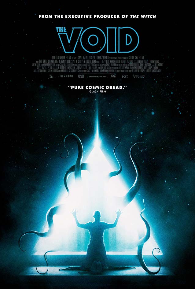
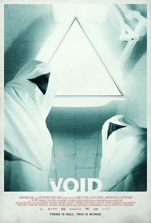
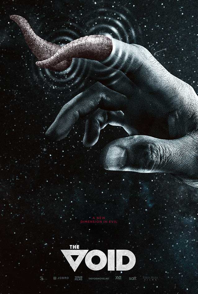
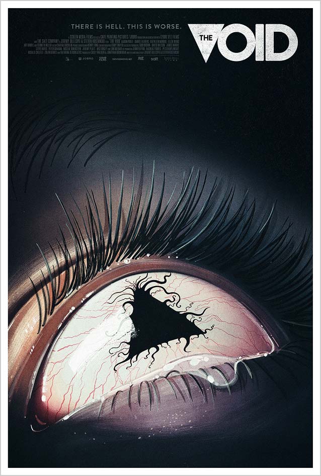
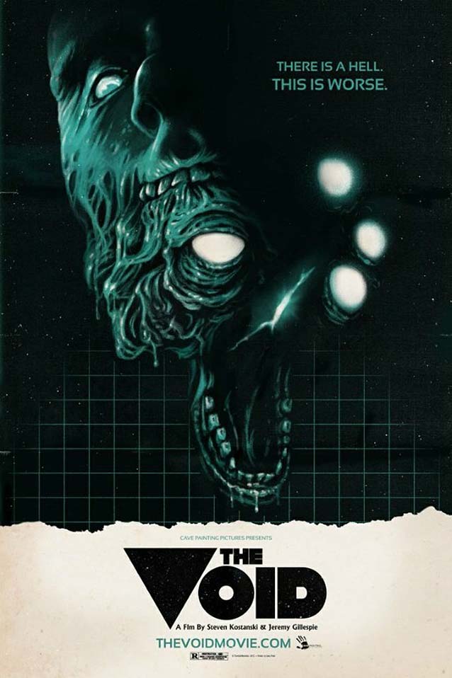
Despite being a comparatively “small” film in limited release, The Void enjoys an impressive media campaign. Priding itself on (crowdfunded) practical effects for the creatures, this sci-fi horror thriller is the claustrophobic account of strange and violent occurrences linked to a group of mysterious hooded figures in an understaffed hospital. While the inspiration for the retro poster for the previous film can be traced back to 1970s artwork for Stephen King and Steven Spielberg, the visuals for this movie reference eighties posters for John Carpenter, David Cronenberg, Clive Barker, and Stuart Gordon. Hector Guerra’s art direction for Gravillis, Inc. deftly plays with genre conventions, injecting just enough nods and winks without crossing into pastiche territory. The two posters here stick to horror type classics—ITC Serif Gothic at left and ITC Symbol at right.
Poster for The Void
© 2016 Cave Painting Pictures. Poster by Gravillis, Inc.
Poster for The Void
© 2016 Cave Painting Pictures. Poster by Gravillis, Inc. with illustration by Akiko Stehrenberger.
The poster on the left goes the extra mile by replacing Gotham’s V with the triangular motif in the movie title. For the last poster, Gravillis, Inc. commissioned painted artwork from Akiko Stehrenberger, who created a chilling image with the triangle and squirming tentacles as the pupil of the terrified eye. I love how the THE functions as the counterform in the triangle sitting in for the Brandon Grotesque V.
Poster for The Void
© 2016 Cave Painting Pictures. Poster by Gary Pullin.
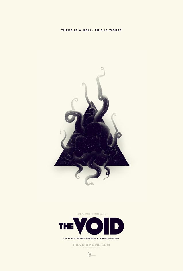
The Void also offered three unabashedly retro posters as rewards for their Indiegogo campaign to aid in the creation of the monsters. Gary Pullin knew the filmmakers were going for an eighties-inspired look and feel, so he wanted his artwork to reflect that era and represent the practical special effects showcased in the film. Growing up as a teenager in the eighties, Pullin spent a lot of time in video stores browsing the horror section and obsessing over the cover art. For the film title, he wanted to use something very bold. Starting with the typeface Null, Pullin tweaked the letters, turning the V into the triangle that symbolizes the hooded cultists in the film. Sansation Bold lends a science fiction feel to the tagline.
Poster for The Void
© 2016 Cave Painting Pictures. Poster by Graham Humphreys.
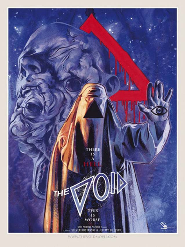
Graham Humphreysartwork, far from brooding, is a vibrant vortex of swirling imagery, the logo itself distorted by the circular motion revolving around the veiled alien. Humphreys wanted to evoke the Lovecraftian blend of horror and science fiction not only through the overt use of dripping blood, but also through the lurid primary colors of Greg and Tim Hildebrandt’s 1977 poster for Star Wars, where space is bright electric blue. While focusing on the eerie figure with the blank triangular void where its face should be, Humphreys also opted for a repetition of the triangle—a recurring visual theme in the film—in the title treatment: in essence, two triangles with a binary 0 and 1. Humphreys explained that he subconsciously may have tapped into his memory of Philip Castle’s UK poster for A Clockwork Orange, with its unique blend of airbrushed post-psychedelia and art deco (and a similar triangular framing device). The pop-art sensibility of the image is intentional—not for nostalgia, but for context.
Poster for The Void
© 2016 Cave Painting Pictures. Poster by Phantom City Creative.
Poster for The Void
© 2016 Cave Painting Pictures.
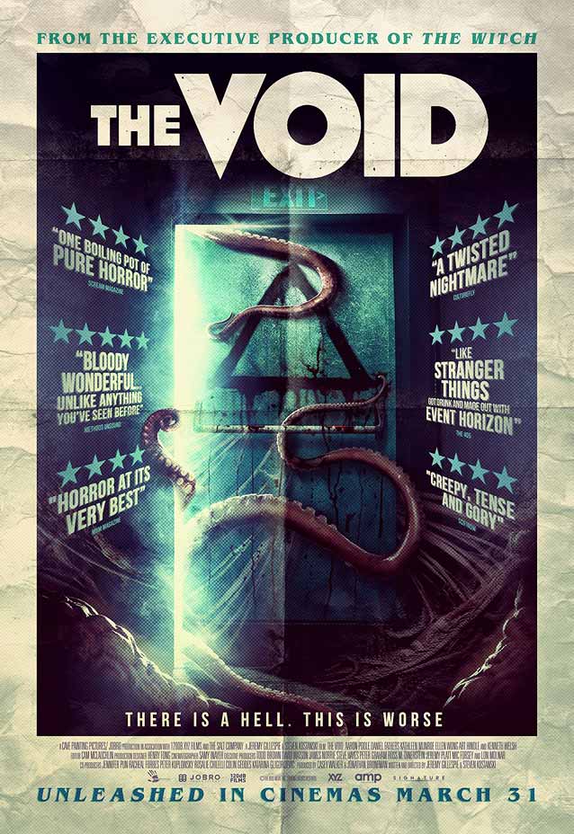
In my opinion, the most beautiful of the three incentive posters is by Justin Erickson, aka Phantom City Creative. Erickson veered away from pure nostalgia and updated the visual cues to a more contemporary interpretation, whittling the motifs from the film down to the tentacles emerging from the triangle. The last (uncredited) retro variant goes too far in the opposite direction. It pairs the inescapable ITC Benguiat with art-deco type similar to Pilar, Arbotek, and Mostra Nuova, on a poster with fake creases. This comes across as postmodern anecdotal irony gone haywire.

Free Fire

Poster for Free Fire
© 2016 A24. Poster by Bond.
Poster for Free Fire
© 2016 A24. Poster by Bond.
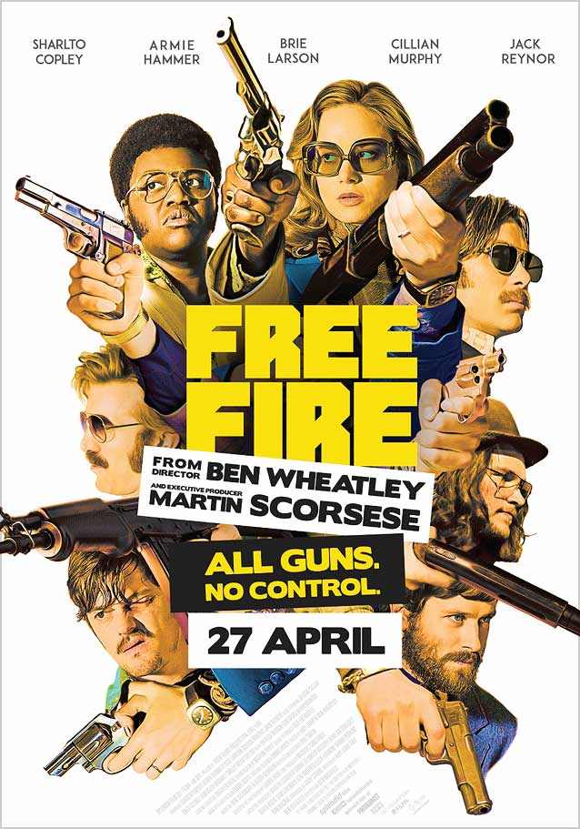
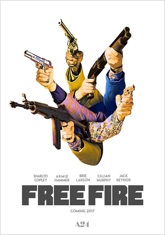
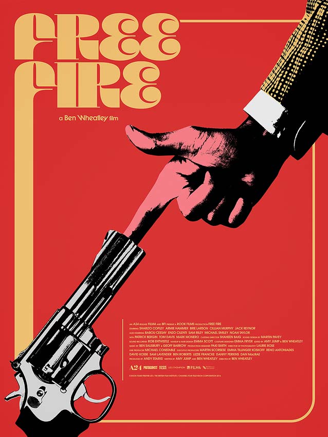
For a film described as “comedically chaotic,” Free Fire couldn’t have gotten better marketing collateral than Bond’s theatrical one-sheet and teaser. Set in 1978, the UK crime flick centers around a meeting between two gangs in a deserted warehouse in Boston that devolves into chaos and a giant shoot-out. The art painted in period-perfect style does a great job of visualizing the mayhem: a tangled mess of headshots and arms pointing guns in all possible directions, with the type acting as a central focal point. The teaser takes it one step further by showing only the arms and guns—notice how they go as far as having two different arms grab the shotgun in the top right corner. The type used for the film title looks amateurish: the angled parts in the F and E mirroring the R are gimmicky, and the widths of the letters are inconsistent—the R is too narrow in relation to the wide F and E. Given the warehouse setting, the retro vibe, and the humoristic tone of the film, Cyrus Highsmith’s Tick or Tock would have looked simply fabulous on these posters.
Poster for Free Fire
© 2016 A24. Poster by Intermission Film.
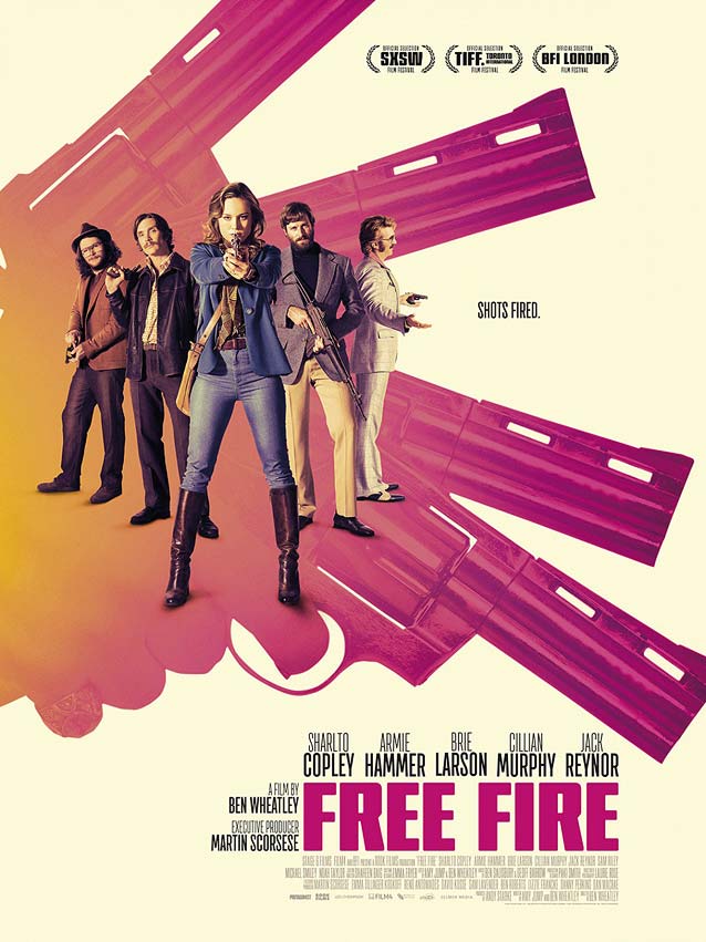
Just like The Void, Free Fire boasts a gazillion alternate posters: well over thirty. One design worth singling out is Intermission Film’s localized variant commissioned for Scandinavia. It contemporizes the 1970s style, and throws in a fun nod to the James Bond movies by having Brie Larson aim at the audience, as she stands in front of guns forming a shape similar to the iconic iris diaphragm from the Bond title sequences. Antenna Compressed and Condor Compressed would make good alternatives, and Sibylle Hagmann’s mechanical Axia strikes a similar tone to Barge, the typeface used in this poster.
Poster series for Free Fire
© 2016 A24. Poster series by Empire Design.
Poster series for Free Fire
© 2016 A24. Poster series by Empire Design.
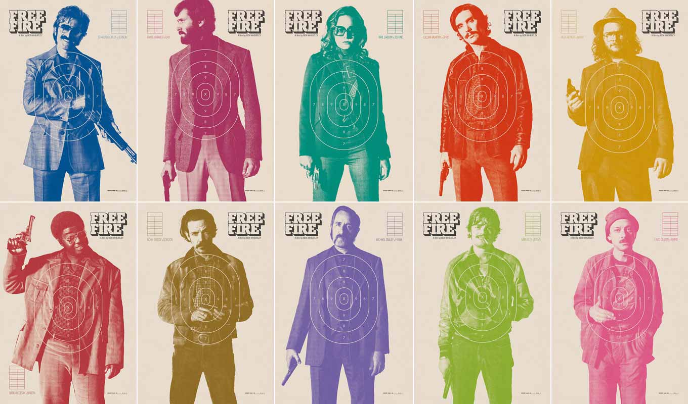
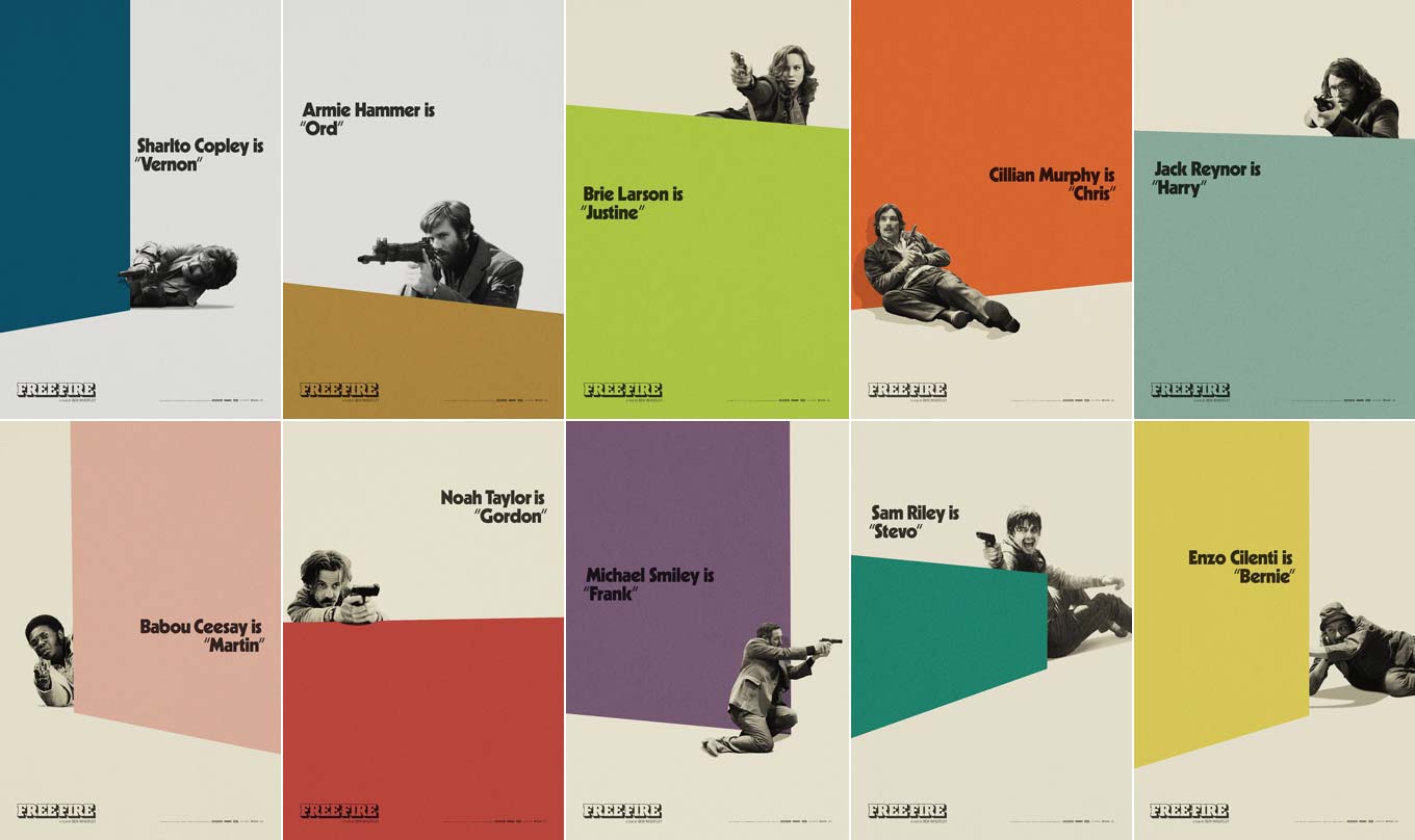
Empire Design created two fun series of character posters with a lovely color scheme. The first series features the characters as practice targets; the second uses flat-colored shapes to suggest architectural objects offering cover for the shooting protagonists. For some reason, to me the posters in these two series look like vintage paperback covers found at a flea market.
Poster for Free Fire
© 2016 A24. Poster by Jay Shaw.
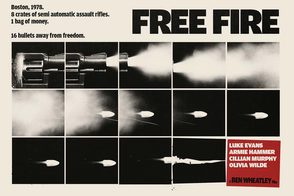
Jay Shaw designed superb variants for Free Fire. Director Ben Wheatley approached him a few years ago to create a marketing poster for the upcoming film. At the time, Wheatley had the plot down and some potential cast members in mind, but that was about it. Because the film was to be set in 1970s Boston and featured lots and lots of gunfire, Shaw went for a decidedly hard-nosed retro crime-film aesthetic. His grid-based design recalls American genre posters from that decade. Amplitude’s characters forcefully cut the words in the poster, their rhythm reflecting the sequential photographs tracing the trajectory of a bullet from shot to final impact.
Poster for Free Fire
© 2016 A24. Mondo poster by Jay Shaw.
Once Shaw got to see the finished film, he quickly discovered there was a great layer of comedy on top of the carnage. When it came time to create a new poster for Mondotees, he wanted to back away from the serious tone of the previous one and lean in on the absurd humor that sets the tone for the film. While he went for a “Monty-Python-meets-French-Connection” feel, Shaw’s striking artwork also seems to tap into the legendary style of Polish theater posters. The funky display face, Squirrel FY by the Parisian Black Foundry, is a perfect match.

Berlin Syndrome

Poster for Berlin Syndrome
© 2017 Screen Australia & Aquarius Films. Poster by Jason Cooper.
Poster for Berlin Syndrome
© 2017 Screen Australia & Aquarius Films. Poster by Jason Cooper.
Poster for Berlin Syndrome
© 2017 Screen Australia & Aquarius Films. Poster by Jason Cooper.
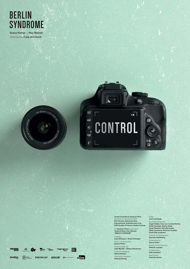
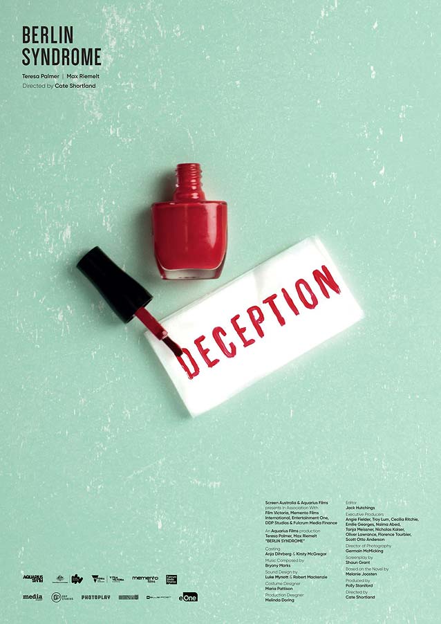
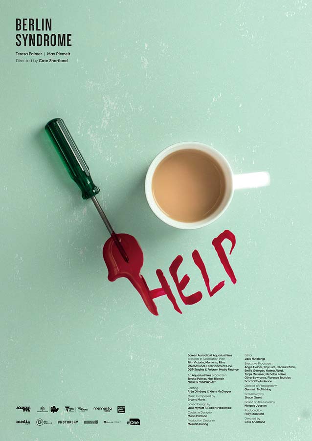
We end with a cool minimalist series for the thriller Berlin Syndrome, whose story line bears some resemblance with Hounds of Love. An Australian photojournalist lives a passionate holiday romance that leads to an obsessive relationship, as she wakes up in a Berlin apartment and finds herself unable to leave. Jason Cooper was commissioned by eOne to create a series of posters departing from mainstream advertising campaigns. Cooper wanted to depict three themes from the movie by merging actual scenes with conceptual interpretations of its story line. Image and type were balanced and aligned utilizing a strict grid, in an effort to create a tension in the layout that would cause a slight unease in the viewer. The movie title (set in Dense) and credits were relegated to the corners, so the coupling of ordinary objects with a foreboding word would become the hero of every poster. Each provides a clue about a key moment in the film, giving the viewer the opportunity to piece the puzzle together.
Unless you, too, are being held captive against your will in someone’s apartment, I propose we reconvene in a month or so for more movie poster goodness. Until then, savor a little aftertaste with The Leftovers in a couple of days. Bald Condensed, né Yves Peters, is a Belgian-based rock drummer known for his astute observations on the impact of letterforms in the contemporary culture-sphere. A prolific writer on typography, he has a singular knack for identifying the most obscure typefaces known to man.