
ScreenFonts: June 2017
Poster galleries galore: the June episode of ScreenFonts looks at posters for LA 92, Restless Creature: Wendy Whelan, Sleight, Burden, Violet, Hounds of Love, A Dark Song, The Void, Free Fire, and Berlin Syndrome.
The lone film poster used to be one of the most direct artistic expressions in the public sphere. Nowadays, campaigns consisting of multiple teasers, character posters, theatrical one-sheets, localized variants, festival posters, collectors’ editions, and digital-only posters have become integral to many movie-marketing efforts. This episode highlights several good examples of this evolution.
Unless you, too, are being held captive against your will in someone’s apartment, I propose we reconvene in a month or so for more movie poster goodness. Until then, savor a little aftertaste with The Leftovers in a couple of days.
Bald Condensed, né Yves Peters, is a Belgian-based rock drummer known for his astute observations on the impact of letterforms in the contemporary culture-sphere. A prolific writer on typography, he has a singular knack for identifying the most obscure typefaces known to man.
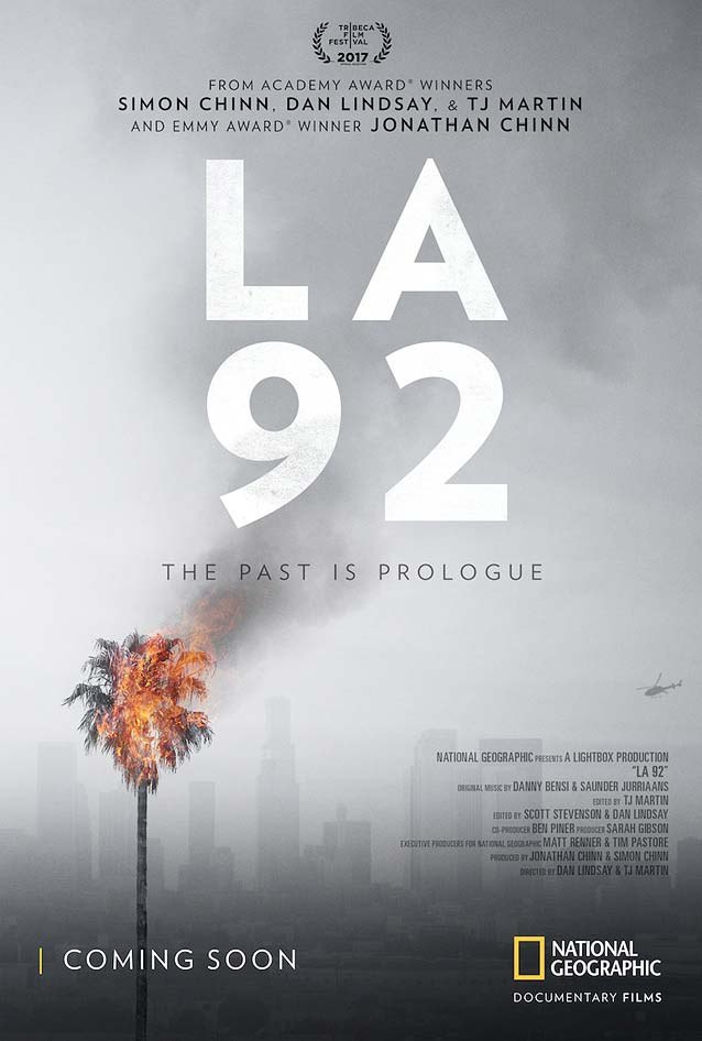
LA 92
|
Restless Creature: Wendy Whelan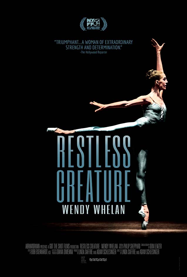
|
Sleight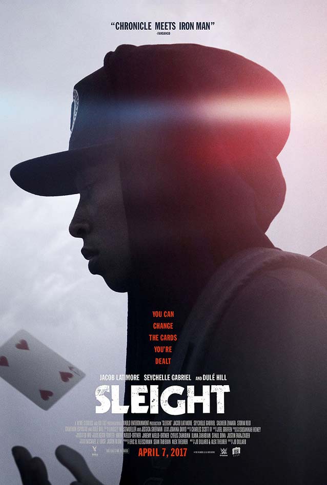
|
Burden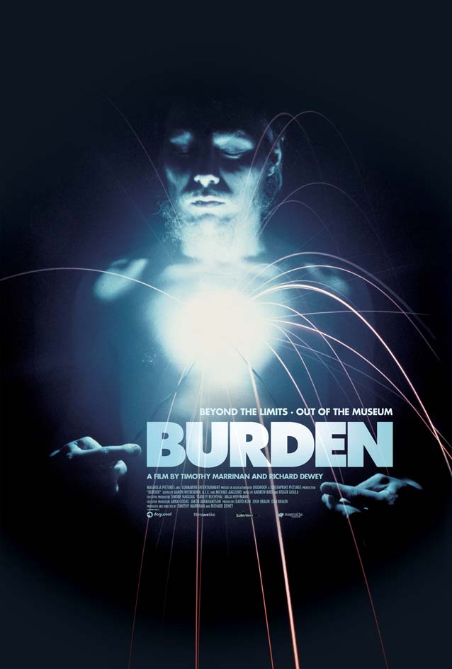
|
Violet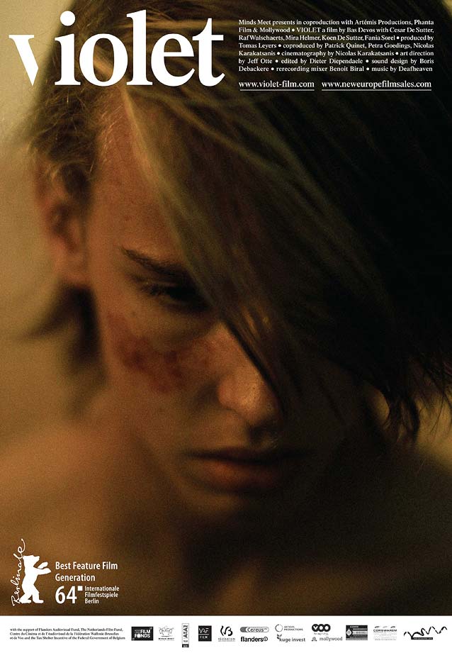
|
Hounds of Love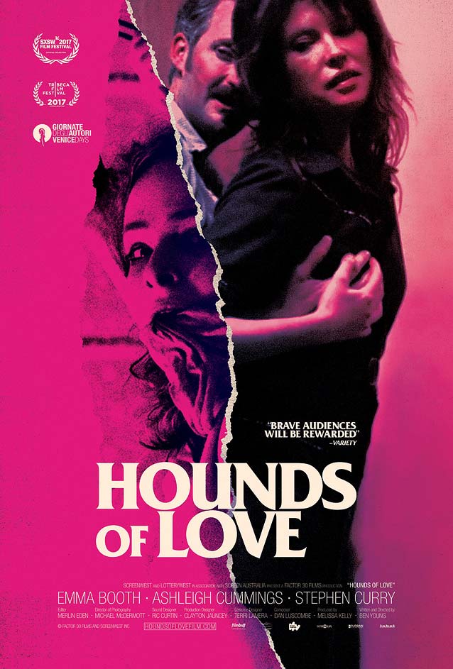
|
A Dark Song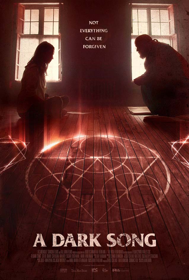
|
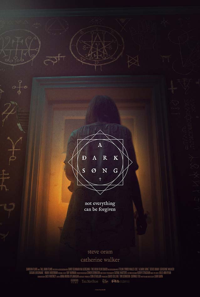
| It doesn’t have to be like that. Irish occult horror drama A Dark Song allows us to compare two different approaches. Like the previous poster, the obligatory retro design sports Friz Quadrata. The poster looks good primarily because it shrouds the viewer in an inoffensive, comfortable blanket of familiarity. Ómar Hauksson’s theatrical one-sheet, however, shows how a contemporary interpretation referencing old type and occult symbols can be just as effective without needing to resort to nostalgia. The artwork features IM Fell, Igino Marini’s crude, uncorrected digitization of the classic Fell types, named after the seventeenth-century Bishop of Oxford John Fell. |
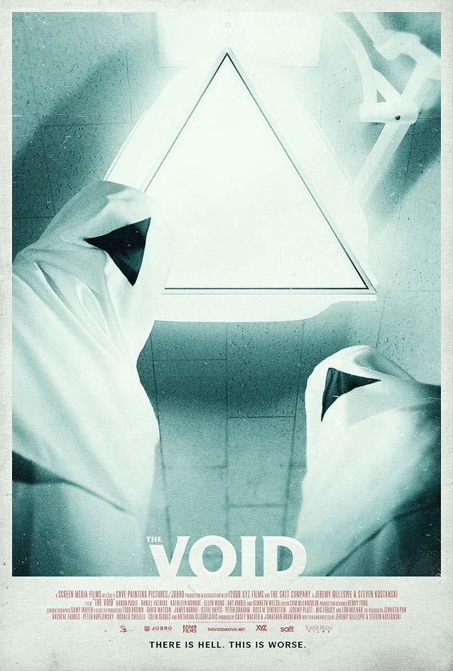
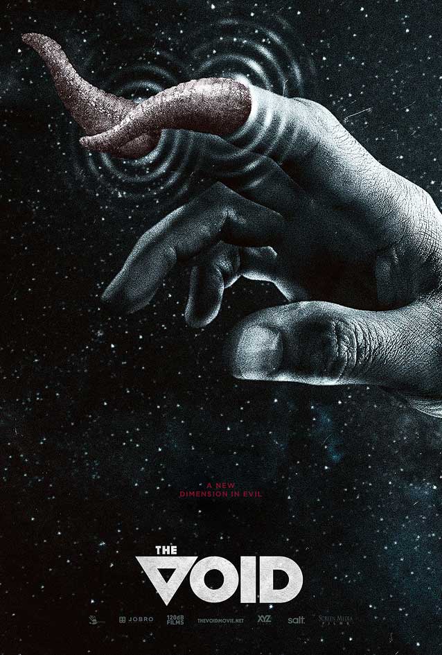
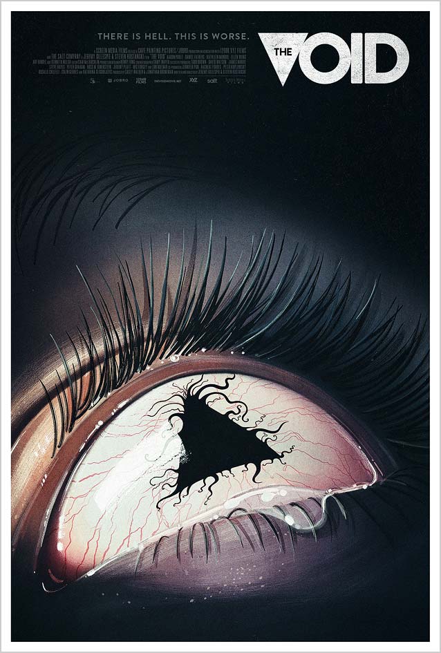
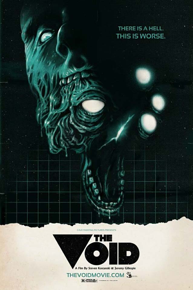
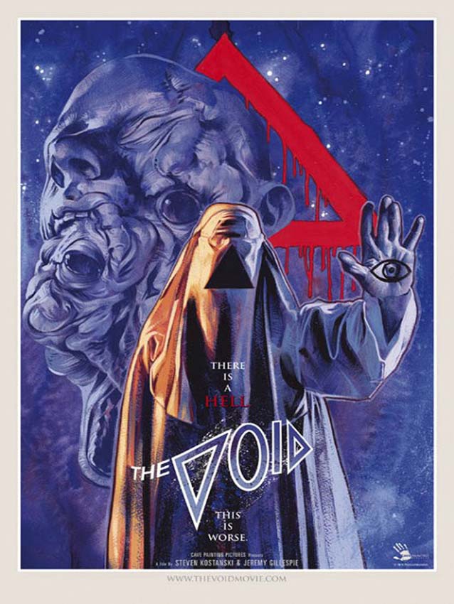
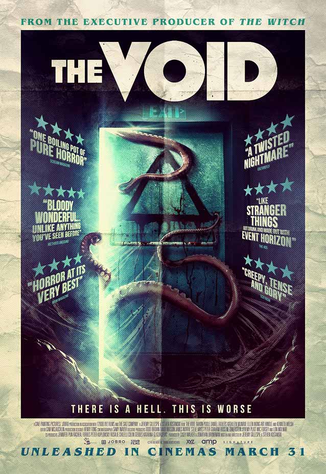
The Void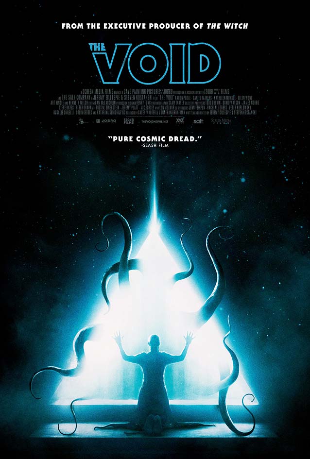
|
| Despite being a comparatively “small” film in limited release, The Void enjoys an impressive media campaign. Priding itself on (crowdfunded) practical effects for the creatures, this sci-fi horror thriller is the claustrophobic account of strange and violent occurrences linked to a group of mysterious hooded figures in an understaffed hospital. While the inspiration for the retro poster for the previous film can be traced back to 1970s artwork for Stephen King and Steven Spielberg, the visuals for this movie reference eighties posters for John Carpenter, David Cronenberg, Clive Barker, and Stuart Gordon. Hector Guerra’s art direction for Gravillis, Inc. deftly plays with genre conventions, injecting just enough nods and winks without crossing into pastiche territory. The two posters here stick to horror type classics—ITC Serif Gothic at left and ITC Symbol at right. |
|
| The poster on the left goes the extra mile by replacing Gotham’s V with the triangular motif in the movie title. For the last poster, Gravillis, Inc. commissioned painted artwork from Akiko Stehrenberger, who created a chilling image with the triangle and squirming tentacles as the pupil of the terrified eye. I love how the THE functions as the counterform in the triangle sitting in for the Brandon Grotesque V. |
|
|
|
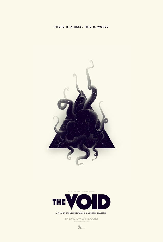
| In my opinion, the most beautiful of the three incentive posters is by Justin Erickson, aka Phantom City Creative. Erickson veered away from pure nostalgia and updated the visual cues to a more contemporary interpretation, whittling the motifs from the film down to the tentacles emerging from the triangle. The last (uncredited) retro variant goes too far in the opposite direction. It pairs the inescapable ITC Benguiat with art-deco type similar to Pilar, Arbotek, and Mostra Nuova, on a poster with fake creases. This comes across as postmodern anecdotal irony gone haywire. |
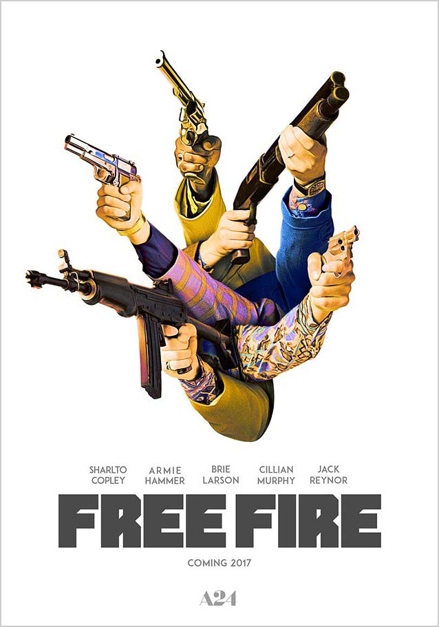
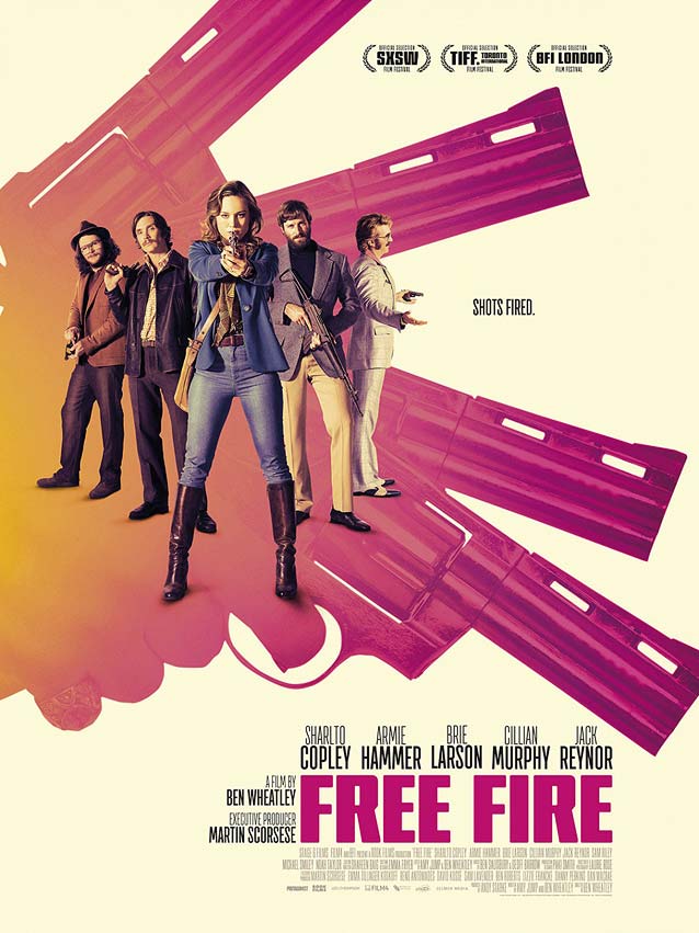
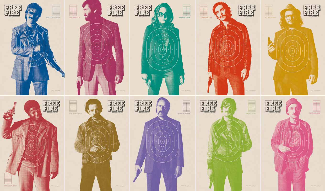
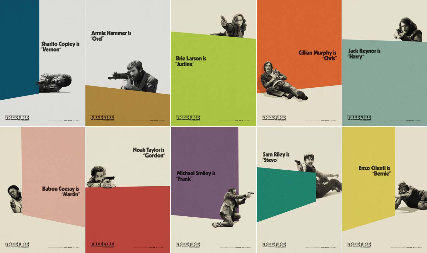
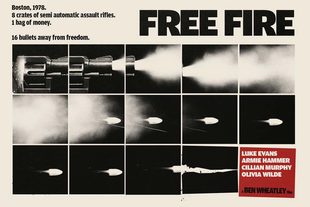
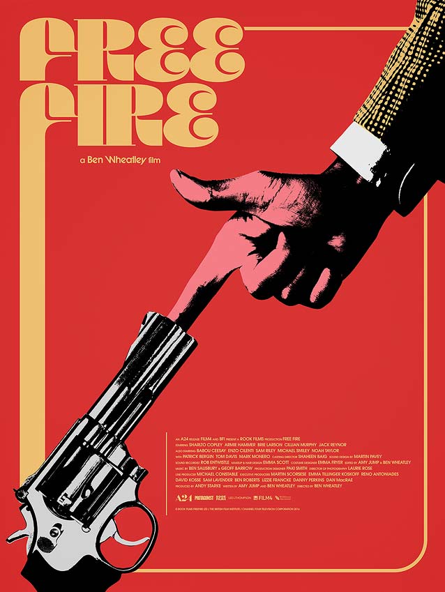
Free Fire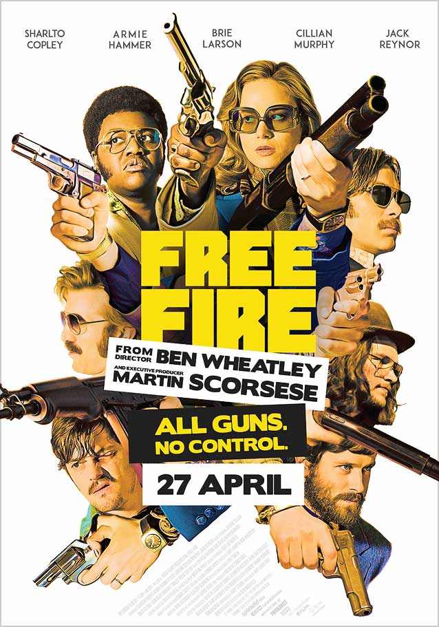
|
|
|
|
|
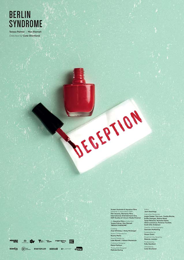
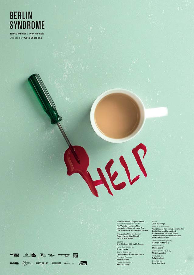
Berlin Syndrome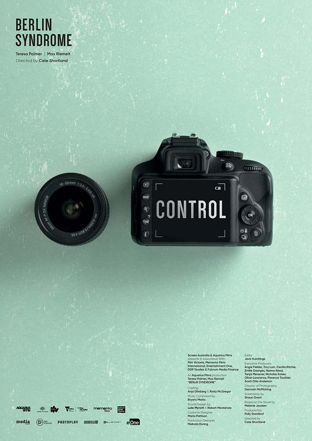
|
|