Montreal boasts a distinct public-lettering culture. In September, I had the good fortune to navigate a handful of the city’s signs and wonders in some very distinguished company.
By Caren Litherland
I measure New York in bygone signs. If, as Colson Whiteheadwrites, we become New Yorkers the first time we remember what used to be in the place of what is there now, then I suppose I became a New Yorker in the late nineties. One evening, walking home from my daily subway ride, I noticed that the Irish Action Bureau, with its Limerick lace curtains and heartfelt hand-painted sign, no longer appeared in my peripheral vision. I had meant to photograph the sign countless times. And so I learned, the hard way, an important New York lesson: don’t blink.
My experience of cities tends to be overdetermined, even haunted. Looking at signs, I can’t not see palimpsests. Beneath a TD Bank storefront, I can still make out Dick’s Hardware; where the latest inscrutable mobile-phone shop is, I remember Frank’s Shoe Repairs. I regret the homogenization of the urban landscape and the proliferation of what I’ve come to think of as JPEG signage—hideous flip-flops from analog to digital and back again. I don’t understand the impulse behind a stretch of University Place where all of the awnings on all of the stores appear to be dressed in Copperplate Gothic, or retail signage surrounding the Empire State Building that blurs together from the application of a single typeface (regardless of how well made that face is). What is arguably the world’s most vertical city flattens into a sprawling, late-capitalist Olive Garden. Sometimes I wonder if I’m in thrall to nostalgia. But no; I really do believe that most signs made today are spectacularly shitty and that New York, particularly Manhattan, is growing incrementally more boring as its vernacular personality fades.
So when I found out I would be visiting Montreal for ATypI in September, I was thrilled. I had extremely fond memories of the city, which I hadn’t visited in several years. Eager to explore it again and to see how its public Schrift stacked up to New York’s, I took plenty of snapshots on the walk from my hotel on René Lévesque to the Université du Québec à Montréal (UQÀM). When I entered the Sherbrooke Pavilion on the opening morning of the conference, one of the first people I saw was the wild-headed Paul Shaw, who was a generous presence at ATypI this year. I told Paul how sorry I was to have to miss the letterwalk he was giving on Sunday morning, since I was catching an early flight back to New York. He said he was planning to do a test run of the walk and asked me what I was doing the following afternoon. I was pretty sure I was busy but, without missing a beat, I said I didn’t have any plans. He told me to meet him the next day. I felt like the luckiest person in the world. We took the Metro from UQÀM to the Guy-Concordia stop, emerged blinking into the bright Montreal sun, and started walking. What follows is a sliver of what we saw.
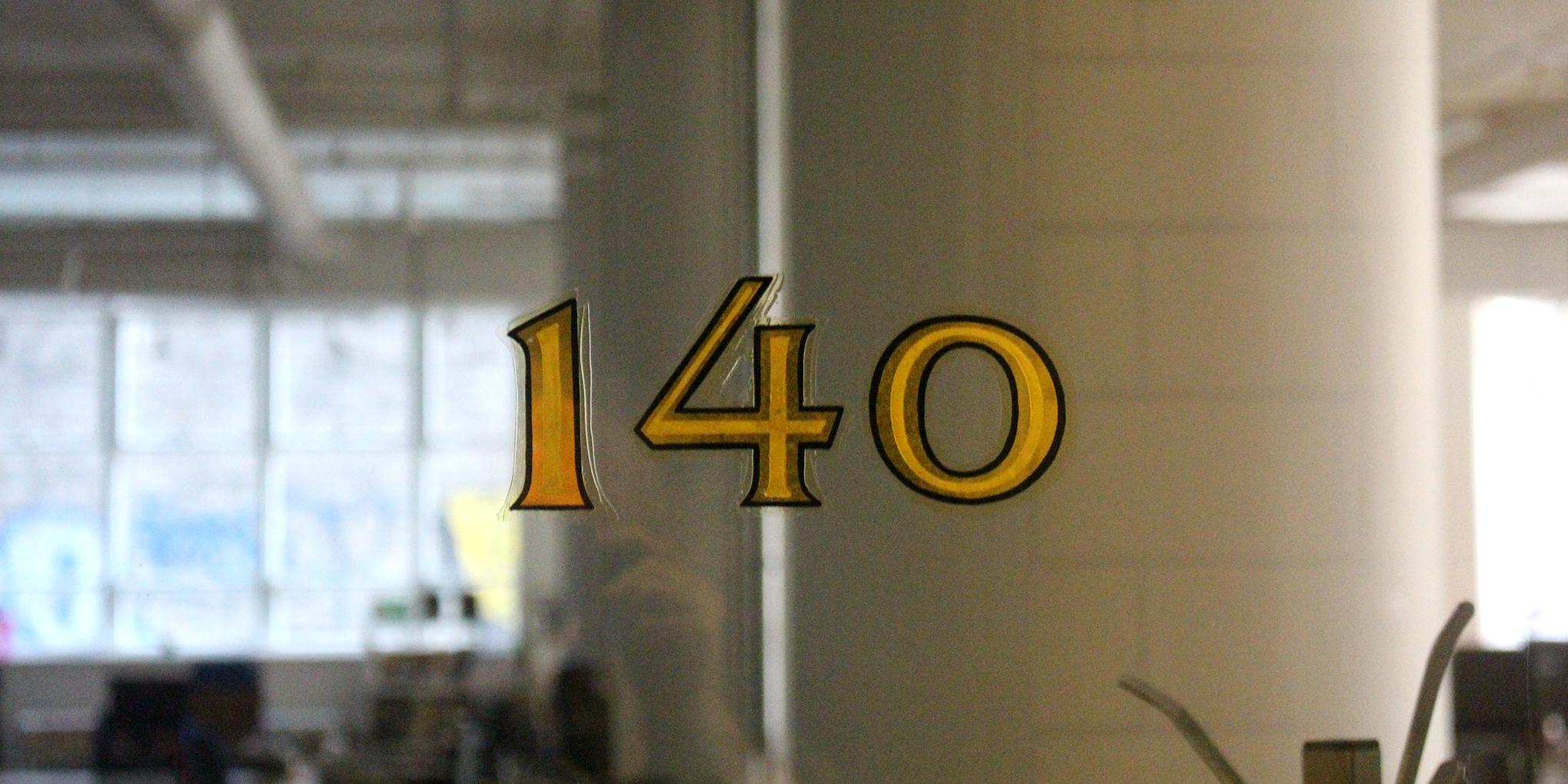
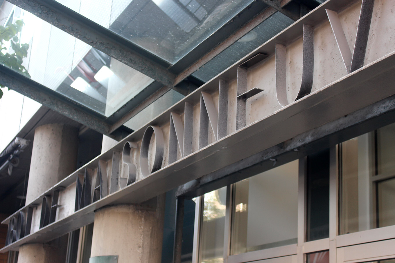
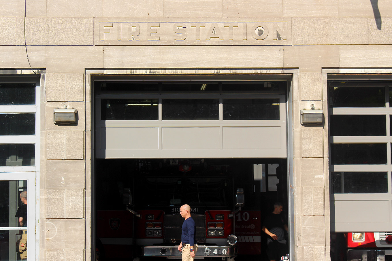
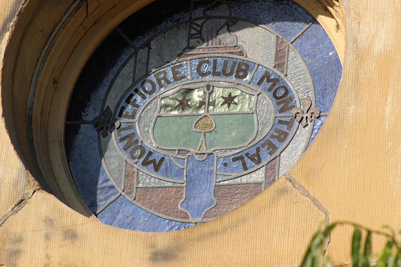
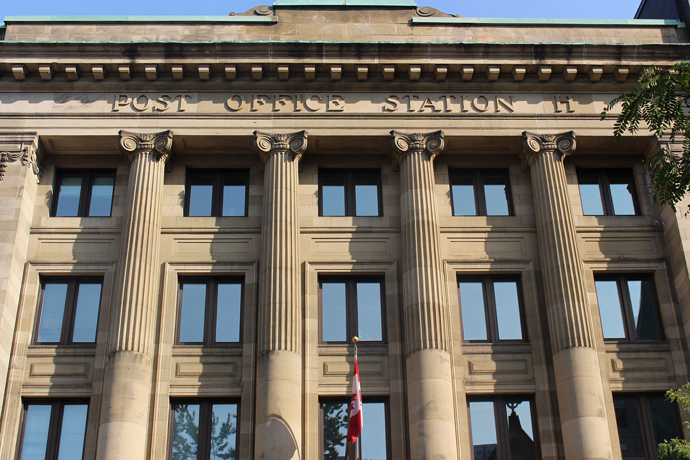
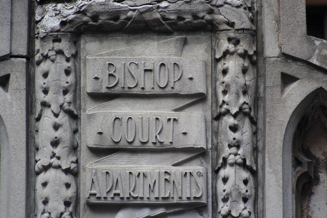
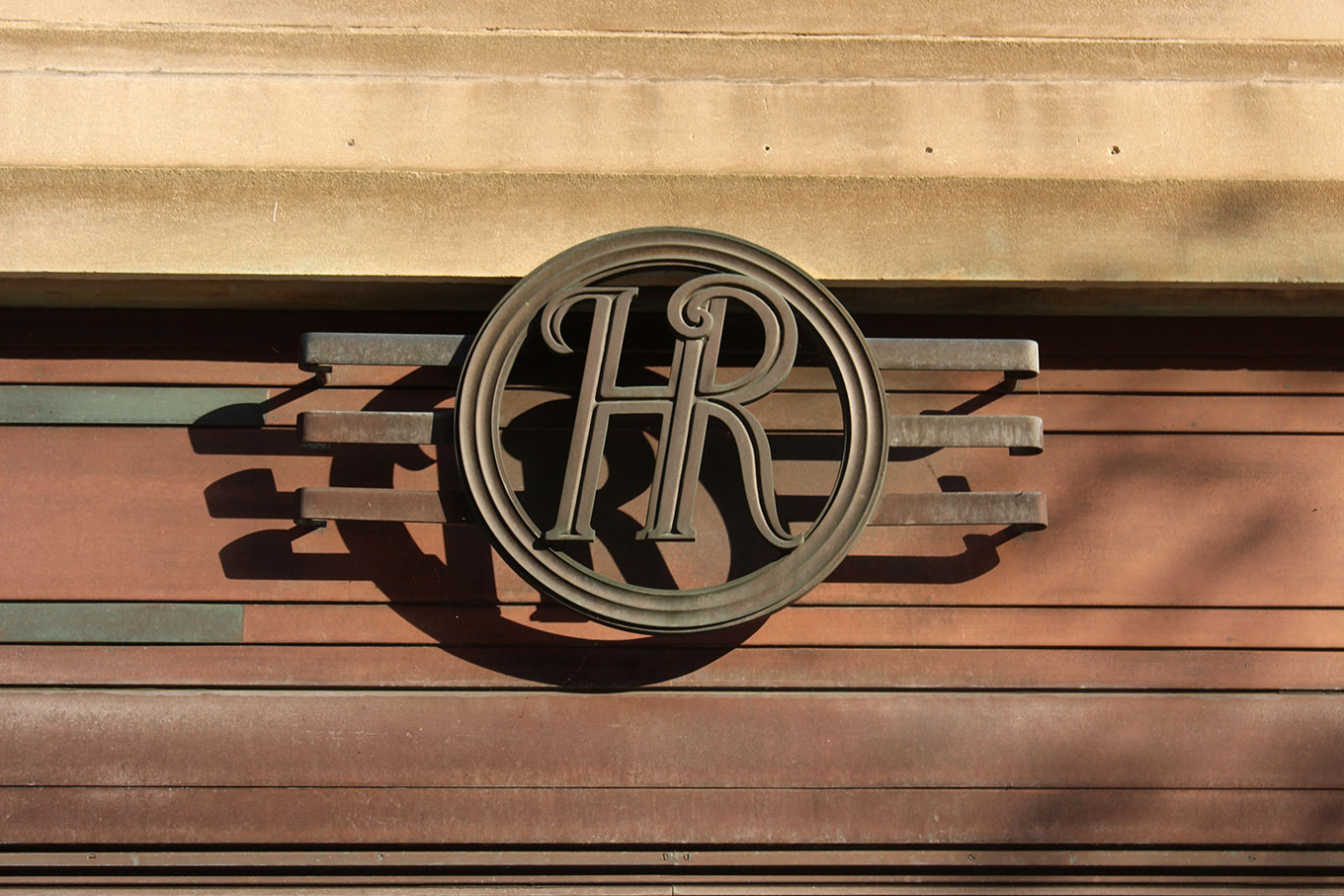
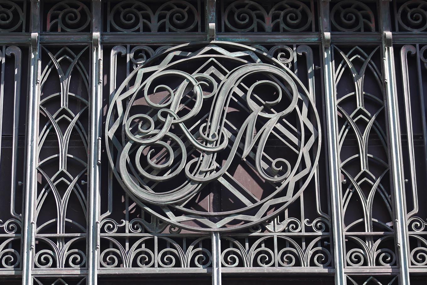
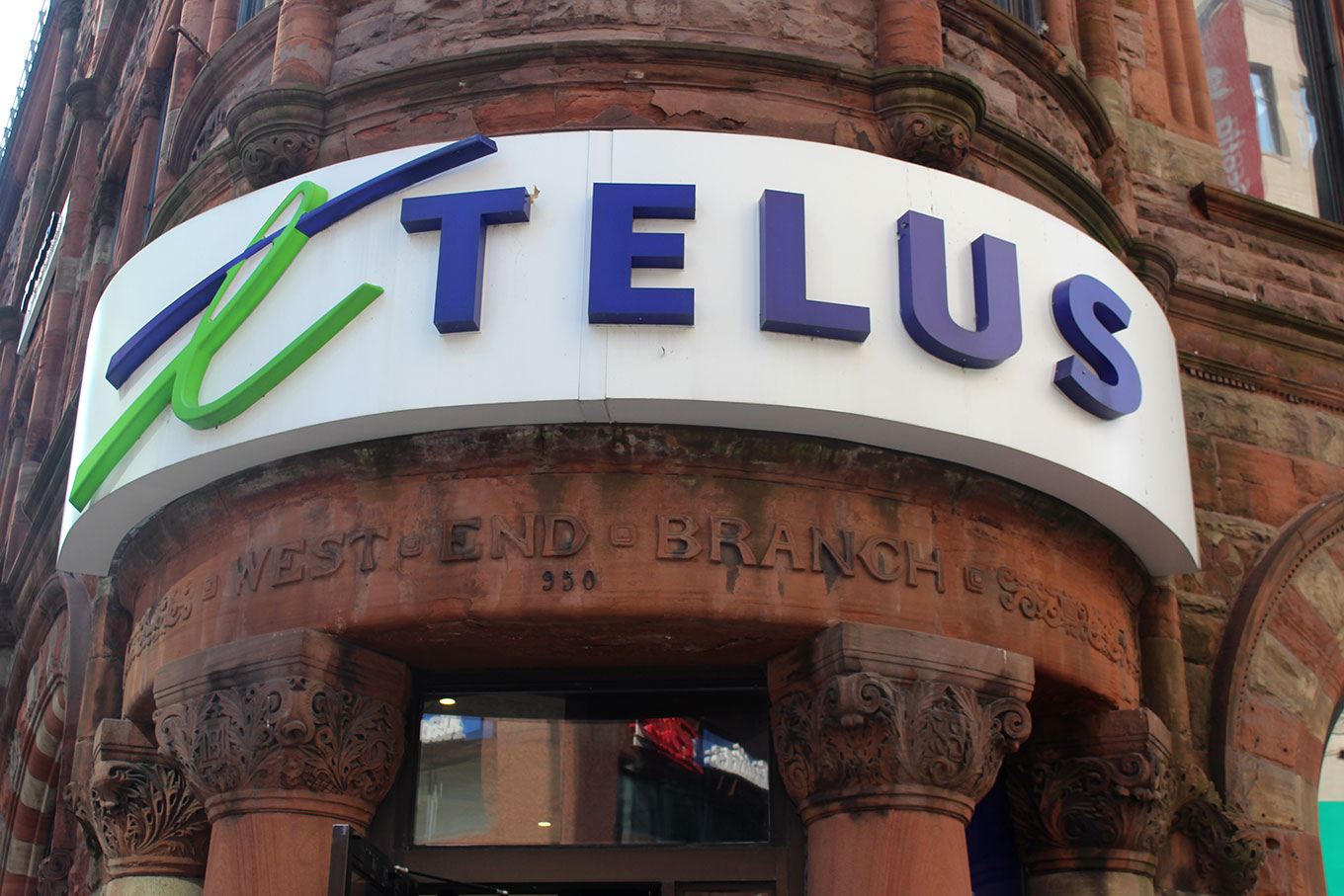
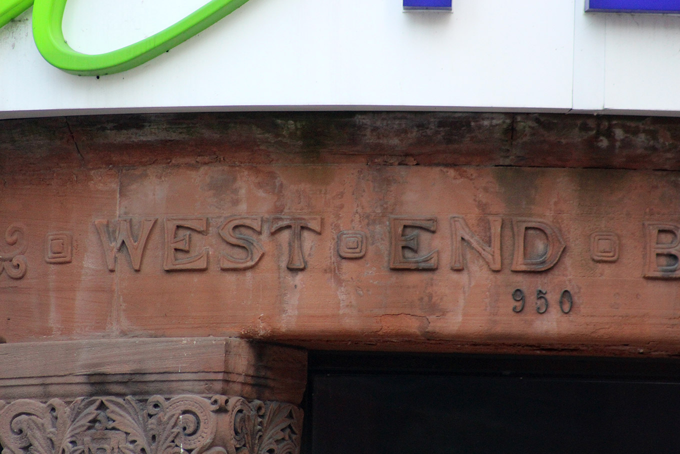
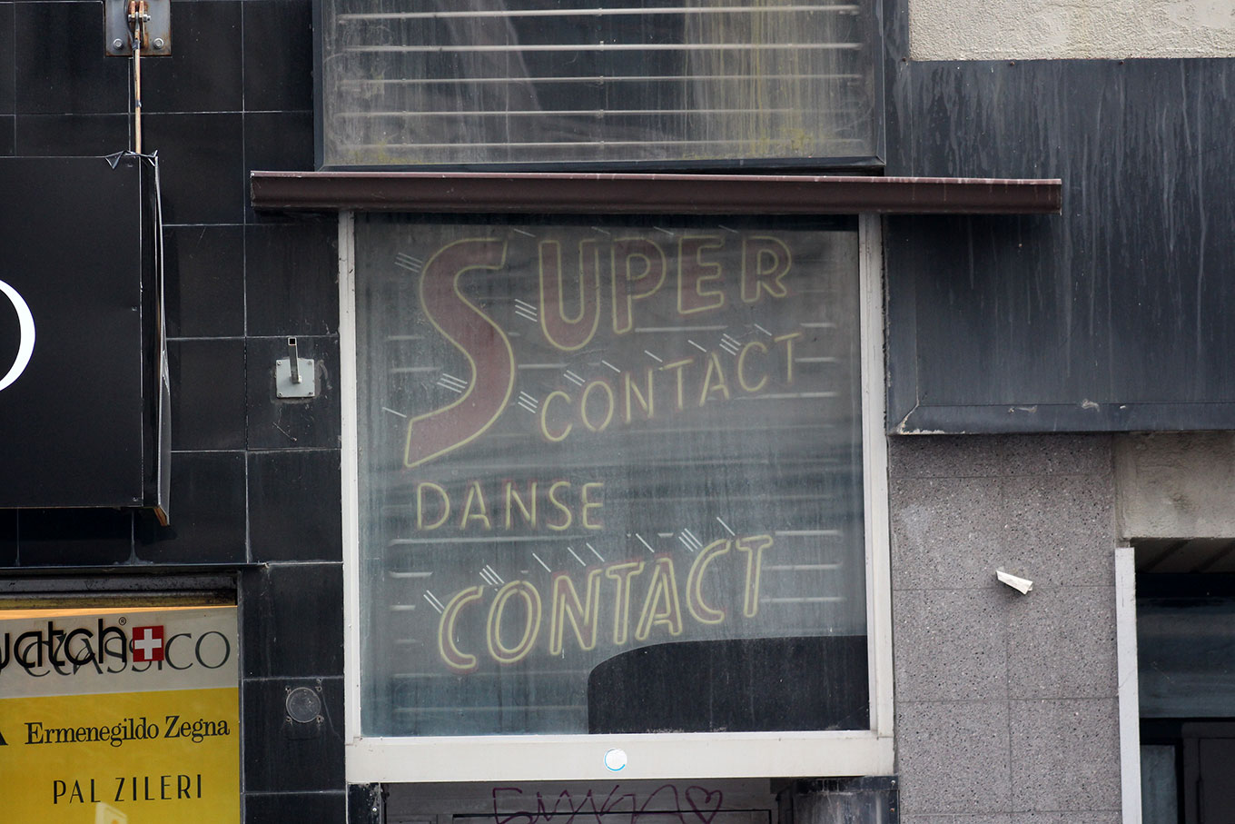
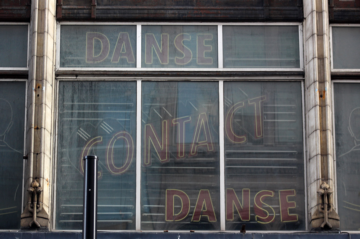
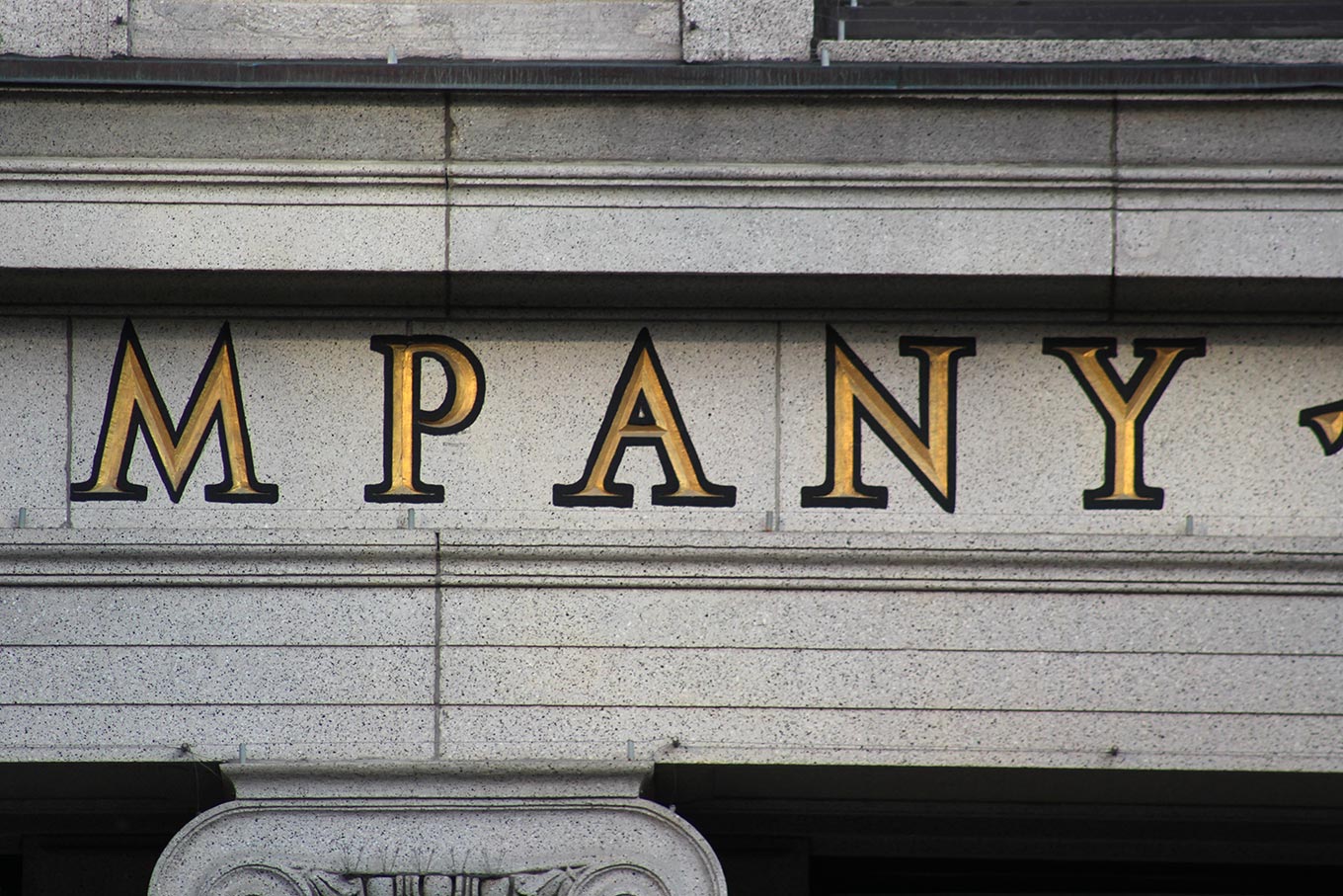
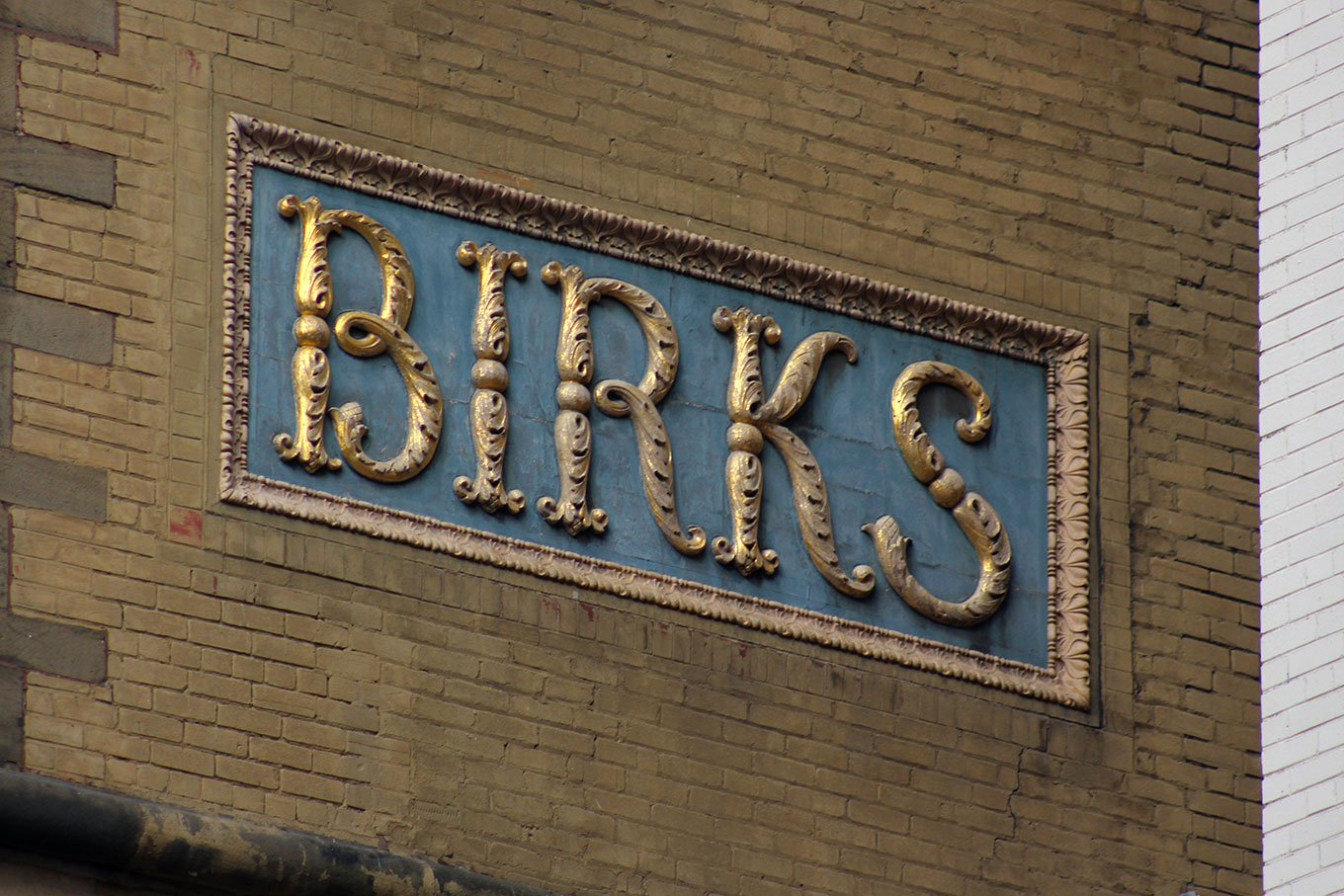
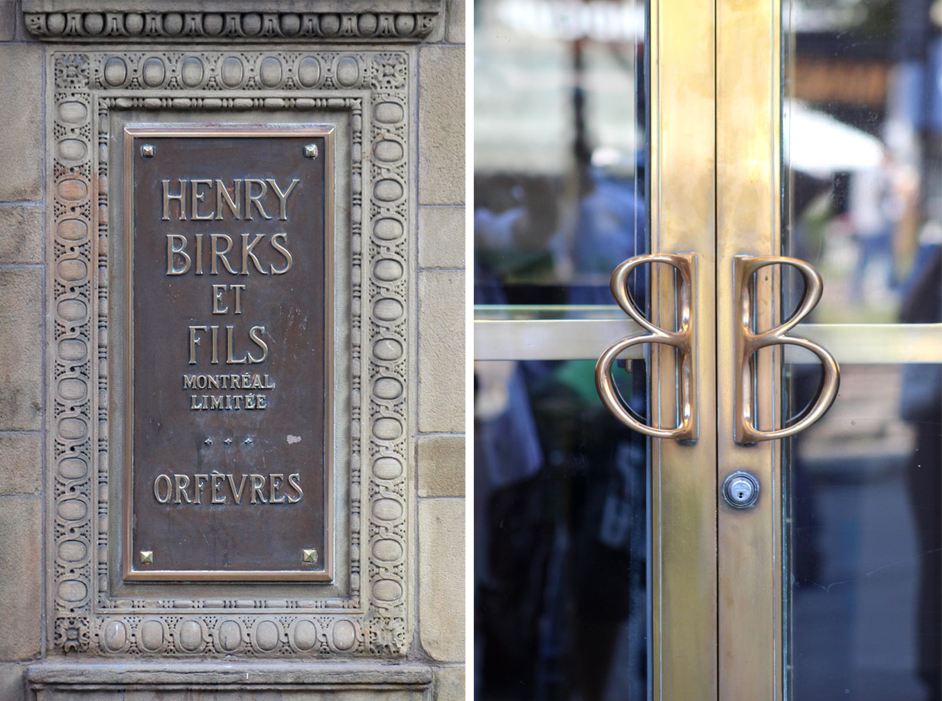
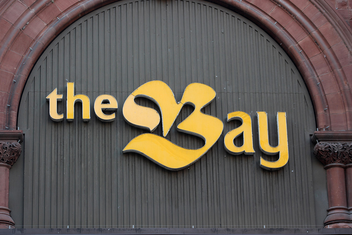
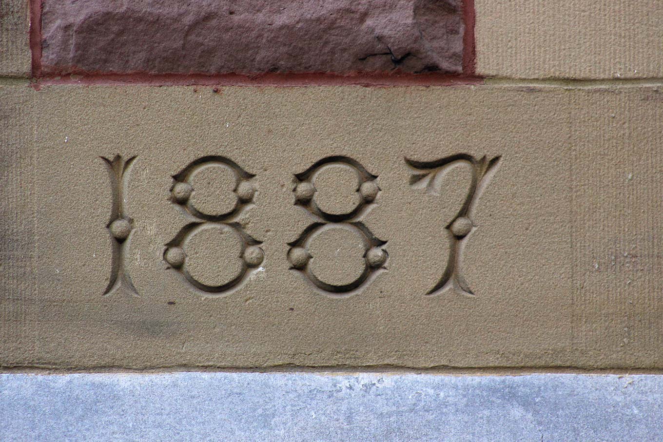
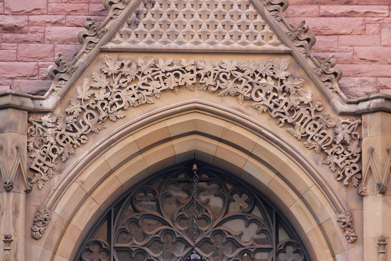
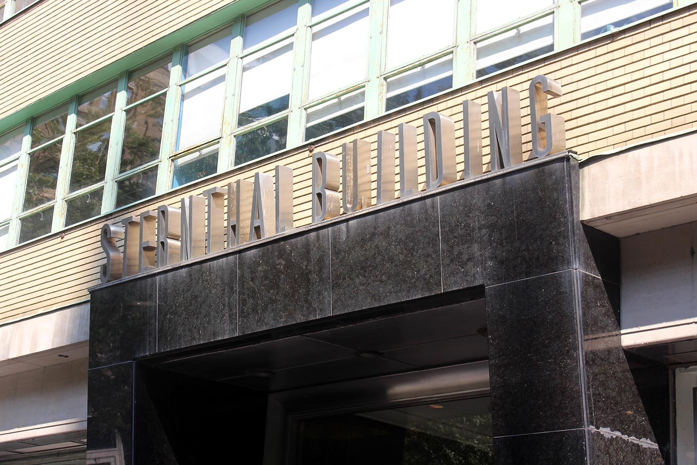
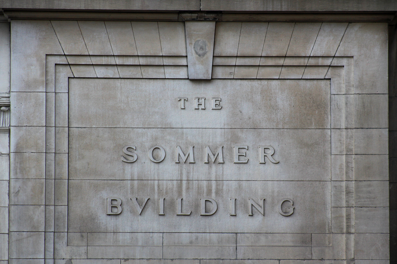
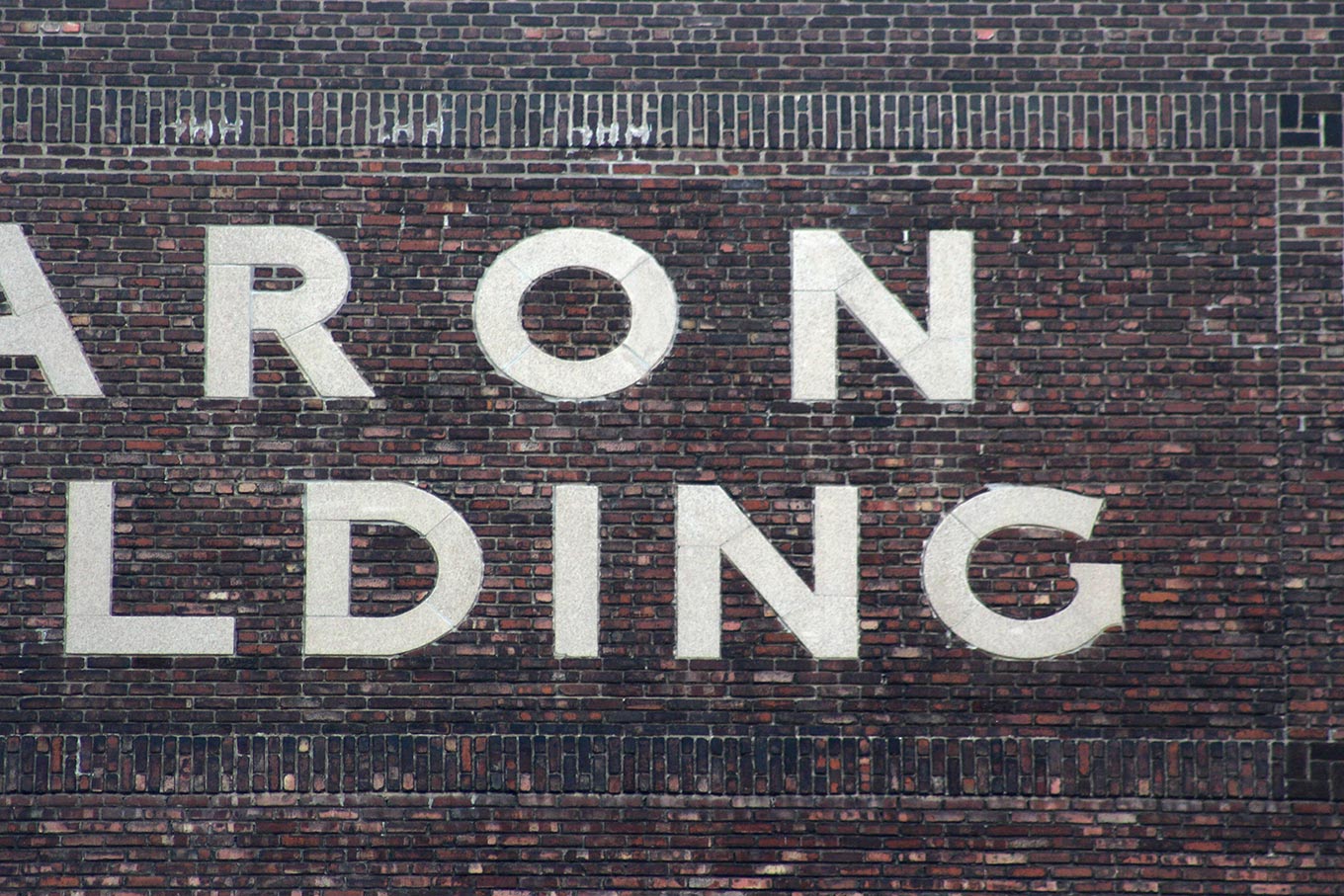
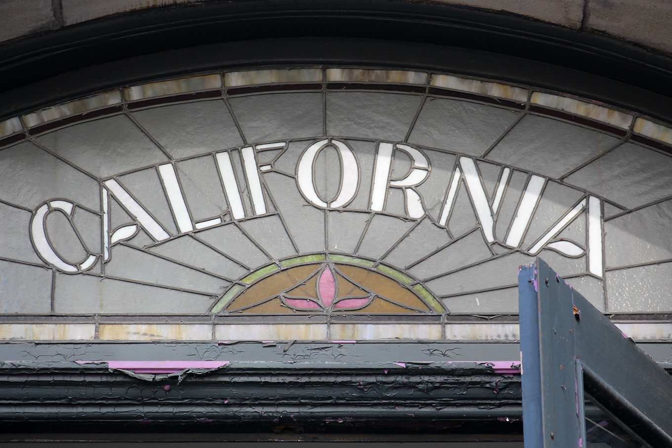
1801, boulevard de Maisonneuve Ouest: the fabricated stainless letters are the best thing about this 1990s office building.The Police and Fire Station 10, at the corner of boulevard de Maisonneuve Ouest and the rue St-Matthieu, features blocky raised inscriptions on the facade.The Montefiore Club served as a vital hub of Jewish life in Montreal for decades before closing in 2010. This sign above the door from its final location on Guy Street probably dates from the early twentieth century.The Beaux–Arts-style Post Office Station H, built in 1913–14, bears an imposing raised inscription over four Ionic columns.Built in 1904, the Bishop Court Apartments escaped demolition in 1976, when the Quebec government declared the complex a historic site. A raised sandstone inscription appears on the facade at the corner of rue Bishop and boulevard de Maisonneuve Ouest.I noticed more monograms in Montreal than I ever do in New York. This one, which probably dates from 1937, adorns the Holt Renfrew Building on Sherbrooke Street West.“RMS” stands for Robert M. Simpson. This wrought-iron monogrammed window grill, probably from the late 1920s, appears on what was Simpsons department store (now Simons, without apostrophe), on the rue Ste-Catherine.Laminated wraparound Telus signage covers the original art-nouveau lettering above the door of what was formerly the Bank of Montreal.The original raised sandstone “West End Branch” lettering still appears beneath the wraparound Telus sign.Exuberant 1970s neon advertised the Club Super Contact and its sister club, Club Super Sexe, on the rue Ste-Catherine. Both are now closed. Dibs on the signage.The neon for Club Super Contact and Club Super Sexe made me think of comic books and Roy Lichtenstein. The signs need to be experienced; photos don’t do them justice.Completed in 1922, the majestic limestone Canada Cement Company Building merits a visit. The outlined inscription on the facade has been lovingly preserved.The iconic Birks Building on Phillips Square, built in 1894, wears enormous expressive letters high up on its facade.Brand all the things. At left, a bronze inscription plate probably dates from the time of construction; at right, a more modern Birks logo takes the form of solid brass door handles.The Hudson’s Bay Company rebranded as The Baie / La Baie in 1965, introducing an iconic new logo by Lippincott & Margulies.St. James United Church, a limestone Gothic revival Methodist house of worship on the rue Ste-Catherine, shows off wild uncial lettering above the front entrance. The cornerstone figures, though ornate, seem almost staid in comparison.“The Lord is in his holy temple.” Paul and I briefly squabbled over what the trippy uncial lettering over the door to St. James United Church actually said. He was right, of course.Paul really likes art deco. Frankly (for reasons I don’t yet completely understand), I don’t. I’m still not tired of modernism. I loved these tall fabricated stainless letters atop the Sternthal Building entrance.At the corner of the boulevard de Maisonneuve Ouest and the rue St-Alexandre, sharp raised letters appear on the neoclassical Sommer Building, completed in 1912.If you tilt your head back and squint, you can see inlaid limestone letters way up high on the side of the Caron Building on the rue de Bleury. Check out that cap G.Victorian stained-glass transom windows still appear above many residential doors, like this one in downtown Montreal.
So am I considering emigrating to Montreal? Yes. But I also returned to New York galvanized and excited to look at its letters anew. And I recognize how fortunate I am to live here—larger cities like San Francisco and New York offer guided tours on a fairly regular basis. If you have a chance to be anywhere near a letterwalk with a Paul Shaw or a Sasha Tochilovsky, don’t hesitate to go. Or explore your environment with someone from elsewhere; wandering in New York with a Swiss friend has awakened me to aspects of the American vernacular that I always simply took for granted. You may have to peer a bit harder to find interesting public lettering these days, but there is still lots to discover, wherever you are. Look down. Look up. Every walk is a letterwalk.
Caren Litherland lives and works in New York, where she looks down and then up.