XYZ Type’s Study graduates with honors · Type Network
XYZ Type’s Study graduates with honors
Jesse Ragan breathes new life into a lost hand-painted alphabet by designer and illustrator Rudolph Ruzicka.
By Type Network Staff
Detail of Plate 1 from Rudolph Ruzicka’s Studies in Type Design showing some of the painted letters that served as the basis for Study.
In 1968, Rudolph Ruzicka published Studies in Type Design, a cloth-bound portfolio presenting ten hand-painted typeface concepts by the Czech-born American wood engraver, etcher, illustrator, and type and book designer. Until now, none of these alphabets has ever been realized as functional type. XYZ Type cofounder Jesse Ragan—long an admirer of Ruzicka’s oeuvre—recognized the potential of the first alphabet reproduced in Studies. He began developing it as a digital typeface, dipping in and out of the project over the years. When Original Champions of Design asked him if he could draw a custom typeface for Dartmouth College’s upcoming brand-identity update marking its 250th anniversary, Ragan suggested his typeface. It seemed like a natural fit—after all, Ruzicka had a close relationship with the university, having designed a number of lettering commissions for them. So, as Ragan refined and completed the typeface, he also created a custom version for the brand identity called “Dartmouth Ruzicka.” And now, fifty years after the publication of Studies in Type Design, XYZ Type is making a retail version of the typeface, dubbed Study, available to the public.
Study comes in six weights in roman and italic, all with small caps, making it an excellent choice for setting copy for immersive reading as well as dignified display typography.
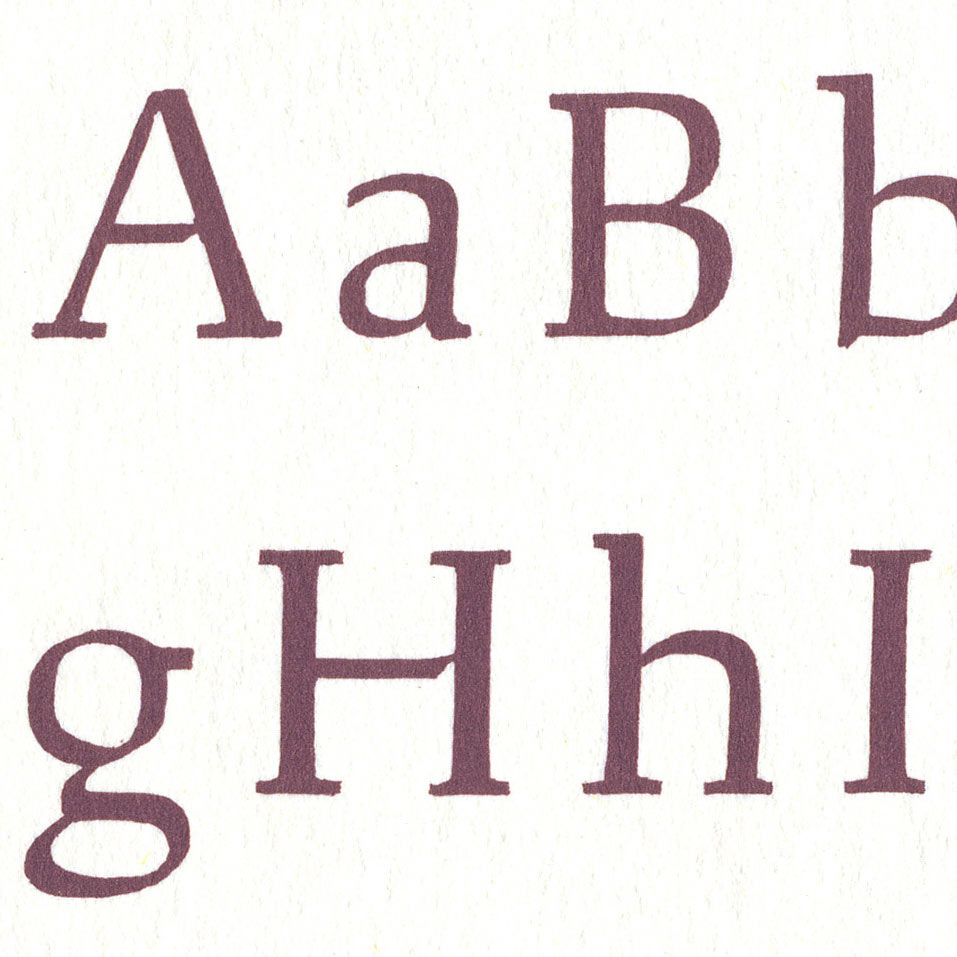
The Czech-American flavor of Ruzicka’s alphabet shines through in Study’s decisive, slightly squarish counterforms. But there’s also a lyrical, calligraphic sensibility to the letters’ finish that makes the type flow elegantly on both page and screen. This combination of formal qualities looks beautiful in larger sizes and creates a wonderful rhythm from paragraph to paragraph. The design is replete with delightful details, like the playful upward flick in the capitals’ horizontal finials, the delicate nick in the crossbars, and the sloping half-serif at the bottom of the descenders. Study is at once confident and warm, and exudes a pleasant, bookish atmosphere. Generous counters and distinctive horizontal and vertical movements in the letterforms make Study a prime candidate for setting body text—poetry or prose—in books, magazines, annual reports, brochures, and newsletters. The typeface also serves with distinction in headline settings, imbuing titles with a personable clarity.
Ragan dramatically expanded the scope of Study’s inspiration source—a roman alphabet in a single weight, accompanied by a partial italic—to create a six-weight family from Light to Extra Bold, outfitted with all of the typographic niceties needed for demanding typesetting: small caps in both roman and italic weights, additional ligatures, and several sets of numerals.
Like all XYZ Type fonts, Study is available for print, web, applications, and ePub licensing. Webfonts may be tested free for thirty days; desktop trials are available upon request. To stay current on all things XYZ, subscribe to Type Network News, our occasional email newsletter featuring font releases, foundry happenings, type and design events, and more.