Quite Type builds a hypnotic mini-site for Gasket.
By Occupant Fonts
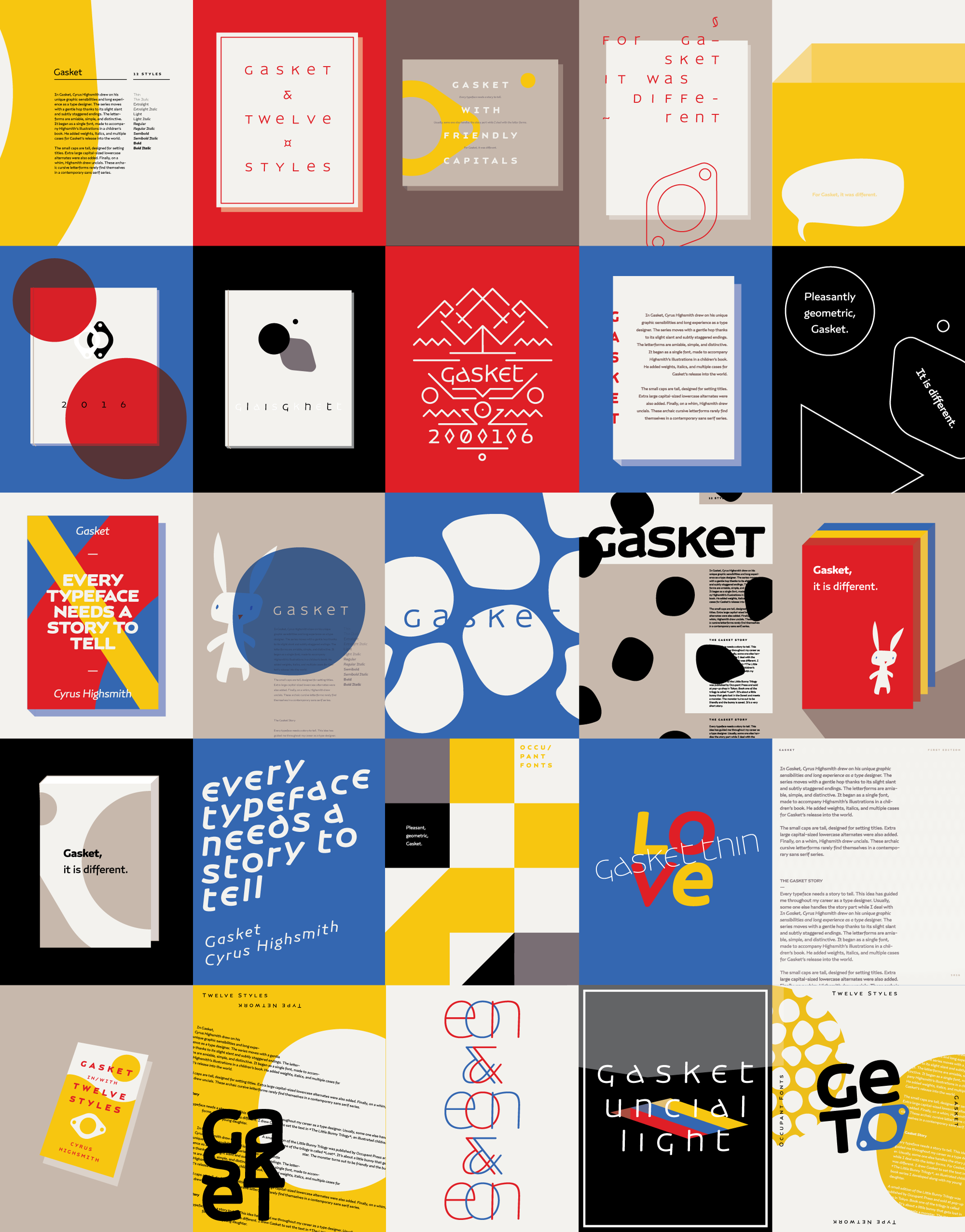
Keavney's numerous sketches for the morphing layouts.
Occupant Fonts worked with Quinn Keaveney at Quite Type to create a mini-site for Cyrus Highsmith’s Gasket.
At first, Keaveney was skeptical when he learned Highsmith drew Gasket for a children’s book. "The rule of thumb is to present a typeface in the context it was made for — so when we began designing Gasket's mini-site I was pleasantly surprised that Cyrus didn't want a story book,” said Keaveney, “We generated a series of concepts and ended up choosing a layout-morphing direction. Now that I reflect on the process I don't think either of us knew what that really meant.”
Highsmith was happy to take a step back and let Keaveney figure it out.
Keaveney continued, “Not knowing what the site would look like, I started designing as many different layouts as I could. I was so pleased by how Gasket performed in drastically different styles that I ended up developing far more designs than I had intended. Gasket is a versatile typeface that will be successful in more scenarios that you can hope to imagine.”
Occupant Fonts is looking forward to more collaborations with Quite Type.