We use them for everything we make, including the text of this lecture. Yet, we know so little about them. Words. Where does meaning come from? Or betekenis? Or the eppnophonics of a story? Why is writing so hard and reading so easy? A lecture about the process of creation and the education of design. About the flow of language and the typography of text. About bullet lists and code. And what is likely to be the next etcetera.
This article is the text of the Lubalin 2015 June 15 lecture at Cooper Union in New York. Watch the video capture here.
By Petr van Blokland
This lecture is about words. And about all other stuff that is essential for designers to survive in the near and distant future. A bit of warning is in place, though. The lecture is a roller coaster ride. We pauze a bit on points of view. And we race through areas that may need your attention in the future. Just to know that they are there. It’s a lesson. A workshop. You have to work. To listen. Follow. Imagine. Calculate. We’ll be exploring the deep and the wide. Specific and abstract observations about design. Expressed in many words. Please don’t shoot, if the message doesn’t seem convenient for you right away.
Design is for everyone.
Design is cult.
Typography will save the world.
Of course this is al true. One way, or another. Somewhere on the world. But the question is: does that make them useful statements? If something is always true somehow, it also has no real value. Value comes from context, in contrast to situations where it is not true. Designers love “final” words as “none” and “all”. But they only work in extreme contexts. “Me and my team explored all possible logo combinations.” or “My typeface is made for all kinds of usage”. Mathematically this can never be true.
Language is tricky business. How can I know that you understand anything from I will says during this lecture? You are all intelligent human beings. You must be, as you seem to survive being designers in the jungle out there. So any misunderstanding is entirely my fault. Talking Dutch English or English Dutch, I am sorry about that. Well not really.
At least my English is a lot better than the Dutch of most of you. Want anders zou ik gewoon in het Nederlands verder kunnen gaan. Maar dat is niet effectief en dus waarschijnlijk toch niet zo’n succes.
Looking at English words from a clean outside view, may even lead to some fresh observations.
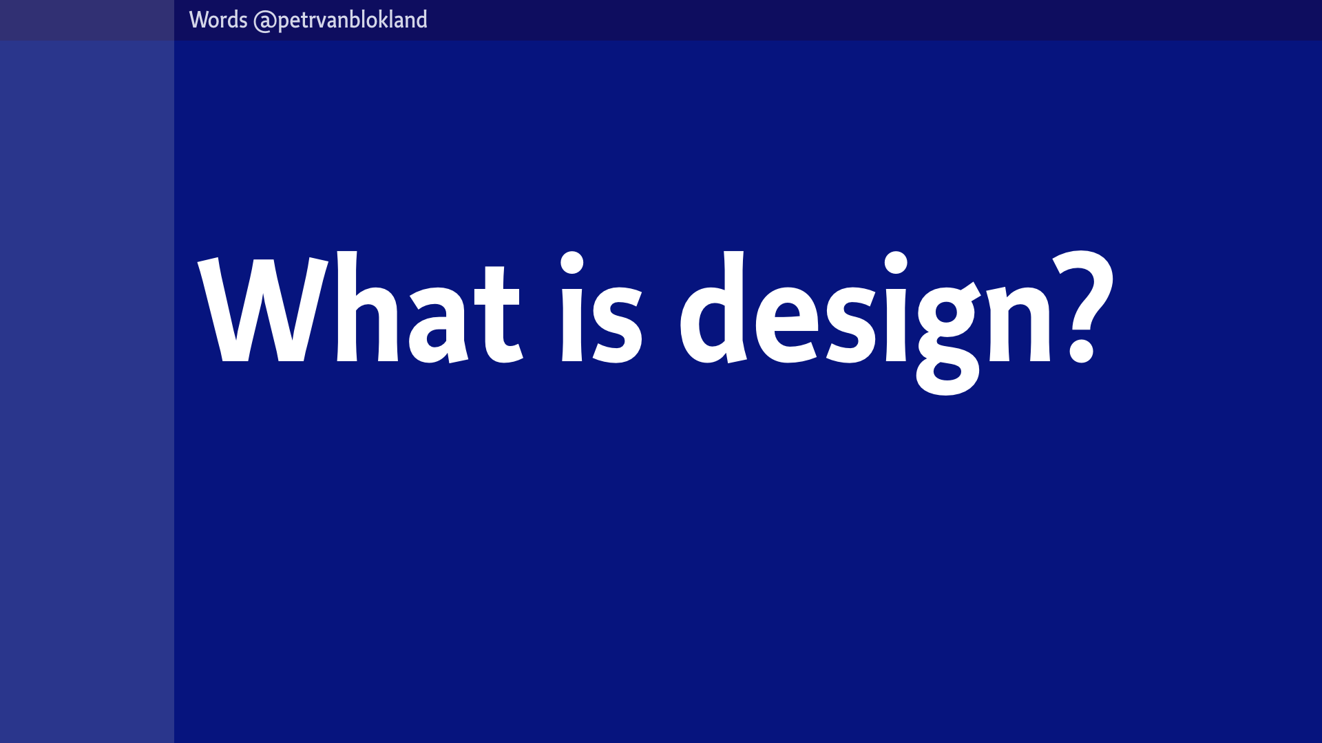
If English is the main language for this talk, still we have difficulty with the meaning words. For instance, what is design? Answering that question is almost as difficult as answering the question “What is Art”. And just as controversial.
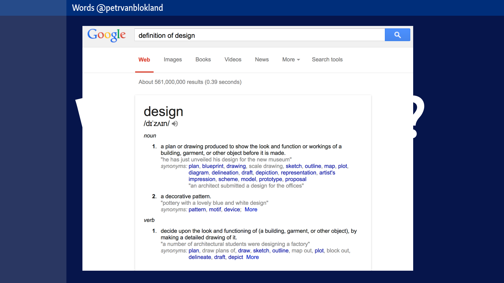
Dictionaries don’t help so much.
As noun:
1 A plan or drawing produced to show the look and function or workings of a building, garment, or other object before it is made.
2 A decorative pattern
As verb:
1 Decide upon the look and functioning of (a building, garment, or other object), by making a detailed drawing of it.
Definitions as this aren’t very useful. Why not? Because you cannot tell a designer to act like this, to be a designer. “Acting like” is fundamentally different from “being one”. In this lecture, we must develop some better methods to address the meaning of the words that we use.
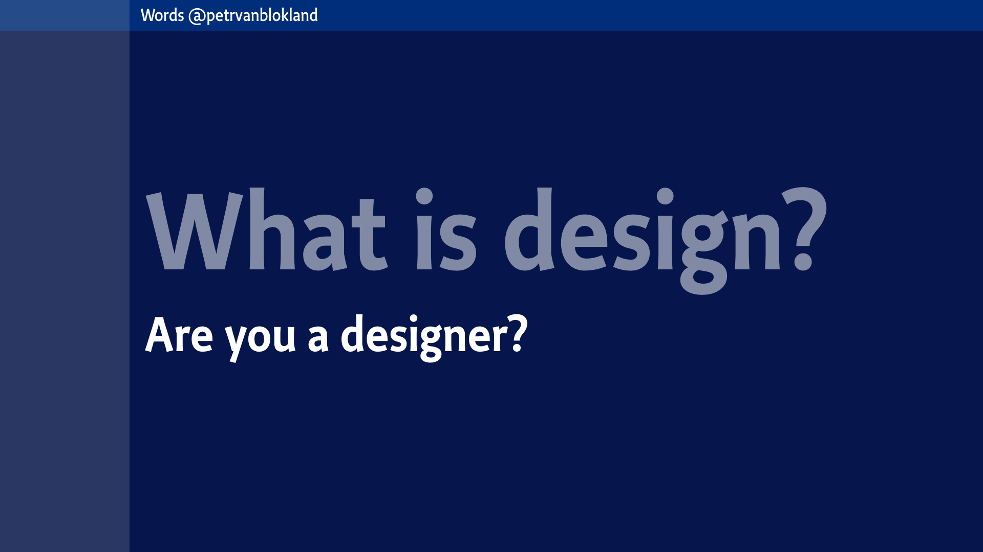
“Are you a designer?” “Yes, I am a designer. Actually, I am the best designer ever.” “Wow!”
“There is more. I am also an artist and a famous contemporary musician!” “Awesome”.
Words are tricky business. Because often words are just words.
“Isn’t that our flag, they are burning there?”
“No, just some old cloth, with colors here and there.”
“I want good medical help for everyone.”
“Are you a commie, or what?”
Words are about what they represent. What we agree on, that they represent, assuming that sender and receiver have the same context in mind. Ok, but before we try to solve most of the world problems in 1.5 hour, lets focus on our own vocabulary.
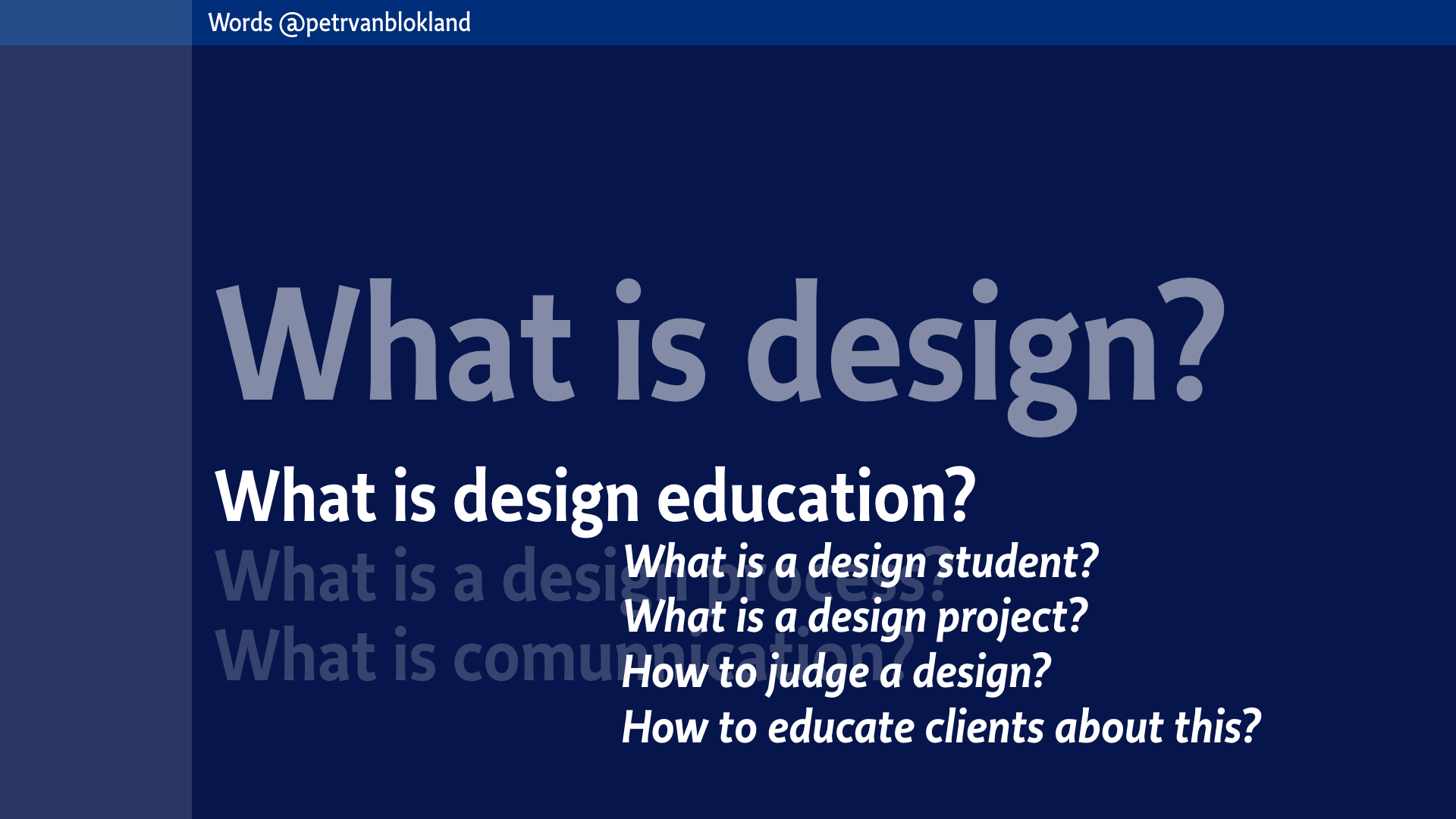
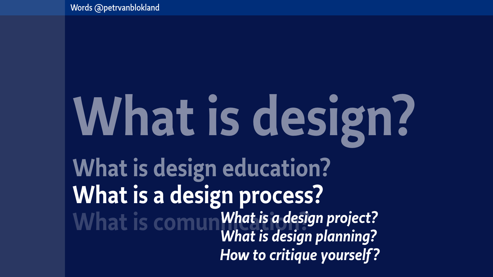
If we don’t know what design is, then what is a design student? What is a design process? How to judge a design? How to educate clients about this?
If we don't know what the process is, how can we plan it? Or quote it? Or critique ourselves, in order to do it better next time?
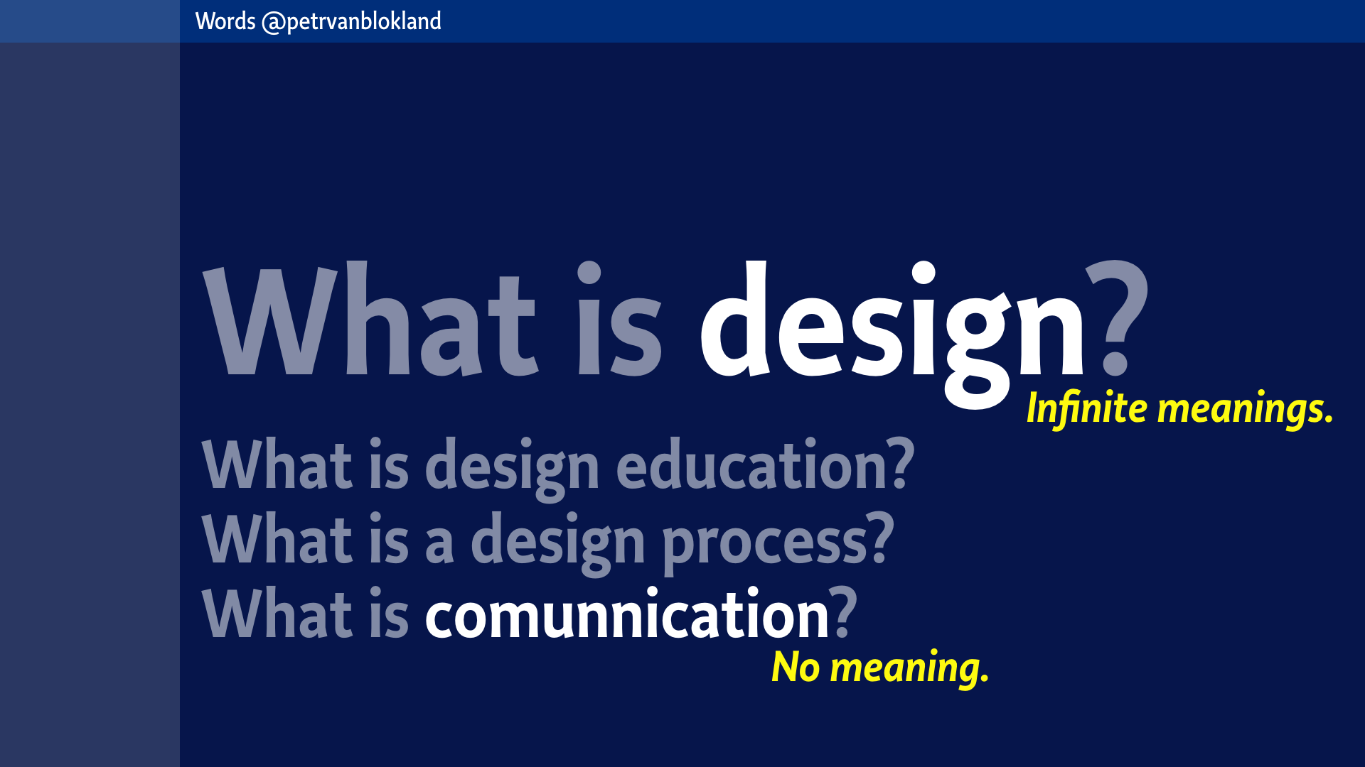
What is comunnication (misspelling intended)? Design has infinite meanings. Cominnication has no meaning. Just associations.
Words are tricky. Because they play games in our heads. Words never “are”. They shift meaning, depending on context and history. They glue to similar sounds. They associate with other visual appearances. They flirt with similarities on all levels of abstraction.
Here is a random statement.
There is no hint to anything different from what it says.
It doesn’t make sense. Still you got the connection, I guess, but it’s all made up in your head. On different levels of association.
It connected by an abstract group. And it connected by sound. You connected with information that you know. What you learned and heard in the past. Because you are connected to the world. You are intelligent beings. You will pass your own Turing Test. (Isn’t that funny, for years I use the Turing Test in my lessons, and suddenly – because of some movies – there is no need to explain it any more).
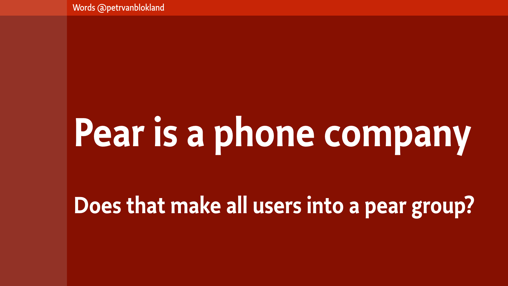
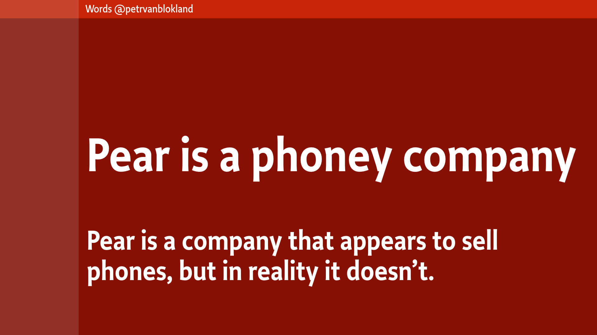
Here is another one. The original meaning of “phoney” is “not real. False. Inauthentic person or thing”. But we made an other meaning in this context. Just here.
The new definition could be something like “a company that appears to sell phones, but in reality it doesn’t.”
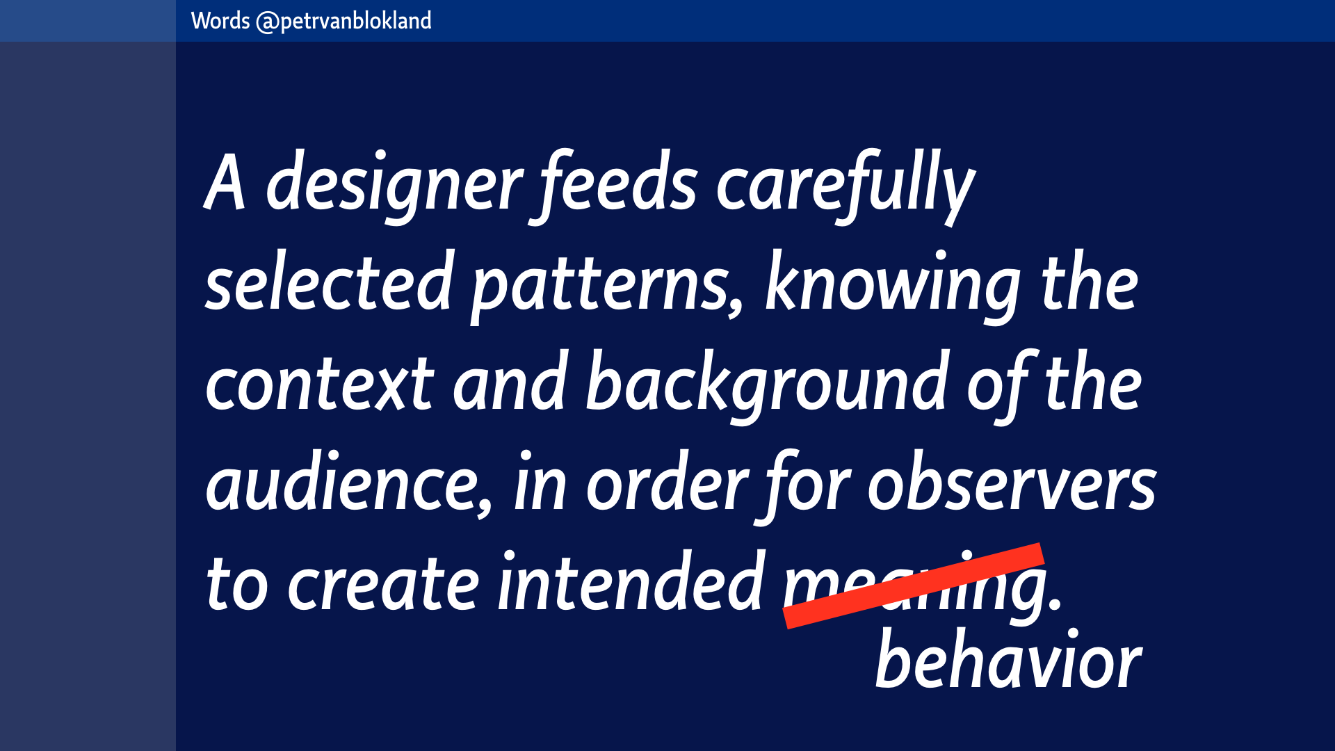
“Yeah, you’re just playing with words.” you could say. But by themselves words are nothing, vapor. I’m playing with your mind. Like copywriters do. Feeding it with carefully selected meaningless patterns, while knowing the context and guessing your background. You then take this meaningless input and create meaning with it. In your head. Or in your conversations afterwards.
How about using that as a definition?
[A designer feeds carefully selected patterns, knowing the context and background of the audience, in order for observers to create intended meaning. ]
It’s a workable definition for now. But it lacks the creative part. Because this one would also include copying the work of others. And I know that there are designers who call that inspiration, but let’s not get into that swamp of that “inspiration, influence, copy and theft.” definitions for now.
Here is an update. At least this definition works better for writers, educators, designers, composers and others who have an intended message to stick into the minds of their audiences. Possibly with an intended change of behavior.
But it is not good enough. We’ll work on a better definition later in this talk. We must improve on what got so far. Perhaps. How about that as a design process?
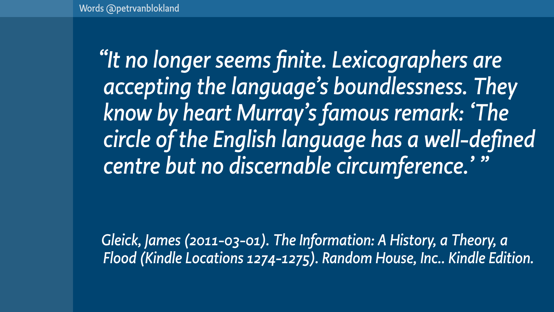
Words are so tricky. It’s a simple question: How many English words are there? For an answer you can read “The Information: A History, a Theory, a Flood” by James Gleick, a great resource for design students (and the rest of the world). It’s convincing proof why readers should not take so much for granted.
The problem is that boundaries of languages are not defined. (Did you notice that the reference info is automatically inserted, if you copy from the Kindle application? I think that is really clever.)
The answer to the question “How many English words are there?” totally depends on the context. For some time in history scientists have been trying to make the “Complete dictionary”, and it took a while for them to understand that language only can stay alive if words appear, disappear and constantly shift their meaning. There is no call for the word “transistor” in 1600.
Let’s imagine the opposite. The number of English words is fixed and the meaning of all these words is completely defined. It would be impossible to communicate.
The only way I can get an idea across in this lecture, is to take a word that already had a meaning in your head, and then slightly shift it, hoping that this altered meaning will stick in your memory. Even putting focus on it, such as “transistor” or “design” will add to your interpretation of the word. If there is already a lot of meaning available, I have to push really hard to make it move. If it is a new word it is much easier. But that I’d have problems to connect it to the rest.
At least I need to shift some of the meanings. If no shifting takes place in this talk, you will remember it as extremely boring. If too much meaning is shifted, you’ll think that I am lunatic, but at least then something happened. So, let’s go for that one.
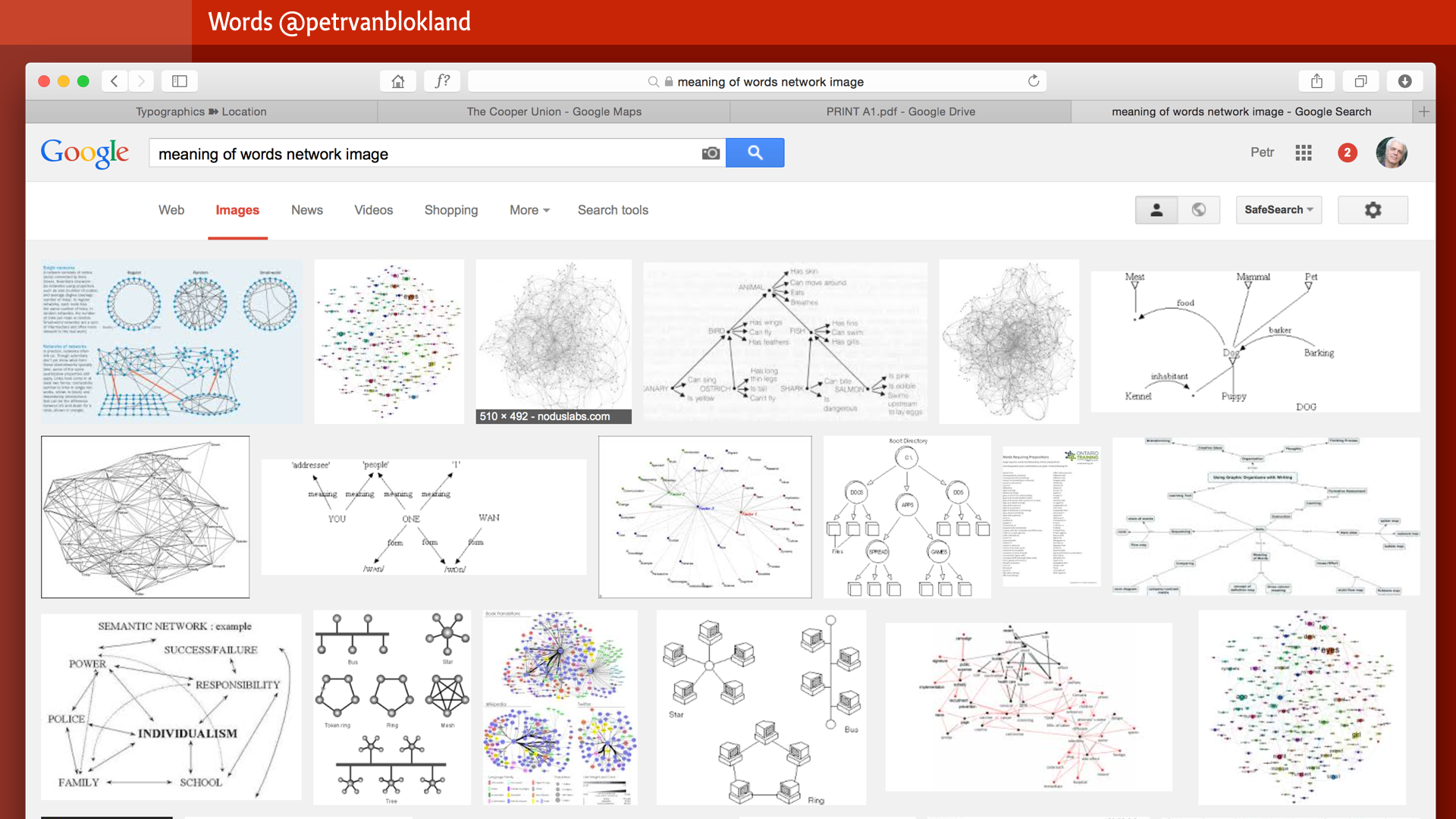
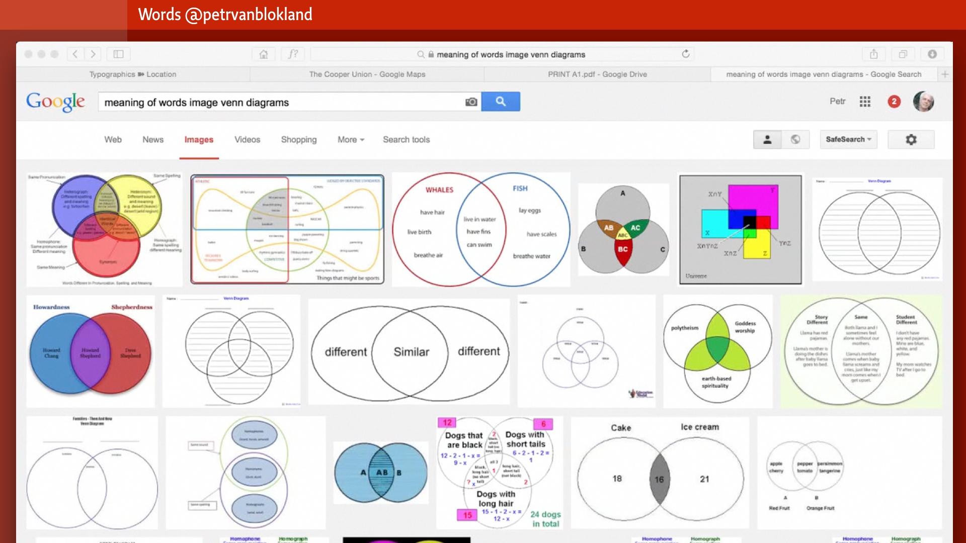
There cannot be a fixed network of meanings. The Google search on “meaning of words in a network” shows nice network images, where words have a clearly defined position with clear arrows to many other words. So that can’t be right.
Venn diagrams are even worse. People love them, because they make the world such a well defined place. There is us and there is them. And some overlap. Good and bad. Friends and terrorists. But the real world is infinitely more complex. No circles with words in them. More like fuzzy areas, without clear boundaries. Just a notion of generic meaning here and there. Blurry and faint. If the Word is God, then at least it shows how undefined and open for mis-interpretation this whole language business is. Whatever God turns out to be, somewhere in the future, I’m pretty sure it’s not a Venn-diagram.
Maybe understanding that would solve quite some violent and bloody world conflicts. If people would only be aware that so often words are just words. On the other hand, that aware still would not solve inequality, greed or poverty. And we would be facing the problem that wrong interpretation of words often goes with illiteracy. (Although, having said that, it the most educated people who think that Venn-diagrams rule the world)
But before trying such a design project of a lifetime, maybe we first should get some experience, and try to clean our own backyard first.
By getting a grip on what design is.
Don’t get me wrong. Intuition is an extremely important and powerful tool. It allows us to value a situation in a split second. Fast thinking. But complex tasks need more than quick decisions. If crucial functions are simply forgotten or ignored, it can be painful and extremely expensive to repair in a later stage in the process. The design of testing methods is a design process in itself. You’ll get better at it, if you do it more often. Unfortunately, this kind of development is hardly part of the curriculum in design schools. Or it is hidden away in separate departments. Human behavior studies, not part of the main iterations of graphic design.
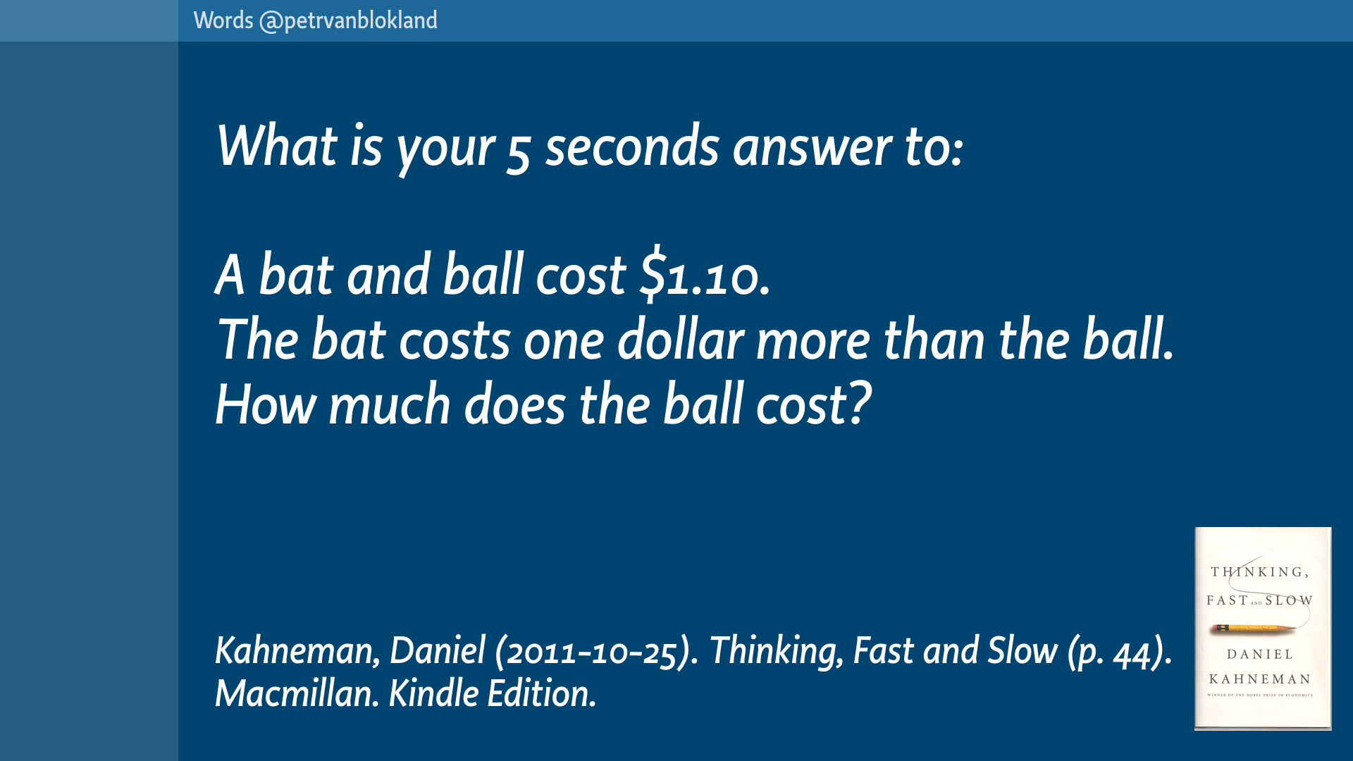
Kahneman’s book is a must read for all design students. It is a lot ore valuable for modern design than reading why a well known typographer used the Golden Section 100 years ago as the margin for a book column.
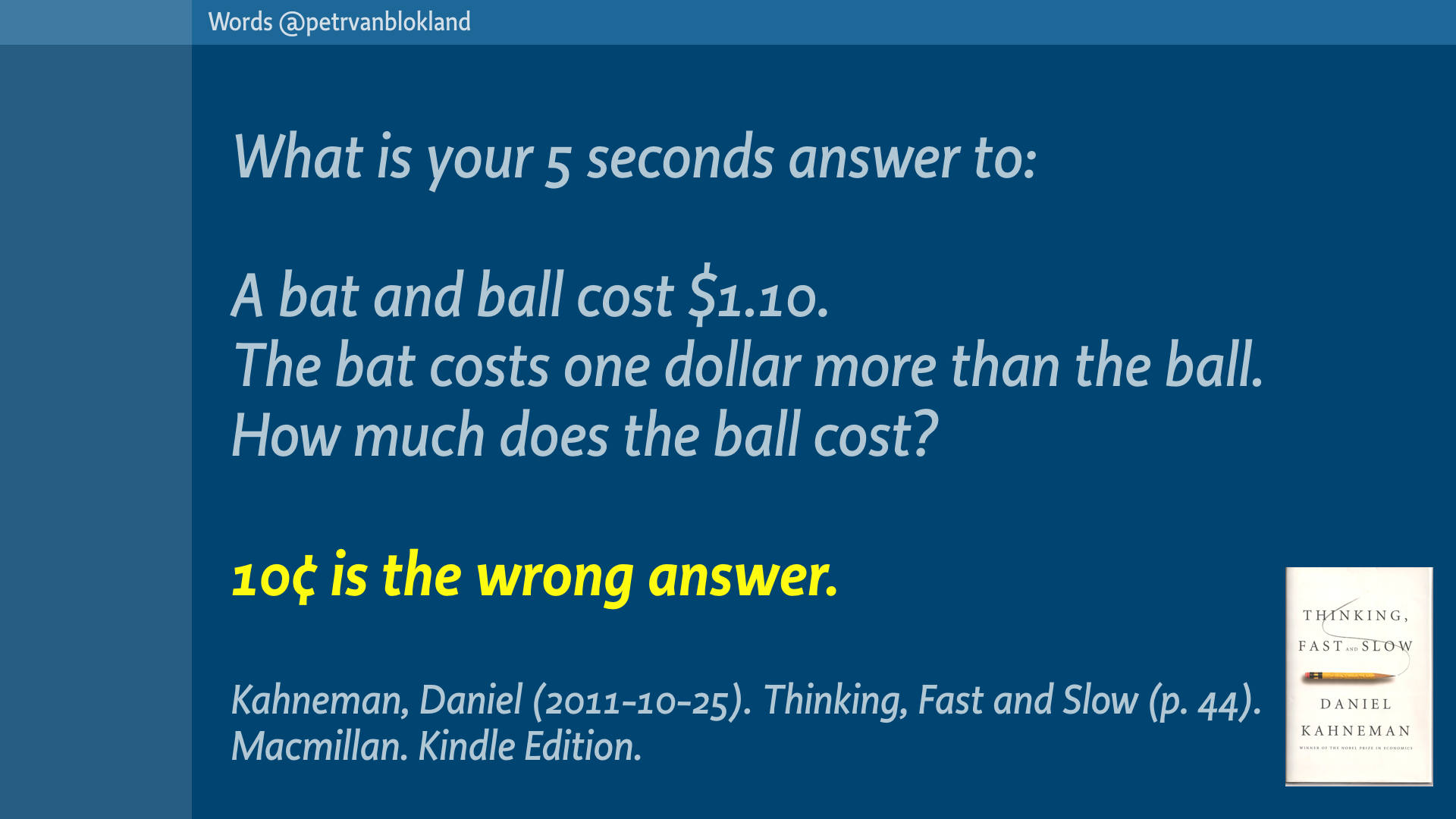
Kahneman asks questions. Shows why we can refuse to multiply 37 x 43, but cannot prevent involuntary recognition of a face. The book summarizes it all by this riddle.
You can figure out the real answer for yourself.
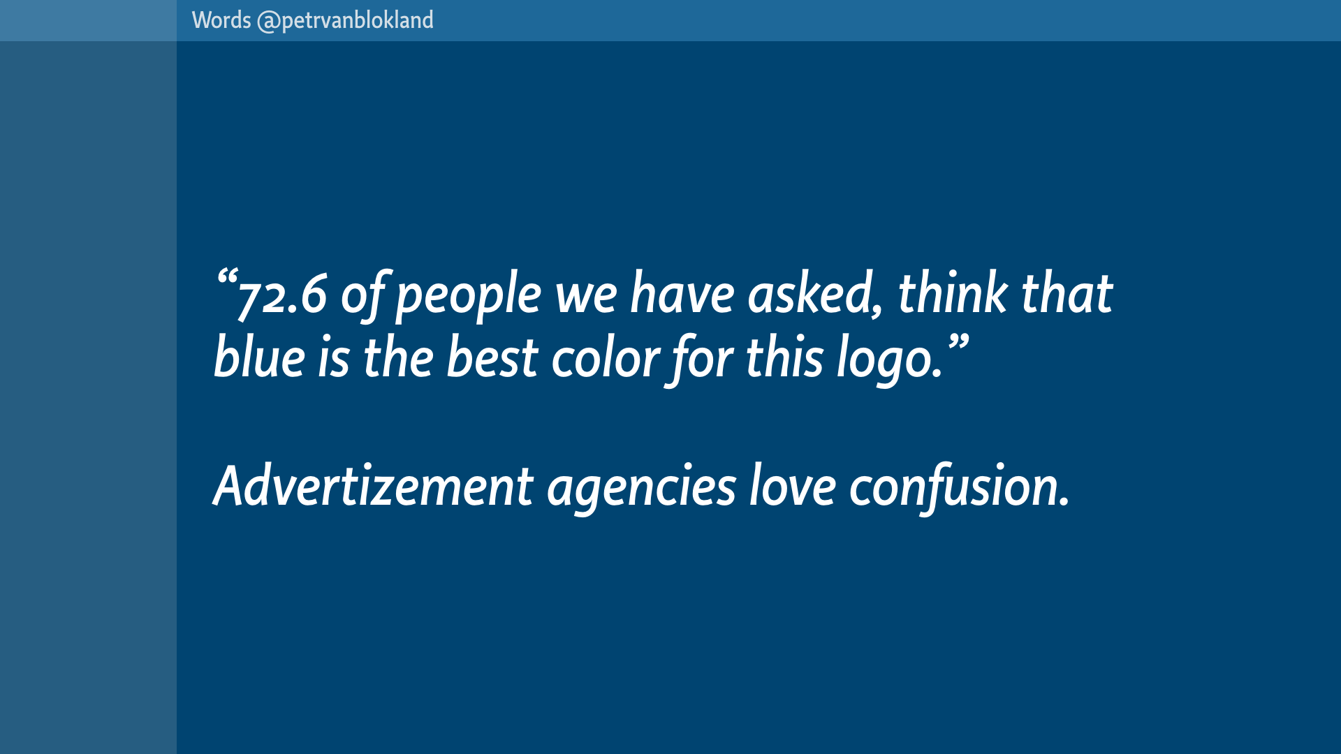
You cannot solve puzzles by intuition alone. You cannot “feel” statistics. The 72.6% of you who think that this lecture contains valuable information, fall in that trap.
If even a simple equation like the bat and the ball is that hard to solve for most mortals, how can we expect people – designers – to value statistics? Our inability to interpret statistics is both a curse and a blessing. It’s a curse for the people who get fooled by it.
This is a statement that is as true as it is useless. How many people where asked? What were the criteria, that these people were selected by? What was the idea presented? And how was it presented? And was there any confirmation about the meaning of the word “best”?
It is a blessing for advertizement agencies. They love it.
Maybe that is the most important task for graphic designers to change. Maybe all focus should be on showing that models are just models. That they may work as a representation of reality in a conversation. But they are not reality itself.
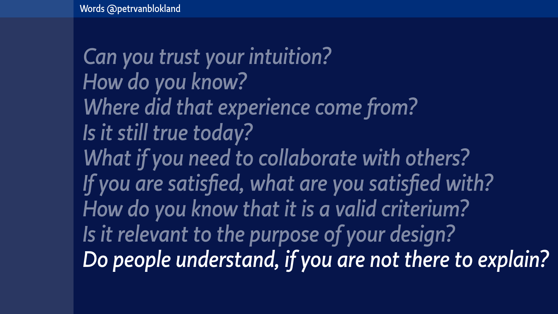
Here are some very basic questions, that apply to your designs and to all intermediate steps during the process of creation.
These are truly scary questions, if you apply them on yourself.
Great question to freak out students, if they are willing to participate in the torture.
So, what is it that we are doing?
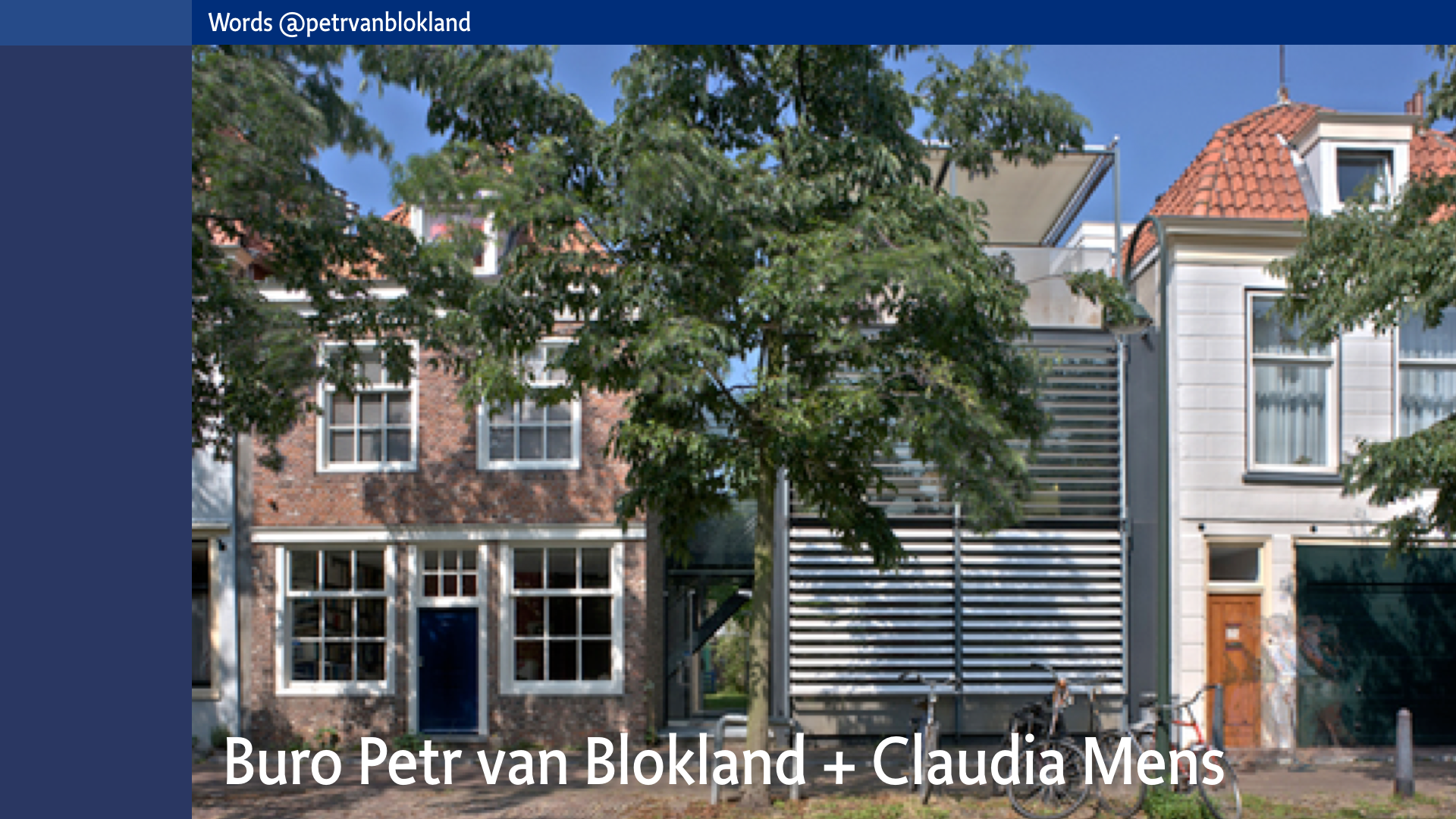
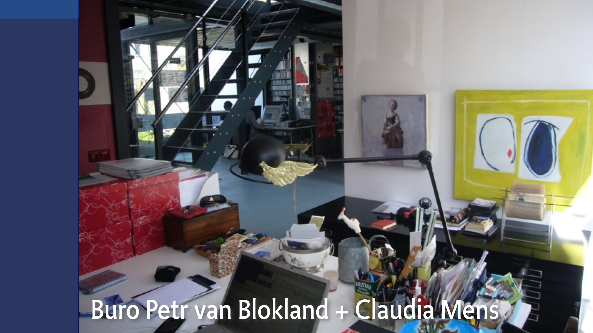
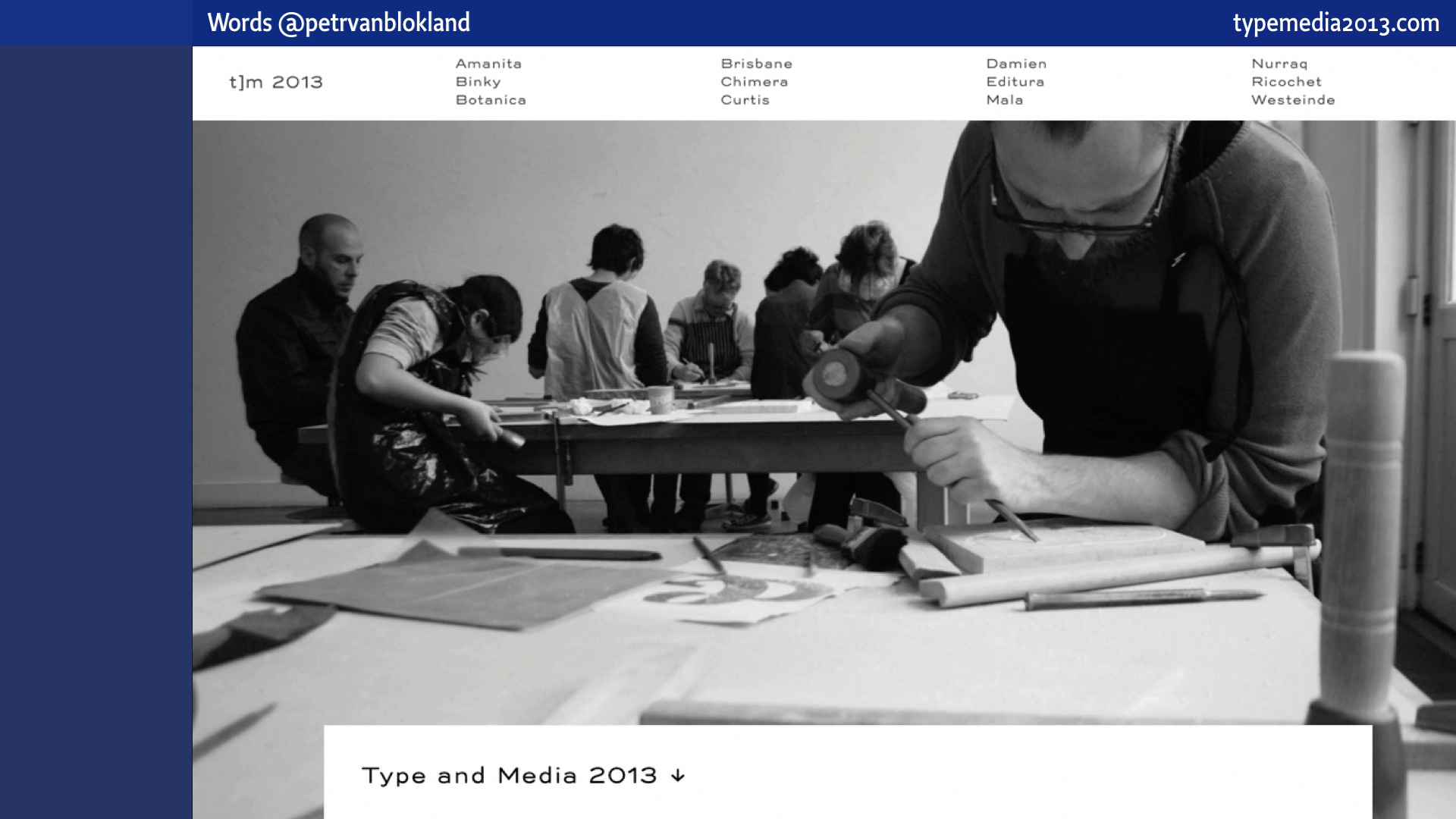
This is a design studio. Our design studio, in Delft The Netherlands.
In order to get a better understanding, let’s pretend that this lecture is a TypeMedia lesson.
A short one, because even a single lesson of one evening in Delft takes twice the amount of time than we have now.
The other difference is that there is many more of you than the 12 student in a regular class of TypeMedia, the one-year type design master study in The Hague. In the series of lessons that we meet, during that year, a range of topics is addressed.
Some in detail, other only briefly. And some repeated over multiple lessons, because they are important or because they relate to other topics.
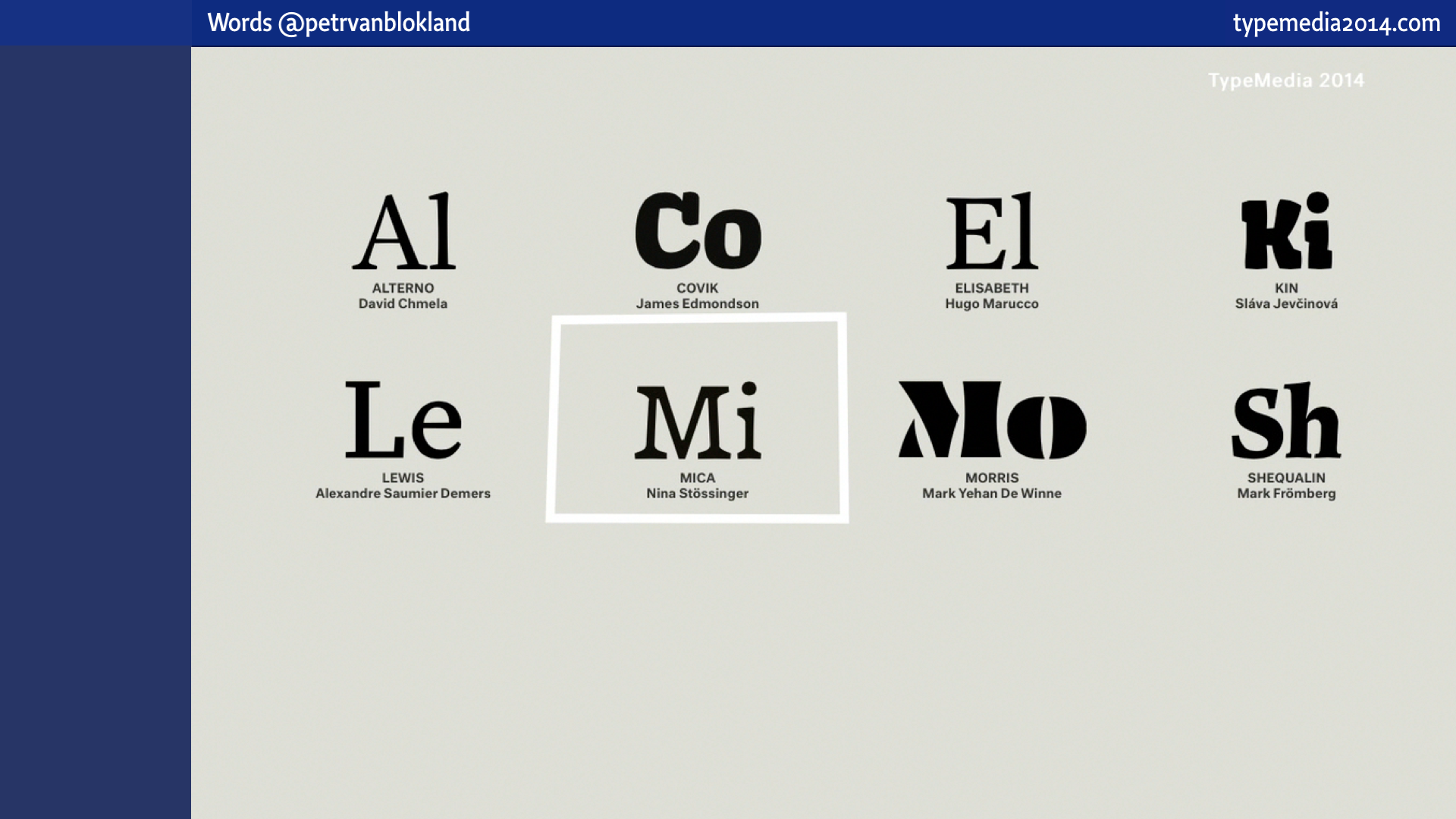
These are the sites of the TypeMedia graduates of 2013 and 2014. Check them out, if you haven’t done before. Great designs there.
“Oh, there is the word again. Design. What is it?”
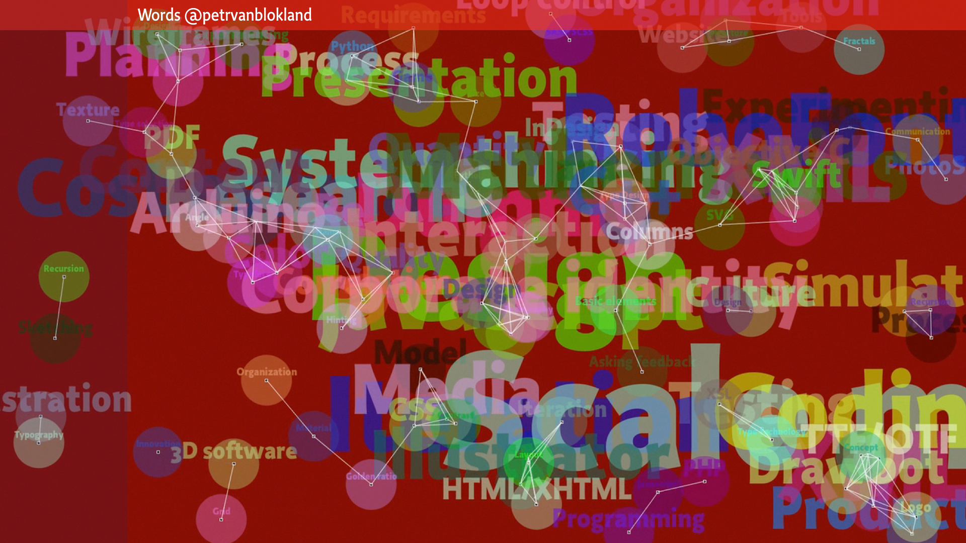
During the first lesson we make a list of topics that seem interesting or relevant enough for the rest of the year. To dive into in the bi-weekly lesson, getting the students away from their class room. And put their mind on a wider perspective than types of contrast and shapes of serifs. The list is an attempt to map the profession. There are many more of you in the audience than 12 TypeMedia students, so building the map during this lecture is not as interactive as it should be, but you’ll get the idea.
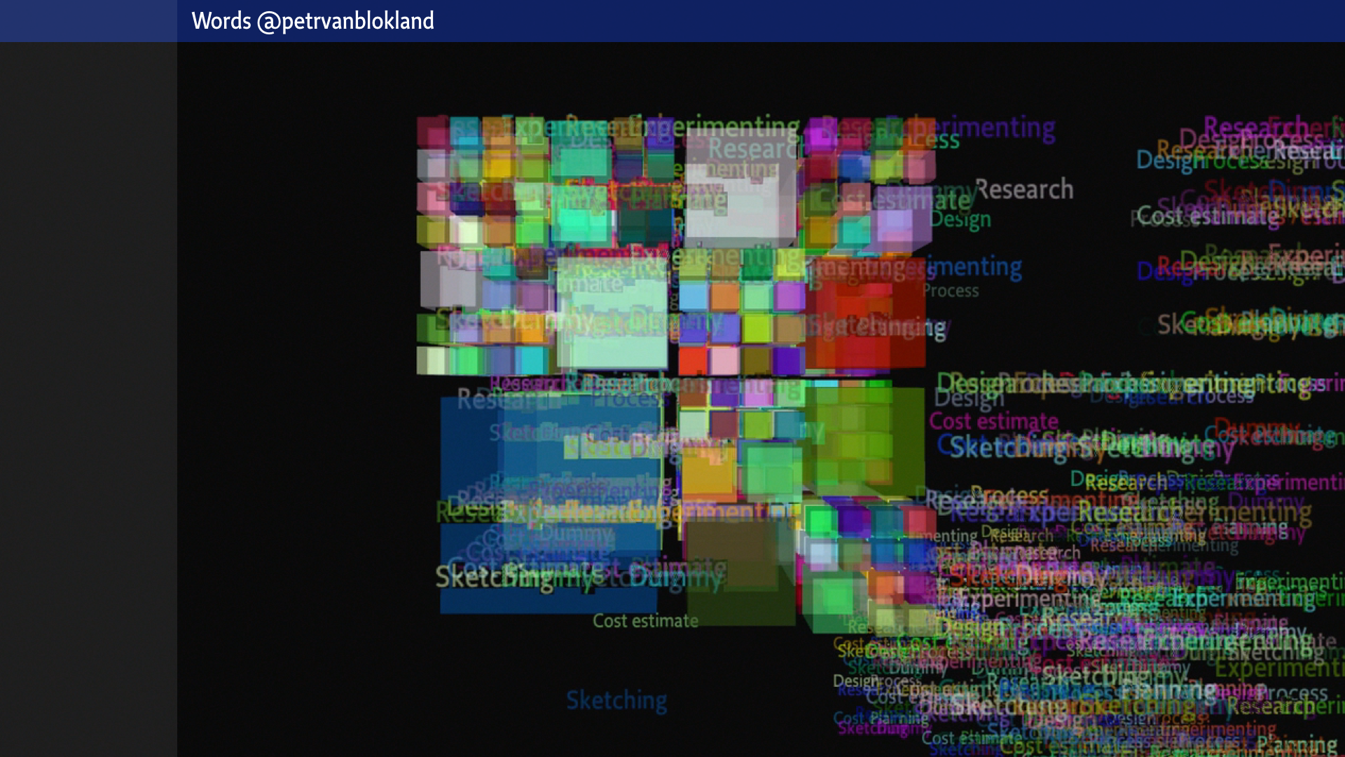
[Mapping the profession] = [Movie]
Like any other brainstorm technique, this is a group proces. Students can yell any word that – to their opinion – it related to design. There are no wrong words, except that they have to fit one rule: they also need to indicate to which level in the hierarchy they belong. In other words, what are the siblings that a word share a parent with.
Of course it is an impossible task to force all these words in a tree, because in reality words (and the various meanings that they represent) relate as a network – many to many relations – not a one dimensional hierarchy. And even that type is too simple, as we have seen before. It’s a model.
So a more realistic model would be something like this, where the relations are changing in time and context.
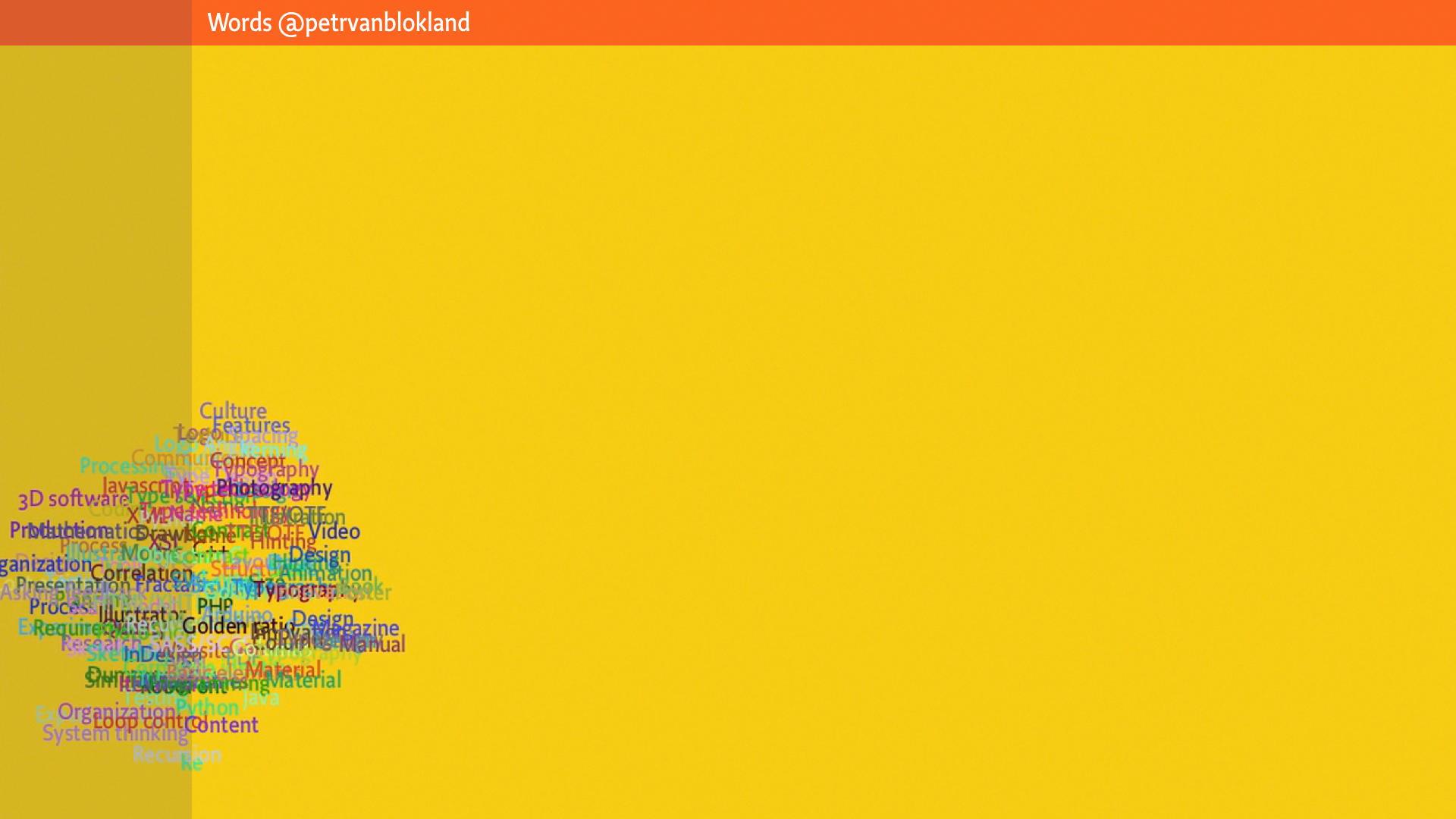
Nice movie, made by a simple Processing program, but “more realistic” also means that it is more difficult to understand. Maybe the words should not be represented as entities that come and go, in a more or less random pattern. Maybe some of the relations should not break so easily.
Maybe all the words could be bound into something that is connected, something like the design of this entire lecture.
Loosely bound together in the beginning, but if the design process proceeds, the connections become better defined, more stiff and the lecture is getting more consistent. Until finally it can be considered as a solid entity, withstanding external opinions.
But that is all still two dimensional. An over-simplified model, just because we have flat screens and we only have a 2 dimensional view on the words, regardless of the 3D illusion that our brain makes from the two images of our eyes.
The design of these representations is called information design, of course. A totally different topic for a totally other kind of lecture.
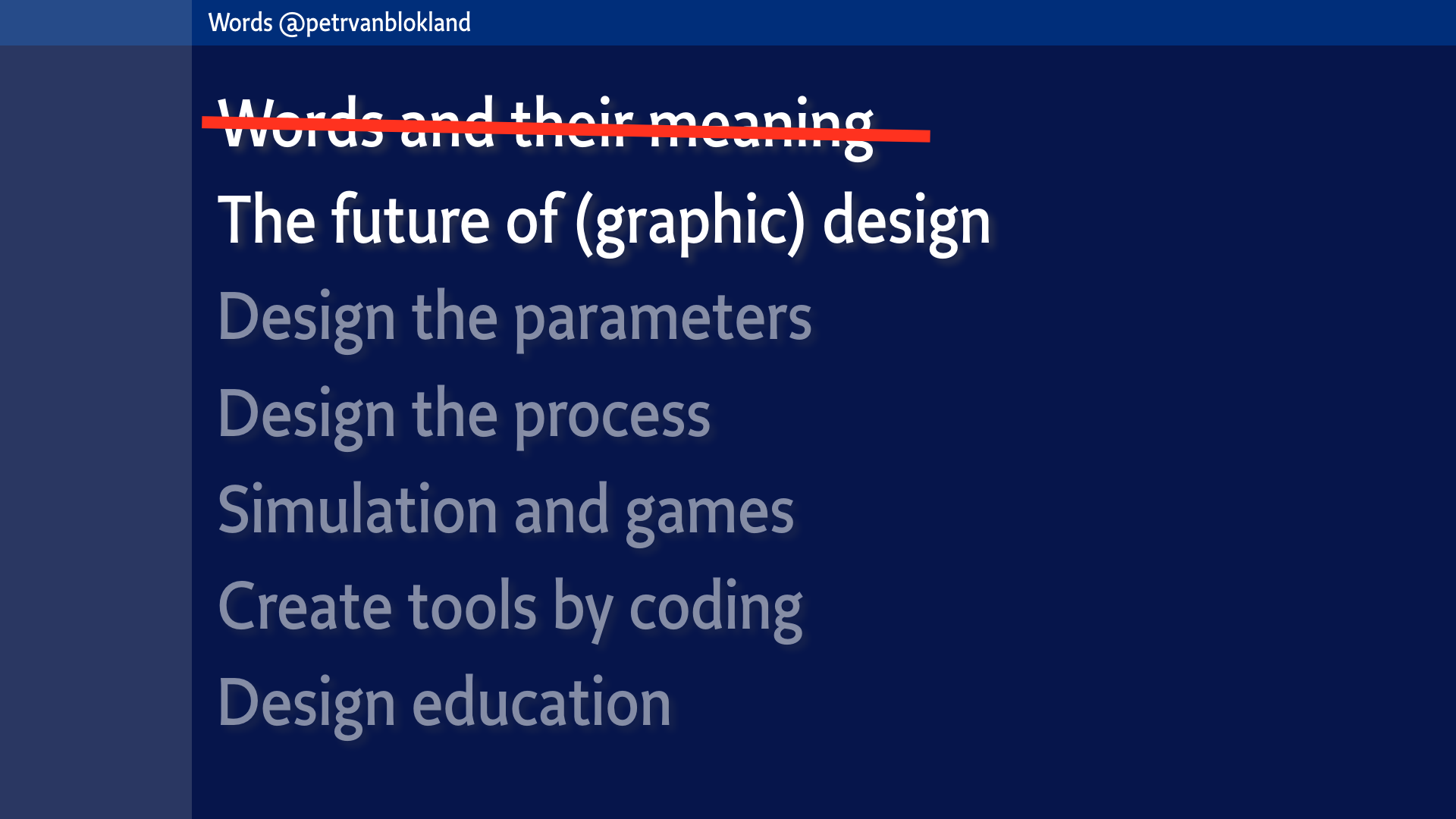
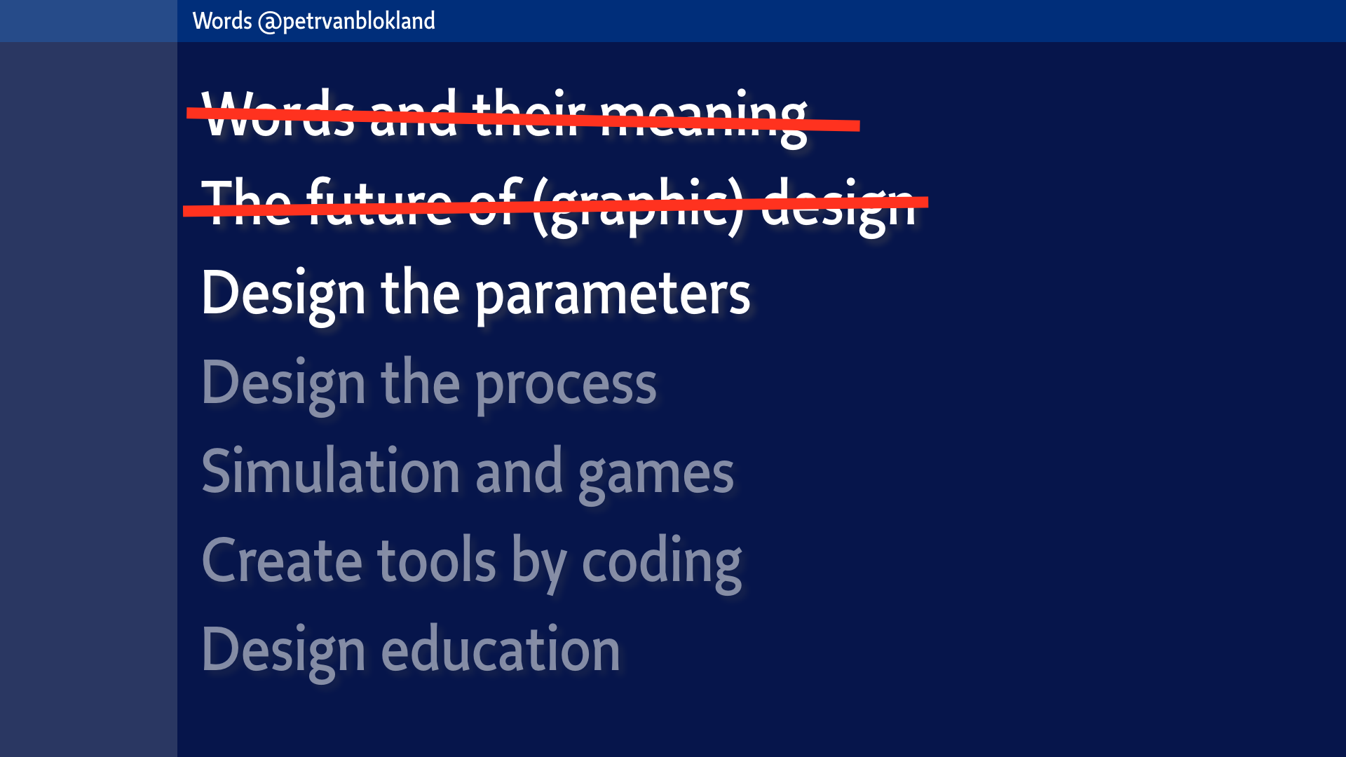
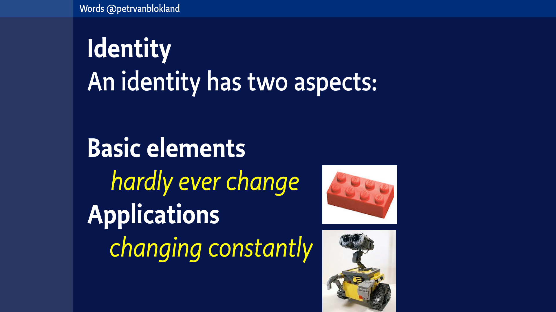
Design the parameters
Bertin
Basic elements vs Applications
Design = “art form” vs Design = “industrial”
Judging methods (we’ll see more of this later, as real examples).
Design the process
Development of models: Design is management of details
Fast thinking and slow thinking
Definition of words: design, process, concept
Sketching is a level of details. Not by definition physical.
Programming is a state of structure. Not by definition code.
Planning, hierarchy & order. Recursion.
Building skills
Fear of failure
Simulation and games
Design Game
Judging methods
Creating tools by coding
RoboFont tools
Processing and Python samples, automating part of the process
(because it gives feedback on how valid the models and parameters are.
Because it automates the parts that are not design (by definition)
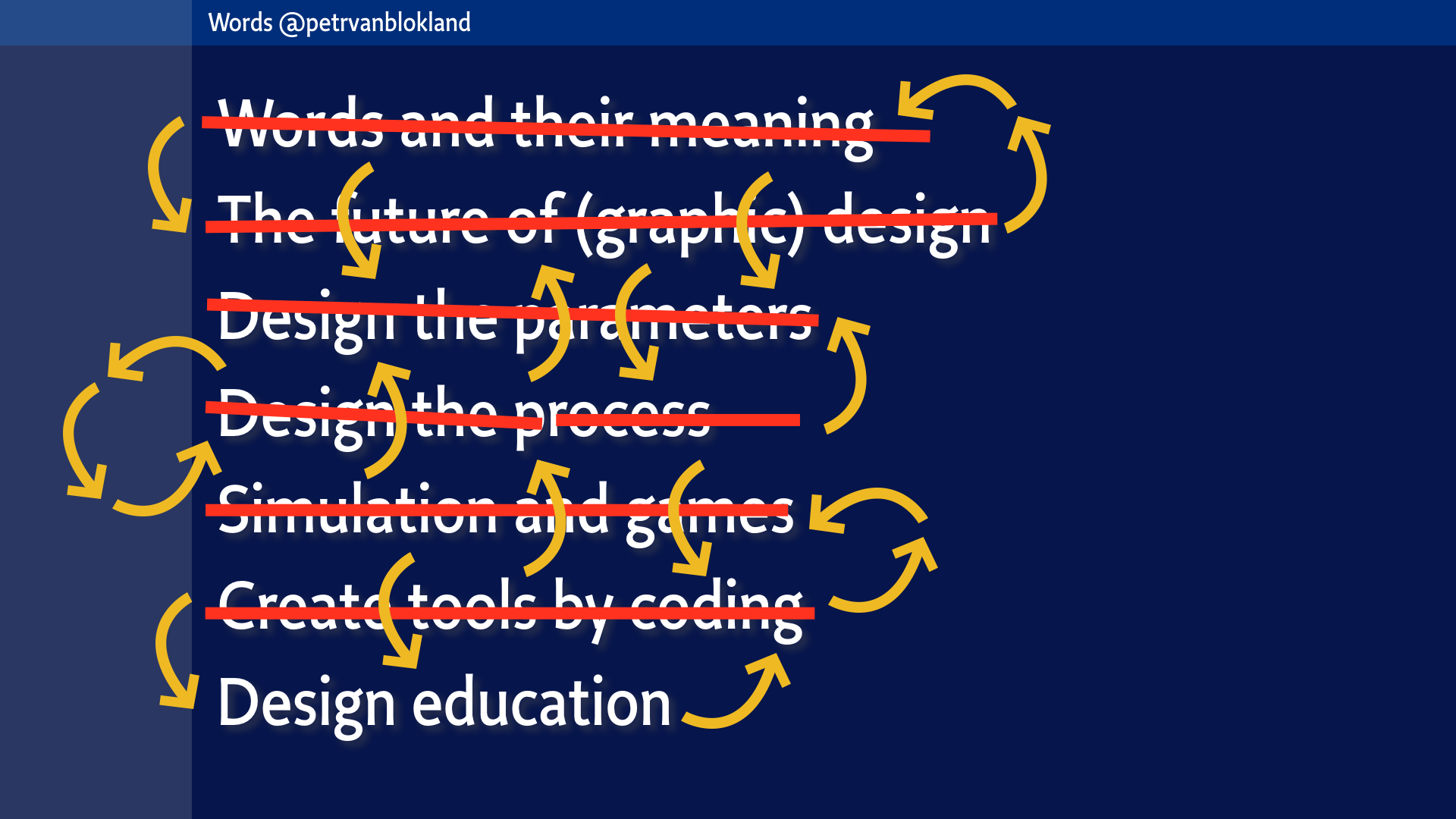
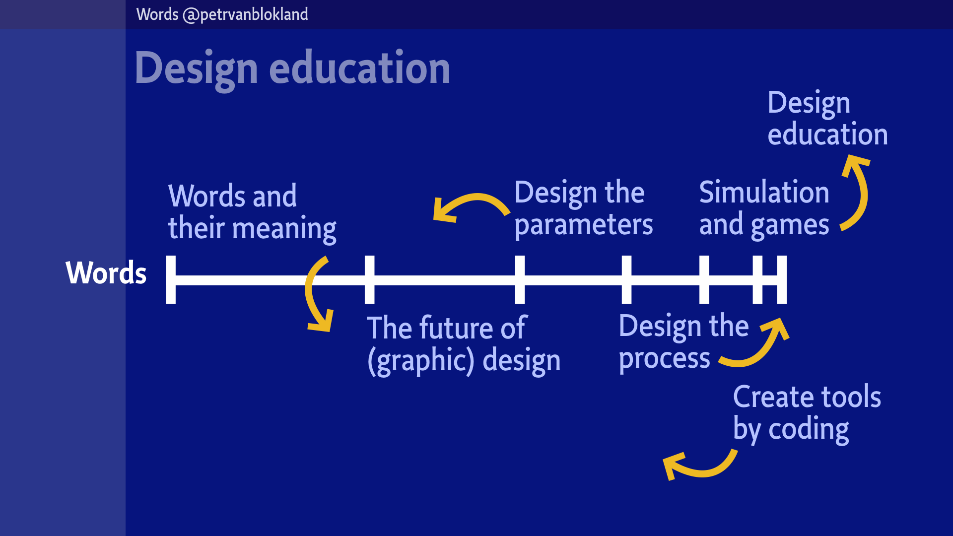
Let’s focus and pick some topics for this lesson. How about these. 7 fit nicely on the screen, a holy number, or something.
With 1.5 hours for the lecture, so we have around 12 minutes for each topic.
The first one we already did, so there are six more. How am I doing in time? More than 12 minutes have passed so far. Nothing to worry about. “Words” is the title of the lecture, so there is the emphasis. But we have to hurry up.
Design educators should ask themselves what they are educating for. If it is so difficult to formulate exactly what design is – and in particular graphic design – how can we educate students to become designers. And not only for a couple of years after their graduation. But preferably for their entire professional career. There is a challenge there.
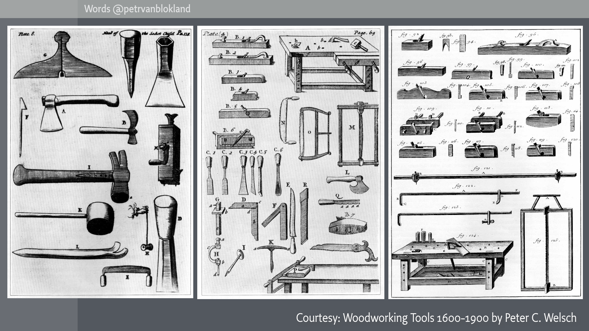
Carpenters around 1600 had a relative easy job in educating apprentices, apart from dying young of age. “Hey lad, watch carefully how I do this. for a couple of years. And you can do it for the rest of your life.” Tools were tools. They hardly changed. Innovation was slow, knowledge would stay valid for at least a whole generation. It was not the hardware that needed development. It was the skills. SImilar to writing and lettering with pens, brushes, chisels and hammers.
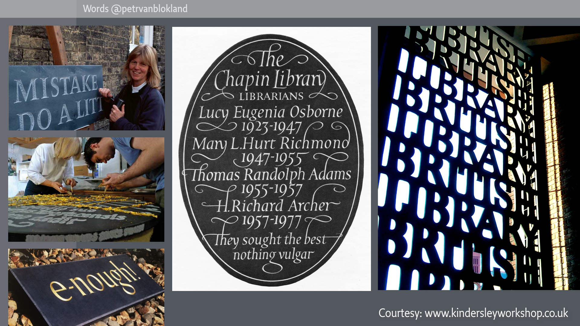
Lida Lopes Cardozo, who runs David Kindersley’s Workshop in Cambridge UK – employing 15... (well, what do we call them: designers? typographers? type designers? lettercutters? What is in a word?) told me some time ago that she’s now using a nylon hammer instead of wood. One of her biggest innovation in years. She doesn’t have email. There is no need for that, if the shortest deadline to finish a stone is around 6 months. If communication about a job cannot be done by a letter in an envelop, it is not their cup of tea. They take one apprentice per year. Exactly one. Exactly one year. Check them out if you don’t know them. There is a great website, but as you can suspect: it’s not responsive.
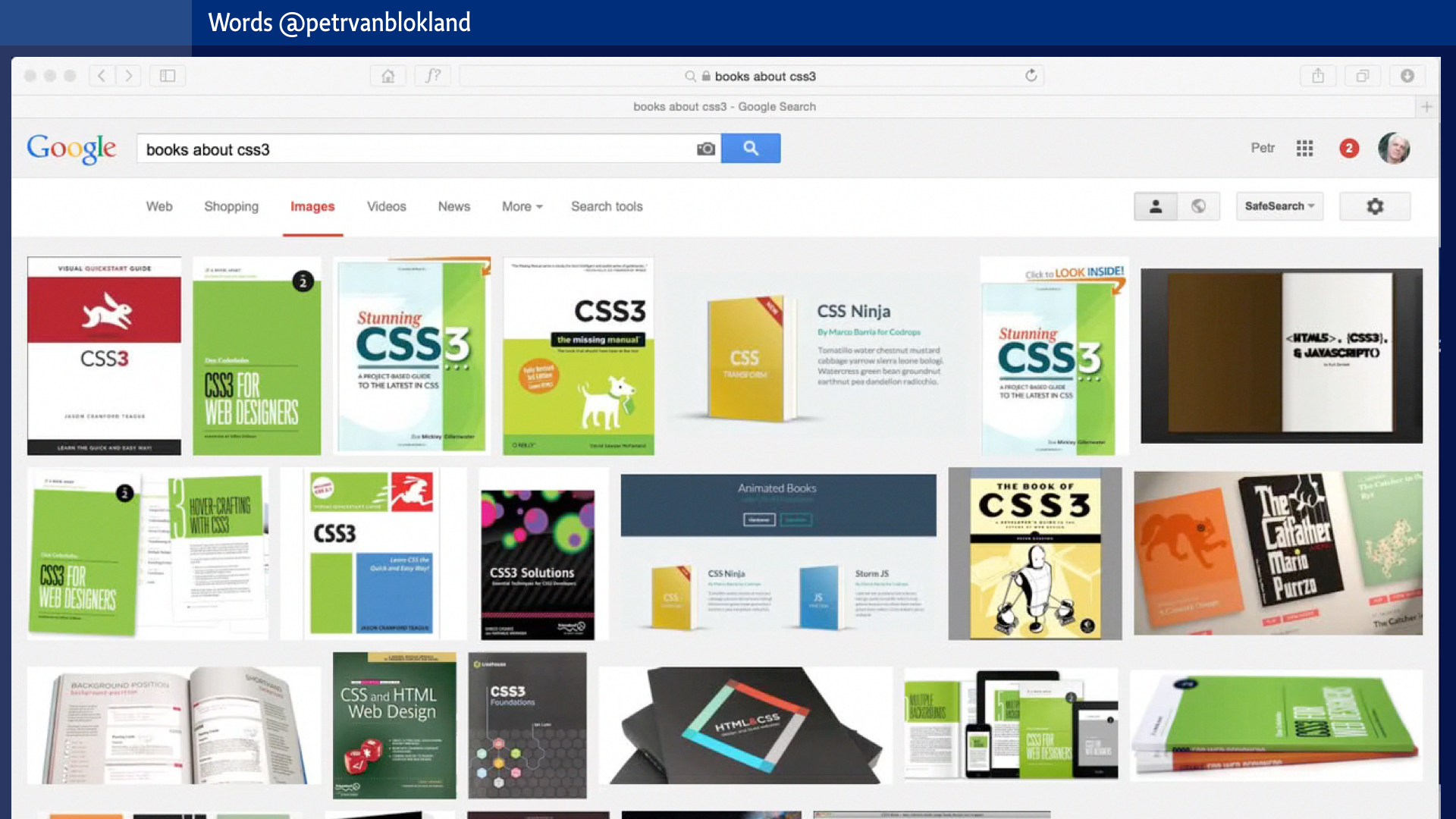
How different is that from the rest of the world. Were knowledge about how to make websites becomes useless after 3 years, after the notion of responsive pages kicks in. Where every update of browsers, standards and bandwidth makes webdevelopers revise their entire knowledge base, their set of tools, their vocabulary and the level of required specializations. Where the rumor about HTML6, CSS4 and Angular 2.0 is as dangerous and scary as an hurricane. Still out of view, but to be expected soon. When the storm hits, they need to be prepared.
As simple history once was, that difficult is todays life. If structural changes to tools and methods become shorter than a lifetime, professionals have to adapt. There is no choice. The only alternative is to quit entirely and look for another kind of work. But as these changes not only happen for graphic design, it is likely to encounter the same problems in another branche.
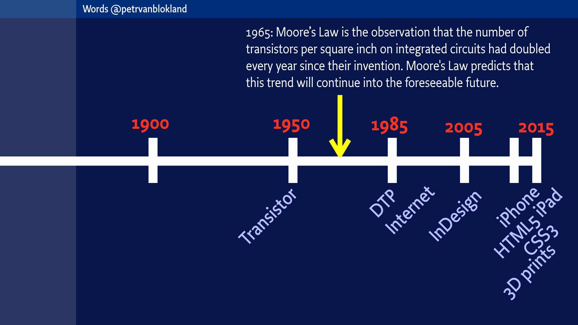
You probably all know this, or at least you should. I’ll mention it anyway, because it is critical to understand why professions run out of sync with reality. Formulated in 1965 Gordon Moore made the observation that the number of transistors per square inch on integrated circuits – your computer chips – had doubled every year since their invention. Moore’s Law predicts that this trend will continue in the foreseeable future.
That doubling made Internet, InDesign, iPhone, HTML5, CSS3 and 3D printing possible. And it is not going to stop. For a while.
The main problem is that, although the development of technology still follows Moore’s law, the human mind does not. It still takes 9 months to breed a baby. It still takes 10.000 hours to get on a professional level where skills are involved.
Not Google knowledge, but real skills. The experience how to do something in a certain situation. Training. Muscle memory. For those who participated in the Typographics workshop by John Downer know exactlywhat I mean.
Students who complain that again they need to make a poster or a website, while they already did one last year, simply don’t get the point. They think that a skill is something you can download from a webshop. mySkills.com.
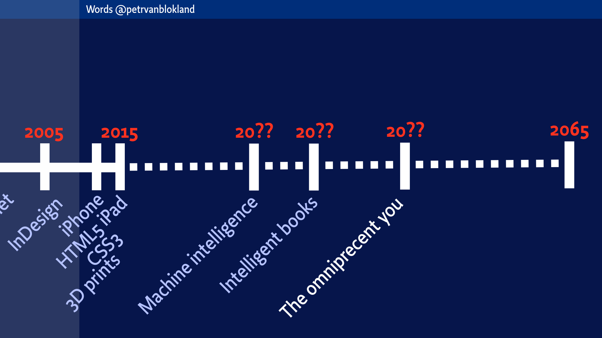
So what is it that students should learn, to make them independent and robust designers in the future? Let’s have a look at this simple time frame. Let’s say that the professional life span of a graphic design student is around 50 years.
In 1900 scientists said that all of physics had been discovered – and they were right, just looking at Newtons model – nobody could predict that Einstein would write his theories of relativity shortly after. And then later in history he could not believe quantum theory to be true.
The most important message that we can learn from the past is that if anyone says “We discovered all of it”, it is probably wrong.
Some prediction are easy. Responsive type is around the corner, referring to what we saw in Typographics. Getting all world scripts aboard is another development that is likely to happen, relatively soon. Better typography on all devices. Responsive to any user parameter. Generated on the fly, in your browser. Better screen resolution. Faster computers. Invisible computers. Virtual and augmented reality. 3D vision. HTML7, CSS 8, iPhone 12. iOS 26.
We can only guess what lies ahead, after these easy predictions, and if we ignore all doom scenarios that cheap movie makers want us to believe.
But it is not entirely guessing. Some larger waves can be seen, especially when connected to the field of Artificial Intelligence.
What is your role as graphic designer in all of this? Can you keep up? Or can you find your niche pool, most of the time undisturbed by the tides.
Design the parameters
Did you ever buy a car or a house? The kind of decision that will tie you down for a while? How did you get to that decision? By ratio? Walking through a well documented sequence of pros and cons? Or more by your own intuition? Or even by the smell. The legendary apple-pie, when selling a house. What is it that makes a beautiful design? Of practical? Or useful?
Whatever your method and purpose, probably a lot of important aspects were never considered. Because you know beforehand that the pro and cons don’t compare very well.
Designers – and especially design students – don’t like methods. They prefer to trust their intuition, their taste and especially the feeling of their guts.
A typical Dutch words, used by students is “uitstraling”. It doesn’t really translate, but literally it says that the design is good if its radiates of something. Such an identity may fit well to the branding of Tnjernobyl or Three Miles Island. It maybe a good example that many designers don’t give a shit about the environment.
Designers using the word “uitstraling” think that designs broadcast a message, independent of any audience. They think that if the message is clear to them, it must be clear for the rest of the world.
Not to mention teachers who have a “good” or “bad feeling” about their students work. How much information does that give, other than learning to guess what is in the teachers’ head? How can they ever be sure? What if they are not? What if that feeling is based on a legacy interpretation of the world, when the teacher reaches at a certain age? Slowly getting cynical?
Reality is more complex than the one-to-one relation between teacher and student or between customer and designer. What if the judging needs to be done during a longer period of time. Or by a group? Of in a way that it can be reproduced by others? Or for a complex project, such as the design a new trade center or the construction of a new corporate identity?
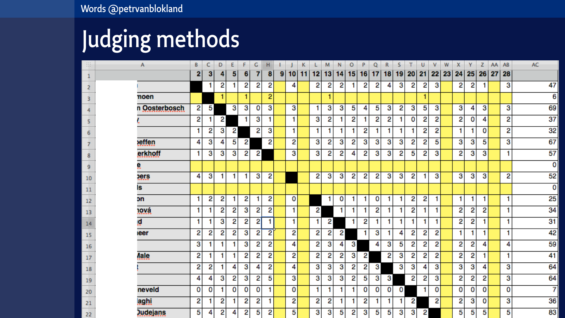
In the Master Graphic Design in Breda, students present their work as weekly exhibition at the start of each lesson. The presentation needs to be so clear, that it doesn’t need any comments. Students judge each others work, individual or as small groups. The teacher can define the criteria for the evaluation of the weeks. Completely free. Or just on the volume of the sketching process. Or how clear the presentation is. Or how much the result fits the original set of requirements. Each team can give marks from 0 to 5. (This is deliberately not the tradition A, B, C or 1-10 scale that marks normally are given in. They need to think about the marks, so if there is no initial routine value, it is better.
There are some other rules: The total number of points given must be double the amount of presented designs. That is an arbitrary value, but it works well in practice and it allows the group easily to scale to any number.
The total available time is also that amount. If there are 20 students the exact total of points to give is 40 and the whole judgement needs to be done in 40 minutes.
The method scales easily from 5 students to 25 students.
Can you think of an other educational method to get 361 opinions in that short amount of time?
Over the duration of the course the judging methods can vary. They develop. The type of judged parameters can be different every week. Evaluation can be done by numbers, or by comments, as can be seen here. It even happens that developing a new judging method is part of the assignment. What are the criteria to judge judging methods?
If applied to student assignments, this is such an efficient way to create feedback on work, that it can be done on a weekly basis. It encourages students not to hide away because their sketches are not finished (as if that ever can be). It show trends and it allows the formation of teams. E.g. the highest scores of a week are mentors for the lowest scores of the week. For Master students this mentoring role is an essential part of their education.
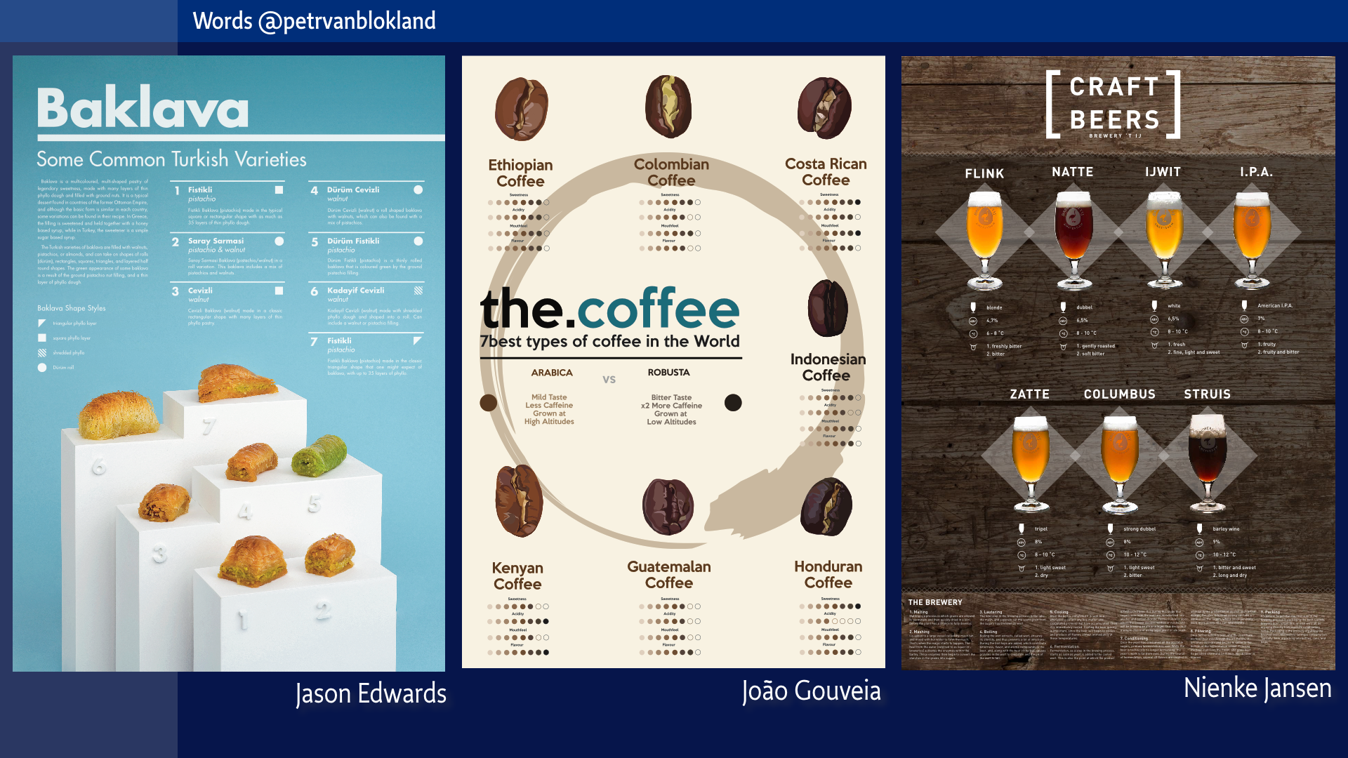
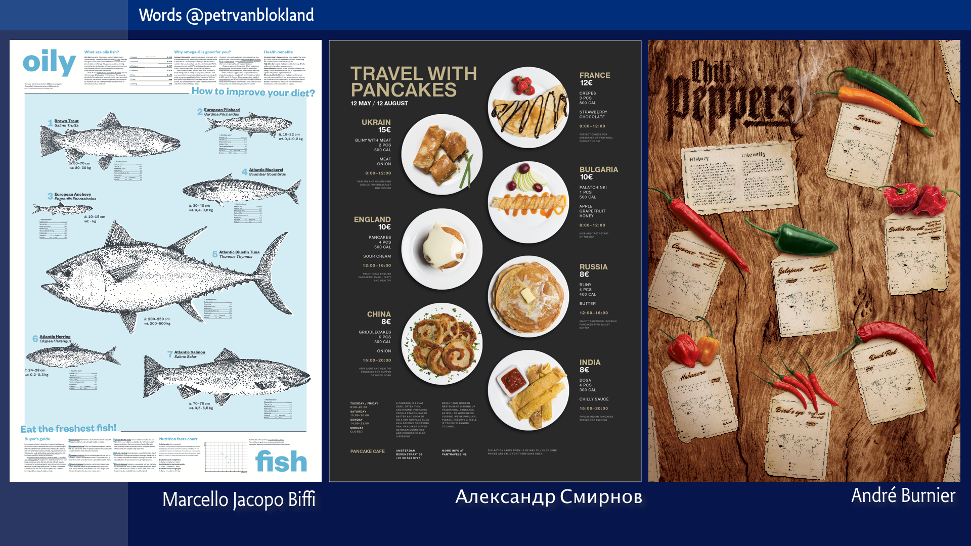
Here is another assignment. Tough sets of requirements. Sketching. Esthetics. Typography. Information. Techniques. Planning. Organization. Collaboration. Production. Programming.
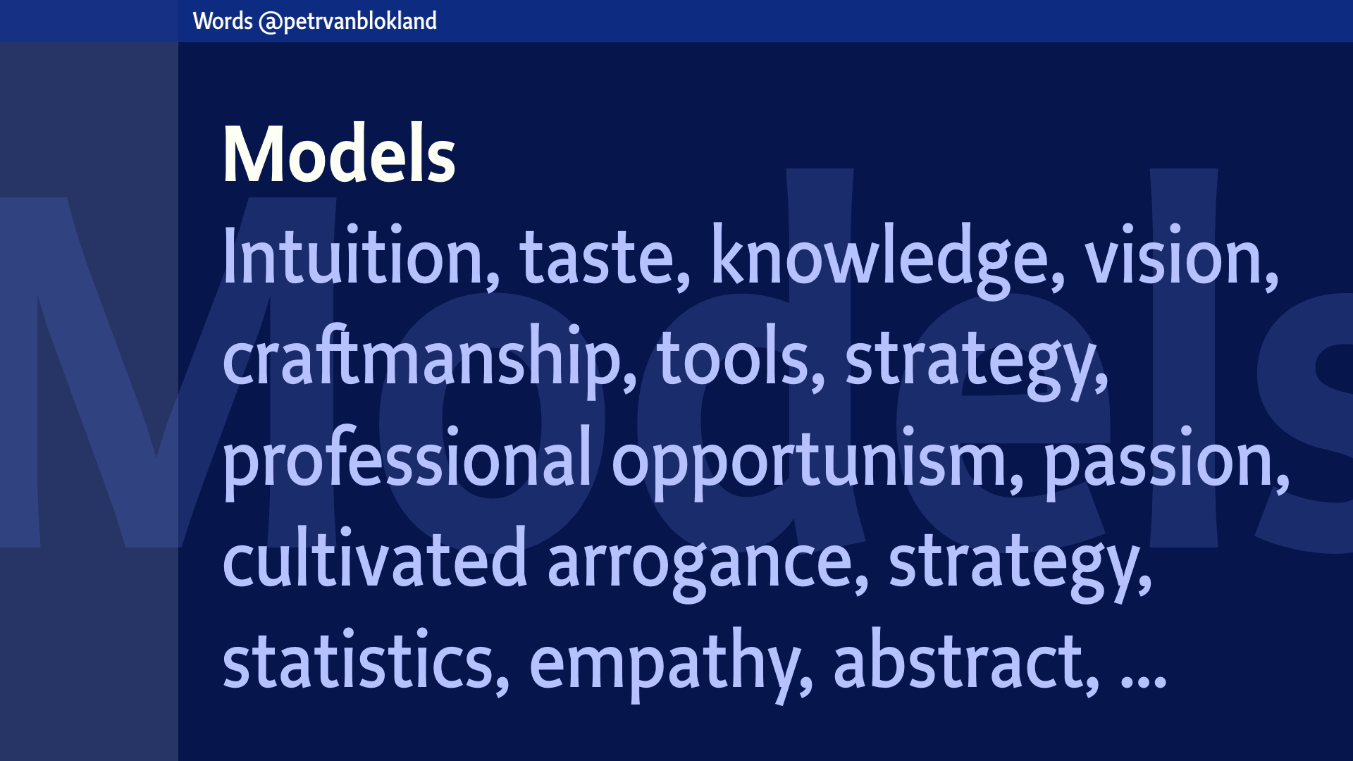
Models
The process of design and the methods to judge the result are all based on models. Simplifications of reality. By removing details we can get grip on an idea. A concept. Otherwise it is just beyond our imagination.
There are many types of models, all with their own value.
Intuition, taste, knowledge, vision, they all represent a subset of reality that act as pars pro toto – the one that stand for many – for the whole idea we want to grasp. But which one fits best in a given situation? Has the best result? Selecting (and designing) the type of models is a design process in itself. You get better at it, if you do it more often.
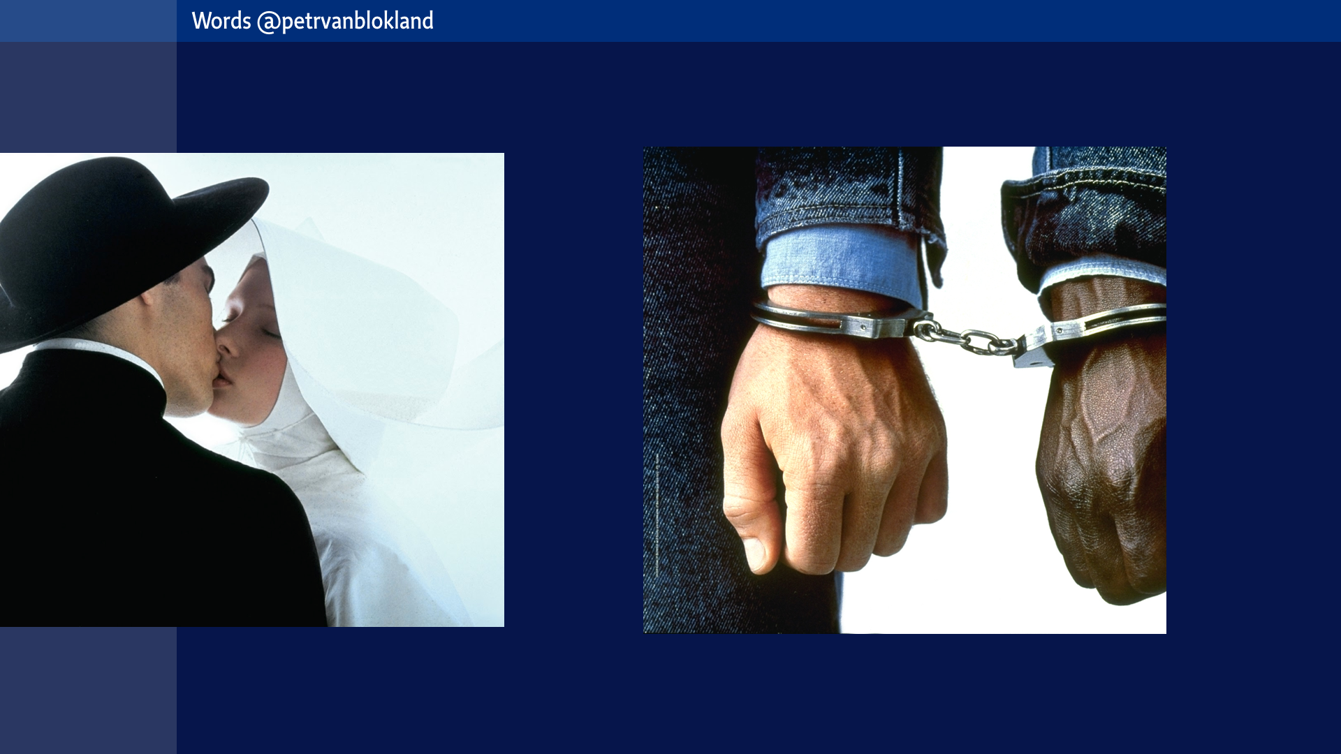
Why does the meaning of an image change entirely when the context changes.
The same is true for this image. What is the brand?
But how does that work for design clients who don’t have millions to spend, and still want to get a share of this icon-glue in our heads.
Design education
As I predicted we ran out of time. Design processes can never be predicted, but that fact itself is really a certain factor.
Skipping the education part? Not really. I hope you found that in fact this entire lecture was about design education. It is so important, that there is no need for a separate chapter.
There is a lot of things we did not address, in detail. We didn’t look at the typography of words. We did talk about the design of type. But you already know about that, as the expertise is piled up in this hall, especially right after the great Typographics conference.
We had a look at words. Just words. Not even sentences. Do you know that it only takes the permutation of 80 words, to match the estimated amount of atoms in the universe. If there is a God, mathematics must be a large part of it.
Words are tricky. Perhaps I changed your feelings about owning a Maserati. A bit. But hopefully for the rest of your life. I could be sorry about it, but that is how life works. You volunteered to be here. To expose yourself to other opinions than your own. People who don’t want that, have no other way than shutting down communication entirely. Locking themselves in a group. Inside borders. Sensoring internet. Altering the flow of info. That is what countries do. And religions.
But if you are a designer, it is your task to alter. Your profession to shift meanings. Changing focus. For yourself. But most importantly, for your audience. Shifting in an intended direction. No matter how small or how large that change is.
Otherwise its art. Or to put is otherwise, artists who shift in a intended direction I’d call designers, according to the definition that we have seen passing by in this talk. But that is an entire different discussion. What is the meaning of the words “art” and “design” anyway, other than the topic for just another lecture?
Thank you.