Much has gone into research and writing about the Gutenberg revolution, but some facets of the Mergenthaler revolution could bear a little more scrutiny, as you can imagine I am about to give them.
By David Berlow
Before Mergenthaler’s lines of type, typesetting text—selecting and placing letters sequentially to form words and spaces—referred to typographers who were capable of reaching into a drawer, selecting the correct letter, and placing it into some sort of form holding one line of type or more. At this point, if letterpress type was being used, the line or lines of type would be ready to go to the press. If typographers were pouring their own line of type, as they occasionally did for frequently used bits of text, they poured it into a form, let it cool, and had a line of type ready for the press.
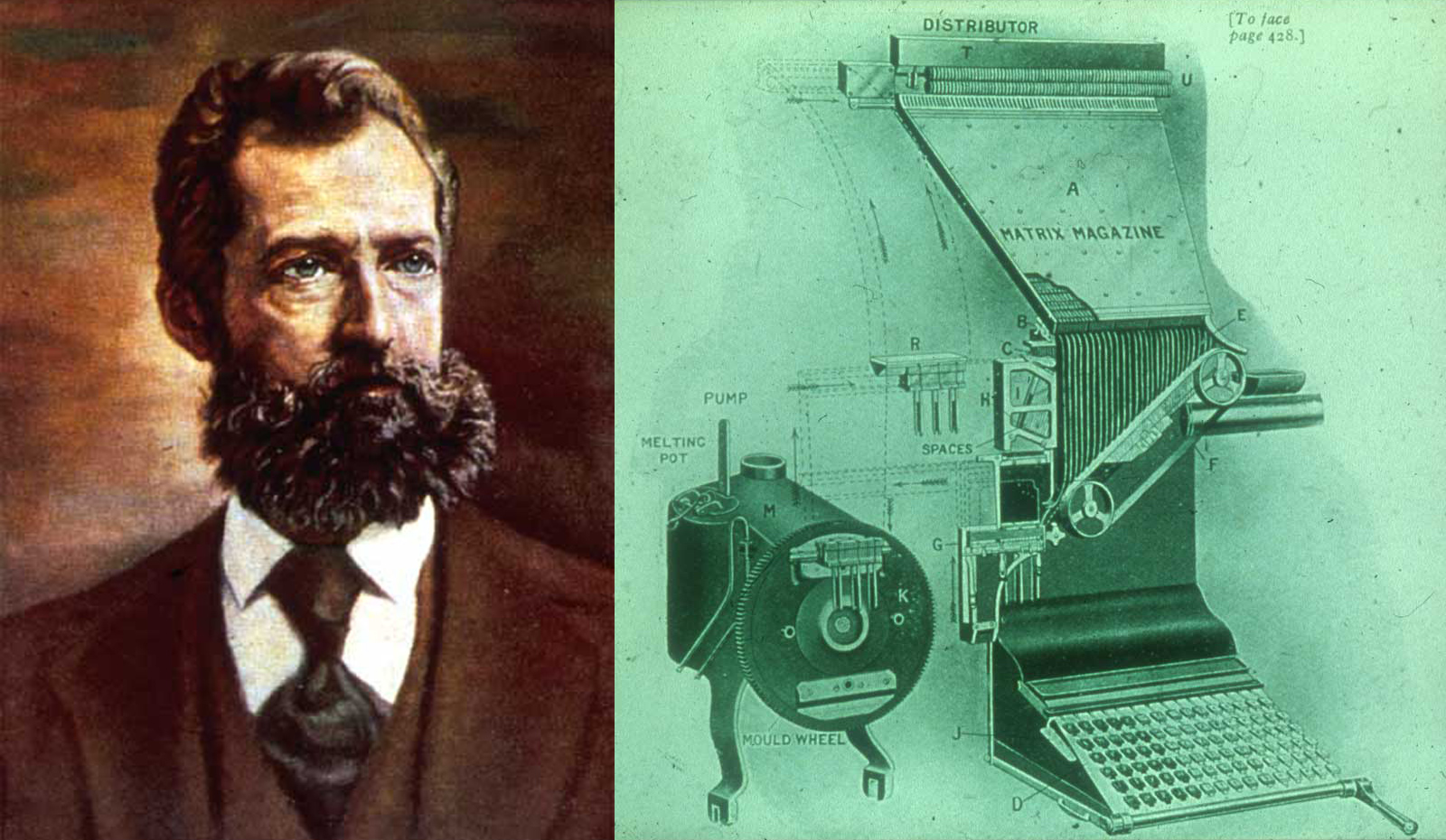
LEFT: This portrait of Mergenthaler looks a lot like the romanticized images of founders that hang on the walls of the offices of the succeeding presidents of the company, because that’s what it is. RIGHT: Close-up and drawing of one of the Linotype machine’s gonkulators, bottom left, and the magazine, where all of the matrices were stored.
In both cases (with the former being much more common than the latter), the letters in that drawer got to the printer in a heavy brick-shaped package of metal, either from a different department or from a company that made type. These letters were sorted into the drawers, and then repeatedly used, cleaned, and sorted back into the drawers. And the letters shuffled from drawers to press until they were worn out and the metal got recycled, which could be a few days or months in the case of a font used for popular book text, or a few decades in the case of a font of holiday ornaments.
Not much about letterpress may strike us as “virtual” today, but Gutenberg’s innovation of separating the formation of letters from the document they were formed on marked a step toward abstraction. Four hundred years later, it was still going strong, because, among other things, you could tie the text up and store it.
The Linotype machine added a second layer of virtuality to type, especially text type, to serve the needs of a new kind of commercial immediacy demanded in the second half of the nineteenth century. You know the story—the spread of ideas during the Industrial Revolution via printing, blah blah blah—except possibly for the fact that the machines always lagged behind. It wasn’t that better type technology was invented to spread knowledge further; it was that the demand for knowledge had been held back for hundreds of years by manual composition.
Mergenthaler’s revolution was in text type, which was the hardest to set and wore out the fastest. Not having to get the type from the case, print, and then put it back in the case, in fact stopping it from coming in the door altogether, was the virtual advance. The type appeared and disappeared in and out of a melting pot, at the command of a keyboard. That could happen because Mergenthaler employed an existing series of mechanical parts to move each letter’s mold, or matrix, around inside of a Linotype machine, to ready the form; then, after the line of type was poured, an ingenious set of shapes, like keys, on the bottom of each matrix guided the matrix back into the right spot in a rack full of matrices, called a magazine, so it could be used immediately in the next line of type.
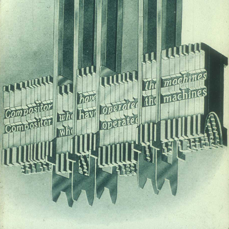
MACHINE PARTS: A romanticized drawing of one of the more destructive machine parts in the Linotype catalog, the duplexed roman and italic matrix. With duplexed matrices stored in the magazine, the user didn’t need to switch the magazine for italic matrices, or worry about getting a quality italic companion to the regular, as most lowercase italic i, f, l, r, and t, in serif types, do not take too well to being on the same widths as the regular.
For slow jobs in a small shop, the keyboard-operated machine could be easily managed and afforded by one person; in print factories, the machines had round-the-clock crews of ten cycling input to lines of type, to the press, and back to the pot, like a bucket brigade. If what a nineteenth- or twentieth-century purchaser saved from this had been realized, published materials would’ve been practically free; but the fact that publishing empires around the world spread almost instantly from the Mergenthaler invention is another story. What is not so much a different story is that this second revolution of metal type, its mechanization and virtualization to that date, was a process that was not necessarily possible or replicable across the worldwide range of scripts, font sizes, and type styles that had been using the Gutenberg invention successfully for type. The keyboard and magazine were obviously engineering examples not suited to all scripts and designs.
And the “peaceful use of metals” is an overarching issue that modern readers need to appreciate as well. From the beginning of Gutenberg’s invention, the makers and printers of type put a huge demand on the supply of metals that hadn’t existed before. And all of these metals were scarce even in peacetime. So the Mergenthaler revolution, which used and reused the same “hot metal” again and again, took over most text type. For headlines and other display uses, hand-set type and hand-lettering stayed around as expressive and commercial partners to the “hot metal” machines for text type— providing, among other things, headline types above Linotype’s text-type size range. Hand-setting lingered for other reasons as well, like its superior crafting potential.
A different split of technologies might take place in other markets and other publishing cultures. The Ottoman Empire, which used the Arabic script for publishing in both Arabic and Turkish, got native Muslim ownership of Gutenberg’s invention by the early eighteenth century, and part of the initial compromise between Arabic-script publishers and letterpress was the separation of secular and religious publishing: secular texts might be printed, but religious texts would be handwritten by calligraphers, until the mid-nineteenth century. I mention these dates and practices, for one state and one script among many, only to point out the fact that while the two metal-type revolutions rolled along in a number of overlapping waves, the storm that caused the waves was the need to expedite the publishing process from punchcutting to binding for growing populations. While this growth was universal, it is and was handled quite differently in the various jurisdictions, which are not universal now and were not universal then among the growing populations of type users.
A lot has been said about receptiveness to metal type of any kind in the contexts of nationality, politics, religion, economics, scripts, and languages, but this essay aims to be about typefaces and technology in change. Among the changes was a wave of “quality adjustment.” Within a few decades of Mergenthaler’s release, the Latin English-language types in the Linotype library—the default fonts of their day in some ways—had to be replaced because they were so bad compared to hand-set foundry type. These fonts were not replaced in reaction to any internal sense of design quality, but at the insistence of an external hire, and the desire for better, more useful text-type designs for the public.
What allowed the low quality to roll along for twenty years was that the Mergenthaler Linotype Company was making a lot of money from selling machines that depended on a large number of engineers working—from the drafting boards in Brooklyn to the adjustment of a Linotype machine’s gonkulators for the local humidity of Texas—and the fact that the type matrices were treated about the same as any other one of the company’s machine parts. Stylistically, they tried to copy the existing letterpress fonts in use, to satisfy one customer after another, but by adding the fonts as machine parts into a process with so many variables, they ended up with a library of typefaces, each responding to different market pressures or engineering needs, that were special in everything except appearance.
And although machine parts are fine for some designs, languages, and scripts, they are hopeless for others, or at least they were until the arrival of photographic or digital type. So while a struggle ensued for the right balance between writing, hand-setting, and mechanical typesetting in cultures around the world, the Latin script, especially in use for English, hit the sweet spot, both technically and culturally. In economic combination with a compact keyboard and the potential for ugly but functional fonts, this birthed both the Linotype machine and the typewriter. These two machines linked individuals up to typesetting, via paper and early electronic communications systems, to form the first networks we might see as modern.
I think of this period—that of metal type from Gutenberg’s to Mergenthaler’s—as the “backwards” era, because when I got to work at Linotype in the late 1970s, all of the letters were drawn on huge sheets of paper, on a large em square, backwards, or mirrored. This was a symptom of a lot of engineering voice and very little design voice. But by the time the digital font revolution rolled out, engineering had given design quite a bit more voice—or at least letters were no longer being drawn backwards. Of course, since what I’m writing about is typefaces and technology, the most exciting thing about this coming set of waves, the second digital font revolution, is how the designers of type and scripts were set free, after many generations of foundry type, letterpress, hot-metal type, and the first generation of digital type.
Now, a more direct evolution of the creative process—from writing, carving, engraving, or whatever the human mind and hand have in mind, without being held back by letterpress or mechanical type or even the first digital fonts—opens up possibilities for amazing exploration with variable fonts.