Washington Post
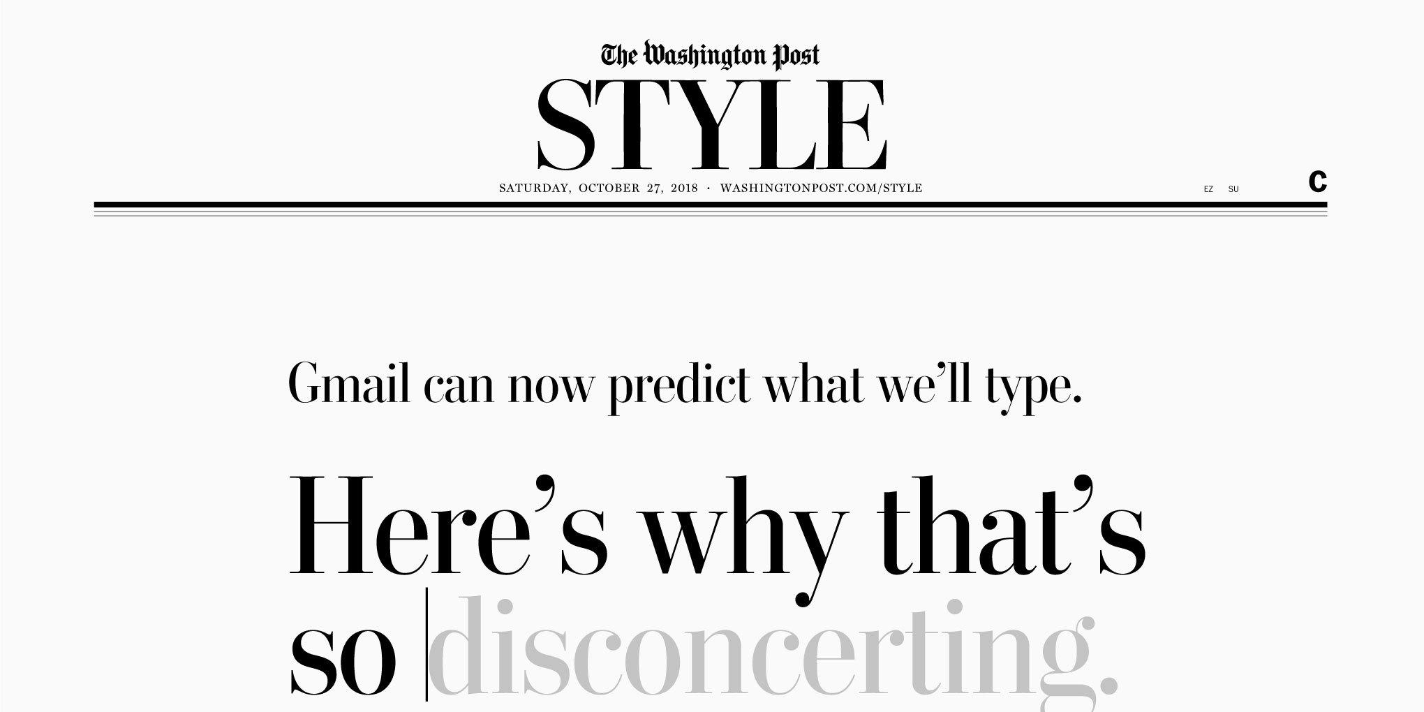
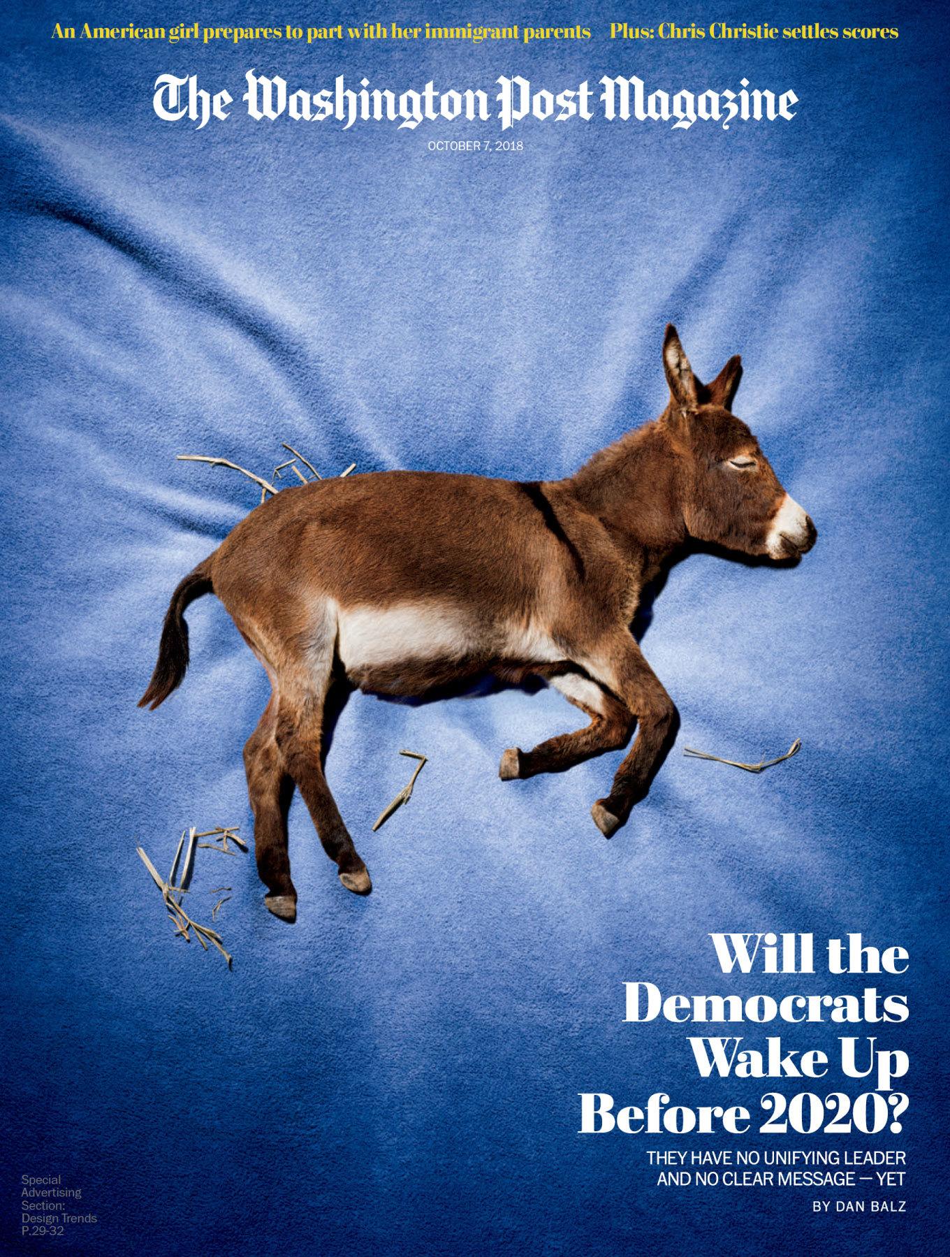
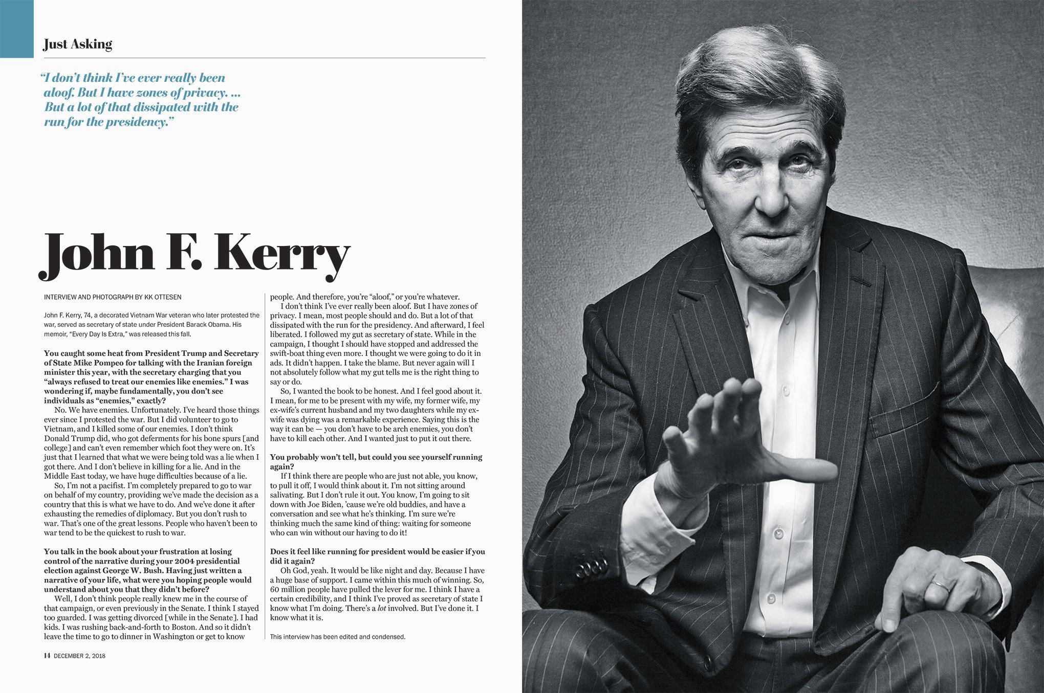
The story of Postoni illustrates how commissioning a custom typeface can become a long-lasting relationship between the client and the typeface. What started out as a modest four-style family has grown into a twenty-four-style custom headline family.
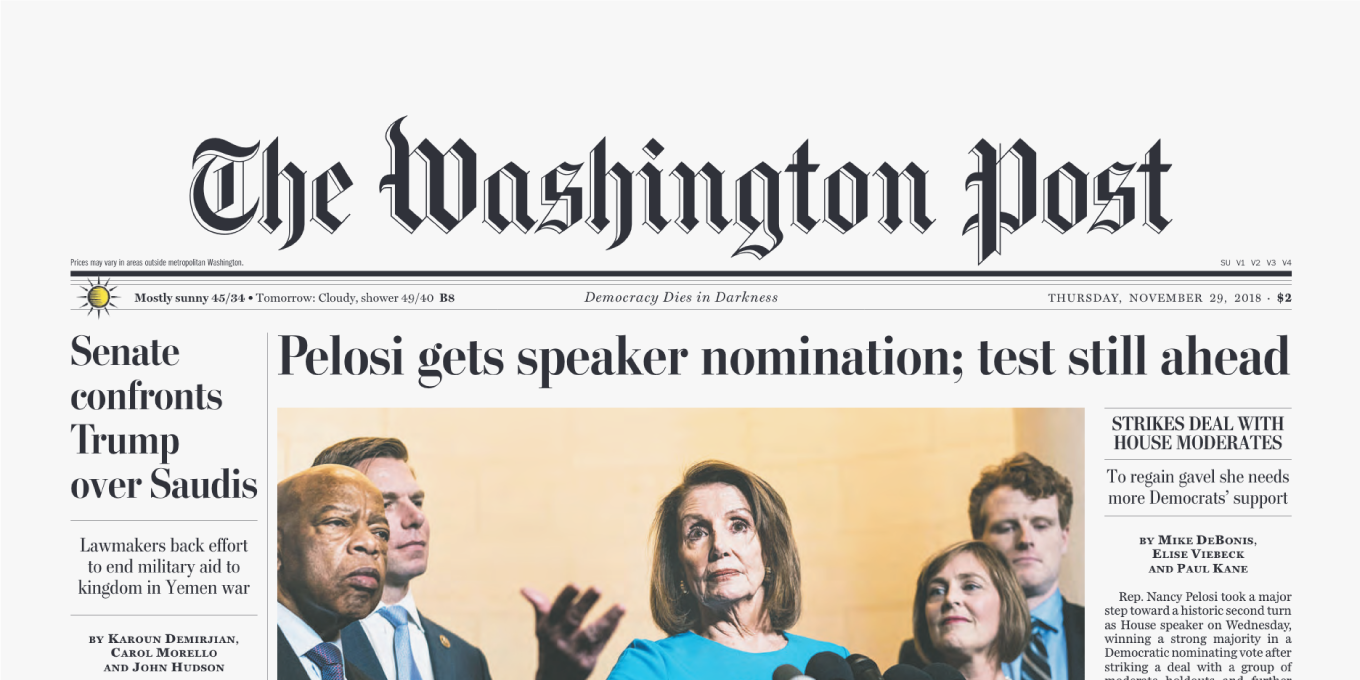
When The Washington Post introduced its redesigned newspaper in a smaller format in early March 1998, it marked the culmination of an intense process that began two years earlier. Although the Post decided to keep the title-case headlines and continue using Bodoni, Michael Keegan (assistant managing editor for news design from 1985 to 2008) found the capitals too prominent and thought they made the paper look old-fashioned.
Service: Custom licensing and consulting
Partners: Carter & Cone, Font Bureau, Kerns & Cairns and Lipton Letter Design
Date: 1997-2020


Matthew Carter is a type designer with fifty years’ experience of typographic technologies ranging from hand-cut punches to computer fonts.
Keegan commissioned Font Bureau to design a custom Bodoni with smaller, lighter caps. Legendary type designer Matthew Carter started working on his interpretation of the iconic neo-baroque face in the latter part of 1997. He developed Regular and Bold weights, each in Roman and Italic, with additional fonts featuring fractions and old style figures for all styles. The new headline faces appeared for the first time in the relaunched Washington Post with the affectionate name “Postoni”.


For over twenty-five years, Font Bureau has designed custom typefaces for almost every major American publication. Its retail library includes some of the most celebrated fonts on the market.

Calligrapher Richard Lipton develops original typefaces as well as custom fonts for international clients.

Dyana Weissman helps clients find their way to the logical, beautiful conclusion of whatever their creative challenge is.
In most cases, that would be the end of the story. Over the next two decades, however, Postoni’s design space kept expanding at the behest of the Post’s team. In 2009, Richard Lipton, Jill Pichotta, and Dyana Weissman drew new display weights with a higher contrast: Regular and Bold in regular and condensed widths, all with matching italics, for a total of eight new styles. Three years later, new Standard weights bridged the gap between the original Postoni and Postoni Display: Regular and Bold in regular and wide widths, again with matching italics for a total of eight additional styles. The latest additions came in 2018: Black and Ultra weights with italics were added to regular widths of the Display subfamily by Lipton. Postoni, which started out as a modest four-style family, has grown into a twenty-four-style custom headline family.


At Type Network, we view the development of a custom typeface as a journey that clients and designers embark on together. When necessary, type families grow and evolve according to the clients’ needs, changing publishing environments, and font technologies.