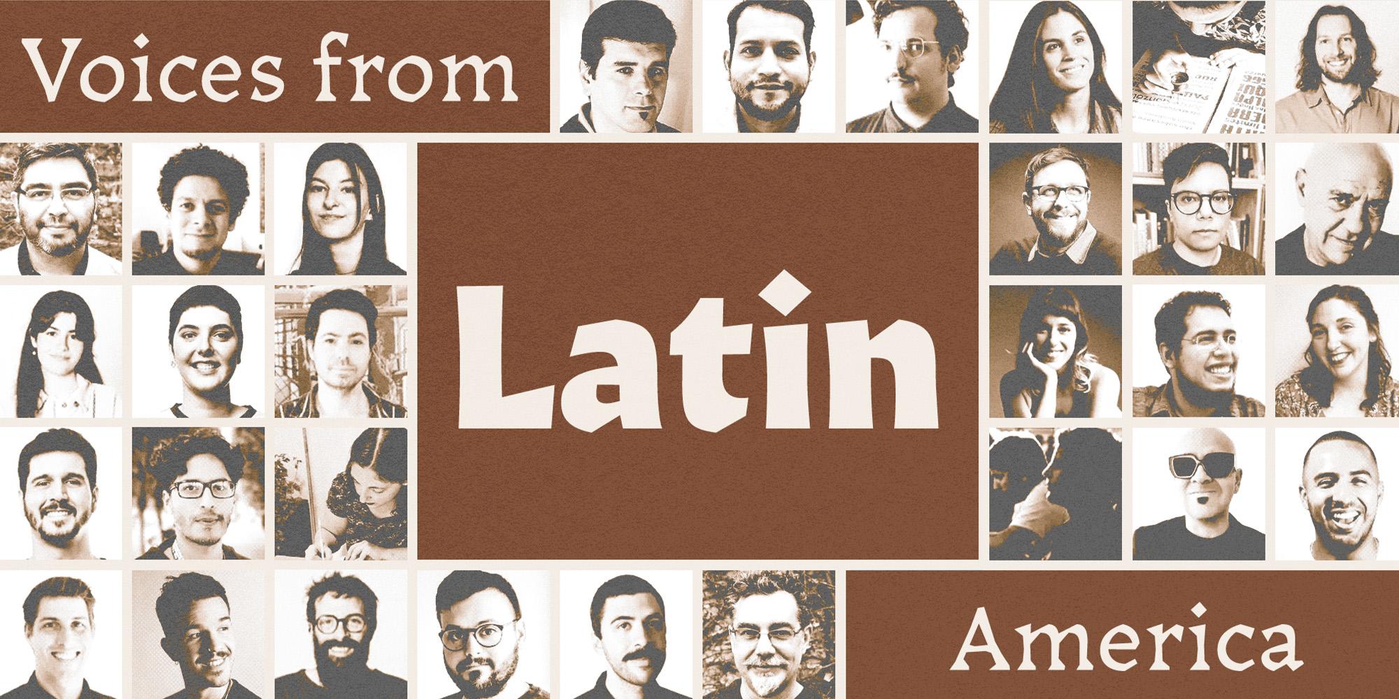
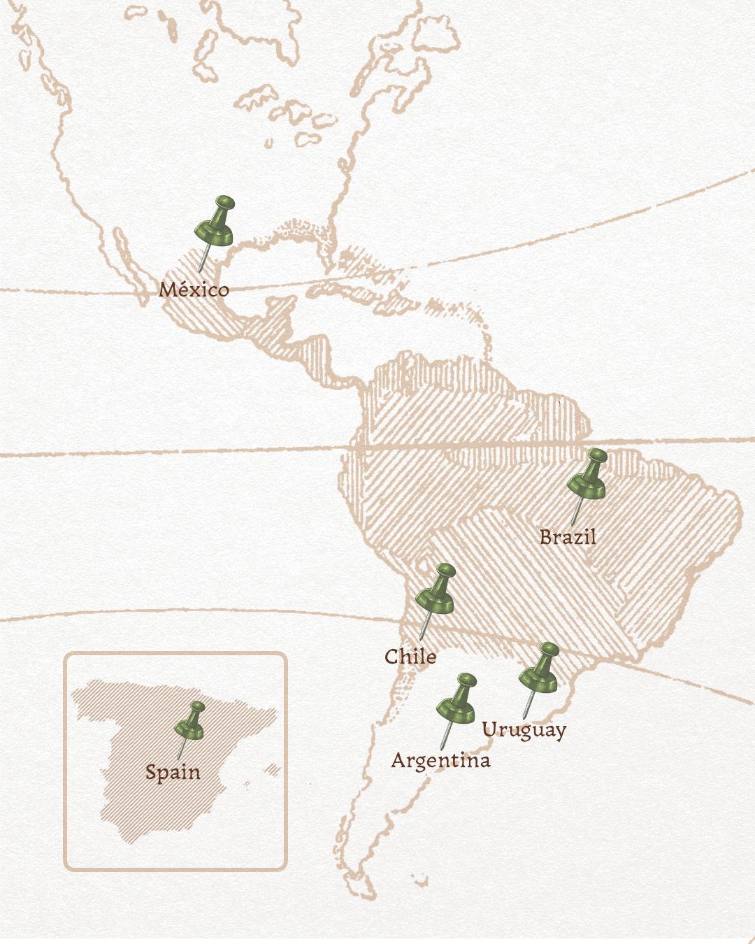
Featuring: Sudtipos · Buenos Aires, Argentina, Fer Cozzi · Buenos Aires, Argentina, PampaType · Córdoba, Argentina, Reset Type Studio · Montevideo, Uruguay, Quintana-Font · Santiago, Chile, Lechuga Type · Querétaro, México, Plau · Rio de Janeiro, Brazil, Naipe Foundry · Rio de Janeiro and Barcelona, TypeTogether · Buenos Aires, Argentina
Voces de Latinoamérica: Designers and foundries to know
There is a cultural boom in Latino Latin fonts, and now we’re in Hispanic Heritage Month. Let’s celebrate the people shaping type from Buenos Aires to Querétaro. Here are nine foundries, one standout face apiece, and a whole continent of letterforms.
Latinoamérica is one of the most vital type scenes in the world, and has been for decades: rigorous schools, thriving award programs like Tipos Latinos, and studios whose work moves easily between local culture and global brands. This week the listicle becomes a travelogue,a route that runs from the Río de la Plata to Rio de Janeiro.
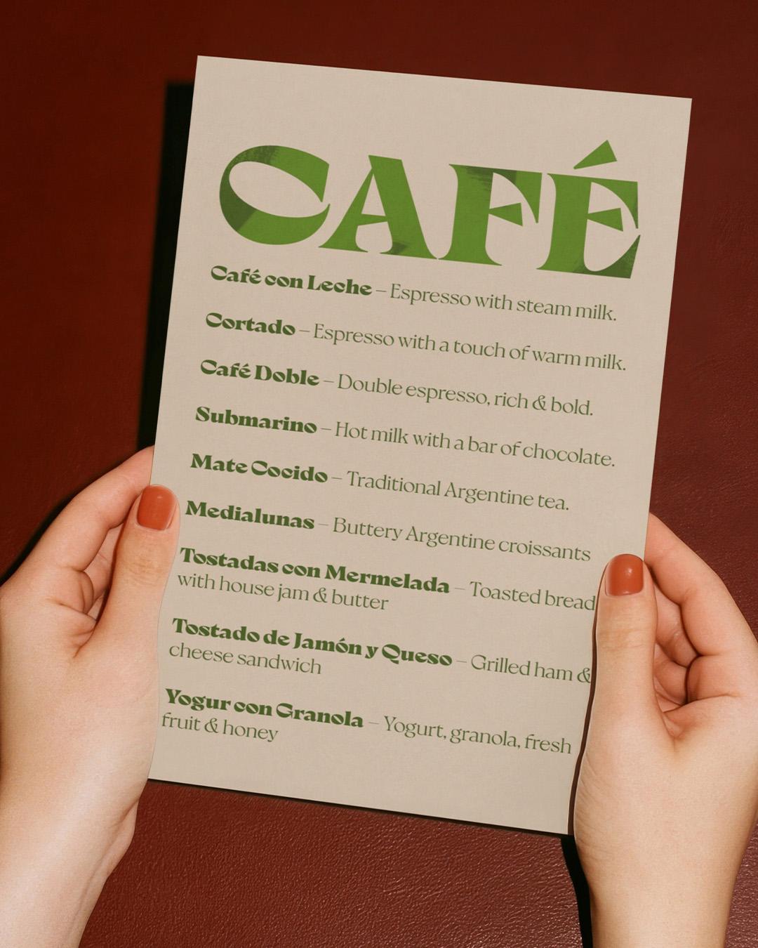
Bold type, global recognition, and a taste of Argentina
Founded in 2002 as a collective of graphic designers passionate about type, Sudtipos has put letterforms on Coca-Cola campaigns, Levi’s ads, and the pages of The New York Times, collecting honors from the Type Directors Clubs of New York and Tokyo along the way. Standout face: Milanesa Serif, designed by Andrés Felipe Ramírez, a warm contemporary serif named, with typical Sudtipos wit, after Argentina’s favorite comfort food.
Milanesa Serif
Variable
Starting at $40
Buy
Andres Ramirez
Andrés Felipe Ramírez is a Colombian type and brand designer whose work blends custom lettering, typography, and mid-century sign inspiration. He is one of the designers behind Milanesa Serif.
Where type, rhythm, and creative spontaneity collide
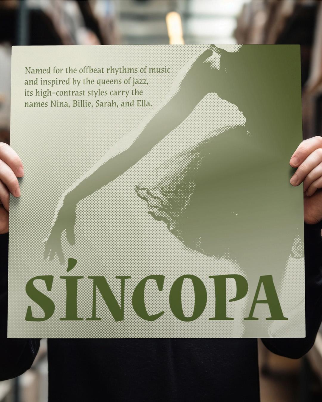
An independent designer who teaches in the type design master’s program at the University of Buenos Aires, Fer Cozzi describes her work as the place where randomness and a not-so-obvious rationality meet. Standout face: Síncopa, named for the offbeat rhythms of music and inspired by the queens of jazz, its high-contrast styles carrying the names Nina, Billie, and Ella. Type that dances, from a designer who does too.

Fer Cozzi
Fer Cozzi blends playful spontaneity and rationality, with Síncopa as her standout jazz-inspired typeface.
Handcrafted type with organic rhythm and literary soul
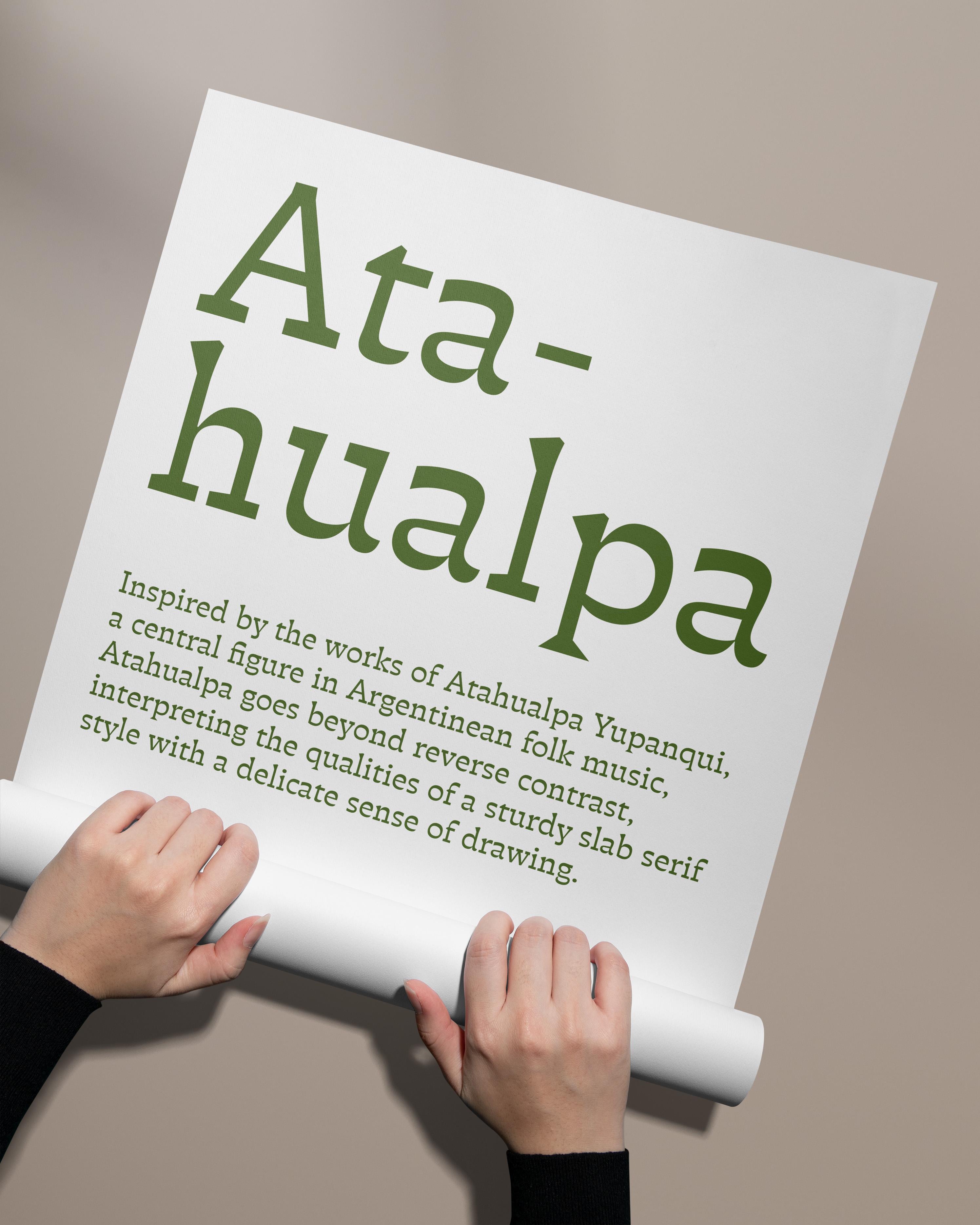
Since 2001, PampaType has been recognized across the region’s type world for handcrafted fonts built on visual rather than mathematical logic, with organic rhythms that never feel mechanical. The library reads like a bookshelf, with families named Borges, Arlt, Perec, and Rayuela. Standout face: Atahualpa, Alejandro Lo Celso’s slab serif named for Atahualpa Yupanqui, the Argentine folk troubadour, its reverse-contrast strokes running thick where the eye expects thin across twelve weights. A Typographica favorite and a Tipos Latinos honoree, it reads as sturdy as its namesake’s guitar and twice as warm.

Alejandro Lo Celso
Loche is an Argentine type designer, educator, and founder of PampaType, known for his influential work on Atahualpa, other typography, lettering, and letterform history.
Versatile type built to travel, adapt, and go the distance
Crossing the river to Montevideo, Reset is the studio Fernando Díaz and Matías Di Iorio founded, with more than a decade of experience building hardworking variable fonts. Standout face: RST Trasandina, Díaz’s hybrid sans, pairing the broad open shapes of a humanist face with the sharp, decisive curves of a geometric one, drawing equally on mechanical twentieth-century German type and the pulpy sci-fi book covers of the 1970s and 80s. Built to cross a continent’s worth of use cases without breaking a sweat.
RST Trasandina
Variable Hairline
Starting at $25
Buy
Fernando Díaz
Fernando Díaz is a type designer and educator known for award-winning typefaces, international teaching, workshops, and work on RST Trasandina.
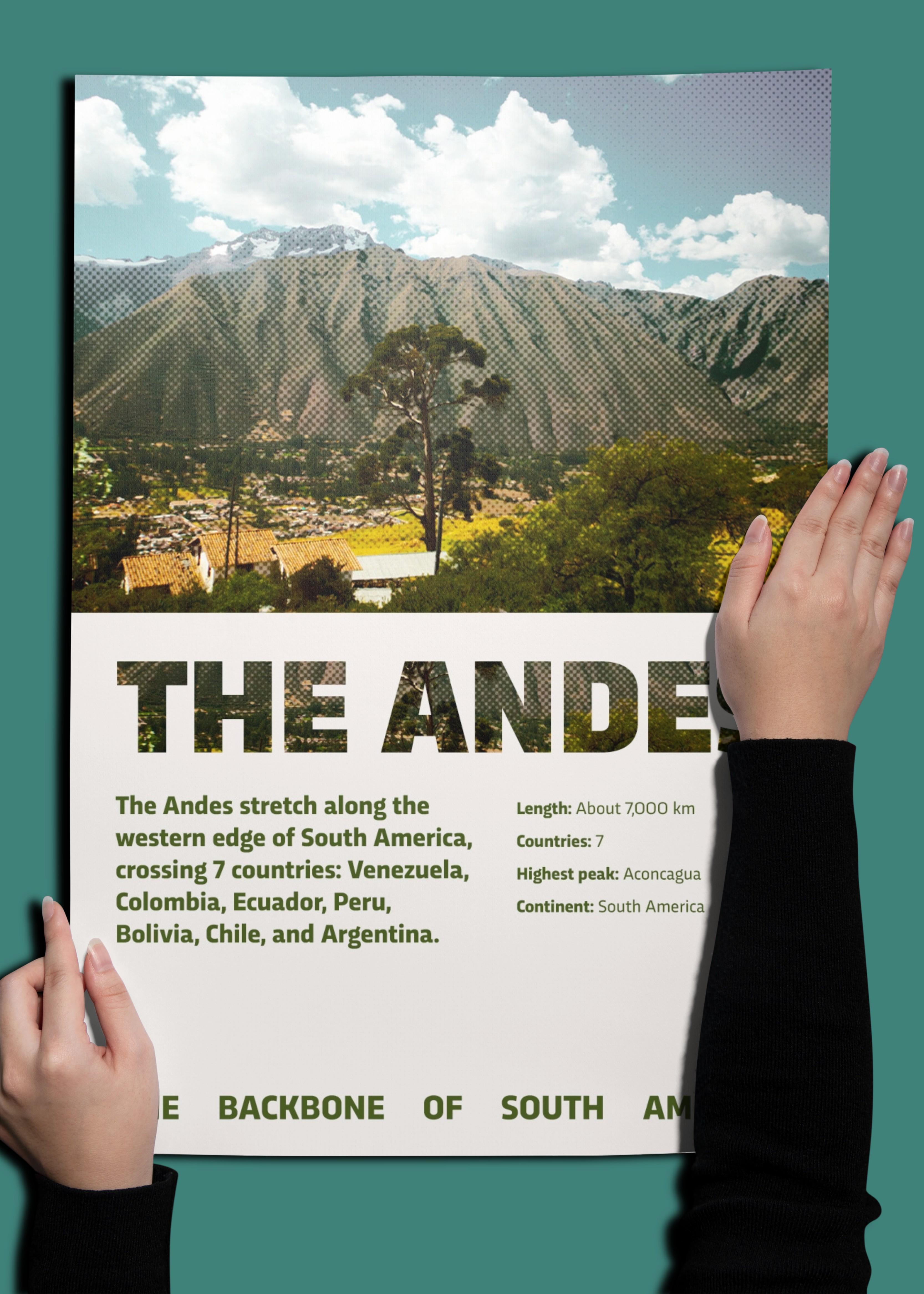
Chilean culture, expressive type, and limitless possibilities
Next to the Andes sits Quintana-Font, a Santiago foundry that draws on Chile’s artistic and cultural expressions to build typographic and pictographic systems designed to keep growing. Standout face: Mazúrquica, designed by Javier Quintana Godoy, a characterful family whose name tips its hat to Violeta Parra’s beloved song Mazúrquica Modérnica, and which ships with a Compressed width and Cyrillic support. Local soul, wide reach.
Mazurquica
Variable
Starting at $32
Buy
Javier Quintana Godoy
Javier Quintana Godoy is a Punta Arenas-born typographer and type designer, founder of Quintana-Font, known for his expressive typeface Mazúrquica and other editorial, logo, and pictogram design.
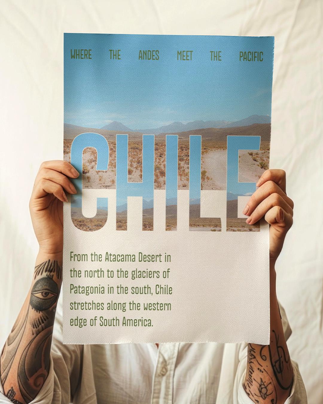
Mexican character, flexible systems, and a voice of its own
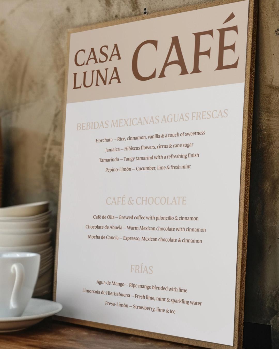
North to Mexico, where Lechuga Type has spent a decade crafting custom type systems and retail fonts for clients from Revista Gatopardo to América Móvil. Standout face: Mestiza, designed by Antonio Mejía Lechuga. It’s his studio’s flagship, a family whose name honors mixed heritage and whose Sans and Text companions turn one voice into a full identity system. An emerging foundry helping brands find a voice of their own.
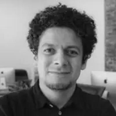
Antonio Lechuga
Antonio, (the designer behind) Mestiza, is a Mexican graphic and type designer specializing in custom typography, lettering, branding, and logo design from his independent studio in Querétaro.
Where type meets music, with bold Brazilian rhythm
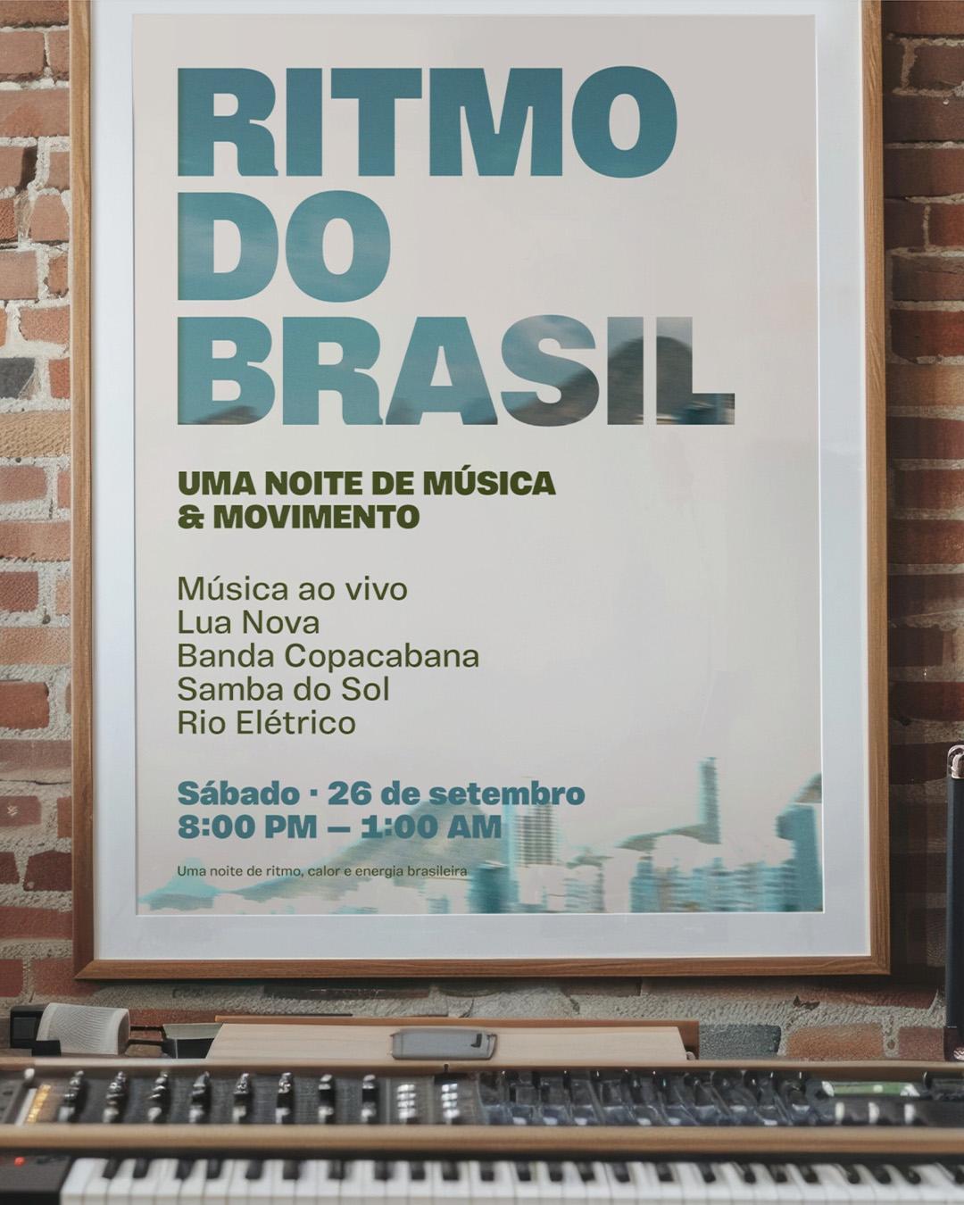
Rodrigo Saiani founded Plau on the belief that type should be part of everyday conversation, as popular as music. Fitting, then, that the standout face is Vinila, drawn by Flora de Carvalho and Saiani, which began life as lettering for a Brazilian music album and grew into forty-nine styles across four widths, its juicy ink traps going from supple in the light weights to commanding in the black. Turn it up.
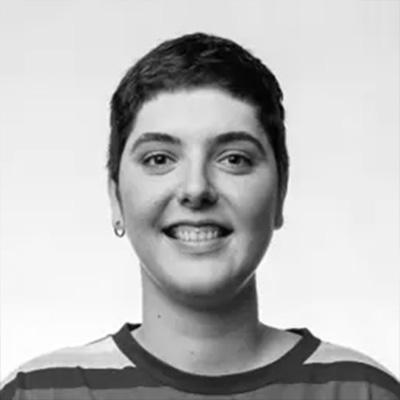
Flora de Carvalho
Flora de Carvalho is a Brazilian graphic designer and type designer known for Vinila, collaborative design, and founding the design magazine Recorte.
Brazilian heritage, Art Deco character, and football spirit in every letter
Born in Rio and now based in Barcelona, Naipe has been helping brands find their typographic voice since 2018. Standout face: Pacaembu, which began as a study of the Art Deco stone lettering embedded in the walls of São Paulo’s Estádio Pacaembu, inaugurated in 1940, and grew from a wayfinding commission into a seven-weight family with football in its bones. History you can set a headline in.
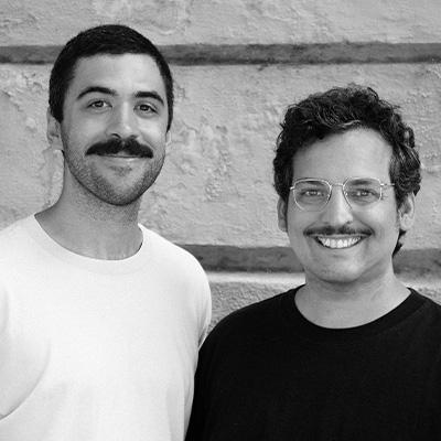
Felipe Casaprima and Álvaro Franca
Felipe Casaprima and Álvaro Franca are the founders of Naipe Foundry, combining type design, branding, and font engineering. Watch their recent "meet the foundry" video.
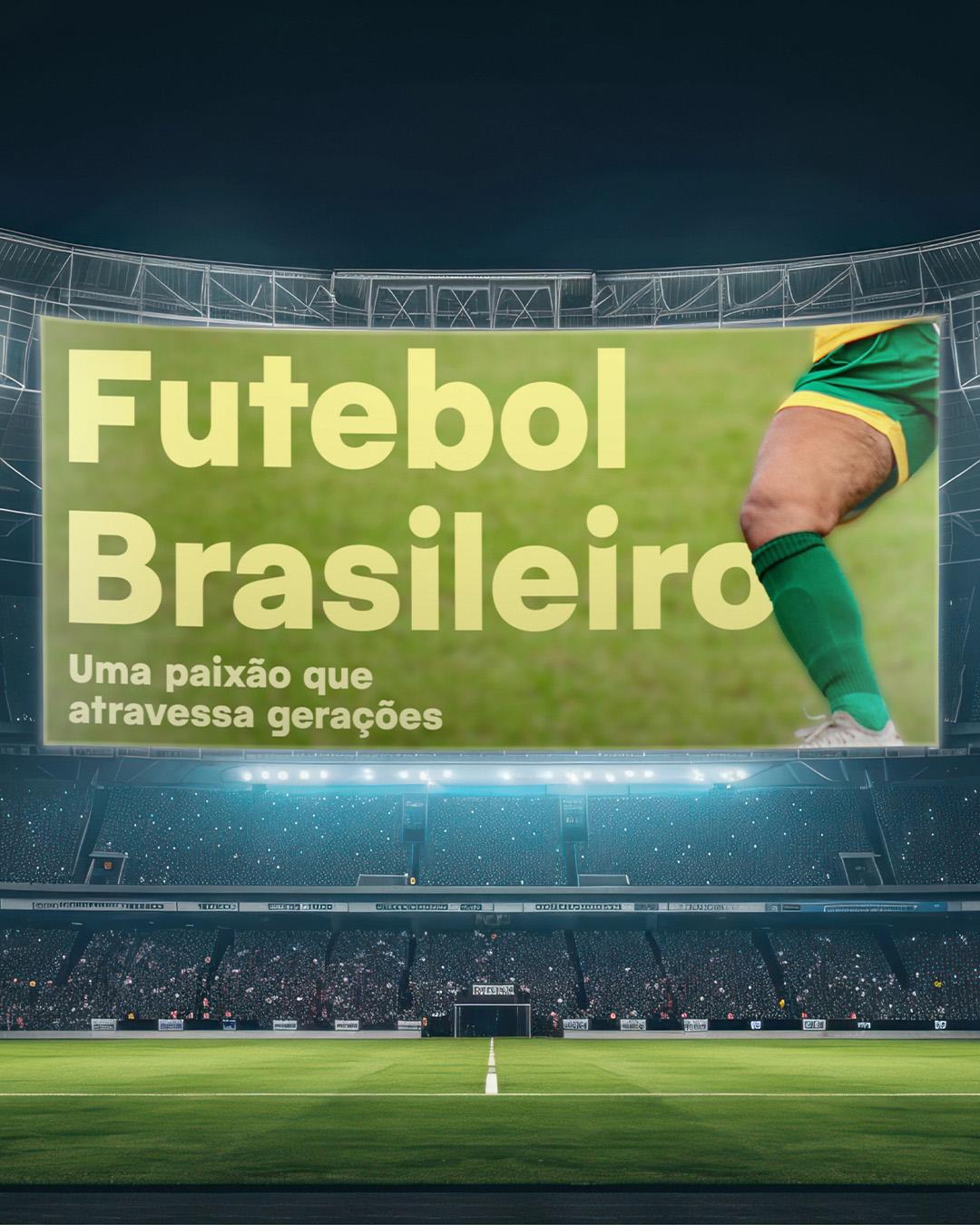
Type design with a global voice
Trained and taught across Argentina’s leading design schools, José Scaglione co-founded TypeTogether with Veronika Burian in 2006, and the studio has grown into a genuinely global team, drawing on more than thirty-five international designers and consultants. Standout face: Adelle Sans, the pair’s 2012 companion to their slab serif Adelle, now spanning eleven writing systems from Arabic to Thai, each one optically matched to the Latin original. One studio, letterforms in hundreds of languages.
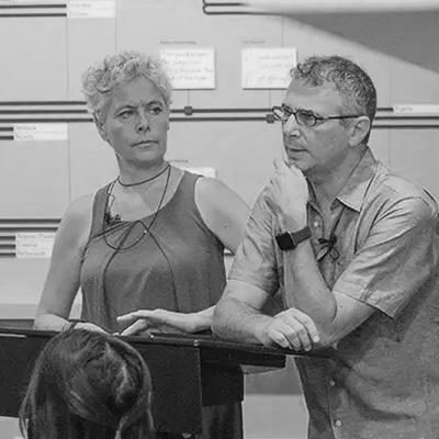
Veronika Burian and José Scaglione
Founded in 2006 by Veronika Burian and José Scaglione, TypeTogether creates innovative typefaces for global editorial, digital, and branding needs.
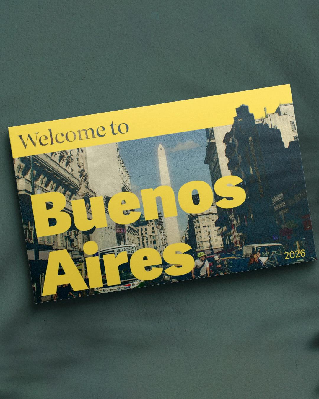
Nine studios, five countries, and one shared conviction: that letterforms carry culture. Spend Hispanic Heritage Month getting to know them all, and license their work, at
store.typenetwork.com.