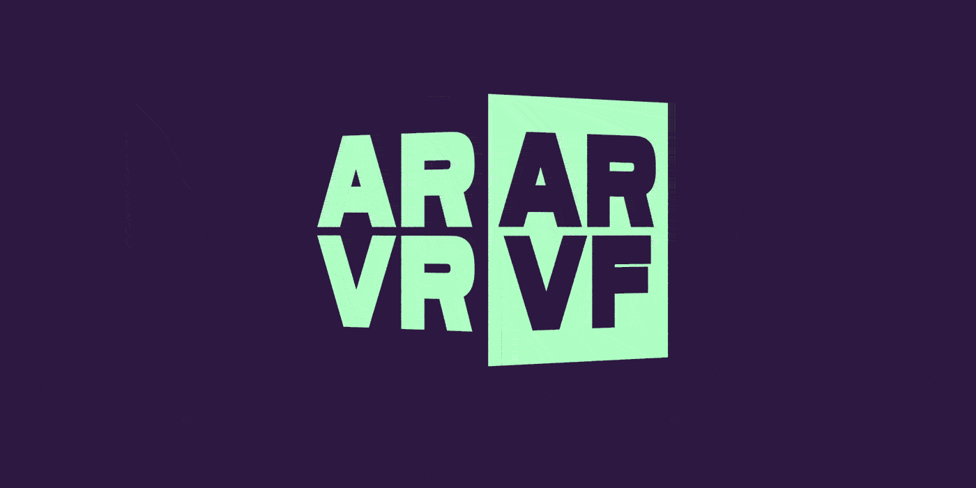
VF in AR and VR: More than acronyms
Variable fonts introduce new possibilities with web, print, and identity design today, but what about tomorrow? With all the recent talk about the “metaverse,” how will type (and designers) adapt to our changing landscape? Andrew Johnson’s typographic experiments might give us the answers.
Over the decades, a handful of designers and typographers played Nostradamus and predicted the advent of variable fonts. There were previous formats trying to fill the same need, too—which we discussed in this series opener, Variations on a theme. Variable fonts as we know them were introduced in 2016, so how did futurist designer Andrew Johnson know about them in 2015?
Johnson (not the 17th president) published an article on A List Apart in January 2015 titled Live Font Interpolation on the Web. In it, he described the core problem of web typography: “today’s webfonts tie our responsive sites and applications to inflexible type that doesn’t scale.” The result? “Users get poor reading experiences and longer loading times from additional font weights.”
He proposed “interpolating a font on the fly inside the browser,” allowing for “precise size-specific adjustments [and] the ability to extend great reading experiences to everyone, regardless of how their context changes.” Sound familiar? His demo and description of what would become variable fonts was quite prescient, considering it was published a year and a half before Adobe, Apple, Google, and Microsoft announced VF in September of 2016.
In the years since the introduction of VF, Johnson has turned his innovative prowess towards the fields of augmented reality (AR) and virtual reality (VR). For those unfamiliar, the former—AR—generally means the addition of digital layers on top of our lived environment. Perhaps you’re familiar with the Pokémon GO game, in which your phone’s screen and camera combine to add an AR layer of monster catching to the real world. VR takes things one step further: You don a headset and enter entirely digital worlds, think: Ready Player One (2018) or Johnny Mnemonic (1995).
While these headsets and apps are still relatively rare, it’s a good idea for designers to start thinking about them. The “Metaverse,” as some call the joint AR/VR world, is growing and is expected to reach more than 200 million participants by 2025. While it might feel to some like we’re just getting the hang of web design, AR and VR are fast approaching.
Aware that web typography is still a rough work-in-progress, Johnson has spent countless hours working to lay the groundwork for AR/VR typography. Partially out of his own interest and partially out of a desire to clear a path for future typographers—all of whom will eventually need to consider AR and VR—Johnson has published several articles and technologies to make things easier.
Type is one of those rare things that is both an object and a part of an object. Physical type sorts and pieces of type Letraset are used to create the 2-dimensional image of type for reading. In that way, print design and web design are similar. AR and VR are different. In his piece Breaking Boxes—Typography and Augmented Reality, Johnson explains how “augmented reality gives us a unique opportunity to reexamine typography’s relation to both us and our space.”
Johnson set out to do exactly that. Through an ongoing series of experiments, he’s been pushing the boundaries into 3D digital type.
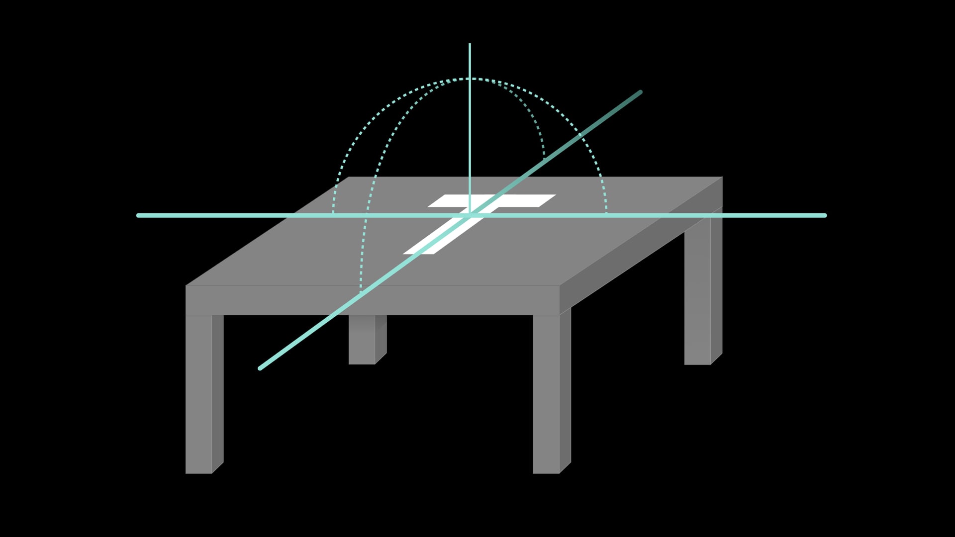
The first of these such experiments involved adjusting typography based on the reader’s physical distance from the type. To create this, Johnson worked with Erik Van Blokland to create a typographic lock-up made of “only individual four sided polygons,” a constraint of the medium when rendering in real time. He added that “this is interesting because it means visual hierarchy can shift based on distance:” One design for flyers and billboards.
The next experiment was with CJ Dunn of foundry partner CJ Type, where they worked to adjust Dunn’s Louvette along its optical size axis based on viewer distance. On this experiment’s importance, Johnson wrote, “we can make subtle optical adjustments based on distance. A font’s representation can be tied to the user’s place in space.”
With each experiment, Johnson adds layers of adjustment and variance to the virtual and augmented worlds. His version of Emmanuelle Moureau’s Forest of Numbers, using DJR’s Gimlet, showed that “content itself can change based on a person’s proximity to an object, not just its style.”
Variable fonts are already having designers think differently. We’ve seen the possibilities with VF: how they impact accessibility, branding, animation, and more. But when a designer approaches AR and VR typography… the possibilities expand further.
Each phone, computer, and AR/VR headset is packed with sensors. They detect distance, angle, velocity, rotation, momentum, and more. Johnson writes that, “in AR, all these sensors, inputs and cameras are […] part of the medium.” They become paper and ink, the screens and the pixels.
To close his article Approaching Spatially Adaptive Type, Johnson writes:
Learn about variable fonts
To learn more about variable fonts, subscribe to the Type Network Newsletter, where we’ll be sharing interviews, case studies and tutorials explaining everything designers should know about variable fonts.
2D screen design puts forth its fair share of rigor – design systems, accessibility, attention to typographic detail, and responsive grid systems. Spatial typography, in its n-th wave nascency can aim for a similar bar as it evolves.
That evolution has already begun, and variable fonts are at the center of it. 3D type is only so useful as its adaptability permits, and in this arena static type simply doesn’t compare to variable fonts. Preparing oneself for the future of typography means familiarizing oneself with its tools today.