Variations on a theme
For the next few months, Type Network is going to take some in-depth looks at the still-developing world of variable fonts from a number of different perspectives, from the technical to the creative.
The invention of variable fonts is one of the most important changes to graphic and web design since desktop publishing. And while it’s unlikely you’ve used one yet, you’ve almost certainly seen one.
What’s the deal?

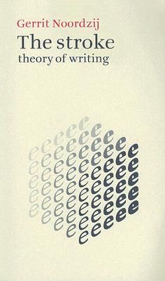
Predicted for decades—most notably by Gerrit Noordzij’s The Stroke—and attempted by various technologies over the years—Apple’s TrueType GX and Adobe’s Multiple Master Fonts—variable fonts were finally introduced by Adobe, Apple, Google, and Microsoft in September 2016.
Here’s the concept behind variable fonts (VF), which differs from person to person: It’s one font file—one download, one install, etc.—that can take on many styles. Some say it’s “one font that behaves like many,” but that sells the idea short.
You might start to fantasize about all the design possibilities this opens. Everything from animated text using CSS to ultra-refined typography in print becomes as easy as adjusting some sliders or numbers. Not to mention the speed improvements in download speeds for websites and apps, or the possibility of better automation in typesetting to help you get the best results whether or not you’re an experienced typographer.
Before a VF can be used by a graphic or web designer, though, it needs to be designed, just like any other typeface.
The OpenType Font Variations format includes a broad range of standard variables.
The OpenType Font Variations format includes a broad range of standard variables.
For many type designers, variable fonts have completely changed their workflow. Rather than thinking in terms of discrete styles, designers are thinking of a “design space”—from a single continuum (or “axis”) with two endpoints, to a complex relationship of multiple properties that intersect.
There are common axes—weight, width, slant angle, optical size—which allow for limitless interpolation and experimentation within the realm of what designers are used to. Outside of those, though, type designers have devised plenty of other axes, quirky and useful alike: Melt, Gravity, Pump, Grade, Serif, and so on.
Amstelvar, an experimental project by David Berlow, demonstrated Type Network’s views on the possibilities of VF with more than two dozen parametric axes, allowing broad control over texture, color, and spacing.

Variable fonts have been gaining more technical support, although slowly. Support was announced in Windows with the introduction of “Bahnschrift” by Aaron Bell in 2017. This new digitization of DIN 1451 employed axes for weight and width, giving Windows users their first native use of VF.
Online, most browsers support VF now, with only some CSS needed to allow developers to take advantage of the many possible expressions of any given variable font.
Adobe desktop programs—Photoshop, Illustrator, and InDesign, specifically—support variable fonts, and provide user controls for fine-tuning their settings. Noticeably missing from that list of supported applications are AfterEffects and Premiere Pro, which means animating VF axes over time in these key motion design apps requires plugins or workarounds.

Variations targeting readability (like grade, illustrated here) can be used subtly to improve reader experiences.Experiment with this example
Through native web support and some Adobe support, designers have been able to create wonders with variable fonts: From branding to pin-point typography. And with the growing popularity of generative design through libraries like p5.js, much more is possible.
Type designers are coming up with original, strange, and useful typefaces, and graphic designers are using (and abusing) them to great effect.
Type Network will be sharing some of these stories. Through weekly interviews, case studies, and tutorials, readers will gain a thorough understanding of variable fonts. By the end, you should know what they are, what they can do, and—most importantly—how to use them in your work.
We start with Bas Jacobs of Underware, whose variable fonts have pushed the envelope of what people think is possible. As he says, “There are no regular or irregular axes.[…] There’s an entire universe of type within a Variable Font, we just need the tools to explore it.”
In this series, we’ll see how tech companies, television stations, and news agencies use variable fonts. We’ll learn how to use them in our own web, print, and branding designs. We’ll also talk to influential creatives using VF for responsive web typography, augmented reality typography, and more.
Variable font technology is finally at the cusp of maturity, and our goal is to provide inspiration and food for thought about how and why these fonts can become part of your own work as you look toward a dynamic future.
To learn more about variable fonts, subscribe to the Type Network Newsletter, where we’ll be sharing interviews, case studies and tutorials explaining everything designers should know about variable fonts.