
Variable font questions: Answered.
At the conclusion of our recent webinar on variable fonts, the speakers launched into a discussion sparked by audience questions. Dan Rhatigan moderated the discussion, which touched on everything from VF’s practical limits to making animations with VF.
Dan Rhatigan: Lynne and Kevin, in your teaching with variable fonts, have you discovered any common challenges to the conceptual aspects of how they work?

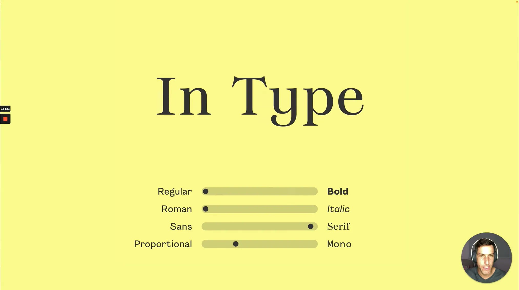
Lynne Yun: Yes, I can speak to that. We teach the variable fonts workshops together, and I teach type design separately. For graphic designers who are just trying to understand what type is and how to construct fonts, there is this notion that variable fonts are different from regular fonts. That’s a big barrier. I don’t know how much of that is because variable font marketing is shown with animations. There is this misconception that variable fonts are for animation; of course, you can use them for that.
People think that you need to design differently, and variable fonts are just a separate sector of type design. We know that’s untrue.
Get variable fonts on
the TN library
From expressive scripts to readable serifs, find the variable font you need on the Type Network library.
Another aspect of the difficulty of comprehending variable fonts is that user interfaces control a lot of what people can do. So, if there is no slider, what do you do? Or, if the UI doesn’t show the instances, people don’t really know what to do with them. Often the demos use sliders, but they go into some other software, and they say, “Oh, I don’t see that anymore. Is my font broken?”
Dan: How much ongoing education do you have to do while designing and using variable fonts?

Rodrigo Saiani: Having people who understand fonts in the client’s team is always great. So, if we design something custom, and the client already asked for something that is variable, he’ll probably be willing and able to learn what to do with it.
On the other hand, there’s retail variable fonts. With people who are buying their first variable typeface ever, we get more questions than ever.
First, they ask how to do this and that in software. As Lynne was saying earlier, standardization for software is not nearly optimal so far. And even UIs for variable fonts are not up to par yet. On the other hand, so many people just share the fact that they can play with it. We don’t know if they’re going to use it well, but it’s more Instagrammable in a way. So, it has been good in terms of getting the word out.
I think at the surface, it will be something that people will like to toy with. Then we’ll get to Bas’s question: What can we do with variable fonts that are much deeper than that?
Dan: Bas and Sami, what work have you seen that pushes interesting boundaries?
Sami Kortemäki: There’s a challenge of communicating what we know is possible versus what the average graphic designer—who is making a website—thinks is possible. Already the projects are not including these new possibilities. And when it’s not included, then it’s not even thought of. There are still a lot of gaps in communication. That’s the first thing to fix, then we can see the possibilities more.
Dan: DJR, this is an audience question: Is all the hinting in Fit based on the counters to keep the optics correct?

David Jonathan Ross: Since it’s a variable font for large sizes, I leave it unhinted! The static fonts are autohinted . . . so nothing too fancy.
Dan: Someone in the audience said they would like to design Fit Arabic, DJR: Is that in the plans?
DJR: Thanks so much! There are a couple other scripts currently planned or in the works, but I’m always happy to chat about expansions.
Dan: Do you know how many axes can be built into a variable font? There’s a theoretical technical limit, but what is the practical limit?
Bas Jacobs: Yes, yes. I can’t remember the exact number. Maybe 64,000, technically. Practically, there is no limit. At a certain level, the axes start to play together. So, if 20 axes play together, you basically set up one axis. So, then you have a low-level axis containing all these 20 different axes. I don’t think it’s relevant to focus on the number of axes; it’s more important to first find what your font should do. Then find how the user controls this.
Dan: With all that possibility, how do you manage all the complexity of your design spaces?
Bas: I think the trick is, at any moment, you can compare whatever you’re doing to when things get even more complex. For example, you can write OpenType code. If it’s very simple, you can just write it by hand. If it gets more complex, you write a script, which then writes your code. The same goes, I think, for more complex design spaces. If you start with a simple request, you can do it by hand. But if it gets more complex, you write scripts or you program it. And then this script makes your design space. And it’s very hard to imagine sometimes. So even if you made the script yourself, it’s hard to visualize what the scripts really made.

Kevin Yeh: We’re trying to figure out how to control this huge blow up in complexity. You saw everyone today: The work that we’re sharing is kind of us playing around with the technology and playing around with what we can express. We’re still in a phase where people are trying to get comfortable with it and trying to understand what you can do with variable fonts. We’re really trying to open up that space and just let people play right now. We’re building tools for tools.
Lynne: I’ll add on to that. In our practice, we’re platform-agnostic. Some tools that are more powerful than others. Specialized tools tend to be more powerful. And obviously, like, the more technically apps can take advantage of those platforms better. But as educators, simpler is always better.
The fear of new technology is always very high, especially for people in the arts, who unfortunately have been trained to see technical, mathematical skills as something that is antithetical to art. We always keep coming back to making variable fonts simpler, more fun, and friendlier.
Rodrigo: I can totally relate to what you’re saying. Because I come from a background that’s not even in design. I went to business school before diving into design, and I’m a terrible programmer.
But I see this stuff you guys, Sami and Bas, make, and I’m like, “This is amazing, I want to be able to do something like this!”
Dan: Kevin and Lynne, how do you make your motion graphics? Any specific apps that you’d recommend?
Kevin: The special thing about variable fonts is that a lot of the motion and animation that can happen is being coded in those axes. The type designers will do a lot of the work for you. And then you can just use a little bit of CSS, some layout, and CSS animations in order to do that. For us, we also do a little bit more advanced motion. So we use a library called p5.js. Then there are some less code-based animation apps that you can use as well: Things like TouchDesigner or Cavalry.
Dan: Bas, what do you think about variable font sliders?
Bas: The misconception is that you need standard sliders for variable fonts. That’s necessary. That’s a UI issue, which can be solved in different ways. We don’t necessarily have to say, “Okay, we have a weight slider and width slider and that’s it.” If, for example, somebody builds a fillable form with a height slider–which is not standard–you can code it in such a way that the UI understands that this axis is built-in and then implement it in its UI. Of course, that’s more work on the interface, but that’s an interface issue, not a font issue.
Dan: Lynne and Kevin, in your workshops, are you finding ways to help open up people’s thinking?
Lynne: There are many, many, many layers to this, like onion layers. One is the fear of new technology, which I don’t think is specific to variable fonts. There is this idea that every time there’s an update, every time there is some new tool that comes out, it’s going to be difficult to use. We need to improve upon that. It should be like a new, exciting update that we can have all these new possibilities with variable fonts, as opposed to like, “oh, no, another new hurdle that I have to solve in my career.” In our workshops, our ethos is to talk about the excitement of new possibilities and try to have people become comfortable with the unknown.
Before I was a type designer, I was a graphic designer, working for different ad agencies, making brand guidelines. And even for OpenType features, it was just so difficult to communicate to an average team of graphic designers that “there are all these new cool things that are inside the OpenType panel, if you just open it up, there’d be all these new possibilities.” But people just find it difficult to open up that panel to see what’s in there. How do we give people guardrails, so they can feel comfortable, but also allow people that want to explore to open the gate?
Dan: Do you try to steer some of the results away from certain areas?
Bas: Want to say something, Sami?
Sami: Yeah, Bas. On a general level, we want to leave as many ropes loose, and make a lot of loose ends, because that creates creativity. We don’t want to close everything, by default.
Bas: In the end, I think we should not be talking about “variable fonts” anymore. But variable fonts should be just called fonts. 10 years ago, we were talking about “web fonts.” And at a certain moment, we stopped talking about “web fonts,” because we consider them fonts. And 20 years ago, we were talking about “OpenType fonts,” which we now call fonts. We should not talk about “variable fonts;” we’re just talking about fonts.
To learn more about variable fonts, subscribe to the Type Network Newsletter, where we share interviews, case studies and tutorials about variable fonts.
Rodrigo Saiani
Rodrigo Saiani of Plau is trying to make type as popular in the world as music – starting with Brazil. He gets closer everyday by making typefaces for people and the brands they love; teaching about type at Miami Ad School; creating workshops and talking about type with pretty much anyone. His work has won awards from Type Director’s Club, Tipos Latinos, Brand New Awards, ADG Brazil - Brazilian Design Biennial Best of Show (Guanabara Sans, Primot, Tenez).
David Jonathan Ross
David Jonathan Ross draws letters of all shapes and sizes for custom and retail typeface designs. A native of Los Angeles, he now makes fonts in the woods of Western Massachusetts. He began drawing typefaces at Hampshire College and joined Font Bureau in 2007 where he honed his bézier-wrangling skills. Now he publishes his typeface designs at his own foundry, DJR, as well as working on projects with Type Network and developing unusual display faces for his Font of the Month Club.
Lynne Yun
Lynne Yun is a NYC-based type designer and educator who specializes in typography, hand lettering, and calligraphy. She is a partner at Space Type, a Brooklyn based type studio that operates at the intersection of type, design, and technology. Lynne was previously a full time type designer at Monotype, and served on the board of AIGA NY and Society of Scribes. Prior to working at Monotype, Lynne held positions as a graphic designer at Apple Inc., Publicis, and Deutsch.
Bas Jacobs
One of the founders of Underware, Bas devotes his days to designing type, optical illusions, language research, dialects, ambigrams, and answering fan mail. He completed his type design postgraduate studies 1998-1999 at KABK, the Hague. Then studied visual communication at the Art Academy ABK in Maastricht. He was born in a village of impressionist painters, Wanssum, the Netherlands, in 1976.
Sami Kortemäki
One of the founders of Underware, Sami was born in Kerava, Finland in 1975. Over the years 1995–2001 he studied graphic design at the Lahti Polytechnic/Institute of Design. During 1998–1999 he also studied at the KABK in Den Haag. Lives with his wife Ulrika and their son in Helsinki, Finland.
Kevin Yeh
Kevin Yeh is a partner at Space Type. Kevin has a background in computer vision, graphics and robotic learning, and holds an MS in computer science and film studies from the University of Texas at Austin. He also works at Nava PBC, where he partners with government agencies to build simple and reliable public digital services.