Using variable fonts on the web
Over the past 5 weeks, we’ve learned what variable fonts are, where they’re going, how they’re being used by Rhode Island and Google, and how to fix the issues with web typography. Now, we’re turning our attention to action: How we actually use variable fonts in our web designs.
First, it’s important to ask ourselves why? What do we stand to gain from switching to a variable font? For the web, the answer is twofold: speed and fine-tuning.
Hint
Hover over highlighted text to see variable fonts in use.
Some statistics to illustrate the importance of speed online: According to Load Storm, 1-second delays reduce page views by 11%, customer satisfaction by 16%, and conversions by 7%. Those are big numbers, and they add up fast. Between your images, other graphics, and fonts you’re serving on your site, how long are you expecting visitors to wait?

On the flip side, small improvements have outsized positive impacts. According to Deloitte, a 0.1-second improvement in site speed led to an almost 10% increase in sales, “while lead generation and luxury consumers engaged more, with page views increasing by 7% and 8% respectively.”
Furthermore, Google research shows that a site’s bounce rate (the likelihood someone leaves before clicking through to a second page) increases by 32% when load times increase from one to three seconds.
Long story short: Speed really matters.
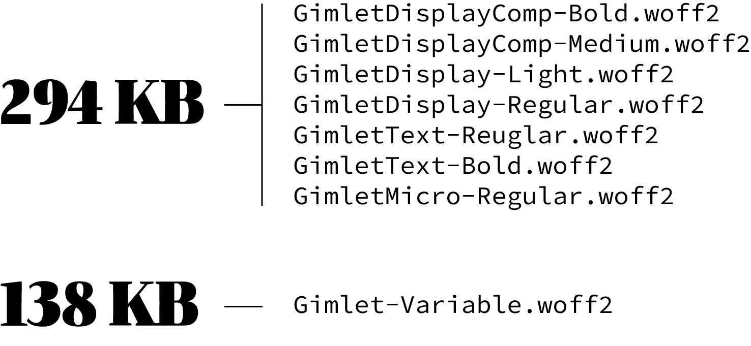
Variable fonts help with page load times because they can be used to replace multiple fonts which would have otherwise added up to a larger download size. Loading seven styles of DJR’s Gimlet—a few text, a few display, and one micro—adds up to 294KB. Gimlet-Variable, on the other hand, is less than half the size at 138KB. Half the size means half the time spent loading.
With respect to fine-tuning, as we learned with Jason Pamental, David Berlow, and Scott Kellum, variable fonts allow you to adjust your website’s typography experience to account for accessibility requirements, personal preference, optical sizing, scale, and more. They unlock the door to levels of precision previously unavailable on the web.

If you’re sufficiently convinced—or even just curious enough—let’s move on to the how.
We won’t do a better job here at explaining how to implement VF via CSS than A Variable Fonts Primer, which was in part created by Jason Pamental. We’ll cover the basic axes and how to adjust them.
The five most common axes are: Weight: expressed as ‘wght’ Width: expressed as ‘wdth’ Italic: expressed as ‘ital’ Slant: expressed as ‘slnt’ Optical size: expressed as ‘opsz’To illustrate how to use these axes on the web, we’ll look at one of the helpful axes, weight, as its uses are obvious. Thinner headlines, bolded emphasis, etc. are all achievable with a single font file. This usually exists on a scale from 100 to 900, with 400 being ‘normal’ for most fonts. Each typeface will, of course, warrant some tinkering to get things to look right, but once you figure it out, you can set your styles like so:
p {
font-variation-settings: 'wght' 450;
}
strong {
font-variation-settings: 'wght' 700;
}
.semibold {
font-variation-settings: 'wght' 575;
}
You can do this for any class, so you can take a granular, modular, nuanced approach to weight in your web designs.
Learn about variable fonts
To learn more about variable fonts, subscribe to the Type Network Newsletter, where we’ll be sharing interviews, case studies and tutorials explaining everything designers should know about variable fonts.
In fact, you can do this with any VF axis, too. There are the five common ones listed above, but as we learned in conversation with Bas from Underware, the possibilities are endless. The good news is that all modern browsers support variable fonts natively, with only different abbreviations for each in the CSS.
The beauty of all of these adjustments being implemented in CSS is that they’re editable with native CSS animations. You can expand button text when clicked, embolden link text when hovered, or have your headlines change style when focused. Combine these with other CSS properties like color and point size, and you have everything you need to create interactive, animated typography.
Using variable fonts on the web isn’t about using flashy new technology for the sake of it. It’s a way to create meaningfully better web designs. They make things more interesting, more dynamic, more accessible, and more readable. They also make things much faster, increase conversion rates, reduce bounce rates, and improve user experiences overall.