Typography, from feudalism to democracy · Type Network
Typography, from feudalism to democracy
By the end of the mechanical type revolution, the effort to serve a growing number of markets that used the Latin alphabet had led the metal letters in the machines to become virtual, while the limitations that mechanical typesetting imposed on a lot of the world’s other scripts had become actual. Much research and writing has been done on the PostScript revolution, which changed the terms of those limitations by making all type virtual, but some things still need to be said about both that change and the ongoing “OpenType revolution.”
By David Berlow
Before PostScript fonts, applications, and PDFs, the people who typeset text at publications and printers, whether photographically or digitally, had to determine the length of an incoming piece of text before they set it. If it was not the right length, they had three choices: change the text itself, horizontally scale the type at the point size and line spacing their publication was committed to, or figure out how much space the unadulterated text would take in a variety of alternative fonts and sizes.
Finagling the text was done all the time in newspaper and magazine typesetting; in book publishing, it was more common for the publisher and the author to debate cost versus space, and to fight out, essentially, how much the book would cost to make. This situation drove most type users, from print shops to custom design studios, to work with a small number of typeface families that they were familiar with and that would give them predictable results.
Many people who learned about fonts only after PostScript don’t always appreciate how important it was for a graphic or industrial designer to know a few font families really well. That might also mean knowing who was setting the type; sometimes it meant, for instance, having “Darkroom Al’s” home phone number in Queens, to wake him up at 1 a.m. so he could reset a headline, because he was the only one who had that font family, for that font size and output material, at that hour, in New York City.
A published or produced type-laden object was often output or manufactured after multiple physical outputs were combined into a single object, then photographed, scanned, woven into fabric, or whatever. Proprietary fonts, applications, operating systems, and page descriptions moved around on magnetic tapes, or Jurassic-sized floppies, accompanied by handwritten, typewritten, or word-processed notes, verbal instructions, and scribbles on Xerox copies or the palms of hands.
The transition between analog methods and Desktop PCs with PostScript is sometimes called the “Proprietary Age” of graphic design—the fonts were digital, but the equipment they were used on was still a mishmash of proprietary, mutually incompatible machines. This accident-prone process had been developing, haltingly, since the 1950s; it still meant merging multiple physical objects to form something manufacturable. A lot of ideas and processes got invented over and over in early digital solutions, by hundreds of vendors and thousands of customers around the world who had been customizing typesetting for their own scripts, languages, and publications—in a particular market and for a particular subculture, operating system, and production process.
Even in the Latin-alphabet world, designers of corporate identities found that it required great effort just to get consistent fonts sent to the printer, weaver, die-cast manufacturer, and silk-screener—not to mention applied to the side of an airplane. Those fonts might come from a variety of companies who licensed proprietary fonts as computer software, or they might be film fonts, fonts in numerically controlled cutting devices, slides, hand drawings, or a combination thereof.
It was hard sometimes, after all that physical work, to see clearly that a company had chosen Helvetica for their corporate type.
Not surprisingly, if a publication, designer, or studio spent all of their time on one client’s needs, they might only ever use one or two typeface families, but they often knew the families of the people who supplied those fonts, and sent them holiday gifts. Farther-ranging design studios would pick four to eight font families, establish relationships with the various producers using those font families, stick with those producers and fonts from client to client, and have a longer holiday gift list.
Other designers made their own film, wood, metal, or stencil fonts for their products, or used a combination of their own handmade fonts and commercial ones. Rolling Stone is an excellent example of a traditional combination coming together, where the display types were made and owned by the publisher, the text faces were chosen from the library of a major typesetting manufacturer, and it was all combined by increasingly sophisticated means, right up to the advent of PostScript. Before PostScript, everything was merged into a printable product, from word processors to handmade artwork, with craft occurring right to the end, at which point the “production department” appeared and produced it.
These production experts were the people who really ran things, telling art directors and editors what they could and could not do in whatever time was being requested that second. They lasted five to ten years into the PostScript era, until the mid-1990s; after that they either disappeared, became software engineers, or were replaced by software engineers, and then they were replaced by software.
This was all part of a “Digital Revolution,” where reading is evolutionary and slow to change, but writing is revolutionary and fast to change. The typewriters that had been sputtering along beside the Linotype machines, and in their millions throughout the world, were the first to change.
It started innocently enough as an attempt to save, first, lines of writing—and then pages of writing, and then whole documents. The typewriter soon became too small and too loud to do this. Software for the masses began in the 1970s at Xerox PARC, and the rapid developments that followed spread to, among other places, Stanford and Hamburg. Many of these early “desktop publishing” efforts, some by Xerox and IBM, but also by quite a few companies in Europe interested in digital publishing, were accomplished with close ties to the font industry. Font foundries became involved, supplying the type for laser printers (a blessed sonic alternative to dot matrix printers), usually in bitmap form, and in a range of sizes for screen display and laser printing.
Font companies like Linotype were involved primarily because the companies making these typewriters-on-steroids could then compose (albeit not understand) the design of proportionally spaced type at a variety of sizes. But no one could keep up with the demand for more fonts. It didn’t take long for type tools to become available, with Donald Knuth and Charles Bigelow at Stanford, and Peter Karow in Hamburg, developing two completely different suites of digital outline font tools, standards, and processes: MetaFont and Ikarus. Outside the font industry, things had moved even faster, and by 1985, PageMaker, PostScript, and the Apple Mac brought the combination of computer memory, processing speed, screen resolution, typesetter throughput, networking, proportionally spaced type, and a user interface to a price where graphic designers could pay for it with a job or two. The Mac very suddenly compared in functionality with computers that could barely do more, yet cost hundreds of thousands of dollars.
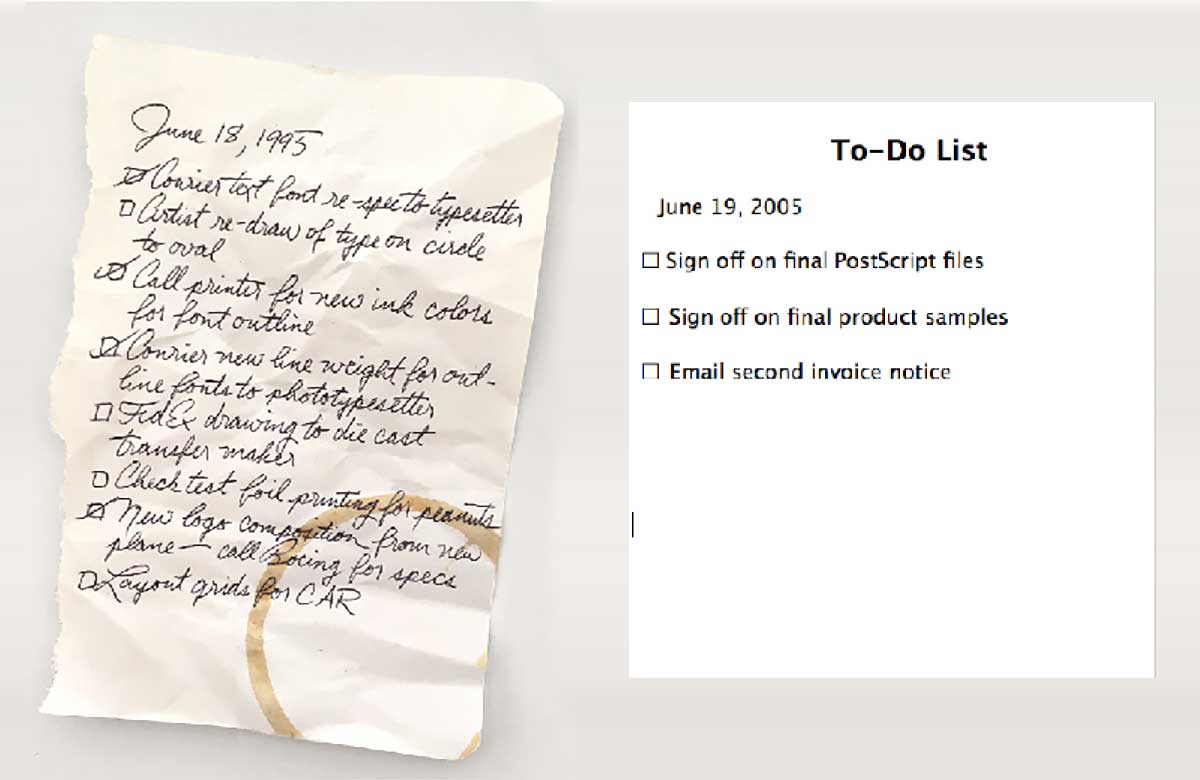
On the fictional desk of a fictional graphic designer, before and after PostScript.
With PostScript, the mouse- and keyboard-operated personal computer could be easily managed and afforded by one person, for small jobs in a small shop. In larger design studios, both independent and corporate, the personal computers had round-the-clock crews working on them—cycling input, designing pages with type, completing layouts, which would be quickly available for review and discussion by the art and editorial staffs together, before being sent off to the press by network, or by courier. The pixels that were used for proofing were on recycled paper or still on the computer screen. What a late-twentieth-century publisher saved from this was so significant that publishing, and world culture, irremediably changed. Slowly at first, with small design shops and new publications springing up among existing empires based on PostScript publishing, new organizations based on the skills and economics of PostScript started changing the political and educational aspects of every culture they met. PostScript’s revolution was to have text type and display type composed together, along with everything else on the page. The resolution independence of digital outline fonts allowed preview on screen, low-cost proofing, and high quality-control abilities through inexpensive redos.
Between 1986 and 1994, desktop publishing grew from a very small Latin-language base of graphics and publishing geeks to a networked, global, full-color, on-demand publishing environment. It deeply penetrated the publishing and computer industries, with a much more complex and flexible format for fonts and font technology than the size-specific, resolution-specific bitmap fonts previously employed, or the proprietary fonts that could only work on one vendor’s typesetting machine. The ideas spawned by this were numerous, including motivation for technical advances that would lead to bigger monitors, higher resolution, antialiasing, more memory, faster processing, better color handling, advanced typographic glyph substitution, and a universal page-description standard. Competition in font software soon emerged, too. Apple and Microsoft introduced TrueType; SGML was followed by HTML and joined by CSS. But the biggest thing was that digital publishing was here, and a lot of people were intent on its remaining digital, wherever printing could possibly be avoided.
So virtual typography, or the conditions necessary for typography’s existence without actually existing physically, had arrived. Quality scaleable type and the HTML page-description language, among other things, led to publishing on the World Wide Web. Carefully hinted, optimally compressed, and scalable default system fonts, in TrueType format, worked from the smallest pixel fonts up. They made possible the initial introduction of a resolution-independent platform that had been, as a result of the primitive nature of the page-description language at the time, all about content. There was little concern for typographic presentation, besides font size, serif or sans, flush left or centered, in Web 1.0—including virtual handling of complex non-Latin scripts.
So from 1994 to 2004, the web basically bombed typography back to its digital stone age, the days of word-processing English. The web shut itself off from the typographic cultures of the world, disenfranchised publishers who had a typographic culture established, and entrenched whole new organizations whose founding did not depend on typographic presence. But at the same time, between the introduction of PostScript and the web, the glyph repertoire and shaping engines of the operating systems went from dealing with the NATO nations and Japan to the scripts of the world; and, via Unicode’s addition of dead scripts, went back in time; and, via private unicodes, added fictional scripts beyond the real world.
Since 1984, the font technologies in the operating systems, and the WWW as a guest of those OSes, have gained the resolution, processing speed, memory, and networking power to broadcast responsive designs and typography, video, and audio to mobile devices. Inside such a broad scope of advancement, the file sizes of the largest and most complex fonts ever made have become of great concern. In addition, the scalable hinted fonts, which evolved into a single one-size-fits-all font file that was expected to work at every size, pretty much failed in providing readability on the web. And now, the concept of type size, and a document’s space, has evolved from an absolute value for metal typographers to a relative value in web space.
With that, and the 2009 standardization of custom webfonts twenty years after the web’s launch, a whole series of issues presented itself to users, developers, and foundries. With little or no response in font formats since then, whatever happens next, for all users of type, is going to be a key development in culture. The line-to / curve-to world of PostScript, where we knew where the lines and curves were going, is now joining a world of potentially responsive font variations, where the lines and curves can go anywhere and then be anything.