Typeland joins Type Network
Lucas Czarnecki: If you remember a specific moment, when and why did you became interested in type design?
Alessia Mazzarella: There wasn’t a clear-cut moment. When I was a graphic design student, I realized that my university projects became more and more focused on typography, so at the end of my BA I decided to pursue an MA in type design. The original plan was to become a better and more skilled graphic designer, but I got sucked into the world of drawing typefaces and producing fonts and I never looked back.
Vaibhav Singh: I was mainly designing books after my degree in visual communication, and my interest in typography led me, gradually, to typeface design. As I started working with letterforms in logos and visual identities, I kept coming up against things that I felt would be better off done differently. It took many years, but eventually the idea that I should learn to design typefaces began to make sense, and I pursued it further.
LC: What is the story behind your first typefaces?
AM: My MA student project is the one I consider my first typeface. It was a family designed to support Latin and Odia scripts, with different styles. It was designed as a hybrid of calligraphic styles based on flowy, swoopy strokes and more deliberately angular shapes. I mostly used it as an excuse to test different ideas; how to combine them; and explore how two very different scripts could share some design characteristics. I am very attached to that project, and I have learnt a lot in the process.
VS: My first typeface was also the student project I did during my MA at Reading. I was trying to do something wacky, as all first-time designers probably do, with not a lot of success. I was also trying out various ideas for a workable combination of Latin and Devanagari that could be based on the features of the Devanagari design, rather than the other way around. It was definitely something I had a lot of fun pulling apart and reworking, and a display idea that I had worked on then became a spinoff stencil design later.
LC: How did you meet, and why did you decide to start working together?
AM: We have different recollections of the exact moment, but we met in Reading, at the Department of Typography & Graphic Communication where we both studied. We had some shared interests but a lot more contrasting ideas and approaches! But we realized that we complement each other’s skills quite well and don’t need to have the same preferences or ways of working to be a good team. We approach things in our own ways, with different specialties, and we use that to our advantage based on the demands of a project.
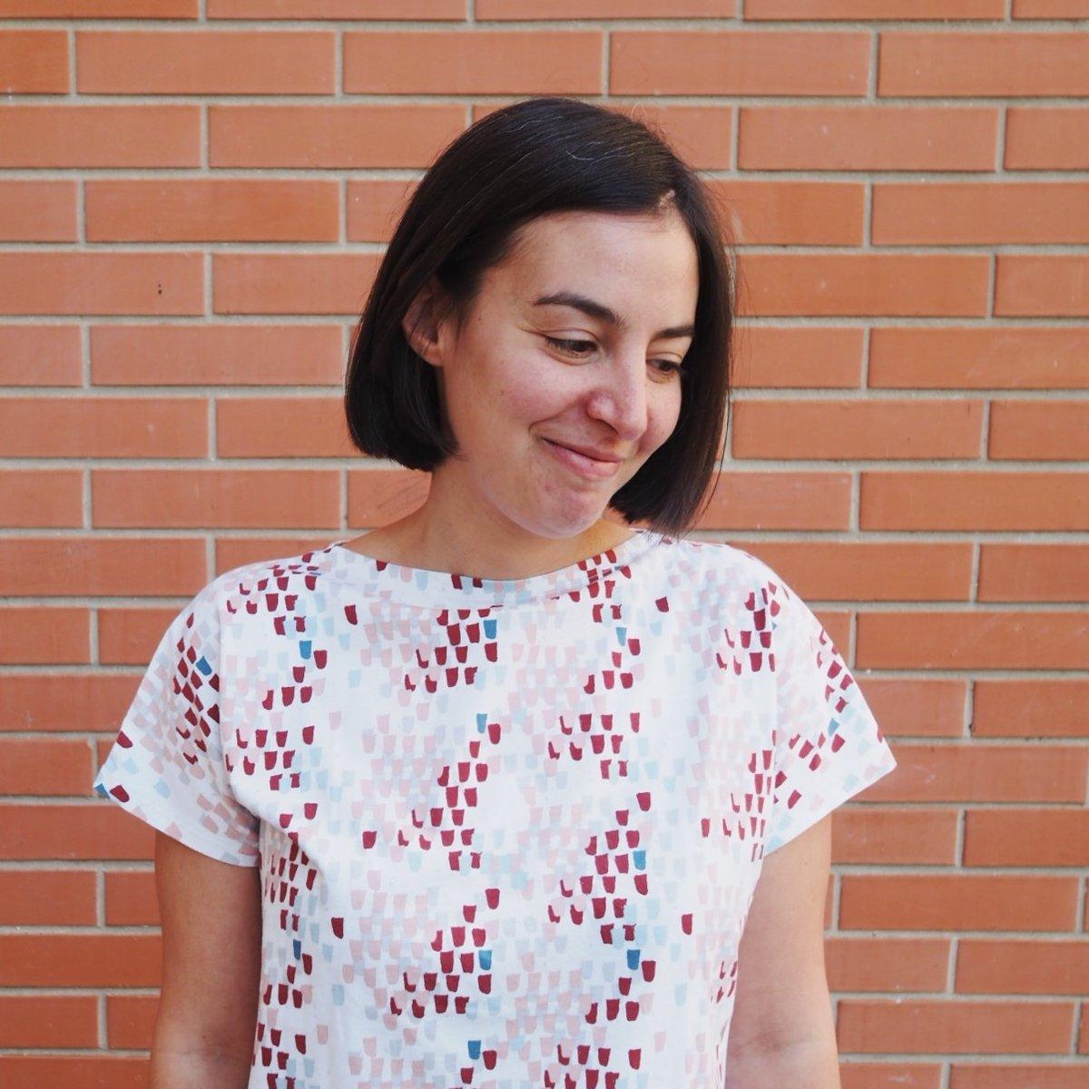
Alessia Mazzarella holds an MA in Typeface Design from the University of Reading, in addition to degrees in Graphic Design from Central Saint Martins, London, and Graphic & Media Design from Sapienza University of Rome. She has several years of experience in the industry, having worked with and for various type foundries as a type designer and font engineer.
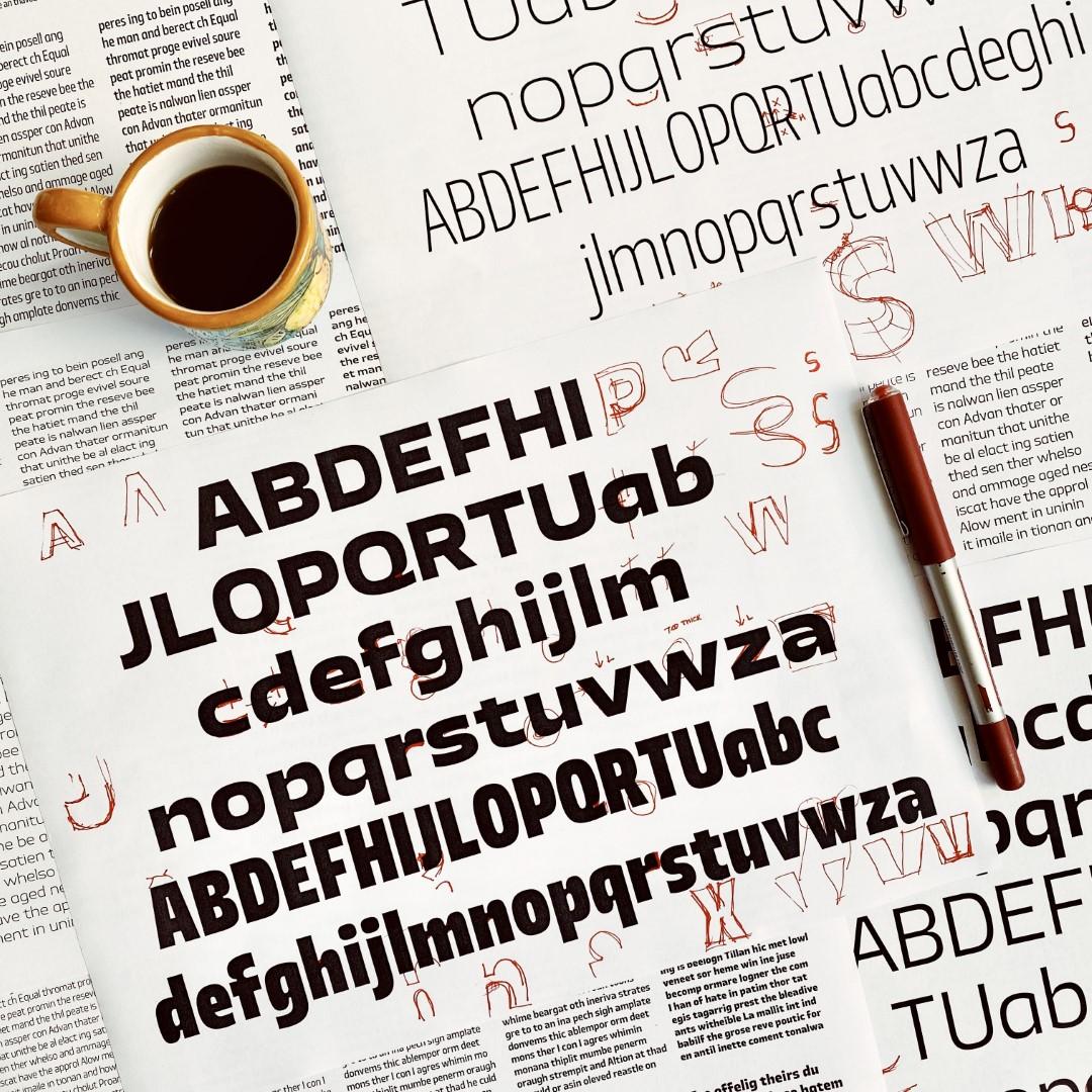
The Typeland process involves the liberal use of red ink.
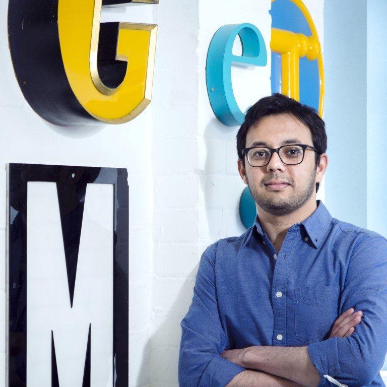
Vaibhav Singh holds degrees in architecture, visual communication, typeface design, literature, and book history. Pursuing a wide-ranging freelance practice for over a decade, he has worked as a graphic designer, book designer, and exhibition designer in Mumbai, Delhi, Panjim, Reading, and London. He is also the editor and publisher of the journal Contextual Alternate.
LC: How did you decide to start your own foundry?
VS: We always wanted to have an independent home for our typeface design work, but setting it up takes time, and we have been lucky to be constantly occupied with other things. In 2020, we finally had dollops of time thrust upon us. We asked ourselves: Is there a better way to survive a pandemic than by making fonts? There probably was. But evidently, we could not come up with an answer about what that better way might be. So, it turned out to be the year we launched our website with a few typefaces that had been in the works for some time.
We had a very clear idea of what kind of studio we wanted to be and what kind of space we wanted to create for ourselves. We wanted to do things in the way that we thought was right, not conform to received wisdom, or follow the latest trends. That was a natural and important part of our thinking: We want to design fonts that we genuinely enjoy designing and using.
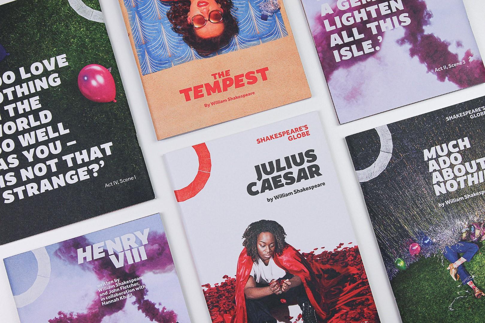
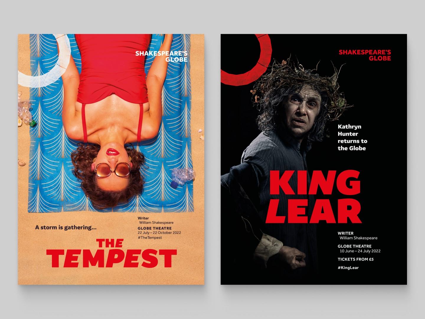
Amifer in use for Shakespeare’s Globe marketing materials, show posters, and playbills.
LC: In what ways did your experience at Reading influence your approach to type design?
AM: We both learned how to approach design critically—with a keen eye for detail—and the rigorous research-led approach at Reading has informed many of our projects since. The experience was particularly valuable as we got to work with an international cohort of students, practicing designers, as well as seasoned academics in the field. The resources that we were introduced to and the knowledge and enthusiasm of the people around us helped open new directions for our own interests. Anyone who’s been to Reading will recall those special days (every week!) when we got to handle typographic treasures, encounter original archival material and rare books, and discover so many unknown aspects of type design.
Amifer is a 10-style sans serif family that brings together characterful letterforms without compromising the clarity and contemporary style of the sans genre.
LC: How do your design processes differ from each other?
AM: I plan the structure of the project quite early on, and I like to sketch out the scope of how far I want a type family to extend. The design process usually involves quick and rough sketches that pick up on the main theme or stylistic features of the design. Once I have an idea of what I’m trying to achieve I write a note to my future self. Then I start testing out how proportions, rough details, and rhythm work with a few key letters. When I’m happy with my prototype I continue with the work, with a good amount of reworking and iterations, as things progress.
VS: I usually have very specific ideas about what I want to achieve in terms of the style and overall feel, because it tends to derive from a context of use or application that I have in my mind. It is a little bit different for experimental projects, where I want a typeface to do something particular through its visual character. For me it’s never about a sudden flash of an idea or an urgency to record it (why would there be!). The driving force behind most new ideas is the slow-brewing discomfort with an existing approach or the way specific details have been resolved. At other times, it is about an absent quality that you can’t put your finger on and must rummage around to find... I prefer to tinker with drawing directly on screen in order to get to that.

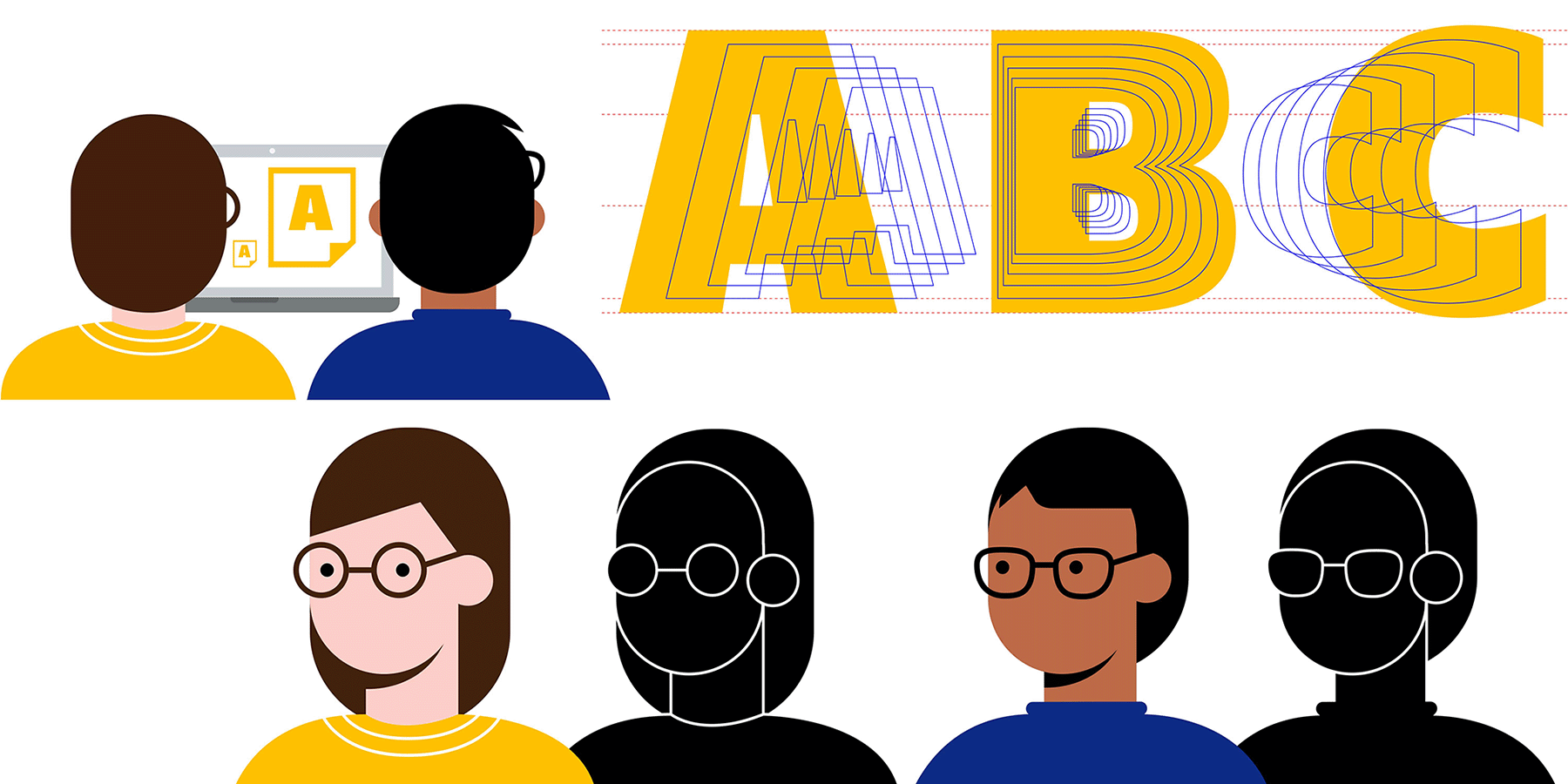
Typeland is an independent design studio based in south London, specializing in multi-script design and custom fonts.
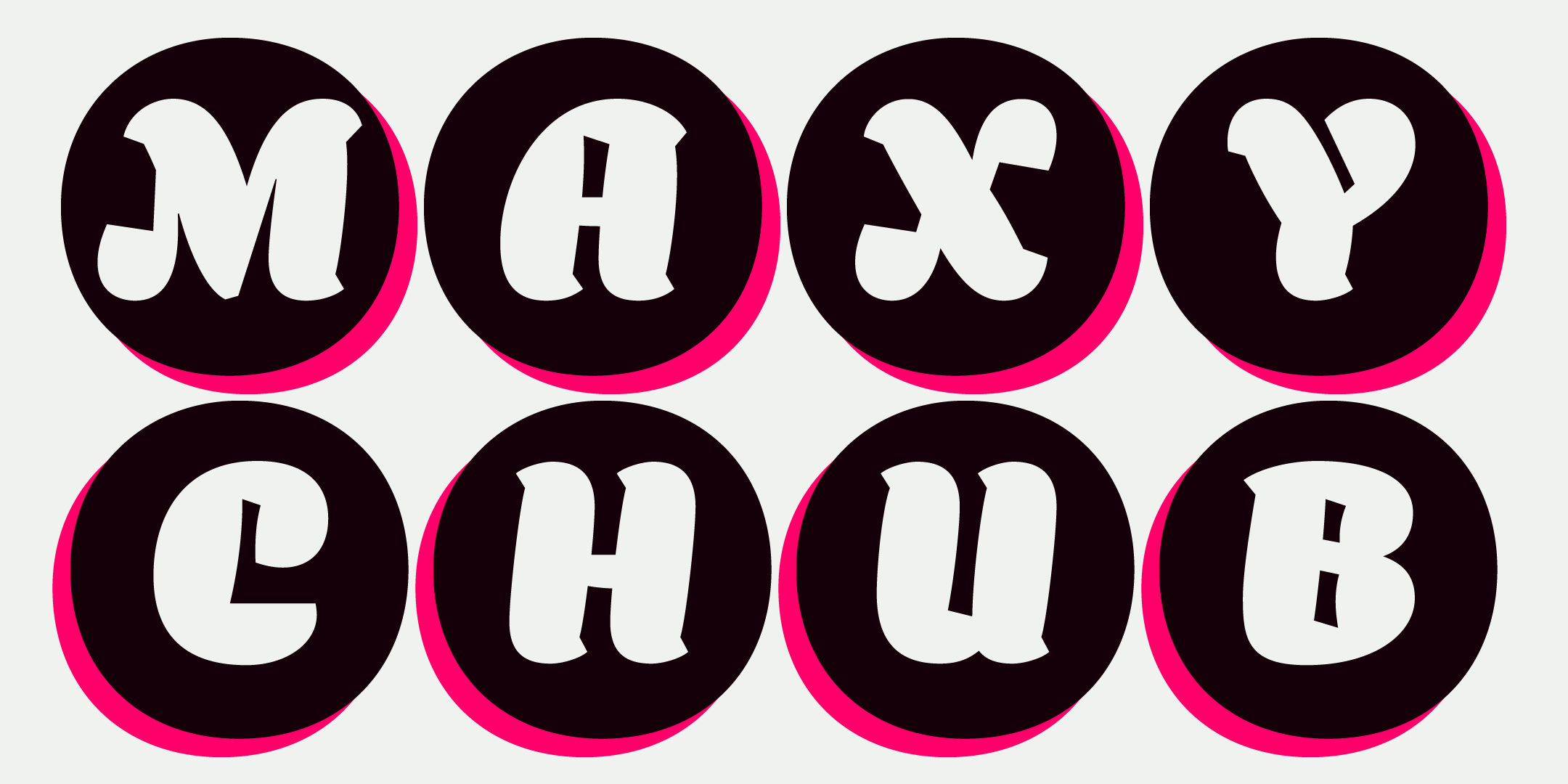
Balbum is a single style typeface that combines heavy and fast strokes which gives the design a sense of movement and play.
LC: Your typefaces range from classic and restrained to boisterous and eclectic: Where do you find inspiration for your designs?
AM: A lot of my designs are a weekend escape and small tests that at some point turn into something bigger and more defined. I tend to prefer hybrid constructions: I avoid basing my design on specific models and rather translate abstract ideas into shapes. Some designs pick up on ideas about tight spaces with a constant internal tension—and shapes that can fight those restraints. In other cases, it is about evoking materials and their peculiar qualities—to infuse letters with that kind of feel, like foam that can be sculpted yet keep some bounciness and airiness.
VS: I approach designing typefaces as a purpose-driven activity: Discussing a project’s requirements is usually sufficient to generate ideas in my mind. Then I draw, which I think is how one discovers things anyway. For self-initiated projects I do not seek inspiration—I’m dissatisfied with a sufficiently large number of things in the world that can furnish starting points for my explorations!
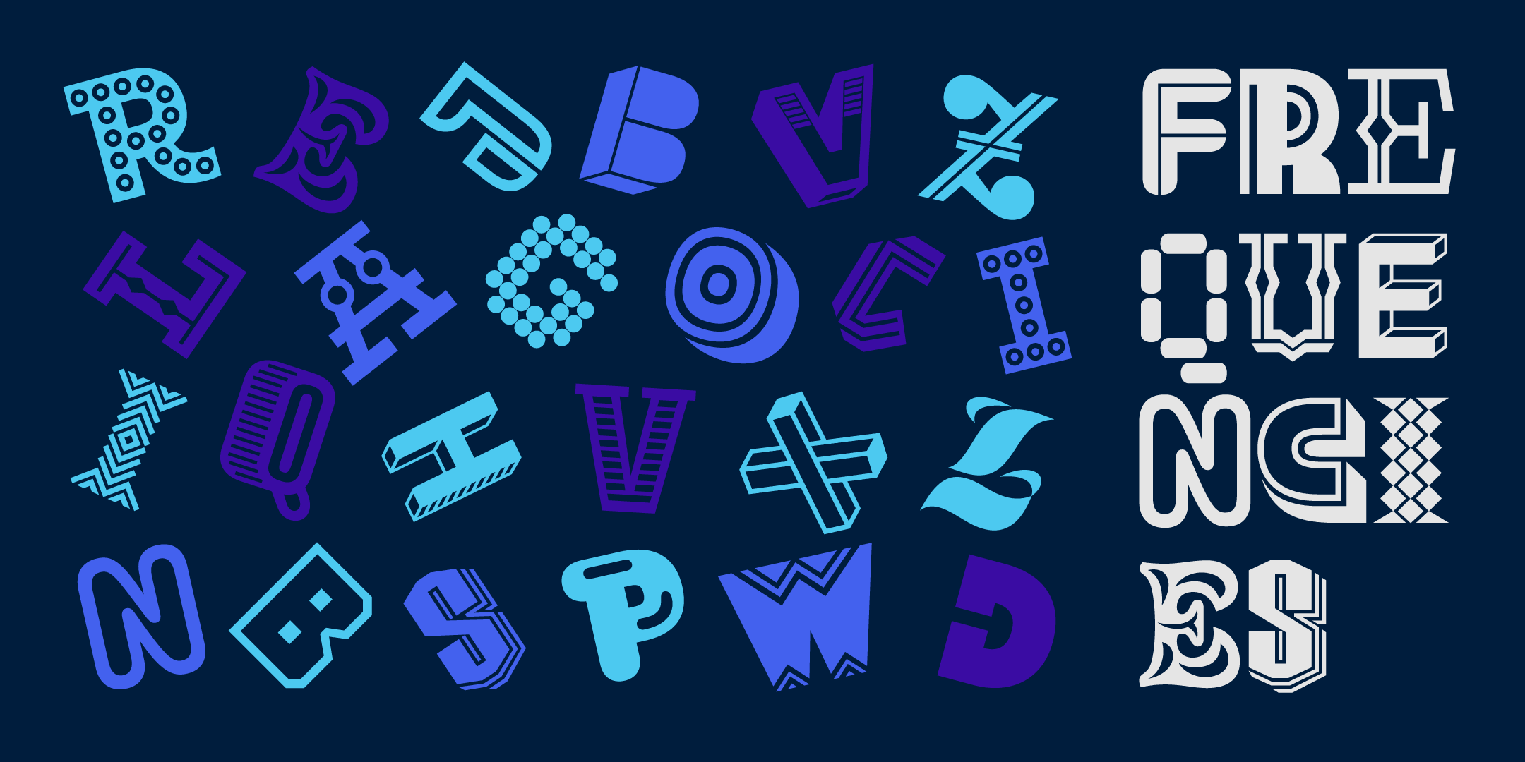
Frequencies is a single style display typeface with multiple variations for each letterform and a playful take on expressive typography.
LC: Do you have a favorite example of seeing your type used in the wild?
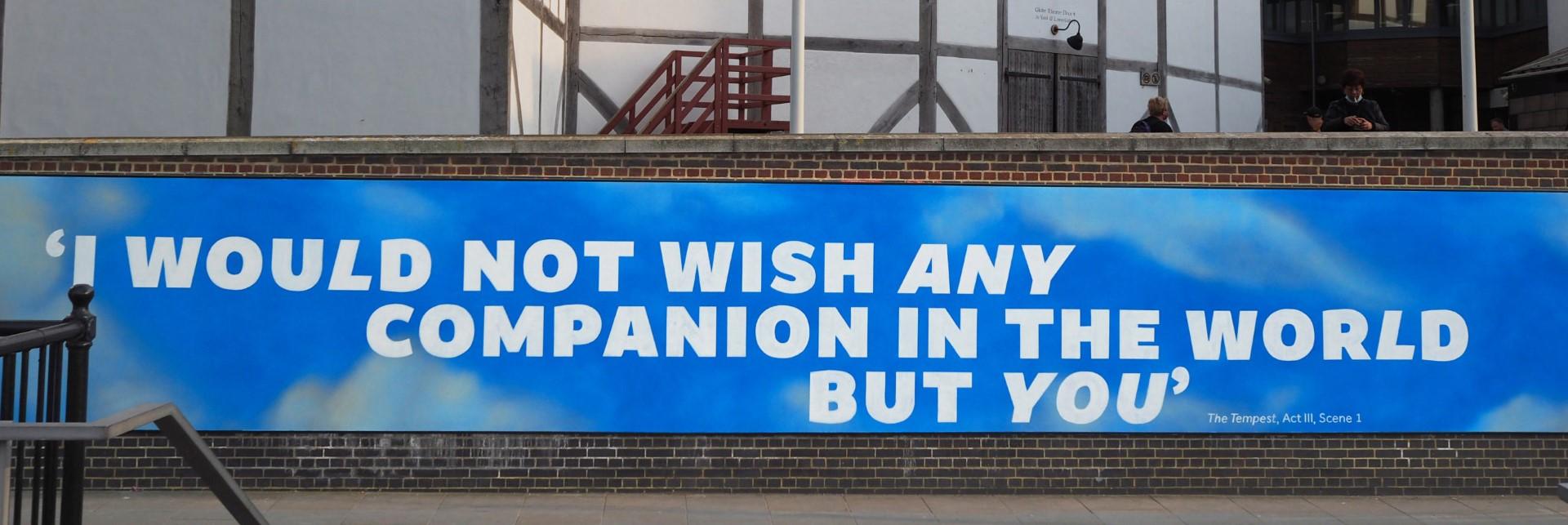
The wall on London’s South Bank with a quote painted in Amifer Black/Black Italic that was part of the summer campaign for Shakespeare’s Globe last year.
LC: Tell me about the typefaces with which you’re launching on Type Network.
We wanted to start with something that paints a picture of who we are as designers, demonstrating unapologetic enjoyment and stylistic versatility in the design of letterforms. We are launching with Amifer, a sans-serif family in 10 styles; Balbum, a rotund one-weight display font; Zubtrak, a stencil family in two extreme styles; and Frequencies, which is a display font with multiple randomized forms for each character. The idea is to showcase a diversity of projects that allow for different kinds of applications but always with an element of distinctiveness and personality.
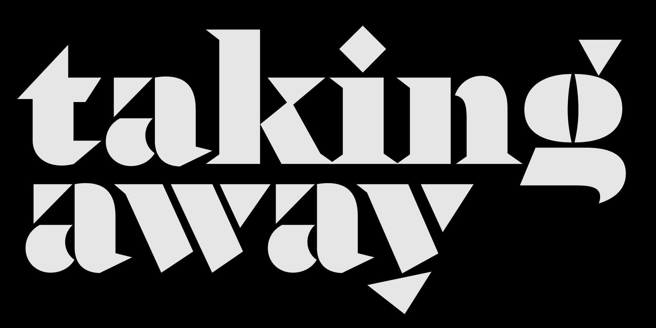
Zubtrak is a display typeface in two extreme styles. It is designed for crisp contrast, to add a sharp edge to titles and headings through its striking shapes, strong presence, and unique mix of angularity and color.
LC: What does it mean for you to be joining Type Network? Who among the foundry partners and staff are you most excited to be working with?
We have been fiercely independent as a design studio, and we really enjoy the freedom it affords. That said, we are thrilled to be partnering with Type Network. We share an ethos of producing high-quality designs prioritizing fairness for everyone involved in using and making typefaces. So far, we’ve really enjoyed discussing things with Dan, and working on technical quality with Glenda and Guido. They have been incredibly helpful and admirably thorough, which might just be the most beautiful combination of qualities any designer can hope to encounter in the course of their work.
LC: What’s next for you?
We are excited about upcoming releases, a big type family is in the works, and a custom version of Amifer (riffing on Shakespeare’s First Folio) is just making its way around London, which we’re quite looking forward to documenting. We are also looking to release a few Indian-script retail fonts at some point, having mainly occupied ourselves with multi-script custom design projects so far. And who knows, we might even manage to finish a couple of languishing display designs in the coming months!
Amifer, Balbum, Frequencies, and Zubtrak can be licensed for print, web, mobile apps, and ePubs. Webfonts may be tested for thirty days, and desktop trials are available upon request.
Have a licensing question? Check out our support page or get in touch.