Type Network’s First Festival of Type · Type Network
Type Network’s First Festival of Type
We celebrated the holidays with a festive gallery of banners showcasing all of our foundry partners.
By Marina Chaccur
Editor’s note: As 2016 drew to a close, the Type Network crew considered slowing down and spending time away from type specimens and electronic devices. Inevitably, extreme type geekery overcame any desire to go skiing, and we set off on a two-week-long typographic adventure instead. Type Network team member Marina Chaccur describes the inspiration and process behind our latest collaboration.
At Type Network, our first year-end as a team began innocently enough, but then we went wild. We created a #FestivalofType for everyone: for ourselves, as we had tons of fun in the process; for our partners, whom we honored with dedicated “special edition” banners showcasing some of their faces; and for you! Yes, we did this for all of you type lovers out there.
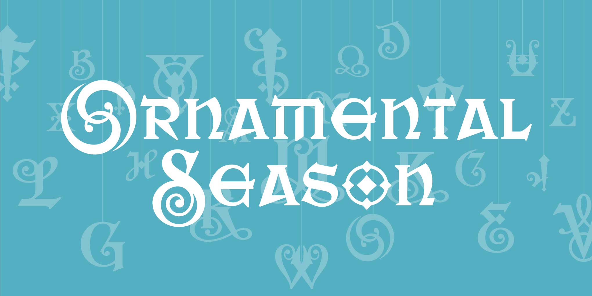
It all started during the production of our December 2016newsletter. While preparing the visual for CabargaType’s Saber, its ornate letterforms reminded me of decorations. I decided to “hang” the flourished capitals from lines, like ornaments on a Christmas tree.
We liked the Saber visual so much that we decided to adapt it for use as a banner on the Type Network site. With the holidays approaching, this naturally evolved into an insane last-minute project. We came up with the idea of creating daily homepage banners—one for each of our foundry partners—that would celebrate something special about this time of year. Claire Lindsey and I would generate the visuals; Tamye Riggs would provide the copy (see captions below each completed banner). After all, the first one had already been posted, so we figured that, in a few days, we would only need to come up with twelve more…
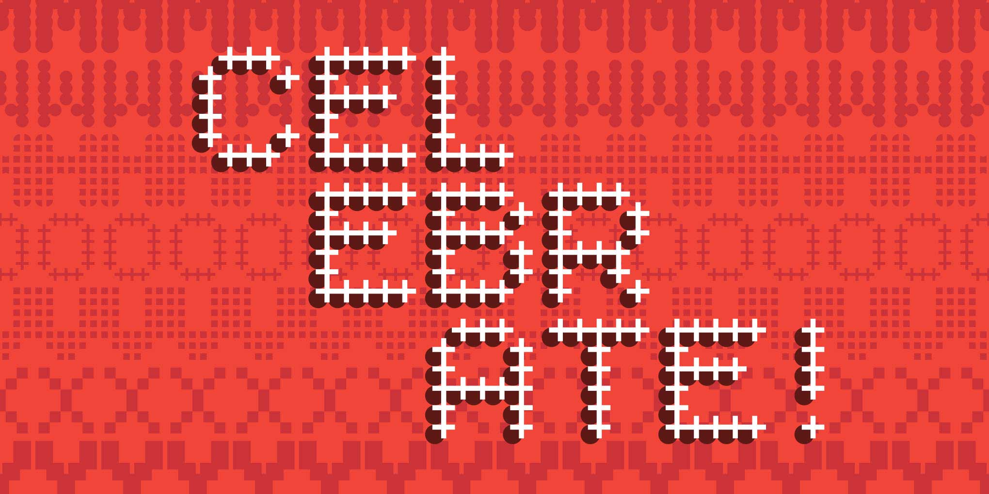
The spirit of Saber.
Exhilarating, edgy, and oh-so-ornamental, Zavier Cabarga’s Saber deftly combines a lowercase inspired by blackletter, uncial, and Celtic forms with highly original capitals hinting at past Victorian frenzies. How very merry.
From that first banner onward, we decided to keep things simple. Each design would consist of an ornamental background exploring typeface “extras” and a brief message on top. This system would allow us to create a cohesive series and help us generate the banners quickly and efficiently. Designing the Kontour piece was relatively easy, since Kopious Extras offered all of the complementary shapes we needed. For the text, we mixed Odile and Axia Stencil.
Kontour’s been very good this year.
Sibylle Hagmann’s typefaces bring elegance, utility, and a touch of whimsy to the season. Glamourous Odile, industrious Axia, and the clever Kopius Extras made one jolly old fellow’s A-list this year. We think you’ll like them, too.
Under the tree with the Type-Ø-Tones.
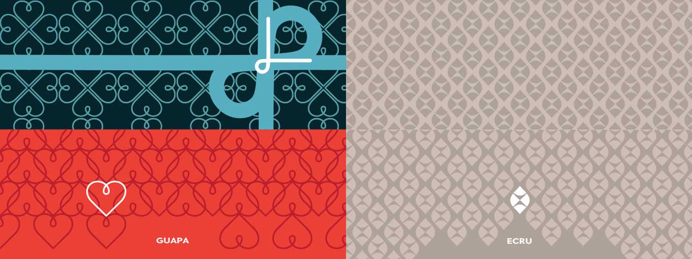
Laura Meseguer and José Manuel Urós (Josema) lovingly craft letterforms with warmth and Spanish flair. Multi, Magasin, and big-hearted Guapa adorn the Spanish duo’s gift to you.
At this point, we couldn’t stop. We experimented with character shapes, constructing intricate figures and motifs. This is how we discovered that Type-Ø-Tones’s Guapa was perfect for gift wrapping! Repeating, rotating, and overlapping Guapa’s heart glyph generated many different lovely patterns, and the lesser than/greater than signs combined to form a simple bow. We set the type in the tag in Multi and Magasin.
Pattern tests for Type-Ø-Tones and Lipton Letter Design showing the base glyphs in relation to the patterns.
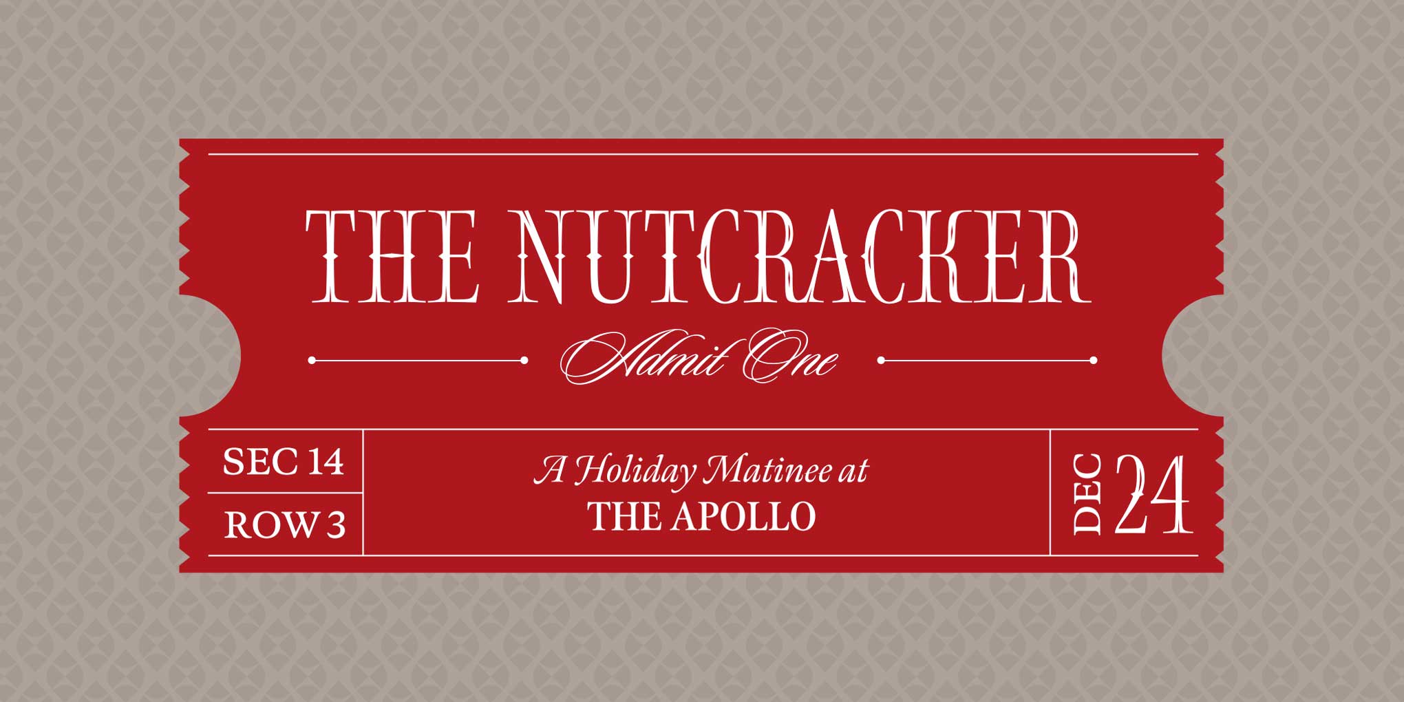
The inspiration for Lipton Letter Design’s banner came from Nutcracker. Because Richard Lipton’s designs can easily be combined in an elegant way, we didn’t think twice about throwing Sloop Script and Meno into the mix to simulate a theater ticket. Ecru provided just the right shape element for building a “nutty” background.
Lipton, the Nutcracker, and the Sugar Plum Fairy.
In 1993, Richard Lipton drew his delicate Nutcracker for the cover of a book celebrating the classic Russian ballet of the same name. Nutcracker and companions Meno, Ecru, and Sloop Script dance captivatingly together, echoing the magic of a cherished toy coming to life on Christmas Eve.
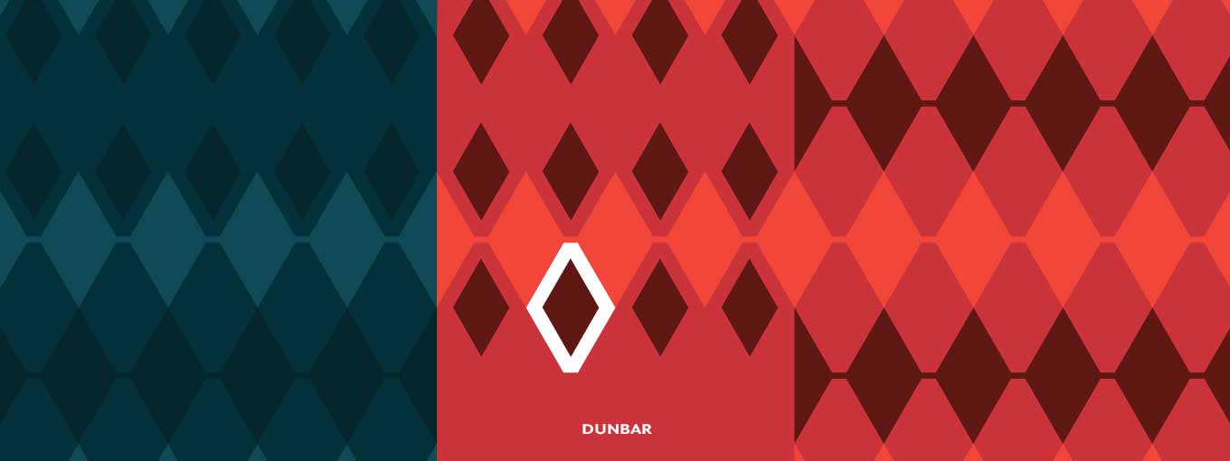
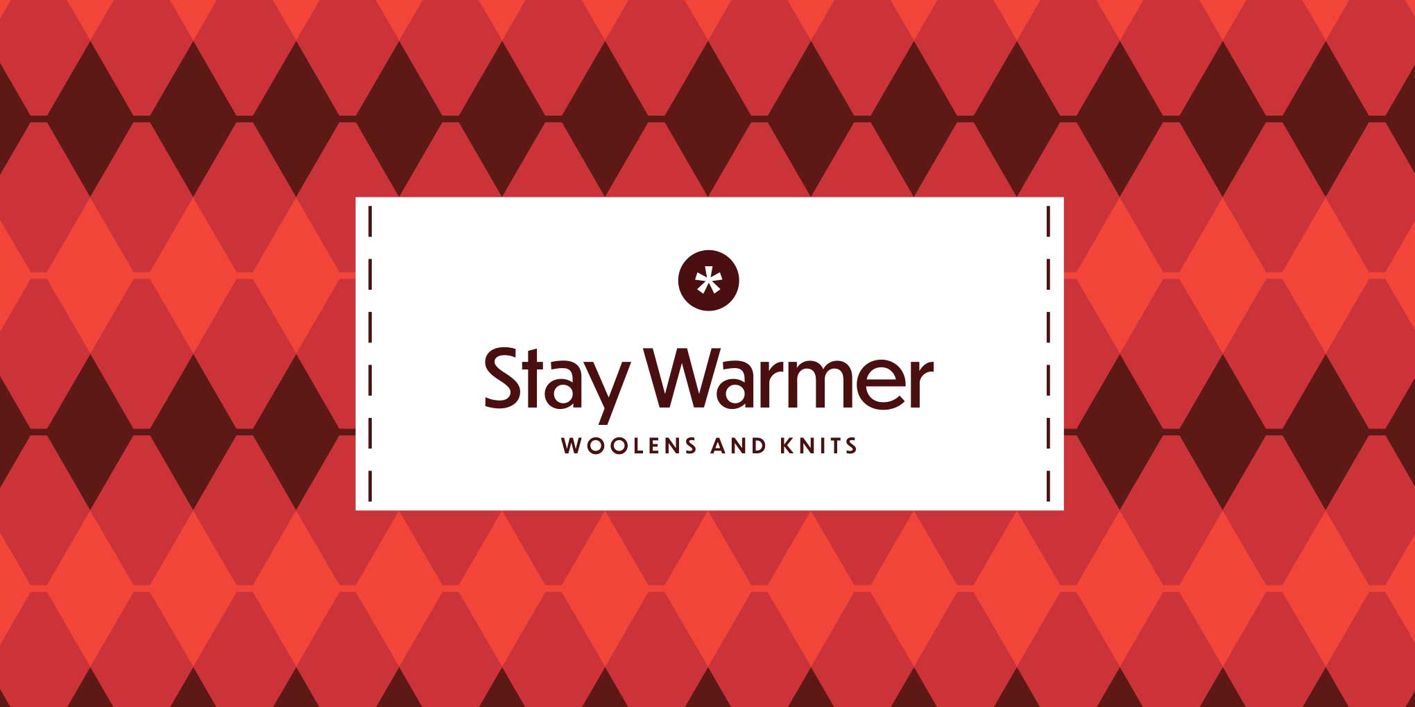
Woolen knits are a must-have for any cold winter, so, naturally, we were inspired by them as well. The lozenge (Unicode 25CA) from CJ Type’s Dunbar came in handy for creating a traditional diamond pattern. We used the typeface not only for the background but also for the tag.
Pattern tests for CJ Type showing the base glyph in relation to the patterns.
Turn up the heat with Dunbar’s neo-retro charm.
It may be cold outside, but sharp vintage threads can brighten even the dreariest day. The same holds true for type! Inspired by Jakob Erbar’s 1920s geometric sans, CJ Type’s Dunbar evokes the classic elegance and warm wit of days gone by.
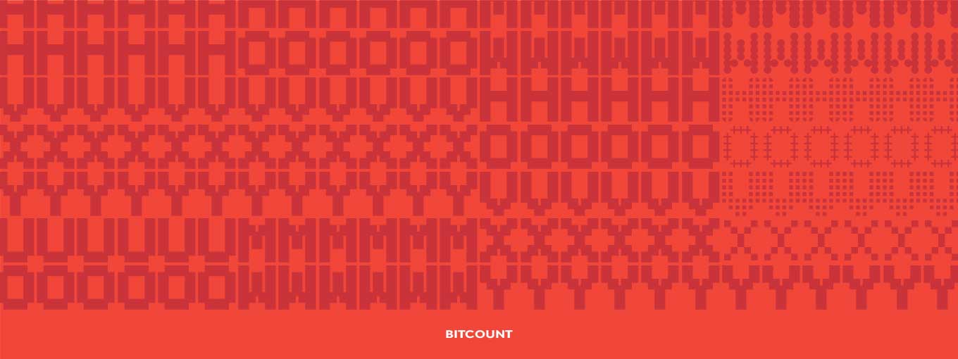
Even though Typetr’s Bitcount type family has not yet been released, we had to include this incredible system: it’s in a category all its own, providing different treatments for layers upon layers of pixel cuteness.
Pattern tests for Typetr’s Bitcount experiment with different vertical letter combinations.
Bitcount banishes the ugly-holiday-sweater blues.
Don’t let well-meaning relatives with poor fashion sense get you down. Use Typetr’s Bitcount to create your own festive holiday sweater patterns. Share with the wannabe clothier in your life before the next knitting marathon ensues. Your closet—and the world—will thank you.
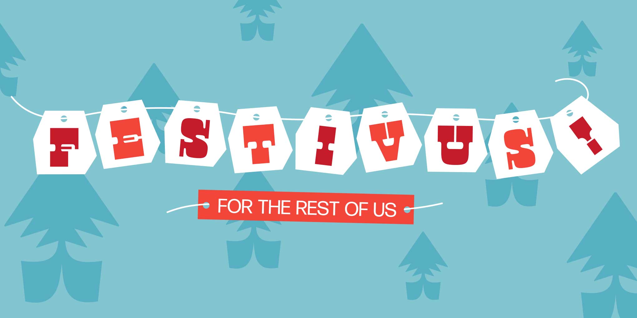
Some ideas came fast and immediately made sense, like using the arrows included in DJR’s Gimlet: they instantly became Christmas trees when stacked in decreasing sizes. By the time most of the banners were ready to go, Type Network’s General Manager Paley Dreier suggested we include Festivus. To be honest, because I had never been into Seinfeld, I had no idea what he was referring to. Once I understood the concept behind the anti-commercial “holiday,” we quickly adapted the message to DJR’s banner, adding Manicotti and Forma DJR to integrate this unusual celebration into our series.
Construction of the Christmas trees for DJR showing the base glyphs in relation to the illustrations.
An unconventional holiday with DJR.
If traditional celebrations aren’t your thing, consider the joys of Festivus. Invented by Seinfeld writer Dan O’Keefe, this secular frolic is a reminder that laughter is key to any successful fest. With Forma, DJR’s cheeky Manicotti reverse-stresses this quirkday in jolly oddball fashion.
Boxing day? Boxes? Squares? Hmm… What about beautifully ornamented squares? Victoria Rushton added the perfect elements to Embury Text for a classical border setting. Yves Peters explains how to use them in “Inside the Fonts.”
Delightful decorating with Embury Text.
Holidays shoppers flock to thematic gifts and seasonal decor (one can never have too many dreidels or elves on the shelves). Consider also those ornaments meant for year-round display: Embury Text’s elegant embellishments will dress up any festive design.
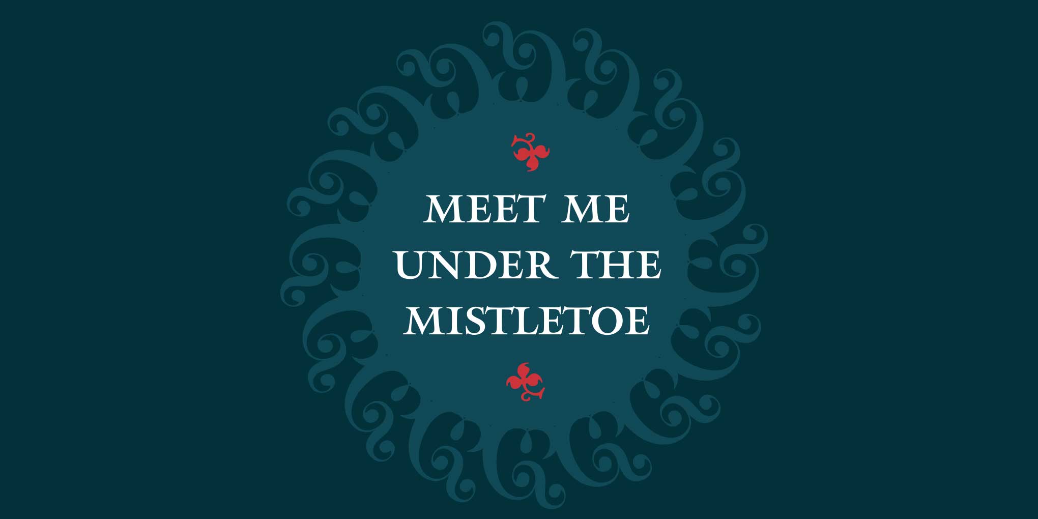
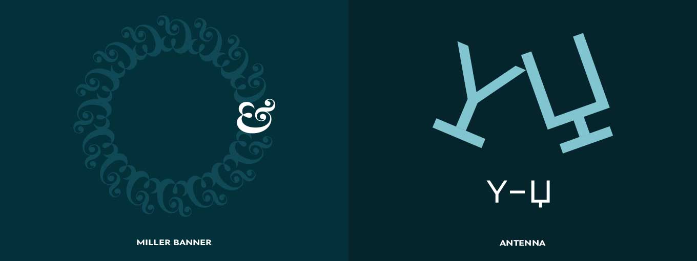
Magick and Mantinia.
Like Matthew Carter’s Miller, Sophia, and Mantinia, mistletoe mystique is rooted in the ancient cultures of Greece, Rome, and the British Isles. The mythical plant promotes peace, healing, fertility, and romance, bringing the promise of a loving future to couples embracing under the “Kissing Ball.”
We couldn’t celebrate the season without mistletoe. The elegant curly ampersand in Carter & Cone’s Miller Banner proved the perfect starting point for composing a special Christmas wreath, with Mantinia spelling out the invitation. Sophia provided the fleurons.
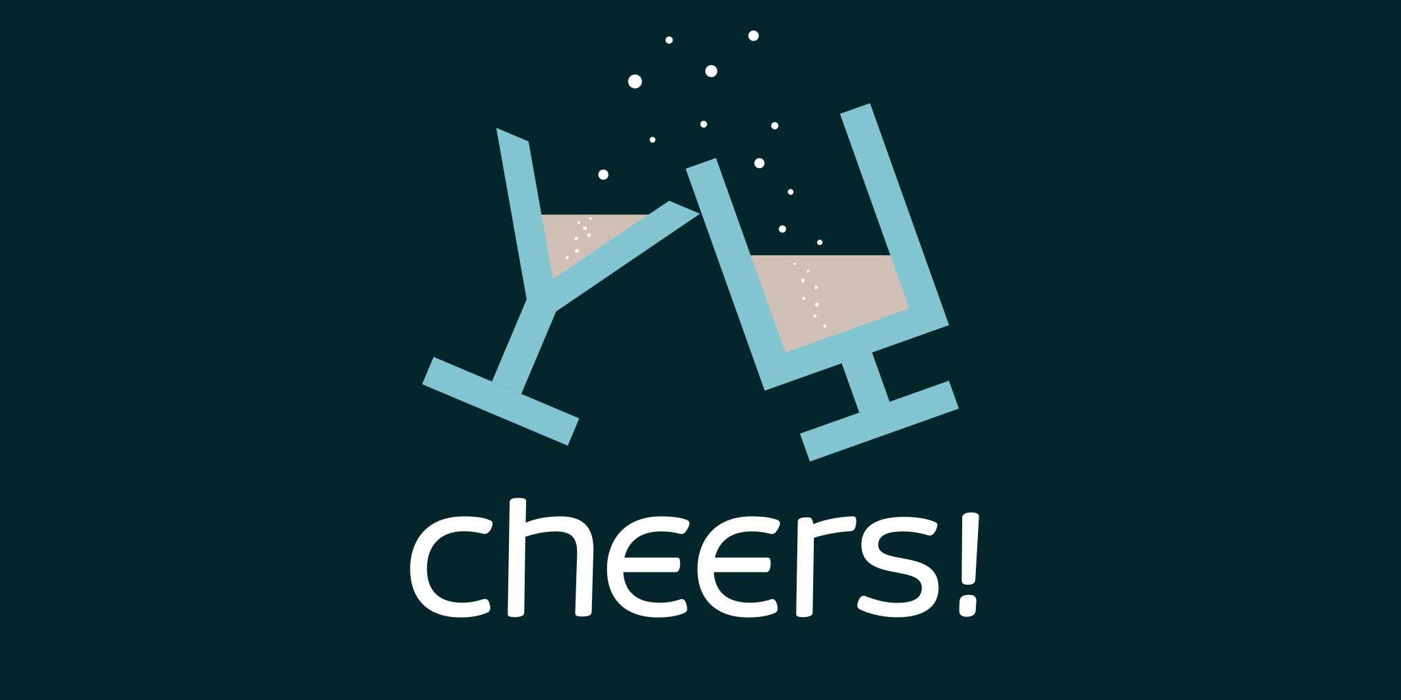
Construction of the Christmas wreath for Carter & Cone and glasses for Occupant Fonts showing the base glyphs in relation to the illustrations.
We raised our glasses with friends and loved ones using Occupant Fonts’ Antenna combined with Gasket Unicase. This banner and the previous one also served as a moment of quiet in the succession of banners on our homepage, calming down the background frenzy.
Raise a glass with Occupant Fonts.
Toasting with a bit of the bubbly is customary this time of year. Whether non-alcoholic fizz or a high-octane libation is in the vessel, it’s the merry message that matters. Lively Gasket and amiable Antenna convey warm words of good cheer.
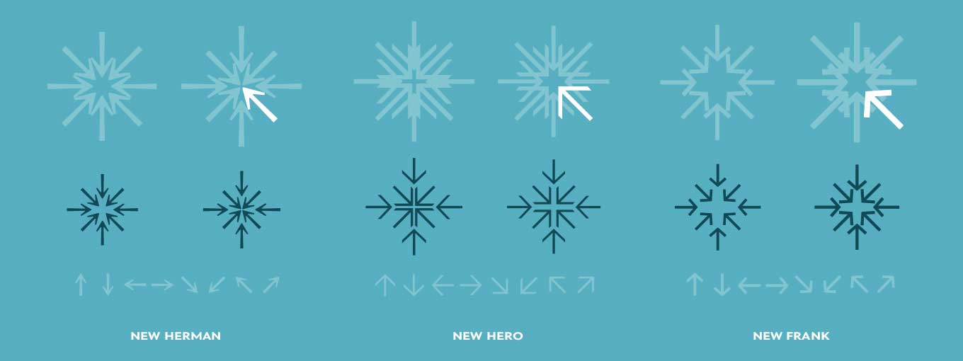
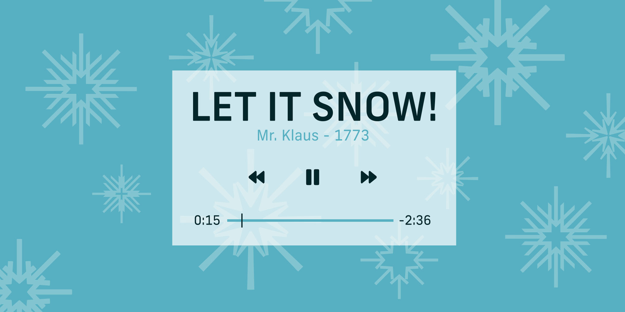
When we launched Newlyn last October, we played with the arrows from New Herman and New Frank. We lifted sketches from the foundry launch files and gave them new life as snowflakes, together with arrows from the recently released New Hero. The media player is a treat, also from New Frank, that we paired with New Rubrik text.
Construction of the snowflakes for Newlyn showing the base glyphs in relation to the illustrations.
Newlyn’s icy cool Yule.
Snowflakes are so delightful! Singular ice crystals form when a speck of dust or pollen attracts water vapor, leading to flakes, puffs, and blankets of the white stuff. Use the arrows in New Hero and other Newlyn types to build unique patterns of typographical “snow.”
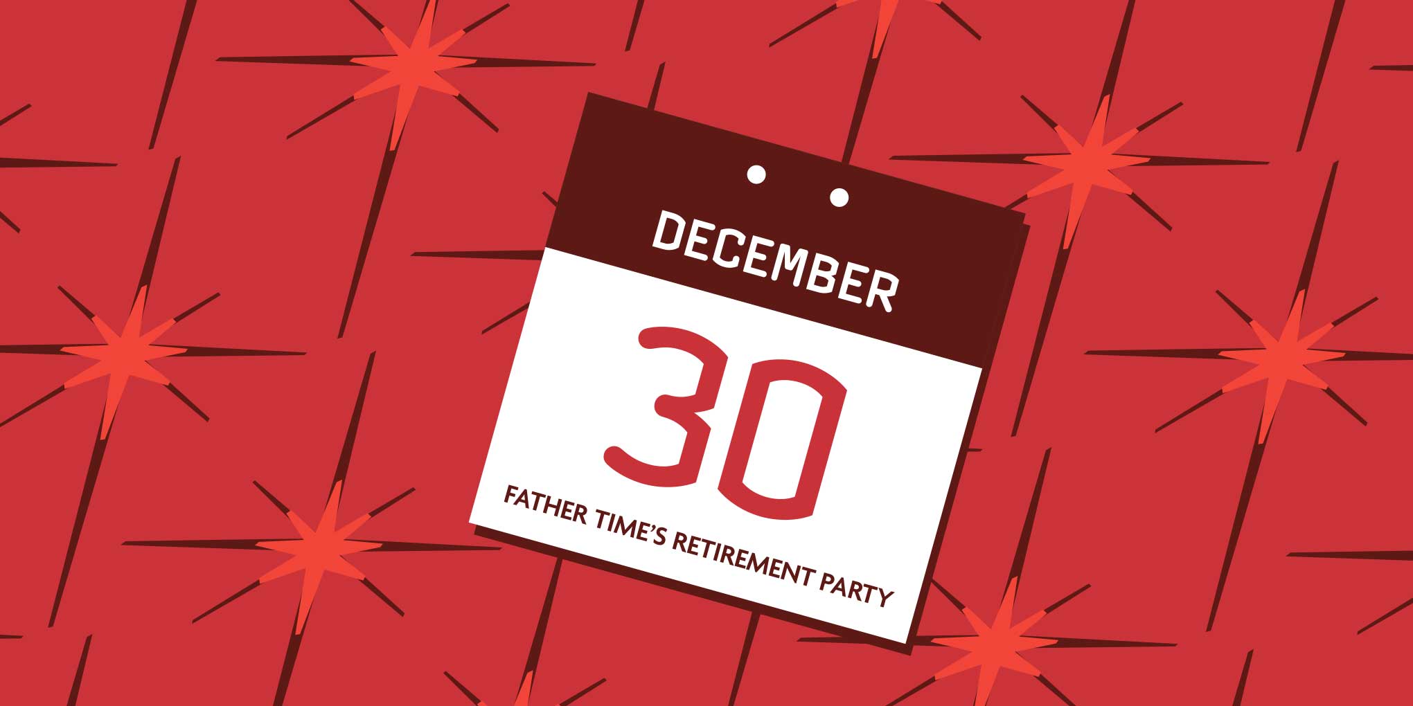
Greg Thompson types fete Father Time. Can you keep a secret? Since Old Father Time will be rather busy on New Year’s Eve, we put his surprise retirement bash on tonight’s Agenda. Cohosting are Commerce and Clicker, Greg Thompson’s party-minded pair of coconspirators.
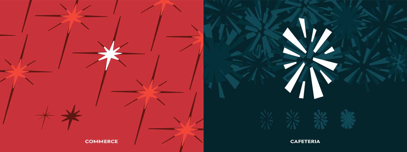
As we approached the conclusion of the series, the countdown was coming to an end—but not the number of stars and fireworks. Overlaying the star ornament in the two weights of Greg Thompson’s Commerce brightened the background behind the calendar, showcasing Clicker and Agenda in a complementary relationship.
Construction of the ornaments for Greg Thompson and Font Bureau showing the base glyphs in relation to the illustrations.
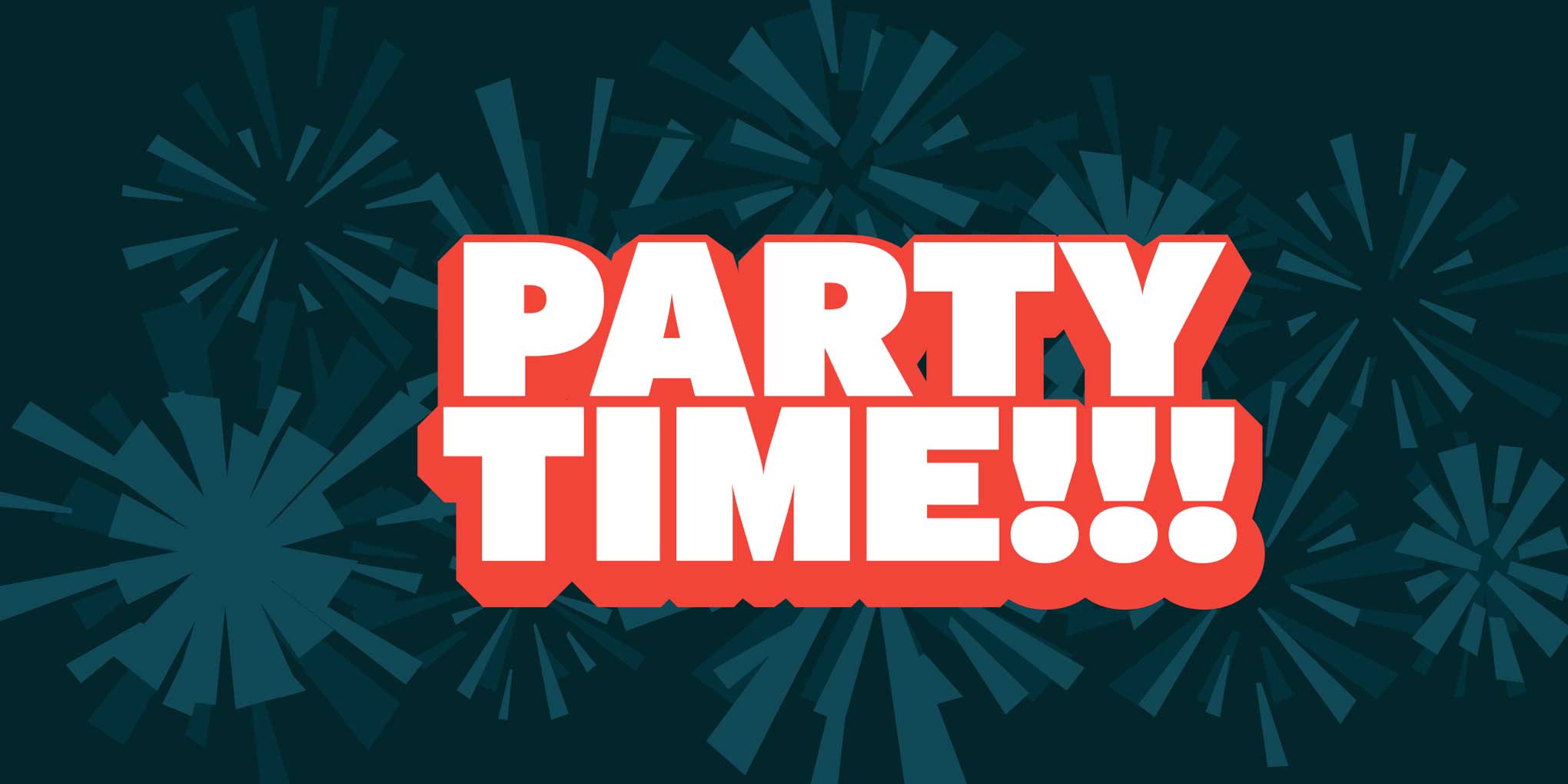
We couldn’t believe Cafeteria contained the perfect glyph for such a festive sky! The fireworks effect embellishing the Font Bureau banner became immediately evident when we superimposed the different weights of the ornament. Interstate was the ideal face to get the New Year’s Eve party started.
Ring in the New Year with Font Bureau.
Where will you be when the ball drops? Warbling “Auld Lang Syne” in a Robert-Burns-style brogue, or going crazy to the Purple One’s “1999”? However you spend the last hours of 2016, we wish you a celebration full of love, laughter, and friendship. See you next year!
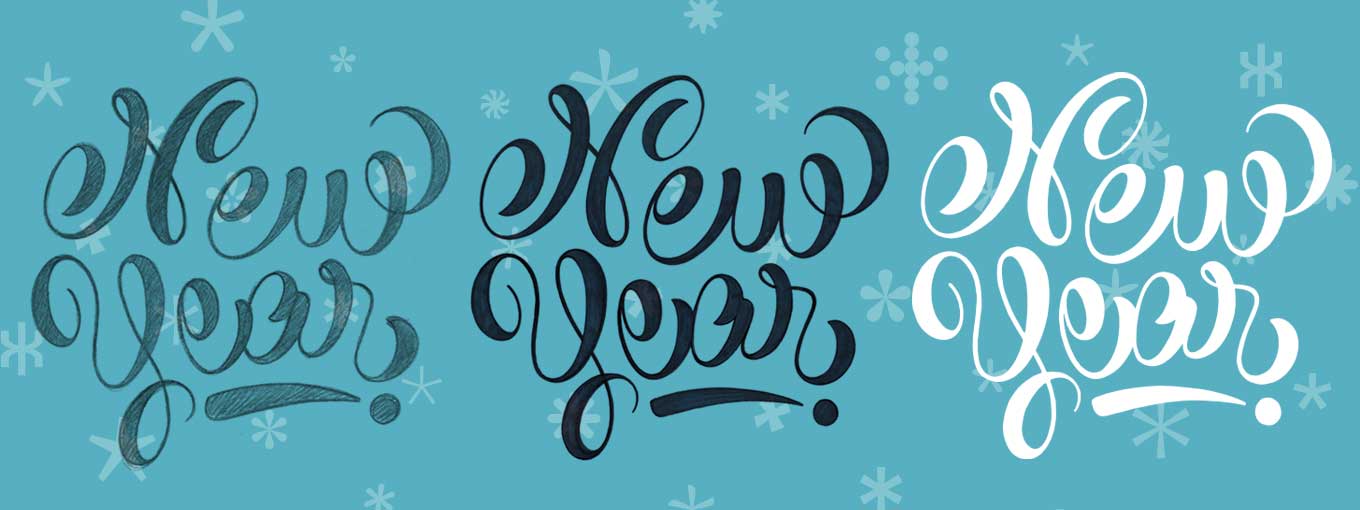
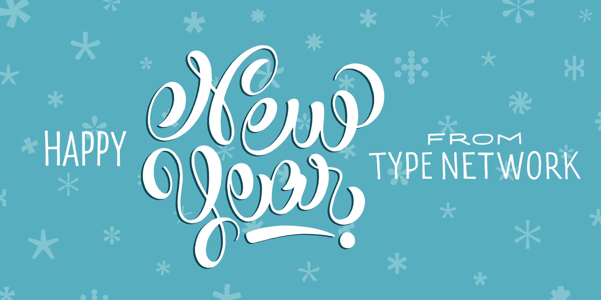
Before embarking on this intense journey, we had considered creating one banner that would represent all of our foundry partners, with at least one glyph from each designer featured in its background. In the end, we decided to mix things up by creating a unique piece of lettering, just as we did for Thanksgiving. I hand-lettered a custom “New Year” for Type Network, starting from a brush-pen sketch that I traced over and adjusted with pencil, refined with markers, and ultimately digitized by live tracing. Notice how the contrast is in the upstrokes? That might look weird, but I like to have fun with letters.
Hand-lettering process: from pencil sketch to marker to digital live tracing. The background is composed of asterisks from several typefaces in the Type Network catalog.
A new year, a new beginning.
We hope your holidays have been nothing short of spectacular! Now that we’ve bid adieu to 2016, it’s time to greet the challenges and opportunities that the new year will bring. Best wishes for a healthy and happy 2017 from your friends at Type Network.
Now that our “ornamental season” is over, we hope you enjoyed it as much as we did. As we add new content to the Type Network site, the banners will disappear from our homepage. Before they do, I want to express my wholehearted thanks to Claire for helping me with the graphics, and to Tamye for coming up with such witty (and appropriate!) copy each day to add to the visuals. The extended Type Network team wishes you a wonderful 2017 and a never-ending #FestivalofType! Tot ziens!
Originally from São Paulo, Marina Chaccur is a type maker and rule breaker based in The Hague. A graduate of that city’s Type and Media Master program at the Royal Academy of Art, Marina exhibits, speaks, teaches workshops, and organizes conferences around the world. She works in marketing and editorial for Type Network, capably assisted by Oprah, the glamorous tuxedo cat who oversees her studio.