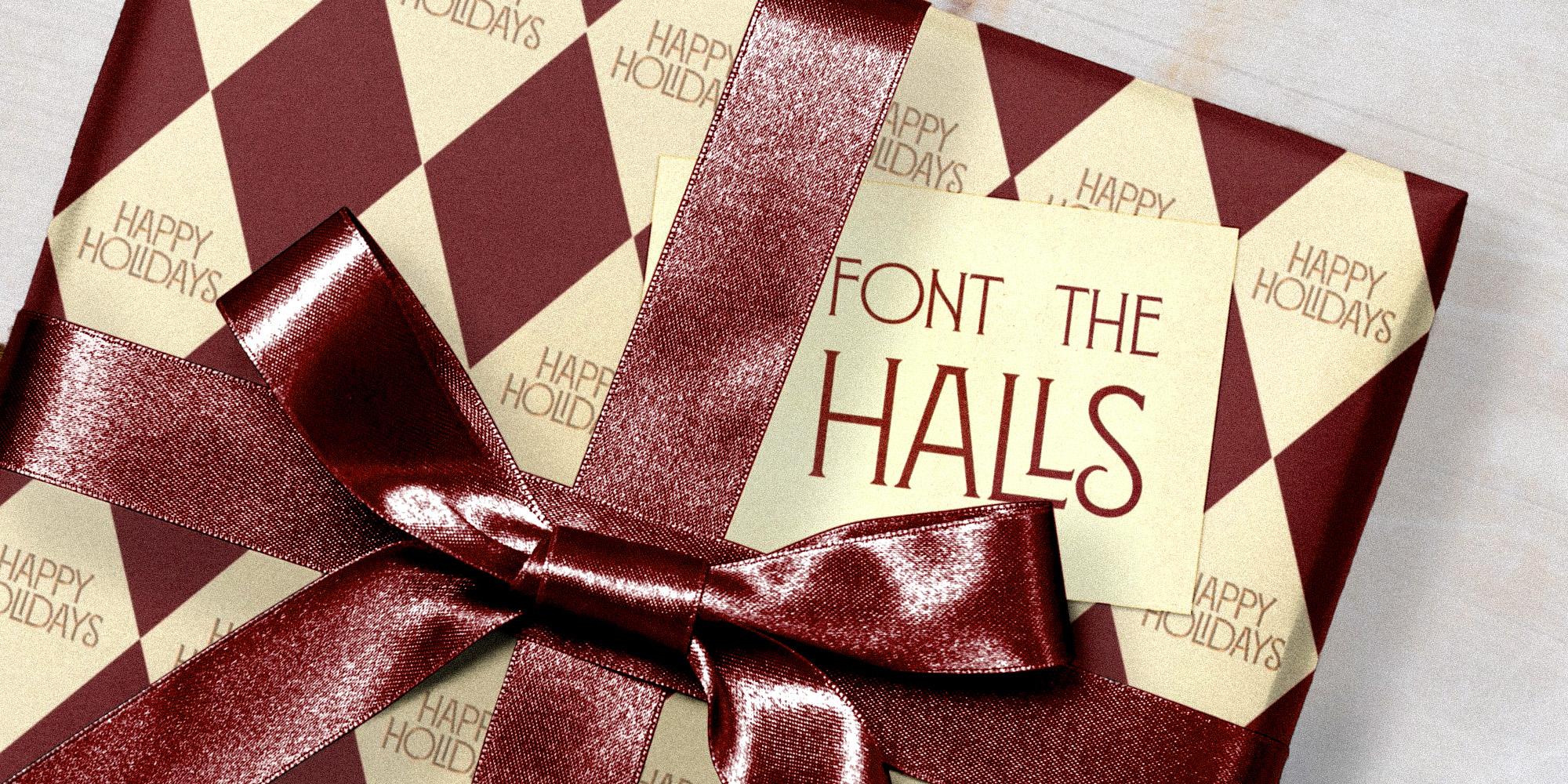
Banner: Montecatini Pro · Tipofili
Featuring:Sweet Sans Pro · MVB Fonts, Spignarian Script · Antonio Di Spigna,Montecatini Pro · Tipofili, Gloridot · Bijou Type, Pennypacker · CJ Type
Type for the holiday shelf: packaging faces that sell
The best gift wrap starts with the letters printed on it. Five faces for labels, boxes, and tags that make a shopper reach before they read.
A store shelf in December is the most crowded stage in retail. Every box, tin, and bottle gets a few seconds to catch an eye and make a promise about what is inside, and the type does most of that talking long before anyone flips the package over. It has to look generous on a gift tag, hold steady on a tiny ingredient panel, and compete with a cart full of rivals. Production deadlines land now, not in December. Here’s what to stock.
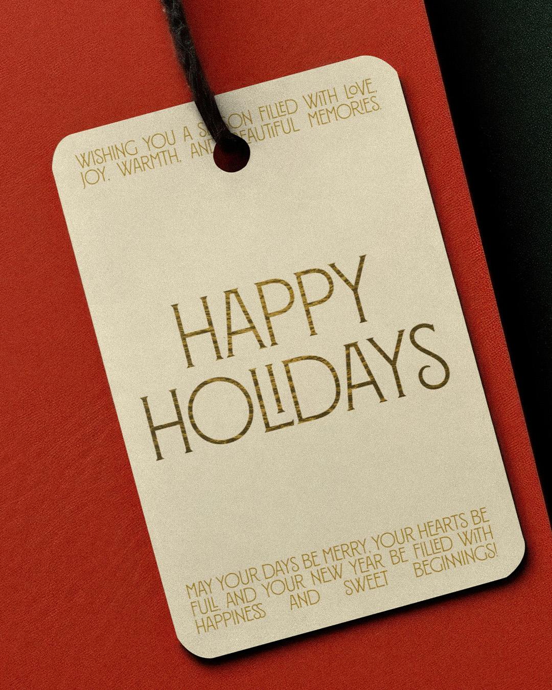
It makes even a plain kraft box look like it arrived with a card
Mark van Bronkhorst revived the engraver’s sans serif for Sweet Sans, a lettering style that has been one of the most widely used on stationery since about 1900. It is the voice of the engraved calling card and the formal invitation, and van Bronkhorst gave it a range those engravers never had: nine weights from Hairline to Heavy, each with a true italic and a complete character set. It makes even a plain kraft box look like it arrived with a card.
On the shelf: candle labels, stationery sets, and anything that should feel gifted before it is unwrapped.
Sweet Sans Pro
Regular
Starting at $79
Buy
Mark van Bronkhorst
Mark van Bronkhorst founded MVB Fonts in San Francisco in 1991. He has created typefaces for major brands including Disney, NBC, Comcast, and Warner Bros., and directs the American Type Founders Collection.


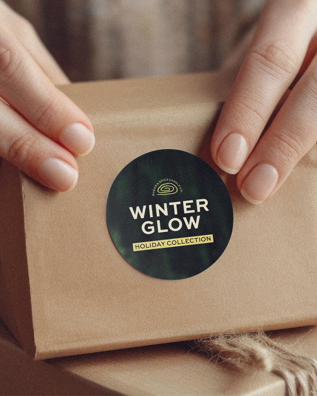
Elegance, signed by the artist
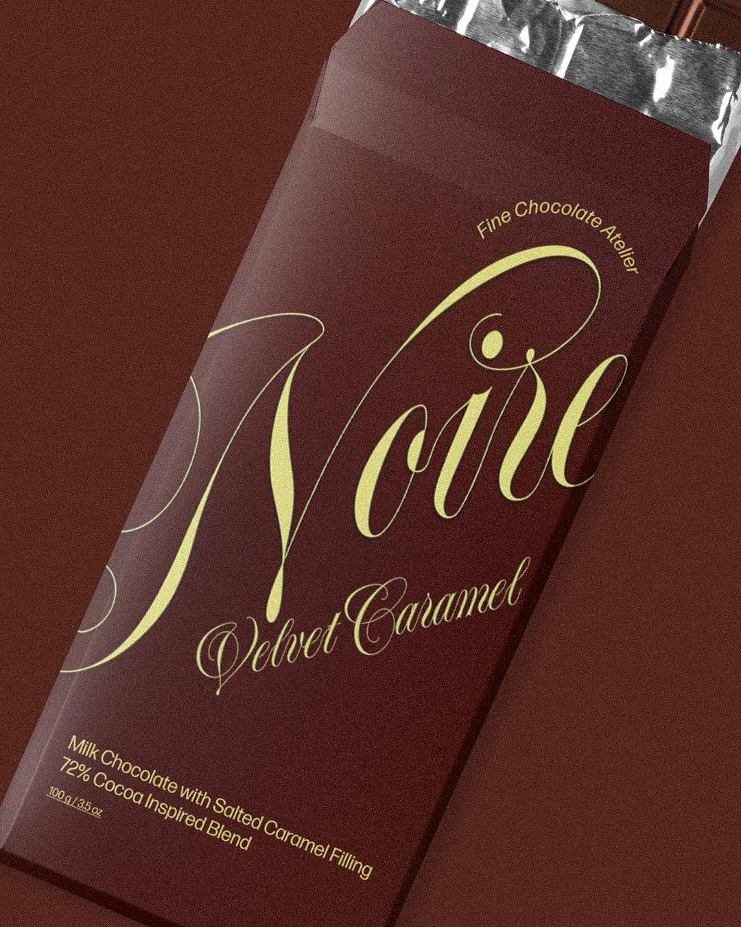
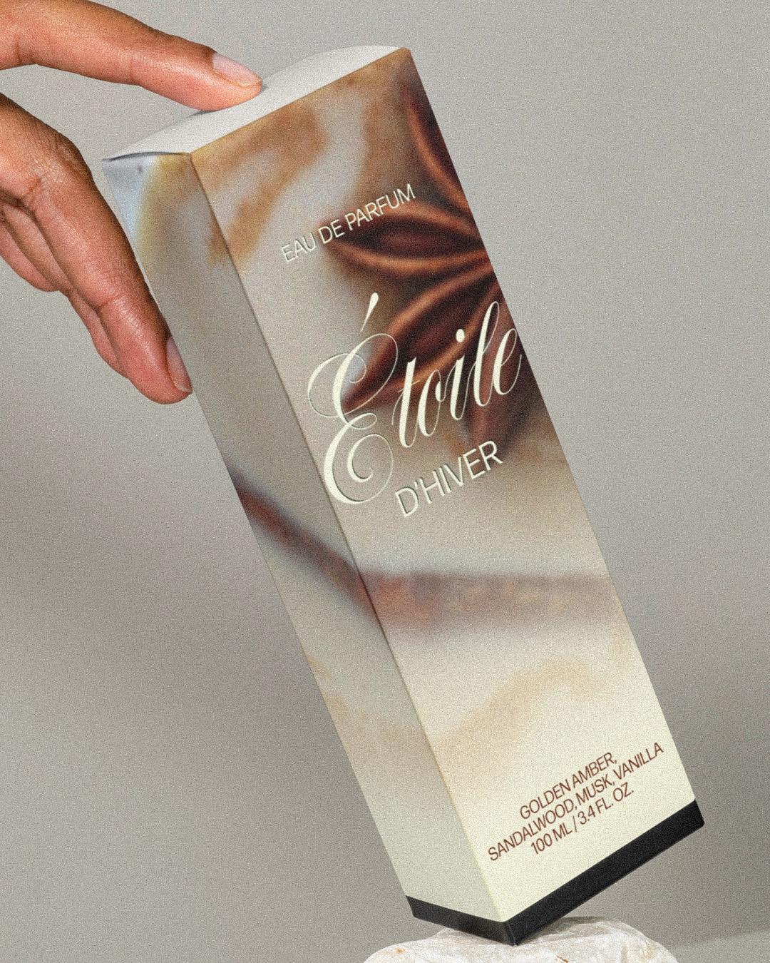
Tony Di Spigna worked alongside Herb Lubalin and Tom Carnase before opening his own New York studio, Artissimo, in 1973, and he is still celebrated for his hand-drawn Spencerian lettering. Spignarian Script, his self-titled showpiece, was penned by hand and refined over countless adjustments into a display face with true hairlines and smooth transitions from thick to thin. Those hairlines need room, so set it large enough to show off every detail. Elegance, signed by the artist.
On the shelf: chocolate boxes, perfume labels, and the name across the lid of the tin.
Spignarian Script
Regular
Starting at $40
Buy
Tony Di Spigna
Tony Di Spigna is an award-winning Italian-born typographer known for his lettering, logo, and typeface designs. He teaches at Pratt Institute and the New York Institute of Technology.
It makes a jar of jam look imported
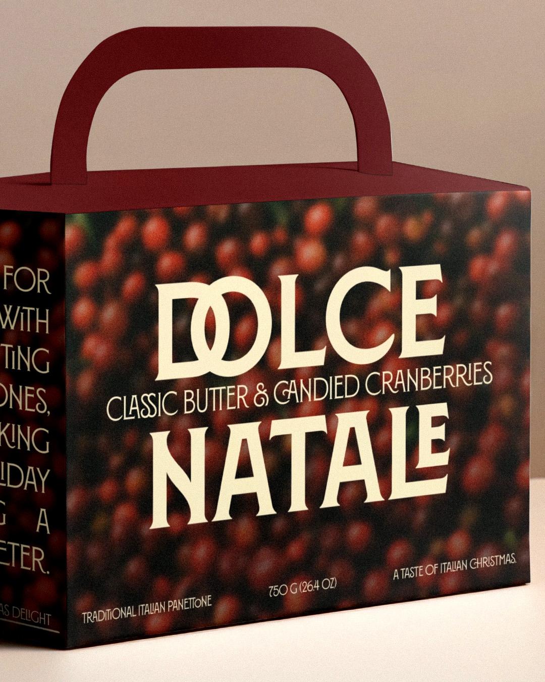
Louise Fili has built logotypes, restaurant identities, and specialty food packaging since founding her studio in 1989, and Montecatini began with a poster she first spotted in the Tuscan spa town of Montecatini Terme in the early 1980s. Taking its cues from Italian Stile Liberty travel posters of the early 1900s, the Pro family she developed with Andy Anzollitto and Nick Misani spans 24 styles across six weights and four widths, finished with Art Nouveau ligatures. It makes a jar of jam look imported.
On the shelf: specialty foods, panettone boxes, and anything with a passport.
Montecatini Pro
Normale
Starting at $35
Buy
Louise Fili
Louise Fili is an award-winning lettering artist and graphic designer known for elegant restaurant branding. She founded Louise Fili Ltd. in 1989, specializing in food, typography, and Italian-inspired design.
Connect the dots, then tie the bow
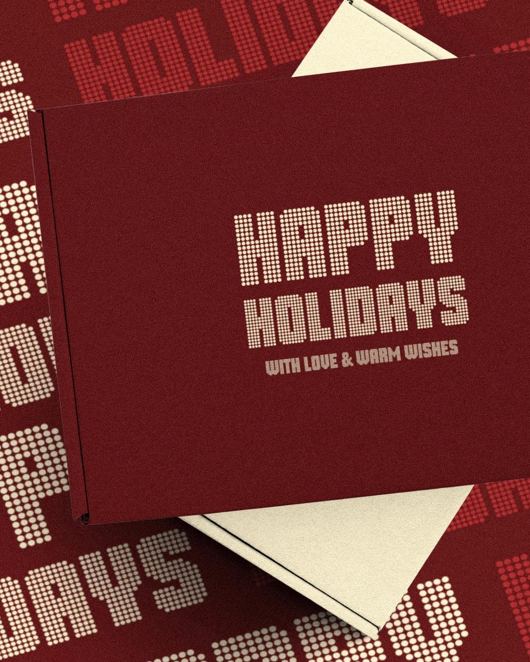
Dan Rhatigan started Gloridot by trying to recreate a handful of letters from an unidentified typeface on an old magazine cover, for an issue of his zine, Pink Mince. The grid of dots behind those few glorious letters grew into a puzzle, and then into a full typeface that supports about 505 languages, plus symbols built for borders and patterns. Made for big, solid headlines, it can spell out the brand on the box and then pattern the paper it is wrapped in. Connect the dots, then tie the bow.
On the shelf: gift wrap, tins, and limited-edition holiday drops.
Dan Rhatigan
Dan is an experienced typographer, designer, and educator who has held senior roles at Monotype and Adobe Fonts. He publishes Pink Mince and serves on the board of the Hamilton Wood Type & Printing Museum.
Dependable as a well-taped box
CJ Dunn drew Pennypacker as a contemporary take on the Neue Moderne Grotesk lineage of early grotesks, a sturdy and reliable sans serif with plenty of personality. Its 45 styles focus on stylish functionality, and the foundry names packaging and poster design right alongside mobile apps and wayfinding. That range is exactly what a holiday line needs, from the bold front panel to the fine print on the back. Dependable as a well-taped box.
On the shelf: product lines, multipacks, and ingredient panels that still look on-brand.

CJ Dunn
CJ is a typeface designer who studied under Ed Benguiat and later founded CJ Type in 2016. He has worked with Font Bureau, taught typography, and presented at international design conferences.
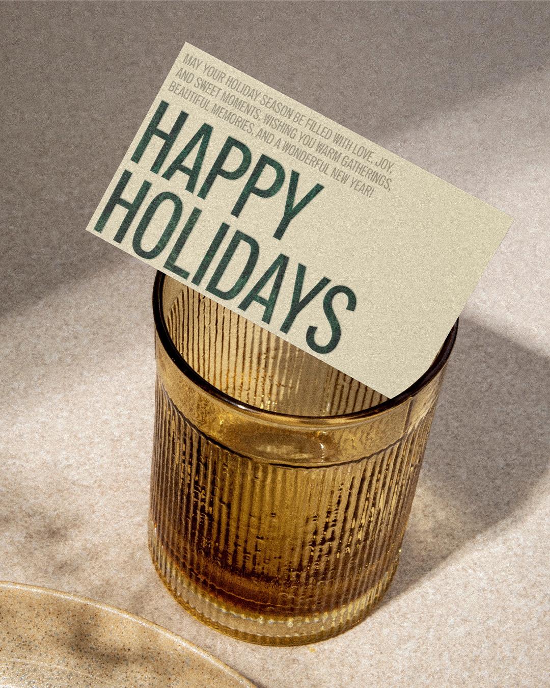
December’s shelf is a crowded stage, and these five know how to take a bow. Wrap up your packaging, and meet the foundries behind these five, at
store.typenetwork.com.