
Type and typography by Roger Black
Roger Black is a giant of editorial design. He produced his first publication at the tender age of six and landed his first job as an art director with a staff of five at just 23. Moving from one publication to the next before transitioning to freelance work made Black realize that he had become more of a consultant than an art director. His flair for typography, formidable knowledge of type history, and knack for identifying which problems need to be tackled has long been avidly sought after by print and digital publications the world over.
Service: Custom licensing and consulting
Partners: Font Bureau in collaboration with Roger Black
Date:
1975–Present
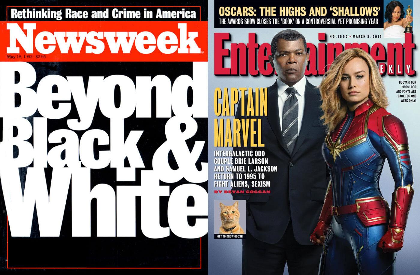
BORN IN THE 90S AND STILL USED TODAY. In the 1990s, Roger Black and friendly rival Michael Grossman took turns commissioning new styles of Bureau Grot from Font Bureau—Grossman for Entertainment Weekly, and Black for Esquire. The end result is David Berlow’s beloved grot family in five weights and six widths.
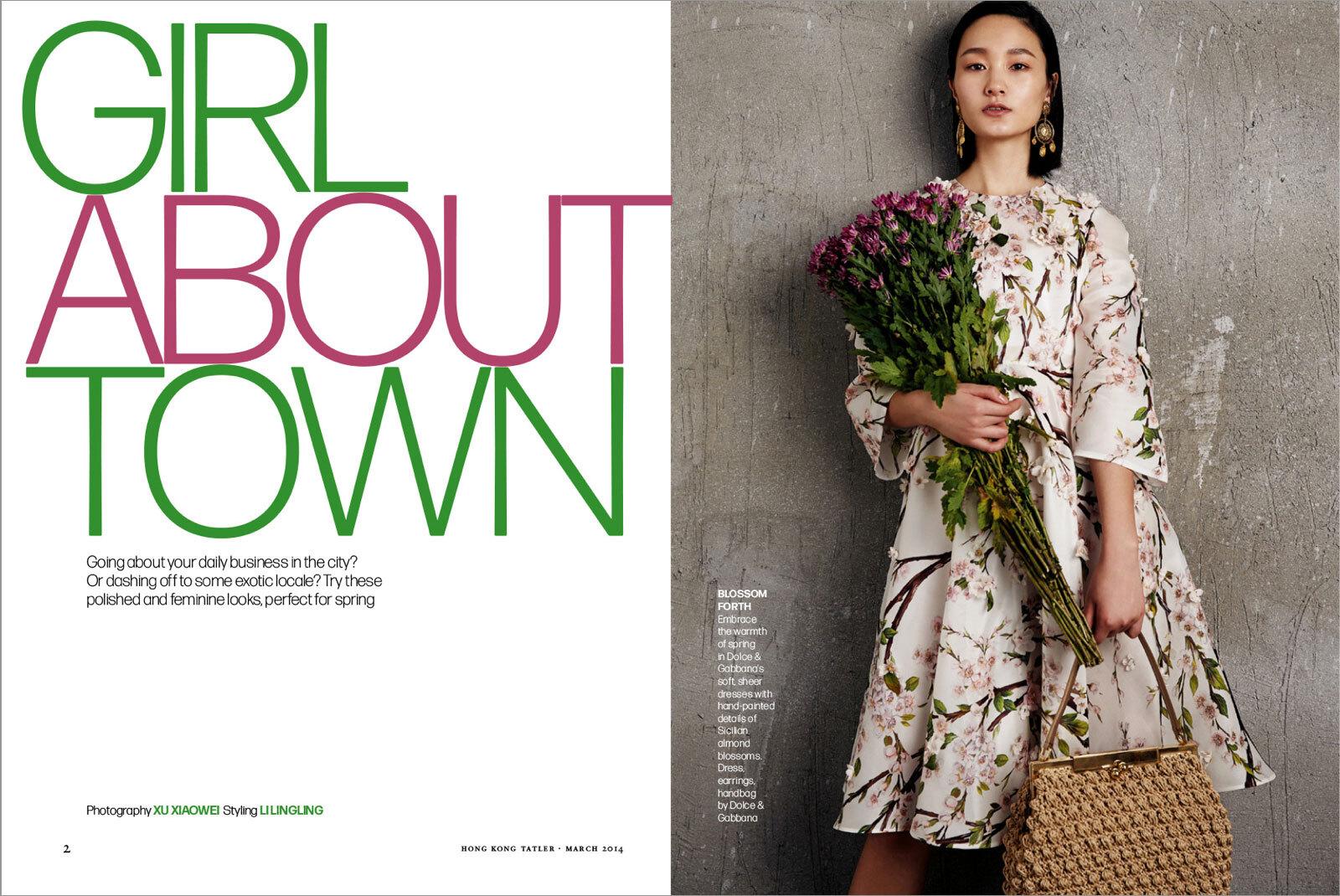
ITALY’S ANSWER TO HELVETICA. Forma is a mid-century grotesque designed by Aldo Novarese for Nebiolo in 1968 with amazingly tight spacing. The typeface was never digitized until David Jonathan Ross’s revival, commissioned by Black on behalf of the Tatler magazine group in Asia. Seen here used in Women’s Wear Daily where it is still in use.
The Roger Black collection illustrates Black’s career with twenty-one examples highlighting the depth and breadth of his work as a typographic consultant. His track record reveals that Black doesn’t believe in one-size-fits-all solutions. Deftly navigating through the possible options for creating custom type, he has commissioned digitizations of classic faces, encouraged type designers to develop designs from their “bottom drawer”, asked for contemporary typefaces to be adapted, and had new typefaces designed from the ground up. A common thread is that Black has always found a solution that benefited the client, raising their profile and often saving them money by advising them on licensing. This is a portrait of an expert deeply enamored of everything typographic.
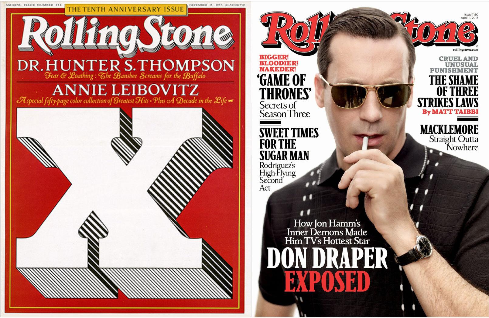
40 YEARS LATER. In 1975, with Nebiolo Jenson as the starting point, Black worked with type designer Jim Parkinson to develop the original Rolling Stone typeface; with the advent of desktop publishing, Parkinson, with help from Font Bureau, digitized the family into what we now know as Parkinson.
“WHAT’S YOUR FAVORITE TYPEFACE?” Font Bureau answered Black’s hankering with Giza—David Berlow’s interpretation of the original 19th-century slabs, called Egyptians (Roger’s favorite: Egiziano from Nebiolo). Using TrueType GX Variations, the first variable font technology, Berlow designed broad axes for weights and widths. The condensed instances a perfect match for Esquire and its spinoff, Gentleman.
If you don’t know where to start, we can guide you. Type Network employs and partners with experts in the fields of publishing, graphic and web design, and app and web development. From the earliest stages of identifying your needs to implementing fonts in your workflow, Type Network understands the stages in the development of a typographic identity.