Titling Gothic FB hypnotizes viewers of Errol Morris’ “Wormwood” · Type Network
Titling Gothic FB hypnotizes viewers of Errol Morris’ “Wormwood”
Designer Jeremy Landman takes Font Bureau’s seven-width wonder to mind-bending heights in a new Netflix docudrama.
By Bald Condensed
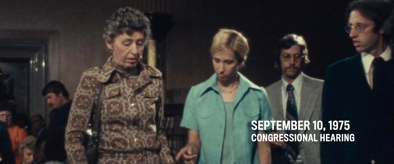
Tomorrow is a big day. On Friday, December 15, streaming-content provider Netflix launches Wormwood. The hybrid documentary, directed by award-winning filmmaker Errol Morris, is being released both as a six-part television series and as a continuous film in select theaters. David Berlow’s Titling Gothic FB, inspired by that century-old favorite ATF Railroad Gothic, is used extensively and exclusively throughout Wormwood: for the title sequences (of which there are multiple versions), intertitle date cards, lower third supers, and end credits. Today, we offer an exclusive sneak peek at the project’s adventurous typography, created by Jeremy Landman, an independent designer who specializes in graphics and title design for film and television.
When I interviewed Landman via email, he explained that he had previously worked with Morris on some of his documentary features, as well as many of his commercials and short films. The pair first collaborated on Tabloid, released in 2010. Landman’s work on the documentary garnered him a Cinema Eye Honors award for Outstanding Achievement in Graphic Design and Animation; in 2013, he was nominated in the same category for The Unknown Known. More recently, Landman worked on The B-Side: Elsa Dorfman’s Portrait Photography. He has also created graphics for many of Morris’ short films, such as the IBM centennial film They Were There, and several New York Times Op-Docs, including El Wingador, The Umbrella Man, and Demon in the Freezer. “His projects are always my favorites,” Landman said. “They are so saturated with ideas. All I have to do is figure out which ones best lend themselves to typographic interpretation.”
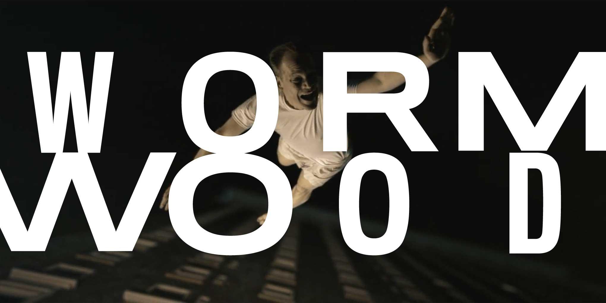
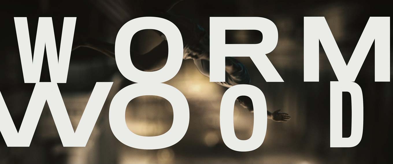
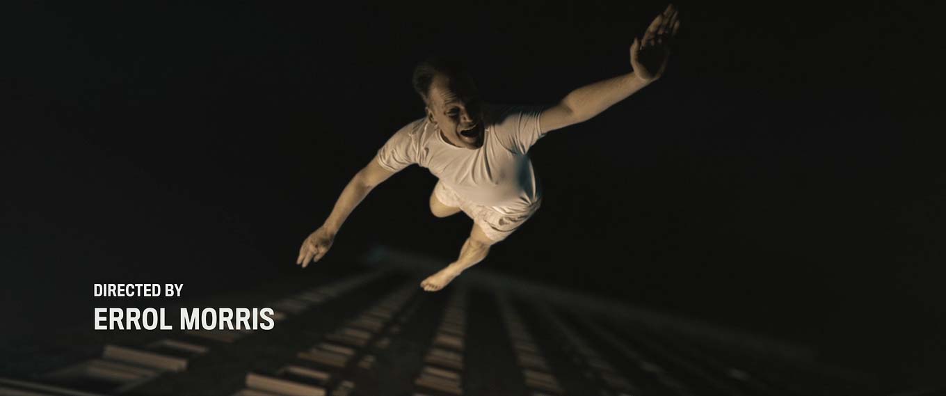
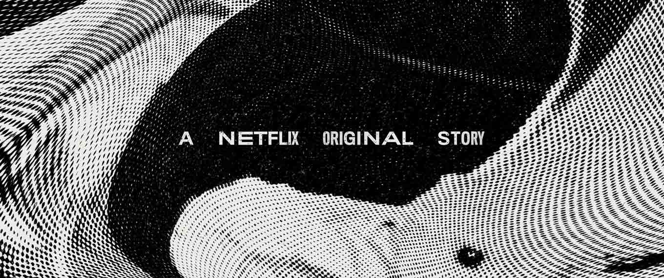
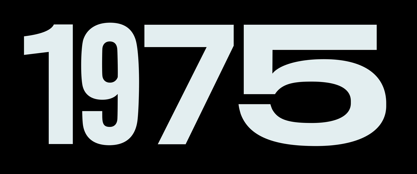
Stills from the title sequence of the first episode of Wormwood. Landman inventively combined Titling Gothic FB’s various widths to create hallucinatory typography.
Landman explained that for Wormwood, the choice of typeface and decisions about typesetting were driven by considerations like the series’ subject matter, its time period, Morris’ filmmaking techniques, and stylistic continuity with his previous work. All of these factors led Landman to select Font Bureau’s Titling Gothic FB.
Wormwood investigates the death of Frank Olson, an army scientist who fell or jumped to his death in 1953 after being surreptitiously dosed with LSD by the CIA. One of Landman’s favorite parts of the series is the extensive use of Olson’s home movies. “It’s incredibly moving to see the family from his perspective, to literally see what he saw,” Landman recalled. “I asked myself, ‘What did Frank see at the end?’” Landman tried to imagine how Olson’s perception might have been altered during and after the experiment—how letters might have looked to him in that state. The fact that Olson died in 1953 complicated matters. His death predated most of the examples of psychedelic imagery Landman gathered during his research. The challenge was to make the typography “trippy” while avoiding direct references to the visual language of sixties psychedelia.
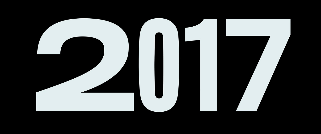
Stills from the title sequence of the second episode of Wormwood. Op-art patterns in black and white suggest LSD-induced hallucinations.
The distorted footage in Saul Bass’ title sequence for Seconds served as a major inspiration for the final treatment. It does a great job of conveying a state of mind similar to what was reported in CIA accounts of Olson’s final days. Once Landman decided the type should feel distorted, he searched for a typeface that could simulate warping by alternating between its existing widths, rather than actually distorting the type with a filter or optical process. If the distortion effect could rely on the original type family’s design, it would increase the visual coherence of the typography, Landman reasoned. The concept of using a typeface that could capably fill such a broad role helped narrow down the type choices.
Date cards for Wormwood, with subtly animated character widths created in Adobe After Effects. Titling Gothic FB’s different widths offer a visually coherent way to simulate warped typography.
The distorted perception of reality, however, wasn’t the only idea guiding the typography. In the series, Morris deploys a variety of techniques in what he has called the “everything-bagel” approach, blending documentary, drama, reenactment, archival material, and graphics. The story offers accounts from a variety of perspectives. Landman started to think of Wormwood as (at least) two movies: a 1950s period drama and a contemporary documentary. Because each era carries different design styles, Landman decided to apply a couple of distinct typographic systems throughout the narrative. One is understated, with a clear hierarchy and conventional typesetting. The other is a bit weird, and features flattened hierarchy, absurdly generous word spacing, mixed widths, and so on. To further enhance the weirdness, Landman animated the individual letters to have their widths shift ever so slightly. After converting both the original width and the target width for each word or numeral to outlines, he used Adobe After Effects to interpolate the in-between shapes. “In order to tie both systems together,” said Landman, “I wanted a typeface that could work in both applications. It had to be something that would not look out of place during the 1950s-era sequences, yet not feel too retro during the contemporary documentary sections.”
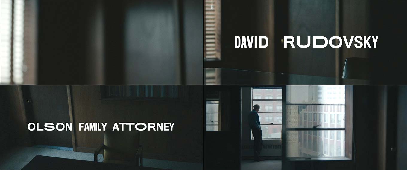
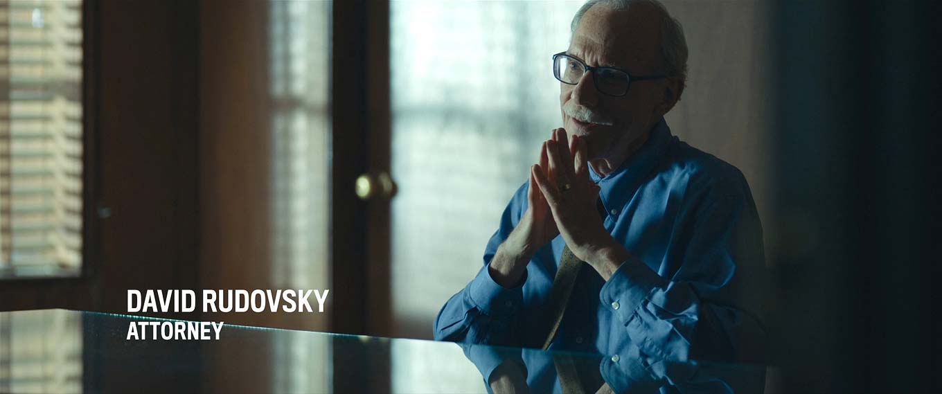
Stills from Wormwood. The conventionally typeset titles in the bottom two images are static; the letter widths in the warped titles in the top image are animated, shifting imperceptibly to create a subconscious sense of alienation and unease.
For Wormwood, Morris expanded his approach to filmmaking. He dropped the interrotron, shot with multiple cameras, included extended dramatic sequences with actors, and used split screens. Still, Landman thinks it feels very much like an Errol Morris film. This duality helped his selection. “Titling Gothic FB shares some formal characteristics (and design pedigree) with typefaces we’ve used before, such as Benton Sans and Rhode. It distinguishes the series from earlier projects, yet formally connects to what Morris has done in the past.”
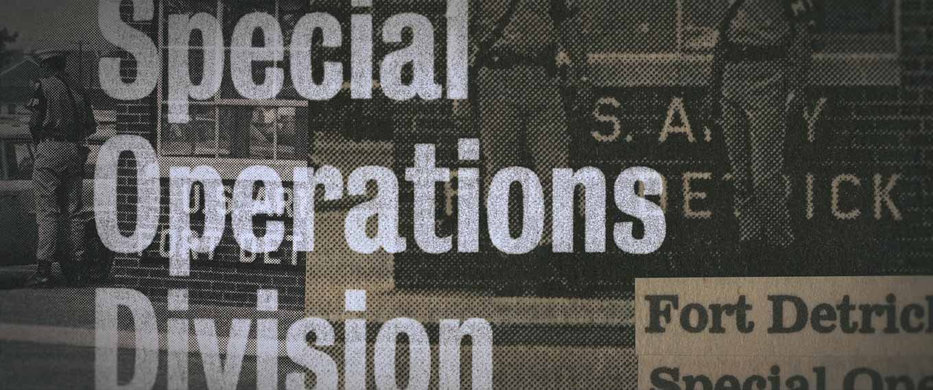
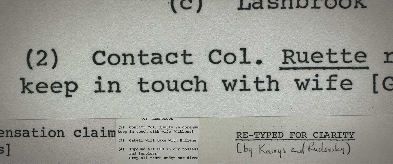
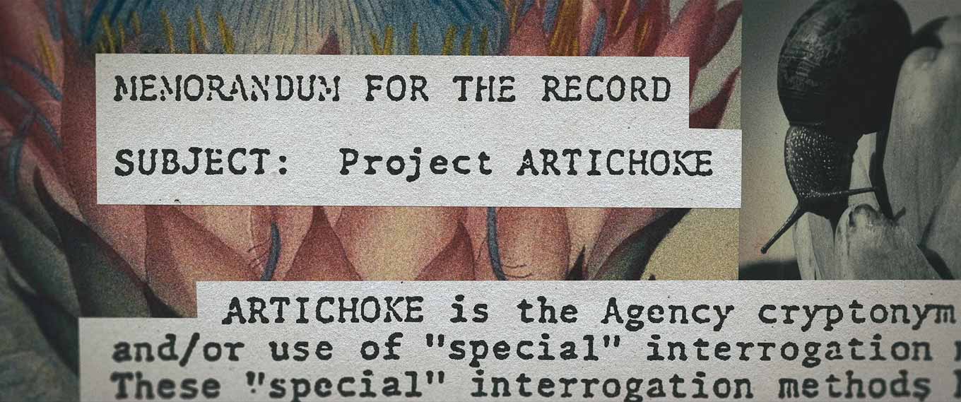
Examples of Landman’s collage-style visuals complementing the story.
I would like to thank Netflix for giving me advance access to Wormwood. Titling Gothic FB lives up to its name: the seven weights and seven widths make it possible to fit any title into any space. But Landman uses this flexibility in innovative ways. By mixing the widths and then subtly animating individual characters, he has created a surprising typographic language completely his own. And it’s not only the titles that showcase his talent. The beautifully layered collages mixing typography (newspaper headlines and clippings, and fragments of CIA documents) and photography (rasterized images, vintage photographs, and stills from the documentary) not only elucidate and enhance the story, they also add to the visual opulence of this fascinating documentary series.
See Wormwood on Netflix and in select theaters starting Friday, December 15.
Netflix Wormwood trailer from Materia on Vimeo. Jeremy Landman, who designed the production’s typography, unfortunately didn’t work on the trailer. While the animated typography with varying widths is inspired by Landman’s work for the series, instead of using Titling Gothic FB, this trailer employs Adrian Frutiger’s Univers, which is available in only four widths.Like all Font Bureau fonts, Titling Gothic FB is available for desktop, web, app, and ePub licensing. Webfonts may be tested free for thirty days. To stay current on all things Font Bureau, subscribe to Type Network News, our occasional email newsletter featuring font releases, foundry happenings, type and design events, and more.Bald Condensed, né Yves Peters, is a Belgian-based rock drummer known for his astute observations on the impact of letterforms in the contemporary culture-sphere. A prolific writer on typography, he has a singular knack for identifying the most obscure typefaces known to humankind.