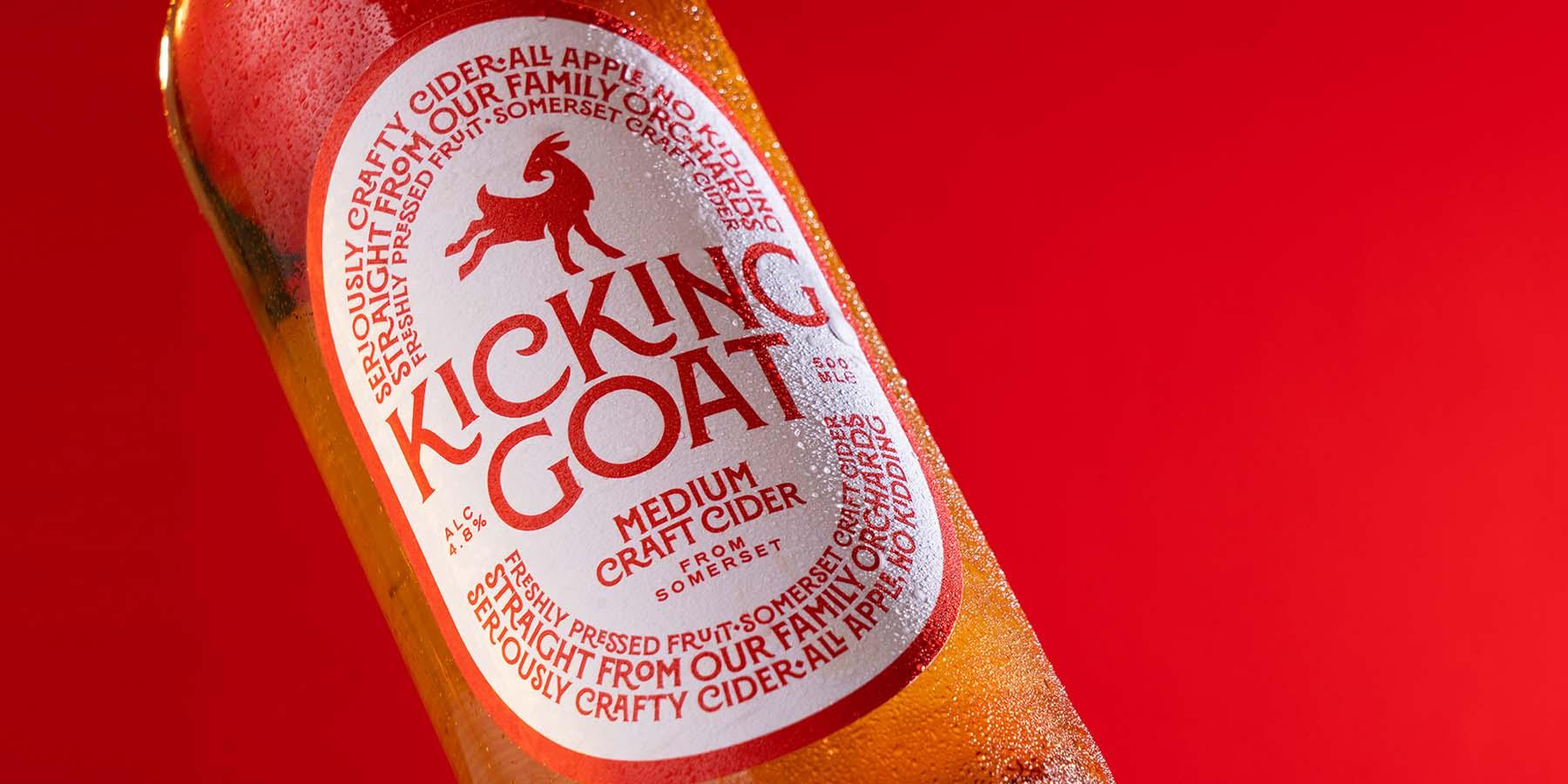
Tipofili’s Montecatini Pro in use for Kicking Goat’s branding and cider labels.
Tipofili’s Italian influences
At the end of 2022, Tipofili launched on TN with three fittingly Italian-inspired typefaces: Marseille, Portofino, and Montecatini. Here, the Tipofili team talks about their upcoming fonts, how their type design intersects with their graphic and branding work as Louise Fili Ltd, and why they started a foundry in the first place.
Andy Anzollitto: Louise, in the past you swore that you would never design fonts. With three fonts on the market and the launch of this type foundry, how has this attitude changed and what are your hopes for the foundry?
Louise Fili: Over the thirty-plus years that we have been designing logos at the studio, we have drawn only the letters needed for the project: no punctuation, no numerals, no diacritics. No interest!
But, when we were invited by the Hamilton Wood Type & Printing Museum to design a font to be cut out of wood, I realized how typeface design could breathe new life into so many forgotten Italian letterforms.
I am hopeful that this will foster a new appreciation of vintage European hand-lettering and its application in contemporary design. Also, our studio is in a building that—coincidentally—was and is now called The Foundry. It must be a sign. So why not continue the tradition?
Matthew Smith: Andy, what was the inspiration behind Tipofili, and what are you most excited about?
AA: The thing I am most excited about, which is also the inspiration behind Tipofili, is translating the spirit of our studio into a type design practice. Conversations about Tipofili started in 2019, following the release of Montecatini Pro. You and I were working on various ideas for new fonts, and we both had this growing feeling that something larger was being built beyond these individual font releases.
That’s when we began talking about what starting a foundry might look like and how we could take a unique approach as a foundry, given our background as a studio.
At Louise Fili Ltd, our work centers on tailored designs that draw from history to fit a present-day context; it has been exciting to take that perspective with us into the realm of type design.
Building on over thirty years of custom lettering, typography, and brand experience, Tipofili is the complementary foundry to Louise Fili Ltd, providing retail fonts and bespoke typography.
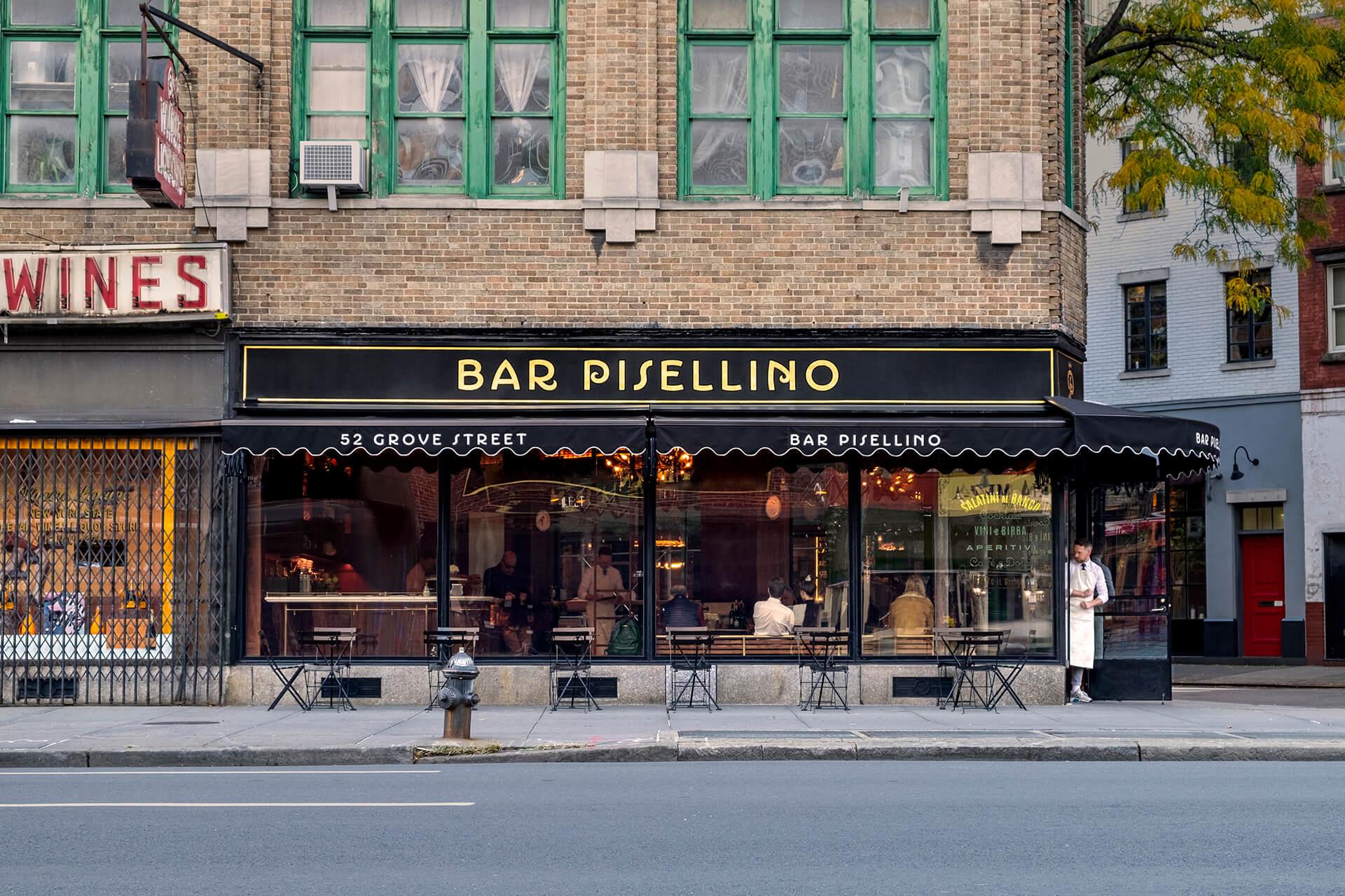
Tipofili’s Portofino in use for Bar Pisellino on NYC’s 7th Ave.
Lucas Czarnecki: What are the upcoming plans for Tipofili?
AA: Our immediate plan is to expand our library. After launching our website last year, we took some time to review developing and prospective font releases. Currently we have two fonts in progress that we plan to release in 2023—one of which has already made a cameo on our website.
MS: Over the summer, we had our first Tipofili-con—an internal conference where Louise, Andy, and I got together to pitch and discuss new retail font ideas for the foundry. In total, we looked at 25+ new ideas and in-progress fonts. So, I can tell you that we have no shortage of fonts we’re working on! However, our conversations nowadays are more around what we want to prioritize. We’re wrestling with questions like: Do we want to expand our website to include a blog or a fonts in use? Should we expand our existing fonts to support Cyrillic and/or Vietnamese? What might it look like to publish fonts from other designers? Frankly, we have more questions than answers at the moment!

Tipofili’s Marseille in use for Ragusa’s pastry packaging.
LC: What does it mean for Tipofili to be joining Type Network?
AA: Design is about context, and this is equally true for the business of design. Through Type Network, we are able to continue building Tipofili alongside an amazing cohort of independent foundries. For us, it is not only an opportunity to make our fonts available to a wider audience, but also to participate in critical discussion around the development of our fonts and company.
MS: I’ll be honest, Dan’s reaching out to us shortly after we announced Tipofili was extremely validating, and we are really excited to be a part of Type Network. Operating a type foundry can often feel like a very siloed experience, and I think that is especially true for our foundry, given where all three of us are coming from. While Louise is an icon in the design industry, we are all relatively speaking new to the field of type design.
None of us have master’s degrees or certificates in type design; our education has largely been learning on the job. So, while we might be embedded in the design industry, we have always felt as if we were a bit on the outside of the type design industry, especially from the business end.
Feeling very confident in our work but also feeling extremely new creates a sort of dissonance in experience which can make it hard to answer the question of “who do we turn to for help?” Perhaps some of this is self-imposed, but it can feel like there’s a lot of pressure to uphold a certain standard of work, as though there is very little margin for error.
All of this is to say: We are a new foundry, and we still have a lot to learn. Type Network’s interest to work with us, despite that green feeling, has been a boost of confidence and given us a real sense of support. We’re grateful to be a part of this larger community.
Montecatini Pro
Normale
Starting at $35
BuyLC: How do you see Louise Fili Ltd’s design work and Tipofili’s type design work intersecting?
LF: For several decades, the Italian and French ephemera of my type reference archive has inspired my work. It first began with book jacket design while I was art director of Pantheon, and then logo design once I started Louise Fili Ltd. With Tipofili, these single-use letterforms opened up an exciting new and expanded world of font family development, with the ability to explore many variations like widths and weights.
AA: Our approach to type design was developed through our work at LFL. We refined how we examine typography in the pages of Louise’s books; experimented with letterforms in the brands we’ve made; and considered the practical benefits of our methods through use. Now with Tipofili, we are taking that research, skill, and sensitivity and applying it to the process of creating retail fonts.
MS: Prior to starting the foundry, Andy and I kept finding ourselves drawing fonts. Considering we both favored drawing letterforms in type design software, most of our new lettering was being conceived directly as fonts. But whenever we had to pick up an old project, we also found ourselves converting the static lettering into fonts. This gave us an opportunity not only to refine the type itself but also to make them more accessible for future projects. In that sense, Tipofili represents a close-up look at one part of our design process.


LC: As Louise mentioned, your studio had done lettering work. Describe your learning curve when expanding into full typeface design. What did you discover in the process?
MS: A lot of our lettering and custom drawn type was tailored for very specific contexts. So, when we began translating this work into fonts, we were forced to confront how our ideas and design decisions worked (or didn’t, for that matter) when used in ways we didn’t originally intend.
That’s the reality of type design: Designers are going to use your fonts in ways you don’t intend, and in the beginning, this can be a hard thing to reconcile. But this has also strengthened our design practice in many ways. Knowing that we use type in specific and highly nuanced ways, we can equip designers with the same features and design decisions we always felt were missing from the fonts we used. Because we design with our own fonts as they are being developed, our decisions are rooted in real practice rather than theoretical use cases.
Louise Fili is an award-winning lettering artist, graphic designer, and author. She is famous for her elegant typographic branding for restaurants and 2,000+ book jacket designs.

With a research-driven approach and background in lettering, he explores how letterforms reflect the environments connected to them—both past and present.

With a background in lettering and code, Matthew takes a particular interest in the relationship between the idiosyncrasies of vernacular typography and the nature of screens.
LC: Finally, tell me about the working relationship you three have. Who does what, and how do you enjoy working together?
LF: My reference library influences everything we do in the studio. It has been a great joy to review all the materials— from type books to hand lettering manuals to orange wrappers to signage photos—with font potential in mind. Anything with possibility, I will text Matt and Andy for their reactions. Then I leave the font creation to the experts.
MS: While there is, of course, a lot of overlap in our aesthetic tastes and interests, what I enjoy most is that we all see and work with type a little bit differently than each other. Louise has a deep well of typographic experience and so much knowledge of design history from a cultural standpoint, which is to say her taste and confidence to discern novel from novelty is unparalleled. The foundry was truly born out of Louise’s studio, and while everything is quite collaborative, her intuition helps really steer the ship.
AA: Louise is the type director and guiding hand at Tipofili; Matt and I do more of the hands-on work with drawing the fonts. Together the three of us run the business as partners. I love working with Matt and Louise. Each one of us brings a different perspective to our shared work, and there is an unspoken understanding—a studio shorthand if you will—that we have while designing which comes from working closely together for many years.
Montecatini, Portofino, and Marseille can be licensed for print, web, mobile apps, and ePubs. Webfonts may be tested for thirty days, and desktop trials are available upon request. Have a licensing question? Check out our support page or get in touch.