Tipofili joins Type Network
Founded in April of this year, New York-based Tipofili grew out of the design practice of Louise Fili, Andy Anzollitto, and Matthew Smith. After designing thousands of book jackets, brands, packages, and more—often with custom lettering—the trio turned their attention to fully-fledged typefaces. Tipofili launches on TN with three lively faces.
Louise Fili is a lettering artist, graphic designer, and author. She is famous for her elegant type branding for restaurants. For eleven years, she was at Pantheon Books, where she designed close to 2,000 book jackets. In 1989 she founded Louise Fili Ltd, to focus on her three interests: food, type, and all things Italian. A member of the Art Directors Hall of Fame, she has received medals for lifetime achievement from the AIGA and the TDC, as well as the Frederic W. Goudy Award for Excellence in Typography.
Andy is interested in the way type can tell stories through form and context. With a research-driven approach and background in lettering, he explores how letterforms reflect the environments connected to them—both past and present. Andy graduated from Baylor University in 2012 and has worked with Louise Fili since 2017. His debut typeface, Montecatini Pro, was published in 2018.
Matthew graduated from the Savannah College of Art and Design in 2016 where he received a BFA in Graphic Design. Shortly thereafter, he moved to New York to work with Louise Fili where they have drawn logotypes for iconic bars, designed specialty food packaging, and branded award-winning restaurants. With a background in lettering and code, Matthew takes a particular interest in the relationship between the idiosyncrasies of vernacular typography and the nature of screens. His typeface Portofino was published with the launch of Tipofili in 2022.
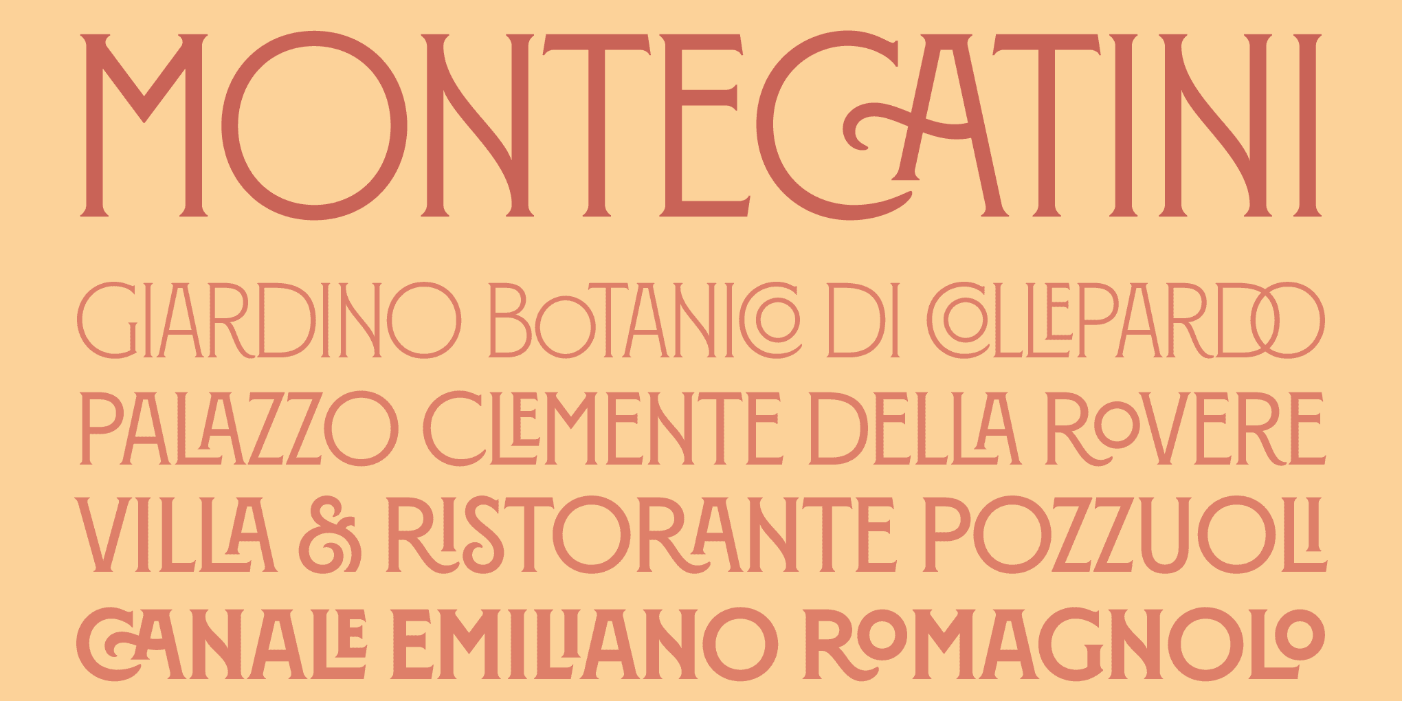
Montecatini Pro
Normale
Starting at $35
BuyMontecatini
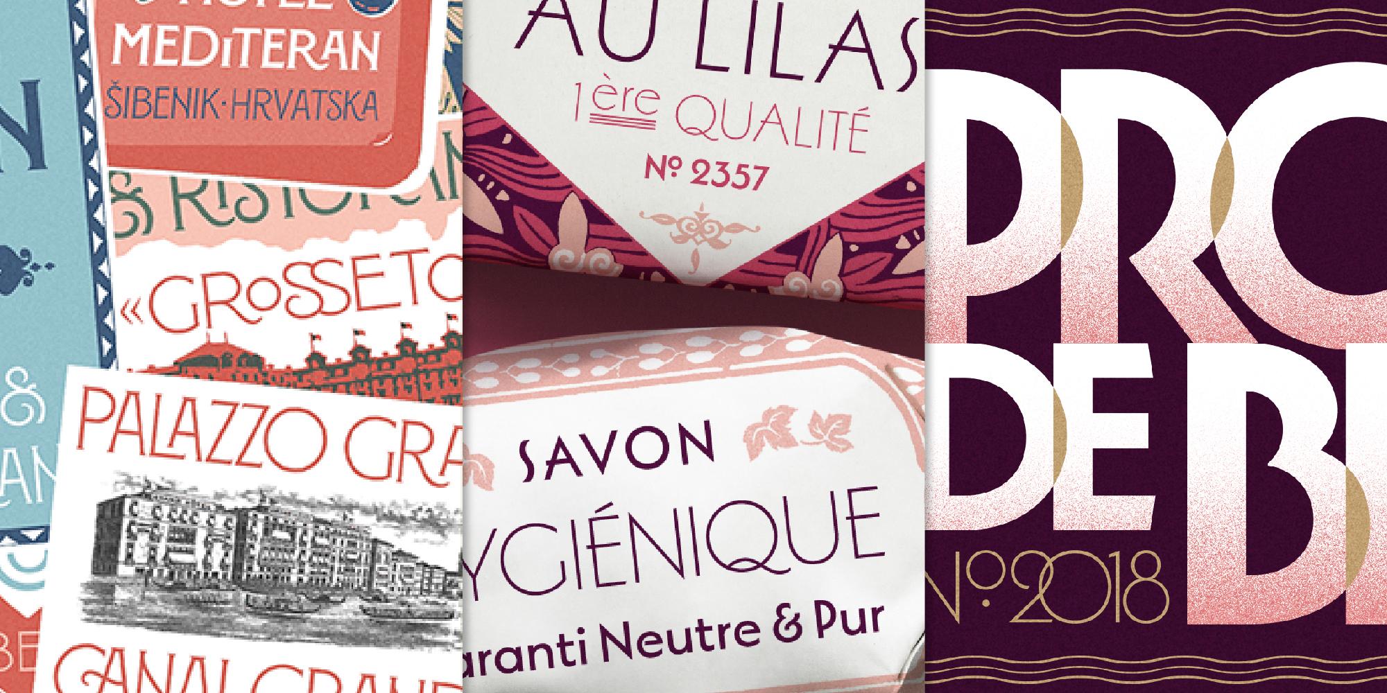
Montecatini takes its cues from the elegant Stile Liberty travel posters of Italy in the early 1900s. The 24-style family spans six weights and four widths to create a vibrant typographic system. Typical of the Art Nouveau movement, Montecatini’s distinctive ligatures provide flair while its widths and weight allow for dynamic copyfitting.
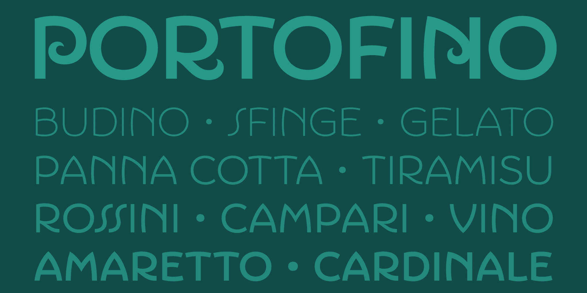
Portofino
Influenced by Italian hand-lettered posters from the early twentieth century, Portofino is a charming display typeface with expressive forms complementing its underlying geometric proportions.
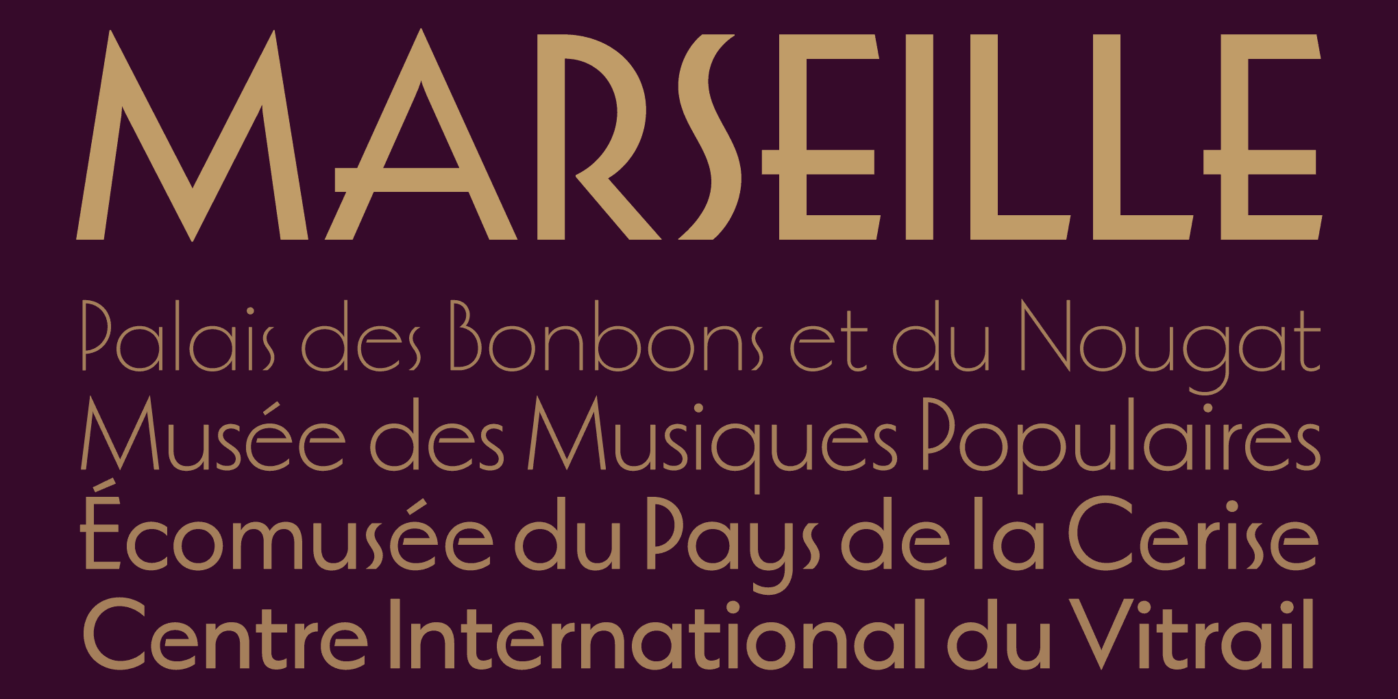
Marseille
An Art Deco-inspired typeface based on Louise Fili’s iconic cover design for The Lover, Marseille is available in six irresistible weights. The adjustable crossbar heights and overshoots, along with a combination of OpenType features, allow Marseille to take on a variety of expressions while remaining timelessly elegant.
Montecatini, Portofino, and Marseille can be licensed for print, web, mobile apps, and ePubs. Webfonts may be tested for thirty days, and desktop trials are available upon request. Have a licensing question? Check out our support page or get in touch.