Loading...
Please wait while we load the content.
Please wait while we load the content.

Decades in the making, the story behind Tony Di Spigna’s new release is as interesting as the face itself:
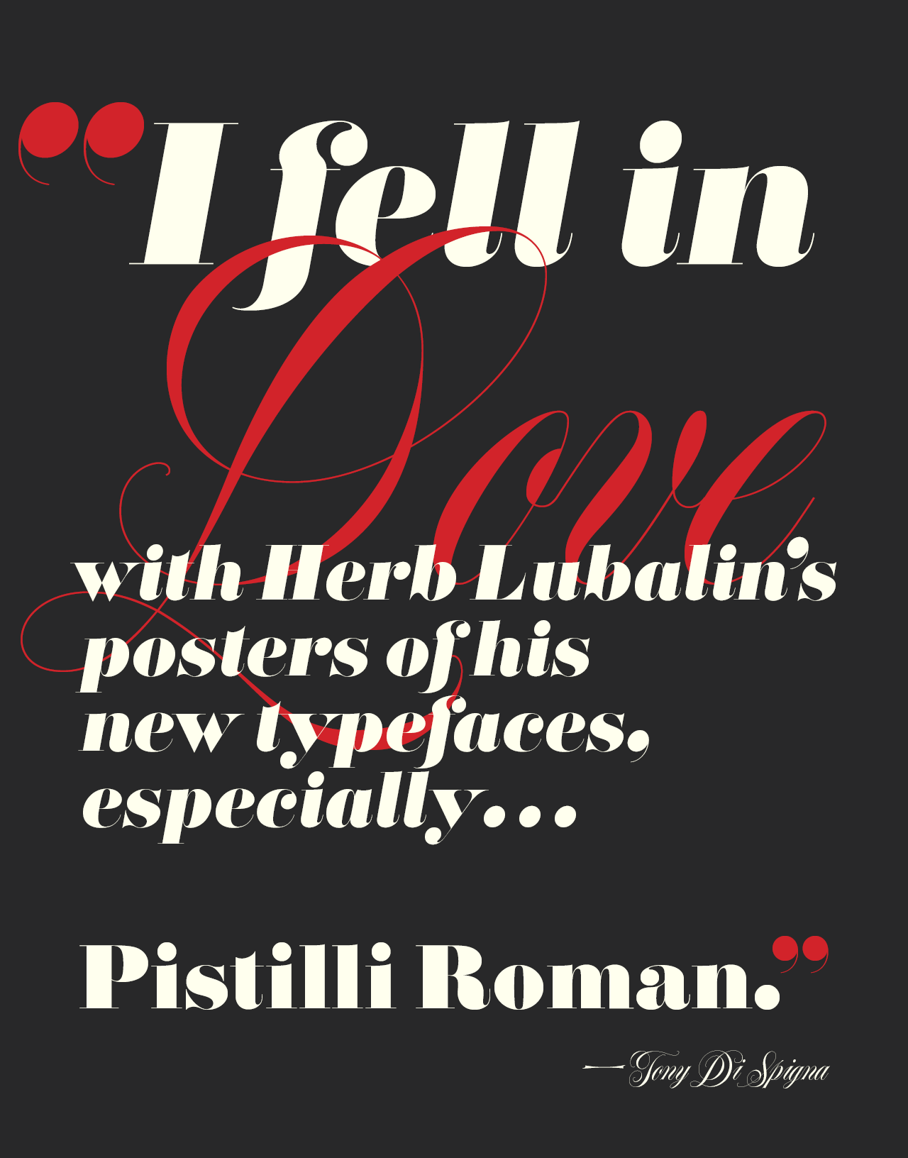
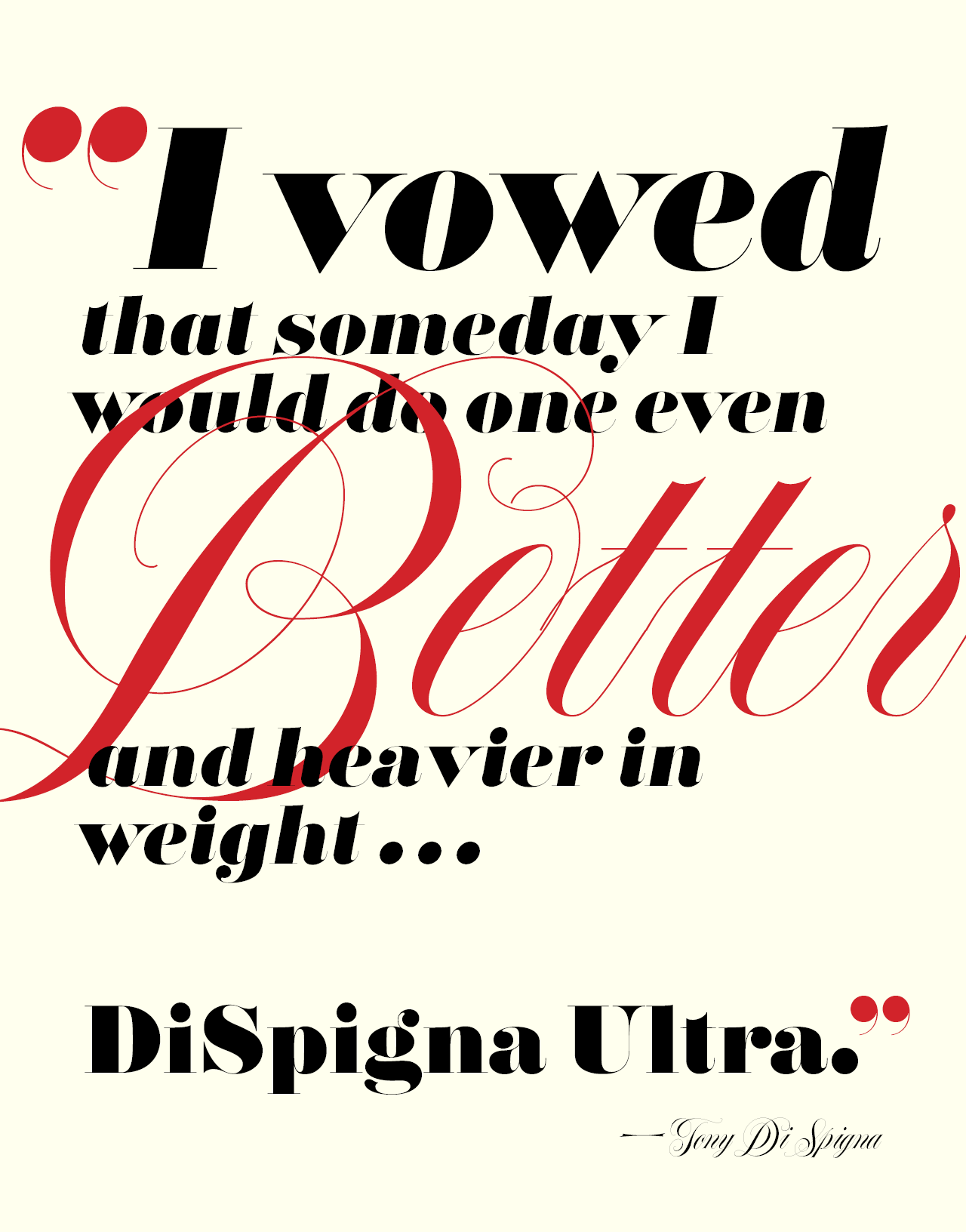
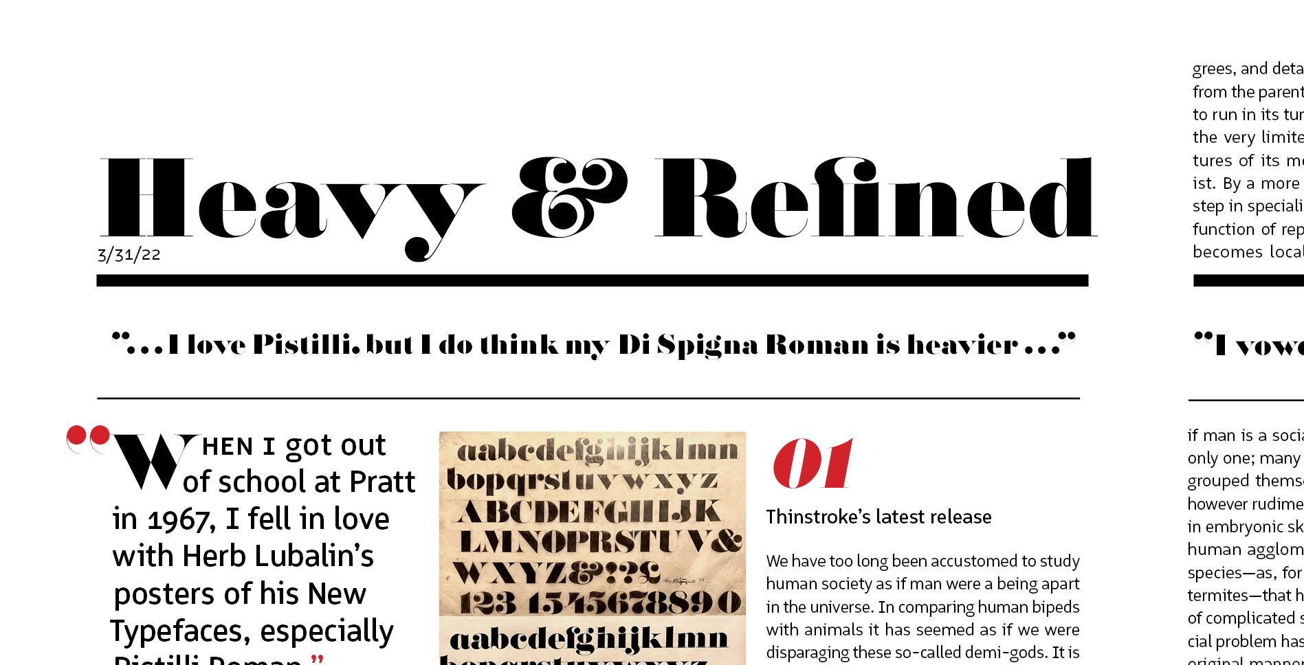
When I got out of school at Pratt in 1967, I fell in love with Herb Lubalin’s posters of his new typefaces, especially Pistilli Roman. (See page 34 of the Herb Lubalin book by Alan Peckolick.) I vowed that someday I would do one even better and heavier in weight. So, in 1969, I designed DiSpigna Roman in pencil on tracing paper, and executed it on heavy stock bond paper with the traditional ink and white clean up paint–the way we did all executions of letterform and typefaces back then. It became one of the first faces we digitized when we created Thinstroke. This typeface harkens directly back to 1969! I still love Pistilli, but I do think my DiSpigna Ultra is heavier with more luscious curves. —Tony Di Spigna

Unlike most fatfaces, DiSpigna Ultra keeps its appeal down to 24-point. The fine hairlines are elegant next to the “preposterous proportions” of the thick strokes. As Thinstroke partner Bill Hilson says, “you can go as big as a house, and it remains classy.”


For a straightforward pairing, Hilson recommends combining DiSpigna Ultra with “any Bodoni or Didot.” On the other hand, for a contrasted and complimentary approach, consider pairing it with a geometric sans like Dinamit, Zeitung, or Aspen.

Meticulously drawn on paper with pencil and ink, carefully converted to digital type, and painstakingly refined through Type Network’s quality assurance, DiSpigna Ultra is ready to be used in the 21st century.
Available in roman and italic, DiSpigna Ultra is available for desktop, web, app, and ePub licensing. Try a web license free for 30 days to test DiSpigna Ultra on your site today.