Thinking beyond the static
Bas Jacobs of Underware speaks with us about how the dynamic possibilities of variable fonts have transformed everything about this foundry conceives of and designs their typefaces.
Type Network: What is the simplest explanation of variable fonts?
Bas Jacobs: A variable font is a font where each letter can transform into anything else.
TN: What's different for a type designer creating variable fonts?
BJ: To answer this question, I need to revisit the previous one. I’m worried that in a few years—or maybe we’re already there—that variable fonts will be commonly defined as fonts that change along weight and width axes. If you’re designing fonts already, then this isn’t much of a change. If you define it that way, then you do what you were already doing, just exporting in a new format.
I’m fighting against this definition. Once you open your mind to the other 99.9% of possibilities, variable fonts let you create anything. They make the SuperFont a possibility. Time can be an axis. We’ve shown this—even five years ago—how time and other dynamics can change type into animations without post-processing or heavy code.
As a type designer, when you start thinking of these possibilities, you can think beyond static letters on a page. Of course, everything you did before you can do now, but you can also do so much more. Sometimes a type designer might not have the time or resources to spend thinking about these possibilities, but when they can, the results are good for everyone.
TN: What's different for a graphic designer using variable fonts?
BJ: In the past, graphic designers have used static type to create static designs and dynamic designs. They’ve had the burden of animation all on themselves. With variable fonts, that dynamism can be a part of the font itself and be animated without much effort. It makes the designer’s job easier.
It also means that they can be better at their jobs. They have such fine control and so many more options, it both raises the standard for good design and adds responsibility to achieve it.
TN: Who are or were some of your biggest influences in thinking about VF?
BJ: Rather than listing the type designers who have influenced me—and there are many—I’d like to share the story of the Dynabook by Alan Kay, the man who predicted tablets back in 1968. He had described this portable, interactive world that would be magazine- or book-sized that you could carry around. He described how much you, especially children, could achieve with a tablet.
Then tablet computers came out and when people asked him if his dream had been realized, he said not even close. They were still so far away from the potential of tablets. Even the iPad doesn’t fulfill his expectations.
This kind of dreaming—thinking far into the future and its possibilities—that inspires and influences me.
TN: How has the technology changed your process overall?
BJ: It changed everything. Everything. There isn’t any part of our process that doesn’t factor in variable fonts. We’re talking about the future of design and typography, or what comes after; we aren’t so much talking about individual fonts. It might sound silly, but when we’re working on something new like Plakato, we’re genuinely trying to push the boundaries and offer others new ways to express themselves through text. So, for us technology is not about engineering, but about exploration.
TN: You've mentioned and you’re known for your irregular VF axes—what do you think of that?
BJ: There’s an assumption built into that question. You see it? There are no regular or irregular axes. Common ones, yes, but the idea that we should fit today’s technology to yesterday’s thinking is misguided.
Our axes are just as valid as weight and width, and since they allow for new possibilities, they’re more in-line with the spirit of the variable font technology itself.
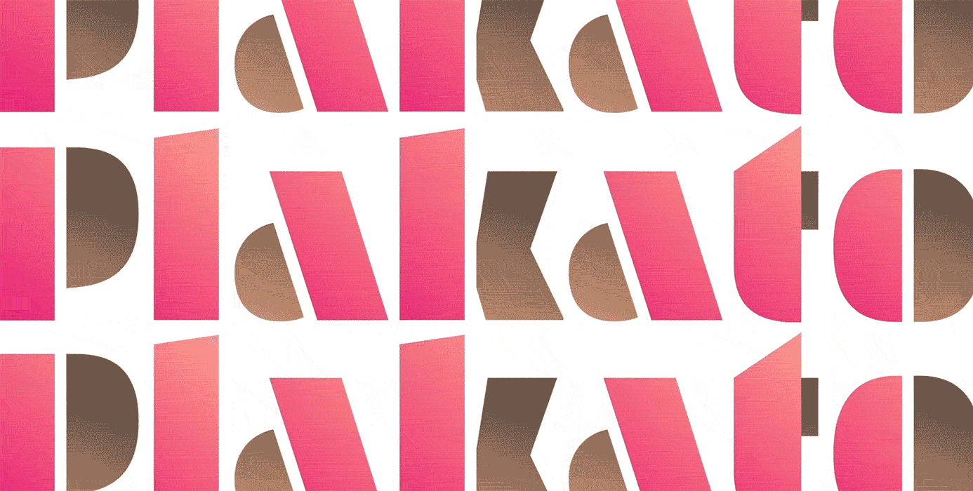
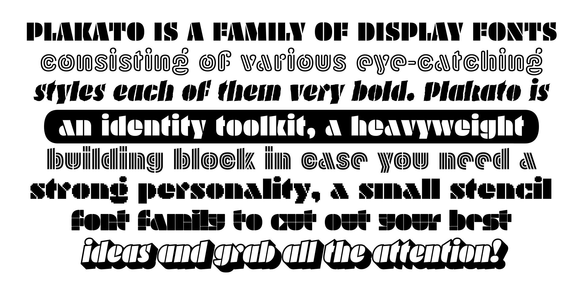
TN: Your latest release, Plakato, has eight VF, each of which has different axes: How did you decide on them and when did you know you had enough?
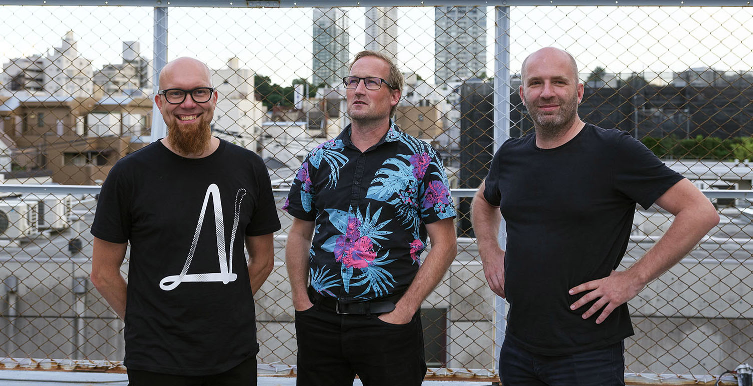
BJ: Working on a team of three makes it possible. I wouldn’t be able to accomplish half as much if I were on my own. So, while someone might appreciate what we do, I always find it more impressive when someone like DJR does just as much—but does it alone.
With our team, I always want to keep the engine running; Akiem [Helmling] always comes up with another perspective; and then Sami [Kortemäki] pauses for a moment and then comes out with a different sketch or idea. Then together there’s the cocktail of these elements. The whole is greater than the sum of its parts. We’re all designing, we’re all adding ideas and challenging each other.
With Plakato, by choosing to create a display family, we really had so many options as a team. We also wanted it to demonstrate everything we’ve been thinking about and talking about with dynamics and motion. When someone gets a license, they should be able to build a brand with it. As identities often contain motion by default today, it can be valuable if the dynamics are already designed and included in the font.
Of course, we could have created more ideas, more axes and more fonts, but eventually you have to release something, and we’re pleased to be releasing Plakato.
TN: You’ve mentioned the SuperFont; what is that?
BJ: Are you familiar with The Library of Babel by Jorge Luis Borges? It’s an imaginary library with an extremely large number of books, containing every possible letter combination. It starts “a a a a a a….” then “b a a a a a…” and so on. Eventually you have every possible book in every possible language. Most of it is junk, but then among the shelves you find the works of Shakespeare, Whitman, Dostoevsky, and so on. You also have every future book that hasn’t been written. Every great text that ever existed or ever will exist.
That’s the SuperFont. It’s every font that can ever exist. It’s Helvetica and Garamond, Plakato and Univers. But it also includes every font that hasn’t been articulated yet.
TN: With that in mind, do you view your job now as more of a discoverer than a designer?
BJ: Within the perspective of the SuperFont, typefaces are no longer new or original in the sense that they exist because of the efforts of a creator. A type designer articulates an idea or a form that already existed theoretically, even if no one had thought of it yet. A type designer needs to discover the right location within that universe.
There’s an entire universe of type (within a Variable Font), we just need the tools to explore it. And even though some of the novelty of new typefaces is reduced with the SuperFont idea, it’s still exciting to be a part of the exploration.
TN: In this “universe” of type, you and the team at Underware might not have left our solar system, but perhaps you’ve made it farther than most. How far are you and how far can you go?
BJ: We are still building our spaceship. We still need to get off the ground and get out there! There are others with spaceships, too—and of course the metaphor breaks down eventually—but we can’t wait to launch.
TN: If a graphic or web designer doesn't know about VF, what advice would you give them?
BJ: Be curious. If you’re curious, you’ll stay updated on the technology and typefaces and the possibilities they create; you’ll be able to create new and interesting designs. If you aren’t curious, then you’re probably happy with what you’re making now, and that’s perfectly fine, too.
To learn more about variable fonts, subscribe to the Type Network Newsletter, where we’ll be sharing interviews, case studies and tutorials explaining everything designers should know about variable fonts.