The Adobe Originals, now available at Type Network. · Type Network
The Adobe Originals, now available at Type Network.
For the first time, a storied library of classics and modern, original designs is available for extended licensing—only at Type Network.
Dating back to 1989, Adobe Originals started as an in-house type foundry for Adobe first led by Sumner Stone with a number of experienced designers joining later, including Carol Twombly and Robert Slimbach. The group was initially tasked with expanding the PostScript library but their responsibilities eventually grew to include developing original designs as the desktop publishing industry started to boom.
Around the time the team started developing original type designs, Stone founded the Adobe Type Advisory Board to help communicate the needs of the greater design industry, give feedback, and share ideas. The goal of the group was to elevate the reputation of Adobe as a leading foundry in the industry as they are still known today. Over 30 years later, the need for high quality digital fonts remains and today we are excited to welcome the Adobe Originals library to Type Network.
Although these typefaces have been available from other distributors and in the Adobe Fonts catalogue, our partnership with Adobe marks the first time that this iconic library is available for extended and enterprise licensing not offered on these other platforms. So whether you need to embed Acumin in your mobile app, host Minion on your website, share Garamond across your company, or simply don’t know where to start, we’re here to help. The first set of releases includes library staples like Adobe Caslon, Adobe Garamond, Trajan, Kepler, and many others.
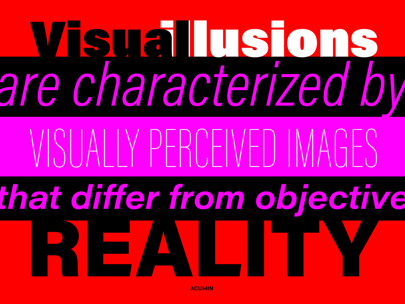
Acumin is a versatile sans serif intended for a balanced and rational quality. Solidly neo-grotesque, it not only performs beautifully at display sizes, but also maintains an exceptional degree of sensitivity for text sizes. Designed by Robert Slimbach
For her Caslon revival, designer Carol Twombly studied specimen pages printed by William Caslon between 1734 and 1770. Adobe Caslon Pro is the right choice for magazines, journals, book publishing, and corporate communications. Designed by Carol Twombly
An Adobe Originals design and Adobe’s first historical revival, Adobe Garamond is a digital interpretation of the Roman types of Claude Garamond and the Italic types of Robert Granjon. Since its release in 1989, Adobe Garamond has become a staple throughout the worlds of typography and graphic design. Adobe type designer Robert Slimbach captured the beauty and balance of the original Garamond typefaces while creating a family that offers all the advantages of a contemporary digital type. Designed by Robert Slimbach
Garamond Premier had its genesis in 1988 when Adobe Principal Designer Robert Slimbach visited the Plantin-Moretus Museum in Antwerp, Belgium to study their collection of Claude Garamond’s metal punches and type designs. While fine-tuning Adobe Garamond, Slimbach started planning an entirely new interpretation of Garamond’s designs based on the large range of unique sizes he had seen at the Plantin-Moretus and on the comparable italics cut by Robert Granjon, Garamond’s contemporary. By modeling Garamond Premier Pro on these hand-cut type sizes, Slimbach retained the varied optical size characteristics and freshness of the original designs while creating a practical 21st-century typeface. Garamond Premier Pro contains an extensive glyph complement, including central European, Cyrillic and Greek characters, and is offered in five weights ranging from light to bold. Designed by Robert Slimbach
Minion is a 1990 Adobe Originals typeface by Robert Slimbach. Minion is inspired by classical, old style typefaces of the late Renaissance, a period of elegant, beautiful, and highly readable type designs. Created primarily for text settings, Minion combines the aesthetic and functional qualities that make text type highly readable with the versatility of digital technology. Designed by Robert Slimbach
An Adobe Originals design first released in 1992, Myriad has become popular for both text and display composition. Myriad Pro expands this sans serif family to include the Greek and Cyrillic alphabets, as well as adding oldstyle figures and improving support for Latin-based languages. The full Myriad Pro family includes condensed, normal, and extended widths in a full range of weights. Designed by Robert Slimbach and Carol Twombly with help from Fred Brady and Christopher Slye, Myriad has a warmth and readability that result from the humanistic treatment of letter proportions and design detail. Designed by Carol Twombly and Robert Slimbach
Named for the classical mathematician, Thomas Phinney’s Hypatia Sans is a geometric sans serif with humanist undertones. Hypatia echoes the basic form of geometric designs from the 1920s and 30s and adds features derived from classical oldstyle typefaces and inscriptional lettering that give the design a balance between cold geometry and warm organic form. The letters are expressive at larger sizes but are still clear and readable at text sizes in short paragraphs. A wide range of weights increases the family’s versatility and its many alternate glyphs and layout features provide a palette of expressive options. Designed by Thomas W. Phinney, Robert Slimbach and Paul Hunt
Since its initial release in 1989, Trajan has risen to international popularity as a distinctive and versatile display family. Carol Twombly’s sensitive interpretation of the Roman capitals inscribed at the base of Trajan’s column in Rome serves as a testament to her skills as a designer and to the craftsmanship of the ancient lettering artists who devised these elegant and enduring letterforms. Robert Slimbach added Greek and Cyrillic as well as four new weights. The extended family provides users with a range of six weights that vary in personality and function. Alongside this extension, Slimbach also created Trajan Sans, which offers users a contemporary and stylish variation of the original seriffed design. Designed by Carol Twombly and Robert Slimbach
Utopia is an Adobe Originals text face designed by Robert Slimbach in 1989. It combines the vertical stress and pronounced stroke contrast of eighteenth-century transitional typefaces like Baskerville and Walbaum with contemporary innovations in character shapes and stroke details. Utopia offers a flexible family of fonts that is excellent for a range of applications from corporate communications and advertising to book and newspaper publishing. Designed by Robert Slimbach
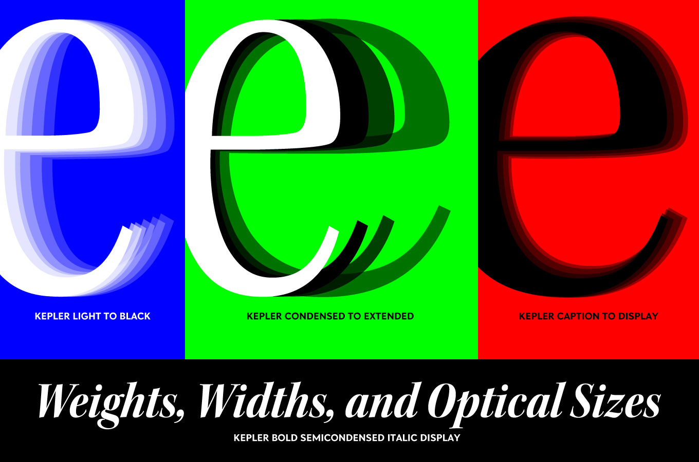
Named after the German Renaissance astronomer, Kepler is a contemporary type family created by Adobe type designer Robert Slimbach in the tradition of modern 18th-century typefaces. Traditionally, modern typefaces are known for their cool intellectual quality, but Slimbach’s Kepler captures the modern style in a humanist manner. It is elegant and refined with a hint of oldstyle proportion and calligraphic detailing that lends it warmth and energy. Designed by Robert Slimbach
Created by Adobe type designer Carol Twombly, Chaparral combines the legibility of slab serif designs popularized in the 19th century with the grace of 16th-century Roman book lettering. The result is a versatile, hybrid slab-serif design, a unique addition to the Adobe Originals family of typefaces. Unlike “geometric” slab serif designs, Chaparral has varying letter proportions that give it an accessible and friendly appearance in all weights from light to bold. Like the drought-resistant brush that blooms on the arid coastal range near Twombly’s California home, Chaparral’s highly functional design is surprisingly beautiful. Designed by Carol Twombly
Adobe Handwriting is a trio of fonts based on the handwriting of some of Adobe’s own designers. The three eponymous styles of the family — Ernie, Frank, and Tiffany — each has a unique flavor with its own rhythm and character. These fonts were originally created in 2012 so Acrobat users could sign documents electronically, but they were capable of so much more. Designed by Ernest March, Frank Grießhammer, and Tiffany Wardle de Sousa
The complete library of Adobe Originals will soon be available at Type Network, but if you have a specific request, please get in touch.
All Adobe Originals fonts are available for desktop, web, mobile applications, and ePub licensing. Have a special licensing request or other questions? Please contact us. Webfonts may be tested free for thirty days; desktop trials are available upon request. To keep current with Adobe Originals and other foundry partners, subscribe to Type Network News, our occasional email newsletter featuring font releases, foundry happenings, type and design events, and more.