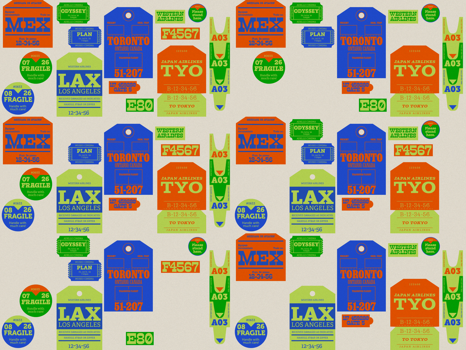
Featuring: Adelle · TypeTogether, Museo Slab · exljbris, Mortise · Signal Type Foundry, Job Clarendon · DJR, Cagney · The Northern Block, R41 Popera · R41
Six slab serifs with real backbone
Some letterforms never wear out, and the slab serif is one of ours. The style runs from delicate to industrial, so this fresh collection runs the route: Bookish slabs built for reading, bracketed classics with poster-scale charisma, and one wood type bruiser to close the show.
Slab serifs refuse to whisper. Born in the early 19th century as the obvious* next step after the “fat face” extra-bold moderns, the “antiques,” as the Brits first called them, were quickly adapted for advertising. They put weight on the baseline and confidence in the room. But heft doesn’t always mean a lack of subtlety. The best slabs read beautifully at text sizes, warm up a brand without softening it, and know how to raise their voice when the page design calls for it.
Adelle
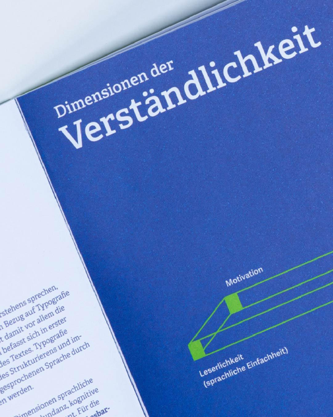
Made for intensive editorial use.
Veronika Burian and José Scaglione designed Adelle for intensive editorial use, and newspapers and magazines have been leaning on it ever since. It reads like a text face and holds like a slab: sturdy serifs give body copy real grip on screens, while the heavier weights carry headlines without breaking character. If this list has a first hire, Adelle is it.
TypeTogether creates innovative and stylish solutions to the greatest problems in the professional typography market worldwide.
Museo Slab
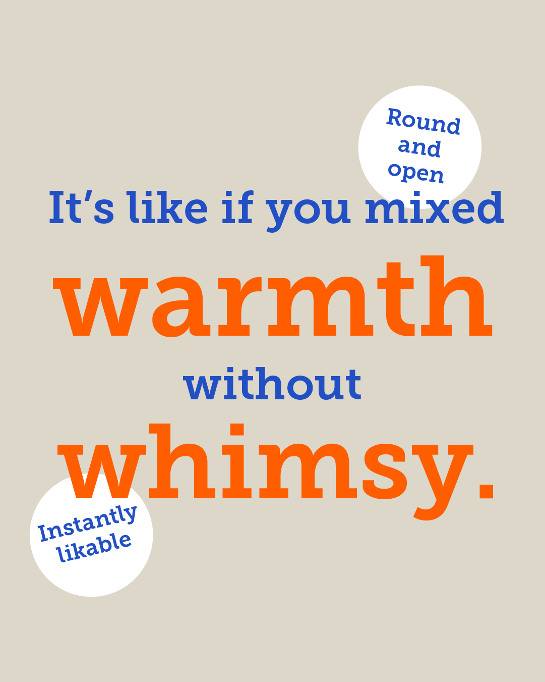
Warmth, without the whimsy.
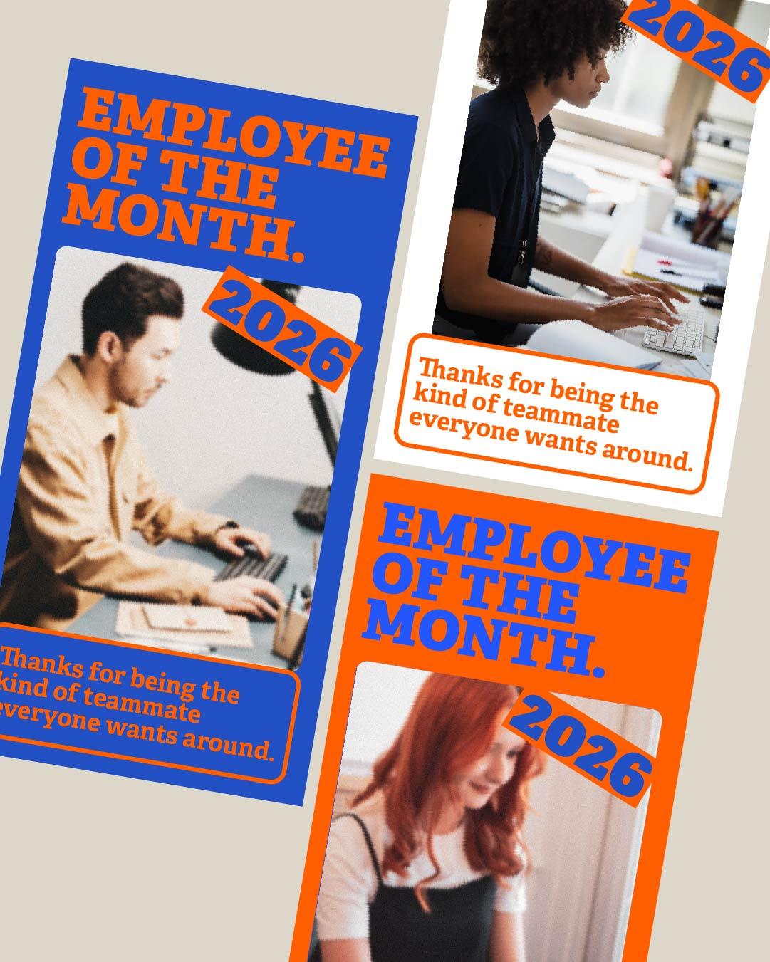
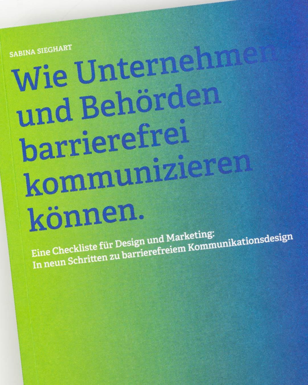
Jos Buivenga’s Museo charmed half the design world with its friendly geometry, and Museo Slab is that same charm with proper serifs underneath. Round, open, and instantly likable, it suits brands that want warmth without whimsy. A slab you could introduce to anyone.
exljbris offers well-crafted fonts by Jos Buivenga, based in Arnhem, the Netherlands.
Mortise
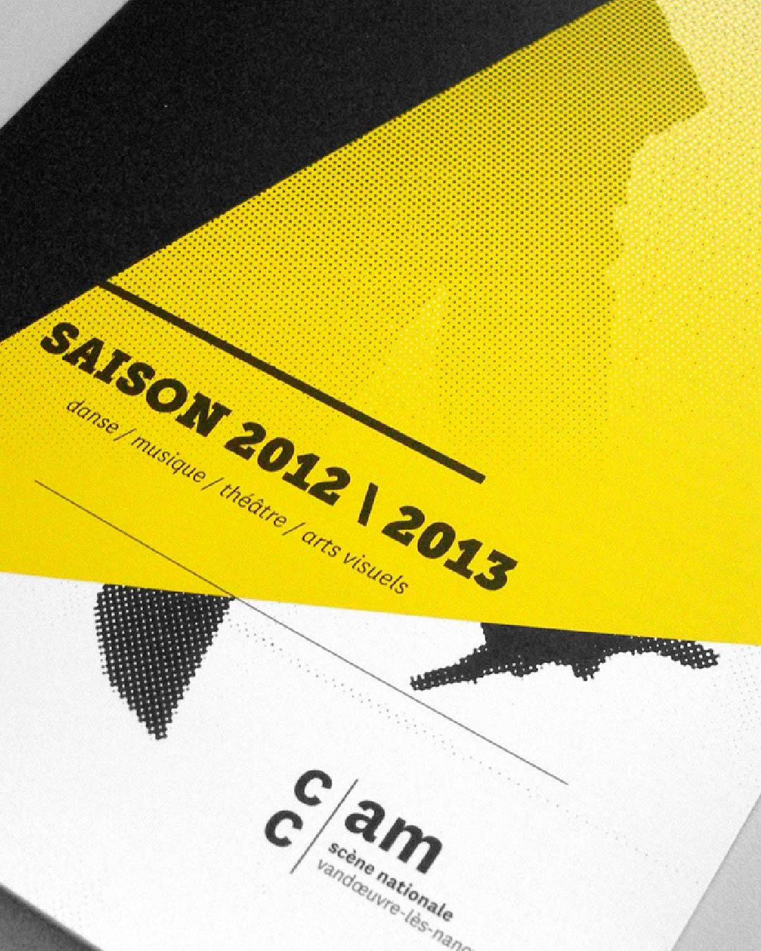
Readability with a little swagger.
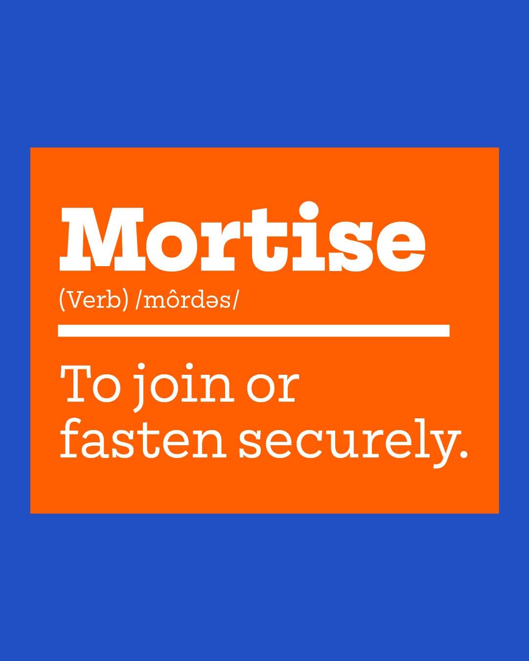
Mortise was drawn by an aspiring furniture-maker and a self-described ageing typographer—Seán Mongey and Max Phillips. The joinery in the name is no accident. Generous x-height, open counters, and monoline strokes keep it readable and practical, while long, slightly curved serifs lend what the foundry calls a raffish, mustache-twirling air. Six weights run from a neat X-Light to a rowdy X-Bold, with the sans companion Tenon waiting for when you want the serifs to come off.
Signal specializes in typefaces, logotypes, and typographic branding, drawing upon three decades of branding and print design experience.
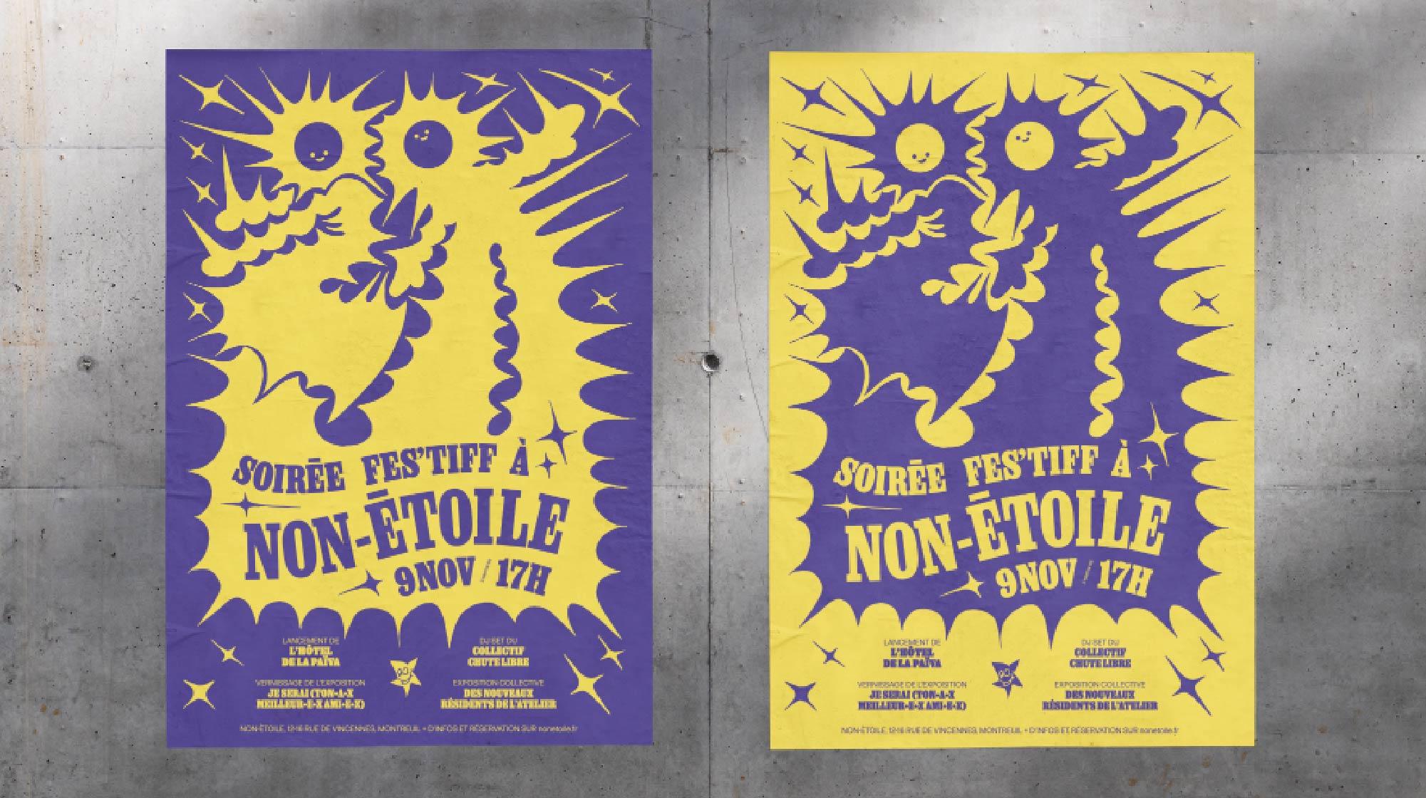
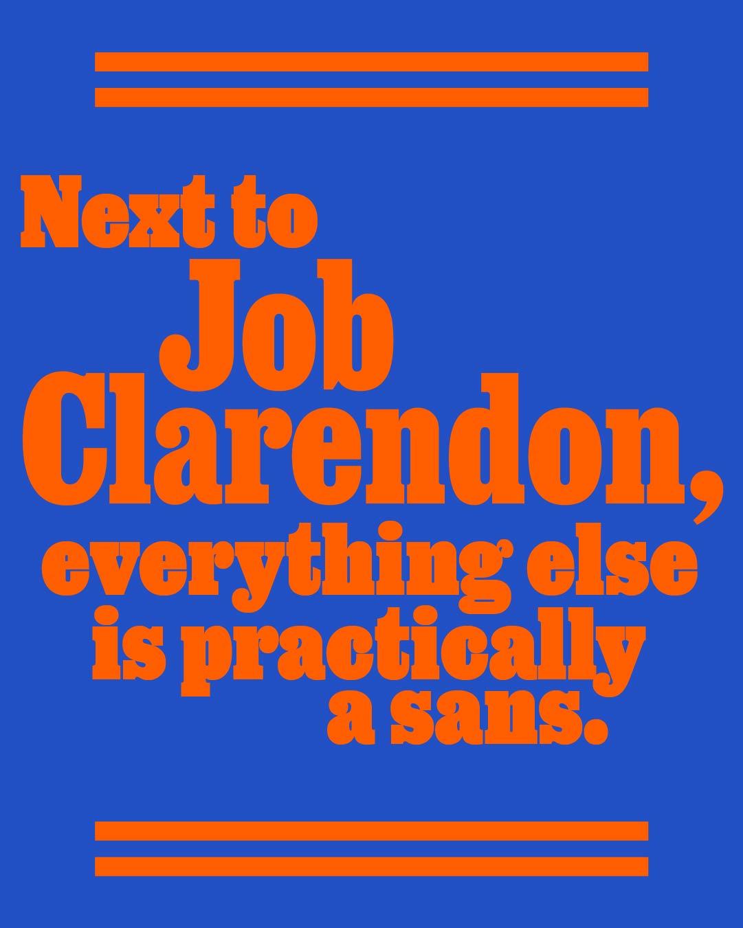
Job Clarendon in use for Soirée Fes’tiff à Non-Étoile posters.
Job Clarendon
A bracketed classic has entered the chat.
The bracketed classic, reborn. David Jonathan Ross and Bethany Heck went back to the Clarendons of later nineteenth-century job printing, the hardworking posters that had to sell a show by Saturday night. Condensed, punchy, and available in a sweeping range of weights with a variable font, Job Clarendon shouts with the good manners of 1885.

David Jonathan Ross draws letters of all shapes and sizes for custom and retail typeface designs.
Cagney
Prohibition Americana dipped in psychedelia.
The Northern Block describes Cagney as prohibition Americana dipped in psychedelia, and the drawing lives up to the billing. A modern grotesque slab with humanist flair and Egyptian boldness, it brings seven weights with italics and more than nine hundred characters per style.

Founded in 2006 by Jonathan Hill, The Northern Block’s highly skilled global team has designed an extensive collection of award-winning typefaces.
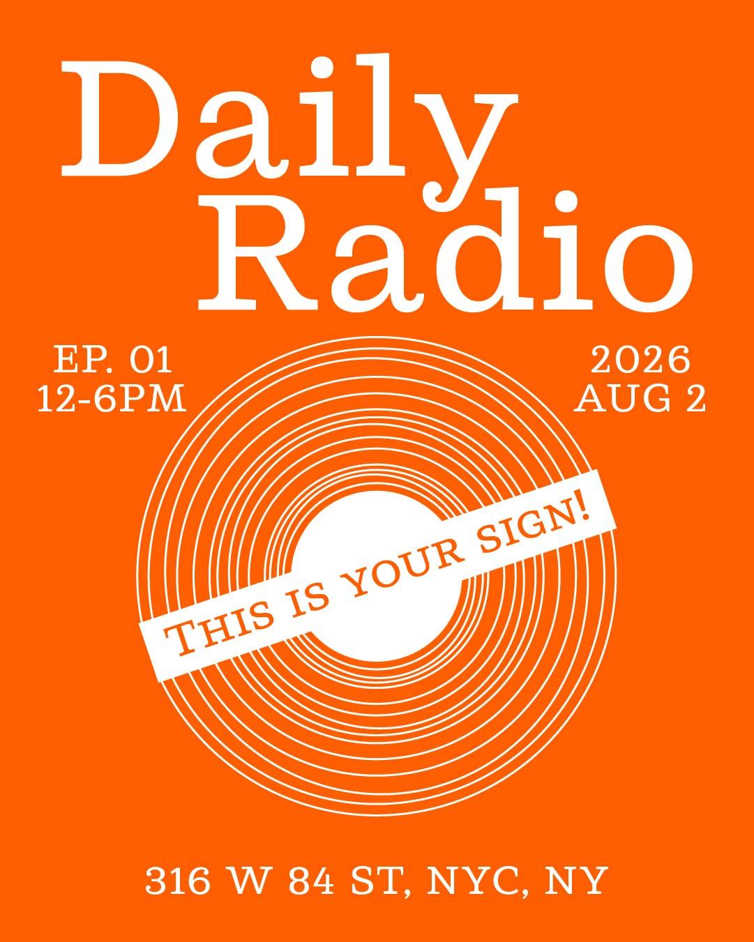
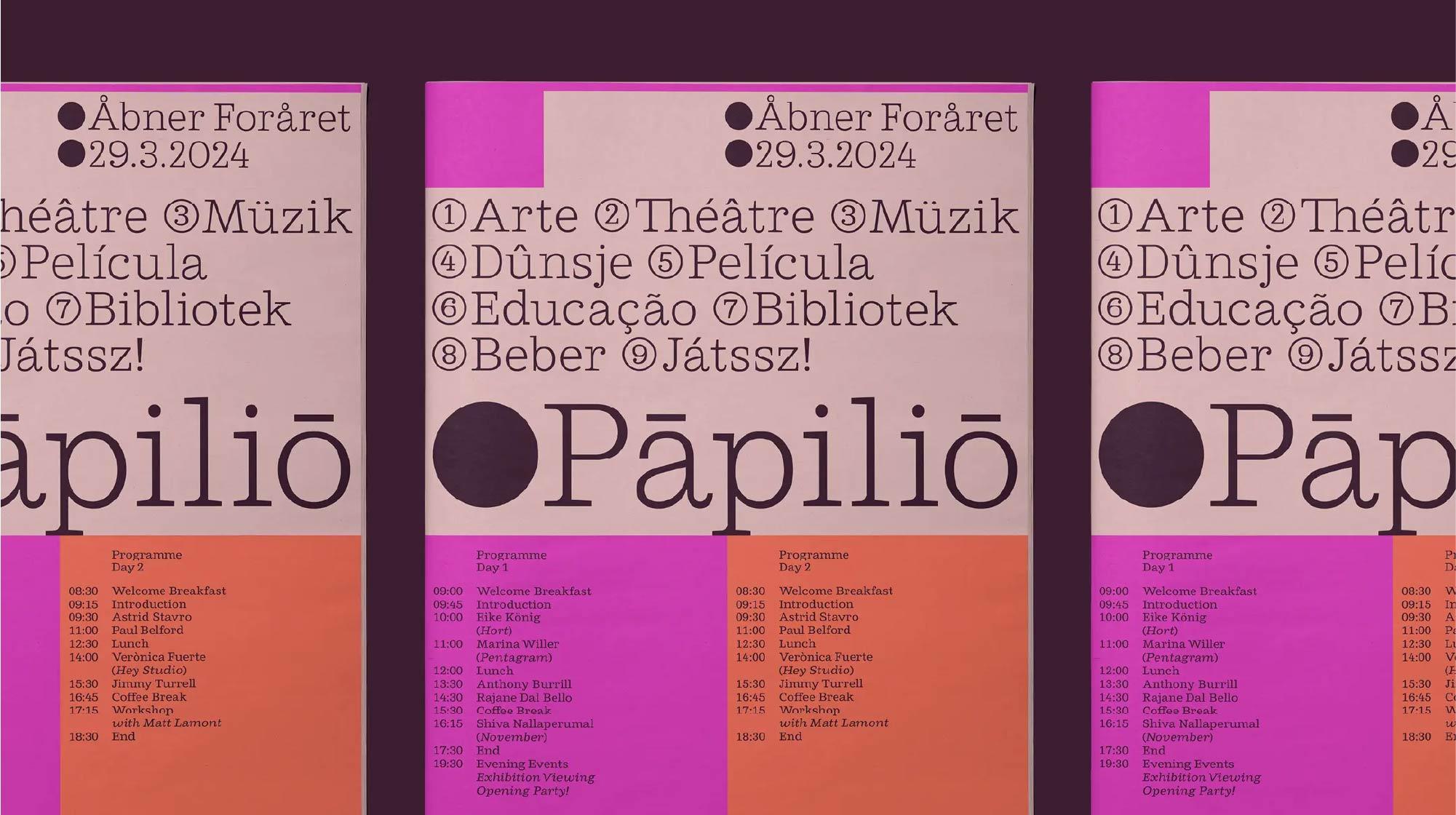
Cagney in use for print design.
R41 Popera
A charming touch of topsy-turvy.
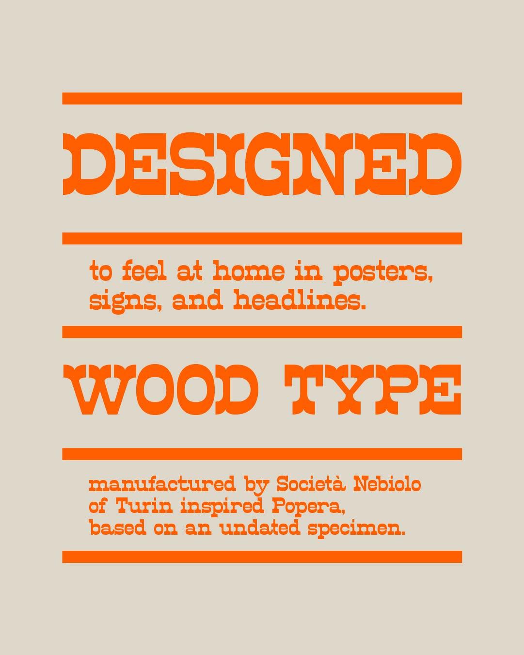
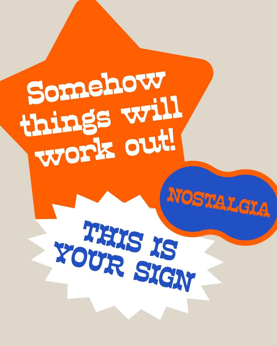
And now, the showstopper. Popera revives a display face from by Società Nebiolo of Turin—all wide, squarish shapes and heavy slab serifs with soft, rounded junctions, its horizontals decidedly thicker than its verticals for a charming touch of topsy-turvy. Lively contextual alternates keep settings fresh, and the all-caps Ornato cut, with its bifurcated serifs, arrives fully dressed for the occasion. Every slab list should end with a little Italian opera.
All the most iconic fonts from the legendary Nebiolo Foundry in Turin, designed by Aldo Novarese, digitized and authentic.
Five of these faces clock in quietly and carry the day. The sixth takes a bow. Either way, backbone comes standard. Meet them all, and the foundries behind them, at
store.typenetwork.com
.
*The first slabs were introduced in 1815 by Vincent Figgins, the London type founder, under the name “Antique.”