Sign Painters review
Dyana Weissman reviews the movie Sign Painters, with its mix of history, personalities, and remarkable lettering.
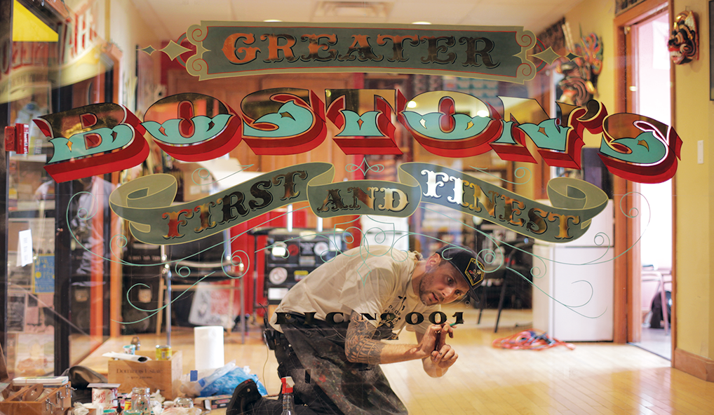 As far as type and lettering related movies go, I found myself enjoying Sign Painters most of all. Right about the time I started to feel like the movie had gone on long enough, it ended. Perhaps I enjoyed it more because I know less about sign painting than I do about Helvetica.
I was worried, initially; the opening sequence seemed to drag a bit. But once the movie got going, it stayed on pace and kept me engaged. A nice balance was struck between providing historical information and shots of beautiful lettering. Several sign painters are interviewed, spanning a range of age and talent, from the self-taught to the traditionally apprenticed and masters.
In our industry, we all know that John Downer, who bridges both fields of sign painting and typeface design, is a spirited, outspoken character. But his time onscreen is mostly limited to explaining the difference between a font and lettering; an important distinction I was grateful to see included, and appropriate, considering his fervor for categorization.
Knowing him offscreen made me question why the vivid personalities of the interviewees aren’t put more on display. The eccentricity of Ernie Gosnell is uncontainable in his interview. At the Q&A after the Portland TypeCon screening, we were all treated to the wit and wisdom of Mike Meyer. It's clear that this a group of outstanding people.
But the movie chooses to focus instead on sign painting as a whole. Which really is the only way to do it, when you think about it. Those of us obsessed with letters can get drawn into the details, but we have to remember to look at the big picture. As we learned from the film, “it’s only a f---ing sign.”
Update: The film is now available at signpaintersfilm.com. You can get $1 off of streaming and downloads with this ironic code: typography.
As far as type and lettering related movies go, I found myself enjoying Sign Painters most of all. Right about the time I started to feel like the movie had gone on long enough, it ended. Perhaps I enjoyed it more because I know less about sign painting than I do about Helvetica.
I was worried, initially; the opening sequence seemed to drag a bit. But once the movie got going, it stayed on pace and kept me engaged. A nice balance was struck between providing historical information and shots of beautiful lettering. Several sign painters are interviewed, spanning a range of age and talent, from the self-taught to the traditionally apprenticed and masters.
In our industry, we all know that John Downer, who bridges both fields of sign painting and typeface design, is a spirited, outspoken character. But his time onscreen is mostly limited to explaining the difference between a font and lettering; an important distinction I was grateful to see included, and appropriate, considering his fervor for categorization.
Knowing him offscreen made me question why the vivid personalities of the interviewees aren’t put more on display. The eccentricity of Ernie Gosnell is uncontainable in his interview. At the Q&A after the Portland TypeCon screening, we were all treated to the wit and wisdom of Mike Meyer. It's clear that this a group of outstanding people.
But the movie chooses to focus instead on sign painting as a whole. Which really is the only way to do it, when you think about it. Those of us obsessed with letters can get drawn into the details, but we have to remember to look at the big picture. As we learned from the film, “it’s only a f---ing sign.”
Update: The film is now available at signpaintersfilm.com. You can get $1 off of streaming and downloads with this ironic code: typography.