Sergej Lebedev Joins Type Network
Sergej Lebedev joins Type Network with a stat that’s hard to top: his typeface Anta, a single style built for Google Fonts, has racked up around 208 million downloads. He just rebuilt it from scratch as Anta Pro, a full system of twelve static fonts, two variable fonts, and matching italics. In this interview, Lebedev talks about treating design and engineering as the same job rather than two separate ones, why he still owns every typeface he’s ever released, and what a genuinely systematic process looks like from the inside.

Lucas Czarnecki: If you can remember a specific moment, when and why did you become interested in type design?
Sergej Lebedev: I’ve always been drawn to letterforms and the wide range of expression they can convey. What fascinated me was that even small differences in shape, proportion, or rhythm could completely change the character of a text.
During my communication design studies at Trier University of Applied Sciences, this interest became more focused. I discovered type design as a discipline that combines visual intuition with systematic thinking and technical precision. That combination—and the ability to shape an entire typographic system from the ground up—ultimately led me to pursue it as a long-term direction.
LC: What's the story behind your first published typeface?
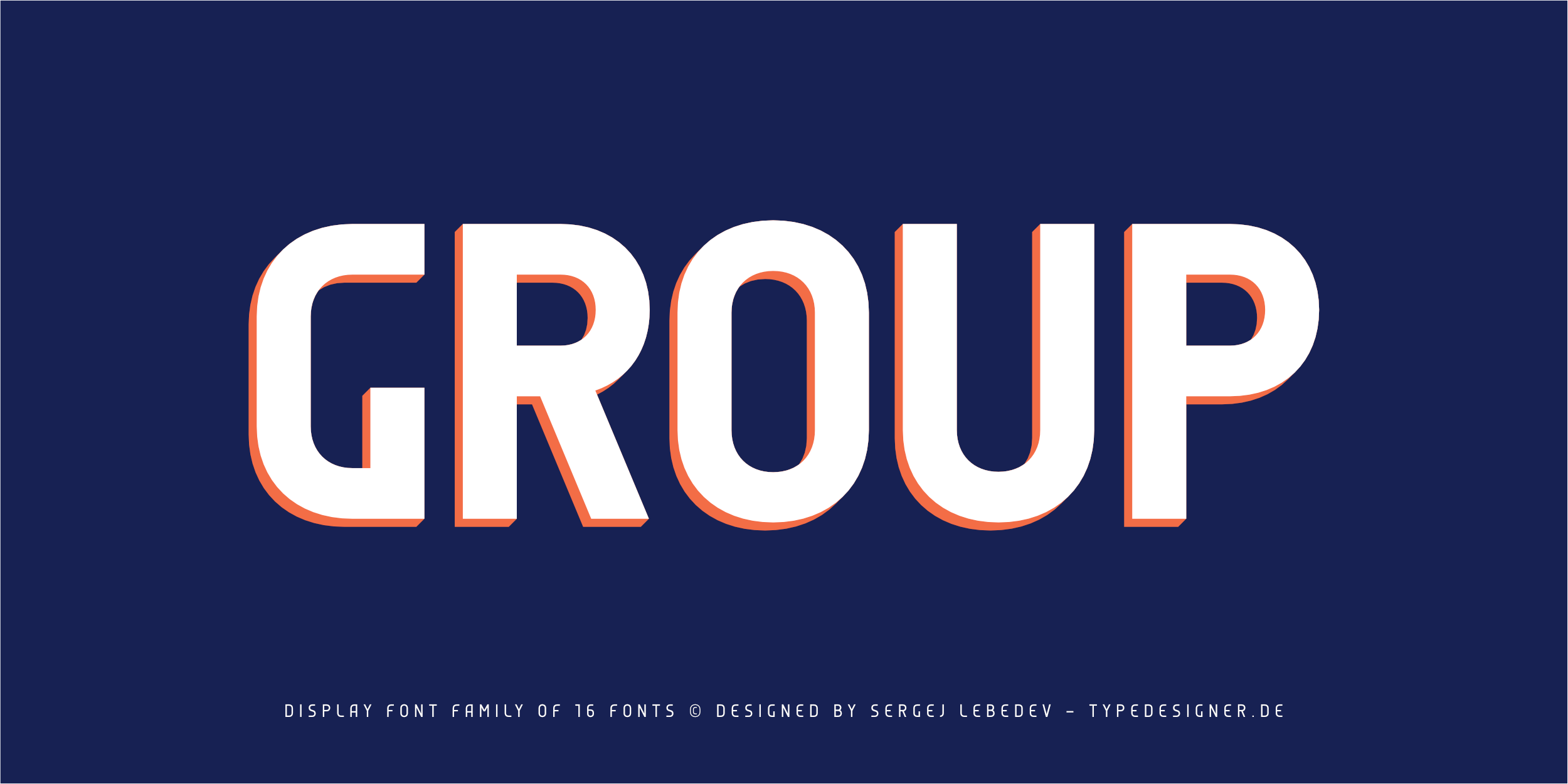
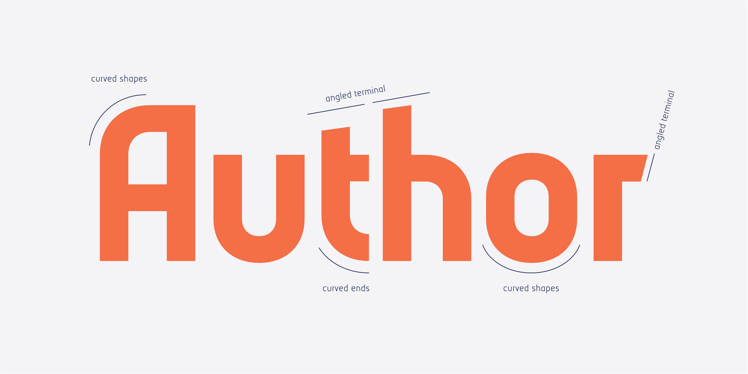
SL: Group was my first commercial typeface and originally appeared as Group Sans on Linotype.com more than a decade ago. The family features futuristic, modern letterforms with relatively narrow proportions, creating a distinctive and striking appearance.
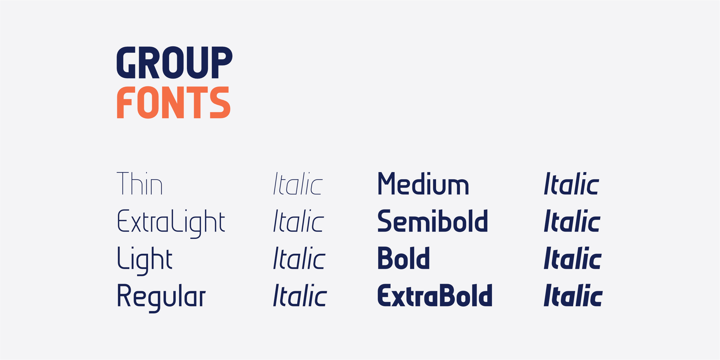
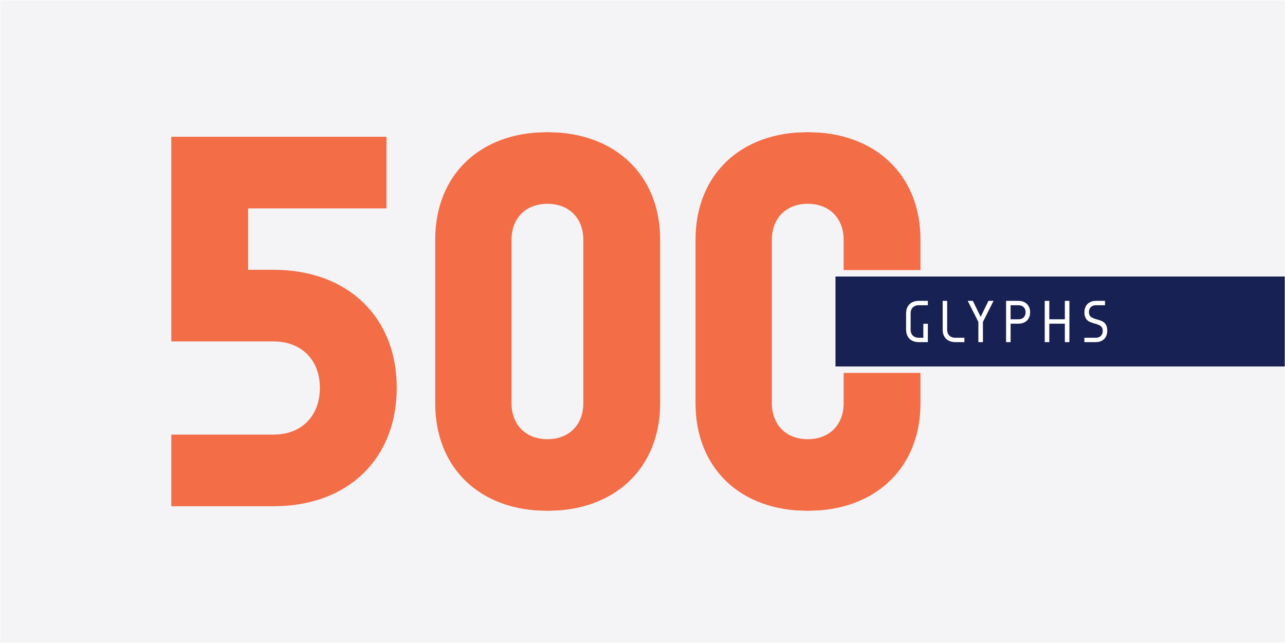
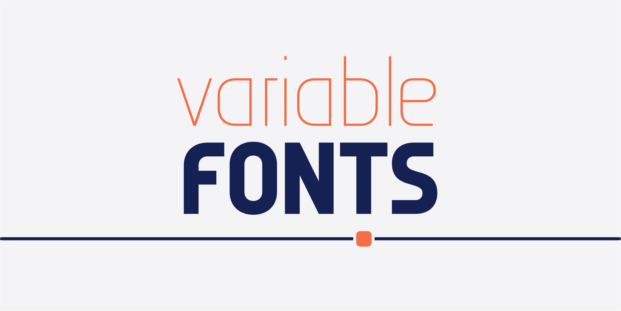
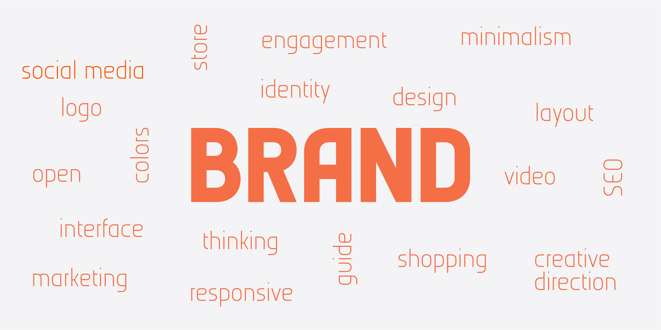
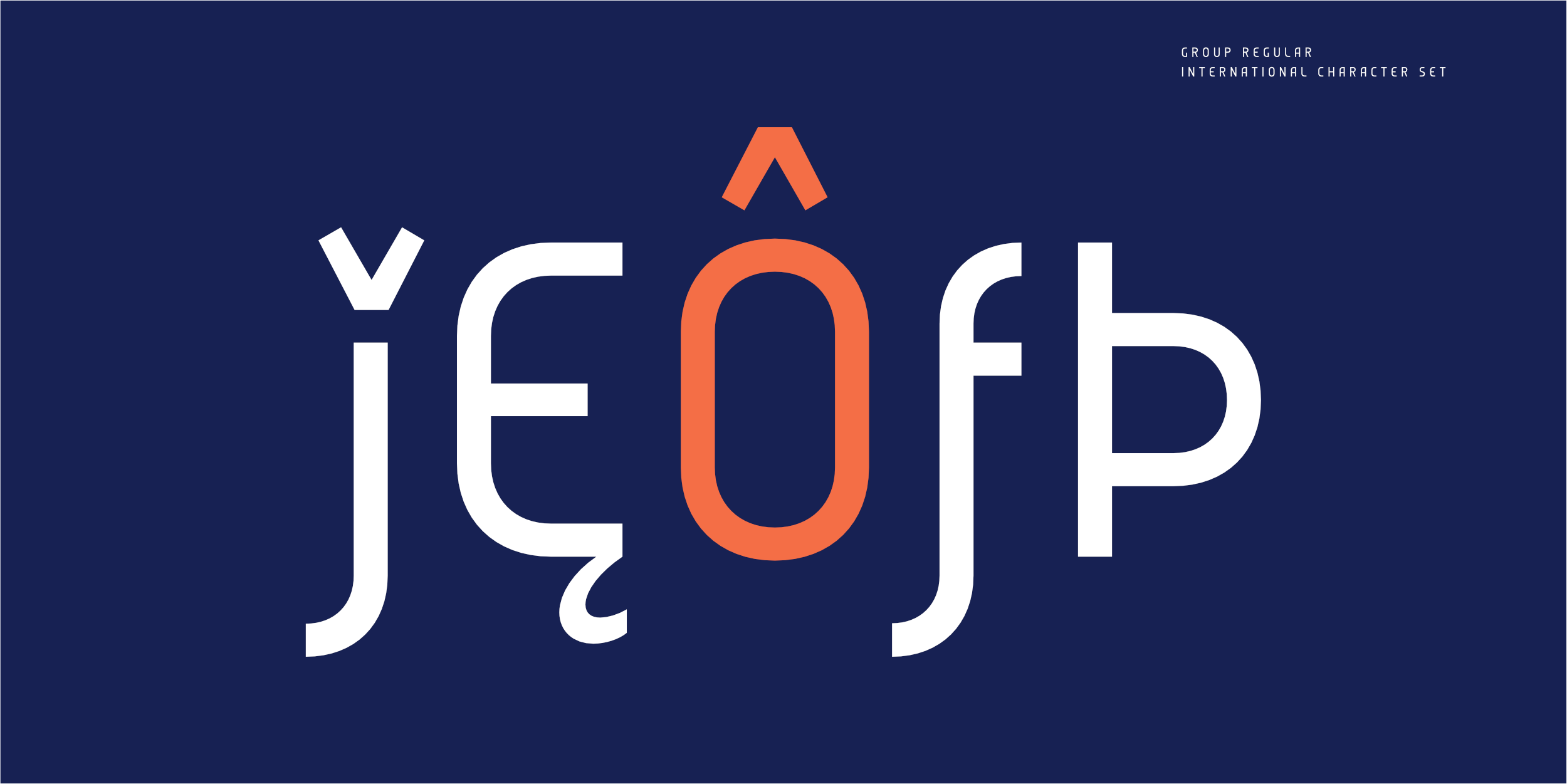
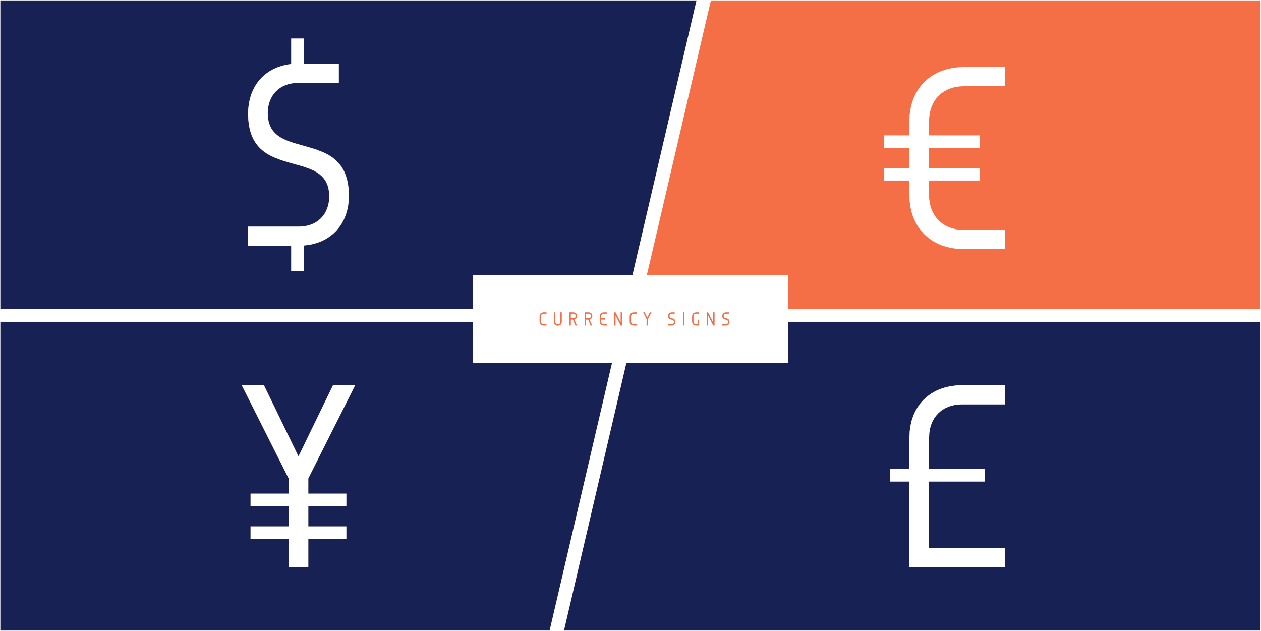
The final release comprises sixteen styles and two variable fonts. While the design is rooted in strict monolinear principles and geometric proportions, the primary goal was not stylistic expression alone, but rather achieving consistency, versatility, and optimal performance across the entire type system.
The complete Group family, including two variable fonts, is available through Type Network.

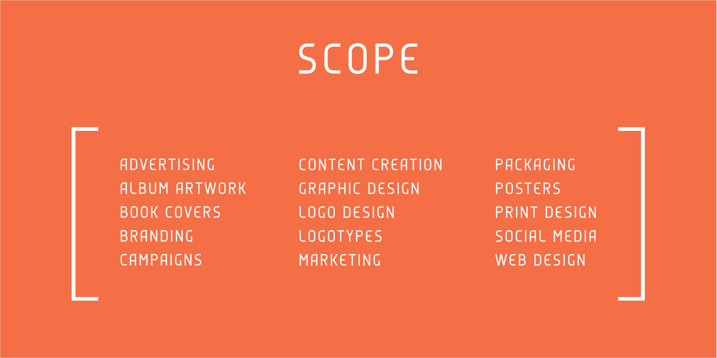

Sergej Lebedev is a German type designer with many years of professional experience in type design.
LC: You have a new release, Anta Pro; why have you chosen to make this pro version.
SL: The original Anta was designed as a single-style typeface for Google Fonts. Its wide distribution—around 208 million downloads—showed that the core idea works well across many different contexts.
However, real-world applications often require more than one style. Anta Pro grew out of the desire to develop the original concept into a complete professional type system. Rather than expanding the existing font, I approached it as a new project built on the same underlying idea. This allowed me to reconsider proportions, spacing, and structure from the ground up and create a type family that performs reliably across a wide range of design applications.
What began as a single display style evolved into a family that can support complete visual systems, from branding and editorial design to product and interface design.
LC: What is different about Anta Pro?
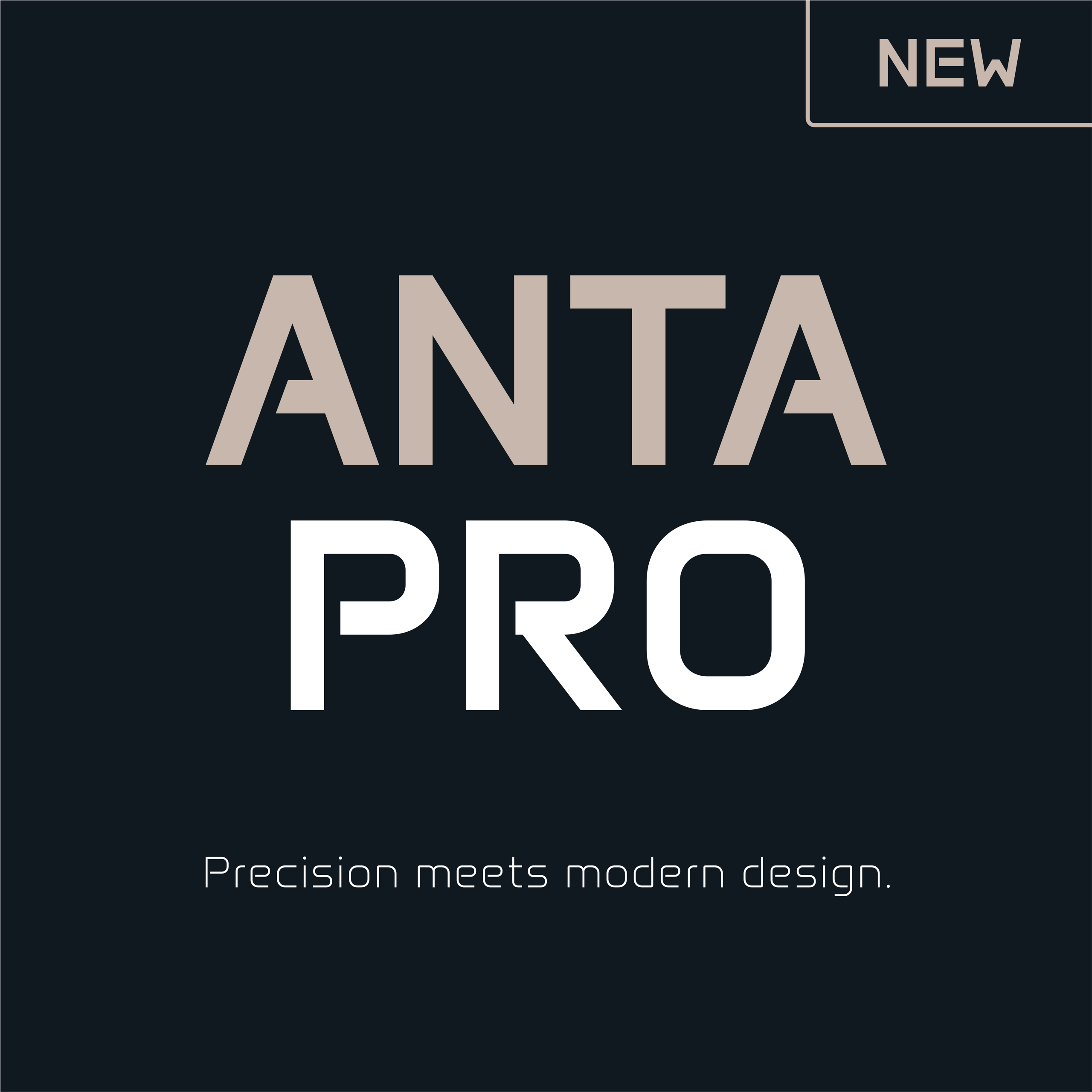
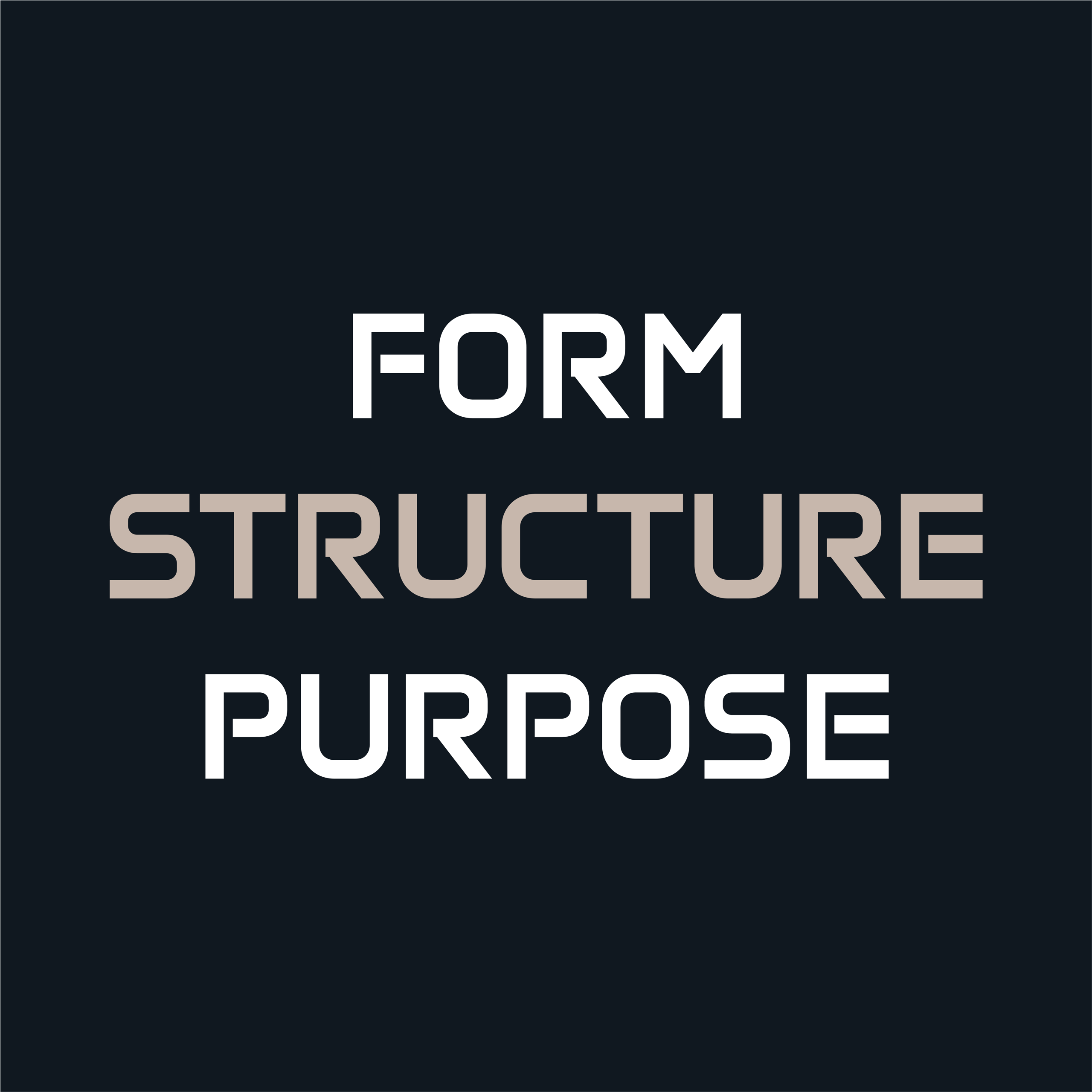
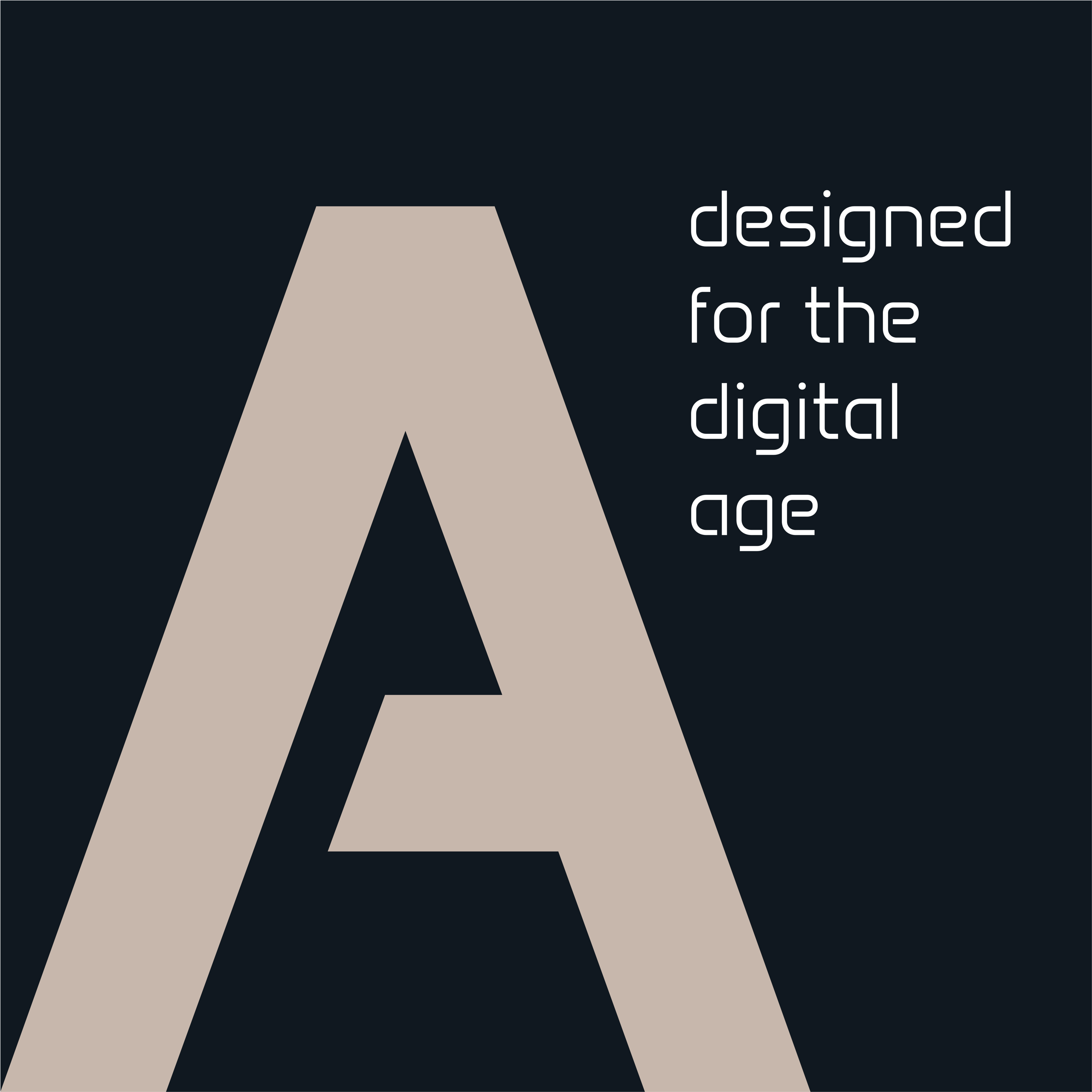
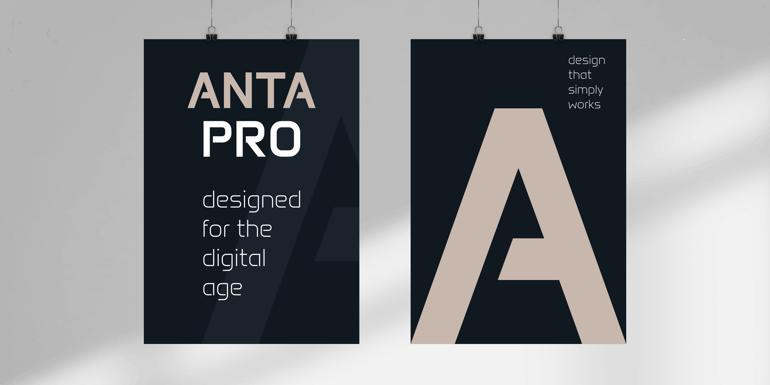
SL: Anta Pro is a new type family built from the foundations of the original Anta concept. While Anta was released as a single style, Anta Pro includes 12 static fonts and 2 variable fonts, ranging from Thin to Bold, along with matching italics.
This expanded range makes a fundamental difference in how the typeface can be used. Designers can create hierarchy, contrast, and sophisticated typographic systems across print, branding, product design, and digital interfaces—something that is difficult to achieve with a single-style typeface alone.
A major goal during development was to achieve consistency across weights and to establish a stable rhythm in longer-text settings. This required refining spacing, redrawing key glyphs, and developing the family as a coherent system rather than a collection of individual styles.
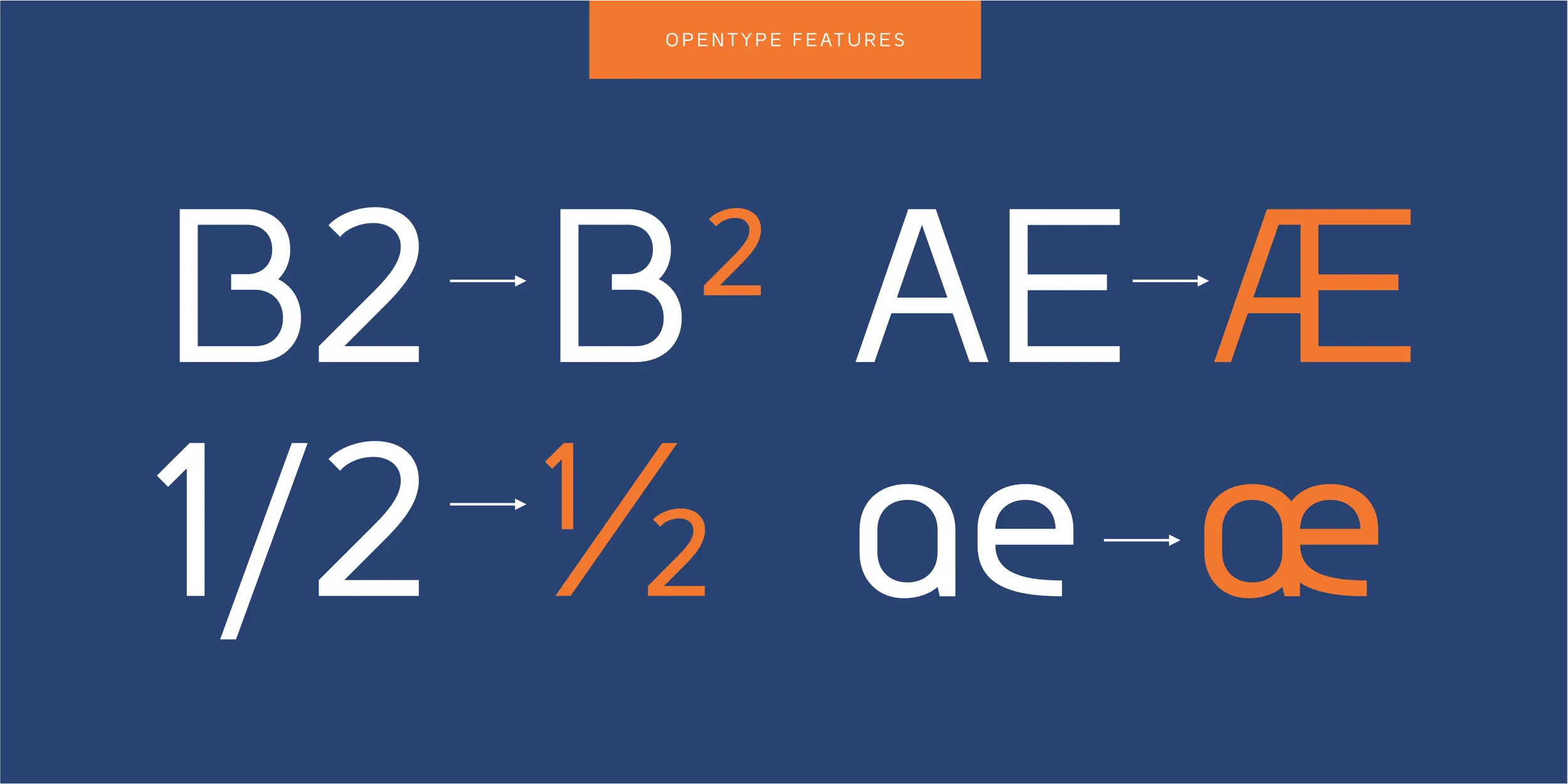
The character set has also been significantly expanded, with broader language support and a more comprehensive feature set. In addition, Anta Pro is available as OpenType and variable fonts, giving designers greater control and flexibility across both print and digital environments.
The result is a type system that preserves the distinctive character of Anta while offering the versatility, depth, and reliability required for contemporary design practice.
LC: How did you decide to start your own foundry?
SL: First, I’d like to clarify the term “foundry”: it refers to the holder of the exclusive rights to a typeface. As a type designer, I retain all exclusive rights to my typeface families and publish only typefaces that I have designed myself.
Working independently allows me to develop typefaces over longer periods, often across multiple stages of refinement and extension. Large families and variable fonts require this kind of long-term, consistent development.
Authorship and ownership are also central to my practice. Typefaces gain value over time through use, and maintaining control over their distribution and evolution is essential to how I work.
LC: Is there anything peculiar about your type design process?
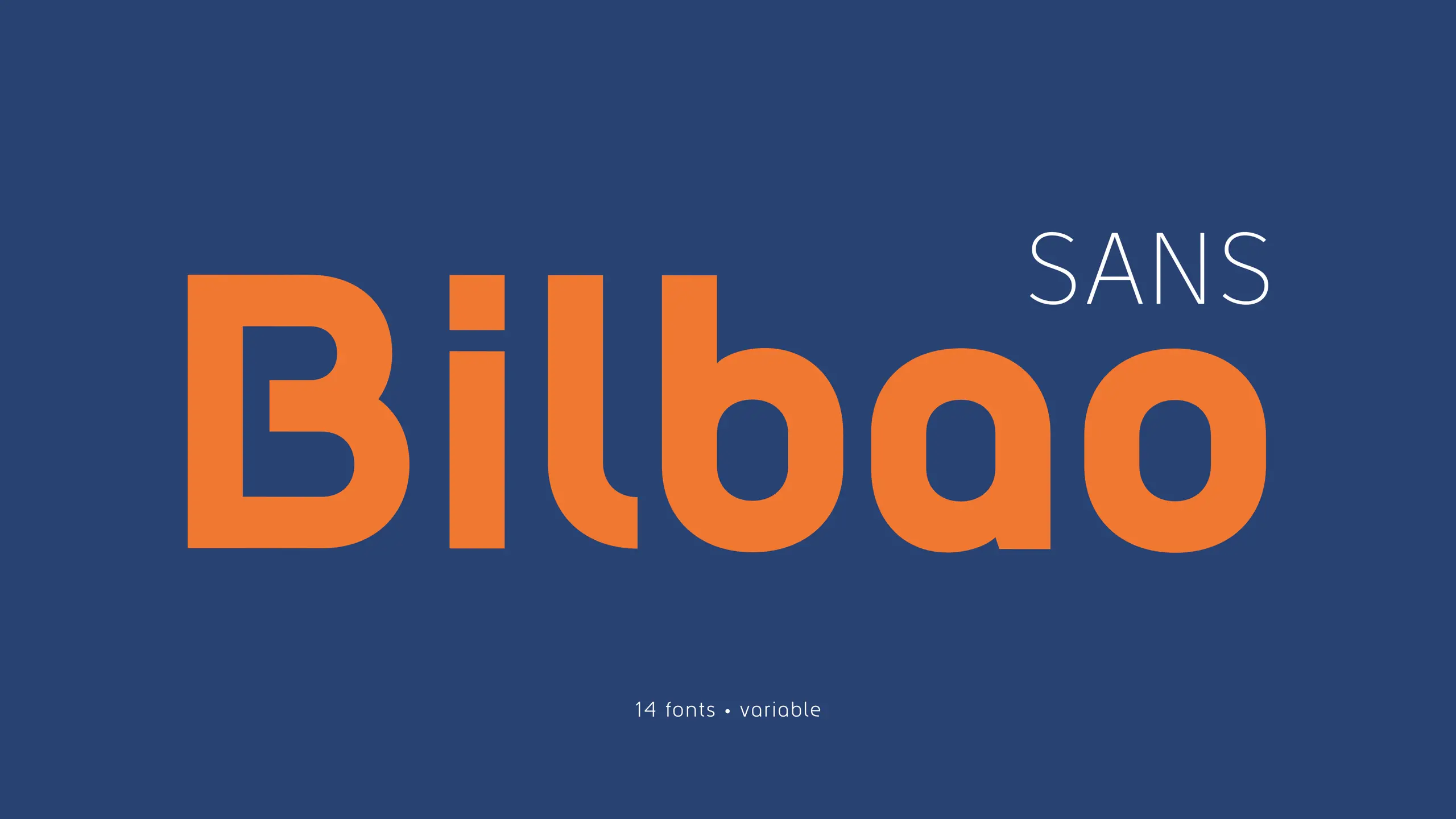
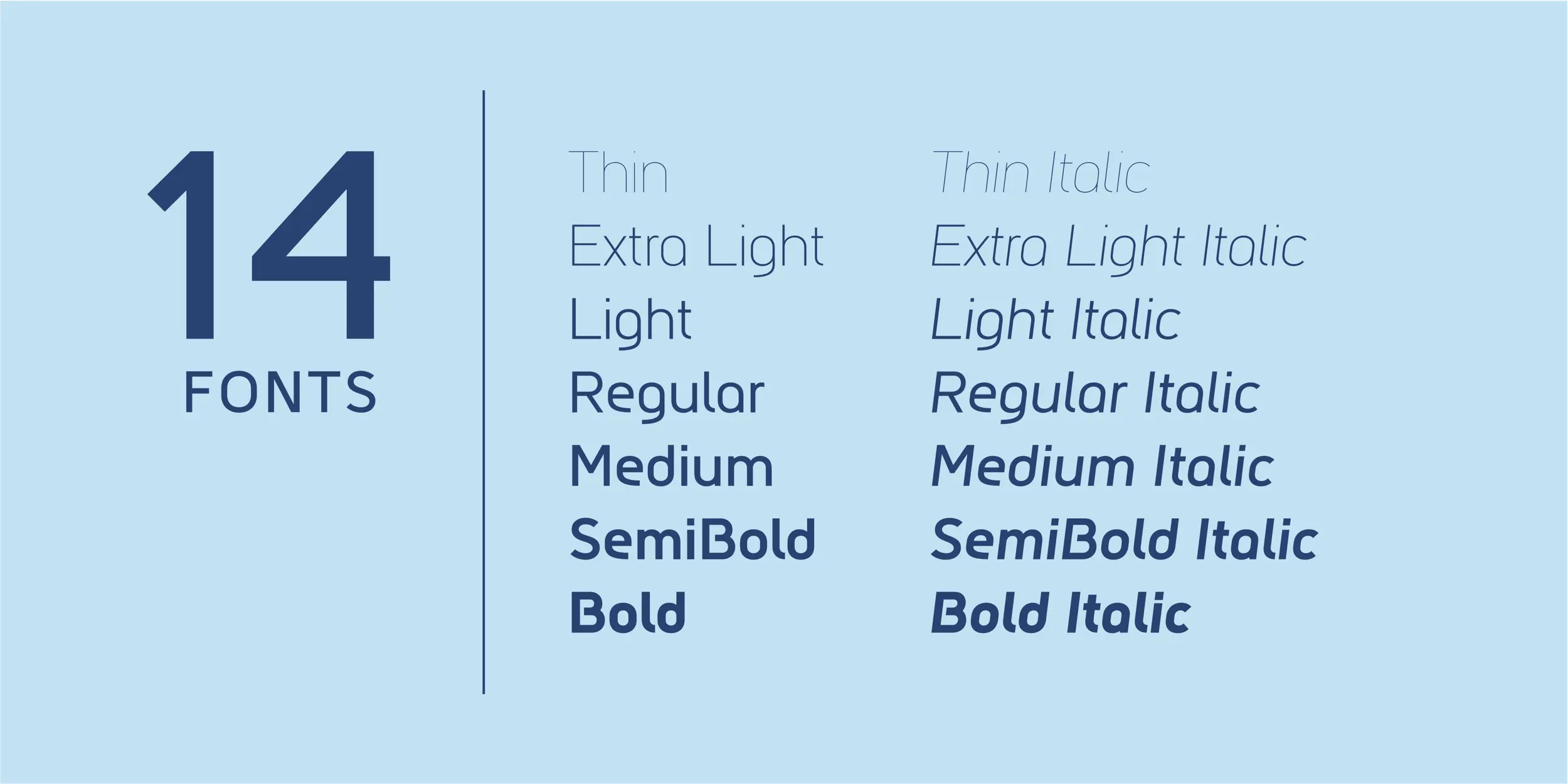
SL: My type design process is highly systematic. Before drawing large parts of a type family, I define its underlying structure: proportions, construction principles, interpolation strategy, and production workflow.
Because I often work on large families and variable fonts, I consider interpolation from the very beginning. Design and engineering decisions are closely connected, so I prefer to solve them in parallel rather than treating them as separate stages.
At the same time, I spend a great deal of time refining the small details that determine how a typeface performs in use. I have always been particularly interested in clear geometric forms, precise curve tension, and maintaining visual consistency across an entire character set.
Balancing a rigorous system with careful attention to detail is central to my approach.
LC: Do you have a favorite example of seeing your typefaces in use?
SL: What I find most interesting is seeing my typefaces used in structured, professional contexts—especially when they become part of larger corporate identity systems.
I’m particularly interested in how designers use different weights and styles to build hierarchy and consistency under real constraints. My families are often used by medium-sized businesses for branding, including logo design and broader identity development.
LC: What does it mean to be joining Type Network?
SL: For me, joining Type Network is primarily about context. It’s a platform that emphasizes quality, authorship, and a thoughtful approach to type design.
Being part of a curated environment alongside other independent foundries creates a framework for presenting work that aligns closely with how I approach type design. I’m also open to collaborations on custom or corporate type projects that may arise through Type Network, as this fits naturally with my focus on scalable typographic systems.
LC: What’s next for you?
SL: My current library comprises 15 commercial-type families with more than 250 styles, including variable fonts. Several of these families will continue to evolve through ongoing refinement and further expansion.
At the same time, I’m developing new projects with a strong focus on variable font technology and scalable design systems that adapt across different applications.
A recent milestone is the Coin superfamily, consisting of 36 static fonts and 4 variable fonts. It reflects my ongoing interest in building flexible, structured type systems that perform consistently across contexts while maintaining a distinct character. Going forward, I want to continue refining this approach—combining strong visual identity with technical precision and long-term usability in real design environments.
Oh One Pro is a free utility for analyzing PDFs, source code, and other documents with ChatGPT o1-pro. Its app icon uses the Anta typeface by Sergej Lebedev.
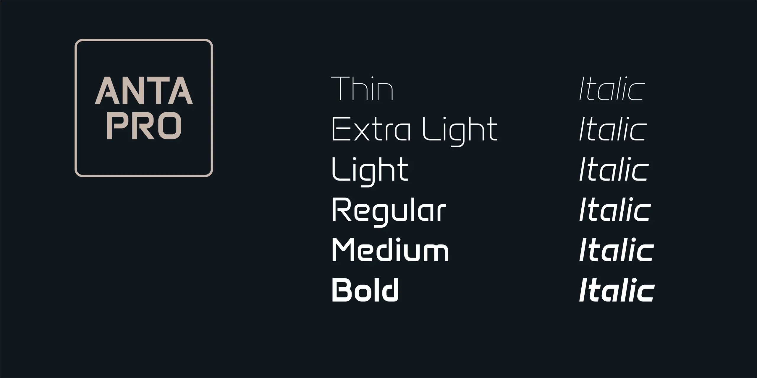
Lebedev’s full library is live on Type Network now, from Group’s narrow, futuristic lines to the newly rebuilt Anta Pro and the 36-font Coin superfamily. Browse the collection, and don’t expect it to hold still for long. Judging by this interview, Lebedev isn’t the type to call a system finished.
All Sergej Lebedev fonts are available for print, web, applications, server, and enterprise licensing. To stay current on all things Sergej Lebedev, subscribe to our email newsletter featuring font analysis, designer profiles, type and design events, and more.
Anta Pro is 20% off August 1–31, 2026. Use code ANTAPRO2026 at checkout.