Type Network Logo
Fonts
Foundries
Designers
Stories
Services
Search Icon
Search
User
Account
Cart Icon
Cart
Menu Icon
ScreenFonts: November 2018 | The Leftovers · Type Network
ScreenFonts: November 2018 | The Leftovers
These posters didn’t make the
cut
, but are still noteworthy for their design and/or typography.
By Bald Condensed
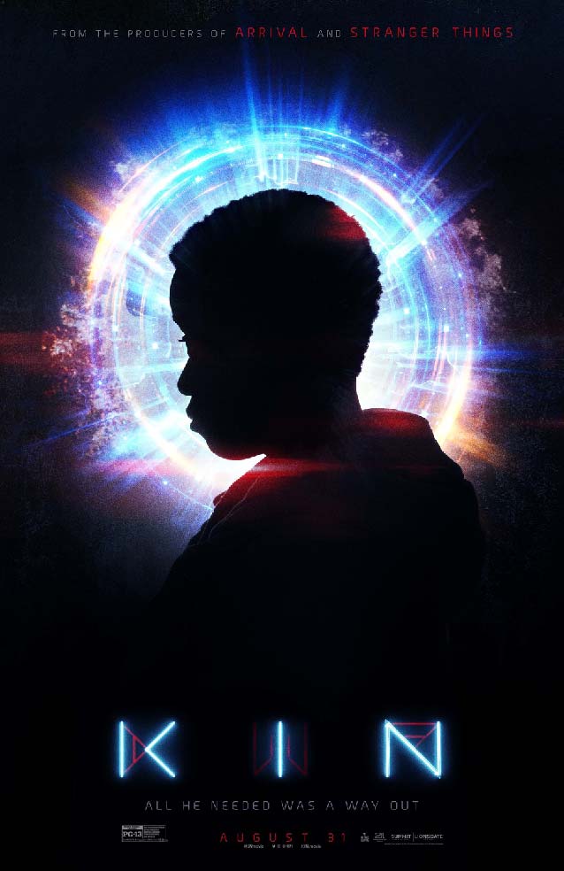
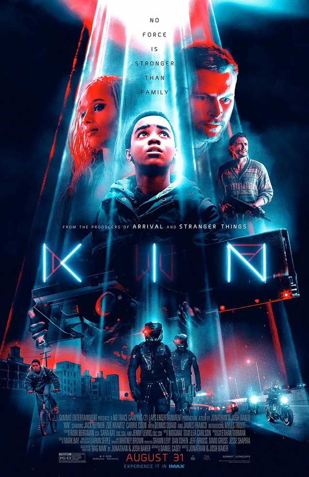
Kin
© 2018 Lionsgate. The multicolored aura surrounding Myles Truitt’s profile in
LA
’s teaser looks sumptuous, and its luminosity reappears around the title’s modular letters.
Arbotek Light Rounded
shares the letters’ strict geometry and rounded finials.
Limiting the color palette to bright blues and radiant reds on a night-blue canvas makes all of the elements gel in LA’s vibrant main theatrical one-sheet for this science-fiction action movie.
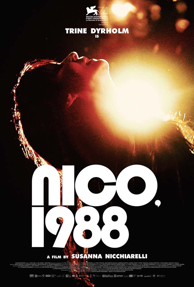
Nico, 1988
© 2018 Magnolia Pictures.
Midnight Marauder
puts the cult singer-songwriter and former Velvet Underground vocalist literally in the spotlight in his wonderfully poetic one-sheet. Blippo’s circular letterforms are a prime example of eighties display typography;
Dunbar Tall
is reminiscent of this style.
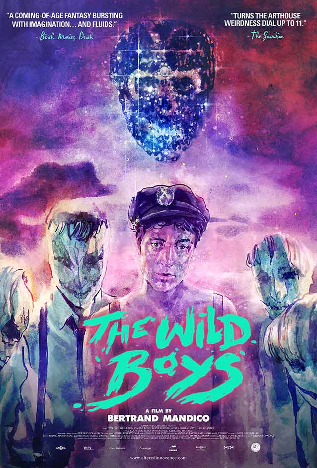
Les garçons sauvages
(The Wild Boys)
© 2018 Altered Innocence. Midnight Marauder recently formalized his frequent collaborations with
Tony Stella
as
Alphaville
. For this poster, Midnight Marauder added loose brush capitals to Stella’s painted art. Underware imbued brush lettering with artificial intelligence and named it
Duos
; it would have worked well in this context.
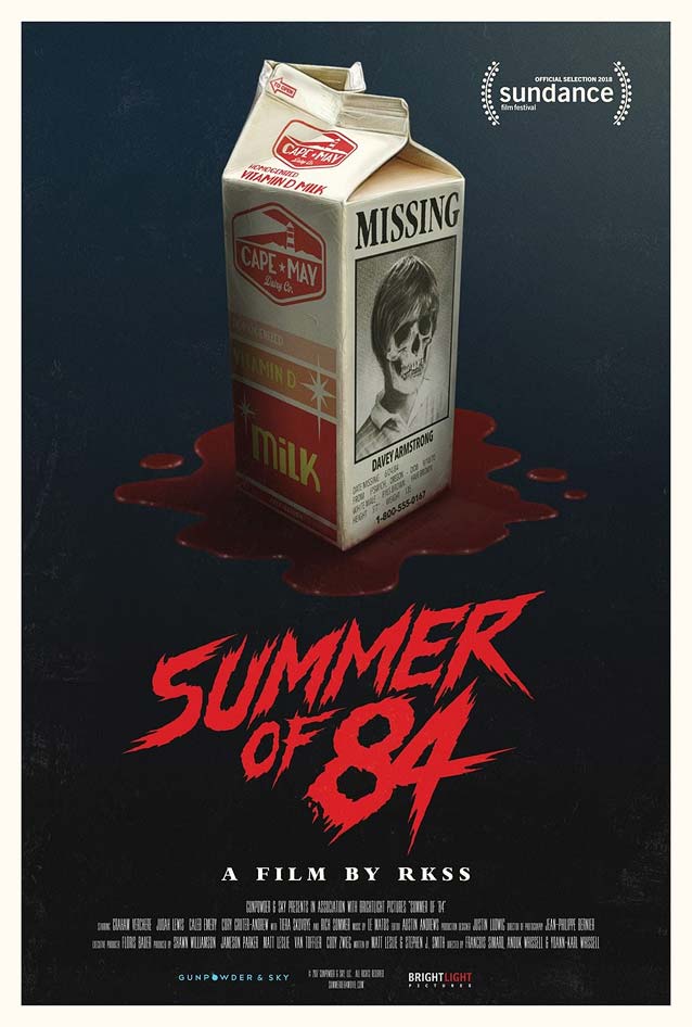
Summer of 84
© 2018 Gunpowder & Sky. Make the rough brush letters more energetic and angular to capture the spirit of horror cinema’s eighties heyday.
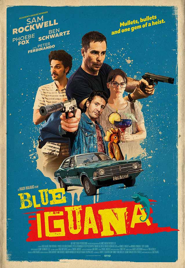
Blue Iguana
© 2018 Screen Media Films. The ransom-note-style typography is consistent with the collage aesthetic in this poster for an action comedy.
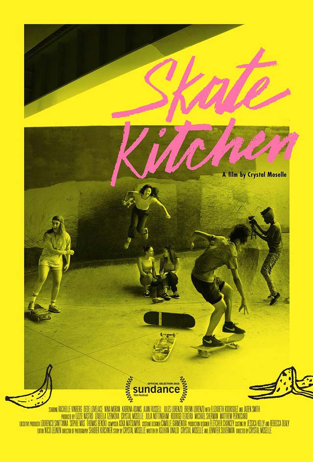
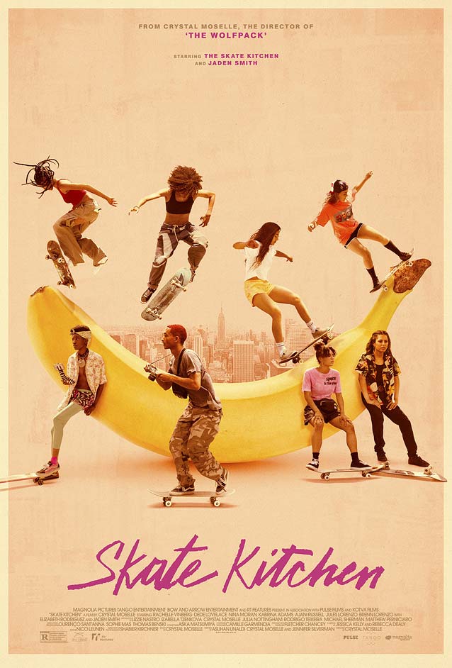
Skate Kitchen
© 2018 Magnolia Pictures. Pink crayon handwriting on a monochrome bright-yellow image makes this festival poster pop.
Caelin White’s theatrical poster tones down the colors but adds a surreal touch by having the young adults use a giant banana as a skate ramp.
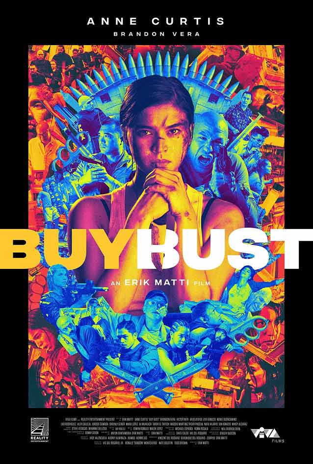
BuyBust
© 2018 Viva Films. These two posters approach the action-movie genre from opposite perspectives. The one-sheet for
BuyBust
is a psychedelic explosion of color, a baroque orgy of violent vibrance. The woodtype-inspired sans capitals remind me of
Titling Gothic Black
and
Rhode Bold
.
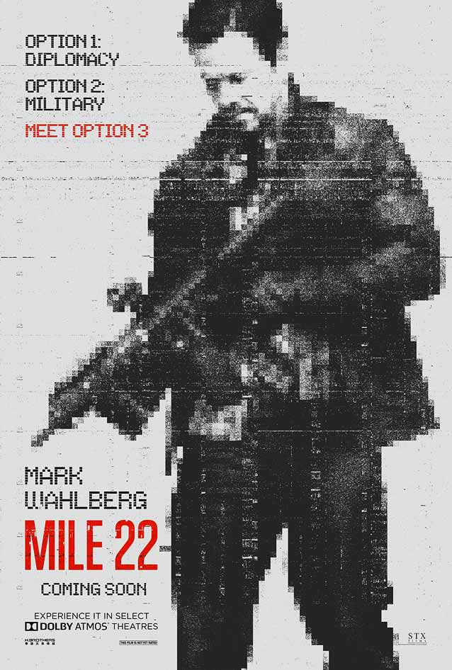
Mile 22
© 2018 STX Entertainment. The poster for
Mile 22
goes black and white, with just a splash of red in the film title. Inspired by the gritty, low-res aesthetic of long-range surveillance drone photography,
Switch
added glitch artifacts and opted for a
dot-matrix design
in the role of supporting typeface.
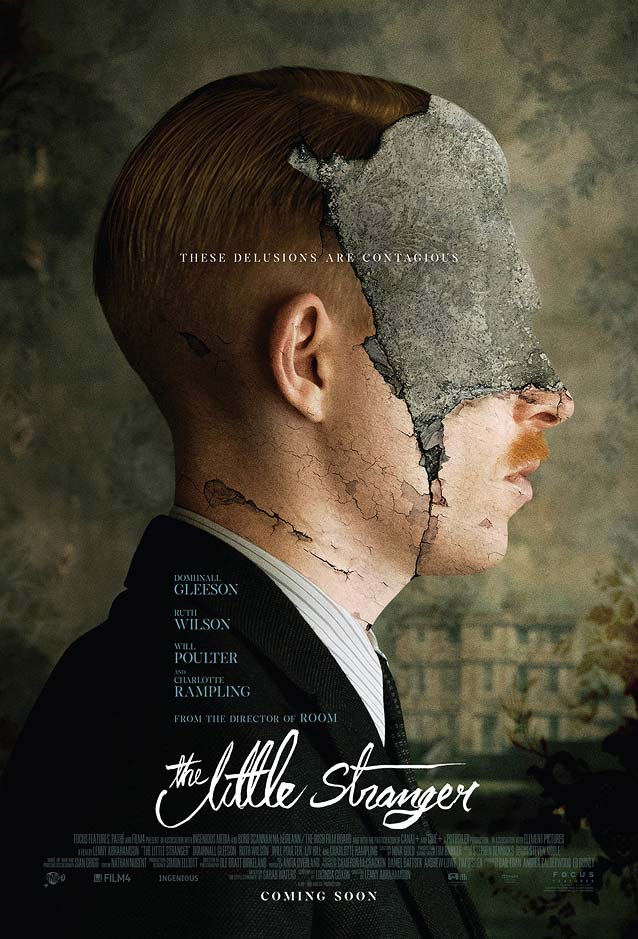
The Little Stranger
© 2018 Focus Features International. As a metaphor for the crumbling manor that becomes a character on the same footing with the actors in this horror mystery,
Bond
disfigured the portrait of the doctor.
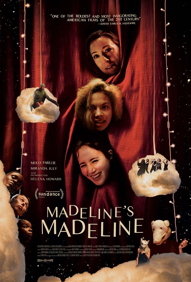
Madeline’s Madeline
© 2018 Oscilloscope Laboratories.
Brandon Schaefer
has the actors peeking through crimson theater curtains to symbolize the blurred line between performance and reality. The contrasted sans serif used here reminds me of
Monokrom
’s award-winning
Vinter
and
Jan Maack
’s
recently released
IvyMode
.