ScreenFonts: November 2018
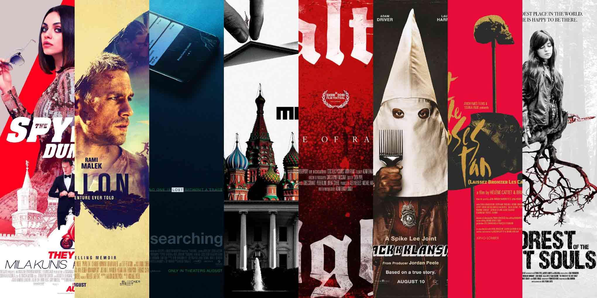
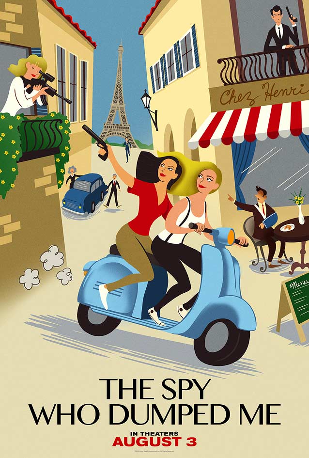
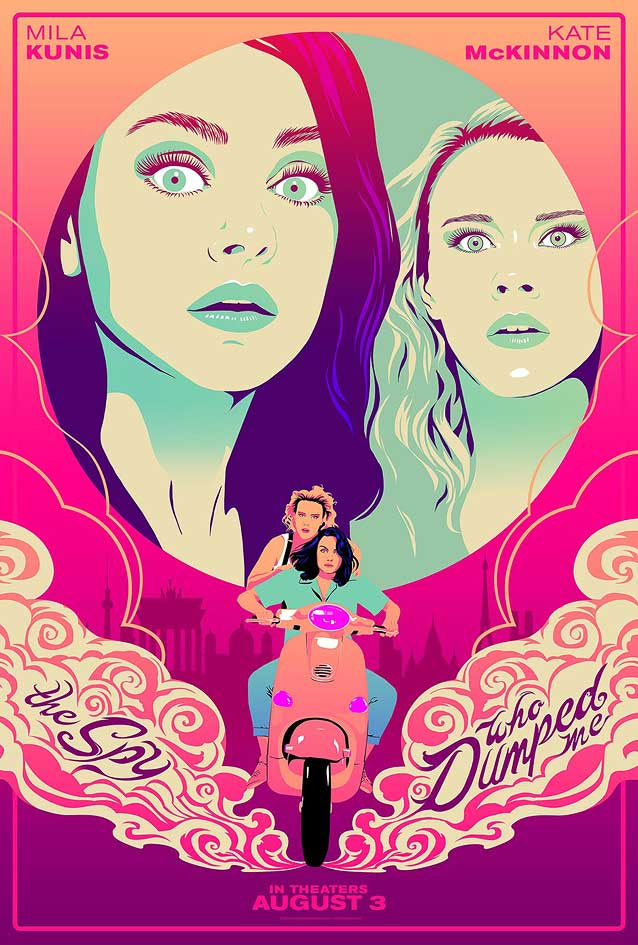
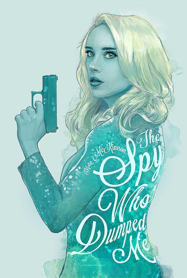
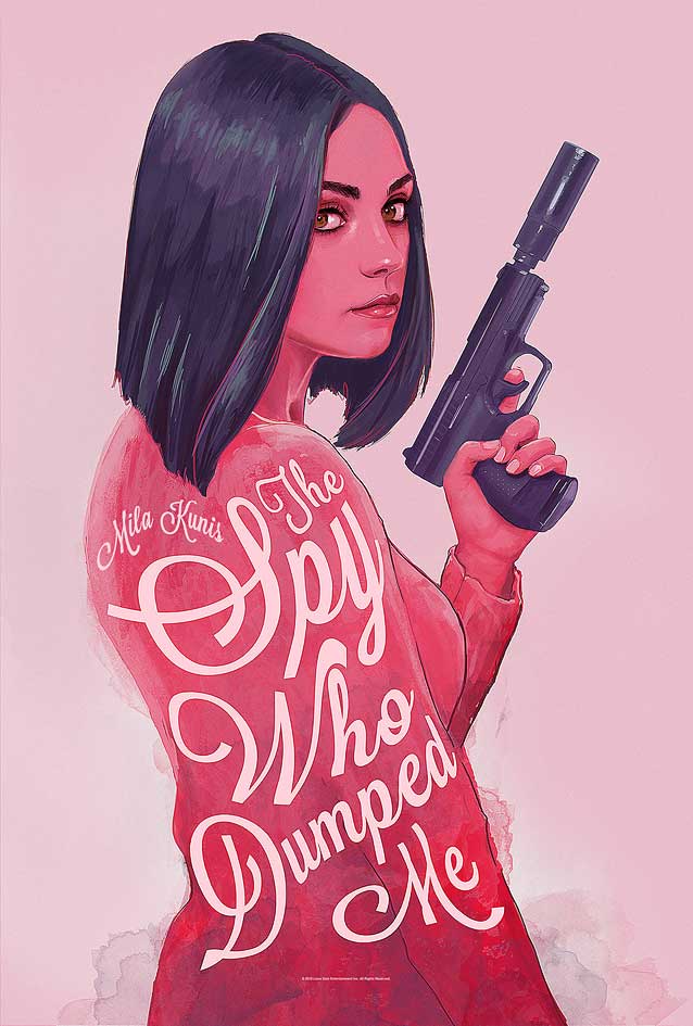
With the poster for The Spy Who Dumped Me, we open on a lighthearted, humorous note—but the balance of this episode is rather somber, even violent, as we turn to Papillon, Searching, Active Measures, Alt-Right: Age of Rage, BlacKkKlansman, Laissez bronzer les cadavres (Let the Corpses Tan), and Floresta das Almas Perdidas (The Forest of the Lost Souls).
The past two months have been exhausting and exhilarating. In September, the annual ATypI conference came to Antwerp, Belgium. Type Network foundry partners David Berlow, Ramiro Espinoza, and Underware gave remarkable presentations; Matthew Carter delivered a terrific keynote; and David Jonathan Ross received the prestigious Prix Charles Peignot. Thanks to Google’s sponsorship, you can watch videos of the talks on ATypI’s YouTube channel. After Antwerp, I traveled to Los Angeles for AdobeMAX 2018, where I talked about variable fonts and did an Adobe Live session with Ariadne Remoundakis for Behance. As you can see, you have a few videos to catch up on, but we’re gathered here today to talk about different types of moving pictures. Let’s take a look at some posters that have caught my eye since the last episode of ScreenFonts.
I hate to end on such a downer, but it seems as if the recent Halloween period steered this month’s selection in a morbid direction. Don’t leave yet, though—the Leftovers are coming!
Bald Condensed, né Yves Peters, is a Belgian-based rock drummer known for his astute observations on the impact of letterforms in the contemporary culture-sphere. A prolific writer on typography, he has a singular knack for identifying the most obscure typefaces known to humankind.
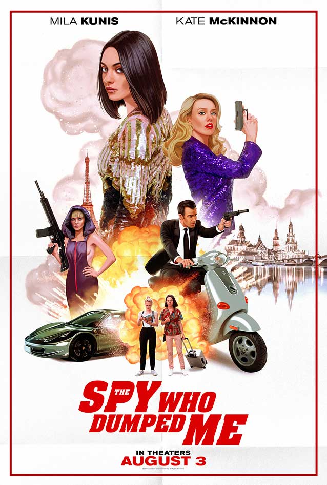
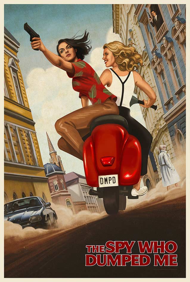
The Spy Who Dumped Me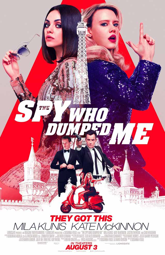
|
|
|
|
|
|
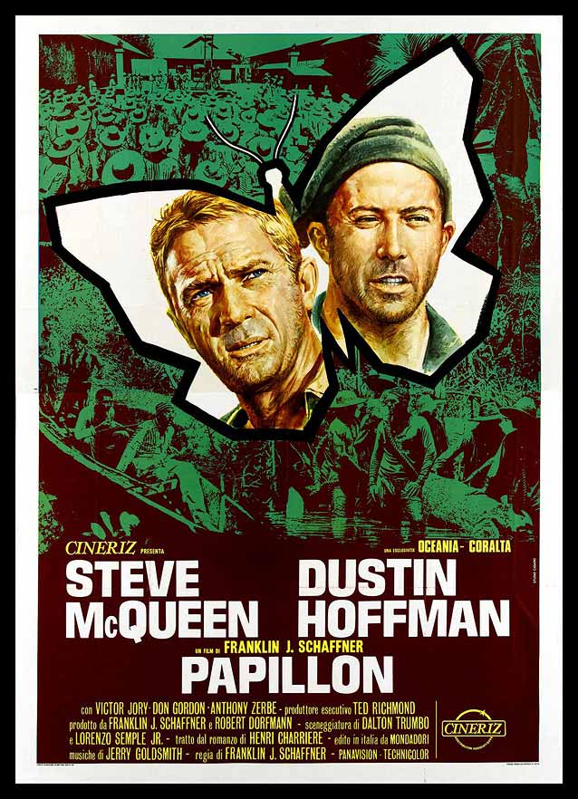
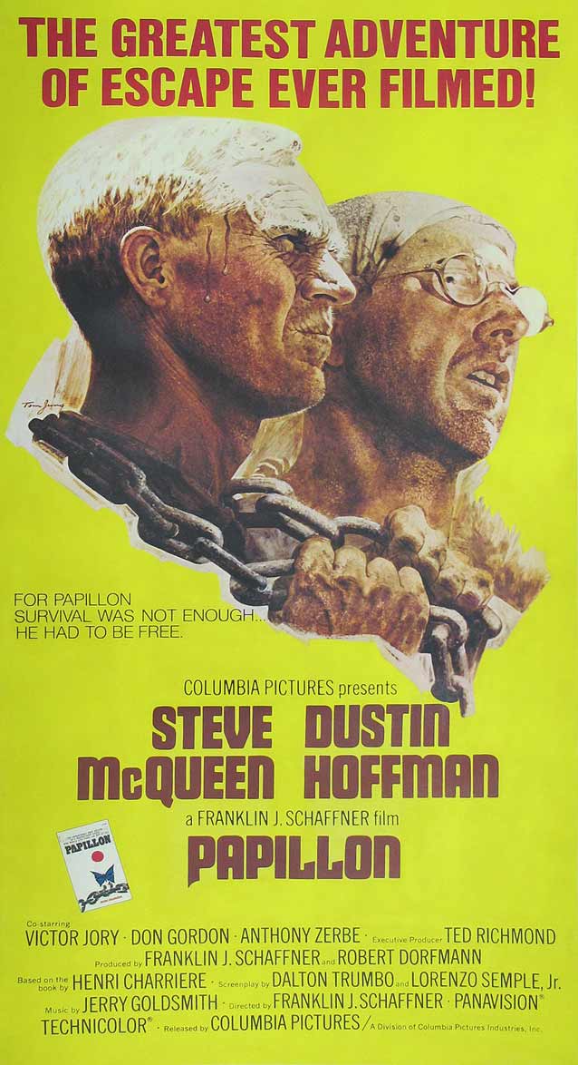
Papillon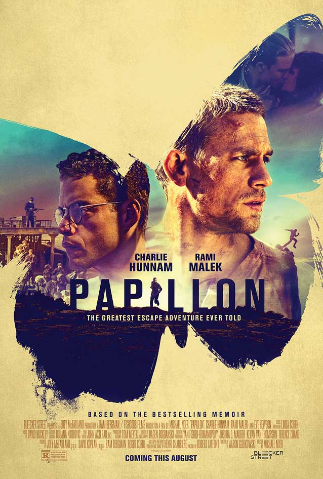
|
| Because escape thriller Papillon is based on a forty-five-year-old cinematic classic, I was curious to see how its theatrical one-sheet compares to the posters for the original movie. I discovered that Bond’s key art resembles a poster by Renato Casaro, considered one of the most important, influential, and innovative Italian film-poster artists. In both designs, wrongfully convicted Henri Charrière and fellow inmate Louis Dega are portrayed in the shape of a papillon, the French word for “butterfly.” Casaro’s artwork is very graphic, with angular, strongly delineated shapes and a restricted color palette of predominantly green and beige. Bond’s design is more painterly: the butterfly silhouette is rendered in rough brush strokes and the saturated, lush hues belie the dourness of the storyline. Notice the running figure replacing the I in the movie title set in a squarish compact sans serif. Titling Gothic Compressed, Rhode Condensed, and Stainless Compressed also combine a fairly square bowl on the P with a low crossbar on the A. |
|
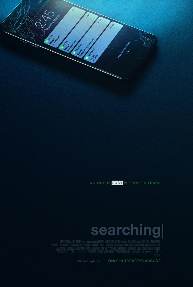
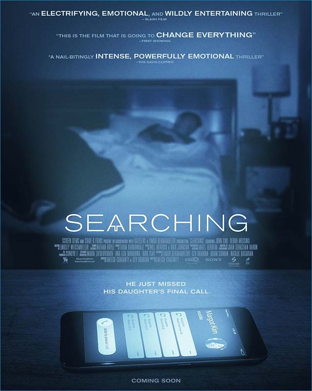
Searching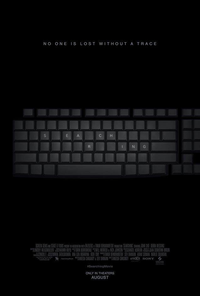
|
|
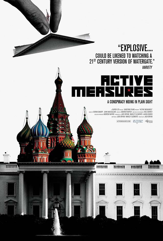
Active Measures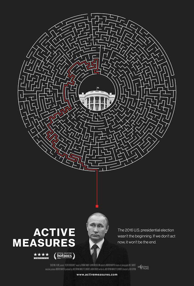
|
|
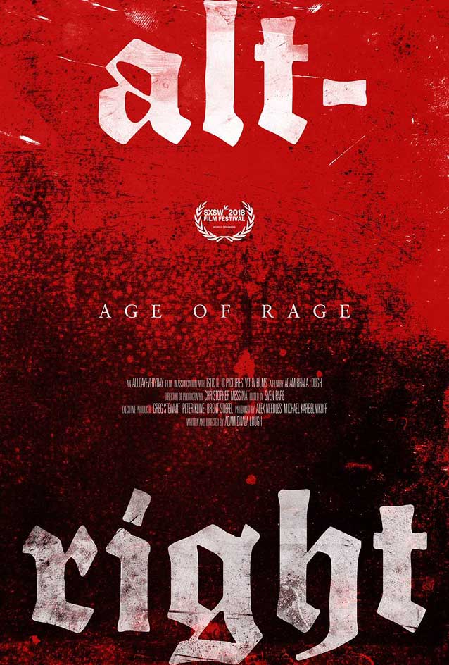
Alt-Right: Age of Rage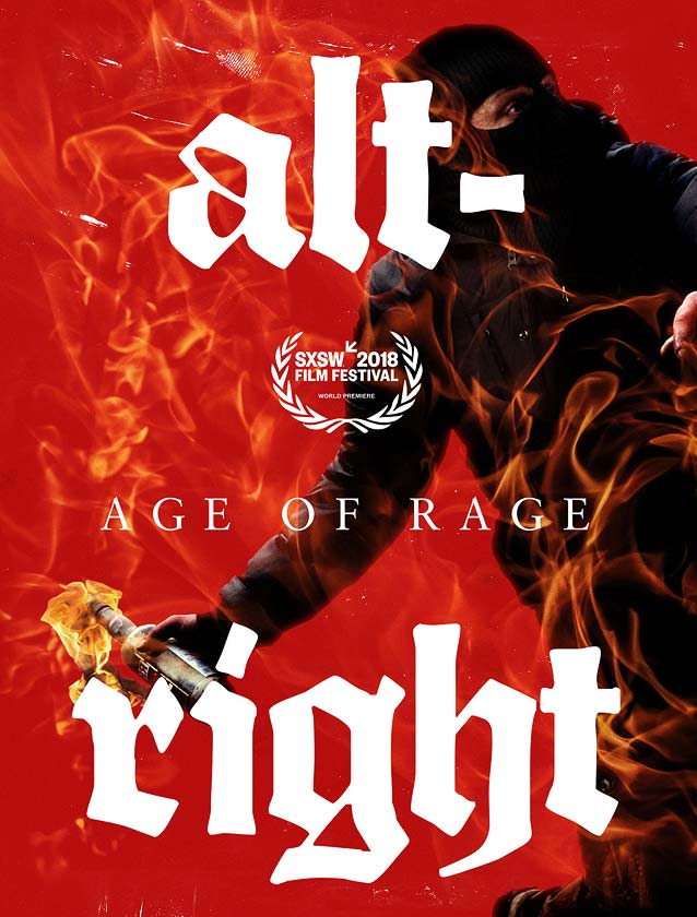
|
|
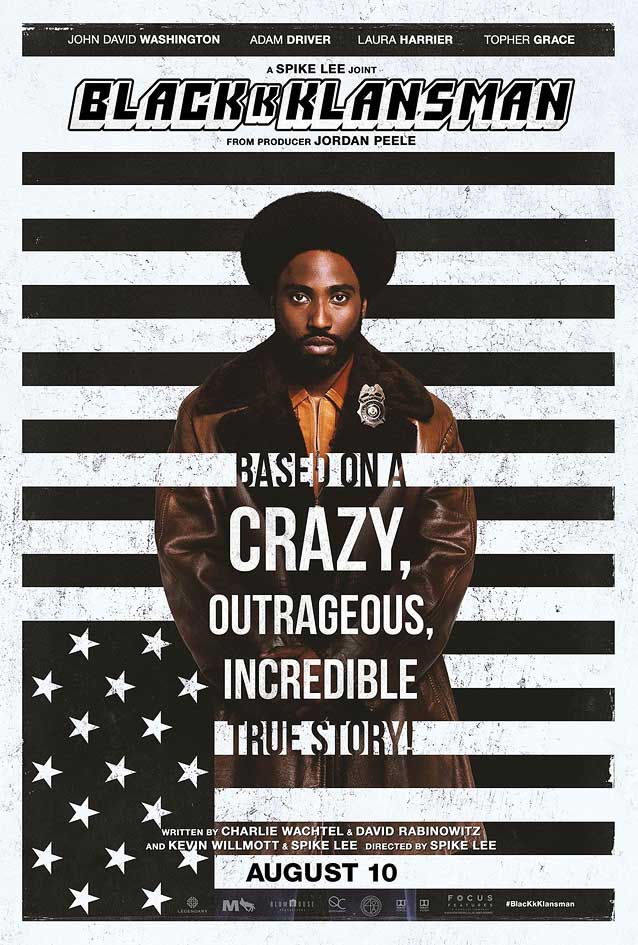
BlacKkKlansman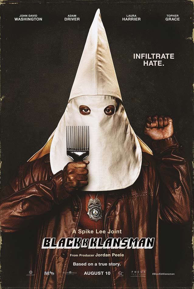
|
|
Laissez bronzer les cadavres (Let the Corpses Tan)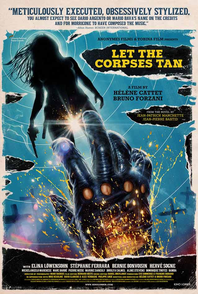
|

|
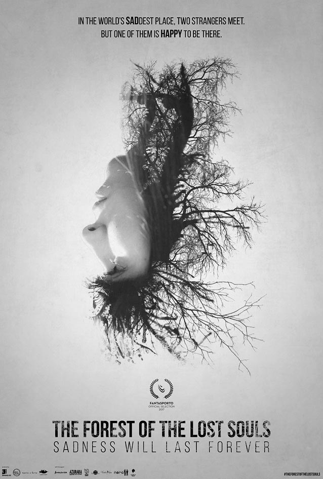
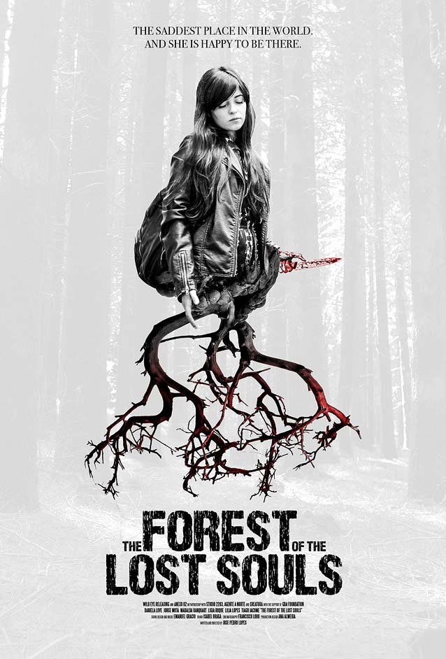
A Floresta das Almas Perdidas (The Forest of the Lost Souls)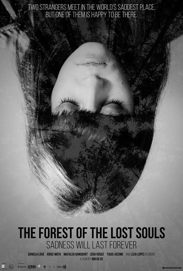
|
| Named after Portugal’s most popular place for suicide, the horror mystery A Floresta das Almas Perdidas (The Forest of the Lost Souls) begins when two strangers meet within the dense and remote forest on a summer morning. Porto-based film-production company Anexo 82 mined the grim atmosphere, portraying the woman of the pair upside down to symbolize her emotional state. In one variant, the forest’s canopy is revealed inside the shadow portions of her hair; in the other, her hair morphs into a tree crown. The generic compact sans-serif typography seems like a missed opportunity. Its neutral look doesn’t add anything to the overall atmosphere. A more distinct type choice would have enhanced the emotional power of this poster. |
|