ScreenFonts: November 2017
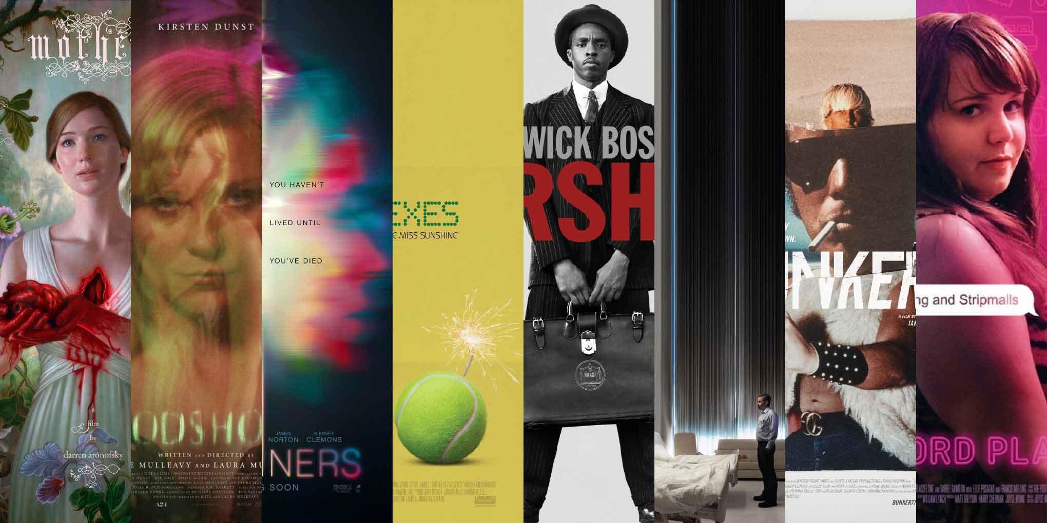
From gritty to ethereal, beauty takes many forms. This episode of ScreenFonts features posters for mother!, Woodshock, Flatliners, Battle of the Sexes, Marshall, The Killing of a Sacred Deer, Bunker77, and Wexford Plaza.
After I finished rounding up the artwork for this installment of ScreenFonts, I realized that I went for posters that I simply found beautiful. This varied selection proves that beauty can be poetic, unsettling, witty, dignified, carefree, heartbreaking, quirky, and even gruesome. Let’s dive into this exploration of aesthetic enjoyment.
Now, I just hope my own life doesn’t turn purple and pink anytime soon. The Leftovers are coming right up, and we’ll reconvene next month for another generous serving of film-poster typography.
Bald Condensed, né Yves Peters, is a Belgian-based rock drummer known for his astute observations on the impact of letterforms in the contemporary culture-sphere. A prolific writer on typography, he has a singular knack for identifying the most obscure typefaces known to humankind.
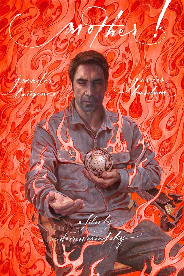
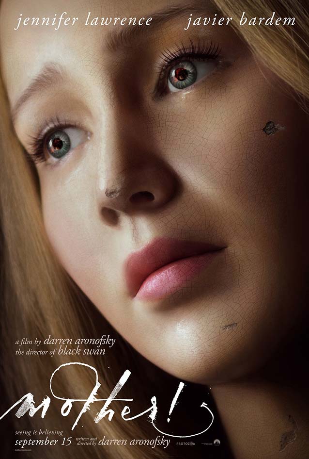
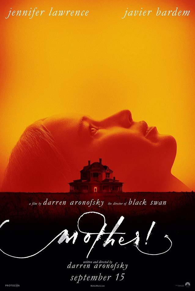
mother!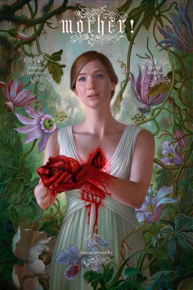
|
|
|
|
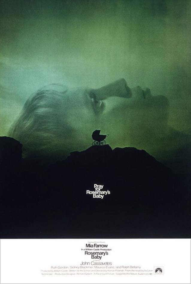
| Tributes to classic posters can be tricky because they tend to veer toward straight-up plagiarism; take, for example, the countless Saul Bass rip-offs in existence. BLT Communications’ teaser, however, adroitly pays homage to InSync Plus’ classic one-sheet for Roman Polanski’s horror drama Rosemary’s Baby (also a Paramount production). From the few details I know of mother!’s plot, a thematic connection exists between the two films that justifies this fine tribute. |
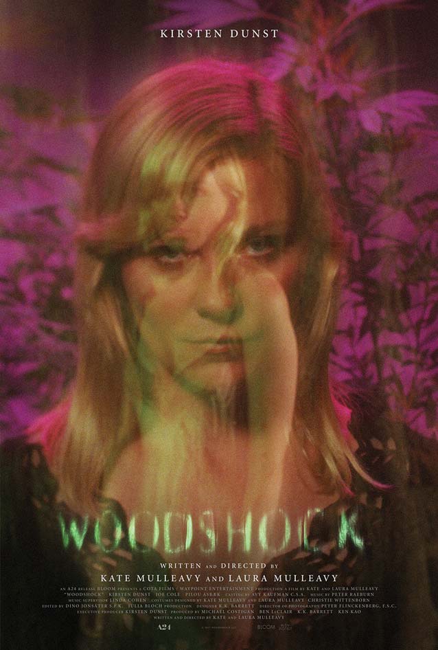
Woodshock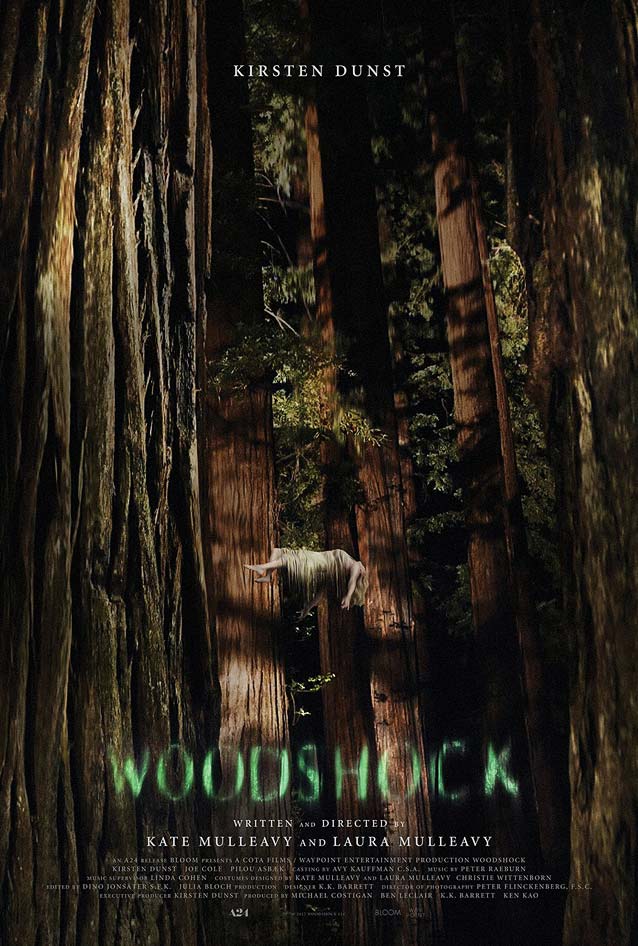
|
Flatliners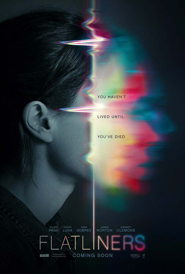
|
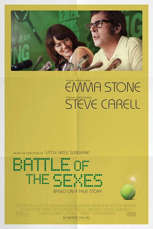
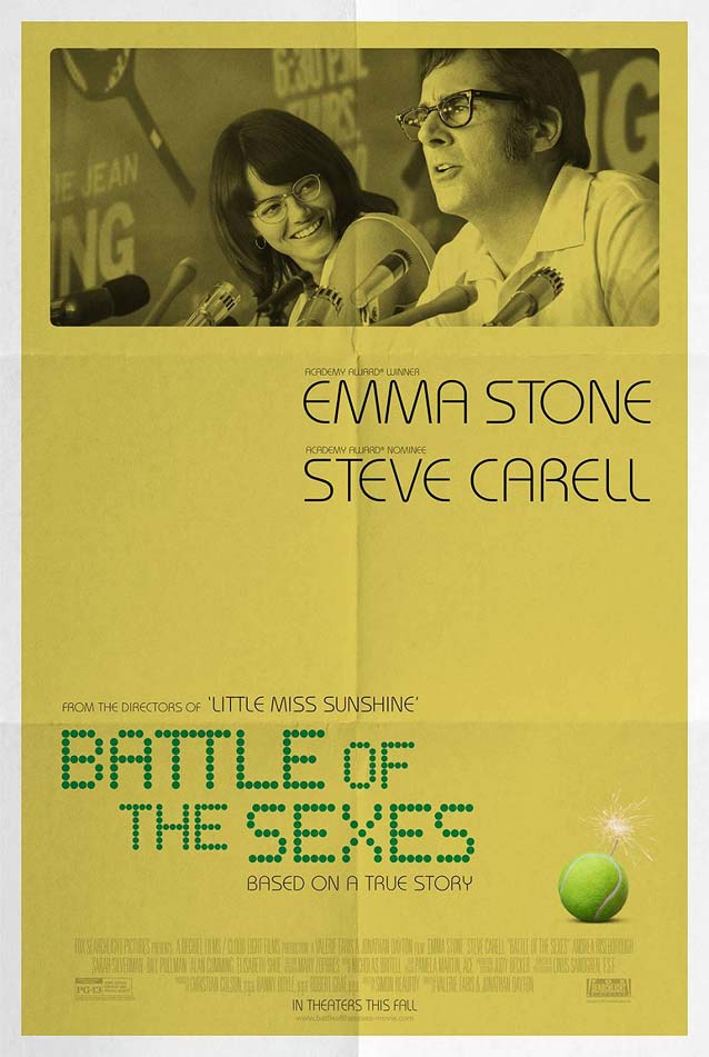
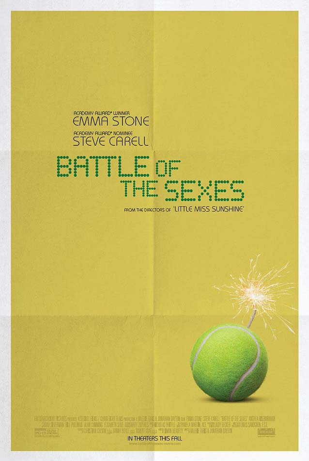
Battle of the SexesPutting four of the posters for Battle of the Sexes in sequence shows how a simple, powerful concept often works better than plastering the stars’ faces all over the artwork. The biographical drama recounts the 1973 tennis match between then-world–number–one tennis player Billie Jean King and former champion and serial hustler Bobby Riggs.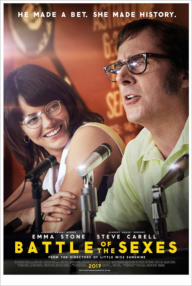
|
| Empire Design’s theatrical one-sheet on the left plays off the star power of the two leads. Emma Stone expresses both amusement and disbelief at the sheer machismo with which Steve Carell draws attention to himself. Apart from the tennis racket pictured on the backdrop, the poster gives little clue that the film is about a legendary sporting event. The nondescript sans serif doesn’t add much, either. The second poster, on the right, is already an improvement. The scene from the movie is relegated to the top third of the canvas and simplified by turning the background monochrome green. A tennis ball with a lighted fuse reinforces the movie title and helps the audience understand the importance of this historic match. |
|
| In the poster on the left, converting the photograph to grayscale and overlaying it on the background color further improves the design by reducing visual noise. Yet it still distracts from the crucial tennis-ball bomb, which is why the best poster is also the simplest one: with the movie still removed, the tennis ball, ready to explode, takes center stage and perfectly synthesizes the film’s plot. Clever references to both tennis and the 1970s surface in the art. The dirty yellow background, with its white border and fold marks, gives the poster a vintage appearance, while the creases nod to the lines on a tennis court. But the supporting face, ITC Bauhaus, is a typographic anachronism—Benguiat and Caruso’s faux-Bauhaus design only launched two years after the events depicted in the movie. The dot-matrix printer typeface of the film title mimics the characters on an electronic scoreboard. When it comes to grid-based typefaces, Petr van Blokland recently released the definitive modular family—his impressive Bitcount comes in 300 (!) styles, with the potential for endless variations. |
Bunker77
|
Marshall
|
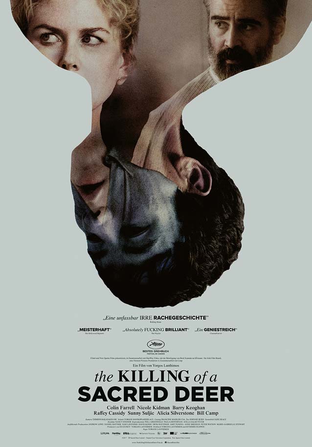
The Killing of A Sacred Deer
|
| Vasilis Marmatakis has created some fabulous, idiosyncratic artwork for Greek filmmaker Yorgos Lanthimoshorror, the high point being his heartrending posters for The Lobster, which I mentioned in last month’s episode. Marmatakis’ main theatrical one-sheet for The Killing of a Sacred Deer constitutes yet another excellent exercise in understated sadness. By stretching the upper part of the picture to fit the proportions of the canvas, Marmatakis has created associations that infuse the scene with new meaning. On one hand, it makes it seem as though the ground is falling out from under Colin Farrell’s feet as he contemplates the empty hospital bed. On the other hand, the upward motion could conceivably take on a religious meaning: the soul of the recently departed rising up to the heavens. OTMentertain’s international poster is a purely formal affair, an arresting photographic composition quite literally trapping Nicole Kidman and Farrell in the sinister teenage boy’s head. As usual, Marmatikis’ typography is underdesigned, a combination of the new de facto movie font Gotham and the old de facto text font Times. If you’d rather not conform to the norm but like this particular typographic style, consider Proxima Nova paired with Starling. |
Wexford Plaza
|