ScreenFonts: May 2018
This episode put me in a contemplative, even slightly melancholy mood, with posters for Disobedience, The Endless, Akher ayam el madina (In the Last Days of the City), Dayu haitang (Big Fish & Begonia), Good Luck, Blumhouse’s Truth or Dare, You Were Never Really Here, and Zama.
As I was compiling this month’s episode, it struck me that all of the posters exude a certain serenity—even with a thriller, a horror flick, and a gritty crime drama in the mix. You’ll have to come back for The Leftovers for visceral visual excitement; until then, turn your gaze inward.
And that’s it for this month. I think I’m going to spend the rest of the day surveying the city’s rooftops from my bedroom window, and maybe ponder the changing of the seasons or days gone by. I may return shortly for The Leftovers. And I will definitely be back next month for another installment of ScreenFonts.
Bald Condensed, né Yves Peters, is a Belgian-based rock drummer known for his astute observations on the impact of letterforms in the contemporary culture-sphere. A prolific writer on typography, he has a singular knack for identifying the most obscure typefaces known to humankind.
Disobedience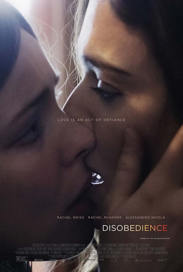
|
The Endless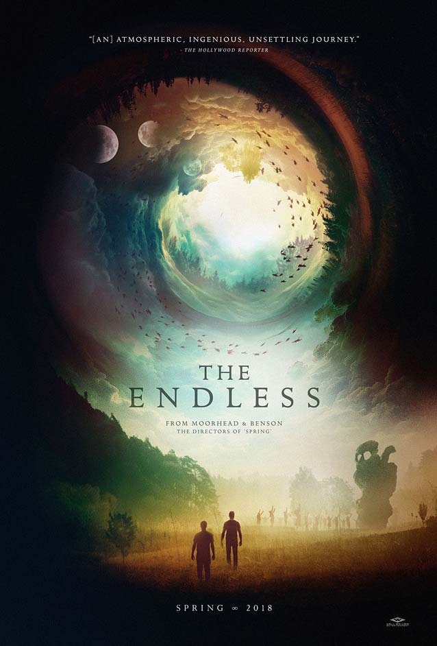
|
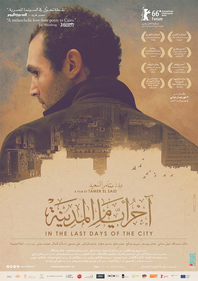
Akher ayam el madina (In the Last Days of the City)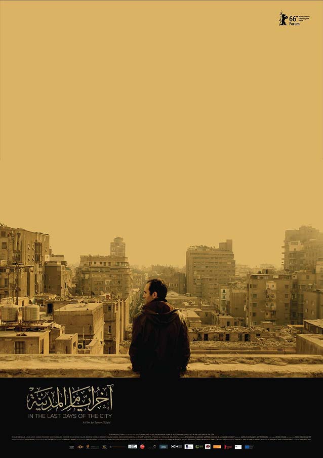
|
|
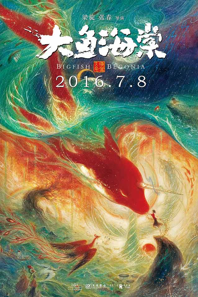
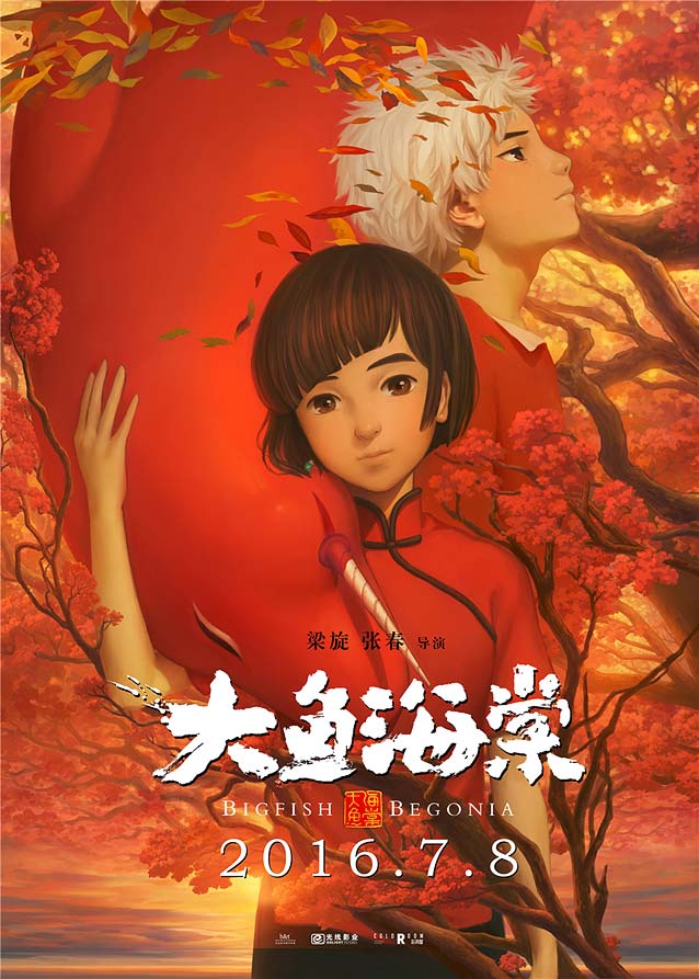
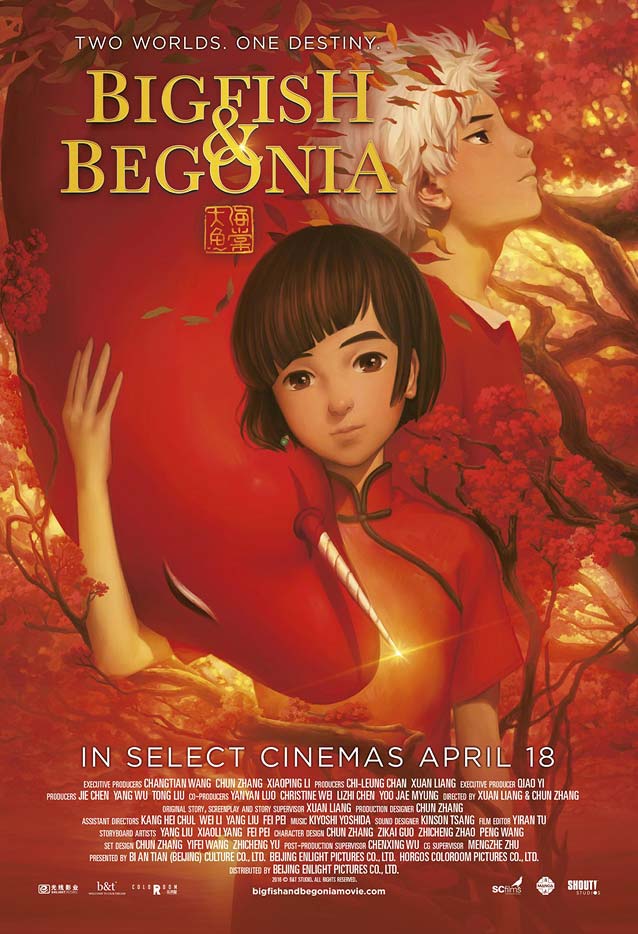
Dayu haitang (Big Fish & Begonia)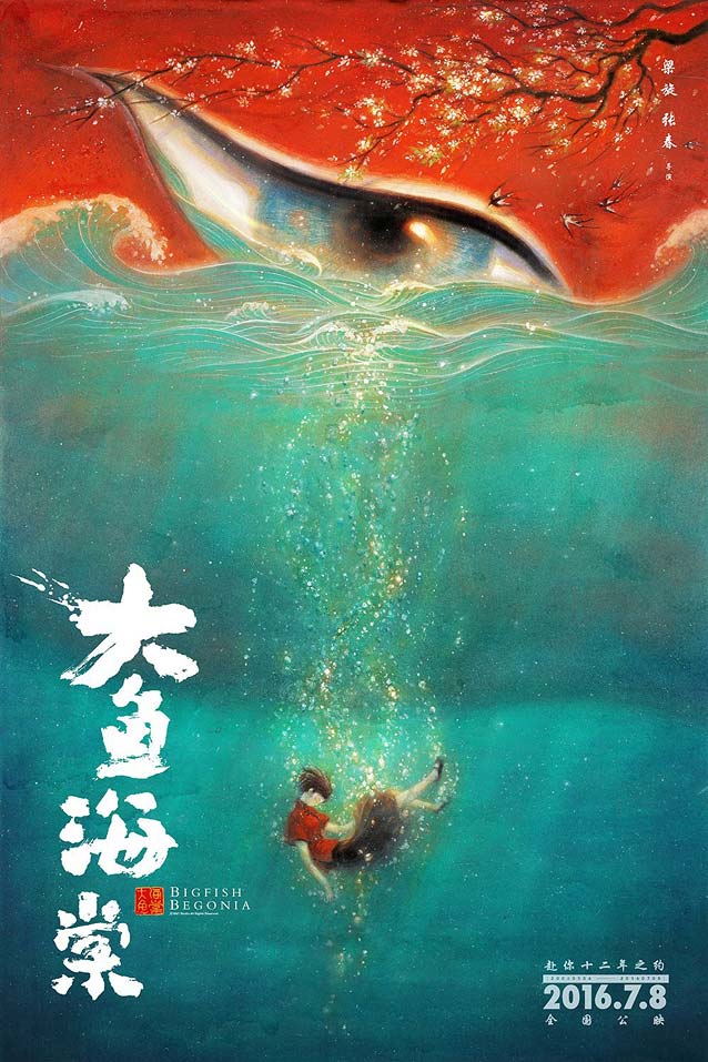
|
| We travel farther east for Dayu haitang (Big Fish & Begonia), an animated fantasy about a sixteen-year-old girl visiting the world in the form of a dolphin and forming a connection with a human boy. The dreamlike domestic posters don’t disappoint. On both versions, the spellbinding painted artwork in complementary colors draws heavily on traditional Chinese art. It masterfully plays with light and texture, composition and scale, and is embellished with magnificent rough-brush calligraphy that puts the supporting Latin typography to shame. |
|
| The UK one-sheet is an adaptation of one of the more conventional Chinese variants depicting the main protagonists in a serene mood. This specific version of Baskerville looks like it was drawn for text use and therefore is a bit clumsy. Matthew Carter’s exquisite, refined Big Moore, inspired by Baskerville’s types, would have been a more appropriate cut here. Personally, I would have loved to see Duos Paint grace this poster; its freeform letter shapes and brush texture would nicely channel the calligraphy in the original artwork. |
Good Luck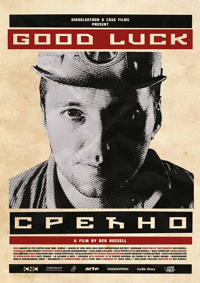
|
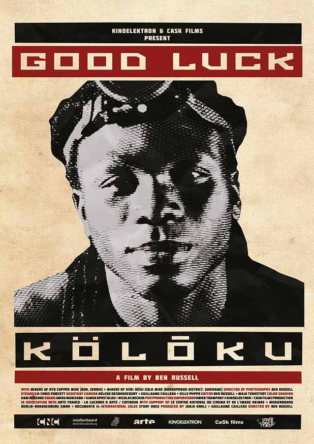
| Filmed between a large-scale underground mine in post-war Serbia and an illegal mining collective in the tropical heat of Suriname, Good Luck is a visceral non-fiction portrait of hope and sacrifice in a time of global economic turmoil. The unfazed faces of the two miners, half a world away from each other, exude calm resolve—or is it resignation? For the posters, movie sales agency Stray Dogs brought director Ben Russell in contact with Paris-based freelance designer Lucie Conan. In an email interview, Conan told me that she worked from an original idea by Russell, who wanted artwork riffing off both Russian revolutionary poster art and the hues of vintage black-and-white movies in the spirit of Under the Skin. “The graphic style is reminiscent of mining codes and artisanal production (paper collage, coarse line raster, and cutout letters), with a dash of propaganda posters (the textured paper effect and the orangy colors).” Conan chose an angular, industrial-looking face as the main type. The words in the black bars are translations of “Good Luck” in Serbian and in Sranan Tongo Creole (Surinamese), referencing the location of the two mines where the documentary was filmed. |
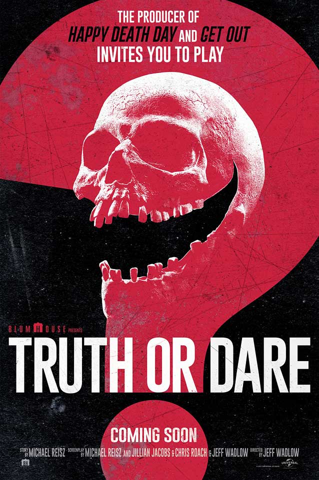
Blumhouse’s Truth or Dare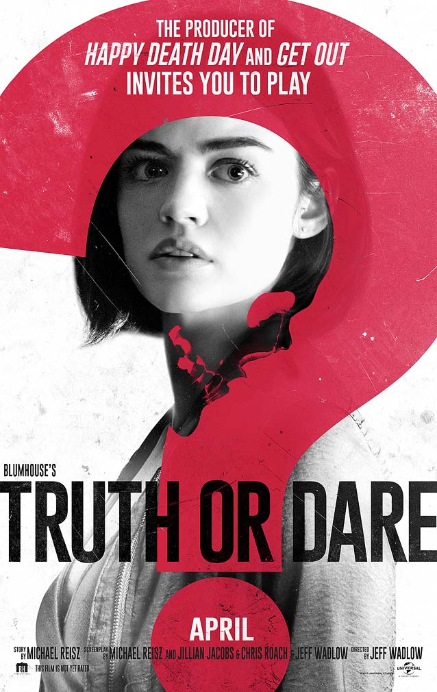
|
| In the horror thriller Blumhouse’s Truth or Dare, the usually mostly embarrassing game turns deadly for those who tell a lie or refuse the dare. LA shunned the genre’s customary gritty imagery and cut-up Trajan (see Richard Lipton’s Canto for a lovely alternative to this ubiquitous face) in favor of a surprisingly subdued typographic treatment. A translucent red question mark, punctuating the question at the game’s core, covers the entire canvas. The punctuation mark is cleverly modified. In the white version, the inside curve adopts the shape of a human skull. In the black version, the exaggerated demonic smile that appears on the victims’ faces immediately before they kill or commit suicide becomes the continuation of that curve. The very narrow sans serif comes close to Titling Gothic Skyline or Benton Sans Extra Compressed. |
You Were Never Really Here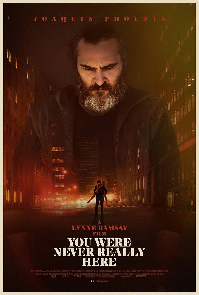
|
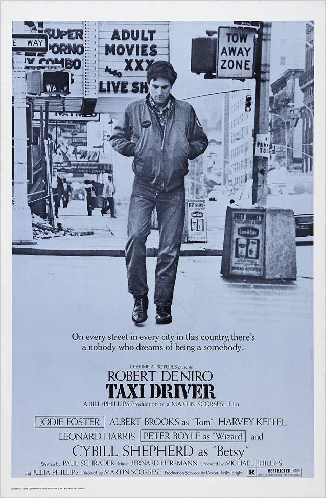
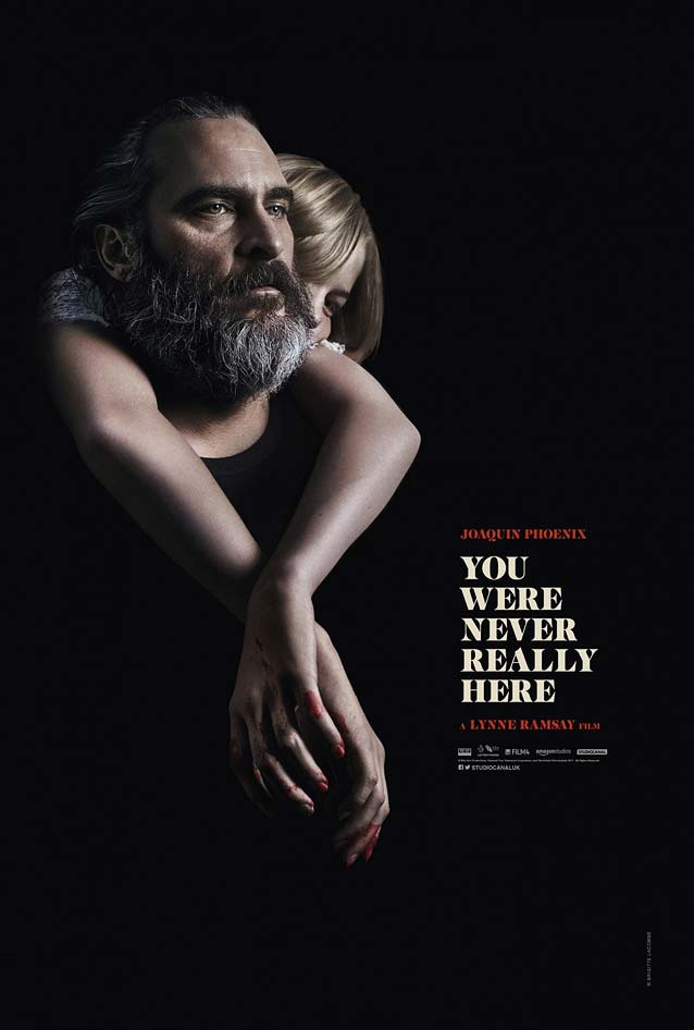
| Joaquin Phoenix plays a traumatized veteran, undaunted by violence, who gets paid to track down missing girls in You Were Never Really Here. Because the promotional campaign describes the film as a modern-day Taxi Driver, I thought it would be interesting to compare their marketing collateral. Empire Design went for a contemporary retro look with their stylish theatrical one-sheet. Phoenix has the same introspective, brooding expression as de Niro’s Travis Bickle; however, making his figure loom over the scene turns him into a far more threatening presence. The single-point perspective draws the attention to the tiny figure walking in the middle of an abandoned street, carrying Ekaterina Samsonov on his back to safety. The city lights behind his back make it seem as if the streets are burning, a metaphor for the mayhem Phoenix leaves in his wake during his rescue missions. Taxi Driver’s stencil titling face is nowhere to be seen, and the same goes for Weiss and Cheltenham as supporting typefaces. But the type here still references display typography popular in the mid-seventies. Modern-day interpretations of high-contrast fat faces can be found among the boldest weights in the largest optical sizes of families like GarageFonts’ Freight, Font Bureau’s Belucian and Escrow, and Carter & Cone’s Miller and Big Caslon. If you want less contrast but more adventure, take a look at Mondial Display and Kazimir. |
|
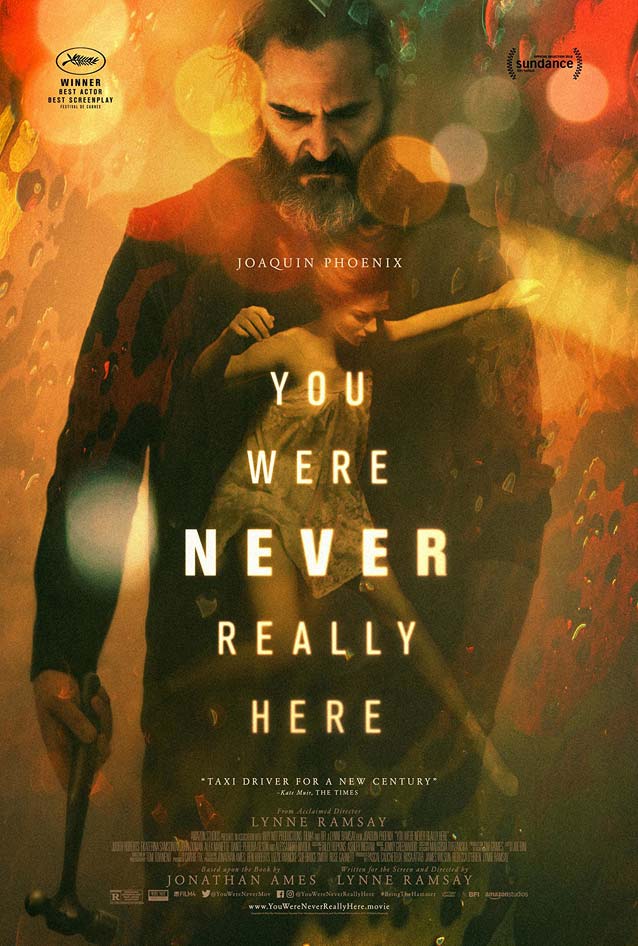
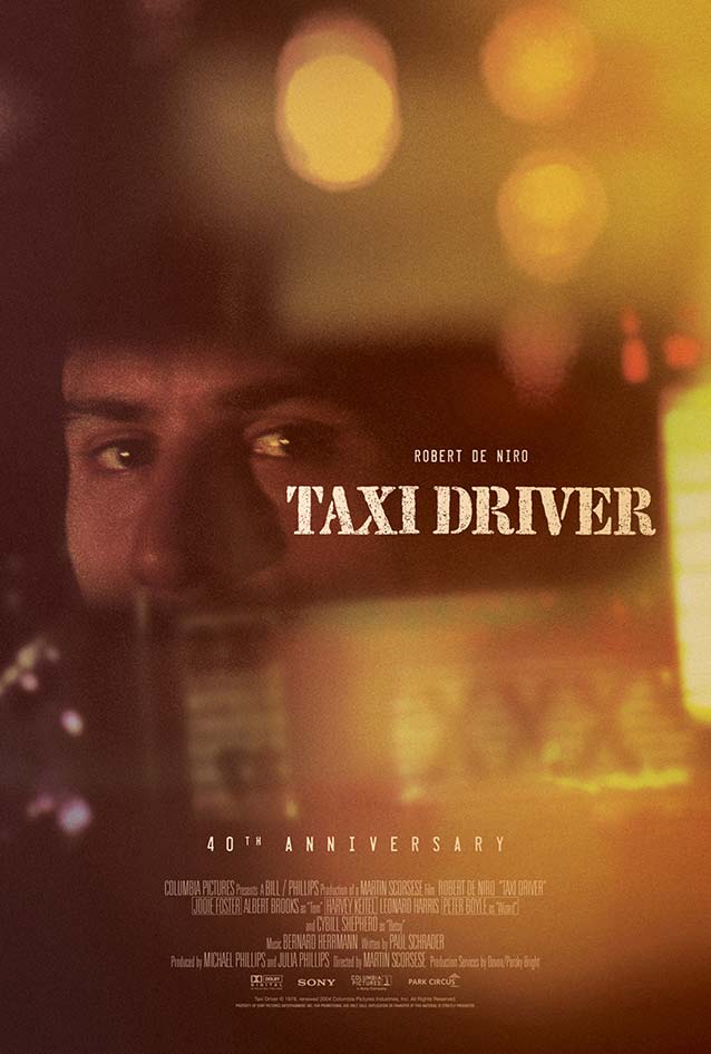
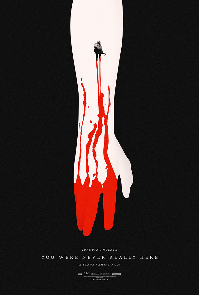
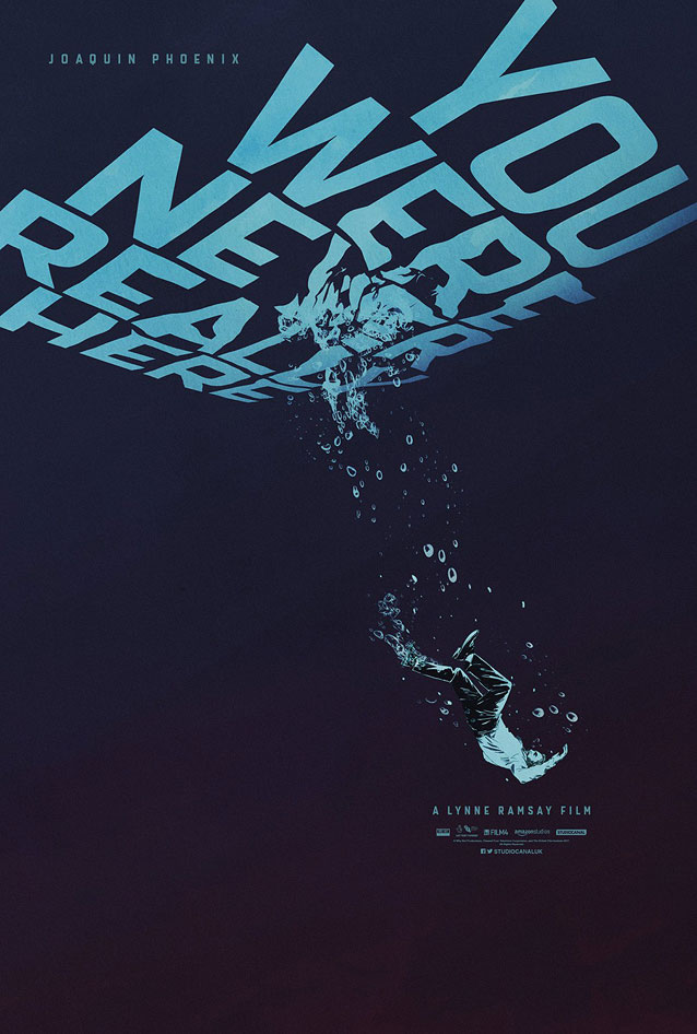
| I doubt this was intended, but P+A’s interpretation echoes the color scheme and bokeh effect of Brandon Schaefer’s classy 40th Anniversary poster for Taxi Driver. The problem with P+A’s design is that there is simply too much going on. All of the elements are fine—I particularly like the image of Samsonov floating in water as a metaphor for her helplessness—but the transparent layering of Samsonov and Phoenix on the busy background with the bokeh dots, the luminous title in two different typefaces, and the jumble of colors result in an overwrought poster. |
|
|
|
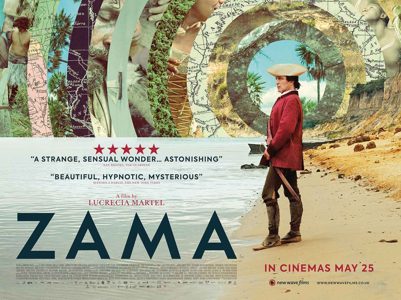
Zama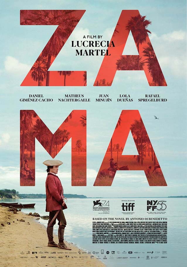
|
|