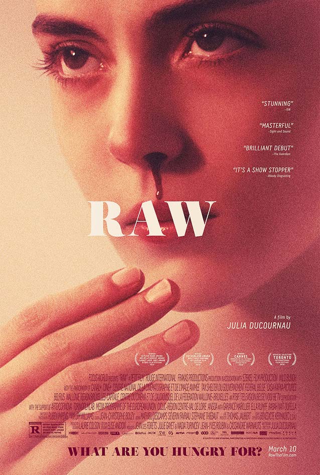
A flurry of painted art: the May episode of ScreenFonts looks at posters for Headshot, Umi Yori Mo Mada Fukaku (After The Storm), Donald Cried, Personal Shopper, God Knows Where I Am, The Blackcoat’s Daughter, Grave (Raw), Before I Fall, and All This Panic.
While gathering examples for this episode of ScreenFonts, I was pleasantly surprised to find a wealth of beautiful painted or illustrated posters, as well as two photographic compositions that look like painted art. I even had to shift some of the work to my upcoming “Leftovers” follow-up due to lack of space here.
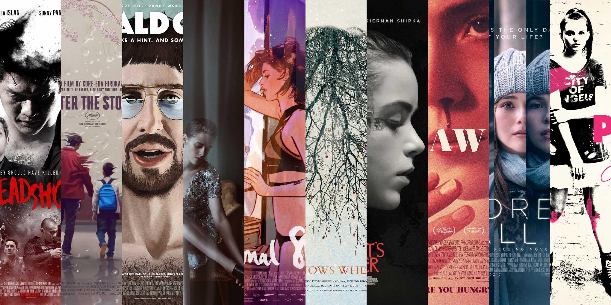
Headshot
© 2016 Screenplay Infinite Films. Poster by bpg.
Designers have a number of ways to cram as much information about a film as possible into a poster—think image mosaics or the oft-derided
floating heads maneuver. One elegant strategy is what I’ve come to call “the
Star Wars stack”: merging characters and story elements into a cluster on the canvas. Yes, I just made up that name, and
Tom Chantrell wasn’t even the first to do this for
Star Wars —but hey, sue me. Noted poster designers
Brandon Schaefer and
Sam Smith , collaborating as
The Poster Boys ,
replied on Twitter that the
Star Wars poster was referred to as
“The Dirty Dozen direction” after
Frank McCarthy ’s art for that 1967 war story. The style, however, has its roots in a lot of the earliest posters from the 1900s.
As I pointed out in
my comparison of the
original Chinese poster for
Journey To The West and
Paul Shipper ’s
superior illustrated art , photographic compositions in this style usually fall flat because they fail to reach the same level of consistency. Yet, once in awhile, a designer proves me wrong.
bpg ’s
theatrical one-sheet for Indonesian action thriller
Headshot manages to achieve a harmonious composition by dramatically desaturating the photographs and using obvious fade-outs instead of trying to cover up the transitions. These fade-outs are consistent with the smoke-like hole in the main protagonist’s head, a clever metaphor for both the injury and the amnesia the young man suffers from. The splattered red lettering not only reinforces the painterly look of the poster, but also serves as a typographic warning about the film’s violent content.
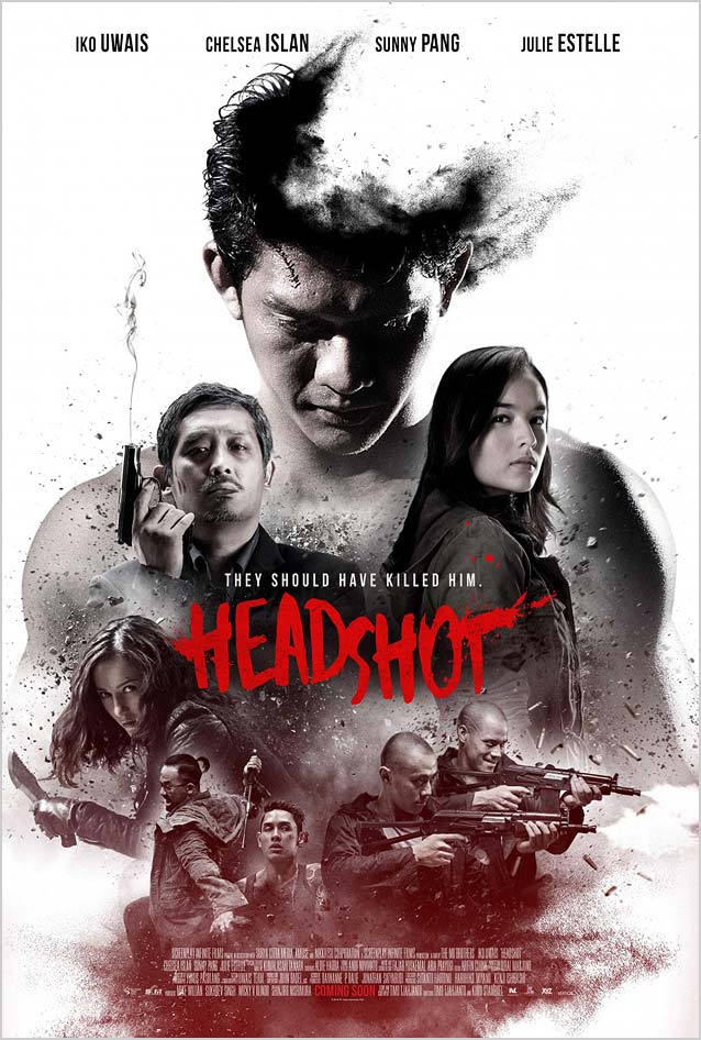
Umi Yori Mo Mada Fukaku (After The Storm)
© 2016 Film Movement. Poster by Akiko Stehrenberger.
Next, we move from a photo montage mimicking painted art to a photorealistic painting. This month’s episode illustrates why
Akiko Stehrenberger is a standout among this generation of film-poster designers. Instead of a signature style, Stehrenberger has a signature
attitude that sees her adopt unexpected solutions tailored to the film—compare, for example, two of her award-winning designs: one for
Funny Games , the other for
Kiss of The Damned . Stehrenberger’s versatility and inventiveness create interesting situations: for example, although both this poster and the next have water as a common thematic thread, they could not be more different.
For Japanese drama
Umi Yori Mo Mada Fukaku (After The Storm), Stehrenberger envisioned looking at father and son
through a rainy window as the perfect metaphor for the film’s subject matter: a private detective struggling to raise money for child support while trying to reconnect with his son and ex-wife after the death of his own father. Instead of putting up a physical barrier, the masterful optical distortion of the raindrops imparts an air of melancholy—and also of profound human connection. The stunning
theatrical one-sheet reveals a rare sensitivity and genuine empathy that is hard to find in film poster design. Just perfect.
Silas Dilworth’s Heroic Condensed stays out of the art’s way. The Skyline styles of
Titling Gothic have the same compact quality, while
Tasse Compressed and
Antenna Compressed are slightly squarer, with airier apertures.
Joost , a
new arrival at Type Network, is another—more adventurous—alternative.
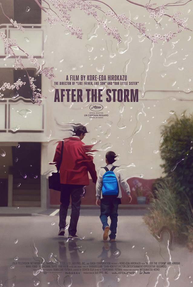
Donald Cried
© 2016 The Orchard, Rough House, Electric Chinoland & Cardboard productions. Poster by Gravillis, Inc. with artwork by Akiko Stehrenberger.
Although she usually presents a handful of concepts for a project, Stehrenberger only showed
a single design for
Donald Cried to creative director
Kenny Gravillis . The character wearing glasses, she explains, offered more possibilities than merely reflecting something. Having them collect water/tears—like underwater goggles tend to do—was a simple and funny visual that mirrored the title and further distorted the protagonist’s already goofy face. Because Stehrenberger likes to keep things straightforward, this was supposed to be the piece’s only gimmick. However, the client felt the artwork needed more elements from the story: sex, drugs, and guns. Stehrenberger incorporated them as a wallpaper motif in the background so as not to have them distract too much from the main image. Still, it made the title less legible. Stehrenberger found out only after the fact that a blurred drop shadow had been added—not a solution she would have chosen.
Type Network recently came by two exciting deco-flavored alternatives to Mark van Bronkhorst’s Bovine, in use in this poster.
Arbotek by
José Manuel Urós is a modern interpretation of art deco, and
CSTM ’s eccentric
Pilar has four stylistic sets that make the typeface increasingly adventurous. Mainstay
Mostra Nuova also fits the (literal) bill.
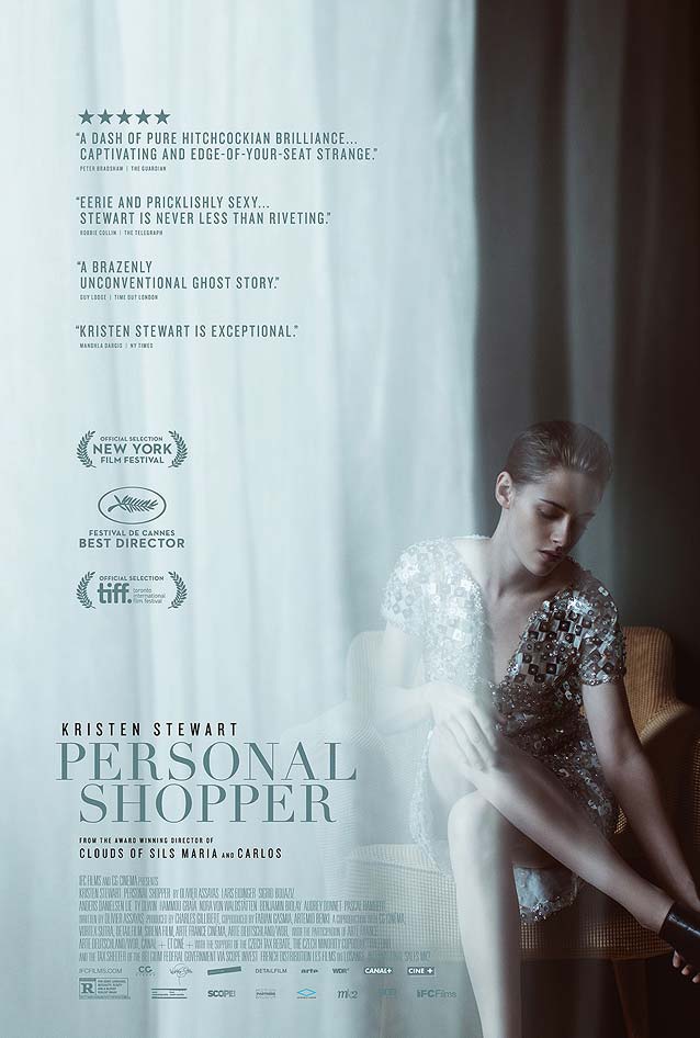
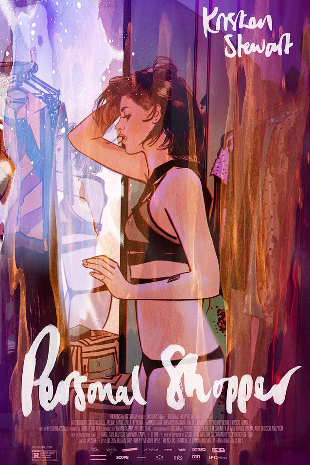
Personal Shopper
© 2016 GC Cinéma. Poster by inSync Plus.
© 2016 GC Cinéma. Poster by Tula Lotay for Mondo.
Artists who don’t normally work in film poster design often bring unexpected richness to the medium. Consider
Personal Shopper , which revolves around a ghost story set in the Paris fashion underworld. The
main theatrical poster by
inSync Plus plays up the mystery in the movie. The sheer curtains covering two thirds of the canvas and partly veiling Kristen Stewart can be seen as an almost literal interpretation of the ghost element, and also enhance the understated sensuality of Stewart’s body language as she takes off her shoes. The fine features of Didot underline the image’s sophistication; for more delicate Modern/Scotch faces, take a look at
Moderno Light ,
Benton Modern Display Light , and
Miller Banner Light . Feeling plucky? Choose
Vinter Thin for an even more pronounced French-fashion look. And you’d be hard pressed to find a finer serif than
Kazimir Text Hairline .
But back to painted art. Whatever the theatrical one-sheet aims to do, it pales in comparison to the absolutely wonderful
variant poster created by illustrator/comic book artist
Tula Lotay for
Mondo . Even though this is “only” a drawing of Kristen Stewart, what we see is a genuine, whole person expressing a fully developed personality, her strengths and insecurities shining through the brush strokes. The palette is gorgeous, and the spontaneous brush lettering is the perfect solution for the movie title and actor’s credit.
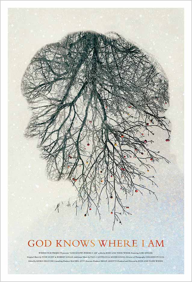
God Knows Where I Am
© 2016 Wider Film Projects. Poster by Dan Forkin Studio.
Things start to get a little surreal here, and this approach is just right for the biographical drama
God Knows Where I Am .Dan Forkin ’s
official key art condenses the documentary’s essence into a puzzling image. The ghostly silhouette framing the apple tree symbolizes Linda Bishop’s dissociation and eventual disappearance into nothingness. The upside-down tree lends itself to various interpretations. As she descends into insanity, becoming trapped in her own mind, Bishop waits for God to save her—hence the tree descending from the heavens. Visually, the latticework of branches mimics the nerves and blood vessels in her head, while the fruited tree reinforces the fact that Bishop survived for nearly four months on apples and rainwater. And this is where the last surreal detail suddenly hits you. The orientation of the apples makes you realize that the tree is not a rotated image—it’s actually hanging upside down, a metaphor for Bishop’s warped sense of reality.
The watercolor letterforms of the book face Bembo supply the poster with a literary touch. I’d like to see what sort of minute shifts in tone and voice would occur if this design were instead executed with
Faunus ,
Elmhurst ,
Whitman , or
Kopius .
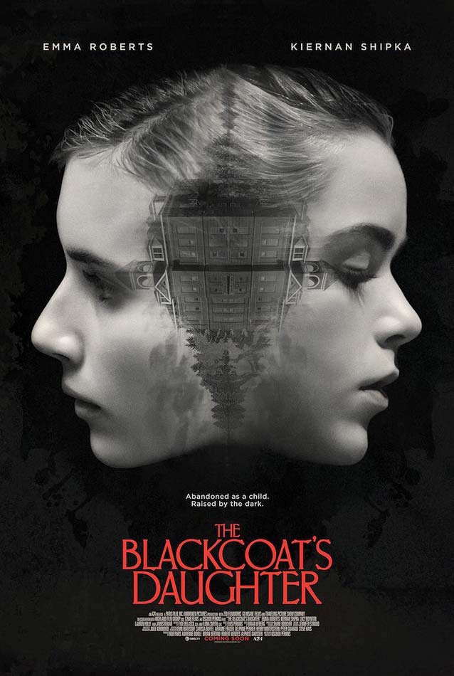
The Blackcoat’s Daughter
© 2015 A24. Poster by LA.
The previous poster proves that flipping, rotating, or mirroring one or more elements can be very effective if you want to introduce a subtle level of disquiet or turmoil into a poster design. (See my review of Orphan for another example.) In the horror thriller The Blackcoat’s Daughter, two girls are up against a mysterious evil force when they are left behind at their boarding school over winter break. In LA ’s theatrical one-sheet , the building providing the setting for the movie is rotated sideways and mirrorred. This forms a bizarre pattern connecting the profiles of the two protagonists, creating the gruesome impression that both faces were initially joined and are now being slowly ripped apart. It can also be seen as the occurrences inside the building invading and infecting the girls’ psyches.
The classic red serif capitals of Carlton, published by the Stephenson Blake Typefoundry in the early 1900s, lend the poster a vintage atmosphere. The architectural Grand Central , the mechanical Meyer Two , and the calligraphic Phaistos have similar period associations.
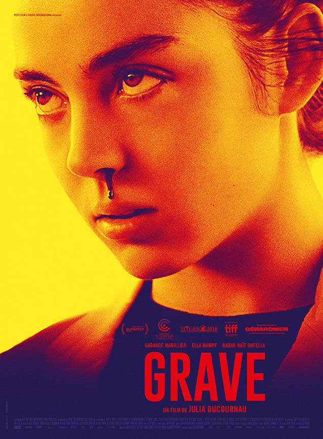
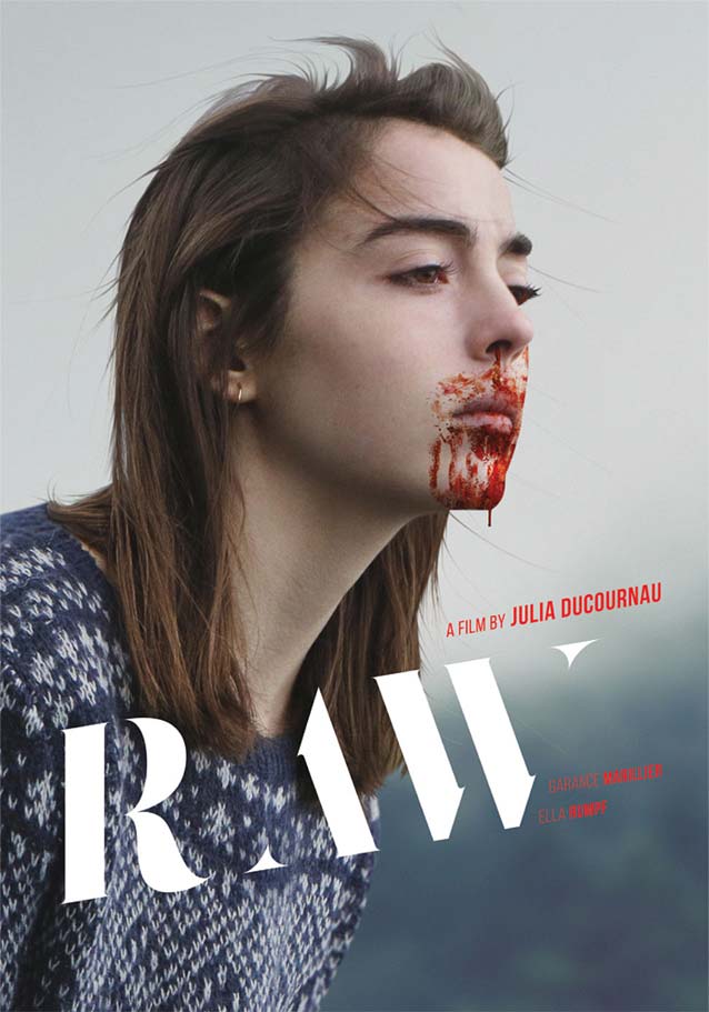
Grave (Raw)
© 2016 Focus World. Poster by Silenzio Communication.
© 2016 Focus World. Poster by P+A.
© 2016 Focus World.
It’s often enlightening to compare an original poster with local or international versions. French horror drama Grave (Raw)Silenzio Communication ’s original one-sheet singles out a key moment in the film: the prescient nosebleed that foreshadows Justine’s cannibalistic tendencies. This artwork and P+A ’s international one-sheet basically use the same image—yet the typography makes all the difference and elevates the latter to a higher level. While the choice of typeface for the film title and its location on the French poster seem mostly functional, in the American version the placement of the film title over Justine’s mouth turns the white high-contrast letters into metaphorical fangs, an imaginative and strong concept. Justine’s pose and bloodied mouth give her a feral, almost lupine look in the third poster variant. The positioning of the type, turned into a stencil face by having an outline eat away at the contours, beautifully reinforces the angle of her shoulders and chin.
The typeface in P+A’s artwork is Salomé, an interpretation of the fat-face model by Atipo , the Spanish graphic and type design studio whose projects I featured a number of times on The FontFeed .
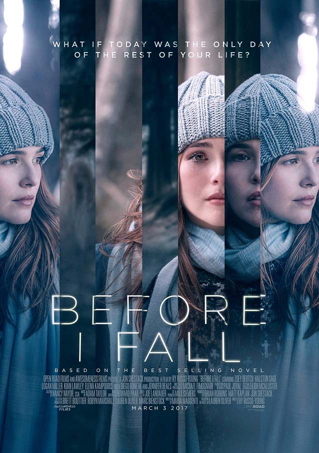
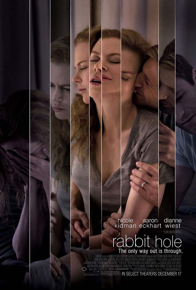
Before I Fall
© 2017 Open Road Films & Awesomeness Films. Poster by Ignition.
© 2010 Lionsgate. Poster by Ignition
I find it a little weird when design studios plagiarize themselves. Ignition created a theatrical one-sheet for mystery drama Before I Fall own design for Rabbit Hole ,The FontFeed almost seven years ago. The vertical divisions and image repetitions serve completely different purposes, though. In the poster for Rabbit Hole , the transition from warm colors and blissful imagery at the center to desaturated despair toward the borders of the canvas visualizes the disintegration of the protagonists’ psyches and marriage. For Before I Fall, this graphic solution symbolizes the fateful last day in the protagonist’s charmed life, which she must live over and over again until she gets it right. While conceptually the artwork for Rabbit Hole has more depth, the fractured typography reinforces the design of Before I Fall. Proxima Nova is a solid and versatile alternative to Gotham, while Arboria or Eagle would add an art-deco twist.
By the way, this is not the only time Ignition has copied their own poster concepts. In early 2010 , I compared their teasers for 30 Days of Night Daybreakers .
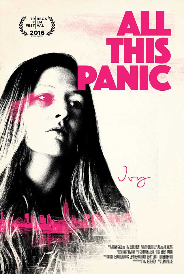
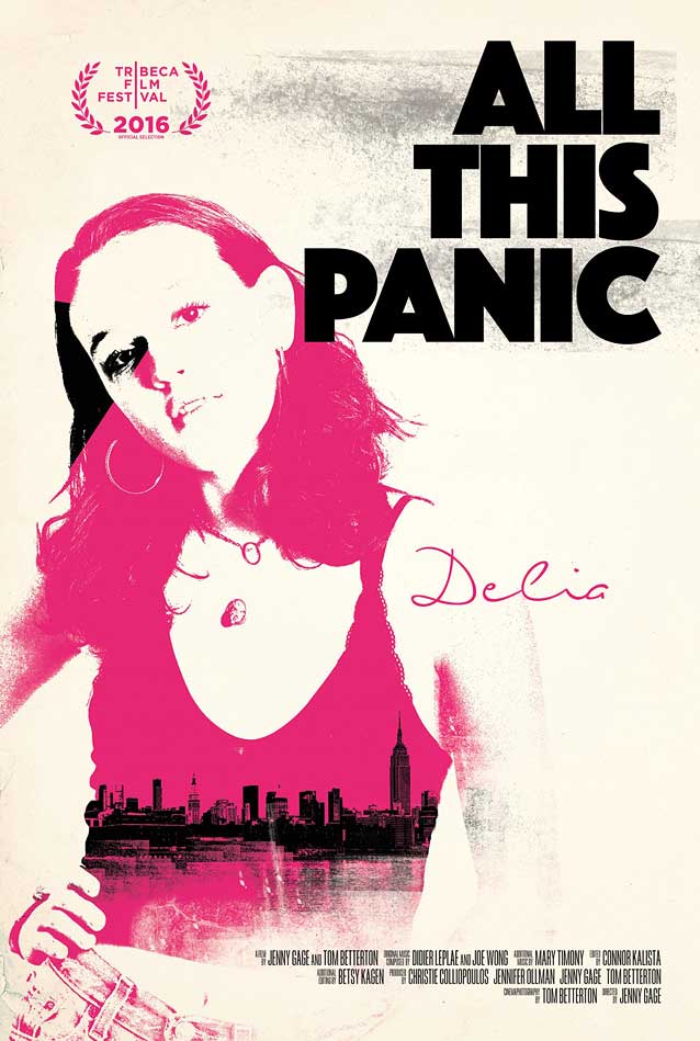
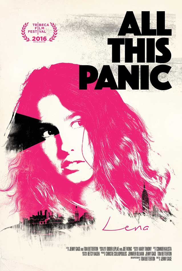
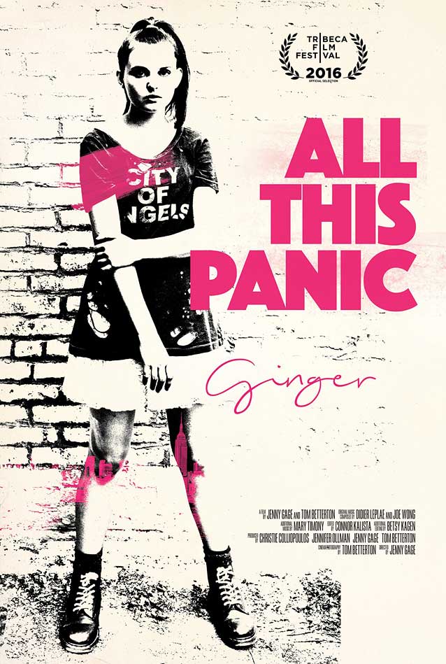
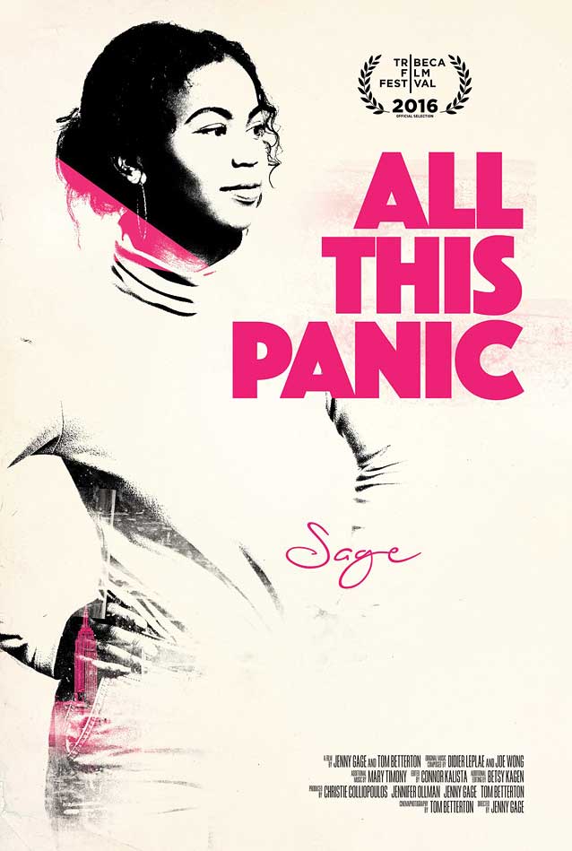
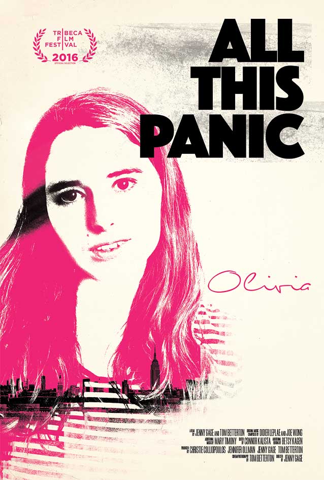
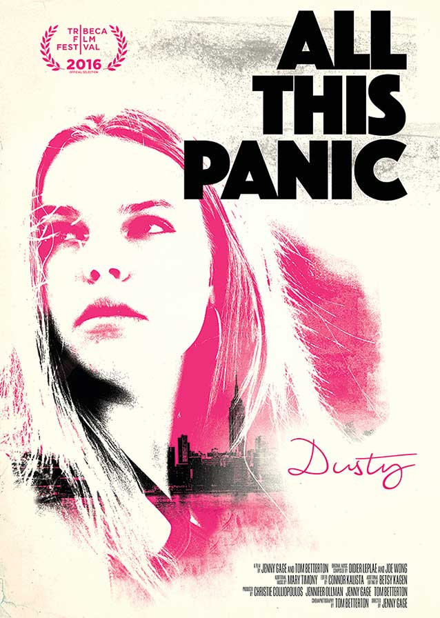
All This Panic
© 2016 Factory 25. Poster by Oddopolis.
© 2016 Factory 25. Poster by Oddopolis.
© 2016 Factory 25. Poster by Oddopolis.
© 2016 Factory 25. Poster by Oddopolis.
© 2016 Factory 25. Poster by Oddopolis.
© 2016 Factory 25. Poster by Oddopolis.
© 2016 Factory 25. Poster by Oddopolis.
We end like we started, with photographs that were manipulated to resemble painted art. The documentary All This Panic Oddopolis ’ poster series beautifully captures the girls’ youthfulness. By cranking up the contrast in their portraits until they look like stencil graffiti in black and hot pink, the posters take on a punk quality. The New York skyline concealed in the dark areas of the photos gives the artwork a sense of place. While I almost immediately recognized Jakob Erbar’s hand, the typeface initially had me puzzled, until I realized I was looking at Phosphor without the inside line. Another one of Jakob Erbar’s types served as the basis for Dunbar ; Allium Black has the same crisp heaviness, but without the peculiar S-shape.
Me, I am way beyond my teenage years, and thus have no reason to panic. And neither have you—if you haven’t had your fill of movie posters yet, come back in a few days to feast on “The Leftovers.” And, as always, you can discover a fresh batch of noteworthy movie posters with me in the next episode of ScreenFonts.
Bald Condensed, né Yves Peters, is a Belgian-based rock drummer known for his astute observations on the impact of letterforms in the contemporary culture-sphere. A prolific writer on typography, he has a singular knack for identifying the most obscure typefaces known to man.